Forms And Validation In Ionic React

Email Newsletter
Weekly tips on front-end & UX.
Trusted by 182,000+ folks.
 Register for Free


 Custom Web Forms for Angular, React, & Vue. Your backend.
 Celebrating 10 million developers
Ionic Framework is a UI Toolkit for building cross-platform mobile applications using HTML, CSS, and JavaScript. The release of Ionic 5 in early 2020 came with official support for React, enabling React developers to easily build mobile applications using their favorite tools. There isn’t much support for working with forms, however, and many of the existing libraries available for building forms in the React ecosystem do not play nicely with Ionic Framework’s components.
You will learn how to build forms using Ionic React’s UI input components in this tutorial. You will also learn how to use a library to help with detecting form input changes and responding to validation rules. Finally, you will learn to make your forms accessible to screen readers by adding helpful text to your inputs’ ARIA attributes.
Ionic’s Form Components
Forms are an important part of most web and mobile applications today. Whether you are enabling access to restricted parts of your application through user registration and login forms or collecting feedback from your users, you have to — at some point in your application’s lifecycle — build a form.
Ionic provides prebuilt components for working with forms — some of which include IonItem, IonLabel, IonInput, IonCheckbox and IonRadio. We can combine these components to build standard looking forms without adding any styling ourselves.
For example, the following code:
<form className="ion-padding">
<IonItem>
<IonLabel position="floating">Username</IonLabel>
<IonInput />
</IonItem>
<IonItem>
<IonLabel position="floating">Password</IonLabel>
<IonInput type="password" />
</IonItem>
<IonItem lines="none">
<IonLabel>Remember me</IonLabel>
<IonCheckbox defaultChecked={true} slot="start" />
</IonItem>
<IonButton className="ion-margin-top" type="submit" expand="block">
Login
</IonButton>
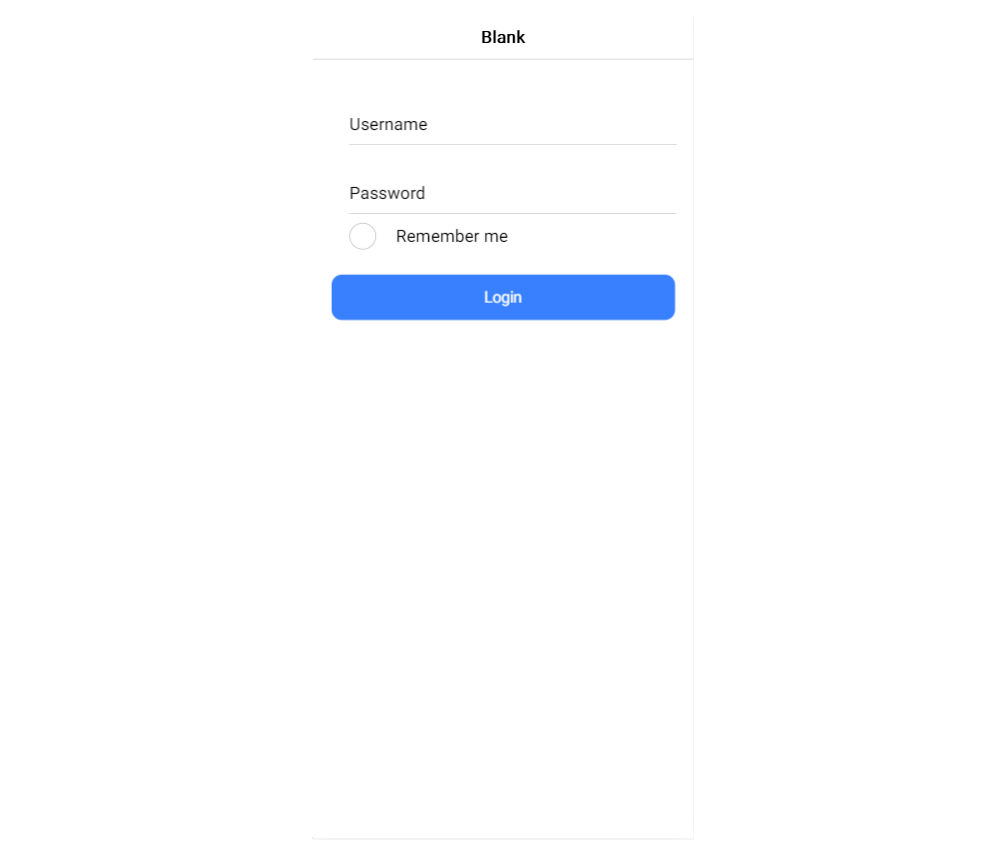
</form>Will give us a login form which looks like this:
Out of the box, Ionic’s form components look great on iOS or Android, but they can be a bit unwieldy if you are working with React. As with most tools in the React ecosystem, you have to decide how you want to go about building your forms when it comes to functionality and accessibility — both equally as important as design.
While there are already so many React form helpers available to choose from, most of them do not work with Ionic’s form components. I suspect the main reason for this is that the event fired when a field value changes in Ionic is onIonChange, whereas most of the existing form libraries listen for onChange.
React Hook Form: Small And Fast React Forms Library
Thankfully, it isn’t all doom and gloom. I recently came across React Hook Form (RHF), a library for working with forms in React projects. It provides support for controlled or uncontrolled components and input validation, and the API is hooks-based so it only works with functional components.
The most appealing feature for Ionic React developers — in my opinion — is the wrapper <Controller /> component it provides for working with controlled components. The component has an onChangeName prop which can be used to specify the change event name for whatever component instance you pass to it. I’ll show you how this makes working with forms in Ionic really easy in the following sections.
Building A Signup Form
Let’s see how RHF helps us with form functionality as we build a registration form in Ionic. If you are running the latest version of the Ionic CLI (run npm i -g @ionic/cli to confirm), start a new Ionic app with React by running the following command:
ionic start myApp blank --type=reactI used a blank template here. You should be able to rewrite your existing forms to use the React Hook Form library with ease, especially if your components are written as Functional Components.
Note: You should remove the ExploreContainer component and its import in Home.tsx before proceeding with this tutorial.
To get started with your form, install the React Hook Form package by running the following command in your project’s root directory:
yarn add react-hook-formThis will make the React Hook Form library available in your project. Let’s create a form input field using the library. Open the Home.tsx file and replace its contents with the following:
import { IonContent, IonPage, IonText, IonItem, IonLabel, IonInput, IonButton } from "@ionic/react";
import React from "react";
import "./Home.css";
import { Controller, useForm } from 'react-hook-form';

const Home: React.FC = () => {
  const { control, handleSubmit } = useForm();

  const registerUser = (data) => {
    console.log('creating a new user account with: ', data);
  }

  return (
    <IonPage>
      <IonContent className="ion-padding">
        <IonText color="muted">
          <h2>Create Account</h2>
        </IonText>
        <form onSubmit={handleSubmit(registerUser)}>
          <IonItem>
            <IonLabel position="floating">Email</IonLabel>
            <Controller
              as={<IonInput type="email" />}
              name="email"
              control={control}
              onChangeName="onIonChange"
            />
          </IonItem>
          <IonButton expand="block" type="submit" className="ion-margin-top">
            Register
          </IonButton>
        </form>
      </IonContent>
    </IonPage>
  );
};
export default Home;
This gives you a form with a single field to collect an email address. Let’s break down the important parts (highlighted in the code block).
First, we destructure the return value of the useForm() hook from RHF. handleSubmit passes your input’s values to the handler function you specify when the form passes validation. control is an object containing methods used for registering controlled components into RHF.
Next, we have a standard form item block, but unlike the example for the login form, we pass the IonInput component to RHF’s <Controller /> component, register the change event by setting <Controller />’s onChangeName prop to Ionic’s change event name, and set the control prop to the control object from invoking useForm().
This is good so far, but you might find yourself repeating nearly the same code over and over again. You could try to make a reusable Input component that builds an input field with given properties.
Create a file in the src/components directory named Input.tsx and add the following code to the file:
import React, { FC } from "react";
import { IonItem, IonLabel, IonInput } from "@ionic/react";
import { Controller, Control } from "react-hook-form";

export interface InputProps {
  name: string;
  control?: Control;
  label?: string;
  component?: JSX.Element;
}

const Input: FC<InputProps> = ({
  name,
  control,
  component,
  label,
}) => {
  return (
    <>
      <IonItem>
        {label && (
          <IonLabel position="floating">{label}</IonLabel>
        )}
        <Controller
          as={component ?? <IonInput />}
          name={name}
          control={control}
          onChangeName="onIonChange"
        />
      </IonItem>
    </>
  );
};

export default Input;
This component receives a name prop and optional control, component and label props and renders an input field using the Ionic form components introduced earlier. This reduces the amount of code you have to write when creating form input fields. You can finish the rest of your form using this component. Edit the Home.tsx file with the following changes:
import { IonContent, IonPage, IonText, IonInput, IonButton, IonCheckbox, IonItem, IonLabel } from "@ionic/react";
import React from "react";
import "./Home.css";
import { useForm } from "react-hook-form";
import Input, { InputProps } from "../components/Input";
const Home: React.FC = () => {
const { control, handleSubmit } = useForm();
const formFields: InputProps[] = [
{
name: "email",
component: <IonInput type="email" />,
label: "Email",
},
{
name: "fullName",
label: "Full Name",
},
{
name: "password",
component: <IonInput type="password" clearOnEdit={false} />,
label: "Password",
},
];
const registerUser = (data) => {
console.log("creating a new user account with: ", data);
};
return (
<IonPage>
<IonContent>
<div className="ion-padding">
<IonText color="muted">
<h2>Create Account</h2>
</IonText>
<form onSubmit={handleSubmit(registerUser)}>
{formFields.map((field, index) => (
<Input {...field} control={control} key={index} />
))}
<IonItem>
<IonLabel>I agree to the terms of service</IonLabel>
<IonCheckbox slot="start" />
</IonItem>
<IonButton expand="block" type="submit" className="ion-margin-top">
Register
</IonButton>
</form>
</div>
</IonContent>
</IonPage>
);
};
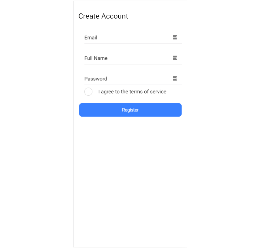
export default Home;With your setup so far, you have an array of your form’s input fields (name is the only required property), with each field rendered using the Input component from earlier. You can take this even further and have your field data in a JSON file, keeping the code within your components with forms clean. At this point, your app (running at https://localhost:8100 with the ionic serve command) should look like this:
How About Field Validation?
You might have noticed that our form’s input fields do not have any validation logic yet. If this were an app intended for real-world use, that could lead to many undesirable effects unless your API is set up to validate incoming data. By the way, your API must always validate incoming data.
RHF comes with validation which aligns with the HTML standard for form validation built-in. This works great for simple validation like making a field required or setting minimum and maximum field lengths. If you want to use complex validation logic, I would recommend using Yup. While you can use any object schema validation library, RHF supports Yup out of the box.
Run the following command to install the library (and typings):
yarn add yup @types/yupNext, add this to your component’s imports:
import { object, string } from 'yup';

const Home: React.FC = () => { ... }
Then, add the following code at the top of your component:
const Home: React.FC = () => {
  const validationSchema = object().shape({
    email: string().required().email(),
    fullName: string().required().min(5).max(32),
    password: string().required().min(8),
  });
  // ...
}
Here, we’ve created an object schema and added validation rules to each property using yup. The names in the object must match with names in your form’s input tags otherwise your rules won’t be triggered.
Finally, update your useForm() hook to use the schema we’ve defined by setting the validationSchema property like this:
const { control, handleSubmit } = useForm({
  validationSchema,
});
Now, when you click on the submit button the handleSubmit handler isn’t invoked and the form data isn’t submitted. While this is exactly what we wanted, it looks like there is no way for the user to know what’s happening. Let’s fix this by showing text hints when a field isn’t filled correctly.
First, update the Input component to look like the following:
import React, { FC } from "react";
import { IonItem, IonLabel, IonInput, IonText } from "@ionic/react";
import { Controller, Control, NestDataObject, FieldError } from "react-hook-form";

export interface InputProps {
  name: string;
  control?: Control;
  label?: string;
  component?: JSX.Element;
  errors?: NestDataObject<Record<string, any>, FieldError>;
}

const Input: FC<InputProps> = ({
  name,
  control,
  component,
  label,
  errors,
}) => {
  return (
    <>
      <IonItem>
        {label && <IonLabel position="floating">{label}</IonLabel>}
        <Controller
          as={component ?? <IonInput />}
          name={name}
          control={control}
          onChangeName="onIonChange"
        />
      </IonItem>
      {errors && errors[name] && (
        <IonText color="danger" className="ion-padding-start">
          <small>{errors[name].message}</small>
        </IonText>
      )}
    </>
  );
};

export default Input;
Here, we’ve updated our component to receive an extra optional property which is the error object from RHF, and we display an error message in the returned input field whenever there is an error. One last thing, add the errors object to your destructured object and update the component in your loop:
const { control, handleSubmit, errors } = useForm({
  validationSchema,
});
{formFields.map((field, index) => (
<Input {...field} control={control} key={index} errors={errors} />
))}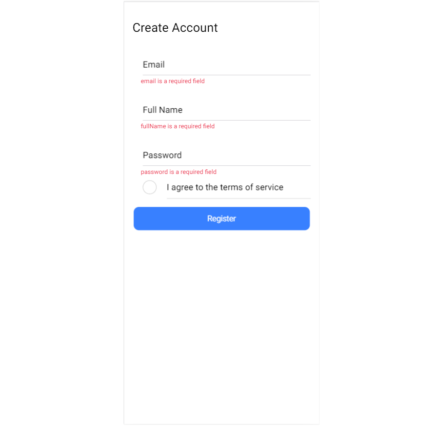
Your forms now provide visual cues when a user isn’t doing something right. Yup allows you to change the error message. You can do this by passing a string to the validation method you’re using. For email, as an example, you can do the following:
{
  email: string()
    .email('Please provide a valid email address')
    .required('This is a required field'),
}
Improving Accessibility
Ionic’s components are usually wrappers over the corresponding native element, meaning that they accept most — if not all — of that element’s existing attributes. You can improve your input fields and make them more accessible to visually impaired users by setting ARIA attributes with relevant text.
To continue with our example registration form, open the Input.tsx file and make the following changes:
import React, { FC } from "react";
import { IonItem, IonLabel, IonInput, IonText } from "@ionic/react";
import { Controller, Control, NestDataObject, FieldError } from "react-hook-form";

export interface InputProps {
  name: string;
  control?: Control;
  label?: string;
  component?: JSX.Element;
  errors?: NestDataObject<Record<string, any>, FieldError>;
}

const Input: FC<InputProps> = ({
  name,
  control,
  component,
  label,
  errors,
}) => {
  return (
    <>
      <IonItem>
        {label && <IonLabel position="floating">{label}</IonLabel>}
        <Controller
          as={
            component ?? (
              <IonInput
                aria-invalid={errors && errors[name] ? "true" : "false"}
                aria-describedby={`${name}Error`}
              />
            )
          }
          name={name}
          control={control}
          onChangeName="onIonChange"
        />
      </IonItem>
      {errors && errors[name] && (
        <IonText color="danger" className="ion-padding-start">
          <small>
            <span role="alert" id={`${name}Error`}>
              {errors[name].message}
            </span>
          </small>
        </IonText>
      )}
    </>
  );
};

export default Input;
The default IonInput component we’re passing to Controller now includes an aria-invalid attribute to indicate whether the field has an error, and an aria-describedby attribute to point to the corresponding error message. The error message is now wrapped with a span having an ARIA role set to “error”. Now, when your field has an error, a screen reader will highlight that field and read out the error message.
- You’ll find the GitHub repo over here.
Conclusion
Congratulations! You have learned how to build and validate forms when building cross-platform apps using Ionic. You’ve also seen how easy it is to make your input fields accessible to users with a visual impairment. Hopefully, this tutorial provides a solid platform that you can use when building forms in your Ionic React apps. There are other components for building forms (such as select and radios) that we didn’t explore in this tutorial, but you can find and read more about them in the official docs.
References
- Ionic Framework Docs
- React Hook Form
- Yup Docs
- Phil Haack on Validating Email Addresses
- Accessibility on MDN Web Docs
Further Reading
- The Safest Way To Hide Your API Keys When Using React
- Creating Accessible UI Animations
- Internationalization In Next.js 13 With React Server Components
- Exploring Enhanced Patterns In WordPress 6.3
 (ks, ra, yk, il, mrn)

