A Practical Guide To Product Tours In React Apps

Email Newsletter
Weekly tips on front-end & UX.
Trusted by 182,000+ folks.


 Custom Web Forms for Angular, React, & Vue. Your backend.
 Celebrating 10 million developers
“Product tours — sometimes called product walkthroughs — introduce users to a new product and help them find their bearings.”
Usually, when it needs to showcase a new feature or complex UI functionality in a web app, the customer-success team would send a campaign email to all of its users. While this is a great way to create such awareness, some users might not have the opportunity to see the added feature; hence, the purpose of the email would be defeated.
A better way to increase user awareness of a particular feature in a web app is by integrating concise, self-explanatory UI tips, called product tours.
Product tours guide users to “a-ha” moments, or showcase high-value features that are being underused. Product tours can be powerful tools to introduce users to a new product and to help them find their bearings. They can draw attention to product launches, promo offers, and product sales.
But when done wrong, product tours can end up feeling like a backseat driver. And no one likes a backseat driver, do they?
In this tutorial, you’ll learn about what a product tour is and the types of product-tour packages in the React ecosystem, along with their pros and cons.
If you’re building customer-facing products using React, then you might be keen to implement this in your React application. By the end, we’ll have built a product tour for a simple shopping-cart UI using React Joyride.
We won’t go through React and JavaScript’s syntax basics, but you don’t have to be an expert in either of these languages to follow along.
Product Tour Guidelines
Product tours are a tricky aspect of web apps, requiring some user-experience expertise to drive results. I’d recommend going through Appcues’ tips for product tours. The following are a few guidelines to consider.
Never Lecture
Putting a lot of tours on a web page is tempting. But users are usually not keen on long introductory tutorials. They become anxious when they have to ingest a lot of information before being able to use a feature in the app.
Break It Down
Don’t teach everything. Focus on a single feature, and create a tour of two to three steps to showcase that feature. Show many small tours, rather than a single long tour. Prioritize their sequence.
Add Value
Do you enjoy taking your own tour? How about your teammates? Present the tour in such a way that users will understand. Showcase value, rather than stories.
Now that we know the value of product tours and seen some guidelines for building them, let’s cover some React libraries for product tours and learn how to use them.
There are only a few React-based libraries for implementing tours. Two of the most popular are React Tour and React Joyride.
React Tour
React Tour has around 1,600 stars on GitHub and is being actively developed. The best use case for React Tour is a simple product tour in which little customization is required.
How It Works
With React Tour, you pass the className selector and content for each step to the component. The library will render the tour’s user interface based on a button click, or after you’ve mounted the component. It’s simple for static pages and UIs:
 const steps = [
  {
    selector: '.first-tour',
    content: 'This is the content for the first tour.',
  },
  {
    selector: '.second-tour',
    content: 'Here is the content for the second Tour.',
  }
  // ...
]
Pros
- React Tour is best for tours that need little customization.
- It works well for static content and for dynamic content whose selector labels always exist in the UI.
- Fans of styled-components might find it interesting because it has a hard dependency on styled-components.
Cons
- If your project has no dependency on styled-components, then you might not find it easy to implement.
- Your creativity will be limited because it doesn’t support customization.
React Joyride
The other main product-tour library is React Joyride, which has about 3,100 stars on GitHub and is also actively maintained.
How It Works
We pass the className as a target and the content. The state stores the tour. The Joyride component uses steps as props.
  state = {
    steps: [
      {
        target: '.my-first-step',
        content: 'This is my awesome feature!',
      },
      {
        target: '.my-other-step',
        content: 'This is another awesome feature!',
      },
      ...
    ]
  };

  render () {
    const { steps } = this.state;

    return (


        ...

    );
  }
}
Pros
- Integrating React Joyride in a web app is less rigid than with React Tour, and it has no hard dependency on other libraries.
- Events and actions are made available, which fosters customization.
- It’s frequently improved.
Cons
- The UI isn’t as elegant as React Tour’s.
Why React Joyride?
Product tours, especially for really big web apps, require customization, and that sets React Joyride apart from React Tour. The example project we’ll make demands some creativity and customization — hence, we’ll go with React Joyride.
Building A Simple Product Tour
First, we’ll build a simple React tour using the props available to us in React Joyride. Next, we’ll use the useReducer hook to automate the tour’s processes.
Clone the “standard-tour” branch in the GitHub repository, or use the web page of your choice, as long as you’re able to follow along.
Install the packages by running npm install.
To start the app, run npm run start.
We’ll be covering the following steps:
- define the tour’s steps;
- enable a skip option in each step;
- change text labels on buttons and links;
- customize styles like button colors and text alignment.
Then, we’ll add some custom features:
- autostart the tour;
- start the tour manually (i.e. with a link or button click);
- hide the blinking beacon.
The props in React Joyride enable us to perform some basic functionality.
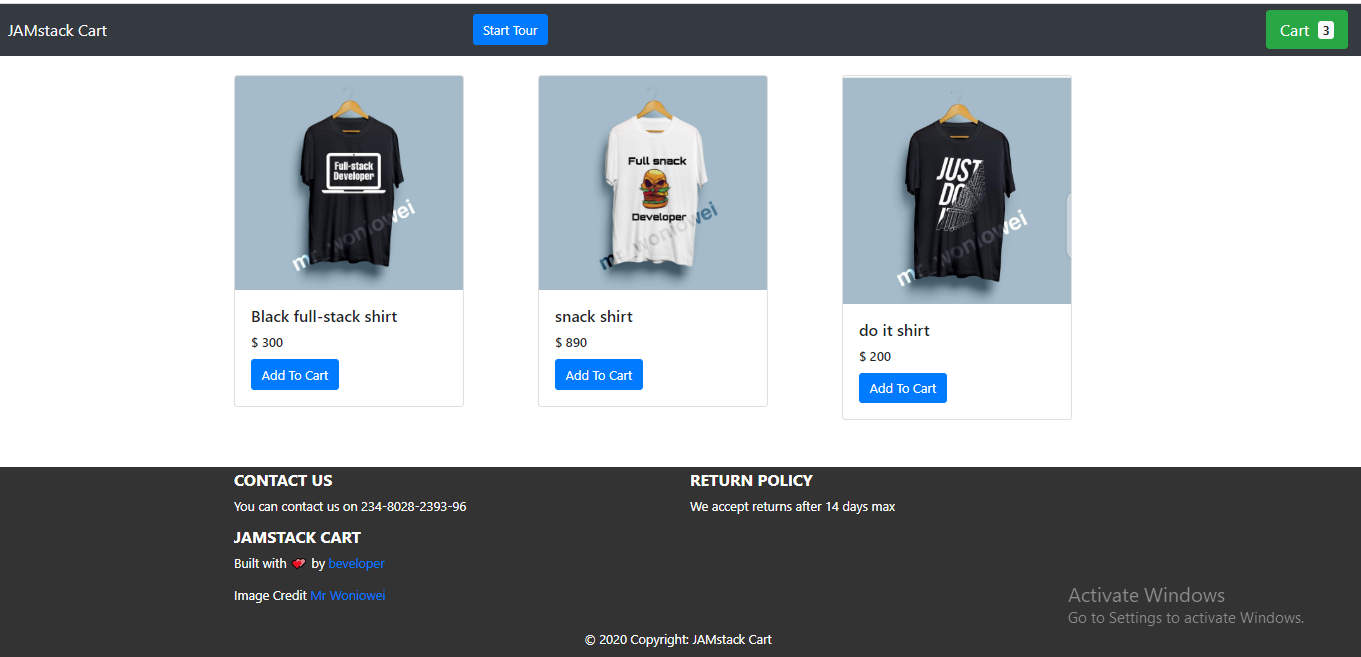
For this tutorial, we’ll build a product tour of the UI shown below:
Define The Tour’s Steps
To begin with, ensure that you’re targeting the particular classNames that will hold the content of the tour on the page — that is, according to whether you’ll be using your UI instead of the shopping-cart UI.
In the component folder, create a Tour.js file, and paste the following code into it. Also, ensure that the target classNames exist in your style sheet. Throughout this article, we’ll tweak the Tour.js component to suit the task at hand.
import React from "react";
import JoyRide from "react-joyride";
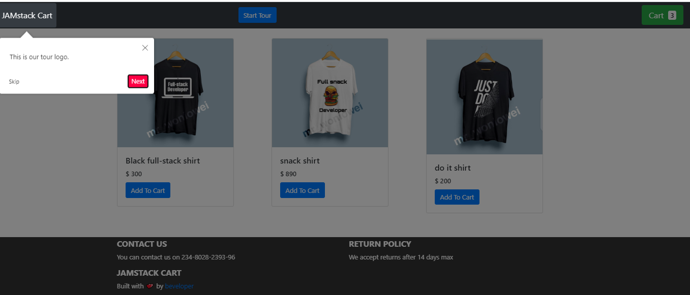
const TOUR_STEPS = [
{
target: ".tour-logo",
content: "This is our tour’s logo",
},
{
target: ".tour-cart",
content:
"View the cart you’ve added here",
},
{
target: ".tour-contact",
content: "Contact the developer",
},
{
target: ".tour-policy",
content: "We accept returns after 14 days max",
},
];
What we’ve done is simply define our tour’s steps by targeting the classNames that will form the bedrock of our content (the text). The content property is where we define the text that we want to see when the tour starts.
Enable Skip Option In Each Step
A skip option is important in cases where a user isn’t interested in a particular tour. We can add this feature by setting the showSkipButton prop to true, which will skip the remaining steps. Also, the continuous prop comes in handy when we need to show the Next button in each step.
 const Tour = () => {
  return (
    <>
      <JoyRide steps={TOUR_STEPS} continuous={true} showSkipButton={true} />
    </>
  );
};
Change Text Labels On Buttons And Links
To change the text labels on either buttons or links, we’ll use the locale prop. The locale prop has two objects, last and skip. We specified our last tour as the End tour, while skip is the Close tour.
 const Tour = () => {
  return (
    <>
      <JoyRide
        steps={TOUR_STEPS}
        continuous={true}
        showSkipButton={true}
        locale={{
          last: "End tour",
          skip: "Close tour"
        }}
      />
    </>
  );
};
Customize Styles, Like Button Colors And Text Alignment
The default color of buttons is red, and text alignment is always set right. Let’s apply some custom styles to change button colors and align text properly.
We see in our code that the styles prop is an object. It has other objects with unique values, including:
tooltipContainer
Its key istextAlign, and its value isleft.buttonNext
Its key isbackgroundColor, and its value isgreen.buttonBack
Its key ismarginRight, and its value is10px.locale
Its keys arelastandskip, and its values areEnd TourandClose Tour, respectively.
const Tour = () => {
  return (
    <>
      <JoyRide
        steps={TOUR_STEPS}
        continuous={true}
        showSkipButton={true}
        styles={{
          tooltipContainer: {
            textAlign: "left"
          },
          buttonNext: {
            backgroundColor: "green"
          },
          buttonBack: {
            marginRight: 10
          }
        }}
        locale={{
          last: "End tour",
          skip: "Close tour"
        }}
      />
    </>
  );
};
The library exposes some props to use on our elements in place of the default elements, some of which are:
useReducer
We’ve seen how to create a product tour and how to customize it using the various props of Joyride.
The problem with props, however, is that, as your web app scales and you need more tours, you don’t just want to add steps and pass props to them. You want to be able to automate the process by ensuring that the process of managing tours is controlled by functions, and not merely props. Therefore, we’ll use useReducer to revamp the process of building tours.
In this segment, we are going to take control of the tour by using actions and events, made available by the library through a callback function.
To make this process feel less daunting, we’ll break this down into steps, enabling us to build the tour in chunks.
The complete source code is available, but I’d advise you to follow this guide, to understand how it works. All of our steps will be done in the Tour.js file in the components folder.
Define The Steps
import React from "react";
import JoyRide from "react-joyride";
const TOUR_STEPS = [
  {
    target: ".tour-logo",
    content: "This is our tour’s logo.",
  },
  {
    target: ".tour-cart",
    content:
      "View the cart you’ve added here",
  },
  {
    target: ".tour-contact",
    content: "Contact the developer",
  },
  {
    target: ".tour-policy",
    content: "We accept returns after 14 days max",
  },
];
In this first step, we define our steps by targeting the appropriate classNames and setting our content (text).
Define The Initial State
 const INITIAL_STATE = {
  run: false,
  continuous: true,
  loading: false,
  stepIndex: 0, // Make the component controlled
  steps: TOUR_STEPS,
  key: new Date(), // This field makes the tour to re-render when the tour is restarted
};
In this step, we define some important states, including:
- Set the
runfield tofalse, to ensure that the tour doesn’t start automatically. - Set the
continuousprop totrue, because we want to show the button. stepIndexis the index number, which is set to0.- The
stepsfield is set to theTOUR_STEPSthat we declared in step 1. - The
keyfield makes the tour re-render when the tour is restarted.
Manage The State With Reducer
 const reducer = (state = INITIAL_STATE, action) => {
  switch (action.type) {
    // start the tour
    case "START":
      return { ...state, run: true };
    // Reset to 0th step
    case "RESET":
      return { ...state, stepIndex: 0 };
    // Stop the tour
    case "STOP":
      return { ...state, run: false };
    // Update the steps for next / back button click
    case "NEXT_OR_PREV":
      return { ...state, ...action.payload };
    // Restart the tour - reset go to 1st step, restart create new tour
    case "RESTART":
      return {
        ...state,
        stepIndex: 0,
        run: true,
        loading: false,
        key: new Date()
      };
    default:
      return state;
  }
};
In this step, using a switch statement when case is START, we return the state and set the run field to true. Also, when case is RESET, we return the state and set stepIndex to 0. Next, when case is STOP, we set the run field to false, which will stop the tour. Lastly, when case is RESET, we restart the tour and create a new tour.
According to the events (start, stop, and reset), we’ve dispatched the proper state to manage the tour.
Listen To The Callback Changes And Dispatch State Changes
 import JoyRide, { ACTIONS, EVENTS, STATUS } from "react-joyride";
const callback = data => {
    const { action, index, type, status } = data;
    if (action === ACTIONS.CLOSE
                ||
       (status === STATUS.SKIPPED && tourState.run)
                ||
      status === STATUS.FINISHED
    ) {
      dispatch({ type: "STOP" });
    } else if (type === EVENTS.STEP_AFTER || type === EVENTS.TARGET_NOT_FOUND) {
      dispatch({
        type: "NEXT_OR_PREV",
        payload: { stepIndex: index + (action === ACTIONS.PREV ? -1 : 1) }
      });
    }
};
Using the exposed EVENTS, ACTIONS, and STATUS labels offered by React Joyride, we listen to the click events and then perform some conditional operations.
In this step, when the close or skip button is clicked, we close the tour. Otherwise, if the next or back button is clicked, we check whether the target element is active on the page. If the target element is active, then we go to that step. Otherwise, we find the next-step target and iterate.
Autostart The Tour With useEffect
useEffect(() => {
  if(!localStorage.getItem("tour"){
    dispatch({ type: "START"});
  }
}, []);
In this step, the tour is auto-started when the page loads or when the component is mounted, using the useEffect hook.
Trigger The Start Button
const startTour = () => {
  dispatch({ type: "RESTART" });
};
The function in this last step starts the tour when the start button is clicked, just in case the user wishes to view the tour again. Right now, our app is set up so that the tour will be shown every time the user refreshes the page.
Here’s the final code for the tour functionality in Tour.js:
import React, { useReducer, useEffect } from "react";
import JoyRide, { ACTIONS, EVENTS, STATUS } from "react-joyride";

// Define the steps
const TOUR_STEPS = [
  {
    target: ".tour-logo",
    content: "This is our tour’s logo.",
    disableBeacon: true,
  },
  {
    target: ".tour-cart",
    content:
      "View the cart you’ve added here",
  },
  {
    target: ".tour-contact",
    content: "Contact the developer",
  },
  {
    target: ".tour-policy",
    content: "We accept returns after 14 days max",
  },
];

// Define our state
const INITIAL_STATE = {
  key: new Date(),
  run: false,
  continuous: true,
  loading: false,
  stepIndex: 0,
  steps: TOUR_STEPS,
};

// Set up the reducer function
const reducer = (state = INITIAL_STATE, action) => {
  switch (action.type) {
    case "START":
      return { ...state, run: true };
    case "RESET":
      return { ...state, stepIndex: 0 };
    case "STOP":
      return { ...state, run: false };
    case "NEXT_OR_PREV":
      return { ...state, ...action.payload };
    case "RESTART":
      return {
        ...state,
        stepIndex: 0,
        run: true,
        loading: false,
        key: new Date(),
      };
    default:
      return state;
  }
};

// Define the Tour component
const Tour = () => {
  const [tourState, dispatch] = useReducer(reducer, INITIAL_STATE);
  useEffect(() => {
    if (!localStorage.getItem("tour")) {
      dispatch({ type: "START" });
    }
  }, []);
  const callback = (data) => {
    const { action, index, type, status } = data;
    if (
      action === ACTIONS.CLOSE ||
      (status === STATUS.SKIPPED && tourState.run) ||
      status === STATUS.FINISHED
    ) {
      dispatch({ type: "STOP" });
    } else if (type === EVENTS.STEP_AFTER || type === EVENTS.TARGET_NOT_FOUND) {
      dispatch({
        type: "NEXT_OR_PREV",
        payload: { stepIndex: index + (action === ACTIONS.PREV ? -1 : 1) },
      });
    }
  };
  const startTour = () => {
    dispatch({ type: "RESTART" });
  };
  return (
    <>
      <button className="btn btn-primary" onClick={startTour}>
        Start Tour
      </button>
      <JoyRide
        {...tourState}
        callback={callback}
        showSkipButton={true}
        styles={{
          tooltipContainer: {
            textAlign: "left",
          },

          buttonBack: {
            marginRight: 10,
          },
        }}
        locale={{
          last: "End tour",
        }}
      />
    </>
  );
};
export default Tour;
Conclusion
We’ve seen how to build a product tour in a web UI with React. We’ve also covered some guidelines for making product tours effective.
Now, you can experiment with the React Joyride library and come up with something awesome in your next web app. I would love to hear your views in the comments section below.
Resources
- Documentation, React Joyride
- “The Ultimate Guide to Product Tours and Walkthroughs”, Margaret Kelsey, Appcues
Further Reading
- The Things Users Would Appreciate In Mobile Apps
- The Safest Way To Hide Your API Keys When Using React
- Internationalization In Next.js 13 With React Server Components
- Meet Codux: The React Visual Editor That Improves Developer Experience
 (ks, ra, al, yk, il, mrn)

