Smart Interface Design Patterns In Your Pocket: Checklist Cards PDF

Email Newsletter
Weekly tips on front-end & UX.
Trusted by 182,000+ folks.
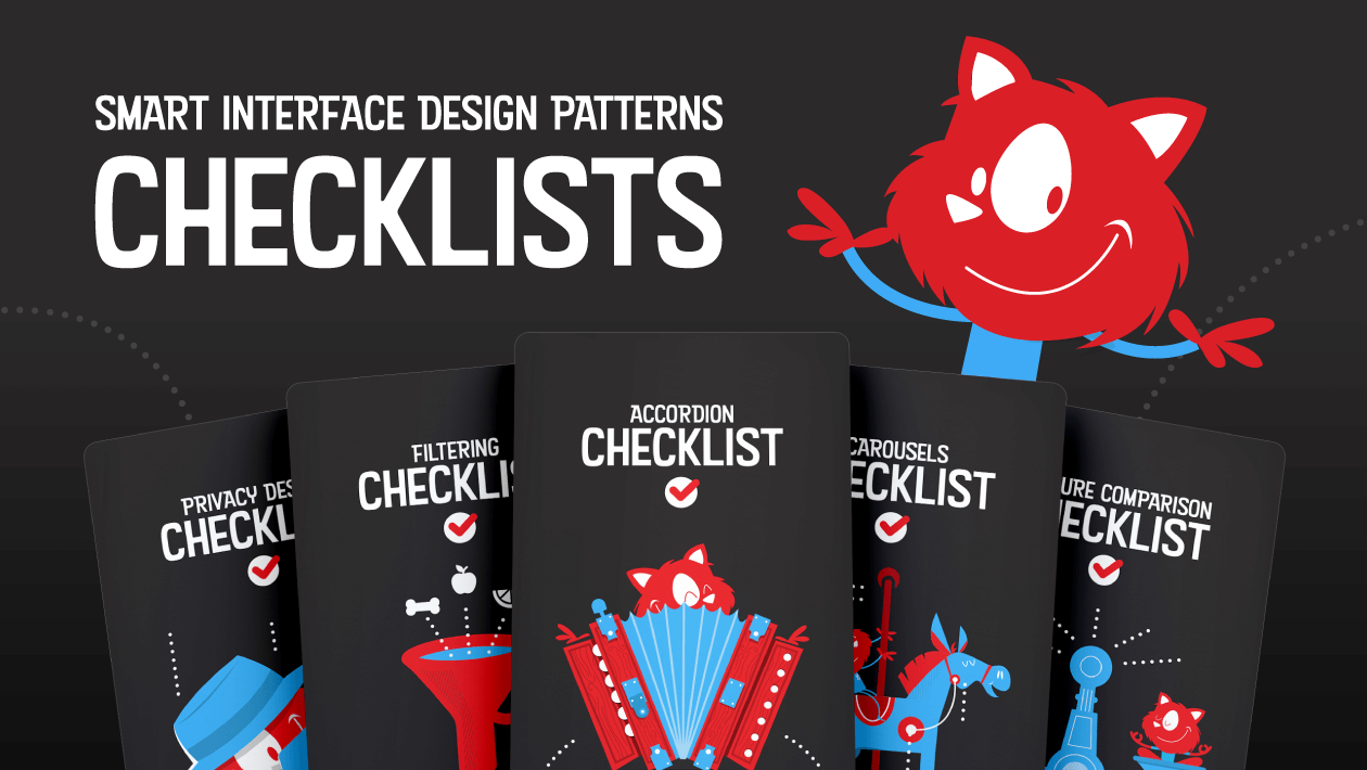
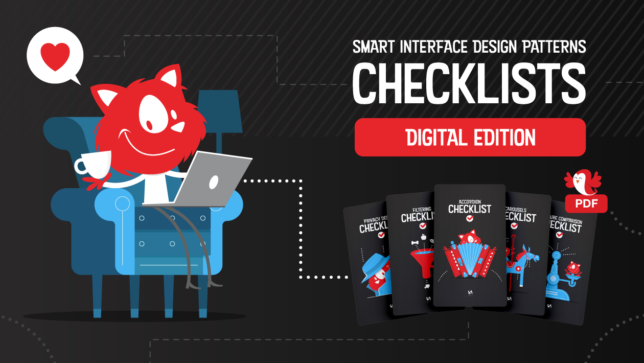
Last month we released Smart Interface Design Checklists PDF, a deck of 100 cards with questions to ask when designing and building pretty much any interface component. Each checklist — from intricate data tables and web forms to troublesome hamburgers and carousels — has been curated and refined for years.
All checklists are based upon usability sessions, design iterations and A/B tests. It's a useful tool for designers & front-end developers to discuss pretty much everything a component requires before starting designing or coding. Jump to the table of contents ↓
How Can These Checklists Be Useful For You?
The cards shouldn’t serve just as a reference before a final wrap-up. We’ve created them for different reasons, and with a different purpose: to help designers and developers iron out misunderstandings early on, thus avoiding ambiguity, unnecessary work and costly mistakes down the line.
And: ensure that fine little UX details don’t get lost in translation from design mock-ups to HTML/CSS prototypes. It doesn’t matter what component you are designing: the cards bring up important questions and conversations, so everyone is on the same page before jumping into design or coding tools. Check the preview (PDF) and jump to description.
If you’d like to dive into design patterns live, attend our upcoming online workshops on Smart Interface Design Patterns, 2020 Edition, where we’ll explore 100s of examples over 5×2.5h live sessions.

Print + PDF
$ 39.00Get Hardcover Print + PDF, with a beautiful card box.
Free worldwide shipping. 100 days money-back-guarantee.
PDF Only
DRM-free, of course.
PDF.
Included with your Smashing Membership.
Download PDF.
Thanks for being smashing! ❤️
1. Use Cards To Guide Designer’s Decisions
Large-scale projects today usually involve some kind of component or design system. Websites are rarely designed ad hoc; instead we architect them, creating, stacking and rearranging building blocks.
The process is quite straightforward. As we are sketching out our websites and apps, we explore visual directions and decide on general guidelines and principles first — for anything from type and colors to easing functions and naming conventions.
We then go ahead and create first mock-ups and prototypes. And while doing so, we design, name and build components in various sizes, colors and variations — actually families of components, for various contexts and conditions. That is to say that we usually think in components all the way throughout the process, from the very first sketch to the fully-fledged release candidate.
That's where checklists prove to be helpful. As the first sketches are being designed, checklists help designers detect shortcomings or missing details of the designs, or just have an internal conversation about the aligned way to move forward. It doesn’t matter what component you are designing, the cards bring up important questions and conversations that help resolve ambiguity and bring clarity to the deliverables.
2. Use Cards To Align Designers And Developers
Of course every process is going to be slightly different, but once we have mock-ups for narrow and large screens, we could start building them out mobile first, slowly moving from mobile to desktop.
At this point, it pays off to take a step back and talk big picture before moving into the trenches of prototyping. The reason is simple: too often the fine details of the designer’s intent get lost somewhere between hidden layers, blurry pixels and long-winded Slack messages. Developers simply don’t know some of the important decisions designers have made along the way. And designers aren’t aware of some of the technical implications and challenges that a particular design decision might have. The meeting is an opportunity to discuss both.
So if possible, we arrange a dedicated meeting for designers and developers to discuss the intent of the design and the behavior of the components it's built upon. Ultimately, they align design and dev teams and help discover potential technical drawbacks and problems early on.

And that's where checklists can come in handy, too. We all have been in belated discussions that we know should have happened earlier. Perhaps we've forgotten about swipe gestures support for carousels on mobile, or the performance footprint of background videos, or too expensive DOM manipulations required for that nifty visual effect.
The checklists push these conversations to the front. They create a helpful framework to bring up important conversations before it's late and hence avoid elaborate last-minute changes.
So for every meeting, we use these cards to bring up questions and spark conversations that either designers or developers haven’t considered yet. From layout and target sizes to fine interaction details and accessible states, we explore things that often get lost or overlooked in production, eventually coming to light in poor results from usability testing.
All these things are discussed on a component level. So with checklists at hand, we go through every component used in a mock-up one by one, and use the cards to have a conversation about the designer’s idea and developer’s view on its complexity — and then find a balance between the two.
The decisions are then written down in a collaborative doc that can be used as a reference for future discussions, or as a guideline for other teams.
3. Use Cards To Check Off Fine Little Details
Once you get into the habit of using checklists in your work, it’s difficult to not rely on them. The cards can be used as a reliable point of reference to ensure that all the fine little details were considered, designed and implemented.
You can also customize them for your needs to cross off all the important decisions, and focus on the missing ones. Ultimately, the cards help avoid unexpected turns of events and put your mind at ease. It’s just really difficult to miss some critical and necessary implementation details or design touches as they are discussed and decided before a single line of code is written. That’s where the cards are really valuable for designers and developers alike.
Print + PDF
$ 39.00Get Hardcover Print + PDF, with a beautiful card box.
Free worldwide shipping. 100 days money-back-guarantee.
PDF Only
DRM-free, of course.
PDF.
Included with your Smashing Membership.
Download PDF.
Thanks for being smashing! ❤️
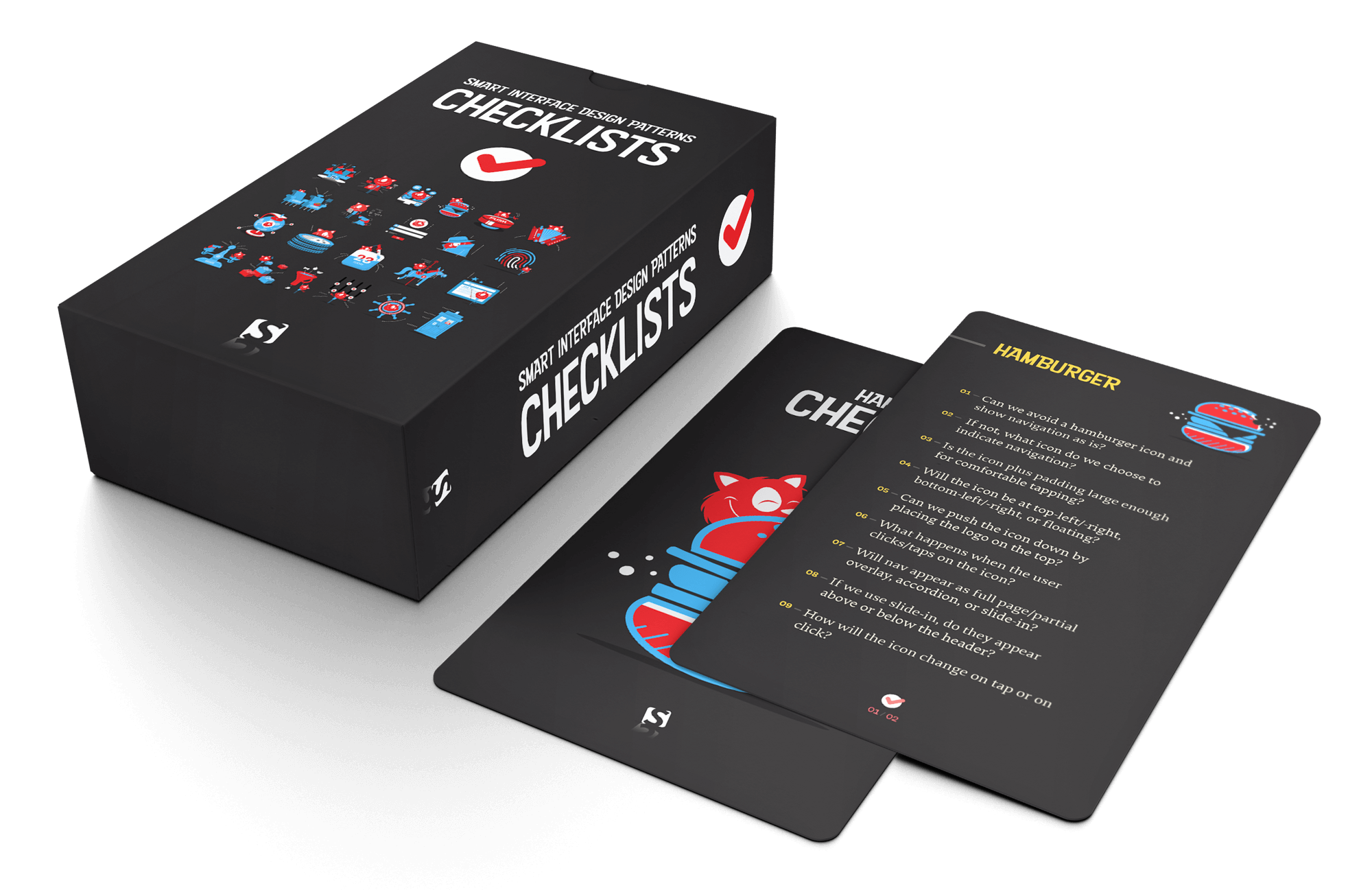
Meet 100 checklist cards with everything you need to tackle any UI challenge — from intricate tables to troublesome carousels. Created to help us all keep track of all the fine little details to design and build better interfaces, faster. Plus, it's useful to not forget anything critical and avoid costly mistakes down the line. Check the preview.
When working on pretty much any interface problem, we sit down with designers and developers and talk about its design, markup and behavior — using checklists. The deck creates a much-needed sense of alignment, so everyone is one the same page before jumping into design or coding tools.
The deck includes checklists on:
- designing for touch (free preview),
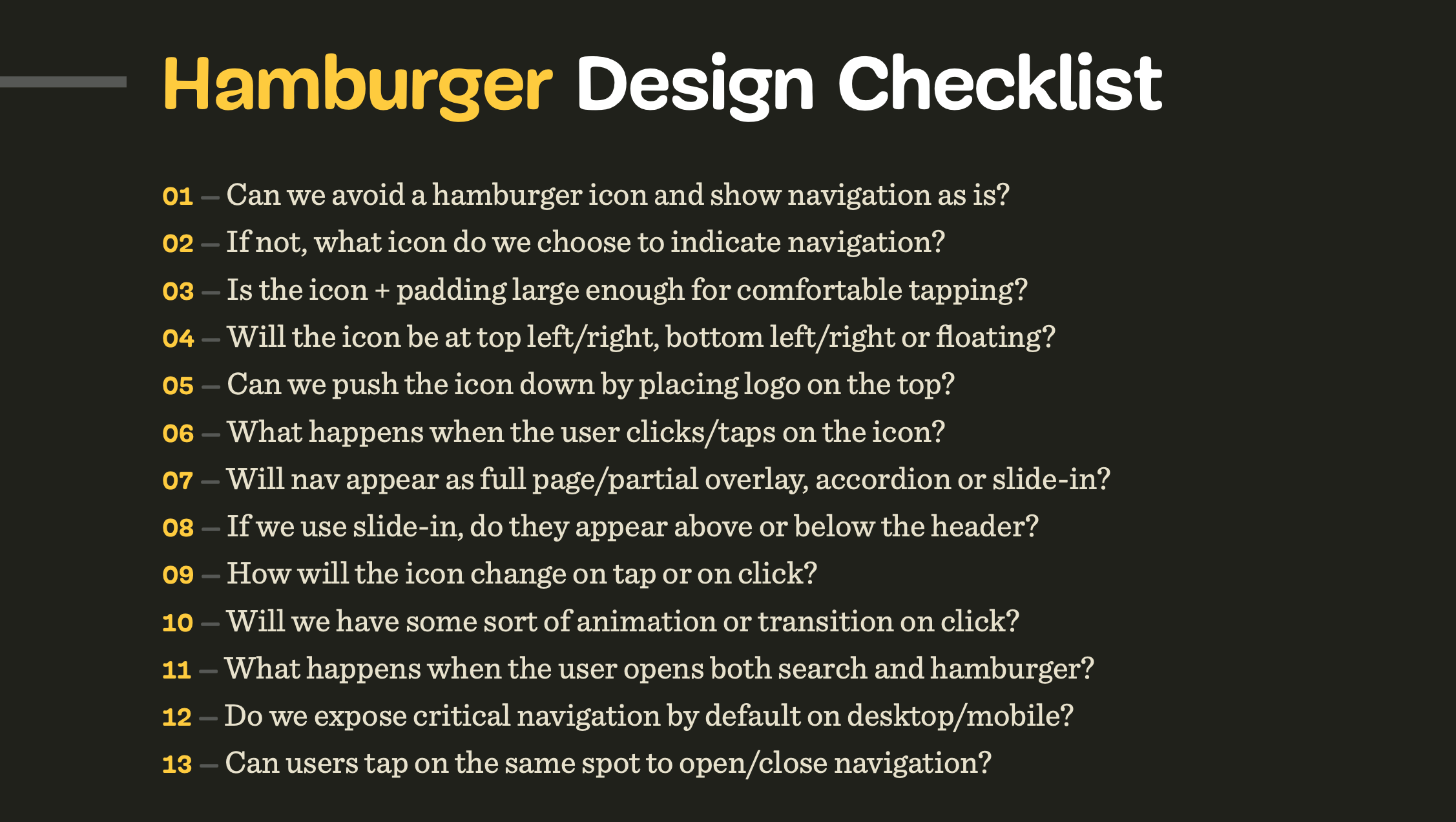
- hamburger menu and accordions,
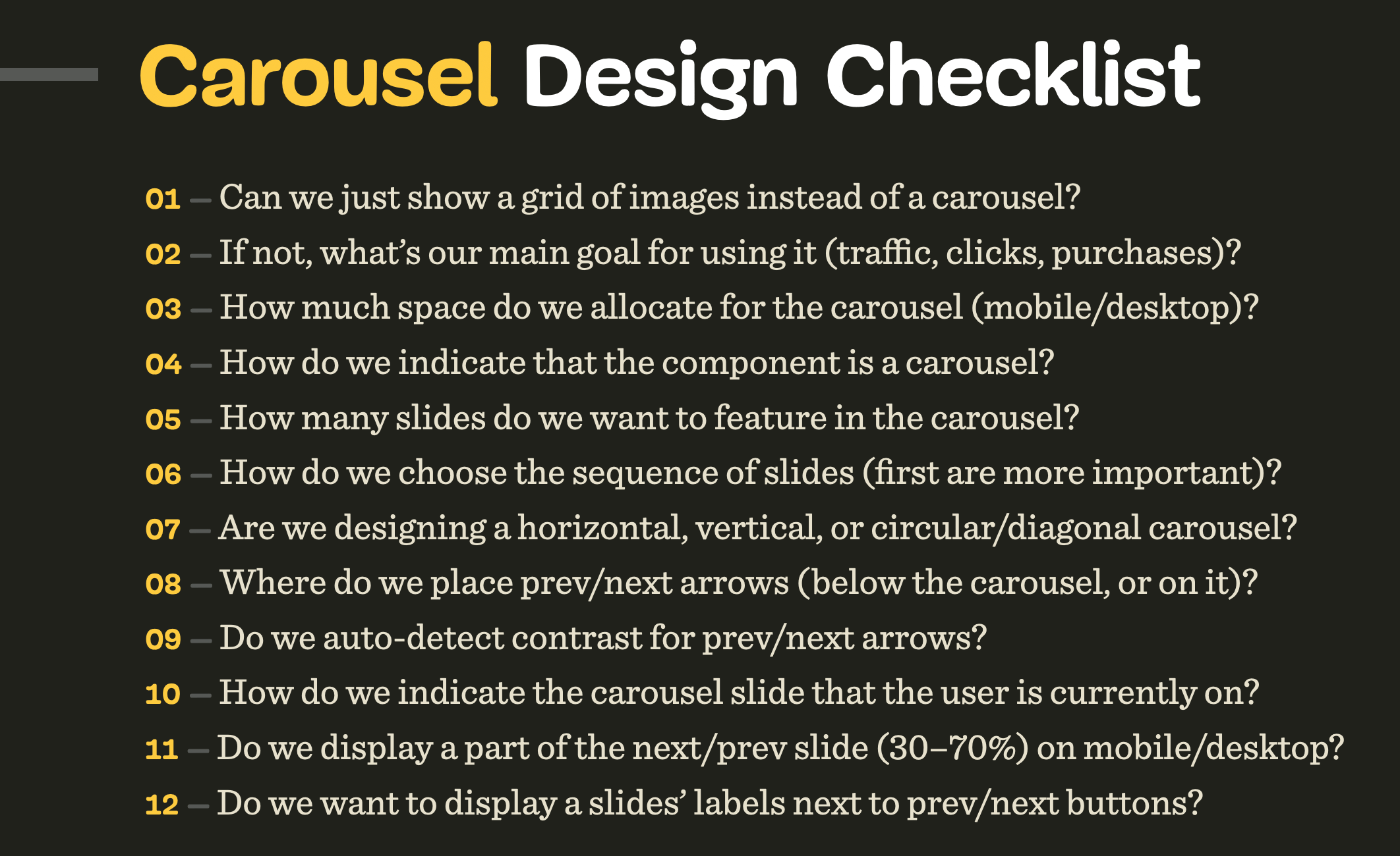
- carousels and navigation,
- filtering, sorting, search,
- data tables and feature comparison,
- pricing plans and product page,
- sliders and video players,
- configurators and wizards,
- date pickers and calendars,
- timelines, maps, seating plans,
- privacy and authentication,
- onboarding and offboarding,
- reviews and testimonials,
- video and audio players,
- web forms and donation forms.
- Plus, 400 practical interface examples (free preview).
Beautifully designed by our dear illustrator Ricardo Gimenes, this deck is always by your side — on your desk or on your phone when you’re on the go.
Additionally, you get practical UI examples, action points and the checklists in a wide resolution (16×9) for reference and presentations.
You’ll get:
- 100 checklists cards PDF on everything from carousels to web forms, carefully curated and designed,
- Practical design examples and action points for your reference in 16×9,
- Checklists as plain text documents to adjust for your needs as you wish,
- Life-time access to the deck, updated regularly.
Print + PDF
$ 39.00Get Hardcover Print + PDF, with a beautiful card box.
Free worldwide shipping. 100 days money-back-guarantee.
PDF Only
DRM-free, of course.
PDF.
Included with your Smashing Membership.
Download PDF.
Thanks for being smashing! ❤️
Table Of Contents
- Designing For Touch Checklist
- Accordion Checklist
- Navigation Checklist
- Hamburger Menu Checklist
- Filtering Checklist
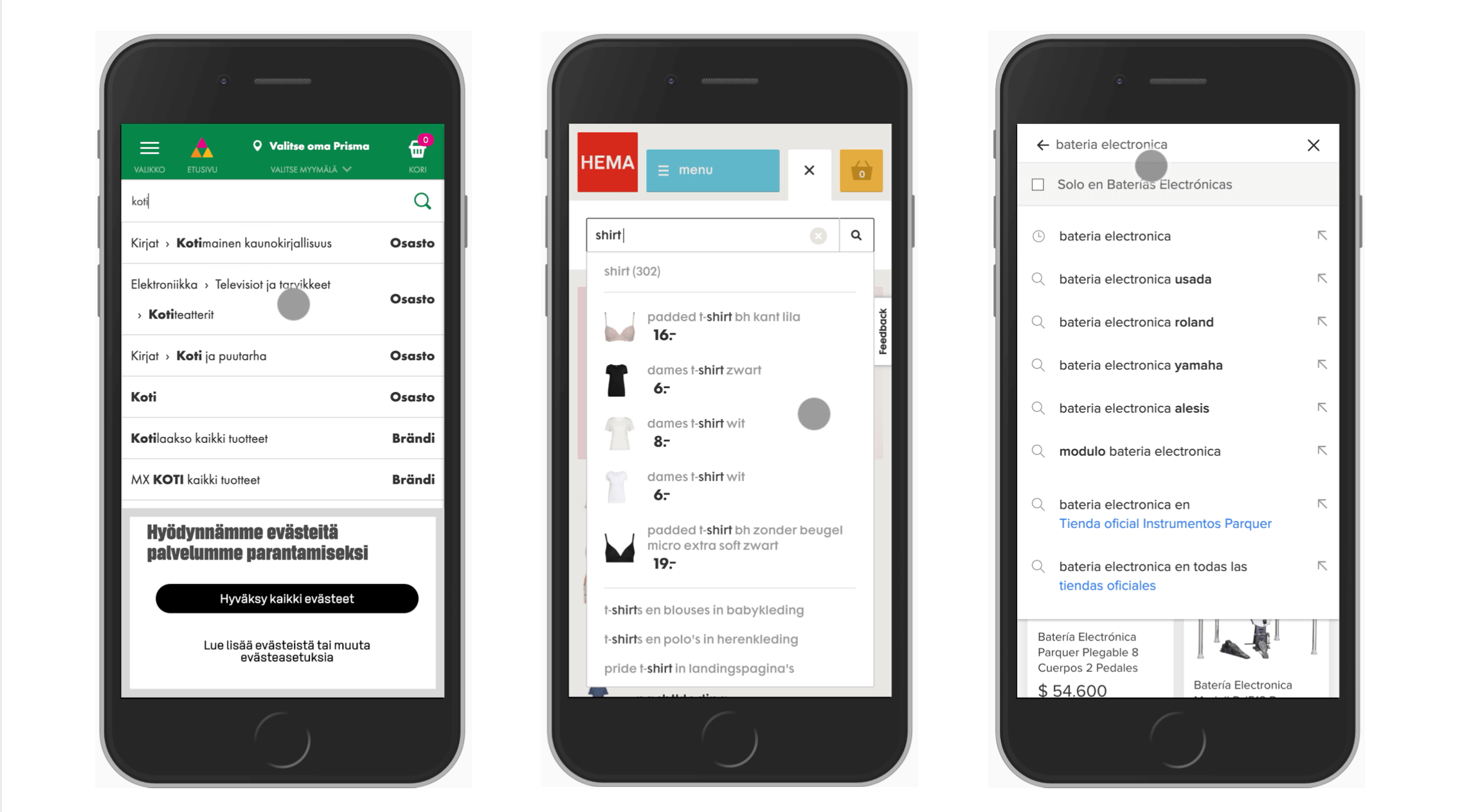
- Sorting Checklist
- Search Autocomplete Checklist
- Carousels Checklist
- Tables Checklist
- Pricing Plans Checklist
- Sliders Checklist
- Date Pickers Checklist
- Configurators Checklist
- Feature Comparison Checklist
- Timelines Checklist
- Schedule And Calendars Checklist
- Maps Checklist
- Seating Plans Checklist
- Privacy Checklist
- Onboarding Checklist
- Reviews and Testimonials Checklist
- Web Forms Checklist
- Donation Form Checklist
- Authentication Checklist
- Product Page Checklist
- Video Player Checklist
What About The Printed Deck?
We'd love to produce a lovely hardcover pack with the cards as well, but at the moment shipping and printing worldwide is very difficult, and expensive. If you get the digital copy though, you'll get a friendly discount for the printed deck as well — we just need to wait and see when it will be more reasonable to ship the cards around the world. Sorry about that, dear friends.
About The Curator Of Checklists
 Vitaly Friedman loves beautiful content and doesn’t like to give in easily. When he is not writing or speaking at a conference, he’s most probably running front-end/UX workshops and webinars. He loves solving complex UX, front-end and performance problems. Get in touch.
About The Workshop: “Smart Interface Design Patterns, 2020 Edition” (Sep 22 – Oct 6)
Do you want to dive deeper into the bits and pieces of smart interface design patterns? We’ll be hosting a series of online workshops, in which we’ll take a microscopic examination of common interface components and reliable solutions to get them right — both on desktop and on mobile.
We’ll study 100s of hand-picked examples and we’ll design interfaces live, from mega-dropdowns and car configurators — all the way to timelines and onboarding. And: we’ll be reviewing and providing feedback to each other’s work. Check all topics and schedule.
The workshop is delivered in five 2.5h long sessions with lots of time for you to ask all your questions. It's for interface designers, front-end designers and developers who’d love to be prepared for any challenge coming their way.
You’ll walk away with a toolbox of practical techniques for your product, website, desktop app or a mobile app.
Print + PDF
$ 39.00Get Hardcover Print + PDF, with a beautiful card box.
Free worldwide shipping. 100 days money-back-guarantee.
PDF Only
DRM-free, of course.
PDF.
Included with your Smashing Membership.
Download PDF.
Thanks for being smashing! ❤️
Thank You For Your Support!
We sincerely hope that the insights you’ll gain from our little goodies will help you boost your skills while also building wonderful, new friends. A sincere thank you for your kind, ongoing support, patience and generosity — for being smashing, now and ever. ❤️
More Smashing Stuff
In the past few years, we were very lucky to have worked together with some talented, caring people from the web community to publish their wealth of experience as printed books that stand the test of time. Paul and Alla are some of these people. Have you checked out their books already?

Click!
A practical guide on how to encourage clicks without shady tricks.
Design Systems
A practical guide to creating design languages for digital products.

Front-End & UX Workshops
Interactive, live online sessions, broken into 2.5h segments and a friendly Q&A.
Further Reading
- Practical Design Tips And Guidelines For Beginner Designers
- Designing Age-Inclusive Products: Guidelines And Best Practices
- Web Quality Assurance: From User Requirements To Web Risk Management
- 45 Incredibly Useful Web Design Checklists and Questionnaires
 (il, mrn)