Designing With Reduced Motion For Motion Sensitivities

Email Newsletter
Weekly tips on front-end & UX.
Trusted by 182,000+ folks.


 Celebrating 10 million developers
 Custom Web Forms for Angular, React, & Vue. Your backend.
CSS has recently added features that allow us to recognize certain user preferences and qualities of the user’s current environment. One of those new features, specifically the prefers-reduced-motion media feature, can be especially useful for designing more inclusive motion on the web.
A few years back, I wrote an article about designing safer web animation for motion sensitivity and the limited options we had at the time to design safe motion on the web. Some things have remained the same since that original article, like the types of motion effects that can be triggering, and the importance of context and user expectations. But what has changed is the existence and support of the prefers-reduced-motion media feature. That makes a big difference in how we can design the motion in our work to be inclusive and accessible.
Why Reduce Motion?
The release of iOS7 back in 2013 sparked a realization throughout the digital design world that some motion on screen — even if it was part of an interface — could have physical consequences for people with motion sensitivities. In the years since then, the major mobile and desktop operating systems have added functionality for people to reduce the amount of motion they encounter in their operating systems.
Articles like “Your Interactive Is Making Me Sick” and “Accessibility For Vestibular Disorders” share first-hand stories of how our design choices, especially around motion, can have physical consequences for those with motion sensitivities. The root causes of these motion sensitivities can vary greatly between individuals. For some, it’s rooted in a vestibular disorder, while for others it might stem from migraines or other factors. What’s triggering can also vary from person to person, or even from day to day for some. The physical symptoms individuals experience as a result of that triggering motion can range from slight dizziness or headaches to nausea or worse.
The design choices we make around animation in our work directly impacts how our work affects people with motion sensitivities. Knowing what kinds of motion are potentially triggering, and how we can mitigate them with our design choices, helps us design experiences that are safe for our audience and won’t cause unintended harm. Animation still absolutely can have a positive impact on our UX efforts, but it’s up to us to make sure we use it responsibly, just like we try to use our other design tools responsibly.
Prefers Reduced Motion On The Web
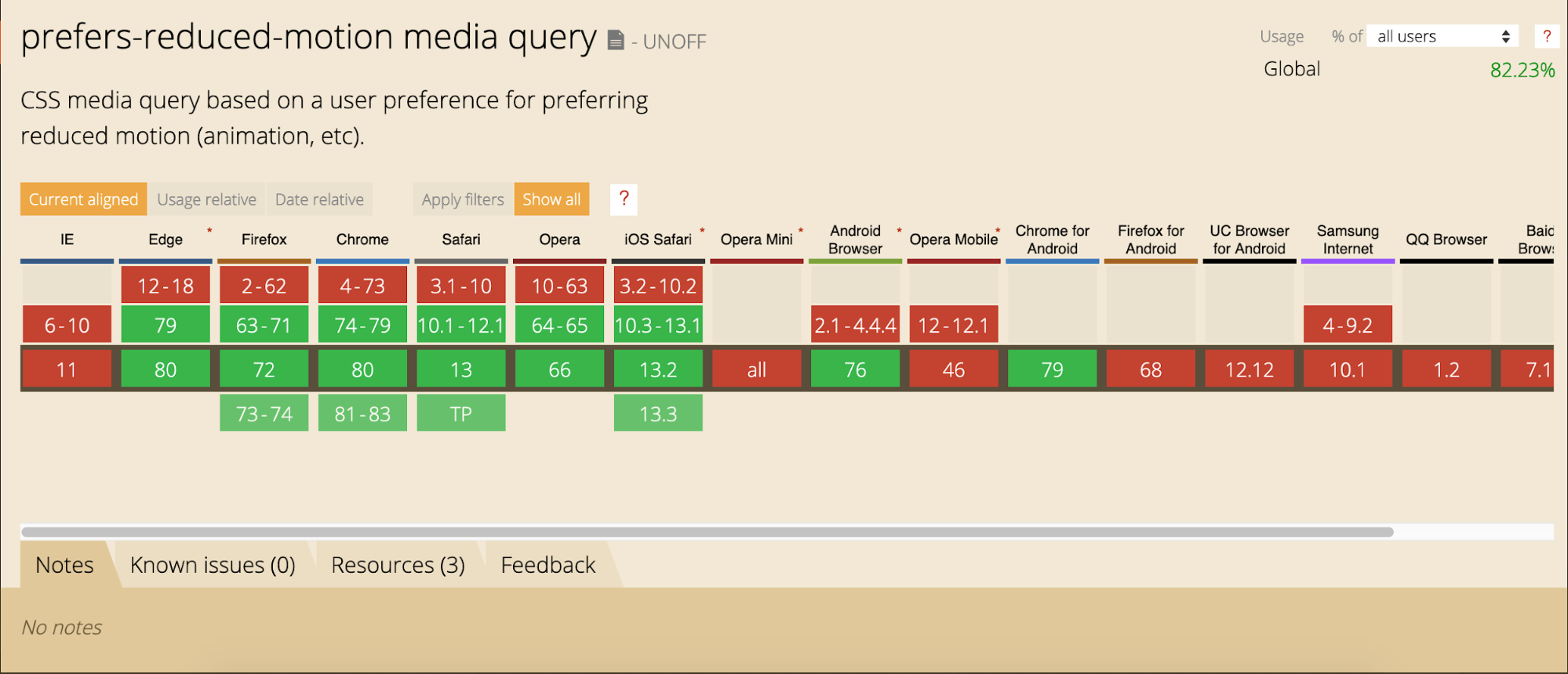
The prefers-reduced-motion media feature now has strong browser support. It’s supported in current versions of Edge, Firefox, Chrome, Safari, Opera, iOS Safari, as well as on Android Browsers and Chrome for Android. The level of support we have today makes it something that you can absolutely use in production. Also, if someone’s browser doesn’t support this feature, nothing bad happens, it will just be ignored and things will carry on as before.
On the development side, we can test for prefers-reduced-motion in the same way that we would use any other media query in CSS or JavaScript to find out if reduced motion has been requested.
In CSS that will look something like this:
@media (prefers-reduced-motion: reduce)  {
    /* reduced behaviour */
}
And in JavaScript:
let motionQuery = matchMedia('(prefers-reduced-motion)');

const handleReduceMotionChanged = () => {
  if (motionQuery.matches) //reduced behaviour;
}

motionQuery.addListener(handleReduceMotionChanged);
handleReduceMotionChanged()
Whichever way you choose to access it, this media query will return one of two values: no-preference (false), or reduce (true). Once retrieved, you can use these values to inform what you display in the browser.
Of the two values that can be returned, the only one we can be sure has been set intentionally is the reduce (true) value. No-preference (false) can mean that the person in question is fine with all types of motion, or it could mean that that preference just hasn’t been set yet. This makes any approach that equates the value of no preference (false) to the person in question opting in to all levels of motion unreliable. Because of this, the better approach is to reduce potentially triggering motion effects when a value of reduce (true) is returned.
For example, here the looping bounce animation is replaced with a fade in animation when reduced motion is requested:
/* A constant bouncing motion effect applied to the title */
h2 {
  animation: bouncing 1.5s linear infinite alternate;
}

/* Replace it with a safer effect when prefers-reduced-motion returns true */
@media (prefers-reduced-motion) {
  h2 {
  animation: fade 0.5s ease-in both;
   }
Reduced Motion From The Users’ Perspective
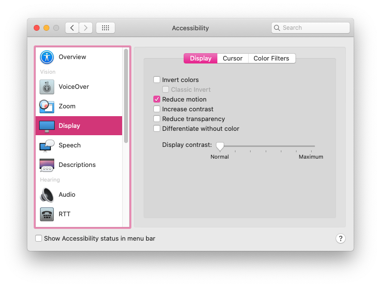
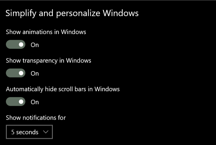
Most major operating systems allow people to set their preferences in their system settings. The exact wording and location of the settings vary, but the preference can be set on iOS, OSX, Windows, and Android operating systems.
The Prefers Reduced Motion Media Feature In Practice
Deciding how to put the prefers-reduced-motion media feature to use is where we have space for creating solutions that best fit the context of our products and content. For most web projects, you’ll want to first identify any potentially triggering motion effects on your site, and then use the prefers-reduced-motion media feature to provide a reduced version of that effect.
Let’s look at each step in more detail.
Identifying Potentially Triggering Motion
To find any potentially triggering motion you might have, go through some typical user flows for your site or product and take a closer look at the motion effects used: Do you have any interactions that have large movements? Any large zooms, spinning effects, or parallax effects? All of those types of animated effects are very likely to be problematic for people with motion sensitivities. In contrast, animated effects like color fades, opacity changes and small changes in scale are unlikely to be problematic. If in doubt, it can’t hurt to add the effect in question to your “to reduce” list to err on the side of caution.
The Web Content Accessibility Guidelines recommend providing a reduced version for any “motion that creates the illusion of movement…that is not essential to the content’s meaning”. I think it’s helpful to see some examples too, especially if you don’t consider yourself to be sensitive to motion on screen. I cover examples of potentially triggering motion in my previous article and this post on the Webkit blog has some too. Chances are, unless your site relies heavily on motion, you’ll end up with a fairly short list of effects to focus on here.
Create A Reduced Motion Version
Next, you want to determine the most appropriate reduced motion condition for these potentially triggering effects. Can the animation easily be adjusted to use a non-motion effect like an opacity fade or crossfade for reduced motion requests? Would pausing the motion or removing the effect entirely for reduced motion preserve the meaning of the content?
The role of the motion in question will be an important factor in deciding what the most appropriate reduced version would be. You don’t want to unintentionally remove content or degrade the overall experience. Here are a few examples of what might work well for the potentially triggering effects you find:
Large Page Transitions
Large page transition effects can likely be replaced with a crossfade effect for a reduced motion mode. The same is usually true for large zooming or spinning transitions that transition between different states or views.
Animated Illustrations
Animated illustrations, on the other hand, might be best replaced with a static version for reduced motion if they are mostly for personality or branding effect. You’ll want to make sure the static version is still meaningful, and the arrangement that has the most meaning may not always be the very beginning or very end of the animation. Adding in functionality to play animated illustrations on demand for reduced motion could also be useful by allowing people to play the animation when they’re ready for it.
Don’t forget to consider the motion in your animated gifs or auto-playing videos here as well. These can also contain potentially triggering motion and would need a reduced version if they do.
Parallax Effects
Parallax effects and exaggerated smooth scrolling effects are universally triggering for folks with motion sensitivities, so those should be significantly reduced or entirely removed for reduced motion. (Every single person I’ve talked to in my research on this has called out parallax specifically as being a problem for them.) Smooth scrolling effects can be replaced with the default browser anchor link behaviour as described here by Eric Bailey. Removing parallax effects for reduced motion is the ideal solution, but make sure to check that all the necessary content is still visible and usable with the parallax removed.
In most cases substituting the potentially triggering effect with a safer effect for reduced motion is the best way to preserve as much of the content’s intent and usability as possible. Luckily, substituting a reduced effect can be pretty straight forward too.
An Example Of Reducing Motion
For example, let’s say I flagged this header animation as potentially triggering when I went through my site. The motion is large enough to create the illusion of motion, so it’s likely to be triggering, and the multiple directions of motion are also likely to be problematic. It’s definitely one I’d put on my list of effects that need a reduced version when reviewing my site.
All the plant photo have the same styles applied to the end state of their animation to position them intrinsically where they’d be in the document flow by default:
.active .plant1, .active .plant2, .active .plant3 {
  transform: translateY(0);
  opacity:1;
}
And each has a beginning state with positioning to translate it slightly above or below its intrinsic position to start. Along with a transition defined to make the animation happen:
.plant1 {
  transform: translateY(-100%);
  transition: $dur $ease-both;
}

.plant2 {
 transform: translateY(120%);
 transition: $dur $dur/6 $ease-both;
}

.plant3 {
   transform: translateY(-100%);
   transition: $dur $dur/3 $ease-both;
}
The text animation works in the same way but with horizontal translation of each word instead of a vertical translation.
I can change the animation to transition opacity instead of transitioning the transform position when reduced motion has been requested by changing the beginning state of the animations like this:
@media (prefers-reduced-motion: reduce) {
.plant1, .plant2, .plant3 {
  transform: translateX(0);
  opacity:0;
  }
}
Now, when the prefers-reduced-motion media feature returns true, the beginning state of each plant photo animation will be set to already be positioned at the end state with an opacity of 0. This means it can use the same transition properties — the same easing, duration, and offsets — but opacity will be animating now instead of the position via a transform:
Notice how I didn’t need to make any changes to the duration, easing or delays of the animation to do this. Swapping out the animating property, but still using the same animation details, was enough to reduce the motion. This particular example was made in CSS, but swapping out the animating property can be just as straightforward with JavaScript or when using animation libraries too.
Examples Of Reduced Motion In The Wild
You can see this approach in action on viljamisdesign.com, which happens to be one of the first sites besides apple.com I noticed working with reduced motion. When you go to the site with reduced motion requested, the spinning starfield animation is stopped and the larger movements of the headline are removed. But animations like the various hover effects are all still there. This results in an experience that has its UX affordances and design details intact, while also being safer for the person who’s requested reduced motion. (Here’s a video of Viljamisdesign.com both with and without reduced motion enabled for reference: https://vimeo.com/399979166/1bd41d1919)

The Airpods Pro page also responds to reduced motion preferences, but in a very different way because of the content and effects used. Almost all of the motion on the page could be potentially triggering since it has a lot of big zooming movements and parallax-style effects. When reduced motion is requested, all the parallax and large motion effects are removed, but they do more than just pause or remove the animations. The version you see with reduced motion selected has been designed with care to preserve the same content and meaning from the full motion experience. (Here’s a video of The Airpods Pro site both with and without reduced motion selected for reference.)

Add Custom Toggles For Motion-Heavy Experiences
I mentioned above that most “task-based” sites likely have only a handful of animations that might be triggering and need a reduced version. But those aren’t the only kind of web sites out there on the web. Projects that involve a large amount of motion, like sites that are meant more for storytelling or creating an experience might benefit from a slightly different approach.
For projects like these, it would be difficult to make a list of potentially triggering motions and provide a reduced alternative for each because almost all of the motion used could be potentially triggering. Plus, the motion is very much part of the content and its meaning. Designing a reduced motion mode for these types of sites will take a more global approach and more effort to be sure the meaning of your content is preserved even as motion is reduced.
For these highly animated experience sites, providing a visible custom motion toggle is a useful thing to include. This will allow people who may not yet know about the reduced motion setting, or who are experiencing some motion sensitivity at that moment in time, to quickly adjust the experience. A motion toggle provides a way for motion-sensitive folks to participate in your content in a way that won’t make them sick. That’s definitely better for everyone involved than them having to avoid your site entirely.
Context Is A Key Factor
Remember that context also plays a big role here. No one wants to be surprised by large amounts of motion where they don’t expect it. If you’re visiting a site billed as a highly interactive storytelling experience you’ll have very different expectations than when you’re visiting your bank’s web site. Both of those sites certainly could feature large amounts of animation, but it would be an unexpected surprise on the bank site.
Building A Custom Motion Toggle
The idea of a custom toggle is something that I mentioned back in my 2015 article, but today it’s a much more viable option. On today’s web, we can create one with more ease, and even make a smarter toggle than we could have just a few years ago.
Marcy Sutton has a great example of how a modern custom motion toggle could work in this CodePen. (This example is part of her course on making accessible web apps, which is also very much worth checking out.) Her example uses a toggle to remove all motion because it only includes one animation, but this approach can be used to provide reduced motion effects across an entire application or site following the same logic as well.
The key feature of this approach is how nicely Marcy ties it in with modern web technology, i.e. prefers reduced motion and local storage. When using this approach, if someone comes to your site with reduced motion requested, they automatically get the reduced motion version without having to manually activate the toggle as well. And if someone invokes the toggle to reduce motion, that preference will be saved via local storage so they won’t have to repeatedly make this selection every time they visit.
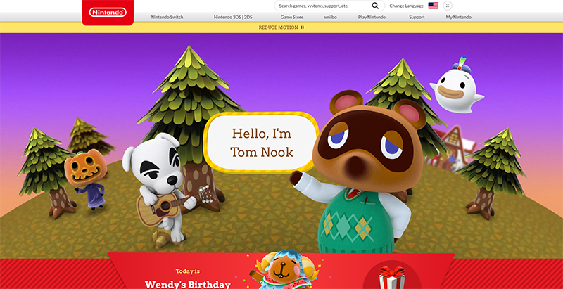
The official Animal Crossing site is a wonderful real-world example of a custom reduce motion toggle combined with the prefers-reduced-motion media feature. It’s one of my favorite examples of handling reduced motion. The design choices they made around how to reduce potentially the triggering motion, while still keeping true to the overall feel of the site and the content, is great. I wrote more about how they pulled it off in this blog post. There are a lot of sites out there whose audience could benefit from a similar approach.
Other Ways To Use Motion Toggles
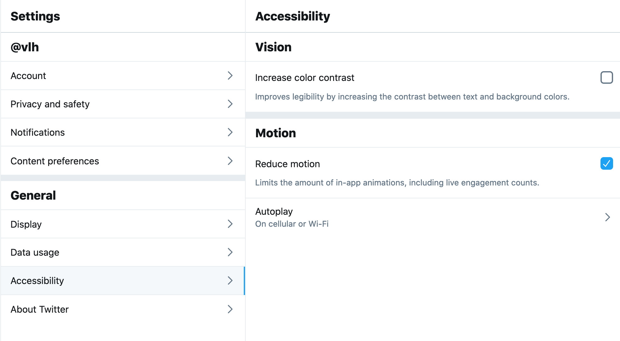
If you already have a preferences or settings panel, adding a toggle to request reduced motion could be a valuable thing to add to these settings like Twitter does on its site. In this case, there aren’t large amounts of motion immediately presented when visiting the site and there’s already a settings panel, so implementing the toggle as part of the settings preferences fits well. Twitter’s toggle also respects OS-level settings via the preferes reduced motion query and is preset to either on or off based on what the user has set at the OS level. Designing your motion toggle to respect OS settings is definitely a smart approach to implementing them well no matter where the toggle might appear.
Contextual toggles are another approach that could be used to reduce motion on specific animated illustrations or other content areas that appear throughout your site. The Dark Side of The Grid article does this nicely by adding contextual toggle buttons to each animate figure to allow the reader to play the animation when they want to see it, but not have it loop endlessly while they are reading.
Along those same lines, Dave Rupert shared a technique for combining prefers reduced motion with the picture element to show static elements in place of animated gifs when reduced motion has been requested. Chris Coyier took that one step further and suggested presenting a play toggle for those animated gifs based on the same approach. Steve Faulkner’s gif de-animator example could also be a useful approach.
All of these, or something similar, could be good options for mitigating any potentially triggering motion on the web. I bring up these examples for two reasons. The first is to show that there are a number of ways to approach providing reduced motion variations and you have lots of flexibility to find an approach that fits best for your content. And secondly, as time goes on and more folks are building sites with reduced motion options, the more innovative solutions we’ll see shared in the community.
There are many creative ways to add toggles and settings in a way that makes sense for the context of your project. It’s an interesting parallel that we’re seeing more and more web sites include settings panels or options for setting preferences like dark mode. Including an option for reduced motion could be a natural next step.
The More We Use It, The Better It Will Get For Everyone
I think it’s important for us, the people designing and building things for the web, to take advantage of the prefers-reduced-motion media feature to make our work more inclusive. By taking steps to respect motion preferences we make the web safer for more people to use, and that can only be a good thing. We absolutely can be expressive and creative with motion on the web while also being responsible and inclusive.
But the awareness level is still something we need to be, well, aware of. Not everyone who might need reduced motion is aware of the option in their OS settings. Perhaps even fewer people know that it can take effect on content in their browser too since so few websites currently take advantage of it. The more we take advantage of the prefers-reduced-motion media feature, and provide a quality reduced motion experience with it, the more meaningful of a feature it will be for those who need it.
Further Reading
- The Things Users Would Appreciate In Mobile Apps
- It’s Time To Talk About “CSS5”
- Infinite-Scrolling Logos In Flat HTML And Pure CSS
- A Designer’s Accessibility Advocacy Toolkit
 (ra, il, mrn)

