How To Use Face Motion To Interact With Typography

Email Newsletter
Weekly tips on front-end & UX.
Trusted by 200,000+ folks.


Web designers are always looking for new ways to improve the presentation of a page’s content. Sometimes, this can lead to ingenious solutions or to interact with technologies that are often kept away from the design field. In this article we will bring typography in contact with Artificial Intelligence, using machine learning to detect such things as the proximity of the user’s face in order to improve the legibility of the text.
We will experiment on how to use face recognition with Tensorflow in order to extract some information from the camera, such as the distance between the screen and user’s face or the amount of people reading the page. Then, we will pass those data to CSS in order to adapt typography and to adjust the page layout.
What Is Tensorflow?
Tensorflow is an open-source platform from Google for Machine Learning. Machine Learning is a field of Computer Science that studies algorithms that learn to recognize complex relations and recurring patterns out of images, audio tracks, time series, natural text, and data in general. These algorithms generate mathematical models (also called trained models), which are a sort of schema that can be used to make decisions based on input data. If you’d like to approach the topic, Charlie Gerard wrote about ML for frontend developers here on Smashing Mag.
Tensorflow provides a lot of tools for AI developers, data scientists, mathematicians, but don’t panic if data analysis is not your daily bread! The good news is that you have not to be an expert to use it, as long as you are using pre-built models, just as we are going to.
Tensorflow models are available to be used on the Web with their JavaScript SDK.
Setup
In order to start using face recognition algorithms, we need to follow a few steps:
- load the Tensorflow SDK.
- load the Facemesh library which contains the mathematical model.
- access the user’s camera and stream it to an HTML video element. Facemesh will analyze frames from the video tag to detect the presence of faces.
In this projects we are going to use Tensorflow via CDN, but it is also available on NPM if you prefer the bundler-way:
<script src="https://cdn.jsdelivr.net/npm/@tensorflow/tfjs-core"></script>
<script src="https://cdn.jsdelivr.net/npm/@tensorflow/tfjs-converter"></script>
<script src="https://cdn.jsdelivr.net/npm/@tensorflow/tfjs-backend-webgl"></script>
Tensorflow does not do the trick itself, so we need to add Facemesh, a library that is built on the top of the ML framework and provides an already trained model for face recognition:
<script src="https://cdn.jsdelivr.net/npm/@tensorflow-models/facemesh"></script>
The next step is to setup the Facemesh library in order to load the trained model and to define the function that will evaluate face data from a video stream:
// create and place the video
const video = document.createElement('video');
document.body.appendChild(video);

// setup facemesh
const model = await facemesh.load({
    backend: 'wasm',
    maxFaces: 1,
});

async function detectFaces() {
    const faces = await model.estimateFaces(video);
    console.log(faces);

    // recursively detect faces
    requestAnimationFrame(detectFaces);
}
Now we are ready to ask the user the permission to access to its camera stream using a video tag:
// enable autoplay
video.setAttribute('autoplay', '');
video.setAttribute('muted', '');
video.setAttribute('playsinline', '');
// start face detection when ready
video.addEventListener('canplaythrough', detectFaces);
// stream the camera
video.srcObject = await navigator.mediaDevices.getUserMedia({
    audio: false,
    video: {
        facingMode: 'user',
    },
});
// let’s go!
video.play();
The navigator.mediaDevices.getUserMedia method will prompt the permission and will start to stream the camera into the video element. Once accepted, the camera will start to stream to the video tag, while the browser console will log face information detected by Facemesh.
Please note that camera permissions require a secure https connection or localhost: you can not simply open the index.html file. If you are not sure how to set up a local server checkout http-server for Node or follow this guide for Python or this one for PHP.
Case 1. Adjust Typography Using The Smartphone Camera
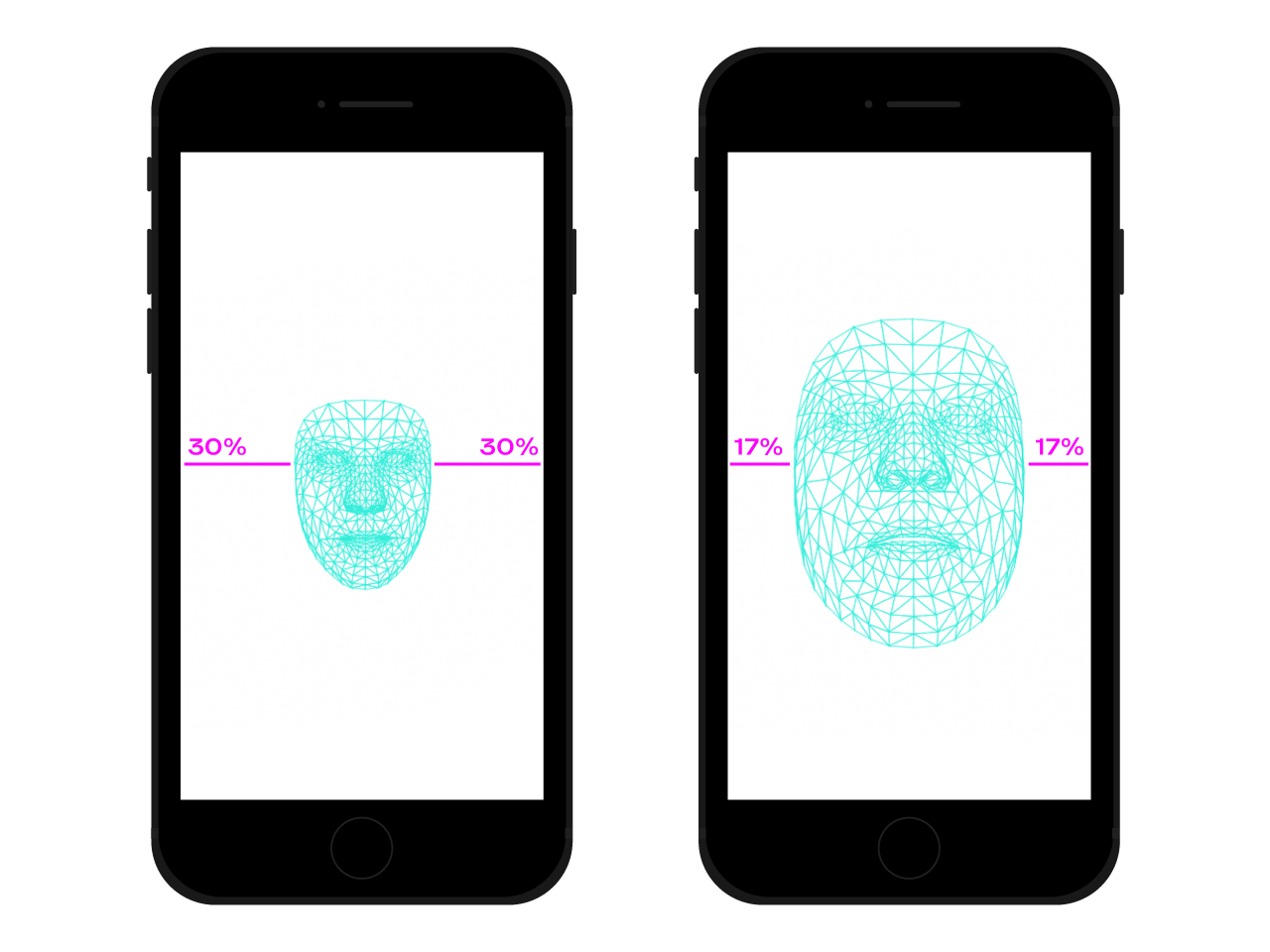
We navigate the web everywhere with our smartphone. There was a time, not so long ago, where we used to take crowded trains or buses and we kept the smartphone very close to our eyes because there was no space. In many moments and places of our day, we often change the position and the inclination of the smartphone, even if we are watching the same site. The distance between eyes and smartphone affects our reading capabilities. Evaluating that distance we can adjust microtypography in order to optimize glyphs for a closer or more distant reading.
Face detection means, of course, eyes position detection too. We can use data provided by Facemesh to calculate the size of our face in relation with the whole picture captured by the camera. We can assume that the larger our face, the closer we are to the screen. We can set up a scale from 0 (one arm distant apart — the face approximately occupies one half of the camera) to 1 (glued to the screen) and detect the current value with a division of segments:
async function detectFaces() {
    const faces = await model.estimateFaces(video);
    if (faces.length === 0) {
        // is somebody out there?
        return requestAnimationFrame(detectFaces);
    }

    const [face] = faces;

    // extract face surface corners
    let { bottomRight, topLeft} = face.boundingBox;

    // calculate face surface size
    let width = bottomRight[0] - topLeft[0];
    let height = bottomRight[1] - topLeft[1];
    let videoWidth = video.videoWidth;
    let videoHeight = video.videoHeight;
    let adjustWidth = videoWidth / 2;
    let adjustHeight = videoHeight / 2;

    // detect the ratio between face and full camera picture
    let widthRatio = Math.max(Math.min((width - adjustWidth) / (videoWidth - adjustWidth), 1), 0);
    let heightRatio = Math.max(Math.min((height - adjustHeight) / (videoHeight - adjustHeight), 1), 0);
    let ratio = Math.max(widthRatio, heightRatio);


    // recursively detect faces
    requestAnimationFrame(detectFaces);
}
Now that we have calculated the ratio, it’s time to make some magic happens, passing the value to the stylesheet:
document.documentElement.style.setProperty('--user-distance', ratio);
With this value and a bit of calc we could easily apply slight changes to font weight, size, and maybe style too, but we can do something even better. Using a variable font, a font that has parameterized shapes and spaces of the glyphs, we can adjust the perception of every glyph by updating its optical size variation.
Since every variable font uses its own scale for optical size values, we need to relate our ratio value to that scale. Furthermore, we may want to move just between a subset of available optical size, in order to provide just little enhancements.
.main-text {
    --min-opsz: 10;
    --max-opsz: 15;
    --opsz: calc(var(--min-opsz) + (var(--user-distance) * (var(--max-opsz) - var(--min-opsz))));

    ...
    font-family: 'Amstelvar', serif;
    font-variation-settings: 'opsz' var(--opsz);
}
You can see it live here. Please note that this example is just a demonstration of how the technology works. Typographical changes should be almost imperceptible to the user’s eyes in order to really provide a better reader experience. Here we leveraged glyphs shapes, but using colors to increase or decrease contrasts is just another good solution to try. Another experiment was to detect the angle of the face in order to calculate the perspective of the reading, modifying ascenders, descenders ad the height of letters:
- See the Pen Facemesh and ascenders/descenders by Edoardo Cavazza.
Case #2: Adjusting A Layout When The Number Of People Looking Changes
In this second case, we are going to change the layout on the basis of the number of people watching the screen. We can imagine an essay displayed on the Interactive Whiteboard in the context of a high school classroom. This scenario is quietly different from the one detected by the deprecated projection media query since we want to adjust the layout of the page if the number of students watching is smaller or larger than the 10. When just a few students are in the classroom, they can safely approach the board, but if the whole classroom is present, probably the space is not enough and we need to change the layout to show fewer (and larger) things.
We just need a few changes to the previous script in order to correctly detect the number of faces watching at the whiteboard. First, we need to instruct Facemesh to detected multiple faces:
const model = await facemesh.load({
    backend: 'wasm',
    maxFaces: 30,
});
And then, we have to pass that number to the stylesheet:
async function detectFaces() {
    const faces = await model.estimateFaces(video);
    document.documentElement.style.setProperty('--watching', faces.length);

    // recursively detect faces
    requestAnimationFrame(detectFace);
}
Again, we could use that value to simply increase font size, but our aim is to provide a completely different layout. CSS grid layouts may help us in this mission. This projected document is a long form with an aside that contains related images:
<section>
    <article>
        <h1>...</h1>
        <h2>...</h2>
        <p>...</p>
    </article>
    <aside>
        <img src="..." alt="..." />
    </aside>
</section>
And this is its default layout:
section {
    display: grid;
    grid-template-columns: repeat(12, 1fr);
    grid-column-gap: 1em;
    width: 120ch;
    max-width: 100%;
    padding: 1em;
}

section article {
    grid-column: 1 / -5;
}

section aside {
    grid-column: 7 / -1;
}
When a large number of people are watching, we need to privilege the long-form reading context, giving more space to the main column, increasing its font size, and removing disturbing elements. To do that, we increase the number of spanned columns, moving the aside below the main text.
:root {
    --watching: 10;
}

section {
    /** The maximum number of people watching for the default layout */
    --switch: 10;
    /** The default number of columns for the text */
    --text: 8;
    /** The default number of columns for the aside */
    --aside: 4;

    grid-template-columns: repeat(calc(var(--text) + var(--aside)), 1fr);
}

section article {
    /**
     * Kinda magic calculation.
     * When the number of people watching is lower than --switch, it returns -2
     * When the number of people watching is greater than --switch, it returns -1
     * We are going to use this number for negative span calculation
     */
    --layout: calc(min(2, (max(var(--switch), var(--watching)) - var(--switch) + 1)) - 3);
    /**
     * Calculate the position of the end column.
     * When --layout is -1, the calculation just returns -1
     * When --layout is -2, the calculation is lower than -1
     */
    --layout-span: calc((var(--aside) * var(--layout)) + var(--aside) - 1);
    /**
     * Calculate the maximum index of the last column (the one "before" the aside)
     */
    --max-span: calc(-1 * var(--aside) - 1);
    /**
     * get the max between --layout-span and the latest column index.
     * -1 means full width
     * --max-span means default layout
     */
    --span: max(var(--max-span), var(--span));

    grid-column-start: 1;
    grid-column-end: var(--span);
}- You can see it live over here →
Viceversa, when a small group of students is experiencing the text near the board, we could give more details, such as media files and interactive action triggers.
Beyond Face Recognition
The cases we faced (😉) are just two examples of how we can use face recognition technology for layout or typographical scopes. Tensorflow provides other models and libraries that can transform the camera stream into variables for our pages. Furthermore, we should not forget that in our smartphones there are a lot of other sensors that we could exploit using the Sensor APIs: GPS, accelerometer, ambient light, etc.
Since mood influences the way we read, study and search for information, with machine learning we can also analyze user’s expressions to switch from minimal to detailed layouts according to the user’s spirits.
For many years we have been used to using CSS Media queries for responsive web design. However, the size of the viewport is only one of the variables of the user experience. Recently, a new kind of media query designed to respect user preferences landed the browsers, such as the prefers-color-scheme and prefers-reduced-motion. This gives designers and developers a way to move a step forward in web design practices, allowing the web page to adapt to the whole environment instead of just the user’s device. In the age of big data, we have the opportunity to go beyond responsive and adaptive design. Our web pages can finally “leave the screen” and become part of the user’s global experience. Interaction design is going to involve all these possibilities, so keeping experimenting with the possible combinations between technology and web design will be crucial in the following years.
Further Reading
- Sticky Headers And Full-Height Elements: A Tricky Combination
- Mastering Typography In Logo Design
- How To Enable Collaboration In A Multiparty Setting
- Powerful Image Analysis With Google Cloud Vision And Python
 (ra, yk, il, mrn)

