The Principles Of Visual Communication

Email Newsletter
Weekly tips on front-end & UX.
Trusted by 200,000+ folks.


Visual storytelling can be intimidating. We’re taught to communicate with words, but words are not always the best way to convey information and ideas. Sometimes the best way to tell stories is through thoughtfully crafted visuals, not long paragraphs of text. Creating visuals is not reserved for designers, illustrators, or artists. It’s a skill anyone can learn and put into practice every day.
The key to becoming more comfortable with visual communication is unlearning the rules you’ve subconsciously collected. Growing up, I loved creating rainbow text with WordArt, adding fancy document borders, and downloading decorative fonts on Dafont. My work in grade school all looked like this:
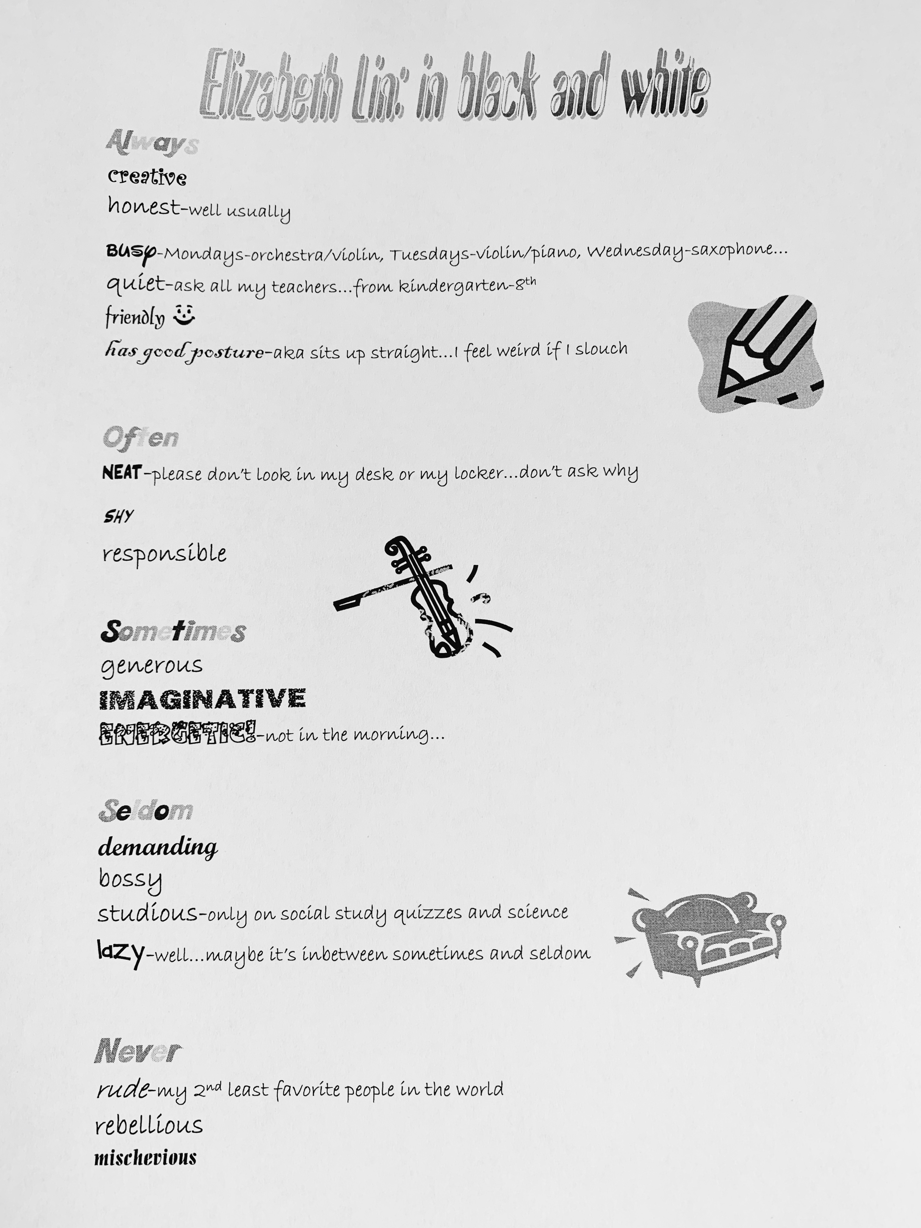
I was just playing with fonts and styles for fun. I had no notion of what makes up “good” or “bad” visual design. Looking back at this poem, the typography is objectively difficult to read. However, I intentionally found fonts that matched each adjective and made each heading the same font style. Through these moments of play, I started to build the foundation of my visual intuition.
Visual storytelling is the process of conveying ideas using things you can see. As we get older, visual storytelling becomes more intimidating because we’re conditioned to believe visuals are childish or purely decorative. We’re taught that all writing needs to be in 12pt Times New Roman and double spaced on letter-sized paper. We’re told that it’s “more professional” to minimize exclamation marks and emojis. We make excuses like “I’m just not artistic enough.”
Today, I communicate with visuals daily. I guide emerging designers to develop their visual intuitions and I design products for homeschooling families. Becoming a better visual storyteller is all about balancing play and practice with a foundation of principles. It’s about finding the happy medium between having fun with WordArt and playing it safe with Times New Roman.
In this article, we will explore visual principles, highlight why visual storytelling is a valuable skill for everyone to learn, and demonstrate how you can improve your visual storytelling through play.
Show > Tell
All visual storytelling can be broken down into a set of concrete principles. To ease you into the topic, let’s learn how typography sets the foundation for all visual storytelling and examine principles shared in effective visuals.
Typography Sets The Foundation
You don’t always need to add an illustration or graphic to visually communicate an idea! Good typography sets the foundation for all visual storytelling. There are plenty of typography resources out in the wild, but my two biggest pieces of advice are:
- Stick to one typeface.
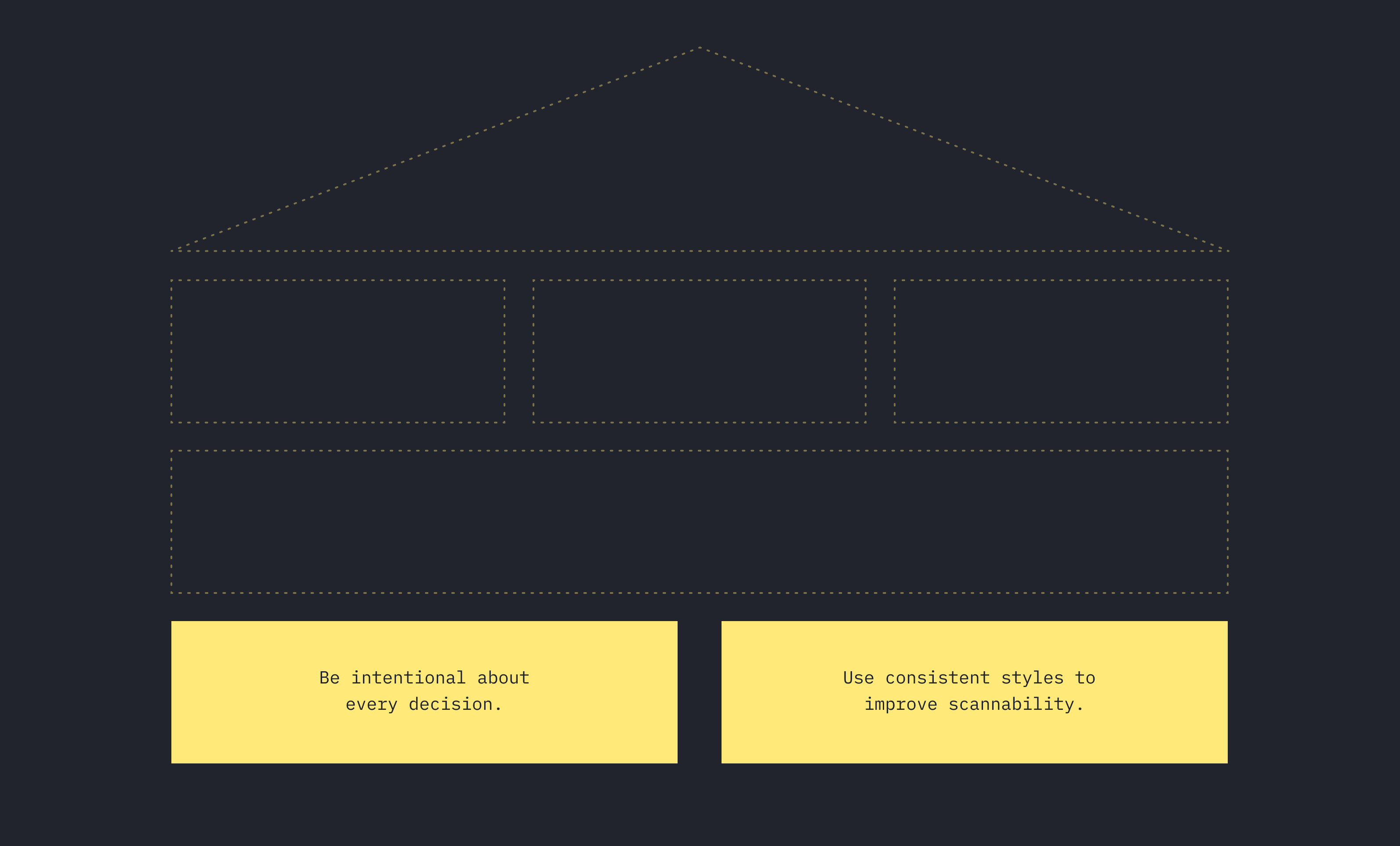
Find a typeface with multiple weights and styles. Combining different typefaces is difficult. My favorite Google fonts right now are IBM Plex Sans and Inter. - Change one thing at a time.
Creating enough contrast between type styles is an art. My recommendation is to change just one axis at a time: size, weight, style, and color are the most popular things to change.
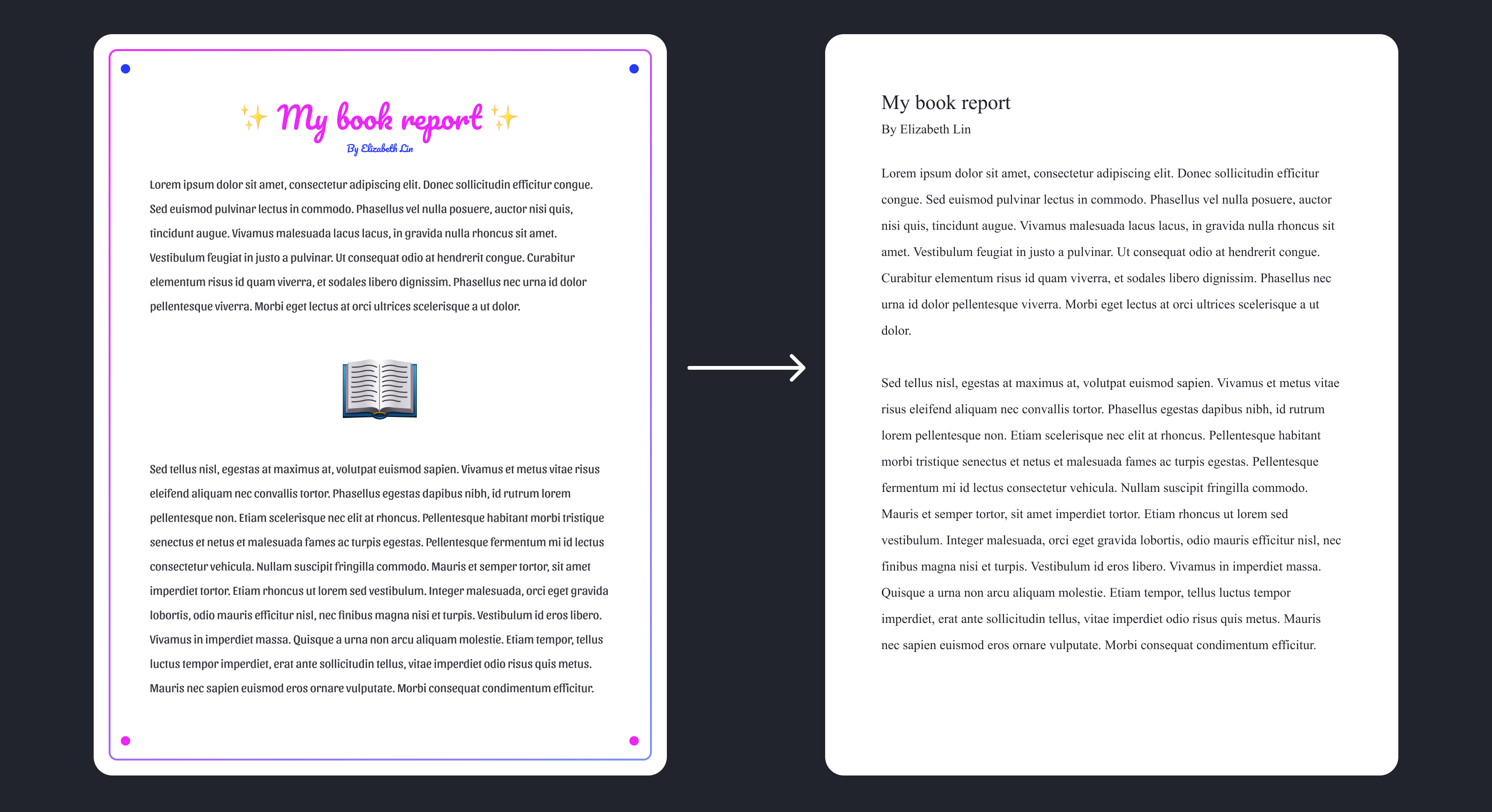
Here’s an example of visual storytelling using simply typography.
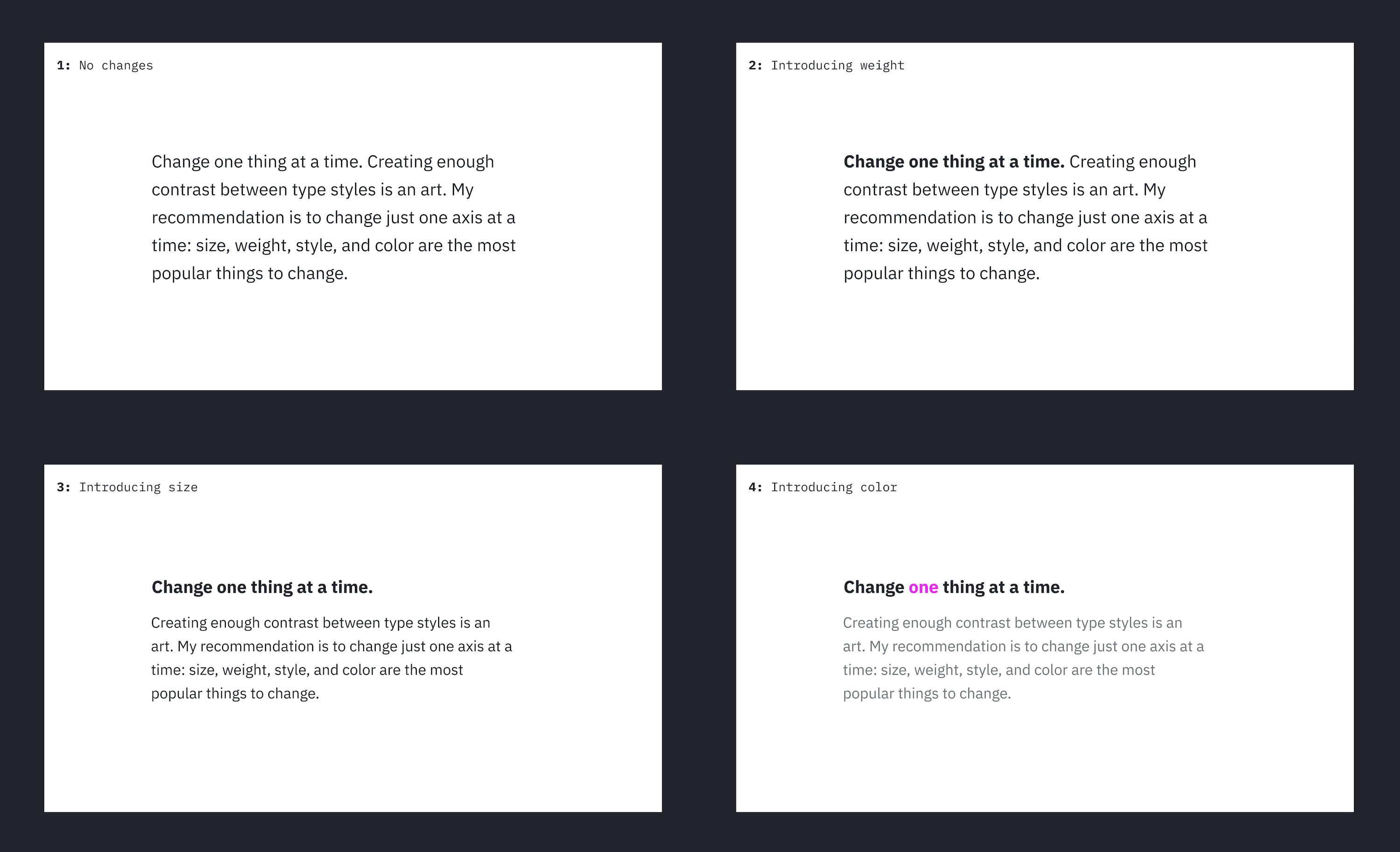
- In version 1, I use the same style for the entire body of the text.
- In version 2, I bold the most important text on the page: “Change one thing at a time”
- In version 3, I decrease the paragraph text size and move the heading to its own line.
- In version 4, I highlight the word “one” in pink to signify importance and I make the paragraph text a lighter shade of gray.
Small tweaks to typography can often communicate more than adding more words. Before you consider adding a visual, always experiment with the typography first. Typography is more than selecting a font. You can change the importance of text by adjusting the size, weight, composition, and color. Think about what is most important and make sure that stands out in a body of text.
Resources On Typography
What Do Good Visuals Have In Common?
Good visuals have focus, communicating the most important idea at a glance. Reports should be informative, but easy to scan. Flowcharts should highlight differences between old and new processes. When you’re creating a visual, it can be easy to overwhelm the audience with too many ideas at once. The best visuals maintain a clear message by drawing attention to what’s most important.
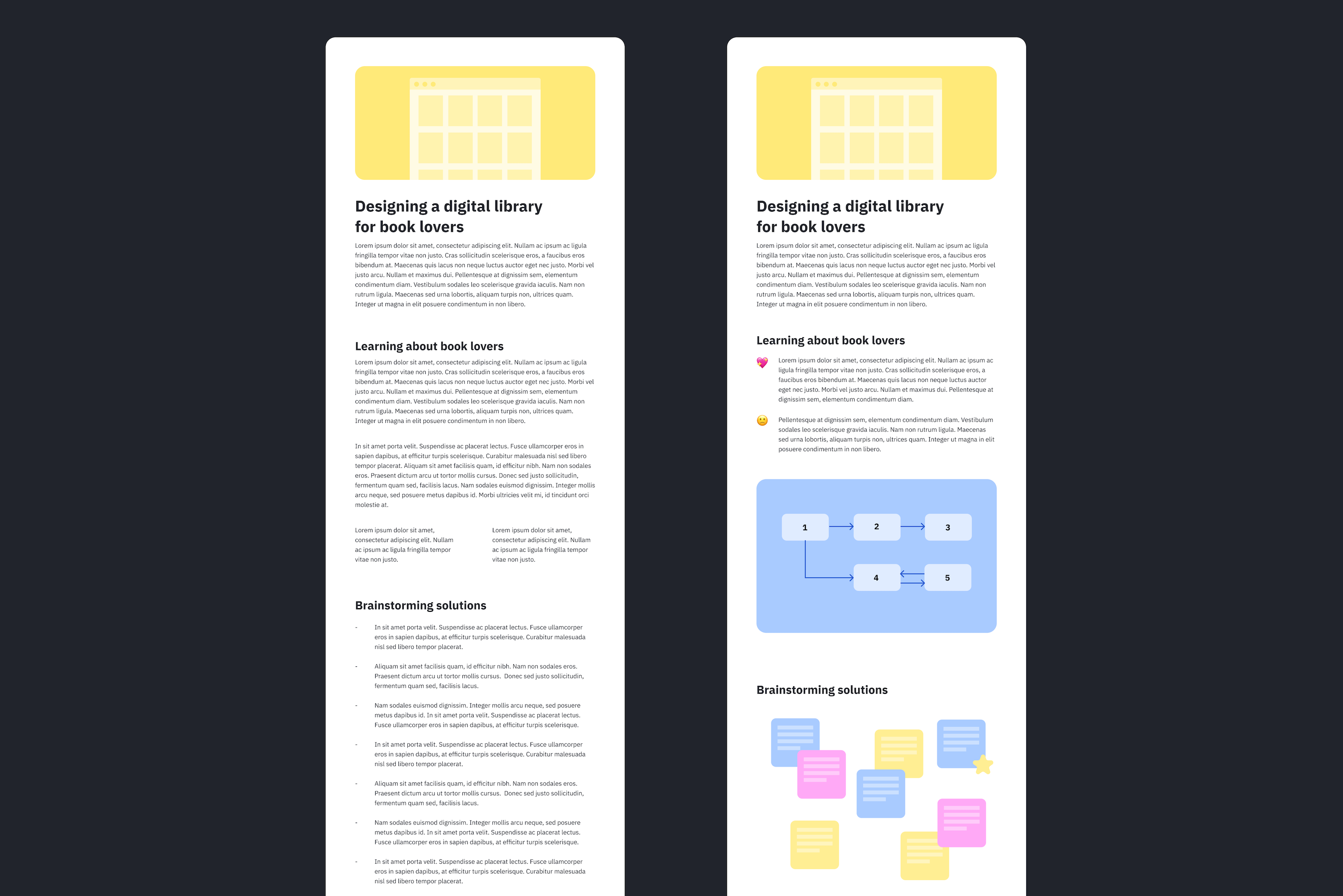
I’ve spent a lot of time mentoring emerging product designers on portfolio building. Design portfolios typically consist of a few case studies that walk through a designer’s thought process from beginning to end.
Below are two low fidelity sketches of portfolio case studies. This is an exaggeration, but the one on the left is less successful because there are no visuals to accompany the story. The one on the right is easier to scan because there are images showing the designer’s process.
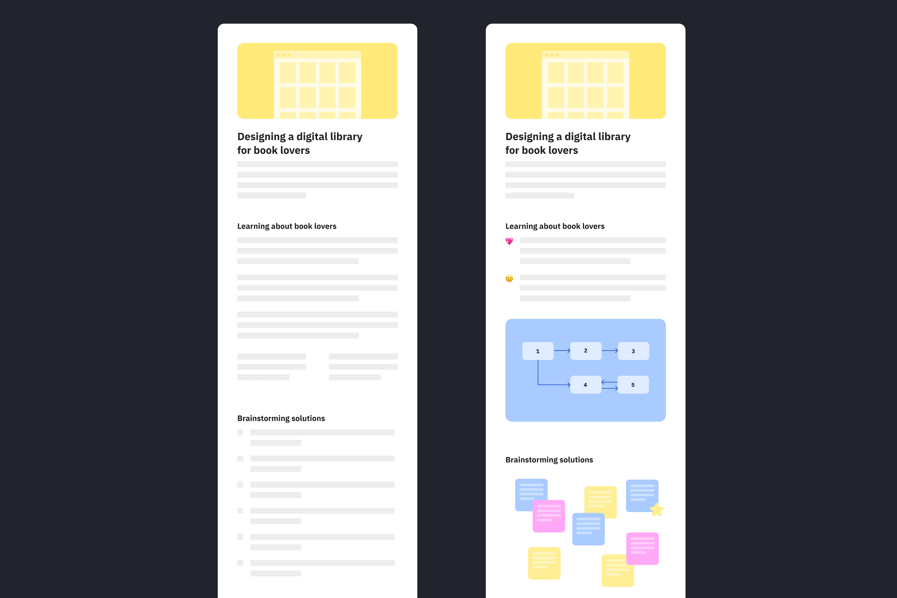
Good visual communicators can highlight the most important parts of a visual. In the case studies graphic above, I intentionally blocked out the body text and made the two versions nearly identical. I tried to minimize all visual distractions. If I add filler body text, the graphic is harder to comprehend because it becomes visually cluttered.
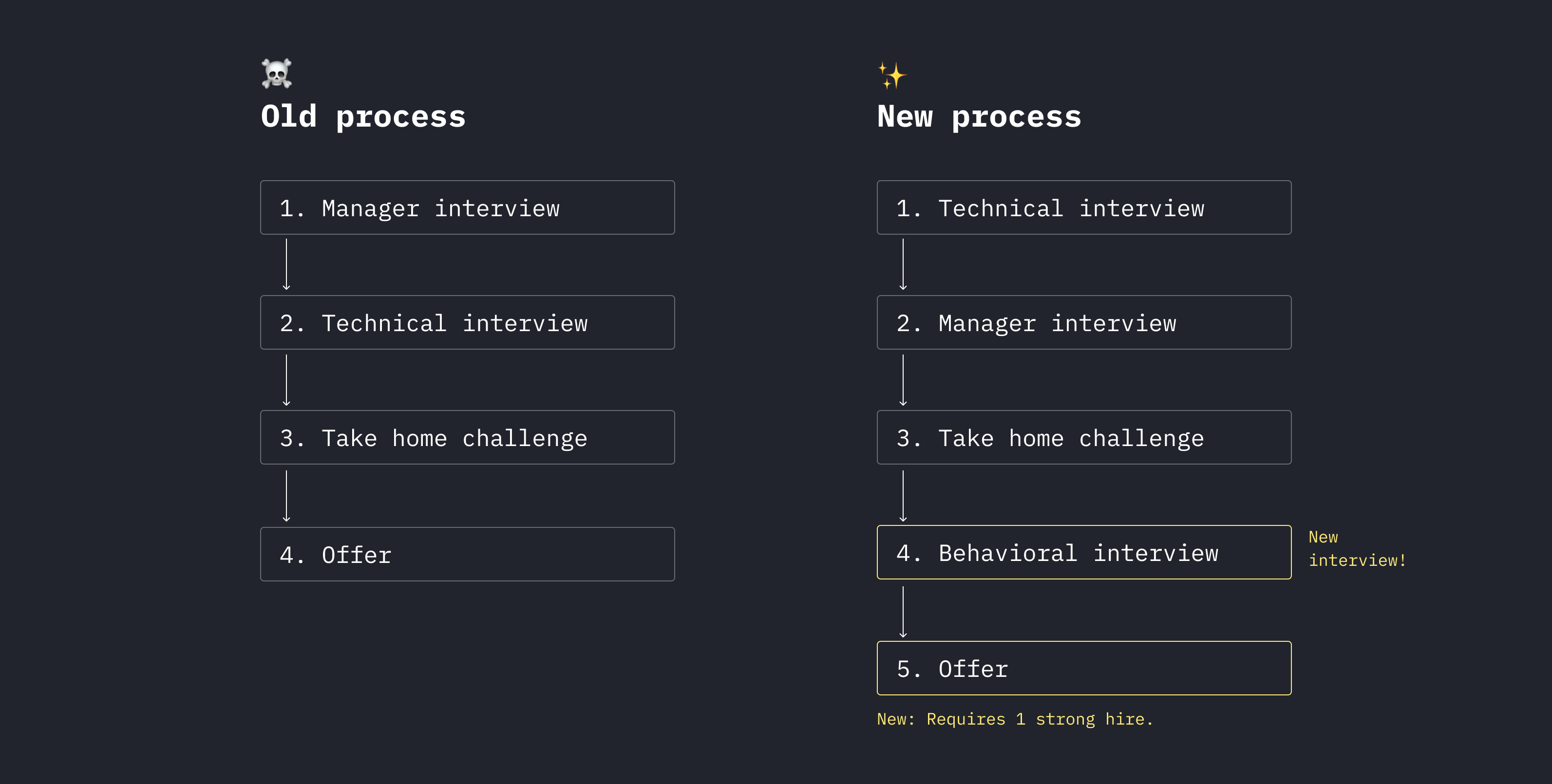
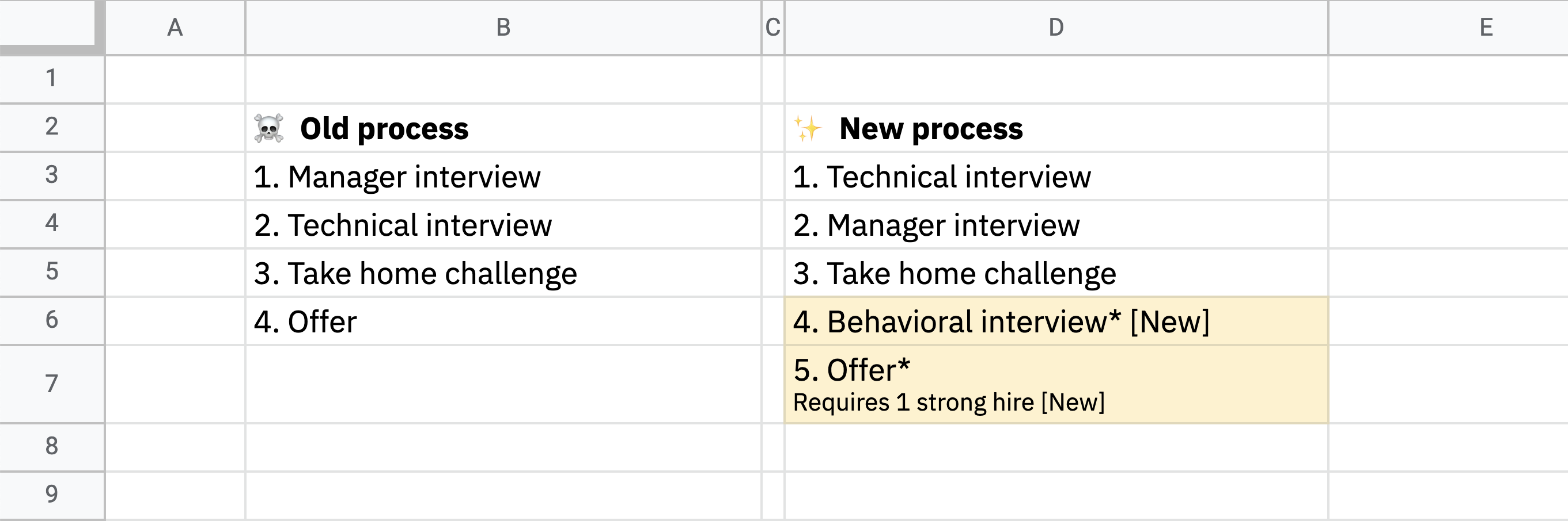
Visuals can also be helpful when you need to communicate a change in the process. For example, if your company restructures the hiring process, it might be helpful to show a before-and-after flowchart that highlights the changes. Imagine these are the changes:
- We moved the technical interview from the second to the first step;
- We added a behavioral interview as the last step;
- We now require at least one strong hire for a candidate to get an offer.
This might seem obvious, but we tend to default to emails and documents in the workplace. Before and after visuals are great because they help people visualize the differences.
In the example below, you’ll notice that I use color sparingly as a way to highlight new additions to the process. Color is one of the best ways to draw attention to important aspects of a visual.
You can create a graphic with anything including pen and paper! I used Figma for the one above because I’m familiar with the tool, but you can create a similarly effective visual with something as simple as Google Sheets.
Visuals are a tool you can use to add clarity to any idea. Remember that you don’t always have to add a graphic or illustration. You can communicate a lot with just small tweaks to typography and presentation. Just make sure to focus on the most important idea and make sure it shines through.
Tools For Creating Visuals
- Figma has a higher learning curve but offers the most flexibility.
- Whimsical is easy to use and has templates for creating common visuals like flowcharts.
- Mural is like a digital whiteboard. It’s great for collaboration and has templates.
Developing Visuals Through Play
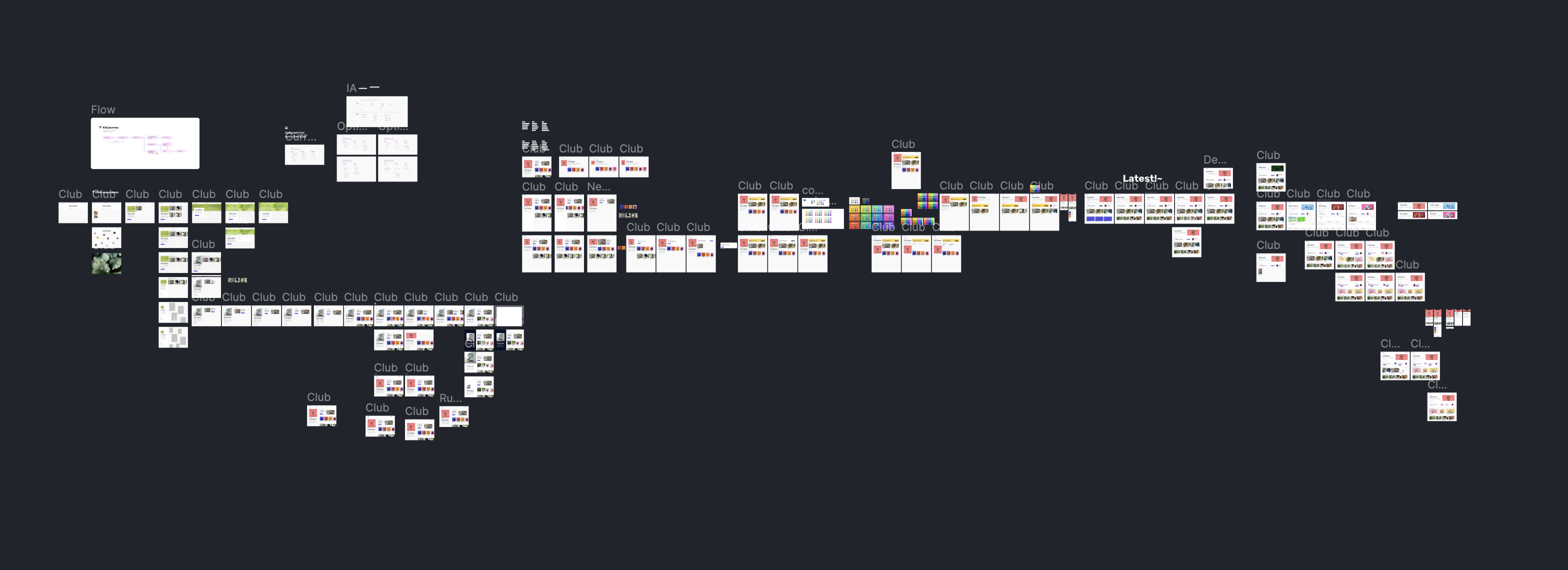
Developing visuals takes time, play, and experimentation. If you’re creating visuals from scratch, your first attempt will never be the best one! I’ve been in the design industry for a while now and I still fail and iterate every single day. This is a screenshot of my recent design iterations for just one screen in a flow.
Learning how to become a better visual storyteller is all about practice and iteration. In my design classes, I teach students to iterate by making it into a competition. I separate the students into teams and the goal is for each team to get the most iterations in a set period of time. For this activity, I encourage students to change one thing at a time as they iterate.
This exercise teaches students to be comfortable trying lots of things that might not work. After 15 minutes of iterating, I have the groups discuss which designs are their favorites. Why do you feel the designs you chose are the most effective?
Iterating might seem daunting, but it’s actually a really fun process. When you’re developing a visual, start by thinking about the one thing you want the audience to learn. Imagine that our goal is to communicate that you need to stay 6-feet apart to prevent the spread of Covid-19.
I always start with setting typography first. Here is a series of iterations where I only adjust the font size, weight, and style.
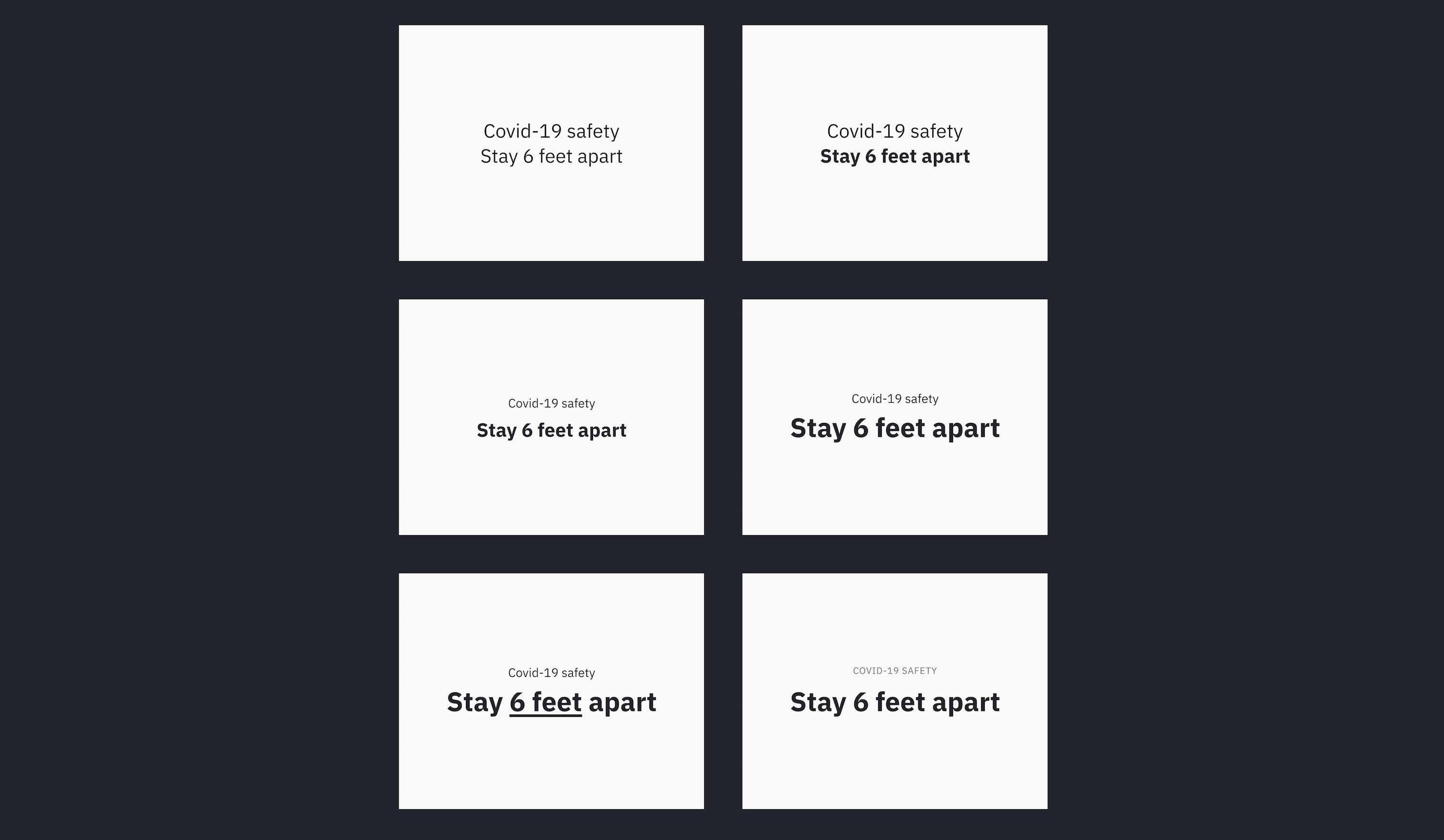
For each iteration, I only changed one thing! Which version do you think works the best? Personally, I think the last iteration works best because the message is loud and clear. Next, I experimented with a few different typefaces. Every typeface has a different personality:
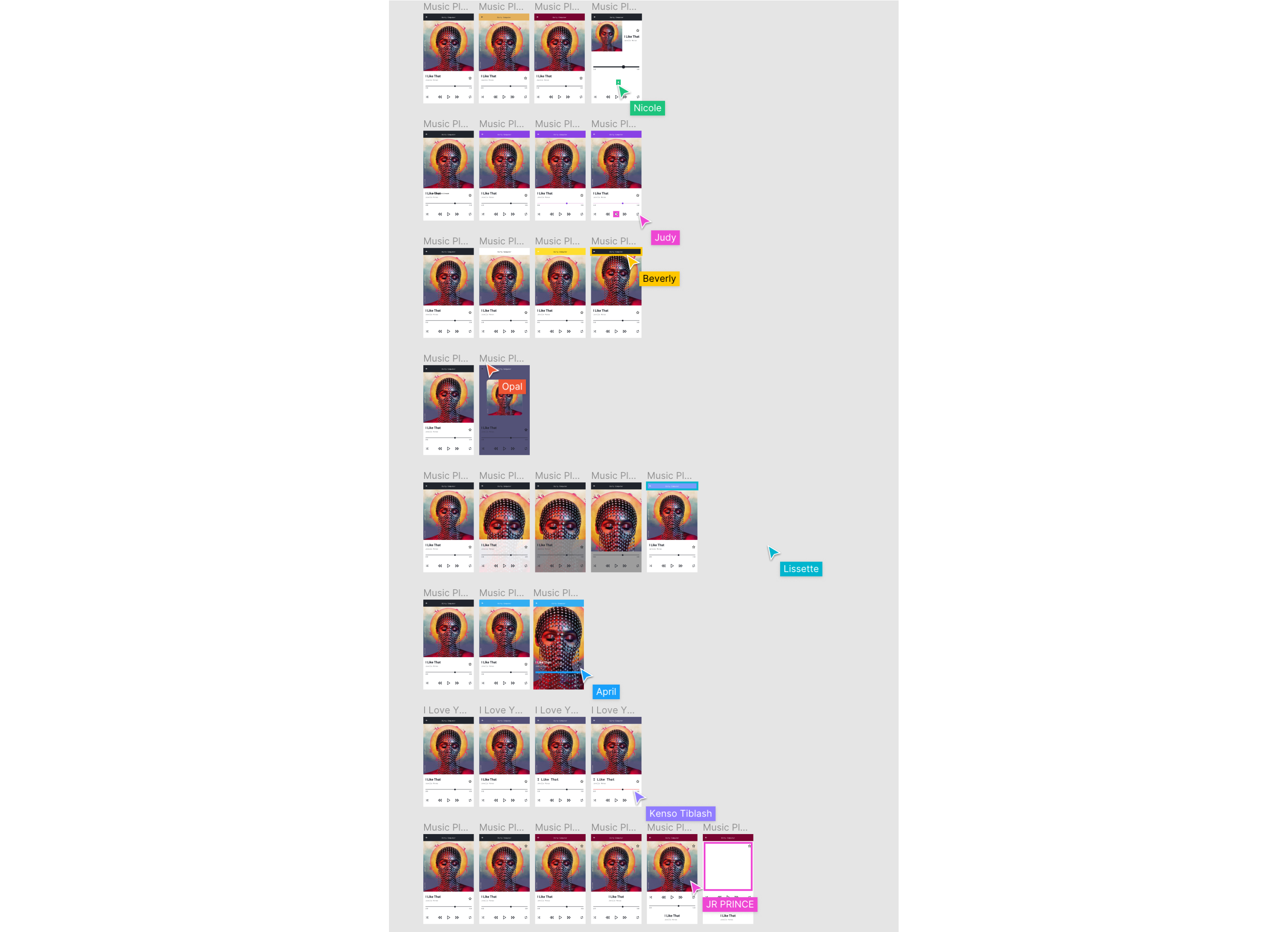
After experimenting with type, we can experiment with adding a graphic or illustration to the poster. You don’t have to be an illustrator to create a graphic. There are plenty of resources online that you can use to compose a graphic.
- In version 1, I used Apple emojis.
- In version 2, I drew an icon of a person using two circles and a rectangle.
- In version 3, I used an illustration library Humaaans.
- In version 4, I used Apple’s symbols set.
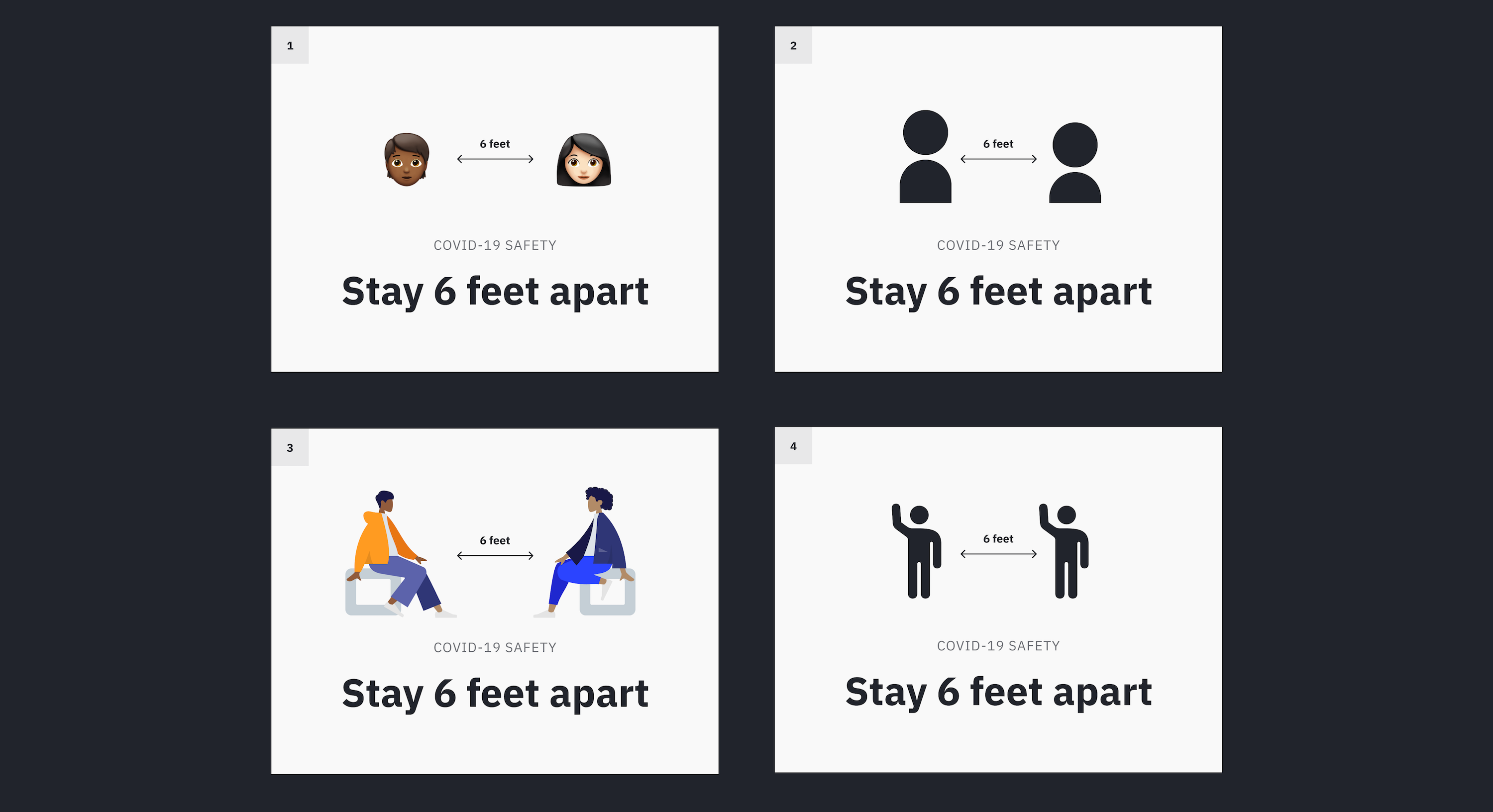
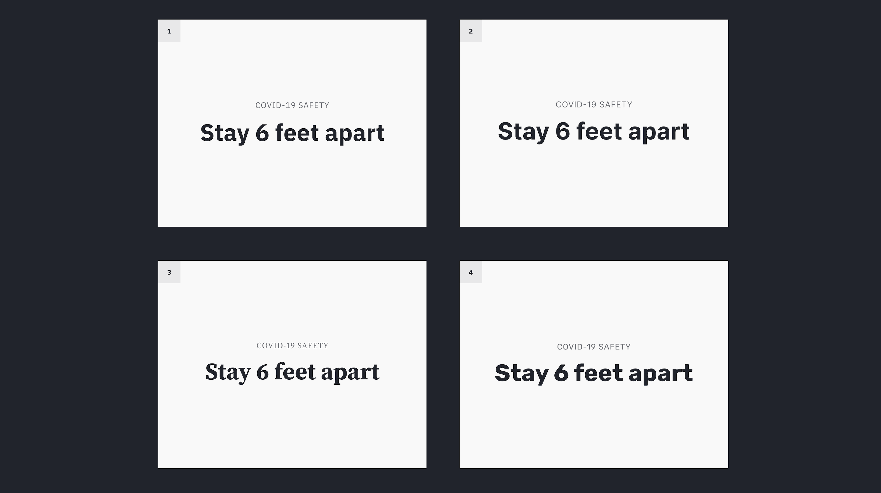
These directions are all effective. Directions 2 and 4 feel more like an official government graphic, but directions 1 and 2 feel more fun and inviting. With all our components in place, we can try adding style and color. It’s important to use style and color sparingly because they can overwhelm the message.
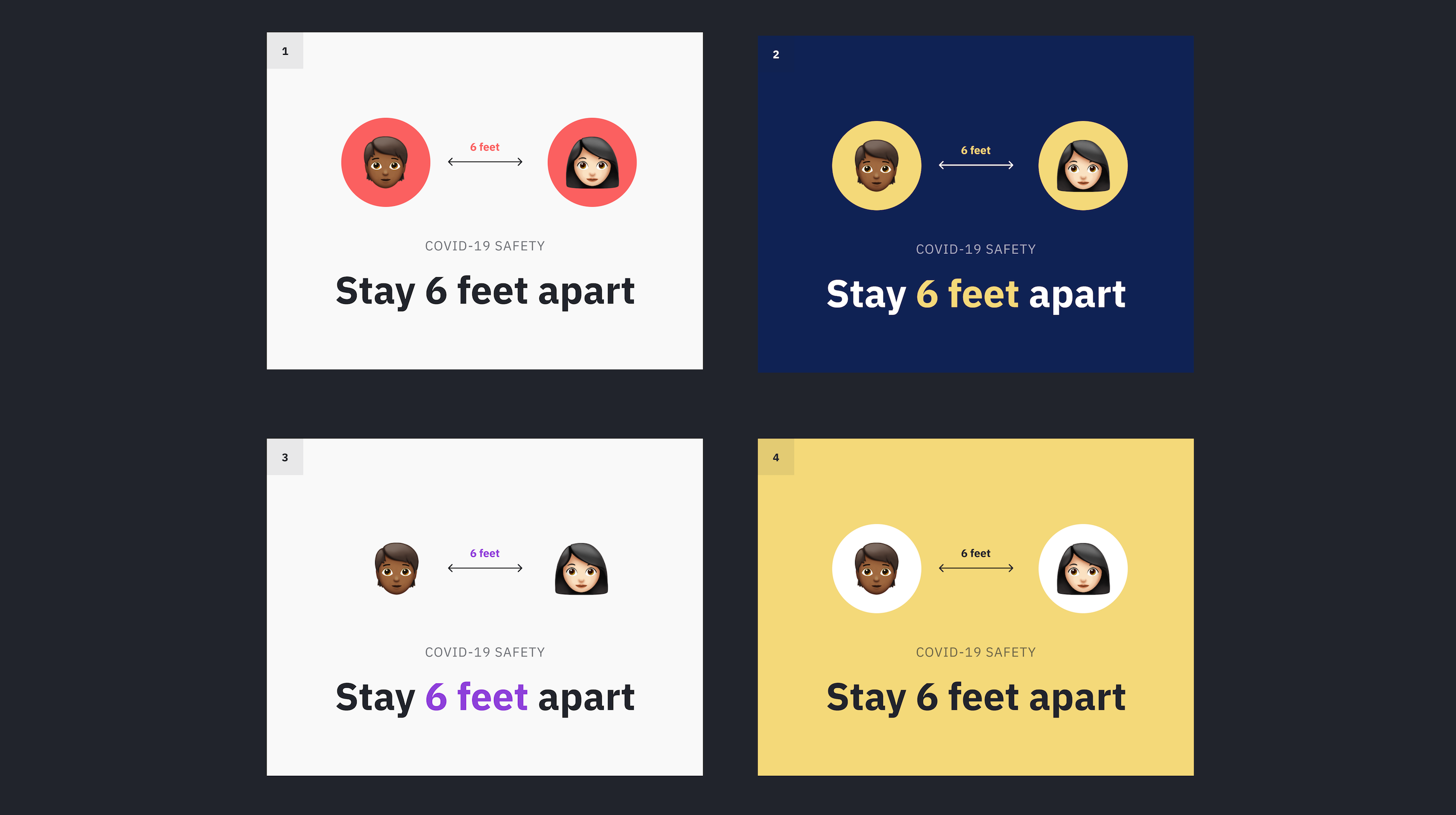
All four of these iterations work well! Directions (2) and (4) capture the eye of the viewer because they use a solid block of color in the background. Directions (1) and (3) might be easier to scan because of the simplicity of the background. I like how direction (3) uses purple to highlight the “6 feet” guidelines.
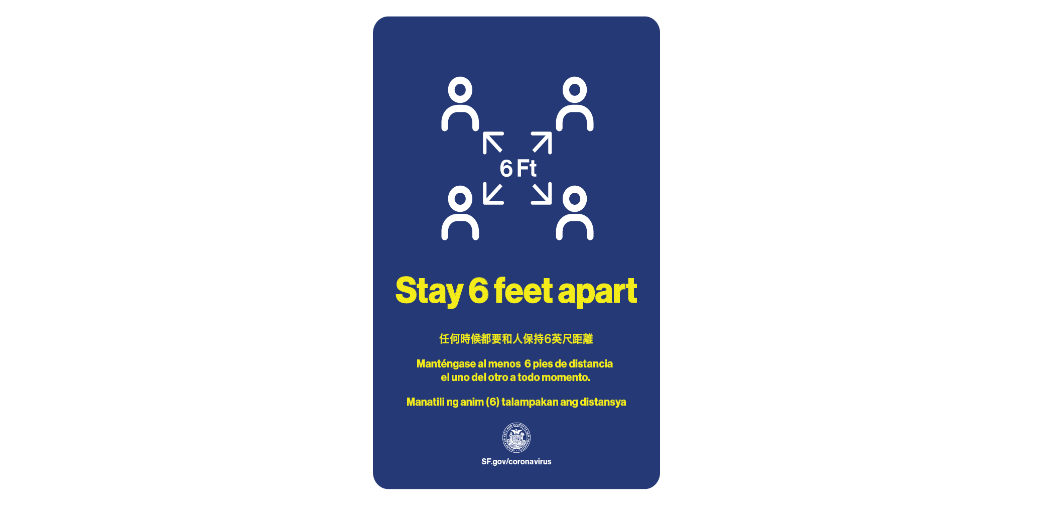
This is what San Francisco’s “Stay 6 feet apart” poster actually looks like. It communicates the message pretty well. The most important text “Stay 6 feet apart” is highlighted in yellow and it also includes a simple graphic that reemphasizes the message.
Resources For Developing Visuals
- Visual Design Basics
- Design Principles: Visual Perception And The Principles Of Gestalt
- Shape of Design by Frank Chimero
What’s Next?
The next time you design a slide deck, make a poster or create a document, think about incorporating a piece of visual storytelling. Start small by emphasizing important parts of the text with typography. If you decide to add a visual, remember that you don’t have to use fancy tools. Try starting with a pencil and paper or any tool you’re familiar with. Visual storytelling is all about communicating ideas, not creating works of art.
If you’re unsure where to start below are some fantastic resources:
Anyone can learn to communicate with visuals! I recommend sharing your work with friends or peers to see if your message is getting across. Getting feedback early and often will improve your work and ideas. The more you iterate, the faster and better you’ll get in the future. With practice and play, you’ll start to collect your own visual principles and build your own visual foundation.
Further Reading
- How To Defend Your Design Process
- Five Steps To Design Your Product With Powerful Storytelling
- What Saul Bass Can Teach Us About Web Design
- How To Use Spaces In Web Design With Gestalt Principles


