Do Website Policy Disclosure Pages Always Have To Be So Ugly?

Email Newsletter
Weekly tips on front-end & UX.
Trusted by 182,000+ folks.
It’s not like consumers aren’t interested in the information provided on terms of use or privacy policy pages. But these pages… Talk about a painful design.
As a web designer, you know that data privacy and security concerns affect how visitors interact with the websites you build. That’s why you build trustmarks into your websites in the first place.
But the sheer presence of “Terms of Use” or “Privacy Policy” links isn’t enough to put visitors at ease. These pages need to be easy to read or, at the very least, easy enough to pull out pertinent details from.
If you’re not in the habit of doing so already, you need to start designing your policy pages in a way that website visitors don’t feel so discouraged that they blindly accept the terms and put themselves at risk.
Designing Policy Disclosure Pages That Visitors Will Read
Tell me the truth: When was the last time you visited a terms of service, privacy policy or other policy disclosure page that was easy to read? Heck, when was the last time you even bothered visiting a terms page?
A recent experiment conducted by ProPrivacy (which you can read about in this ebook) found that of 100 people that encountered a terms and conditions page:
- 70 claimed to have clicked the policy page link to read it (when only 19 actually did).
- 33 claimed to have read the page all the way through (in actuality, only 1 did!).
Why is this a problem? In the case of this experiment, it’s because the users relinquished some pretty crazy rights by unknowingly accepting the terms:
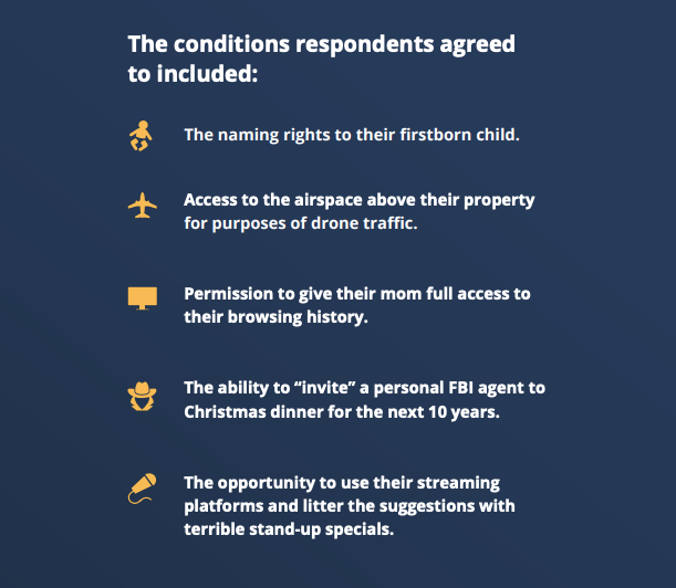
It’s not like your clients would ever hide ridiculous “terms” like these on their policy pages. But that’s not the point. There are other things — like how cookies are used, what happens with email addresses entered into a form, how to license content from the site, etc. — that do matter and can end up buried on a terms page because no one dared to try and read it.
So, here’s what web designers can do to turn this trend around and give visitors more reason to trust a website:
Tip #1: Format The Pages The Way You Do The Rest Of The Site
I’m not asking you to spend a lot of time on this since Terms of Use and Privacy Policy pages aren’t as important as the pages that sell whatever the brand is offering. But…
If a business owner, writer or legal representative gives you copy for policy pages that looks like this one on the Zappos site, you really should do something about it:
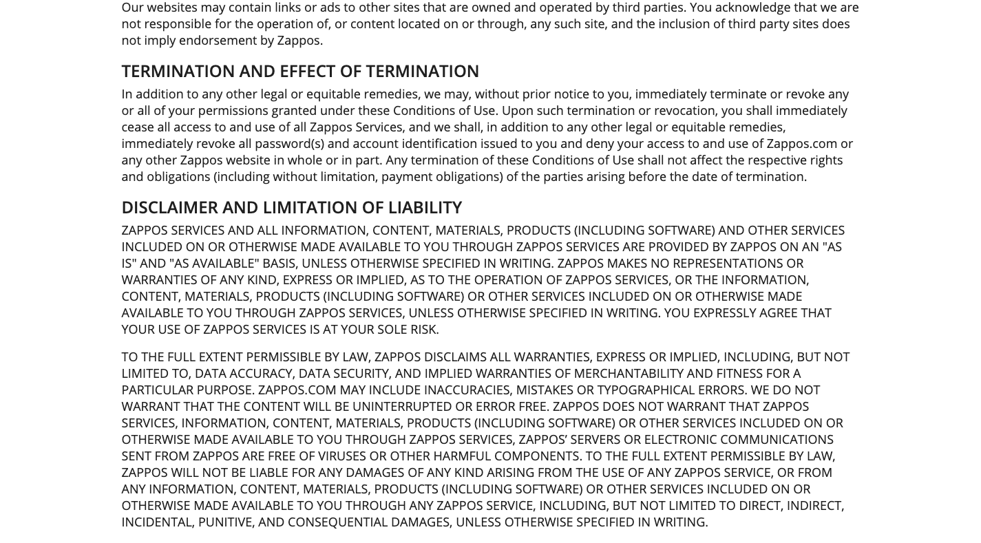
This looks like something you’d receive from a law firm and dread opening it. Extra-long paragraphs. All-caps text. Headers with nonsensical legal terminology all over them. No wonder most consumers don’t bother clicking through to these pages, let alone read them.
Depending on what you’re given, you’ll have to work with your writer or legal rep to edit the content so it’s more user-friendly. As far as design goes, though, that’s all you.
Here are some ways you can improve the formatting of your policy disclosure pages:
Increase the font size and decrease the amount of text like the Fishtank Agency does:
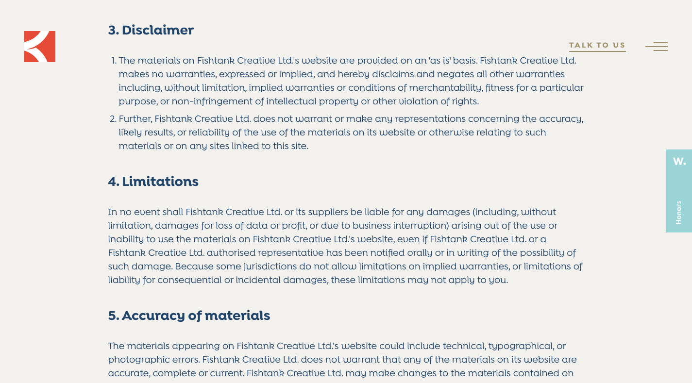
It’s not just the 18-pixel body text or 24-pixel header tags that make this page so easy to read. The sections are short and you can see where they end. Also, the sections are numbered, which makes it easier to find what you’re looking for.
Another thing to do is to format the text like a normal page as H&M does:
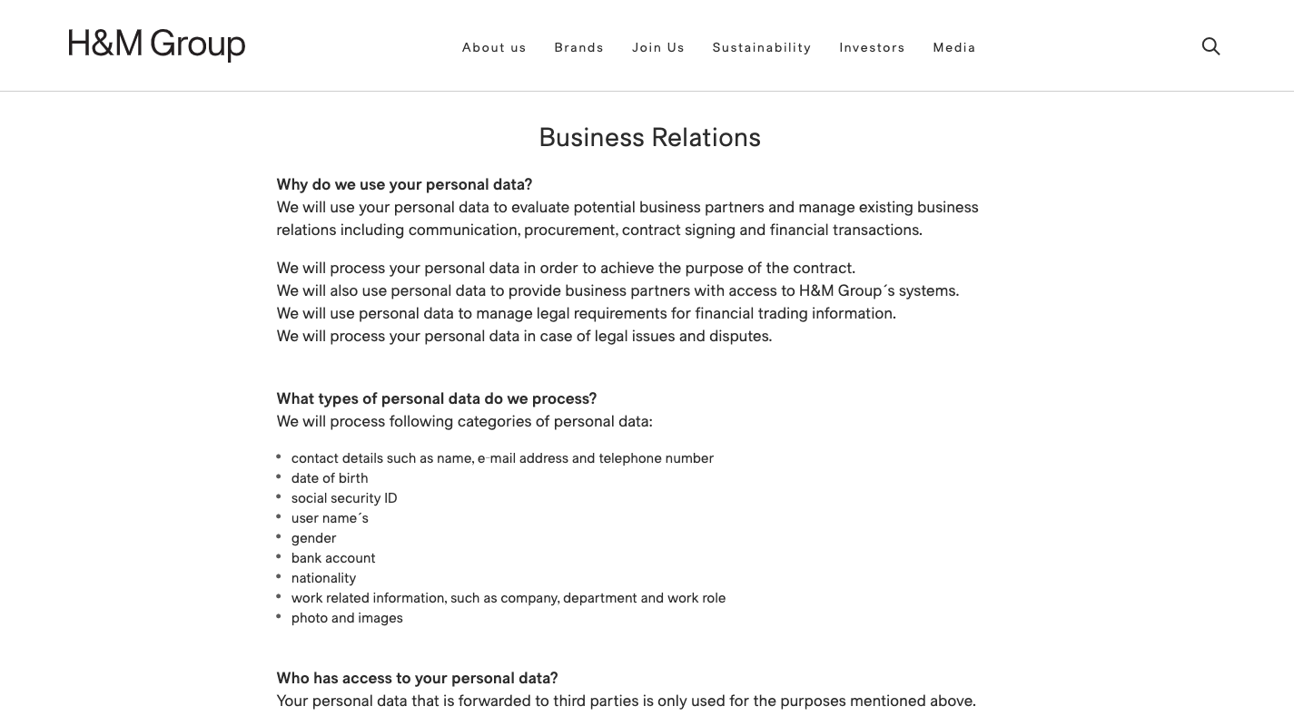
This is where you’d need your writer’s or legal rep’s help since you can’t go rewriting any of this legalese yourself. That said, if you’re given more user-friendly copy for a policy page, break it up whenever possible into:
- Smaller sections,
- Shorter sentences and paragraphs,
- Bulleted lists,
- Bolded questions or headers.
And if you have a lot of information that can be organized into a table, do as Smashing Magazine does with this section on cookies from its privacy policy page:
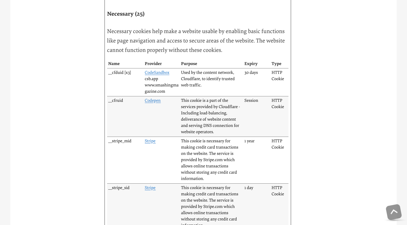
This table makes all of that information that would otherwise be difficult to read in paragraph form much easier to consume and understand.
Or you can follow Bank of America’s lead and use an accordion to make a lot of content easier to consume:
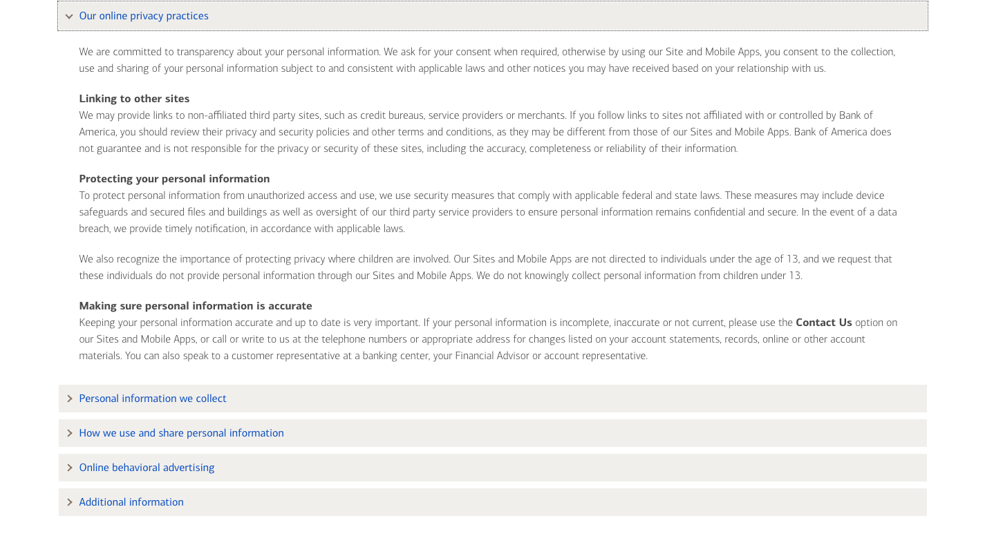
This way, visitors can take a moment to read through each header without being overwhelmed by the policy information. When they find what they’re looking for, they click the accordion to open it and can focus strictly on that section.
Tip #2: Add Navigation To The Page
In some cases, there isn’t a whole lot that can be done to condense the amount of information on a policy disclosure page. And even well-formatted pages can still be challenging for visitors if they’re too long.
Having a navigation specific to these pages will help. There are different ways to handle this.
The New York Times, for instance, includes the following navigational tools on its Terms of Service page:
- Breadcrumbs to backtrack to other legal or help pages,
- A search bar to find something specific in the Terms of Service,
- A table of contents with links to each section.
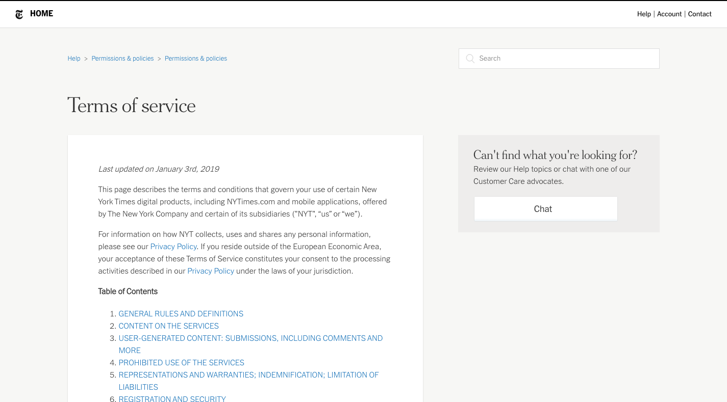
Even if it’s an otherwise generic terms page, these navigational tools will ease the pain of visitors trying to find the answers to their privacy concerns and questions.
Here’s another option for you:
Google uses a sticky sidebar navigation to show people where they are on the lengthy Terms of Service page:
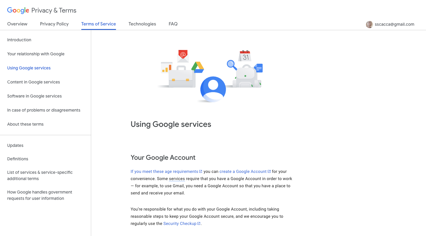
Users can either select the section to navigate to or use the sidebar to orient themselves as they read through the page. Anytime you can give your visitors an idea of the progress they’re making is a good idea.
One other navigation example I’d like to show you is from Indeed:
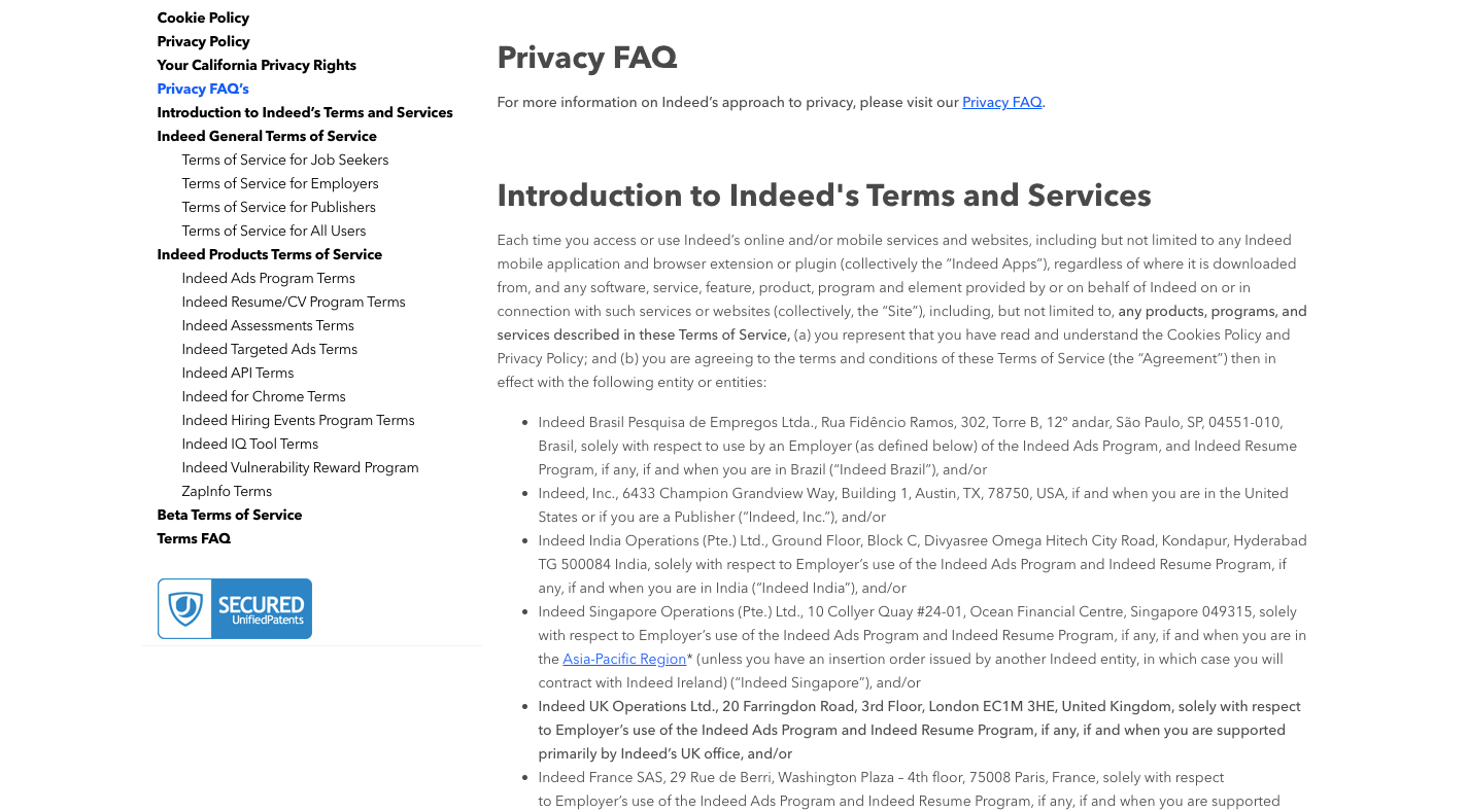
This is the Legal page for Indeed. It contains every single one of its policies:
- Cookie policy,
- Privacy policy,
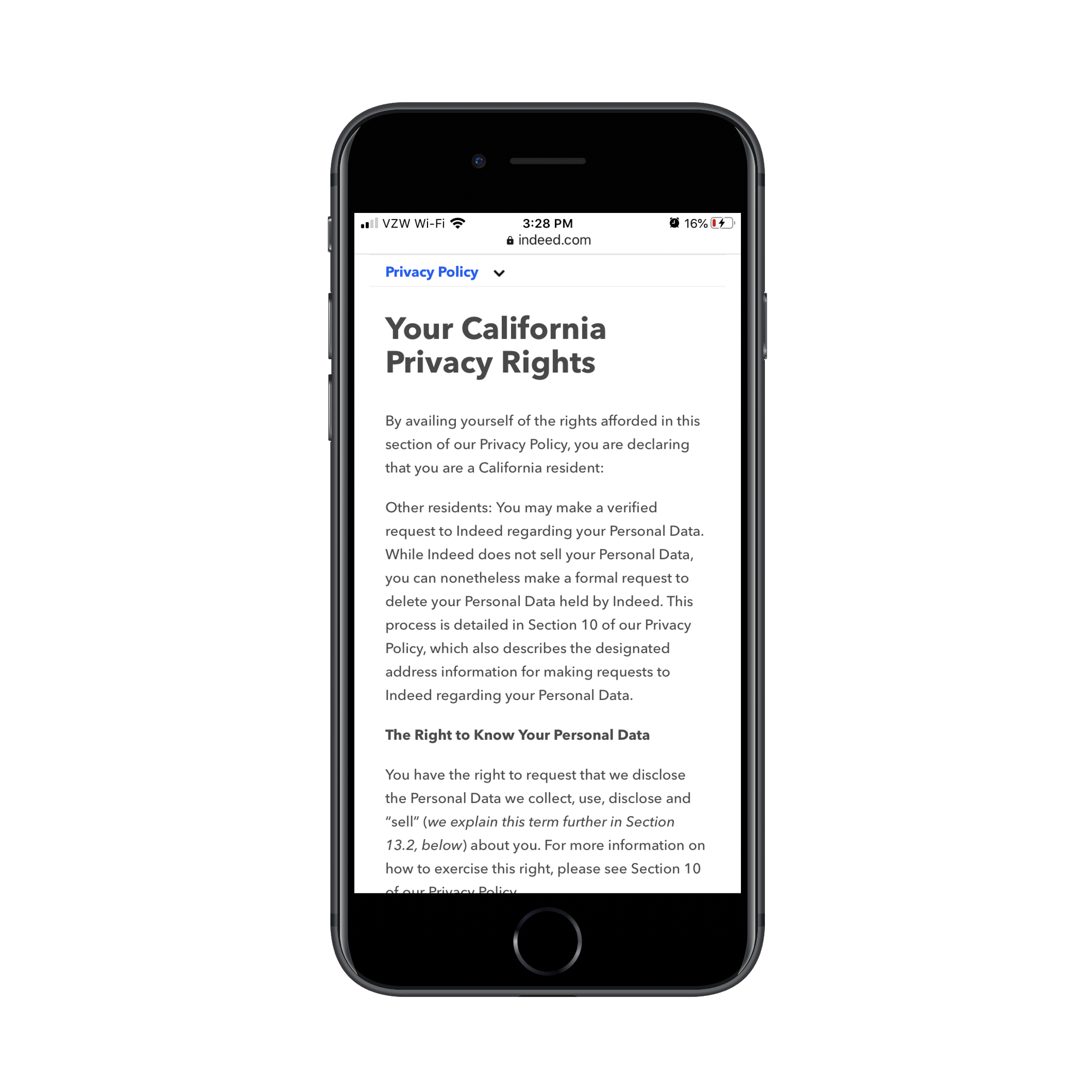
- California privacy rights,
- Terms of service.
It uses a sticky sidebar navigation similar to how Google does. However, I want you to take a gander at how it handles this on mobile:
Rather than ditch the sticky navigation altogether (which some sites do), Indeed affixes the legal page’s navigation to the top of the mobile screen:
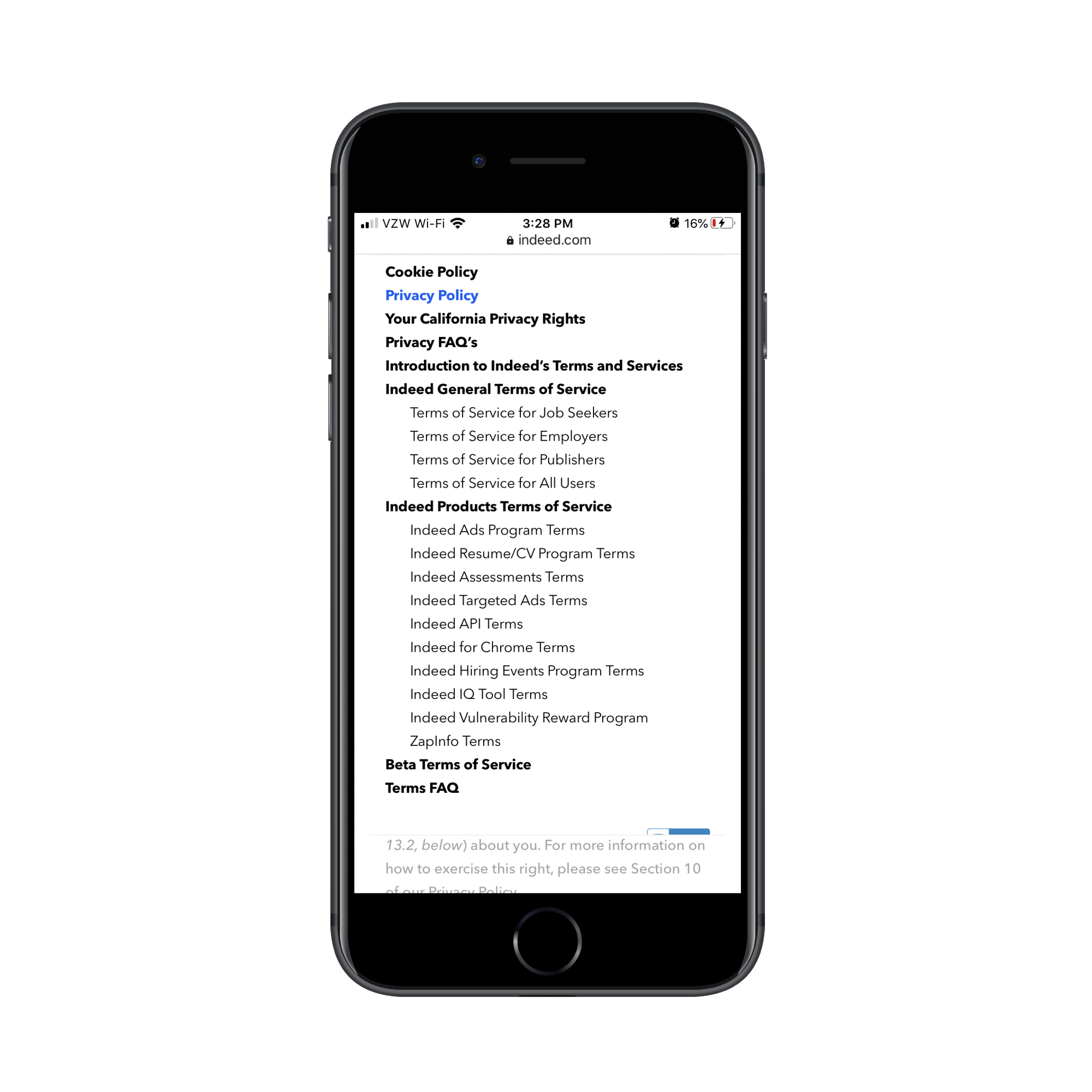
Again, this sticky navigation serves a dual purpose: expediting how Indeed visitors get to the information they need while also orienting them to what they’re reading.
Tip #3: Let Visitors Personalize Their Terms
When building websites for large corporations, popular social media platforms and mega e-commerce sites, you have to remember that it’s not just English speakers in the United States reading the policy disclosure pages. As such, the terms should change from language to language and country to country.
How do you deal with this on top of everything else? Easy. Let’s look at some examples.
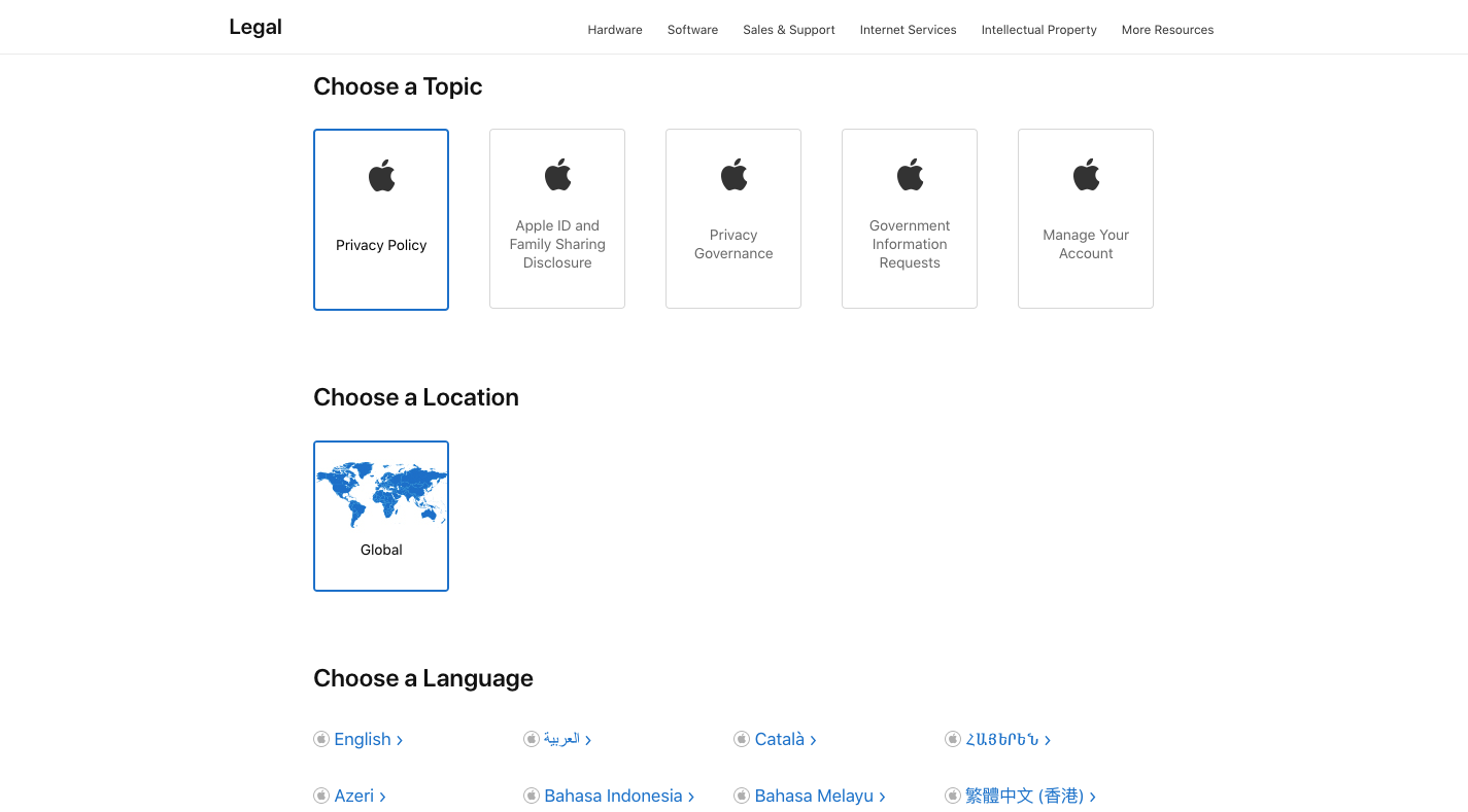
Apple asks visitors to choose a topic, a location and a language:
BuzzFeed is another website that enables global users to adjust its legal pages based on where they live and which language or English dialect they speak:
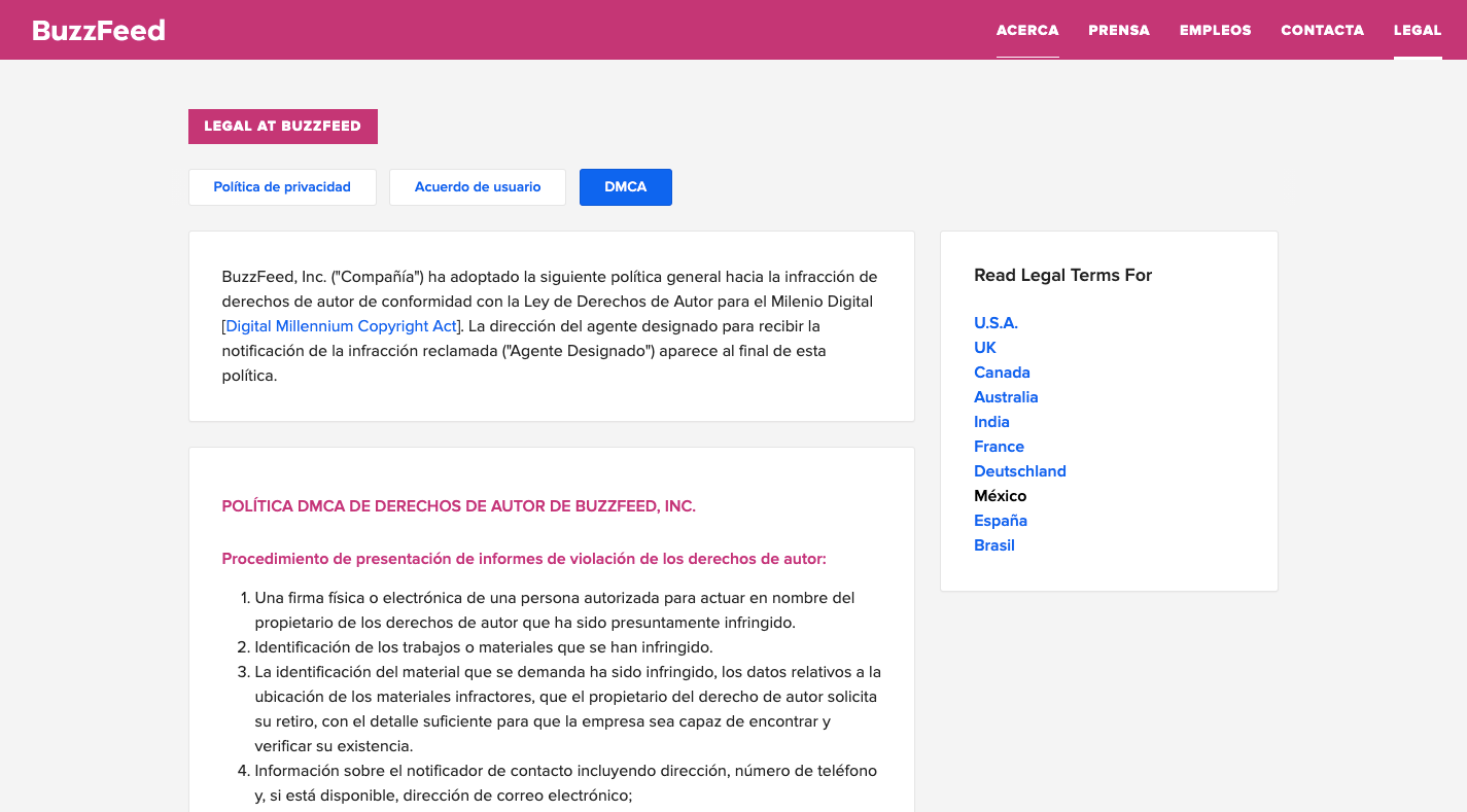
First, users select which document they want to view. It then populates the corresponding terms down below in an easy to read format. They can then select “Read Legal Terms For” if it’s not in their preferred region or language.
This is ideal for website performance, too. Some websites just link out to PDFs that contain the various translations of regional policies. The more files you add to your server, though, the slower it’s going to load. This way, the content dynamically changes on the site based on who’s viewing it.
Tip #4: Provide Eye-catching Summaries
Let’s say the company you’re building a site for has very strict legal terms. Their legal team has advised them not to change any of the policy disclosure content because they need it to hold up in a court of law in case anything should happen.
That doesn’t give you much flexibility in terms of how you design the page then. Sure, you can make the headers extra big and bold and you can use H2, H3 and H4 to create a hierarchy. That’ll help with readability a little bit, but not much.
When there’s no way to manipulate the legal content itself, summaries are the way to go.
LinkedIn is one website that does this:
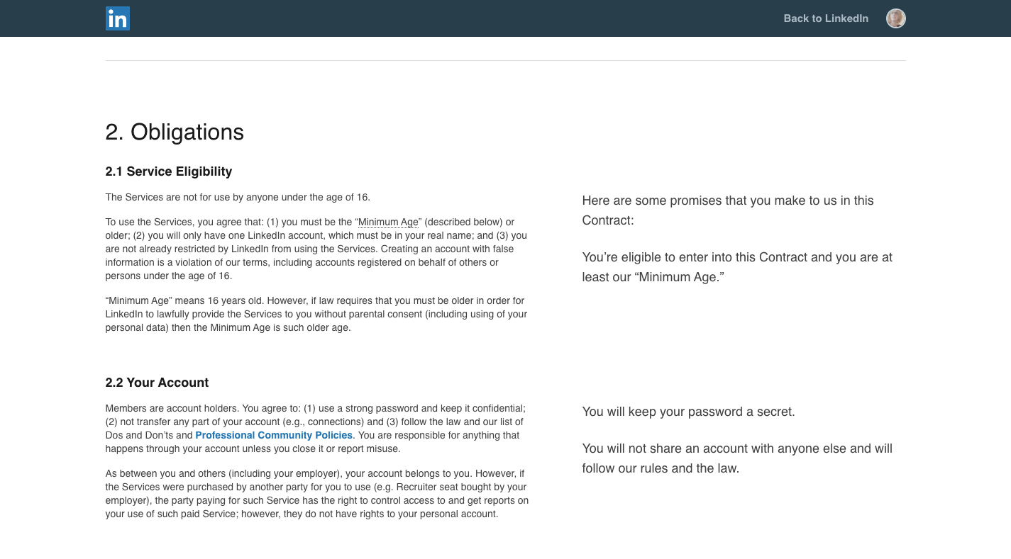
The User Agreement contract is provided in full on the left side of the screen. On the right side are snippets of text in a much larger font.
These are the summaries for each section, written out in layman’s terms, which keeps LinkedIn users from having to slog through lengthy explanations of complexly worded conditions or terms.
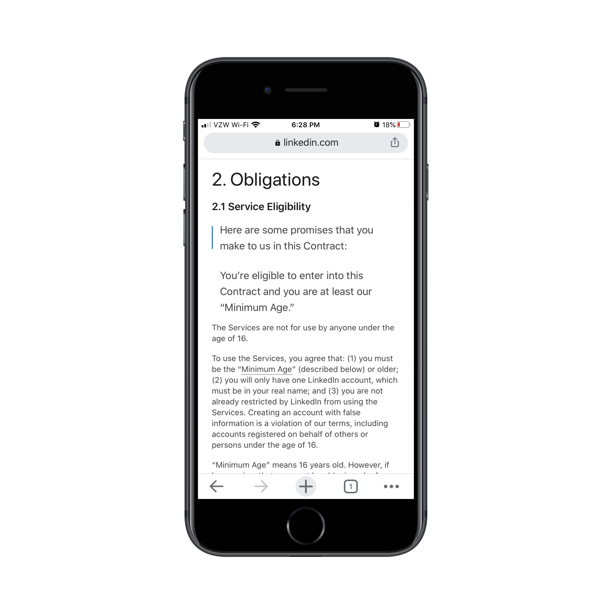
On mobile, these eye-catching summaries appear before all the boring legalese:
Sephora is another website that includes concise, user-friendly summaries on its terms pages. Here’s how it looks on the Terms of Use page:
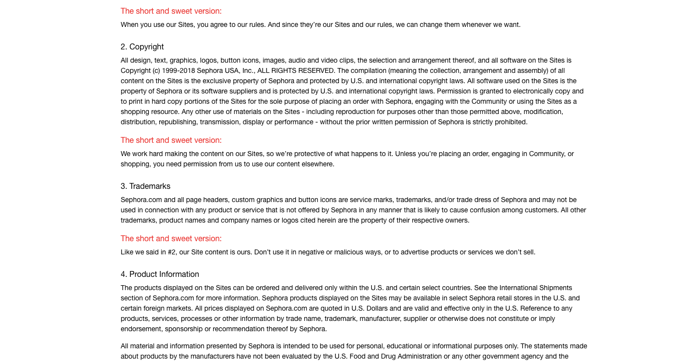
I’d argue that the way this is designed, with “The short and sweet version” called out in red, encourages visitors to focus only on the summaries.
So long as nothing important is lost in translation or missed in these summaries, I think that’s a brilliant idea. The red is much easier to locate when you’re quickly scrolling through a page than a black header tag.
Wrapping Up
I know these pages are often saved until the very end of a design project because… who cares? But as consumers become more savvy when it comes to their data and privacy online, you can’t afford to have a blasé attitude when it comes to creating policy disclosure pages on a website.
By taking extra time to improve their readability and navigability of them, you’ll encourage visitors to actually read these pages and make sure they’re comfortable with the terms they would otherwise blindly or unknowingly agree to. In doing so, you’ll help the website capture more satisfied customers or users in the end.
Further Reading
- Why Anticipatory Design Isn’t Working For Businesses
- How To Build Custom Data Visualizations Using Luzmo Flex
- Hidden vs. Disabled In UX
- The Big Difference Between Digital Product And Web Design