How To Design A Simple UI When You Have A Complex Solution

Email Newsletter
Weekly tips on front-end & UX.
Trusted by 200,000+ folks.
This article has been kindly supported by our dear friends at Flatfile who create beautiful, human-centric experiences to remove the barriers between people and data. Thank you!
What is it they say? Complex problems require complex solutions? That is certainly true when developing apps and software.
But how do you ensure that the complex backend doesn’t trickle over to the frontend?
A complex UI, in general, is more than enough reason for many people to abandon a website or mobile app. When it comes to paying or subscribed users, though, don’t expect any of them to settle for your software’s complicated interface.
It doesn’t matter how amazing your product is. If the outward appearance of it drives your users crazy, you can expect large amounts of costly user churn in return.
The Flatfile team is very familiar with this problem, having built a successful data importer, which is a technology that many designers have struggled to build on their own. Below, we’re going to look at some of the tips that helped them overcome this UI design challenge and can help you, too.
How To Design A Simple UI For A Complex Solution
Your goal when designing the frontend of your solution is to present a very simple and intuitive interface to the user (and sometimes for their end users, too).
So, how was Flatfile able to accomplish this? The data onboarding process alone can be a complicated one — having to take data from a variety of sources, file types, and users and then translate it into usable data inside the app. Getting users to prepare, validate and sanitize their data on the frontend is no easy task either.
In addition to the standard software design process, Flatfile took additional steps to ensure that users never caught a whiff of how complex their product really was. Here’s what they learned:
1. Figure Out Your Users’ Goals So You Can Design A User-First UI
In order to build a product that users find useful, you have to design for their goals and from their perspective. If you lose sight of that, you could end up with a UI that prioritizes your goals and priorities, which allows the complexities from behind the scenes to shine through.
Let’s look at how this misstep can have serious ramifications for your app or software.
Instagram recently updated the header and footer of its long-standing interface. Here’s what the header looked like before and after November 2020:
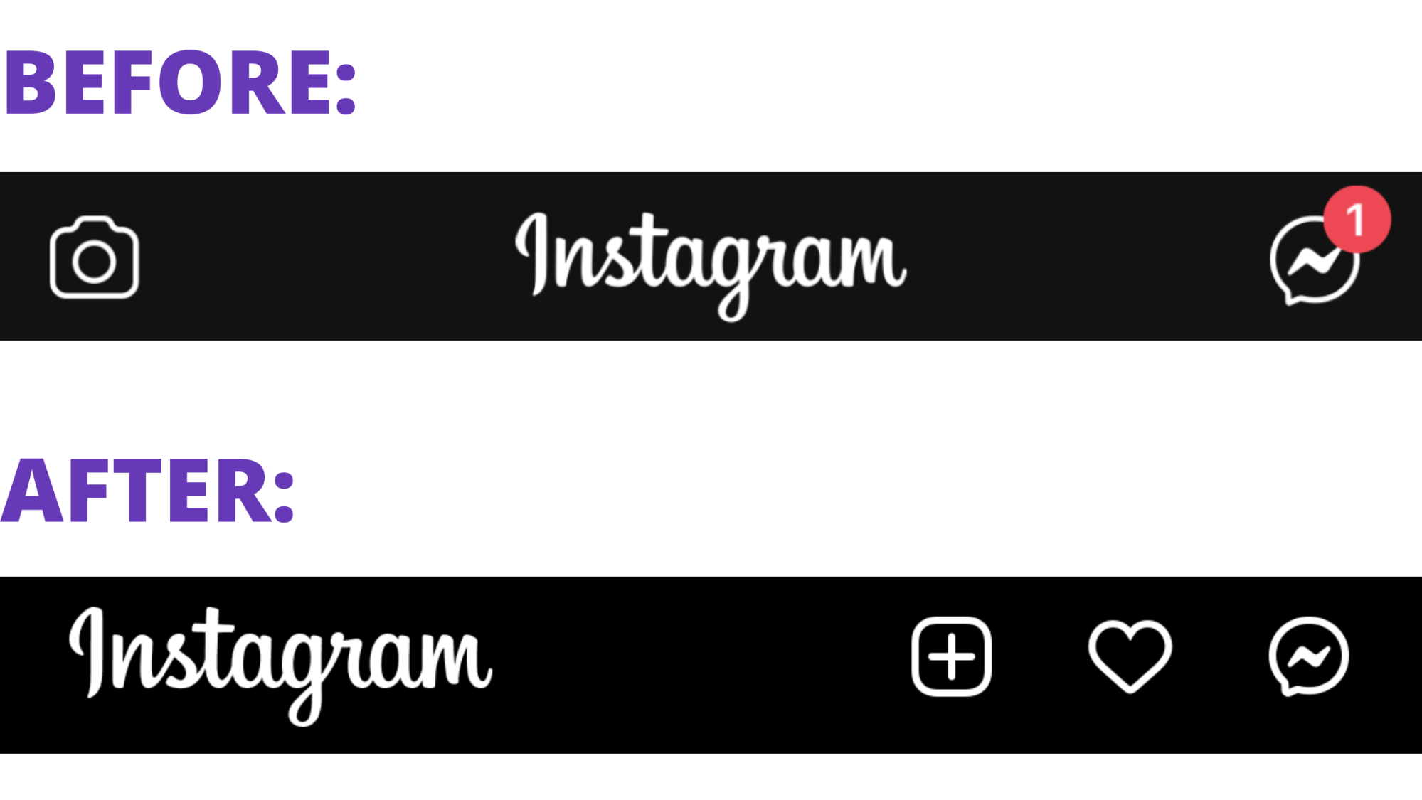
The earlier design contains two symbols/actions:
- The camera icon to take or upload photos.
- The Messenger icon to chat with connections.
The most recent design has pivoted all icons to the right. There are three of them now:
- The plus symbol to create Instagram posts, stories, reels and lives.
- The heart symbol to view activity (i.e. post engagement, new followers, etc.).
- The Messenger icon maintains the same design and placement.
Looking at the header, you might not think much is wrong here. However, Instagram likely didn’t redesign its navigation to improve aesthetics or usability. The new footer is proof of that:
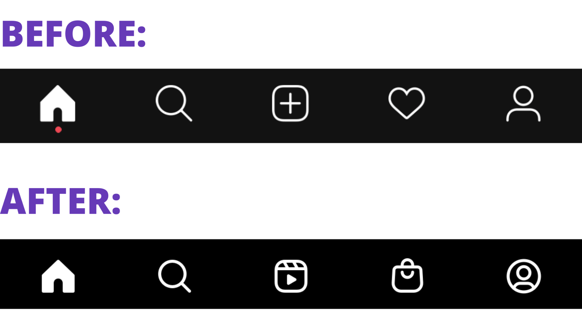
Look at the middle and second-to-last icons. After November, the plus and heart icons were moved to the top-right corner of the app and replaced with the following:
- A link to Instagram reels, a feature that acts similarly to TikTok (and arguably increases the addictiveness of the platform).
- A link to Instagram shopping, a feature that enables users to shop from popular stores (not ones they actively follow).
The UI no longer (primarily) encourages users to curate content from their favorite accounts or to make organic connections with other users. Instead, the UI prioritizes the new pay-to-play aspects of the platform, favoring brands and influencers that spend money on it.
Consequently, the usability of the app has been compromised as the notification and creation buttons have moved out of the thumb zone and into a corner of the app. Not only does it make the app more challenging to use, but this further draws awareness to what’s going on behind the scenes. If Instagram users weren’t thinking about the complex algorithms and business decisions at work, the UI now calls attention to them.
Before you do anything else, figure out what your users want to accomplish as well as how they expect it to happen. Then, sum up your users’ goals similar to how Randy Wiafe, the Head of Product for Flatfile, does:
“The goal for Flatfile's users is to smoothly import their customer's data. Flatfile's users need to move data from one software product to another and this process needs to be as easy as possible because it is one of the first product experiences that a new customer will have — importing their data.”
You can’t afford to lose sight of this. Because if you’re not designing a UI that’s in line with your users’ goals and their preferred journey, then you’re likely to reveal some of the complexity happening behind the scenes.
2. Evaluate The Competitions’ Products In Order To Create Your MVP
A minimum viable product is absolutely necessary any time you build an app. Not only do you save time and money by developing only the simplest version of the product to start, but a live and working beta gives you something to gather real user feedback from as you iterate.
That’s what Flatfile did. Wiafe explains the value of the MVP:
“The beta really opened our eyes in terms of how customers and their end users interact with the product. Being able to understand why and how users were getting blocked helped us improve the experience considerably.”
That said, how do you know how minimal to go with the UI of your MVP? Because there’s a huge difference between minimal and unusable.
Rather than start the design process from scratch, I’d recommend spending time inside the software from your competitors.
Obviously, I’m not advocating that you steal someone else’s designs. What I’m suggesting, however, is that you get some first-hand experience with them.
For starters, this will allow you to identify trends across the UIs — design trends that your prospects are already comfortable and confident engaging with. Secondly, you can use these demos to pare down your MPV to the absolute minimum needed.
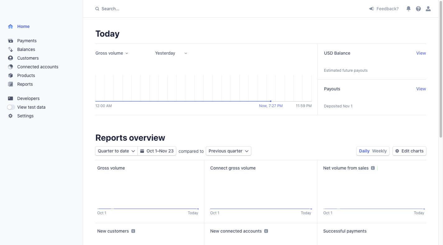
Let’s pretend you’re building a payment gateway software. You might start with Stripe:
And 2Checkout:
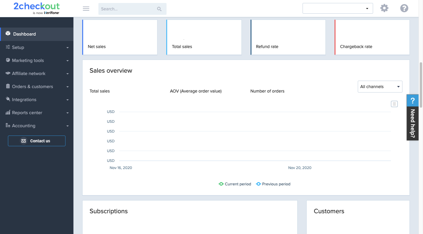
I’ve stripped out all of the data from these dashboards and left only the main components, navigation and labels. What are the common threads we see between the two UIs?
- A search bar near the center of the header,
- A link to the user settings or account info in the top-right corner,
- A left-aligned control panel that takes up between a ⅙ or a ⅕ of the page,
- Data presented within self-contained blocks,
- Neutral sans serif fonts used for labeling,
- Color contrast is minimal and only exists in the dashboard to indicate selected tabs or to distinguish data sets.
That’s just a basic analysis, but you get the point. By stripping out the details and effectively turning your competitors’ products into wireframes, you can identify the design details that users would feel comfortable and confident in seeing within your software.
You can also use this time spent on their products to figure out where their complexity is showing through. Is the hierarchy of data presented illogical? Are there elements included that overcomplicate things because they appear on the wrong screens? Are you asking users to take one too many steps in reaching their primary objective?
One thing that Wiafe suggests is to not treat your MVP strictly like a wireframe:
“Another area of focus for us was how to make this experience feel good to our users. We didn’t want the beta to be cold and unexciting. We wanted to make a good first impression and that meant we needed to spend time giving the software some character before pushing it out.”
So, yes, you’ll use the competitors’ software to flesh out the design specs that will keep the UI simple. However, your MVP still needs to be a viable product that users want to use, which means designing it to be engaging.
3. Introduce Complexity Incrementally And Confirm With User Testing
Have you ever ordered food from a restaurant via a delivery app and wondered why it’s taking so long?
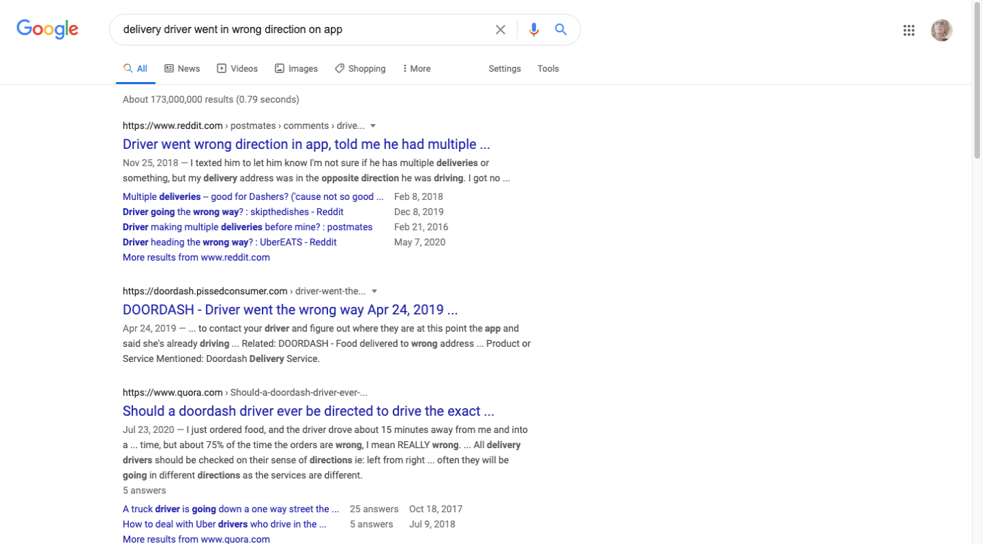
You place your order at 8 p.m. The app says the restaurant confirmed the order a few seconds later and you’ll have the food around 8:45. At 8:40, you open up the app to see where the delivery driver is on the map and you wonder why they’re not moving. Or, worse, why they’re heading in the wrong direction. Your stomach starts to grumble and you regret not picking up the order yourself.
If you’re not familiar with this, lucky you. But if you Google “delivery driver went in wrong direction on app”, you’ll see what I mean:
This is a new problem for people that dine out. In the past, all they’d get was an order confirmation message and then they’d receive a call, text or knock on the door when their food arrived.
But delivery apps have changed over the last year or so, providing full visibility not only into the restaurant’s progress cooking your food, but also showing you the exact whereabouts of the delivery driver.
Was this a feature that was absolutely integral to the success of delivery apps? If it’s infuriating users to the point where they’re experiencing high volumes of customer service complaints, order refunds or user churn, then no, it wasn’t.
This is why complexity should be introduced to your MVP little by little and only fully integrated once user testing confirms that it’s a worthwhile addition.
As Wiafe explains:
“Depending on the user of the product, introducing complexity to the product varies. With our Portal product, we work with developers more frequently so it wasn’t a problem increasing the complexity of the importer. However, Concierge was built for customer success and implementation teams, who tend to be less technically-minded. So we were very careful about adding any complex features or components to the software until we tested them.”
Understanding your users’ objectives and expectations is valuable when you’re first starting out. But don’t assume to understand everything that’s going through your users’ minds once you have a live app or software that’s out there.
Unless you’re in your users’ shoes, experiencing it exactly as they are, you really have no idea what new layers of complexity will do to the usability as they perceive it.
So, it’s incredibly important to formulate working hypotheses related to what will happen when you introduce more complexity to the UI or when you remove something you believe to be too complex. Once you have a data-backed idea, you can start soliciting feedback from your users and refining your product.
Wrapping Up
In order to build an app your customers will use, you have to actually give them something to work with and not something that requires them to contact customer support for help every week. Or that has them questioning why they’re using something that causes them more stress and frustration than before.
So, be careful about how much of the backend complexity you allow to infect the frontend. If the UI is too complicated to navigate or too convoluted to understand, users will revolt and flee en masse.
Further Reading
- Build Design Systems With Penpot Components
- How A Bottom-Up Design Approach Enhances Site Accessibility
- Creating Custom Lottie Animations With SVGator
- How To Manage Dangerous Actions In User Interfaces