Are Websites Adding To Consumer’s Health Issues?

Email Newsletter
Weekly tips on front-end & UX.
Trusted by 182,000+ folks.


 Custom Web Forms for Angular, React, & Vue. Your backend.
 Celebrating 10 million developers
Have any of you watched The Social Dilemma yet? For those of you who haven’t see it, here’s a summary of what it’s about:
- People who were instrumental in building the world’s leading social media platforms explain what’s really going on behind the scenes.
- Essentially, social media companies are in the business of selling their users to advertisers and partners.
- So, the social algorithms are programmed to do whatever’s necessary to gather as much user data as possible.
- This often leads to unethical means of grabbing users’ attention and keeping them addicted to scrolling, reading, clicking and so on.
All this has led to an increase in depression, anxiety, lower life satisfaction, distorted realities, compromised relationships and poor health on the part of the consumer.
“
Certain kinds of mobile apps capitalize on users’ addictive tendencies, FOMO and other negative behaviors. But what about websites? Are they responsible, in part, for the deterioration of consumers’ mental and physical wellbeing?
Today, I’m going to show you five ways in which websites are making visitors and customers feel worse and what you can do to help reverse this trend.
Is Your Website Making Its Visitors Feel Sick?
There’s so much toxicity, hate and divisiveness in the world already. The last thing we need is to give people more reason to feel negatively about themselves or towards others.
We are well aware of how dark patterns as well as misuse of visitor data can impact the way people respond to our websites (and later feel about the experience). It’s the whole reason why ethical design is such a critical matter these days.
But what else could your websites be doing that leads users to feel poorly? Let’s have a look:
1. Playing Into Alert Panic With Fake Notifications
Have you ever been watching something on TV or been in a crowded space and heard the all-too-familiar text message chime and reached for your phone?
Of course, you quickly realize the message isn’t for you as the person on the screen or in the crowd does the same thing as you, except they have someone they need to respond to. And you don’t.
We’ve been conditioned to feel disappointed when that notification isn’t for us. Or when it’s not from the person we wanted it to be.
Worse, because we’ve grown so accustomed to that dopamine hit, we’re often overwhelmed with notification alerts — sounds and visual signals — that we’ve activated on nearly every app we use. Facebook. Text. Email. Food delivery apps. Mobile games. Heck, even my meditation app wants to ping me once a day.
Larry Rosen, a psychology professor emeritus at California State University, explains why this is so bad for us:
“We’ve trained ourselves, almost like Pavlov’s dogs, to figuratively salivate over what that vibration might mean. If you don’t address the vibrating phone or the beeping text, the signals in your brain that cause anxiety are going to continue to dominate and you’re going to continue feeling uncomfortable until you take care of them.”
As a consumer, you’re well aware of the effect that notifications have on people. As web designers, though, what should you do with this information?
Unfortunately, some designers have chosen to add these anxiety-inducing triggers into their websites. Here’s an example from Mobile Monkey:
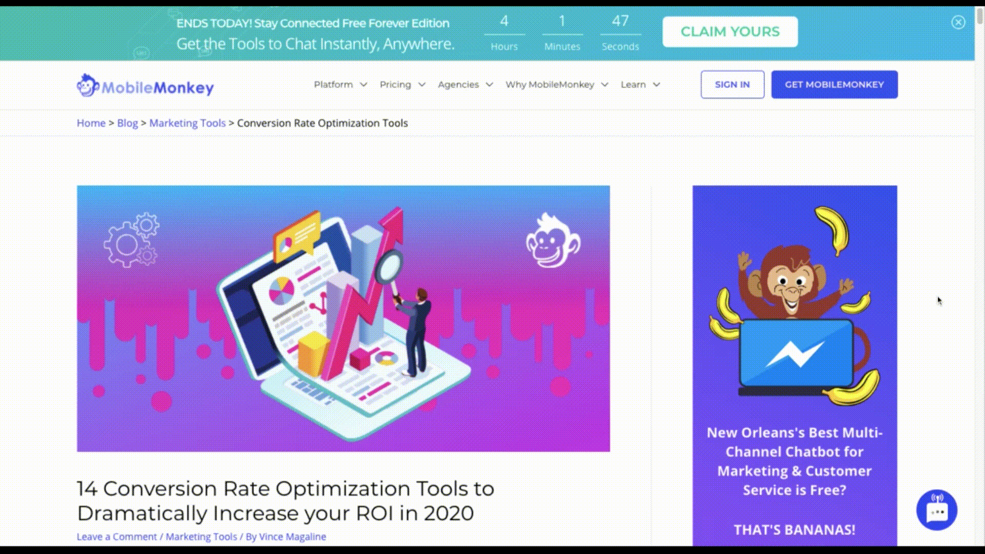
There are actually two panic triggers in the chat widget:
The first are the three bouncing dots that look like someone is typing a message. The second is the red “1” that appears on the corner of the widget afterwards, resembling the marker you’d see if you had an unread text or email.
Considering I’ve never had a conversation with the chatbot on this site before, this alert does nothing but confuse and annoy me. I came to the site to read about CRO tools, not get interrupted by a chatbot I don’t need.
Another example of this can actually be found on The Social Dilemma’s website:
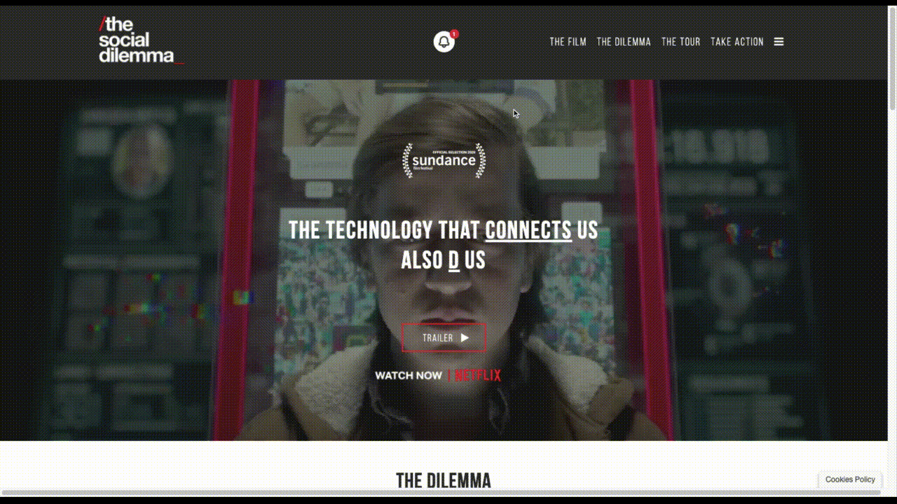
At first, my thought was, “Hypocrites!”. But then I read the entire pop-up and realized it’s actually a brilliant move as it makes their audience hyper aware of how hooked they are to notifications.
Here’s what the grey section beneath the email signup form says:
“WE KNEW YOU’D CLICK THIS!
Notifications like these offer an enticing loop of pleasure that can create an unconscious attachment to our devices.”
This is no different than an actor breaking the fourth wall and looking at the camera to address the audience. While it works for the film’s website — since its whole message is for consumers to break free from this kind of digital dependence — it’s just going to cause harm when used on other sites.
2. Deceiving Customers With Dishonest Photos
Have you ever noticed that social media has become a sort of “second life” for some people?
The most obvious example of this are influencers. They take pictures of their fancy homes, luxurious vacations and expensive clothes. But we’re learning more and more that this isn’t the reality of their day-to-day lives and that the highly staged photos are designed to manipulate fans into buying the products they promote.
But it’s not just influencers who lie on social media. Many of the people we know fall prey to this — only putting out the idealized photos of themselves, their families and their lives.
An article written by Dr. Cortney S. Warren for Psychology Today recaps the results of a number of studies on the correlation between social media and lying:
- 67% of daters have lied about their weight.
- 43% of men have made up facts about themselves and/or their lives.
- 32% of people only shared non-boring aspects of their lives on social media.
- 14% said they make themselves appear more physically active on social.
- Only 18% of men and 19% of women said their Facebook pages were completely accurate.
Warren explains how these lies — while they make the liar feel better about themselves — actually do a lot of harm for everyone exposed to them:
“To make matters more complicated, when we internally believe that what we see in social media is true and relevant to us, we are more likely to compare ourselves to it in an internal effort to evaluate ourselves against those around us (e.g., regarding our looks, wealth, significant other, family, etc.). As we do this against the idealized images and unreasonably positive life accounts that tend to permeate social media, we are likely to feel more poorly about ourselves and our lives.”
Unfortunately, this is something that brands do, too, when they use inauthentic, idealized and doctored photos on their websites. Take, for instance, the example of McDonald’s. This is how its famous McRib is portrayed on its website:
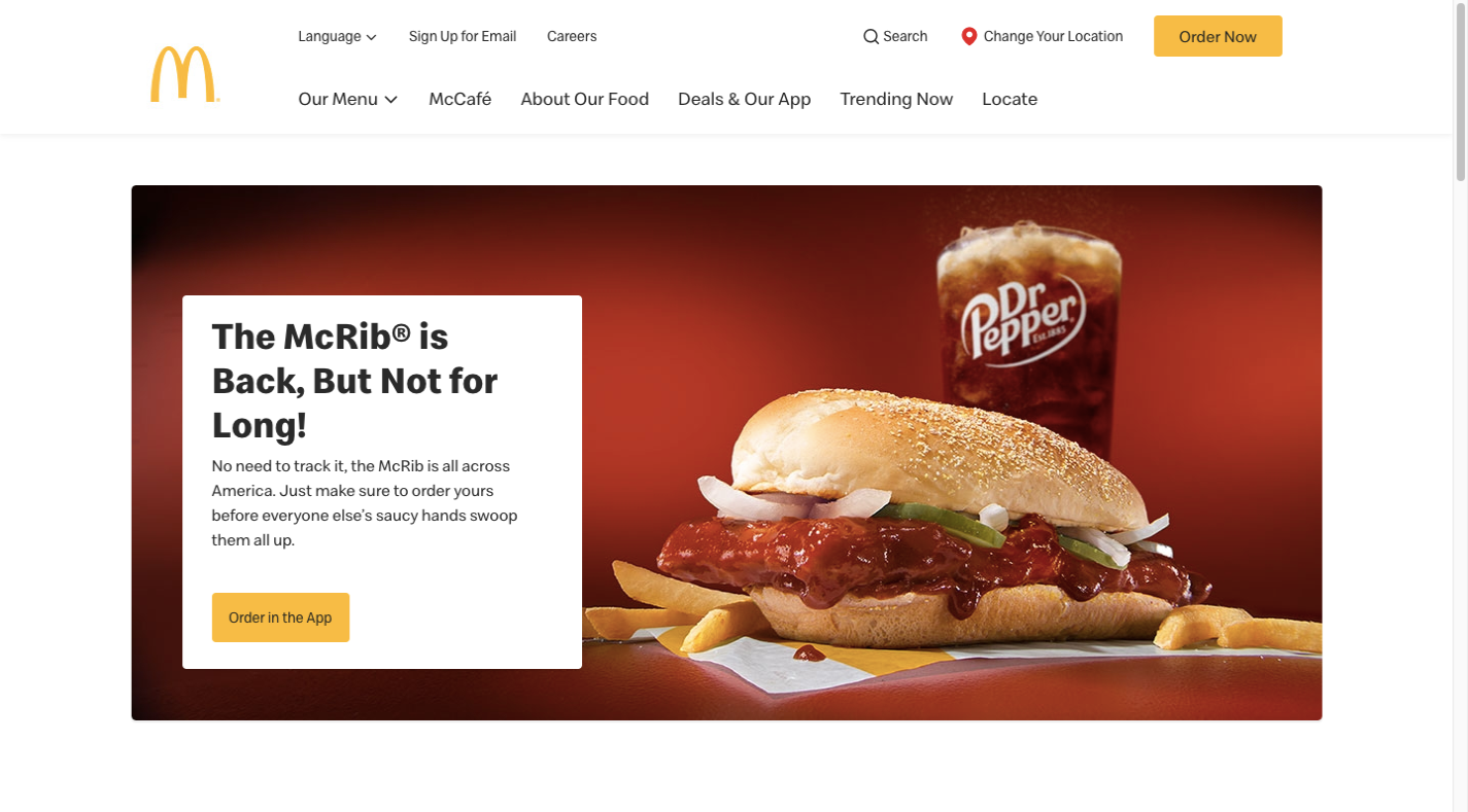
Have any of you ever gotten a sandwich from McDonald’s or any fast food joint that looked that impeccable? Don’t get me wrong. I eat fast food more often than I’d like to admit. But I don’t lie to myself about what I’m about to find in my takeout bag. And that photo right there is definitely not what I’m expecting.
It’s irresponsible of any business to set such unrealistic expectations from the start. This can happen with all kinds of brands, too. For instance, travel companies that make their properties look fancier than they really are or medical facilities that look well-organized and clean when they’re not.
And what about retail and fashion companies that use super-skinny girls to show off their clothing? Not only do those photos lead to frustration when a customer can’t fit into something they bought, they’re likely to blame themselves for being too “fat” or “ugly” or whatever kind of self-hate they decide to inflict on themselves.
If you can’t be honest in your photos, then what your website sells is a lie. And you have to expect the deception to come at a price.
3. Bombarding Visitors With Addictive Content
Social media platforms and their algorithms are designed to keep users logged in and engaged.
If a user were to slow down while scrolling through their feed, for example, the algorithm would run a calculation to determine what might suck them back in. It could be:
- A “Suggested for You” post featuring puppies playing in snow,
- A notification that a close friend just posted something for the first time in awhile,
- An ad for a product the user was looking at on Amazon a few days back.
We’re living in a time of information overload and social media platforms are very good at taking advantage of it. By constantly throwing something new into our field of vision, it becomes harder and harder to pull ourselves away. What’s more, when we’re feeling unmotivated or unproductive, we know exactly where to go to drown ourselves in distractions.
It’s gotten worse during the pandemic, too. As research scientist Mesfin Bekalu explains:
“As humans we have a ‘natural’ tendency to pay more attention to negative news.”
Addictions specialist Dr. Paul L. Hokemeyer elaborates:
“A person who doomscrolls found at some point in the trajectory of their disorder that searching online for information on disturbing events gave them comfort. It gave them a sense of control over their lives and re-engaged their intellect. But while they thought they were being soothed by facts, what they were really doing was hyperactivating their emotional reactivity.”
It’s not just scientists and health professionals who are aware of this. Social media algorithms are, too. And because they’re programmed to manipulate users with content that’ll make them want to keep reading and engaging, guess what people’s feeds are full of?
One of the benefits of building a website for brands is to get consumers away from the chatter, distractions and negativity that thrive on social media platforms. That doesn’t mean you’re free to bombard your visitors with content that exploits their addictive tendencies though.
And, yet, it happens. This, for instance, is what I saw when I clicked on a link to an article on the Small Business Trends website:
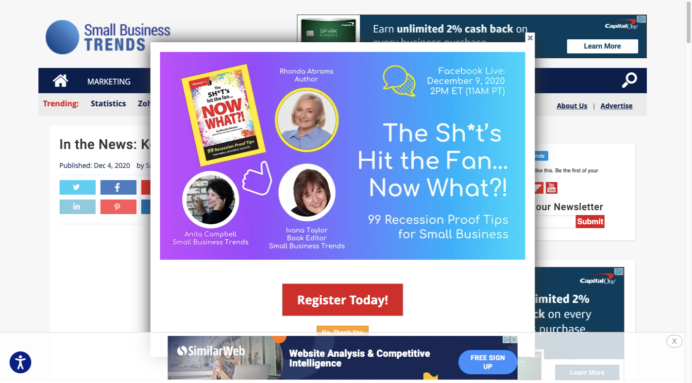
In just my first second on the site, I saw:
- A pop-up reminding me about the pandemic and recession,
- An ad for Similar Web sitting on top of the area of the pop-up where I could say “No Thank You”,
- A newsletter subscription form on the right,
- Ads for Capital One in the header and sidebar.
I see zero content (the title isn’t even fully visible) and I’m overwhelmed with ads — one of which hooks into the anxiety I’m already feeling about the pandemic. I’m sure I’m not the only person who’d feel the same way looking at this site.
It’s not just an overwhelming amount of ads that make visitors feel uneasy or, worse, compel them to explore each of the distractions before actually getting to the content.
For example, there are websites that display promotional videos, but then don’t allow visitors to escape them, as Fast Company does in its sidebar:

There’s no sound unless the visitor triggers it, but it doesn’t matter. The fact that the video is glued to the sidebar, auto-plays and shows the captions makes it an inescapable distraction.
Sites that use an endless scroll are another example of brands exploiting consumers’ addictive tendencies. Entrepreneur has an endless scroll that ensures that visitors will find more content to read… if only they keep scrolling and scrolling and scrolling:
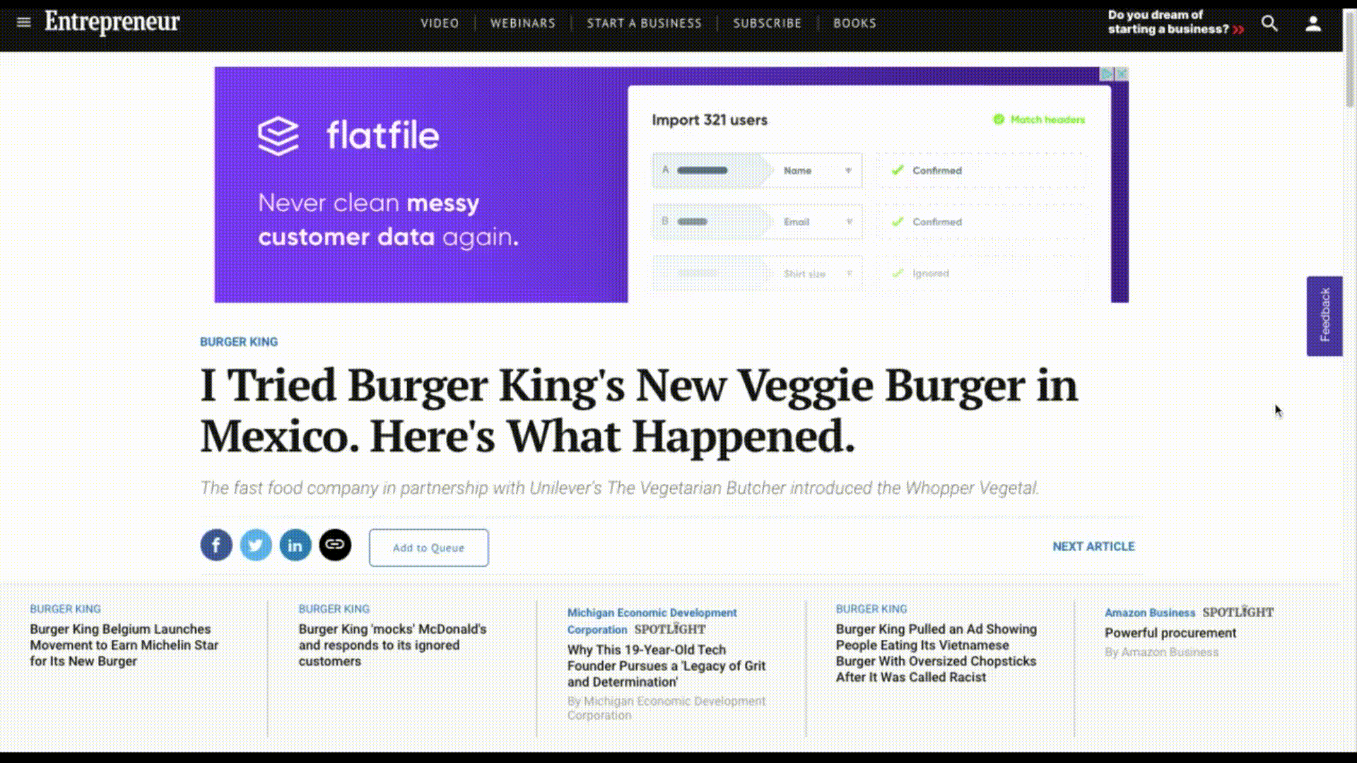
Endless scrolling pages are a lot like going to an all-you-can-eat buffet or somewhere that offers “bottomless bowls” or “never-ending refills”. You know your customers are going to gorge themselves. And while they might enjoy it at the time, they’re going to walk away from the experience feeling mighty ill and probably a little ashamed with themselves for throwing away all that time, too.
Another thing this site does that’s worrisome is that it displays tracking banner ads.
You can barely see it in the video above, but the top of the page has a big ad for Flatfile, which is something I’ve been writing about for the last few weeks. So, before I could even focus on the content, I started stressing out about the state of my current projects.
While that exact response isn’t what the ad was meant to elicit, it’s supposed to stir up some type of anxiety or FOMO for a purchase not completed. For consumers that are struggling with a shopping addiction or outlandish debt, your website could realistically become a vehicle that feeds into it.
Wrap-Up
I know it’s your job to build websites that attract visitors, encourage those visitors to engage with the sites and eventually turn the engagement into conversions.
But if you want to do your part in designing more humane digital experiences, then it’s time to stop exploiting your audience’s vulnerabilities.
You can still take what you know about human psychology and use it to design attractive, friction-free and user-first experiences without manipulation and deceit.
Trust me. With the backlash social media platforms face (like after the Cambridge Analytica scandal), the number of people who quit them every year and now a high profile movie like The Social Dilemma, consumers are waking up. And it’s not just going to be Facebook they abandon when they realize how their thoughts and actions were controlled by a piece of technology and the people who built it.
Further Reading
- How To Manage Dangerous Actions In User Interfaces
- Pushing Back Against Privacy Infringement On The Web
- Understanding Privacy: Protect Your Users, Protect Yourself
- The Autofill Dark Pattern


