Create Responsive Image Effects With CSS Gradients And aspect-ratio

Email Newsletter
Weekly tips on front-end & UX.
Trusted by 182,000+ folks.
 Register for Free
 Custom Web Forms for Angular, React, & Vue. Your backend.
 Celebrating 10 million developers


aspect-ratio property in combination with object-fit provides a remedy to this headache of the past! In this article, Stephanie Eckles will show you how to use these properties, in addition to creating a responsive gradient image effect for extra flair.To prepare for our future image effects, we’re going to set up a card component that has a large image at the top followed by a headline and description. The common problem with this setup is that we may not always have perfect control over what the image is, and more importantly to our layout, what its dimensions are. And while this can be resolved by cropping ahead of time, we can still encounter issues due to responsively sized containers. A consequence is uneven positions of the card content which really stands out when you present a row of cards.
Another previous solution besides cropping may have been to swap from an inline img to a blank div that only existed to present the image via background-image. I’ve implemented this solution many times myself in the past. One advantage this has is using an older trick for aspect ratio which uses a zero-height element and sets a padding-bottom value. Setting a padding value as a percent results in a final computed value that is relative to the element’s width. You may have also used this idea to maintain a 16:9 ratio for video embeds, in which case the padding value is found with the formula: 9/16 = 0.5625 * 100% = 56.26%. But we’re going to explore two modern CSS properties that don’t involve extra math, give us more flexibility, and also allow keeping the semantics provided by using a real img instead of an empty div.
First, let’s define the HTML semantics, including use of an unordered list as the cards’ container:
<ul class="card-wrapper">
<li class="card">
<img src="" alt="">
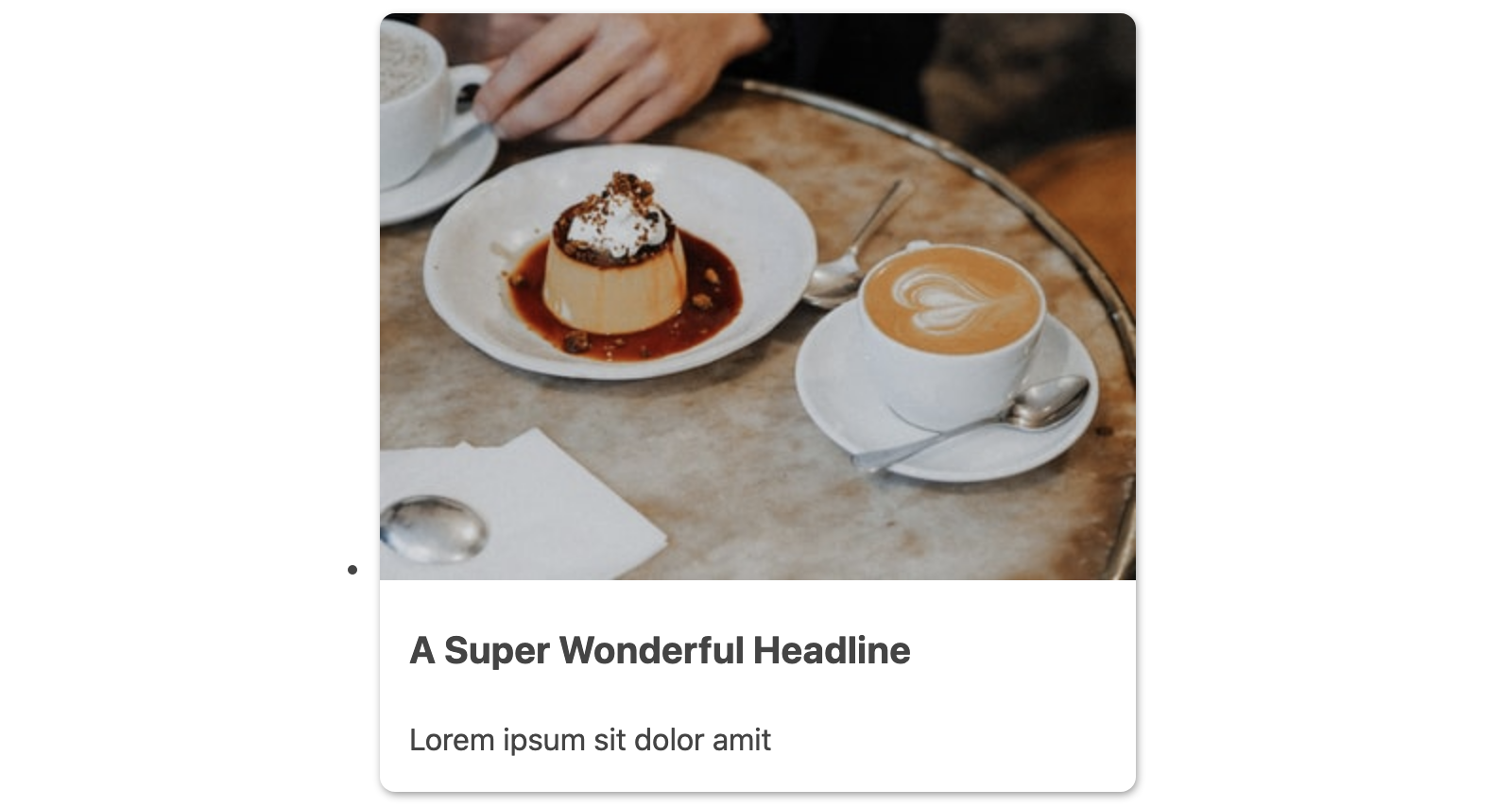
<h3>A Super Wonderful Headline</h3>
<p>Lorem ipsum sit dolor amit</p>
</li>
<!-- additional cards -->
</ul>
Next, we’ll create a minimal set of baseline styles for the .card component. We’ll set some basic visual styles for the card itself, a quick update to the expected h3 headline, then essential styles to begin to style the card image.
.card {
  background-color: #fff;
  border-radius: 0.5rem;
  box-shadow: 0.05rem 0.1rem 0.3rem -0.03rem rgba(0, 0, 0, 0.45);
  padding-bottom: 1rem;
}

.card > :last-child {
  margin-bottom: 0;
}

.card h3 {
  margin-top: 1rem;
  font-size: 1.25rem;
}

img {
  border-radius: 0.5rem 0.5rem 0 0;
  width: 100%;
}

img ~ * {
  margin-left: 1rem;
  margin-right: 1rem;
}
The last rule uses the general sibling combinator to add a horizontal margin to any element that follows the img since we want the image itself to be flush with the sides of the card.
And our progress so far leads us to the following card appearance:
Finally, we’ll create the .card-wrapper styles for a quick responsive layout using CSS grid. This will also remove the default list styles.
.card-wrapper {
  list-style: none;
  padding: 0;
  margin: 0;
  display: grid;
  grid-template-columns: repeat(auto-fit, minmax(30ch, 1fr));
  grid-gap: 1.5rem;
}
Note: If this grid technique is unfamiliar to you, review the explanation in my tutorial about modern solutions for the 12-column grid.
With this applied and with all cards containing an image with a valid source path, our .card-wrapper styles give us the following layout:
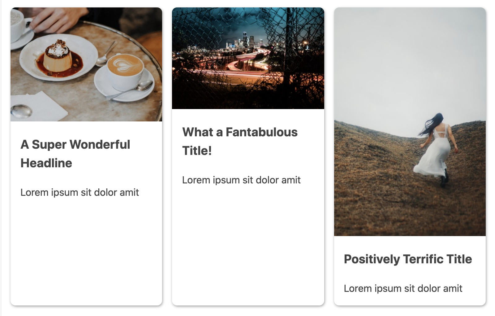
As demonstrated in the preview image, these baseline styles aren’t enough to properly contain the images given their varying natural dimensions. We’re in need of a method to constrain these images uniformly and consistently.
Enable Uniform Image Sizes With object-fit
As noted earlier, you may previously have made an update in this scenario to change the images to be added via background-image instead and used background-size: cover to handle nicely resizing the image. Or you may have tried to enforce cropping ahead of time (still a worthy goal since any image size reduction will improve performance!).
Now, we have the property object-fit available which enables an img tag to act as the container for the image. And, it comes with a cover value as well that results in a similar effect as the background image solution, but with the bonus of retaining the semantics of an inline image. Let’s apply it and see how it works.
We do need to pair it with a height dimension for extra guidance on how we want the image container to behave (recall we had already added width: 100%). And we’re going to use the max() function to select either 10rem or 30vh depending on which is larger in a given context, which prevents the image height from shrinking too much on smaller viewports or when the user has set a large zoom.
img {
  /* ...existing styles */
  object-fit: cover;
  height: max(10rem, 30vh);
}
Bonus Accessibility Tip: You should always test your layouts with 200% and 400% zoom on desktop. While there isn’t currently a zoom media query, functions like max() can help resolve layout issues. Another context this technique is useful is spacing between elements.
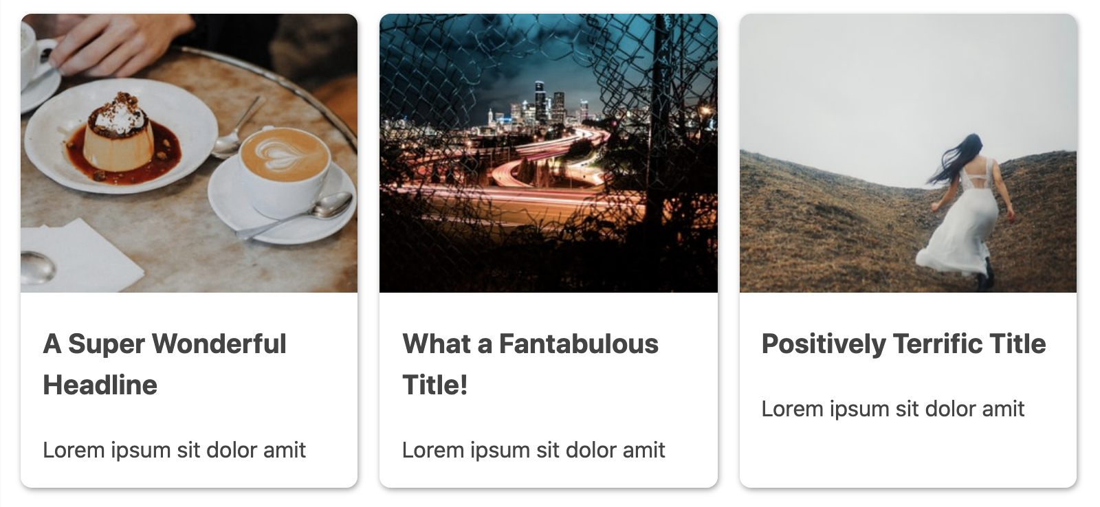
With this update, we’ve definitely improved things, and the visual result is as if we’d use the older background image technique:
Responsively Consistent Image Sizing With aspect-ratio
When using object-fit by itself, one downside is that we still need to set some dimension hints.
An upcoming property (currently available in Chromium browsers) called aspect-ratio will enhance our ability to consistently size images.
Using this property, we can define a ratio to resize the image instead of setting explicit dimensions. We’ll continue to use it in combination with object-fit to ensure these dimensions only affect the image as a container, otherwise, the image could appear distorted.
Here is our full updated image rule:
img {
  border-radius: 0.5rem 0.5rem 0 0;
  width: 100%;
  object-fit: cover;
  aspect-ratio: 4/3;
}
We’re going to start with an image ratio of 4⁄3 for our card context, but you could choose any ratio. For example, 1⁄1 for a square, or 16⁄9 for standard video embeds.
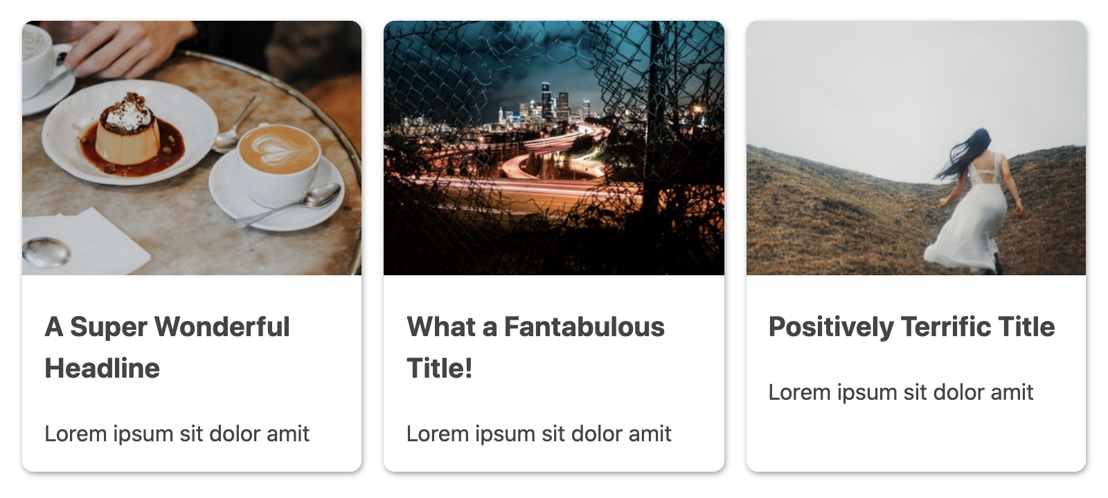
Here are the updated cards, although it will probably be difficult to notice the visual difference in this particular instance since the aspect ratio happens to closely match the appearance we achieved by setting the height for object-fit alone.
“
Adding Responsive Effects With CSS Gradients And Functions
OK, now that we know how to setup consistently sized images, let’s have some fun with them by adding a gradient effect!
Our goal with this effect is to make it appear as though the image is fading into the card content. You may be tempted to wrap the image in its own container to add the gradient, but thanks to the work we’ve already done on the image sizing, we can work out how to safely do it on the main .card.
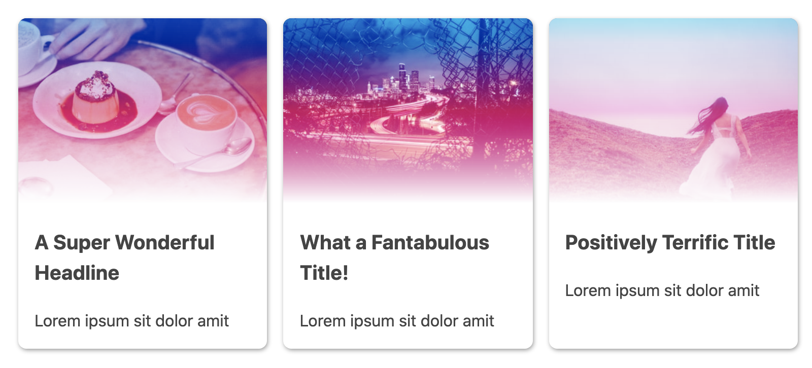
The first step is to define a gradient. We’re going to use a CSS custom property to add in the gradient colors to enable easily swapping the gradient effect, starting with a blue to pink. The last color in the gradient will always be white to maintain the transition into the card content background and create the “feathered” edge.
.card {
  --card-gradient: #5E9AD9, #E271AD;

  background-image: linear-gradient(
    var(--card-gradient),
    white max(9.5rem, 27vh)
  );
  /* ...existing styles */
}
But wait — is that a CSS max() function? In a gradient? Yes, it’s possible, and it’s the magic that makes this gradient effective responsively!
However, if I were to add a screenshot, we wouldn’t actually see the gradient having any effect on the image yet. For that, we need to bring in the mix-blend-mode property, and in this scenario we’ll use the overlay value:
img {
  /* ...existing styles */
  mix-blend-mode: overlay;
}
The mix-blend-mode property is similar to applying the layer blending styles available in photo manipulation software like Photoshop. And the overlay value will have the effect of allowing the medium tones in the image to blend with the gradient behind it, leading to the following result:
Now, at this point, we are relying on the aspect-ratio value alone to resize the image. And if we resize the container and cause the card layout to reflow, the changing image height causes inconsistencies in where the gradient fades to white.
So we’ll add a max-height property as well that also uses the max() function and contains values slightly greater than the ones in the gradient. The resulting behavior is that the gradient will (almost always) correctly line up with the bottom of the image.
img {
  /* ...existing styles */
  max-height: max(10rem, 30vh);
}
“
However, aspect-ratio will still continue to ensure the images resize consistently as was the benefit over only object-fit. Try commenting out aspect-ratio in the final CodePen demo to see the difference it’s making across container sizes.
Since our original goal was to enable consistently responsive image dimensions, we’ve still hit the mark. For your own use case, you may need to fiddle with the ratio and height values to achieve your desired effect.
Alternate: mix-blend-mode And Adding A Filter
Using overlay as the mix-blend-mode value was the best choice for the fade-to-white effect we were looking for, but let’s try an alternate option for a more dramatic effect.
We’re going to update our solution to add a CSS custom property for the mix-blend-mode value and also update the color values for the gradient:
.card {
  --card-gradient: tomato, orange;
  --card-blend-mode: multiply;
}

img {
  /* ...existing styles */
  mix-blend-mode: var(--card-blend-mode);
}
The multiply value has a darkening effect on mid-tones, but keeps white and black as is, resulting in the following appearance:
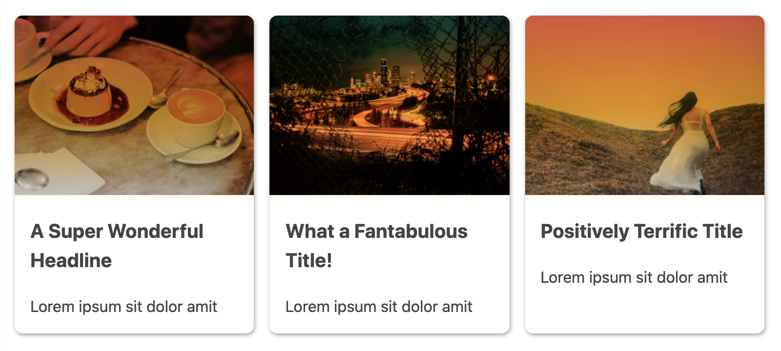
While we’ve lost the fade and now have a hard edge on the bottom of the image, the white part of our gradient is still important to ensure that the gradient ends prior to the card content.
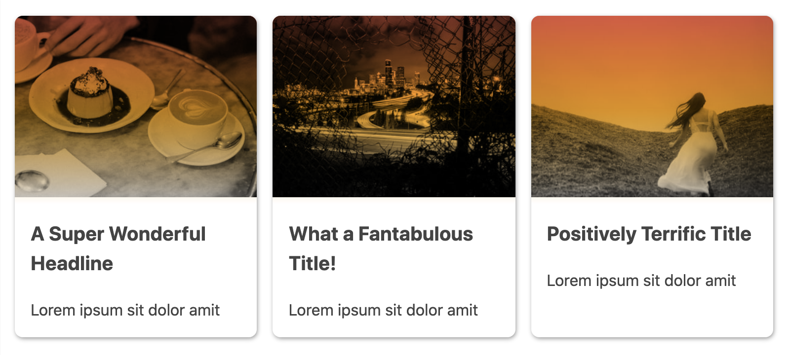
One additional modification we can add is the use of filter and, in particular, use the grayscale() function to remove the image colors and therefore have the gradient be the only source of image coloring.
img {
  /* ...existing styles */
  filter: grayscale(100);
}
Using the value of grayscale(100) results in complete removal of the image’s natural colors and transforming it into black and white. Here’s the update for comparison with the previous screenshot of its effect when using our orange gradient with multiply:
Use aspect-ratio As A Progressive Enhancement
As previously mentioned, currently aspect-ratio is only supported in the latest version of Chromium browsers (Chrome and Edge). However, all browsers support object-fit and that along with our height constraints results in a less-ideal but still acceptable result, seen here for Safari:
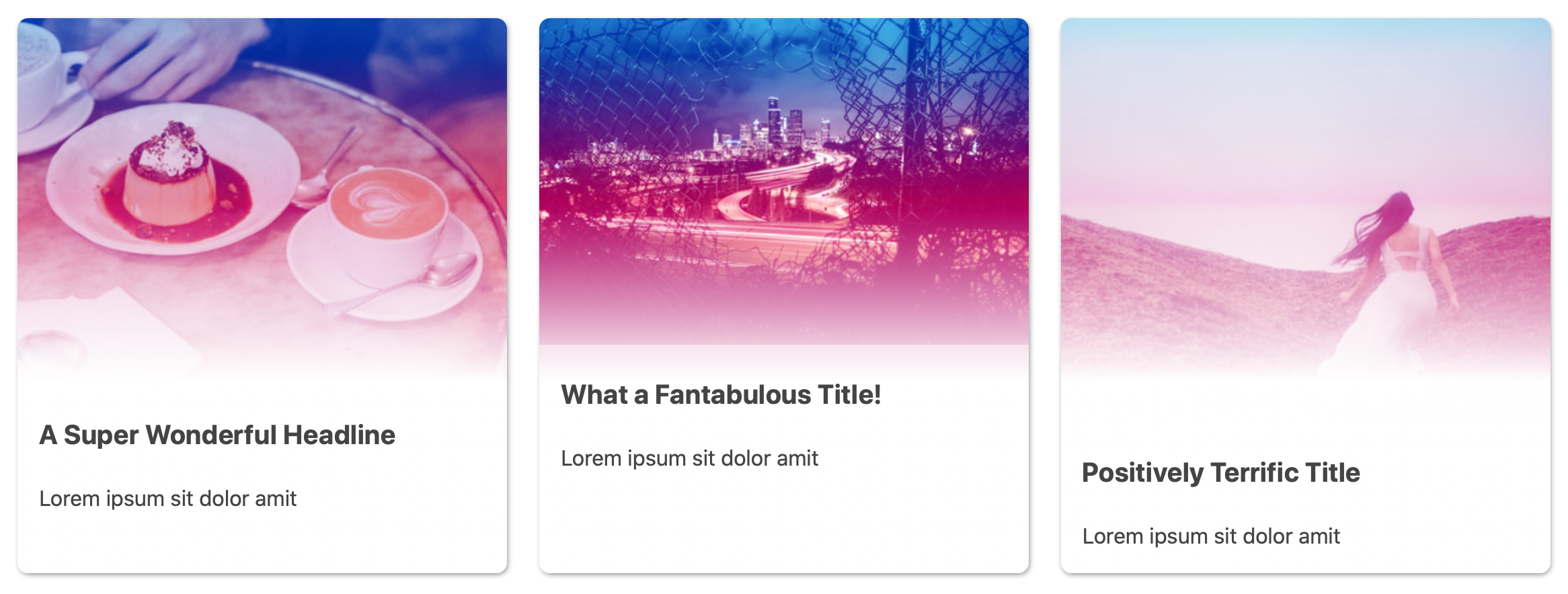
Without aspect-ratio functioning, the result here is that ultimately the image height is capped but the natural dimensions of each image still lead to some variance between card image heights. You may want to instead change to adding a max-height or make use of the max() function again to help make a max-height more responsive across varying card sizes.
Extending The Gradient Effects
Since we defined the gradient color stops as a CSS custom property, we have ready access to change them under different contexts. For example, we might change the gradient to more strongly feature one of the colors if the card is hovered or has one of its children in focus.
First, we’ll update each card h3 to contain a link, such as:
<h3><a href="">A Super Wonderful Headline</a></h3>
Then, we can use one of our newest available selectors — :focus-within — to alter the card gradient when the link is in focus. For extra coverage of possible interactions, we’ll couple this with :hover. And, we’ll reuse our max() idea to assign a single color to take over coverage of the image portion of the card. The downside to this particular effect is that gradient stops and color changes aren’t reliably animateable — but they will be soon thanks to CSS Houdini.
To update the color and add the new color stop, we just need to re-assign the value of --card-gradient within this new rule:
.card:focus-within,
.card:hover {
  --card-gradient: #24a9d5 max(8.5rem, 20vh);
}
Our max() values are less than the original in use for white to maintain the feathered edge. If we used the same values, it would meet the white and create a clearly straightedge separation.
In creating this demo, I originally tried an effect that used transform with scale for a zoom-in effect. But I discovered that due to mix-blend-mode being applied, the browser would not consistently repaint the image which caused an unpleasant flickering. There will always be trade-offs in requesting the browser perform CSS-only effects and animations, and while it’s very cool what we can do, it’s always best to check the performance impact of your effects.
Have Fun Experimenting!
Modern CSS has given us some awesome tools for updating our web design toolkits, with aspect-ratio being the latest addition. So go forth, and experiment with object-fit, aspect-ratio, and adding functions like max() into your gradients for some fun responsive effects! Just be sure to double-check things cross-browser (for now!) and across varying viewports and container sizes.
Here is the CodePen including the features and effects we reviewed today:
See the Pen Responsive Image Effects with CSS Gradients and aspect-ratio by Stephanie Eckles.
Looking for more? Make sure you check out our CSS Guide here on Smashing →
Further Reading
- It’s Time To Talk About “CSS5”
- Sticky Headers And Full-Height Elements: A Tricky Combination
- Generating Unique Random Numbers In JavaScript Using Sets
- Responsive Web And Desktop Development With Flutter
 (vf, il, mrn)

