A Complete Guide To Accessible Front-End Components

Email Newsletter
Weekly tips on front-end & UX.
Trusted by 182,000+ folks.

 Custom Web Forms for Angular, React, & Vue. Your backend.

 Celebrating 10 million developers
Table Of Contents
Below you’ll find an alphabetical list of all accessible components. Skip the table of contents, or just scroll down to explore them one-by-one.
- :focus styles
- autocomplete
- buttons
- cards
- carousels
- "close" buttons
- content sliders
- checkboxes
- color systems
- color palettes
- comics
- component libraries
- cookie consent prompts
- current page navigation
- dark mode
- data charts
- data visualizations
- date pickers
- disabled buttons
- dividers
- documentation
- focus styles
- form styles
- footnotes
- hiding content
- icon links
- inputs
- keyboard navigation
- links
- media scrollers
- modals
- navigation menu
- password fields
- prefers-reduced-*
- radio buttons
- skeletons
- “skip” links
- SVGs
- tabs
- tables
- testing
- third-party component accessibility
- toggle switches
- tools
- tooltips
- video/audio players
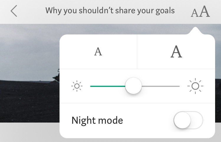
Accessible :focus Styles
Every browser has default focus styles, yet out of the box, they aren’t very accessible. The goal of :focus is to give the user guidance on where exactly they are in the document and help them navigate through it. To achieve that, we need to avoid a focus that’s too subtle or not visible at all. In fact, removing outline is a bad idea as it removes any visible indication of focus for keyboard users. The more obvious the focus is, the better.

:focus Styles (Large preview)There are ways of designing better :focus styles. In her article Tips For Focus Styles, Nic Chan highlights a few helpful tips on how to improve focus styles with better affordance and a bit of padding, offset, and proper outlines. Sara Soueidan also published a helpful reference guide to designing accessible, WCAG-compliant focus indicators. The guide is aimed at both designers who want to learn about accessibility considerations, as well as developers who want to implement them. Need more fun with :focus styles? Lari Maza has got your back, too.
We can also use :focus-within to style the parent element of a focused element, and :focus-visible to not show focus styles when interacting with a mouse/pointer if it causes any issues in your design.
It’s important co consider the accessibility concerns around :focus-visible: as Hidde de Vries has noted, not all people who rely on focus styles use a keyboard and making focus styles keyboard-only takes away an affordance for mouse users too, as focus also indicates that something is interactive (thanks to Jason Webb for the tip!).
Finally, it’s worth noting that most recently Chrome, Edge, and other Chromium-based browsers stopped displaying a focus indicator (focus ring) when the user clicks or taps a button (thanks to Kim Johannesen for the tip!).
Accessible Autocomplete
Every time you have to deal with a larger data set, be it a map, a data visualization, or just a country selector in checkout, autocomplete can boost customer’s input massively. But just as it helps with the input, it needs to help with announcing the options and the selection to the screen reader users as well.
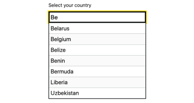
Gov.uk, the team behind the Government Digital Service in UK, has open-sourced accessible-autocomplete (among many other things), a JavaScript component that follows WAI-ARIA best practices. You can choose when to start displaying suggestions, and allows to display the menu as an absolutely positioned overlay, or select the first suggestion by default. The team also provides a demo page, with a dozen of accessible autocomplete examples and implementations.
The team at Adobe also created an accessible autocomplete experience for the React implementation of their Spectrum design system. Daniel Lu shares some valuable insights into the component and the problems it solves.
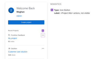
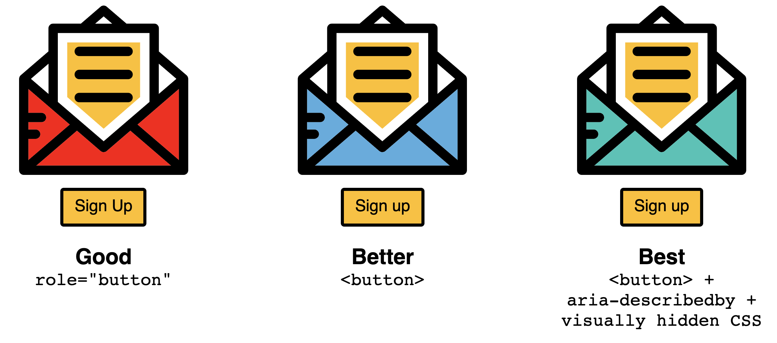
Accessible Buttons And Icon Links
It’s not uncommon to have a link or button that visually has no text but consists only of an icon — a compact navbar, for example, or social icons. But how do you make sure that these kinds of icon links are fully accessible? As it turns out, it’s not as straightforward as one might think.
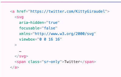
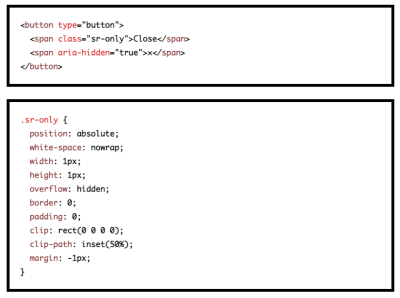
To show how we can do better, Kitty Giraudel dedicated an article “Accessible Icon Links” to the issue. They use an icon link consisting of an SVG with the iconic Twitter bird to illustrate the point, and shows step by step how to make it accessible: with a descriptive text that is visually hidden, then removing the SVG markup from the accessibility tree with aria-hidden, and, finally, correcting the fact that svg elements can be focused on Internet Explorer by adding the focusable attribute. At the end of the article, Kitty also shows how to turn all of this into a little React component.
A small detail that will make a huge difference for a lot of users.
In Creating Accessible Icon Buttons and Inclusively Hidden, Sara Soueidan and Scott O’Hara go into all the fine intricacies and details of icon buttons, exploring a number of techniques to make it work. Sara and Scott explore a number techniques, suggesting to use an appropriate technique for accessible visually hidden text — the text that will be visually hidden but accessible to screen readers. This could be done with a .sr-only utility class, or hidden and aria-labelledby, or aria-label alone. Sara wouldn’t recommend to use the SVG icon itself to provide a label for the button when I can provide one on the button itself directly.
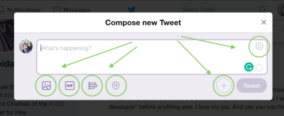
In general though, there is still quite a bit of confusion which element to use for user interaction: when do we use links, and when do we use buttons? Marcy Sutton has written a detailed piece on Links vs. Buttons in Modern Applications. With a link, the visitor navigates to a new resource, taking them away from the current context. But a button prompts a change in the interface.
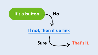
Marcy outlines use cases for both links and buttons in single-page applications, showing that a button is a perfect element for opening a modal window, triggering a pop-up, toggling an interface or playing media content. You can also check Vadim Makeev’s article on “When Is A Button Not A Button?”.
Accessible Disabled Buttons
It has become quite common for lengthy web forms to keep the “Continue” button disabled until the customer has provided all data correctly. This behavior acts as an indicator that something is wrong with the form, and it can’t be completed without reviewing the input. This works if the inline validation for every input field is working well, and it doesn’t work at all when it’s glitchy or buggy.
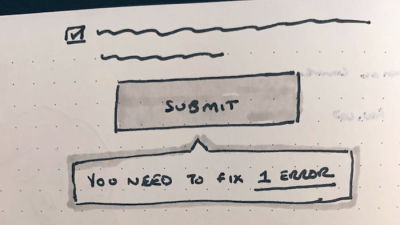
In “Disabled Buttons Suck”, Hampus Sethfors highlights the downsides of disabled buttons. With them in place, we do communicate that something is wrong, but we don’t really explain what is wrong, or how to fix it. So if the customer has overlooked an error message — be it in a lengthy form on desktop, or even in a short form on mobile, they’ll be lost. In many ways, keeping buttons active and communicating errors is more efficient.
And if it’s not possible, at least provide a way out with a button “I can’t complete the form, please help”, so customer support can get back to customers in case they get into trouble. If you need a more detailed refresher on web forms, “Form Design From One to Zero” will keep you busy.
In her article on CSS-Tricks, Sandrina Pereira explores the issue that the common way of using <button disabled> prevents not only the click but also the focus. While this might seem harmless, it causes confusion for screen reader users. Her suggestion: Swapping disabled with aria-disabled makes the experience more enjoyable as the button is still accessible by focus and it can trigger a tooltip, too — although marked disabled.
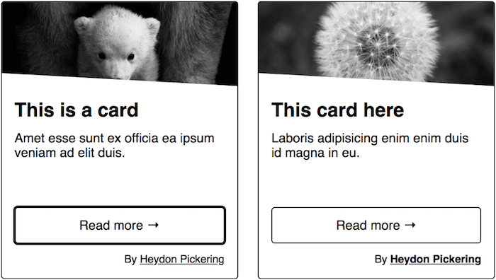
Accessible Cards
Cards offer a lot of advantages. They work well on mobile, provide large click areas, and the fact that they can be stacked both horizontally and vertically makes a lot of layout decisions easier. However, there’s no accessibility standard to follow, no <card> element or an ARIA design pattern. Instead, the potential accessibility barriers you might encounter depend on the card’s purpose and content. In his collection of inclusive components, Heydon Pickering looks into a few permutations of a simple card component and how to keep the balance between sound HTML structure and ergonomic interaction.
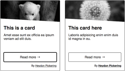
Adrian Roselli also wrote a great article that tackles an aspect of cards that can easily turn into their main accessibility pitfall: large click areas. They can make for extremely verbose controls when a user uses a screen reader to navigate them; for voice users, it can be confusing what to say to select the call to action. Adrian demonstrates how a little planning can solve this issue.
Another deep-dive into accessible card components comes from the team at Nomensa: In their blog post, they take a look at common issues around cards and block links and share valuable tips for making your cards more accessible — by re-ordering content to improve semantics, for example.
Accessible Carousels And Content Sliders
An accessible carousel sounds a bit like oxymoron — while there are plenty of scripts that provide the functionality, only few of them are accessible. Now there are, of course, accessible range sliders, but carousels are a slightly different component. As Alison Walden notices in her article on “If you must use a carousel, make it accessible”, the sighted person is not forced to use the carousel at all, but keyboard users are forced to navigate through the carousel in its entirety. At the very least, a hidden “skip” link could appear on keyboard focus. Also, once the person has tabbed through all the panel sets, focus should move to the next interactive element that follows the carousel.

Heydon Pickering suggests to use list markup to group the slides together, include previous and next buttons, snap points, and use invisible linked items removed from focus. The article also provides a code sample which uses IntersectionObserver, so you might need a polyfill for it.
Accessible Close Buttons
“Close” buttons are everywhere — in modals, ads, confirmation messages, cookie prompts and any overlays that will appear in your interface. Unfortunately, the functionality is often limited to mouse users, leaving screen reader users and keyboard-users out. We can fix it.
In “Accessible Close Buttons” Manuel Matuzovic goes into deep details highlighting 11 examples and patterns of inaccessible close buttons as well as 5 examples of close buttons that work fairly well. The easiest way to solve the problem is to provide a button with visible text and only visually accessible icon and ensure that the description by screen readers isn’t polluted by the icon’s description. Manuel also provides code examples of 5 close buttons that you can apply to your work right away.
Accessible Checkboxes And Radio Buttons
The good ol’ issue: how do we style checkboxes and radio-buttons to ensure that they look, well, at least similar, in most browsers — while ensuring that they stay accessible as well? In her article, Sara Soueidan covers a few techniques to keep in mind to achieve the desired result.
Sara covers the different techniques for hiding elements, how each of them affects the accessibility of the content, and how to visually hide them, so they can be replaced with a more styleable alternative: the SVG.
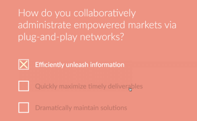
When hiding an interactive element, we need to make sure we choose a hiding technique that keeps it screen reader-accessible, position it on top of whatever is visually replacing it, so that a user navigating by touch can find it where they expect to, and then make it transparent. Sara also provides live demos that we can use right away, along with useful references to articles for further reading.
Update May 2022: With browser quirks and inconsistencies ironed out, there are very few reasons to continue using workarounds if you want to style checkboxes and radio buttons. Scott O’Hara takes a closer look at the current state of things and explains what you need to account for in your CSS to customize styling and how to add additional effects like animation without causing accessibility issues.
Accessible Color Systems
Getting color contrast right is an essential part of making sure that not only people with visual impairments can easily use your product but also everyone else when they are in low-light environments or using older screens. However, if you’ve ever tried to create an accessible color system yourself, you probably know that this can be quite a challenge.

The team at Stripe recently decided to tackle the challenge and redesign their existing color system. The benefits it should provide out of the box: pass accessibility guidelines, use clear and vibrant hues that users can easily distinguish from one another, and have a consistent visual weight without a color appearing to take priority over another. If you’re curious to find out more about their approach, their blog post on accessible color systems will give you valuable insights.
Accessible Color Palettes
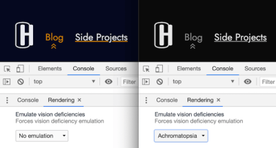
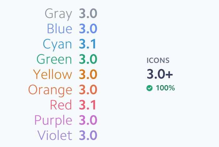
Finding the perfect tint or shade of a color is not only a matter of taste but also accessibility. After all, if color contrast is lacking, a product could, in the worst case, even become unusable for people with vision impairments. WCAG 2.0 level AA requires a contrast ratio of at least 4.5:1 for normal text.) and 3:1 for large text, and WCAG 2.1 requires a contrast ratio of at least 3:1 for graphics and UI components (such as form input borders). AAA requires a contrast ratio of at least 7:1 for normal text and 4.5:1 for large text. A very detailed contrast checker to help you detect potential pitfalls ahead of time comes from Gianluca Gini: Geenes.
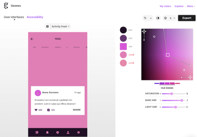
The tool lets you tinker with hue ranges and saturation and apply the color palettes to one of three selectable UI mockups. Once applied, you can trigger different kinds of vision impairments to see how affected people see the colors and, finally, make an informed decision on the best tones for your palette. To use the colors right away, just copy and paste their code or export them to Sketch. You can also emulate vision deficiencies in DevTools.
Automating Accessibility Testing
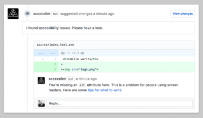
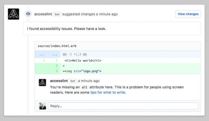
Maybe it’s a missing alt attribute or a heading structure that isn’t semantic, often it’s little accessibility issues like these that slip our attention and make it into production. The GitHub app AccessLint is here to prevent this from happening by bringing automated web accessibility testing into your development workflow: When you open a pull request or make edits to an existing one, AccessLint is already there, automatically reviewing the changes and commenting with any new accessibility issue before the code goes live.
But what about end-to-end testing with real assistive technology? To make it easier for developers, PMs, and QA to perform repeatable, automated tests with real assistive technology — without having to learn how to actually use a screen reader — Cameron Cundiff built Auto VO. Auto VO is a node module and CLI for automated testing of web content with the VoiceOver screen reader on macOS. If you want to dive deeper into how it works, Cameron summarized everything you need to know in an article.
Understanding Visual Impairments
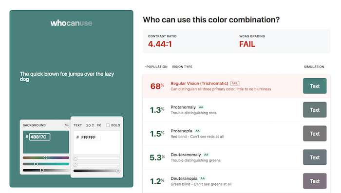
You’ve probably heard of protanopia, deuteranopia, or glaucoma before. But how do people with visual impairments like these actually see your color combinations? Corey Ginnivan’s tool Who Can Use simulates it for you.

Enter a background and a text color and the tool calculates the contrast ratio as well as the WCAG grading for you. To humanize these rather abstract numbers, Who Can Use also shows a list of different vision types, how many people are affected by them, and, of course, the simulation of your color combination for each type. A great little helper to better understand the effect of color.
Accessible Comics
When we use slightly more complex shapes and layouts on the web, sometimes it appears to be so much easier to just save it as a foreground or background image and serve different images to small and large screens. This holds true for complicated charts and graphs as well as good old comics with speaking bubbles, but what if we could re-imagine the experience altogether?
Comica11y is an experiment by Paul Spencer that aims to achieve an all-inclusive online comic reading experience. What if we could have different reading modes for the comic, e.g. with closed captions, proper focus management to navigate between panels, high-contrast mode, SVG color blindness filters, programatic bubbles, selectable and translatable text, LTR and RTL support, and even adjustable font sizes? A wonderful initiative that shows just how far we can take UI challenges and use the web to enhance the experience greatly.
Accessible Component Libraries
While many of the component libraries we create are trying to cover all the usual suspects (the accordions, the tables, the carousels, the drop-downs, along with typography, colors and box shadows), No Style Design System by Adam Silver is focused primarily around accessibility and web forms.
As a system created for and used in his book on Form Design Patterns, Adam’s library provides a set of accessible components for everything from autocomplete, checkboxes and password reveal to radios, select boxes and steppers. Most of them have a minimal CSS styling with clean, accessible markup.
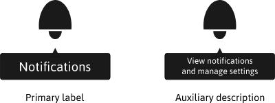
And if you need slightly more advanced components, Heydon Pickering’s Inclusive Components — we mentioned some examples from it above — has got your back: with comprehensive tutorials on accessible cards, data tables, notifications, sliders, tabbed interfaces, tooltips, menus and toggles.
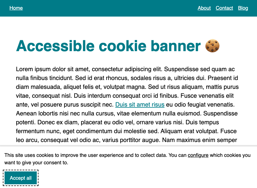
Accessible Cookie Consent Prompts
Overlays and pop-ups are always problematic. But especially for screen reader users, sometimes those prompts are incredibly difficult to deal with to set any settings or even confirm the usage of cookies on the site. In her 15-mins talk on “Screen readers and cookie consents”, Leonie Watson goes into detail explaining the poor experiences that compliance pop-ups have for accessibility. In some cases, users glide past consent prompts without being aware of them, in the others, the prompt are impossible to accept, resulting in an inability to use the site at all.

So how can we make them better? In Cookie banners and accessibility, Sheri Byrne-Haber highlights common issues that cookie prompts usually have: from how they visually appear to focus traps, the appearance in the tab order, the type of acceptance and alternate formats of consent disclosure. Quentin Bellanger provides a basic code example of a cookie consent modal and a tutorial along with it. There are also free open-source solutions: Osano Cookie Consent and cookie-consent-box, but they might require some accessibility work.
Accessible Current Page Navigation States
Color is an effective way to convey meaning, but it’s always a good idea to have a second visual indicator for people with low vision or color vision deficiencies, too. An icon, for example. Callum Hart relies on a color/icon combination to indicate the page a user is currently on. In his blog post “An Accessible Current Page Navigation State”, he shares valuable insights into the considerations behind this design decision.
From inlining the SVG icon in the HTML and using aria-hidden to hide it from assistive technologies to using ems instead of pixels and conveying additional context for screenreader users with the aria-current attribute, the post provides an in-depth look at how to cater for a truly accessible navigation state.
A Complete Guide To Dark Mode On The Web
Dark mode is quickly becoming a user preference with Apple, Windows, and Google having it implemented into their operating systems. But what about dark mode on the web? Adhuham wrote a comprehensive guide to dark mode that delves into different options and approaches to implementing a dark mode design on the web.
To start off, the guide looks at the technical considerations that implementing a dark mode entails, covering different approaches to toggling the themes and how to store a user’s preferences so that they will be applied consistently throughout the site and on subsequent visits. Tips for handling user agent styles with the color-scheme meta tag help avoid potential FOIT situations.
Design considerations are also tackled, of course, with valuable tips to get images, shadows, typography, icons, and colors ready for dark mode. While on it: to ensure we don’t unintentionally break the high contrast in mode, take a look at Styling for Windows High Contrast mode (thanks for the tip, Courtney Heitman!).
Accessible Data Charts
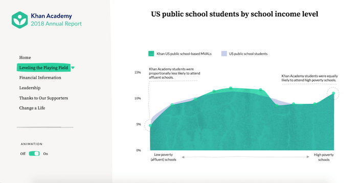
Data visualizations are a great way to make information stand out. However, they also come with their own accessibility challenges. When Sara Soueidan teamed up with SuperFriendly to create an accessible micro-site for Khan Academy’s annual report, she wanted to make sure that the way the data is presented and implemented is as accessible as possible, regardless of how a visitor explores the site. Her solution: SVG.

In a case study on accessible data charts, Sara summarized everything you need to consider when you want to make your SVG charts and visualizations accessible — beginning with the most important step of choosing an appropriate embedding technique. It also covers why you should avoid trying to make an SVG chart accessible using ARIA roles and why Sara didn’t choose <figure> to embed them. A fantastic reference guide. Plus: especially on graphs we could also use better accessible text labels, and Sara covers them in a separate article as well.
Accessible Data Visualizations
Data visualizations often contain important information that users have to act upon. While sometimes we can use large numbers with short sentences instead, visualizations can help understand developments and large amount of information faster. But that means that the information has to be easy to understand, and that refers especially to the selection of colors, the way information is presented, labels, legends as well as patterns and shapes. In their series of articles on accessibility in data visualizations, Sarah L. Fossheim highlights useful guidelines and resources around the topic, along with examples, do’s and don’ts to keep in mind when designing accessible data visualizations.

Sarah suggests to not rely on color to explain the data, and avoid bright and low-contrast colors in general. Using patterns and shapes in addition to color is useful, and clear language, labels and legends can help clearly explain the data visualization. Every article is packed with plenty of examples and resources for further reading. Also worth checking: Sarah’s review of US presidential election data visualizations (thanks to Stephanie Eckles for the tip!).
A Flexible Data Visualization Library
When Torstein Hønsi was looking for a simple charting tool for updating his homepage with snow depth measurements from the local mountain where his family keeps a cabin, he was frustrated with what he found. And, well, that’s when he decided to build his own solution and share it with the world. The result is Highcharts, a flexible charting library that comes with all the tools you need to create reliable and secure data visualizations.

Built on JavaScript and TypeScript, Highcharts works with any back-end database or server stack and includes all essential chart types — line, bar, area, column, advanced and more. All charts intelligently adapt to any device and screen size, and they are accessible to visually impaired users, too. You can download and try out Highcharts for free. There’s also a completely free option for non-profit organizations, personal websites, and school projects.
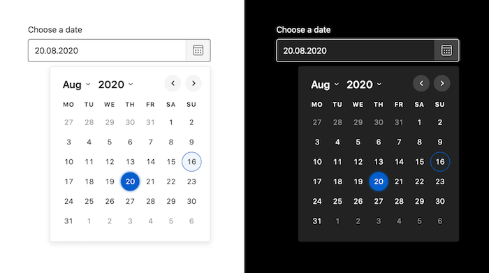
Accessible Date Pickers
There are dozens of date picker libraries out there, but it’s always great to have reliable workhorses that just work across browsers, don’t have heavy dependencies, are written reasonably well, and meet all major accessibility requirements.
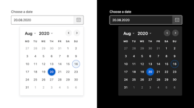
Duet Date Picker is just like that. It’s an accessible, WCAG 2.1 compliant date picker that can be implemented and used across any JavaScript framework or no framework at all. It comes with built-in functionality that allows you to set a minimum and a maximum allowed date, and weighs around 10kb minified and Gzip’ed (this includes all styles and icons).
If you need an alternative, check out React Dates, a library released by Airbnb that’s optimized for internationalization, while also being accessible and mobile-friendly.
Styling Horizontal Dividers
<hr> elements are usually quite boring. Plain, horizontal lines that provide a visual break and divide content. But did you know that they can be styled using CSS and SVG to give your content and designs a nice personal touch?
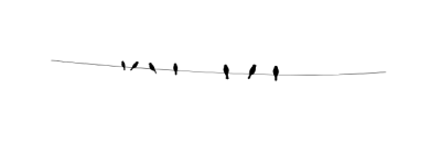
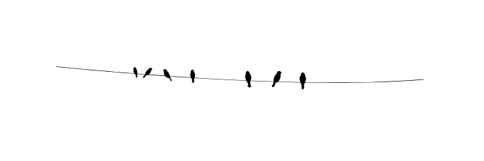
` styled as birds on a wire. (Large preview)
Sara Soueidan did exactly that: The <hr>s on her personal site aren’t displayed as boring lines, instead, you’ll see birds sitting on a wire. To help you make your <hr>s more delightful, too, Sara summarized how she styled horizontal lines with the help of some CSS and SVG magic. She also looks into ways to further improve them so that they adapt to various contexts while remaining semantic and accessible. A nice little detail.
Documenting Accessibility For UX Designers
How can a UX design team that doesn’t talk about software accessibility or inclusive design adopt an accessibility mindset? Elise Livingston shares some of the processes and tools she created to help her team at Qualtrics design more accessible software.
The process that had the greatest impact on building an accessibility-focused culture in Elise’s team was adding accessibility information to all of their design documents. Each design that they hand over to engineering includes things like keyboard behaviors, labels, and semantics. By doing that, they not only improve product accessibility but it also helps the team to think about accessibility and disability-centered scenarios already at the beginning of the design process.
Accessible Cross-Browser Form Styles
Have you ever struggled with hiding and styling custom checkboxes and radio buttons? What about custom select-styles? Or perhaps an accessible dropdown-navigation menu? We tend to build and rebuild the same components all the time, so let’s get them right once and for all.

Sarah Higley’s “<select> your poison” is a comprehensive two-part deep dive into all the challenges and intricacies of styling the <select> element, with editable and multi-select variants, their comparative usability (with data!) and practical recommendations of how to get it right.
Stephanie Eckles’ Modern CSS Solutions for Old CSS Problems highlights plenty of useful modern techniques to solve plenty of challenges, but some articles from her series are dedicated to forms: CSS custom checkboxes, styled radio buttons, select styles, inputs, and textareas.
On her blog, Sara Soueidan goes into detail explaining how to inclusively hide and style checkboxes and radio buttons. Bonus: Adrian Roselli’s code examples provides additional insights into under-engineered toggles. Fantastic resources to use right away and style forms accessibly.
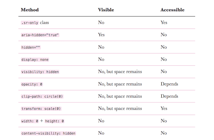
Hiding Content Responsibly
How do you hide content responsibly to make it invisible but still accessible for screen readers? Kitty Giraudel summarized different ways of hiding something, be it with HTML or CSS, and when to use which.
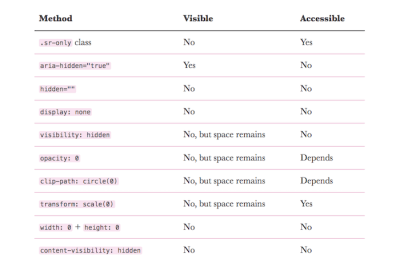
As Kitty suggests, you might want to avoid having too many discrepancies between the visual content and the underlying content exposed to the accessibility layer. The more they are in sync, the better. Kitty defines three different scenarios to help you assess when to use which technique: If you need to hide something both visually and from the accessibility tree (show/hide widgets, offscreen navigation, or a closed dialog, for example), use display: none or the hidden HTML attribute. If you need to hide something from the accessibility tree but keep it visible, use aria-hidden="true" (valid cases are visual content void of meaning, icons). And, last but not least, if you want to hide something but keep it accessible, use the visually hidden CSS declaration group (e.g., for complementary content that provides more context, such as for icon buttons or links). A great overview.
Accessible Footnotes And Sidenotes
In their essence, footnotes aren’t much more than jump-links — links to the description of a source, either placed at the bottom of the document, or in the sidebar, or appearing inline, a little accordion. However, as footnotes are jump-links, we need to ensure that screen reader users understand when links are references to footnotes — and we can do it with the aria-describedby attribute. The counter for every link would be implemented via a CSS counter. With :target, we then highlight the row which the reader has jumped to, and we provide a back-link back to the actual footnote place in the content.
Kitty Giraudel goes into detail explaining how to build accessible footnotes, and you can also check how to build accessible footnotes with React and use react-a11y-footnotes to build them in React with Eleventy (thanks to Kitty Giraudel for the tip!).
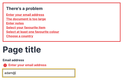
Accessible Inputs
In 2019, WebAIM analyzed the accessibility of the top one million websites, with a shocking conclusion: the percentage of error-free pages was estimated to be under one percent. To make our sites inclusive and usable for people who rely on assistive technology, we need to get the basics of semantic HTML right. With its credo of starting small, sharing, and working together, Oscar Braunert’s article on inclusive inputs is a great starting point to do so.
Starting off with the basics of WAI, ARIA, and WCAG, the article explores how to make inputs more accessible. The tips can be implemented without changing the user interface, and, as Oscar puts it: “If in doubt, just do it. Nobody will notice. Except some of your users. And they will thank you for it.”
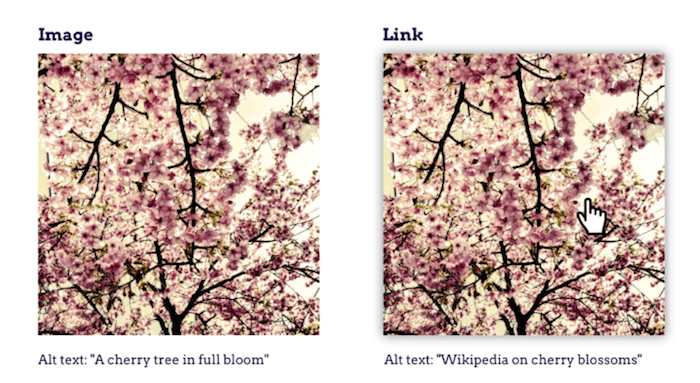
The Perfect Link
A link is a link is a link, right? Well, there’s more to a link than just a clickable word or image. With her article “The perfect link”, Rian Rietveld examines how to write, design, and code a link that works for everyone on every device.

Rian covers the question if a link should open in a new window or a new tab, how to make link texts understandable, how to handle links to an email address, telephone number or file, what you need to consider when embedding an image in a link, when to underline it and how to deal with hover and focus styles, as well as semantic matters and internal links. A 360-degree look at the topic.
Accessible App-Wide Keyboard Navigation
A well-thought-out concept for keyboard navigation benefits everyone: It enables people who can’t comfortably use a mouse, assists screen reader users in interacting with an application, and it provides power users with more shortcuts to work as efficiently as possible. Usually, keyboard support is limited to specific shortcuts, but the team at Discord decided to go a step further with their application and expand keyboard support to, well, everything.
The case study “How Discord Implemented App-Wide Keyboard Navigation” shares valuable insights into how they tackled the task — and the challenges they faced along the way, of course. One turned out to be particularly difficult: How to consistently indicate where focus is on the page? As existing solutions for Focus Rings didn’t work out, the team had to build their own solution from scratch and made the code open source. If you’re facing a similar challenge, this one’s for you.
Accessible Tap/Click Menu
Is it still a good idea to design mega-drop-downs opening on hover? Probably not. Hover menus have plenty of usability and accessibility issues, as they are inconsistent, confusing and of course need an alternative solution for mobile devices. In fact, Mark Root-Wiley suggests that it’s about time to drop hover menus in favor of unambiguous and accessible click menus.
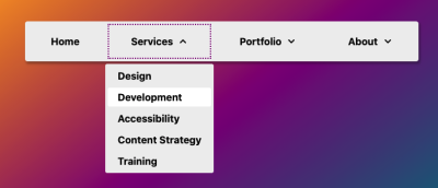
In his article, Mark goes into fine details of how to build an accessible click menu, along with useful pointers and references from his research. The idea is to start building the menu as a CSS-only hover menu that uses li:hover > ul and li:focus-within > ul to show the submenus. Then, we use JavaScript to create the <button> elements, set the aria attributes, and add the event handlers. The final result is available as a code example on CodePen and as a GitHub repo. This should be a good starting point for your menu as well.
Accessible Media Scroller Components
How would you go about creating a responsive media scroller component that works on TVs, phones, and desktops alike? Adam Argyle takes you through the process step by step.
Designed to host thumbnails of media or products, the scroller component is built upon a <ul> with accessible markup. CSS transforms the humble list into a smooth scroll experience that showcases the images and snaps them to a grid. To add some finesse, JavaScript facilitates roving-index interactions, helping keyboard users skip traversing a large number of items, and, last but not least, the experimental prefers-reduced-data media query turns the media scroller into a lightweight experience, if necessary. Clever!
Accessible Modals
You might have a simple modal or overlay on the page, perhaps to confirm customer’s input, or to show a couple of photos in a gallery, or just to confirm user’s preferences. In all these cases, building an accessible modal will turn out to become quite an adventure, also know as a focus trap.
As Eric Bailey explains in detail, you’ll need to identify the bounds of the trapped content, including the first and last focusable item, then remove everything that isn’t within it, move focus into the trapped content, listen for events that escape the boundary, restore previous state and move focus back to the interactive element that triggered the trapped content.
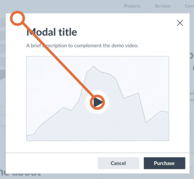
Ideally, we’d use something as simple as the dialog element in HTML, but unfortunately it has massive accessibility issues. With the Shadow DOM, managing focus isn’t easy either. We can use the inert attribute to remove, and then restore the ability of interactive elements to be discovered and focused. For older browsers, we can use inert polyfills from Google Chrome and from WICG.
- Scott O’Hara’s accessible-modal-window is a reliable fully accessible script to use.
- Kitty Giraudel maintain a11y-dialog Next, a lightweight (1.6 KB) script that traps and restores focus, toggles aria–* attributes and closes dialog on overlay click and Escape. It’s important not to confuse this version with previous version (6.1.0) as it relies on the
<dialog>which which still lacks in implementation support, and has lingering accessibility issues. - You could look into Parvus, a simple, accessible, open-source image lightbox without dependencies. In a typical scenario, we’d have an image linked to larger version of the image. With Parvus,, it’s enough to add a class
.lightboxto the link wrapping around an image, and the script does everything else for you automatically.
Accessible Password Fields
“Show password” and password hints make form fields more usable. They help users figure out if they mistyped their password as well as what pattern is acceptable when they create a new one. However, as it turns out, accessibility is often lacking when it comes to these things.
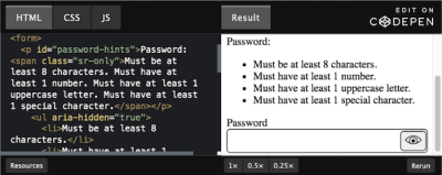
To help you improve the situation, Nicolas Steenhout takes a closer look at show/hide password accessibility and how to make sure that password hints are helpful to everyone. From enhancing show/hide buttons with a role of switch and aria-live and aria-pressed to supporting autocomplete, Nicolas summarized everything you need to know to make the web a bit more accessible in this regard.
Support User Preferences With prefers-reduced-*
Not every user is the same, and while some users love animations, others may have medical issues concerning motion. The prefers-reduced-motion media query lets you toggle animations on and off, but there are even more solutions to manage animations depending on a user’s preference. In his blog post, Elijah Manor addresses different techniques such as @media, matchMedia, and a custom React hook to address CSS, SVG SMIL, and JavaScript animations.
When it comes to making your content accessible to everyone, there’s another prefers-reduced-* media query that is worth knowing about — even though it isn’t supported by browsers yet (but you can emulate it in Polypane and Chromium browsers): prefers-reduced-data. It indicates when a user wants to use as little data as possible — if their connection is slow, for example, or if data is limited.
- Tatiana Mac has written a very thorough piece on Taking a no-motion-first approach to animations, suggesting to place all animation-specific styles in an animation-specific stylesheet and serve it only if the visitor hasn’t indicated “Reduce motion”.
- Kitty Giraudel provides guidelines on Implementing a reduced-motion mode in an example of a banking UI and a code example as well.
- The Polypane team summarized what you need to know about the media query to future-proof your site already today.
Accessible Skeletons
Skeleton patterns tend to lack a meaningful way of presenting themselves to screen readers. They often use aria-busy="true" when a widget is loading, but only few screen readers actually honor the attribute. So how to do better?
As Adrian Roselli suggests, you could use CSS to find any node with aria-busy="true" and set it to display: none to achieve the same effect for screen reader and non-screen-reader users. In his article “More Accessible Skeletons”, he takes you through the process step by step. The demo works across browsers with current releases of JAWS, NVDA, VoiceOver, and TalkBack.
Accessible “Skip” Links
Especially on pages with a large amount of navigation, moving between sections or around the page can be frustrating and annoying. That’s where “Skip” links can be very helpful. Unfortunately, it’s not uncommon to see “Skip” links being implemented but hidden away with display: none, and as such, unavailable to anybody (including screen reader users and keyboard users).
In How To Create a “Skip content” Link, Paul Ryan provides a step-by-step tutorial on how to implement an accessible skip content link. Basically we use CSS transform to push the skip link off the screen, but bring it back on screen on :focus. In the comments to the article, Eric Bailey also noticed that we could provide skip-links before sections of content that contain lots of interactive items, or items that can be tough to navigate through (such as table of contents and iframes).
Accessible SVGs
Talking about SVGs: what we can do with SVGs today goes way beyond the basic shapes of yesteryear. Not only can we describe SVG icons, but also style and animate them. If true inclusiveness lies beyond patterns — what other factors should we consider when designing and developing accessible SVGs?
That’s exactly the question that Carie Fisher is answering in her piece on Accessible SVGs: Inclusiveness Beyond Patterns. In the article, Carie takes a closer look at SVG color and contrast, light and dark modes, SVG animation, reduced motion and plenty of tools focused all around accessibility. You’ll also find demos and code examples in the articles, along with detailed explanations and pointers for further reading.

And if you’d like to dive deeper into the complex world of accessible components — not only related to SVGs — we’ve just published Carie’s piece on accessible code patterns.
Accessible Tabs
Your interface might be using tab panels, but to keep the content of these tabs accessible to keyboard-users and screen reader users, we need a very careful and deliberate exposition of visual design and ARIA semantics. In Tabbed Interfaces, Heydon Pickering goes into detail trying to figure out just the right solution to respect keyboard behavior and focus management. He suggests to progressively enhance sections into tab panels (code example) (thanks to Daniela Kubesch for the tip!).

As Adam Silver notes, screen reader users who are less savvy may not know to use arrow keys to switch tabs. There’s an argument to make all the tabs focusable in the normal tab sequence with little intervention from developers to change the way tabs work via keyboard.
Alternatively, TabPanelWidget is a responsive and accessible solution for tabs. It relies on plain old semantic HTML, and turns into an accordion whenever the tabs cannot fit entirely (thanks to ResizeObserver but there’s a polyfill for browsers that don’t support it yet).
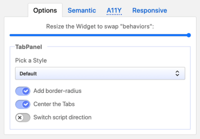
The script is not only a semantic and accessible solution, but also a responsive and versatile one to help you create Tabpanel and accordion widgets for the web. It is keyboard-friendly and available as a vanilla JS library (or as a widget for Vue, React and Angular).
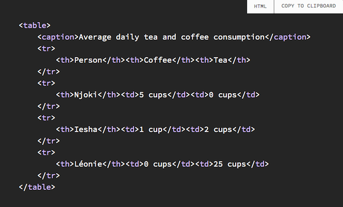
Accessible Tables
There are plenty of accessibility issues related to tables, but the biggest challenges is to turn a visual representation into a linear series that will be read aloud meaningfully by a screen reader, without omitting any important information. Fortunately, Adrian Roselli has been spending a lot of time exploring the challenges and solutions of accessible tables.
In his post on accessible tables, Adrian suggests to wrap the table in a <div> with role="region", aria-labelledby and tabindex="0" to ensure that a keyboard-only user can tab to the container, that the table receives focus and <caption> within table to ensure that it’s properly announced to screen readers. Adrian also provides a code example for a responsive table, as well as tables with expandable rows, sortable table and fixed table headers.
How Screen Readers Navigate Data Tables
Have you ever tried to navigate a table with a screen reader? If not, you should check out Leonie Watson’s article on how screen readers navigate data tables. It shares precious insights and shows what matters to create frustration-free tables that can be used by anyone.
In the post, Leonie uses NVDA to move to a table, navigate its content, and find specific information. The appropriate HTML elements (or ARIA roles) inform her about the characteristics of the table and give her access to keyboard commands specifically for navigating the table’s content.
An interesting takeaway: Keyboard focus and screen reader focus are not the same thing. Contrary to what you might have heard, you do not need to make each cell of a table focusable with a keyboard to aid navigation. If the content inside the cell is non-interactive, you’ll likely make keyboard users work much harder to navigate the table than you intended. You can also watch a Smashing TV video with Léonie on How A Screen Reader User Accesses The Web (73 mins).
Accessible Toggle Switches
Whenever our forms provide a binary selection to our customers — on/off, dark/light mode etc. — we could use a toggle switch. The switch needs to serve a couple of purposes: it needs to clearly explain the current selection (and that’s clear not that often at all!), it needs to explain that there are two options, and it needs to be obvious enough for customers to understand how to switch between them. When Sara Soueidan was looking into how to build a toggle switch, she of course spent quite a bit of time looking into how to build an accessible toggle switch.
Sara’s solution uses two radio buttons, each with its own label, announced to assistive technologies as a couple of separate options, accessible via keyboard, and has no additional ARIA or JS requirements to function. The outcome is a theme switching toggle code example, and you can also take a look at Scott O’Hara’s code example.
It’s important to note that Sara’s radio button toggle switch is accessible because of its two labels. So if a toggle switch does not have two labels, this would not be a pattern to use. You can find markup patterns for toggle switches in Scott’s repo. (thanks to Scott O’Hara for the tip!).
Kitty Giraudel also shares a tutorial for a small HTML- and CSS-only implementation of an accessible toggle that you can tweak at your own convenience. The base for the accessible toggle is a properly-labelled checkbox. It conveys its status with both iconography and color and doesn’t leave any artifacts if CSS is not enabled. The toggle comes with native focus styles that can be customized, a disabled state, and it supports right-to-left orientation, too, if necessary.
Last but not least, Adam Argyle takes us step-by-step through the process of building a switch that is responsive and accessible.At the core of Adam’s approach is a checkbox <input type="checkbox" role="switch"> inside a <label> which has the advantage that it doesn’t need CSS or JavaScript to be fully functional and accessible. Loading CSS brings support for right-to-left languages, verticality, animation, and more. Loading JavaScript makes the switch draggable and tangible.
Accessible Tooltips And Toggletips
A component that’s closely related to icon buttons is a tooltip. Literally “tips for tools”, they are little pieces of information that explain the purpose of a control, or a visual, that otherwise could be misunderstood. Every time we want to explain why we need a particular piece of personal information in a checkout, that’s where we’ll probably be using a good old tooltip. So, how do we get them right?
Heydon Pickering’s Inclusive Tooltips and Toggletips provides a very thorough overview of pretty much everything needed to build an accessible tooltip. That means deciding whether the tip’s content should be provided as the label or description and choose ARIA properties accordingly, not relying on title attributes and avoiding putting interactive content such as close and confirm buttons or links in tooltips.
- Sara Soueidan, of course, also goes into fine intricacies of building a fully-accessible help tooltip and concludes that JavaScript is imperative to make fully-accessible interactive components.
- Sarah Higley also explains the complexity of tooltips and released a code example that shows a reliable pattern in action.
- Scott O’Hara has a GitHub repo on tooltips,
- Adrian Roselli provides plenty of code examples for toggles as well, including demos with disabled tooltips and RTL-direction.
Accessible Video/Audio Players
It’s not uncommon to see viewers frequently using captions when watching a short clip or a lengthy movie these days. We might be consuming the video in a noisy environment, or perhaps we can better understand written language, or perhaps we are currently busy with something else and need to look up something quickly without having to resort to headphones. Beyond that, how often do we use keyboard’s <space> to prompt a pause, or key arrows to move back and forward? Still, many video players and custom solutions don’t provide this functionality out of the box.

Accessible HTML5 Media Players provides an overview of accessible audio and video players. There are plenty of great open-source options, e.g. AblePlayer seems to be one of the reliable ones. It includes a full set of player controls that are keyboard-accessible, properly labelled for screen reader users, and controllable by speech recognition users, features high contrast, supports closed captions and subtitles, chapters, text-based audio description, an interactive transcript feature and automatic text highlighting. It supports YouTube and Vimeo videos. Hower, it depends on jQuery.
Alternatively, you could look into Vime.js as well: fully open-source, lightweight, fully customizable and without third-party dependencies. Other great options like Plyr and Accessible HTML5 Video Player by PayPal are similar. The latter is fully accessible to keyboard-only users and screen reader users, written in vanilla JavaScript, is additionally provided as a React component, and falls back to browser’s native controls if JavaScript is unavailable (thanks for the tip, @jamsandwich!).
Website Features That Annoy Screen Reader Users
A missing alt caption, an auto-playing video, unlabelled buttons, poor use of headings, inaccessible web forms — what might seem like a small issue for sighted users can make the difference between being able to use a website independently or not for blind and visually impaired people. Holly Tuke knows this from her own experience.
To raise awareness for common accessibility issues, Holly summarized five annoying website features she faces as a screen reader user every single day, and, of course, how to fix them. Chris Ashton also published a piece explaining common issues that screen reader users have, which are often neglected in conversations focus on semantics and keyboard-accessibility alone. Little details that make a huge difference (thanks to Alex Chudesnov for the tip!).
But First, Accessibility Support
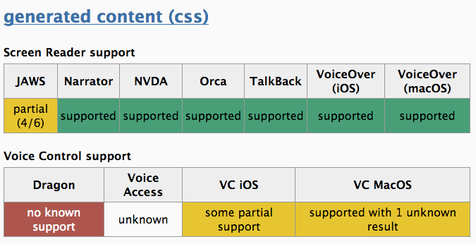
There are many different ways that assistive technologies interact with browsers and code. Since it’s still not possible to fully automate screen readers and voice control softwares, we are left with having to do manual tests. And that’s where a11ysupport.io comes into play.

Originally created by Michael Fairchild, this community-driven website aims to help inform developers about what is accessibility supported. It’s a project that is active and contributions are always welcome, so start testing away. Also, it’s always worth checking the WAI-ARIA authoring practices which describe essential semantics, roles, and ARIA necessary for common components and patterns (thanks to Stephanie Eckles for the tip!).
Accessibility Resources And Checklists
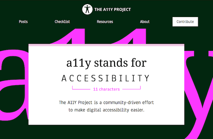
Accessibility is incredibly important, but, unfortunately, often overlooked. The community-driven A11Y Project attempts to make digital accessibility easier, providing designers and developers with the know-how they need to build beautiful, accessible, and inclusive experiences.

From the basic principles behind accessible design to conducting an accessibility audit, and cultivating community, The A11Y Project takes a 360 degree look at the topic. You’ll find articles just like quick tips, tips on books to read, newsletters to follow, as well as handy tools, groups committed to accessibility, and much more.
Repository Of Accessibility Tools
Do you ever get that itching feeling of forgetting something before shipping a project? Well, checklists are known to be the key to keeping an overview of things that need to be done and taken care of before the final showdown. When it comes to accessibility, there’s a growing list of tools and resources that are bound to help you keep an eye on things: A11y Resources.

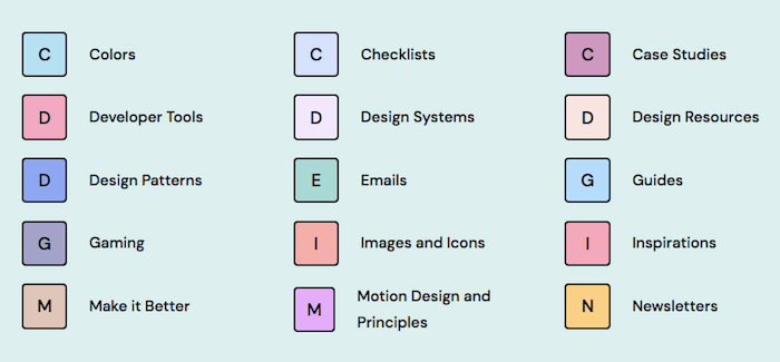
Curated by Hannah Milan, this list was initially created to keep track of more than 200+ hand-curated accessibility plugins, tools, articles, case studies, design patterns, design resources, accessibility standards, and even checklists. Of course, you can always submit a tool if you see anything missing.
Third-Party Component Accessibility
Reusable components like custom selects, autocompletes, or date pickers are powerful helpers. However, a lot of third-party components that claim to be accessible turn out to be only partially accessible once you dig a bit deeper. As Hidde de Vries points out, even components that implemented the ARIA Authoring Practices Guide 1:1 can be critical because the guide doesn’t make claims about screenreader accessibility or user experience. So how do you find those components that are truly accessible?

Hidde published a checklist of questions you can ask to have a little more certainty about the accessibility of a component: How did they test? Who did they test with? Are they open about pros and cons of their approach? And who created the component? He also shares some valuable tips from the community that help you assess whether a component that claims to be accessible will live up to its promise.
Wrapping Up
There are definitely dozens and hundreds of important guidelines by incredible people in the accessibility community, such as Steve Faulkner with a huge series of articles on semantics and accessibility and Leonie Watson with a huge series of articles on accessibility in general. It’s impossible to list everyone, but we are sincerely grateful to every contribution.
We probably have missed some important and valuable techniques and resources! So please leave a comment and refer to them — we’d love to update this post and keep it up-to-date for us all to be able to get back to it and build reliable, accessible components faster.
We sincerely hope that these tools and techniques will prove to be useful in your day-to-day work — and most importantly help you avoid some time-consuming, routine tasks.
Stay accessible!
Thank you! ❤️
A huge thanks to @jamsandwich, Courtney Heitman, Stephanie Eckles, Adam Silver, Daniela Kubesch, Tanisha Sabherwal, Manuel Matuzović, Vadim Makeev, Kitty Giraudel, Ian James, Juha Lehtonen, Heydon Pickering, Shivani Gupta, Jason Webb, Alex Kallinikos, Scott O’Hara, Sara Soueidan, Sasha Chudesnov, Adam Liptrot, Holger Bartel, Kim Johannesen and everybody else who has been passionately working all around accessibility for the contributions to this article. Community matters.
More On Accessibility
- CSS Auditing Tools
- CSS Generators
- Untangling The Complex World Of Accessible Patterns
- Designing With Reduced Motion For Motion Sensitivities
- I Used The Web For A Day Using A Screen Reader
- Accessibility In Chrome DevTools
- Things You Can Do With CSS Today
- Also, subscribe to our newsletter to not miss the next ones.
Further Reading
- Cute Easter Wallpaper
- Fantastic Wallpapers That Will Blow Your Desktop Away
- Beautiful Dual-Screen Desktop Wallpapers
- 100 Really Beautiful iPhone 4 Wallpapers
 (il, cm, mrn)

