CSS Generators

Email Newsletter
Weekly tips on front-end & UX.
Trusted by 182,000+ folks.
 Custom Web Forms for Angular, React, & Vue. Your backend.
 Celebrating 10 million developers


Last week, we looked at CSS Auditing tools, and this week around we’ll be looking at useful generators for everything CSS: from gradients to drop-shadows and bezier curves to triangles and type scales. Just a few useful tools for your toolbelt, to keep close.
More On CSS:
- CSS Auditing Tools
- Things You Can Do With CSS Today
- Useful DevTools Tips and Shortcuts
- Also, subscribe to our newsletter to not miss the next ones.
CSS Generators Collection
We’re going to look at a bunch of different generators in this roundup, so it only seems appropriate to kick it off with this collection of 10 generators built by Temani Afif. Known for his penchant for flat markup and reusable styles, Temani has integrated his modern CSS techniques into this collection that includes generators for tooltips, ribbon shapes, waves, starbursts, gradients, and clipped corners, among several others. The fun thing about this collection is that Temani has shared the techniques he uses to generate the code in a number of articles he’s written here at Smashing Magazine!

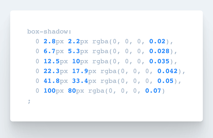
CSS Shadows Generator
Looking for a tool that’ll automatically generate CSS code for really smooth, layered box-shadows? Well, you’re going to love SmoothShadow. Inspired by an article written by Tobias Ahlin Bjerrome, this nifty tool was created to help anyone generate the code they need on the spot.
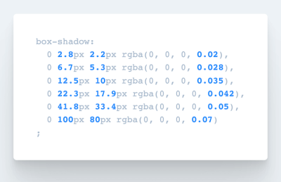
Once you’ve given it a try, it will be difficult to not use it. The little tool allows you to visually design a layered smooth box-shadow, but also tweak alpha, offset and blur with individual easing curves. And it gets even better: The creator of the tool, Philipp Brumm, has also released SmoothShadow as a Figma plugin, so you can optimize your workflow just like you’ve always wanted to.
CSS Border-Radius Generator
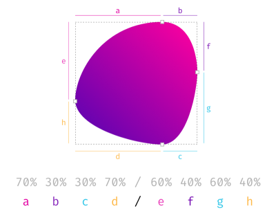
When we think about border-radius, we usually think about a few straightforward values — perhaps 8px or 11px, or maybe 16px. However, border-radius can be quite fancy, and fancy-border-radius generator allows you to generate them easily. The tool provides a visualization of not only plain round shapes, but also organic shapes, by using eight values combined. Essentially, what we are creating are overlapping ellipses that build the final shape. The tool is also available as CLI tool, so you can run it locally as well.
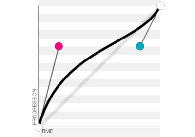
Cubic-Bezier Curves Generator
Sometimes an animation just doesn’t feel right, does it? Perhaps the duration is off, or the easing is quirky, and figuring it out might take quite some time. With Lea Verou’s cubic-bezier, you can preview and compare animations, slow them down and even adjust them visually. And then copy-paste the CSS snippet to plug into your project right away.
And if you need basic or complex CSS @keyframe animations, Keyframes.app provides a visual timeline editor similar to video-editing software. You can add steps, change sizing and position, apply transforms and color changes and get the CSS to copy-paste as well. Ah and not to forget the Animation panel in Chrome and Firefox for debugging as well.
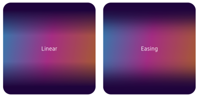
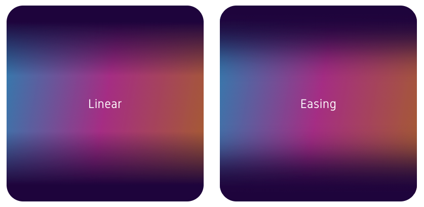
Easing Gradients
With gradients, we often rely on linear gradients, transitioning from one color to another. However, linear gradients have hard edges where they start or end. There is a way to make the gradients slightly better, with easing functions. So Andreas Larsen has built a little editor, Easing Gradients Editor, that allows us to create and preview easing gradients in CSS. The tool is also available as a Sketch plugin and a PostCSS plugin. You can use a color picker, but unfortunately can’t add an actual HEX color value yet.
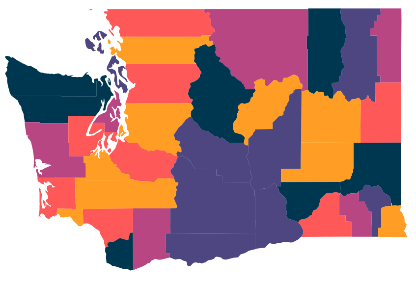
Data Visualization Color Palettes
Sometimes you need very specific type of color for a very specific task. For example, if you are working on a data visualization project — e.g. pie charts, grouped bar charts, maps — you probably need a series of colors that are visually equidistant. That’s when LearnUI Data Color Picker can become very useful. In such cases, it’s better to use a range of hues, so users can identify the differences faster. It’s indeed easier to distinguish yellow from orange than blue from blue-but-15%-lighter.

With the tool, you choose how many colors you need and whether you need a light or a dark background color, and choose whether you want a default palette, a single hue palette, or a divergent color scale. Once you have it, you can copy hex values and export them as SVG to use in Sketch, Figma or Adobe XD.

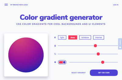
LearnUI also provides an accessible color generator and a quite fancy gradient generator, with different gradient types, interpolation, angle, easing and how smooth you’d like the gradient to be.
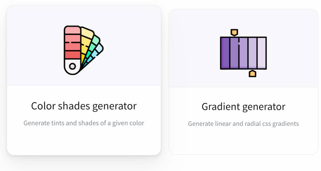
From CSS Color Shades To Triangles And Fake Data
Imagine that you just need to find CSS triangle styles for elements and pseudo-elements. Or perhaps refine the color palette a bit by exploring tints and shades of a given color. Or perhaps generate a linear and radial CSS gradient for a section of the page. There is no need to do it all manually or try to find those CSS snippets all over the web. You can always find them on Omatsuri.

Omatsuri means festival in Japanese, and the site is a lovely little festival of open-source browser tools for everyday use. On the site, you’ll find a triangle generator, a color shades generator, a gradient generator, page dividers, SVG compressor, SVG → JSX converter, a fake data generator, CSS cursors, and keyboard event codes. Designed and built by Vitaly Rtishchev and Vlad Shilov. The source code of the site is available as well.
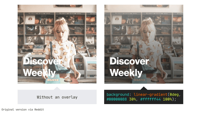
CSS Overlay With High Contrast Generator
If you want to make text better stand out against a background image, there’s a little trick: You can use a CSS linear-gradient overlay with a certain opacity on top of the image to improve color contrast. Spotify, for example, uses the technique.

While all of this only requires one line of code, there’s still one question left to be answered: How to determine the opacity to use for the overlay? The Optimal Overlay Finder helps you find out. You upload an image, enter your text and choose your overlay and text colors, and the tool shows you a preview of what the overlay looks like when applied to your image, as well as the optimal overlay opacity. A small detail that goes a long way.
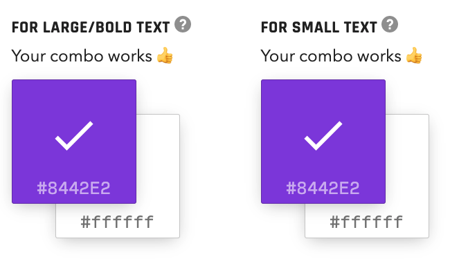
OKLCH Color Picker & Converter
The oklch() color function traverses the P3 color space and offers a number of advantages over other CSS color functions, like rgb() and hsl(). And even though the notation is striking similar to HSL, the “chroma” value (the “C” in OKLCH) may throw you off, as it’s not as intuitive as, say, “lightness” or “hue” which are measured in predictable percentages and degrees.
That makes the OKLCH Color Picker & Converter a handy tool to keep in your back pocket. Made by the Evil Martians team, it’s just plain fun to use this and play with the visualizations that clearly illustrate the shape and boundaries of the color space.

CSS Color Palette Generator
There are plenty of fantastic tools to generate your color palette, but Coolors.co is a little nifty tool that does just enough to generate palettes and explore different shades of a color. You can create a palette from the photo or a collage of photos, test for color blindness and quickly adjust hue, saturation, brightness and temperature. Obviously, it also features trending color palettes.
You can also produce a gradient palette between two colors and create and export your own gradient as CSS. The tool is available as an iOS app, Adobe add-on and Chrome extension.

And if you need something slightly more sophisticated for gradients in your toolbox, CSSGradient.io is another tool for all your gradient needs — be it lineal or radial gradients, color shades or gradient backgrounds.
Also, Gradient Generator generates 1 to 40 stepped gradients from two colors of your choice. Each gradient is automatically presented in HEX, HSL, and RGB formats — all you need to do is simply click on the value, and it will be copied to your clipboard right away.
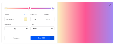
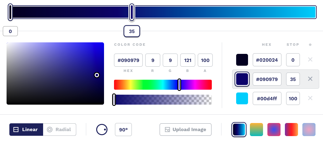
CSS Color Gradients Generator
Hand-picking colors to make a color gradient requires design experience and a good understanding of color harmony. If you need a gradient for a background or for UI elements but don’t feel confident enough to tackle the task yourself (or if you’re in a hurry), the color gradient generator which the folks at My Brand New Logo have created has got your back.
Powered by color gradient algorithms, the generator creates well-balanced gradients based on a color you select. There are four different styles of gradients that go from subtle to a mother-of-pearl effect and an intense, deep color gradient. You can adjust the gradient with sliders and, once you’re happy with the result, copy-paste the generated CSS code to use it in your project.
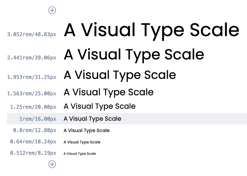
CSS Type Scale Generator
So what if you want to create a reliable typographic system that works well both on mobile and on desktop? Usually you would rely on established typographic scales, that provide a typographic hierarchy for everything from paragraphs to captions and headings. Type-Scale by Jeremy Church is a fantastic little tool that helps you build a typographic scale and export it in CSS. Small scales are usually a good fit for mobile views, medium scales could work well for the desktop view, and large scales could work well for marketing sites.
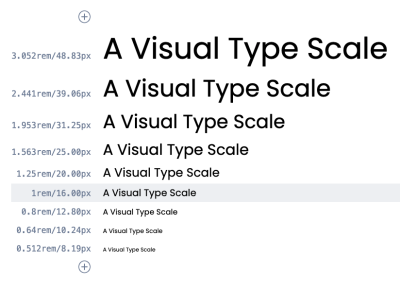
The tool provides 8 pre-defined harmonious type scales (but you can define a custom one as well), from Major Third to Perfect Fifth and generate a sequence of font sizes with a particular geometric incrementation ratio. You can adjust the settings such as line-height and body weight, refine the preview text and get the generated CSS — or edit it with a type specimen on CodePen. Alternatively, you can check Tim Brown’s good ol’ ModularScale.com as well.
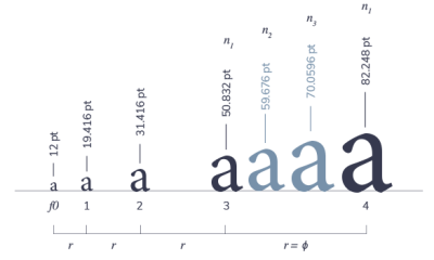
Another lovely tool is a Typographic Scale Calculator by Jean-Lou Desire which, unlike Tim’s and Jeremy’s tools, generates a modular scale using three defining properties (the initial term, the increment ratio, and the number of sizes in the scale) similar to the musical scale. The result is a smoother sizing for designers, with a few more options to compose more values from — e.g. for smaller side notes or large blockquotes.
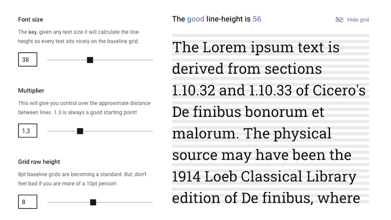
Line Height Calculator
If you’re building a type scale based on a baseline grid, there’s a tricky question to be answered: What’s the right line height for every text size on your scale? Fran Pérez’s Good Line-Height calculator does the maths for you.
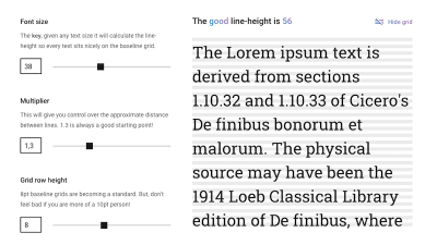
To calculate the results, you only need to enter three parameters: font size, multiplier, and grid row height. Font size is the key to ensure your text sits nicely on the baseline grid, no matter the text size, the multiplier gives you control over the distance between lines, and grid row height defines the height of each row in your baseline grid.
Fluid Heading Generator
Thanks to clamp(), you can set a font size that grows with the viewport but doesn’t go below or above the minimum and maximum font size that you define. To help you find the perfect CSS values for your fluid heading and control how it scales across different viewports, Erik André Jakobsen built the Fluid Typography tool.
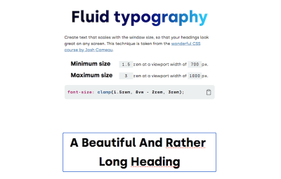
clamp() rule to make your headings fluid. (Large preview)You enter the minimum and maximum font size as well as the minimum and maximum viewport width, and the tool calculates not only the clamp() rule for you but also shows you a demo of what the specifications look like when applied to an actual heading.
Another helpful generator to help you figure out the clamp() rule for your project comes from Maxime Roudier. It works similarly to Erik’s tool but also lets you select a font family and a range that you adjust with a slider instead of entering concrete minimum and maximum values.
CSS Capsize Generator
To minimize disorienting and expensive layout shifts during loading, we need to match the fallback font against the web font. Monica Dinculescu’s font-style-matcher allows us to minimize the jarring shift by matching the fallback font and the intended webfont’s x-heights and widths and we could make use of f-mods to do the same thing with new CSS properties.
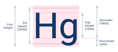
By default, many fonts come with pre-defined margins and leadings, so if a fallback font and a web font are different, the entire layout will change significantly. Capsize adjusts the font-size, so that the height of capital letters is a multiple of your grid. It does so by trimming the space above capital letters and below the baseline. So by keeping the same line-height in a fallback font and a web font, the tool generates “magic numbers” to make sure that the switch is seamless.
CSS Complex Selectors Generator
Imagine that you need to create a table of items. You might want to keep them on the same row if there are 3 or fewer items, but then spanning two full lines for 6 and 8 items, while being just a list of cards with 10 items and more. How would you build it? While many of these situations can be fixed with CSS Grid and Flexbox, sometimes you might end up with a quite complex situation which would need a quite complex CSS selector.
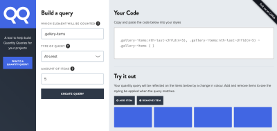
For this purpose, Drew Minns has built a generator for Quantity Selectors — complex CSS selectors that allow styles to be applied to elements based on the number of siblings. For example, when you want to apply styles to all elements when there are at least 5 items and siblings, or at most 10, or perhaps between 3 to 5 items.
The final selector might not be easy to understand though, so it’s worth making sure that you provide a proper explanation in the code of what it’s supposed to target.
CSS clip-path Generator
Thanks to the clip-path property, we can create complex shapes in CSS by clipping an element to a basic shape, be it a simple circle, a fancy polygon, or even an SVG source. The CSS clip-path maker Clippy is a visual tool that helps you create and customize clip-paths right in your browser.
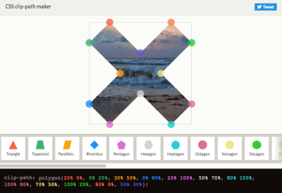
To start off, you select a shape and a demo background from Clippy’s menu. You can then drag the shape’s points to create any shape you like — the color-coded CSS will not only reflect your changes instantly but also highlight them to help you understand how your choices influence the code.
If the whole clip-path thing still feels a bit abstract to you or if you’re looking for a cool example of how to use it in an actual project, be sure to check out the pop-out effect that Mikael Ainalem created with clip-path.
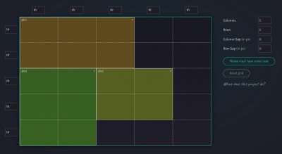
CSS Grid Layout Generator
CSS Grid Layout can be quite straightforward, but sometimes you might want to play with the Grid properties to figure out what just the right behavior would be for your layout. To get started, we can use Sarah Drasner’s CSS Grid Generator, Drew Minns’ Griddy, Ali Alaa’s CSS Grid Cheat Sheet Generator and LenioLabs’ LayoutIt — they all allow you to define the grid and containers on the grid, as well as gaps, and it generates the CSS right away. If you need more guidance around Flexbox, Flexbox Patterns contains plenty of examples to play with.
Or you could use single line of CSS solutions. Una Kravets has built 1-Line Layouts, a collection of ten modern CSS layout and sizing techniques. Starting out with the biggest mystery of all (centering) and covering everything from the classic Holy Grail Layout and the “Deconstructed Pancake” to applying clamp() and respecting aspect ratio, Una’s collection is full of little tidbits that are bound to make your life as a developer easier.
Each technique comes with a demo, a CodePen to tinker with, and information on browser support. Una also recorded a video in which she explains every one-line wonder in greater detail. No matter if you’re a beginner or a pro, this resource will sure come in handy.
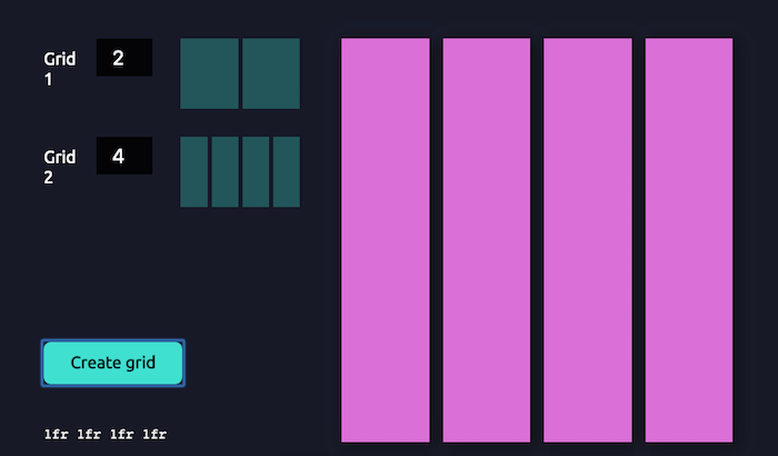
CSS Compound Grids Generator
Compound grids offer enormous flexibility and a lot of room for creativity. Made up of two or more grids of any type (column, modular, symmetrical, and asymmetrical) on one page, they can occupy separate areas or overlap.

A little tool to help you generate compound grids and save time drawing endless variations now comes from Michelle Barker: the compound grid generator. All you need to do is enter the number of columns for each of your grids, and they’ll be merged into a compound grid. A great addition to your digital toolbox. And if you need to create a modular grid, multicolumn grid or manuscript grid for your print project, Modular Grid Calculator provides a thorough explanation on achieve it in InDesign.
CSS Filters and Blend Modes Generator
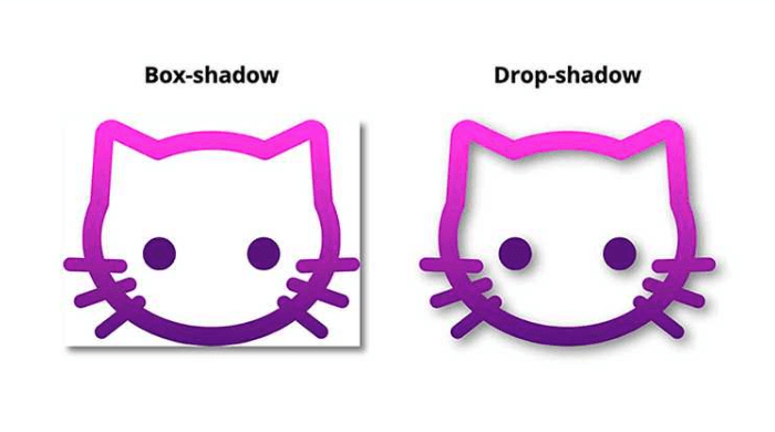
The CSS drop-shadow filter has excellent support but is rather underrated — a real shame given the fact that it could save you a lot of time hacking around with box-shadow.
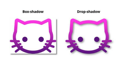
As Michelle Barker explains in a blog post, drop-shadow lets you use values for x-offset, y-offset, blur radius, and color — just like its more prominent sibling box-shadow. However, there’s one big advantage: the shadow does not correspond to the bounding box of an element (which is often where the hacking begins when using box-shadow) but to the non-transparent parts of an image. Perfect if you want to apply a drop shadow to a transparent PNG or SVG logo, for example, or even a clipped shape.
There are plenty of CSS filters out there, so if you need to find just the right set of filters for your project, Mads Stoumann’s CSS Filter Editor for testing out all supported filters, along with some presents that Mads has provided as well. Obviously, the CSS is generated on the fly as well.
Beyond filters, there are also plenty of options for CSS blend modes. If you’d like to preview how some of the visual effects could work together, you can use Rick Metzger’s CSS Duotone Generator. The tool includes options for zooming, spacing, blur and image opacity, but also all blend modes for foreground and background images. Of course, the tool also generates HTML and CSS.
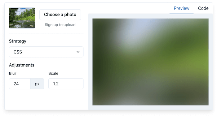
Blurred Image Placeholders Generator
An image placeholder is an efficient way to improve a site’s perceived performance when an image is loading. On his quest to find the fastest and best-looking image placholders for the web, Joe Bell decided to come up with a solution himself. The result: Plaiceholder.

Powered by a collection of Node.js helpers, Plaiceholder turns your images into lightweight, blurred placeholder images. There are several approaches to choose from: CSS (which is recommended), SVG, Base 64, Blurhash, and the experimental Blurhash to CSS.
Hero Generator
Are you tired of implementing the same hero over and over again? Sarah Drasner’s Hero Generator is here to help. It lets you generate responsive heros with just a few clicks, based on your preferences.
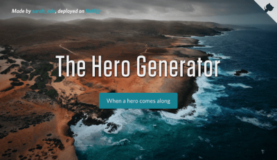
You decide what kind of gradient you’d like to apply to your hero image, the gradient reduction, and title spacing. And if you wish to include a button, the generator has got you covered, too, with options to customize the button’s colors (including hover and gradient color) and button radius. Once you’re happy with the result, you can copy and paste the code and use it in your project right away. A real timesaver!
Image Maps Generator
Image maps let you create clickable areas on an image. If you’d like to create an image map but don’t want to fiddle with coordinates to define the clickable regions, imagemaps.net is here to help.
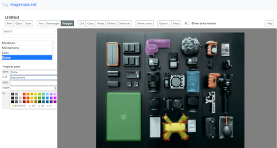
The site features a graphical user interface to make the process more straightforward. Once you’ve uploaded your image, you can use the Pen, Rectangle, and Polygon tools to draw your clickable regions. To customize them and, most importantly, give them their functionality, you can then name each region, assign a link to it, and adjust its color, height and width. A click on the “Export” button provides you with the HTML map and React code that you can copy and paste into your project.
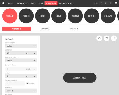
CSS Animations Generator
It’s quite easy to tell a difference between an animation that seems to be a bit off, and an animation that is done just well. But adjusting the keyframes animations or transitions manually can be quite time-consuming. Animista provides a library of animations and transitions that you can use out of the box. There are plenty of presets for entrances and exits, text highlights, button actions and background effects. Once you’ve defined an animation you can copy-paste the CSS snippet of the animation, along with the code generated by Autoprefixer.
CSS Wand provides hover and loading animations, but you can also use Ladda animations (buttons with built-in loading indicators) and Eric Spinners (with Vue.js integration). And perhaps you’d like to add a whimsical twist on hover transitions with Boop! — just keep in mind to scale with pseudo-elements and respect motion preferences for users who opt-in for reduced motion.
3D CSS Cuboid Generator
Jhey Tompkins is known for his fun 3D CSS creations. Maybe you’ve already seen his helicopter that magically shifts as you move the mouse? The basis for the helicopter and other experiments like these are responsive CSS cuboids that are controllable with scoped CSS custom properties.
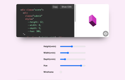
Now, if you want to bring your 3D ideas to life, too, Jhey’s 3D CSS Cuboid Generator is here to help. Just adjust the sliders to determine height, width, depth, and hue of your cuboid, and you’ve already got the code you need to get things rolling, twisting, sliding, or whatever else you’re planning. Have fun!
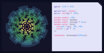
CSS Doodles Generator
We can bring the most sophisticated layouts to life with CSS, but we can also generate playful artworks and doodles. Yuan Chuan has built , a web component for drawing patterns with CSS. The component includes plenty of utility functions and shorthand properties to play with. As a result, the component generates a grid of divs along with the plain CSS. The source code is also available on GitHub.
Useful Little Web Dev Helpers
If you need a few more tools in your life, luckily, there are a lot of good ’ol web developers collecting their favorite useful tools all in one place named Tiny Helpers. Maintained by Stefan Judis, you’re sure to find all sorts of tools: from APIs, accessibility and color, to fonts, performance, regular expressions, SVG, and Unicode.
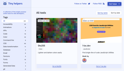
Of course, there are many more shared on other platforms, such as the very useful Twitter thread by Josh W. Comeau but also by Stefan Judis himself. Whatever it is that you’ve been eager to find that will help you get work done better and faster, you’re bound to find it there!
Wrapping Up
There are literally hundreds of resources out there, and we hope that some of the ones listed here will prove to be useful in your day-to-day work — and most importantly help you avoid some time-consuming, routine tasks. Happy generating!
More On CSS:
- CSS Auditing Tools
- Things You Can Do With CSS Today
- Useful DevTools Tips and Shortcuts
- Also, subscribe to our newsletter to not miss the next ones.
Further Reading
- Building The SSG I’ve Always Wanted: An 11ty, Vite And JAM Sandwich
- Modern CSS Layouts: You Might Not Need A Framework For That
- Best Of Pro Scheduler Libraries
- Sustainable Design Toolkits And Frameworks
 (cm, il, vf, mrn)

