Meet Utopia: Designing And Building With Fluid Type And Space Scales

Email Newsletter
Weekly tips on front-end & UX.
Trusted by 182,000+ folks.


 Custom Web Forms for Angular, React, & Vue. Your backend.
 Celebrating 10 million developers

Two decades ago, as we embarked on our voyage from the comfortable, predictable shores of print design to the fluid and ever-changing open seas of the World Wide Web, John Allsopp encouraged the acceptance of “the ebb and flow of things”. Ten years later, Ethan Marcotte coined the term “responsive web design”, kickstarting a seismic shift from fixed-width desktop sites — and their separate mobile counterparts — to single codebases of flexible design.
But we didn’t embrace the ebb and flow. Not really. Instead, we settled on a system of arbitrary breakpoints, and there the expedition ended. Rigid “magic numbers” tied to real-world devices plagued our CSS and directed our design processes. Developers today are often handed a collection of mockups for mobile (320px), large mobile (400px), tablet (768px), small desktop (1024px), and large desktop (1440px). The effort expended in generating so many discrete artifacts is an inefficient use of time and resources. It also perpetuates the archaic practice of creating device-specific websites.
Furthermore, with so many unique reference materials in play, developers are often left to guess at the logic — if any — used in the design process. This can lead to a seemingly infinite number of similar values entering the codebase, needlessly increasing the weight of the CSS and the complexity of the project’s maintenance. This convolution swells exponentially with the number of device-specific mockups generated as well as the number of design contributors involved.
The Promise Of Utopia
One way to ensure our designs feel at home on more devices is to add more breakpoints, enabling more nuanced design tweaks at more screen sizes. This comes with the cost of a more laborious design process, more mockup generation, more code, and more documentation.
Another way is to lean into the fluidity of the medium, recognizing this perceived limitation as the advantage it truly is. Instead of tightening our grip by loading up on breakpoints, we can let go, relinquishing some of that control and allowing the medium to share the load. We can embrace the ebb and flow with a more fluid and systematic approach to our design foundations.
In conversations with clients and colleagues, we found ourselves struggling to articulate these somewhat nebulous concepts. To bring the idea into reality we gave it a name: Utopia. A single word to refer to a particular way of thinking about the fundamentals of fluid responsive web design. Here are the benefits as we see them:
- Design and develop rapidly using a handful of related rules, building the system, not every permutation of its contents at arbitrary breakpoints.
- Create bespoke constraints for your projects to ensure consistent and harmonious designs.
- Streamline communication and collaboration between design and development.
- Visualise the invisible: componentize responsive space, codifying its implementation and behavior.
- Swap jarring breakpoint jumps for buttery-smooth interpolation, with programmatically tailored type and space scales for every screen size.
The Origins Of Utopia
Utopia emerged during years of work at the coalface, designing and developing in agency and product contexts. We spotted some common patterns and pitfalls, and have gradually zeroed in on a solution, iterating with real clients.
We started with a simple spreadsheet-based calculator in 2018, but communicating the benefits of fluid responsive thinking was challenging. An informal sprint at Clearleft in early 2020 resulted in utopia.fyi, where we published some of our thoughts alongside a fluid type scale calculator.
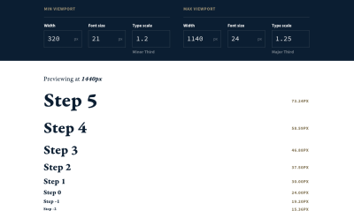
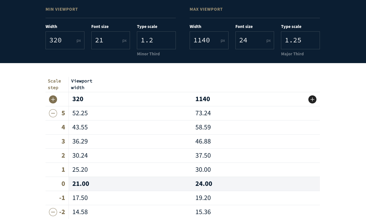
Fluid Type Scales
Typesetting with modular scales isn’t a new concept. It’s a proven mathematical way to ensure harmonious relationships between type sizes in a design. But where traditional print-derived typographic systems are designed to work at specific page sizes, Utopia can unlock elegant typography for all devices.
By defining a suitable type scale for a small screen and another for a large screen, we can let the browser interpolate smoothly between the two, based on the current viewport size. This results in a set of type sizes that is always in tune with itself, without manually setting sizes for multiple breakpoints.
Thinking in terms of steps rather than values, we allow the computer to calculate the optimal sizes, rather than laboriously working them out ourselves. This declarative way of thinking chimes with how CSS itself works: we tell the browser what we want to happen and the browser works out how to do that.
This also creates a shared, tailored language between designers and developers. Instead of referring to a heading size change from, say, “1.687rem to 2.3125rem”, this neat set of options lets you say: “Step 2 to Step 3”. By adding the intentional friction of named steps and embracing this self-imposed constraint, we can guard against an infinite number of magic number font sizes infiltrating our codebases and designs.
Utopia encourages the curation of a system small enough to be held in short-term memory, rather than one so sprawling it must be constantly referred to.
Designing With Fluid Typography
We’ll typically start a project by defining a suitable body copy font and size at nominated min and max viewport widths. The exact sizes depend on a product’s fonts, visual style, content, layout, and audience. We do this by experimenting in Figma with chunks of realistic copy from the client, as well as any design direction insights we’ve uncovered together. At this point, we’re most interested in legibility, line lengths, line heights, size, and weight contrast — all the ingredients that combine to make an appropriate reading experience.
After this experimentation, we’ll have a good idea of the scales that will work for the project and it’s time to visit the Utopia type scale calculator.

Here we’ll map the rough font sizes to mathematical type scales, pulling the values into Figma — manually, for now — to confirm they’re suitable for the content.
You can read more about designing with fluid type scales on the Utopia blog.
Developing With Fluid Typography
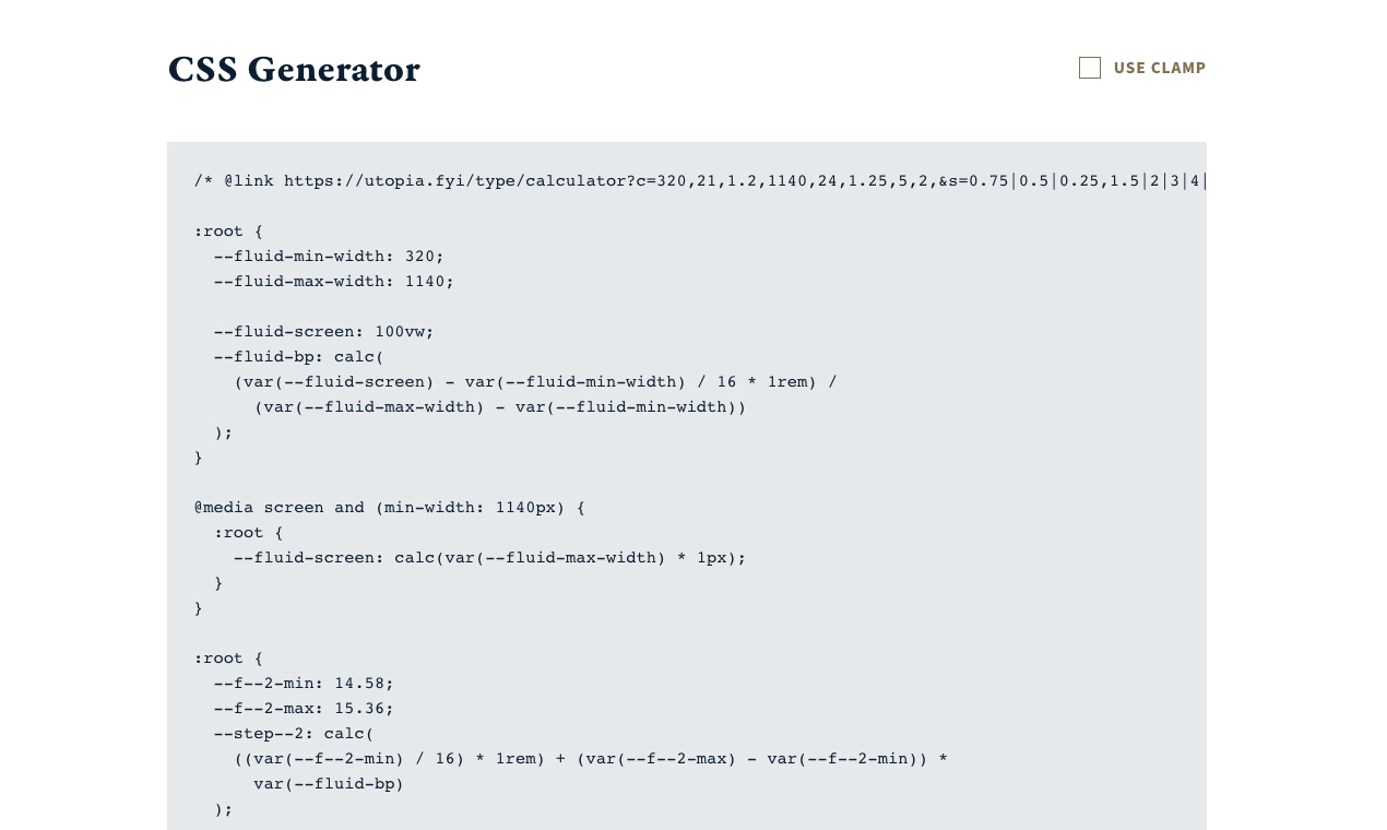
To pull these design foundations into code, the developer visits the same URL as the designer. They can export CSS directly from the tool and drop it into a project.

Utopia relies heavily on CSS custom properties and CSS locks. This has two benefits: it’s entirely opt-in, and the values are tweakable in the browser.
Side note on keeping your values malleable: This is a crucial design decision in the Utopia calculator. We know from experience that all values are subject to change as a project proceeds. Digital design is a fluid process. Design tools like Figma are incredible, but they can’t show you how your fonts will render in every browser on every device. Content often changes during projects. Usability testing can throw up unforeseen issues. Stakeholders emerge with their own design preferences. Just remember the mantra: “A digital product is never finished” and allow the system to flex, change, and grow as you work.
With the fluid sizes exposed by custom properties, there are two main ways to implement them. In any declaration, rather than set a font-size value as a static unit (e.g. px), we refer to the step size:
h2 {
  font-size: var(--step-2);
}
Alternatively, by creating a small set of single-responsibility utilities, we can create fluid components with a single class:
.u-step-2 {
  font-size: var(--step-2);
}
<h3 class="u-step-2">Heading</h3>
Recommended reading: CSS-Only Fluid Modular Type Scales
Fluid Space Palettes
Space is often created ad-hoc by designers, and guessed at by developers. Utopia aims to solve this by standardizing the foundational unit of space used in design and development. This creates a shared understanding and a common set of intentional, fluid gaps to be used by both disciplines. The fluid space calculator is the latest tool in the Utopia collection.
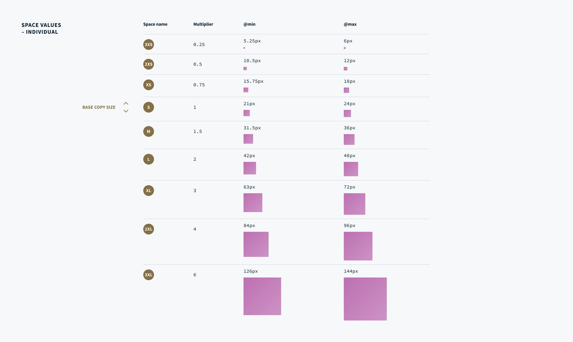
Taking “Step 0” from the fluid type scale as our base unit, we deploy a set of multipliers to create a selection of space units. To keep things simple, we refer to them as T-shirt sizes: (S)mall, (M)edium, (L)arge, etc. Thanks to the fluid base unit, these values subtly shrink and grow according to screen size.

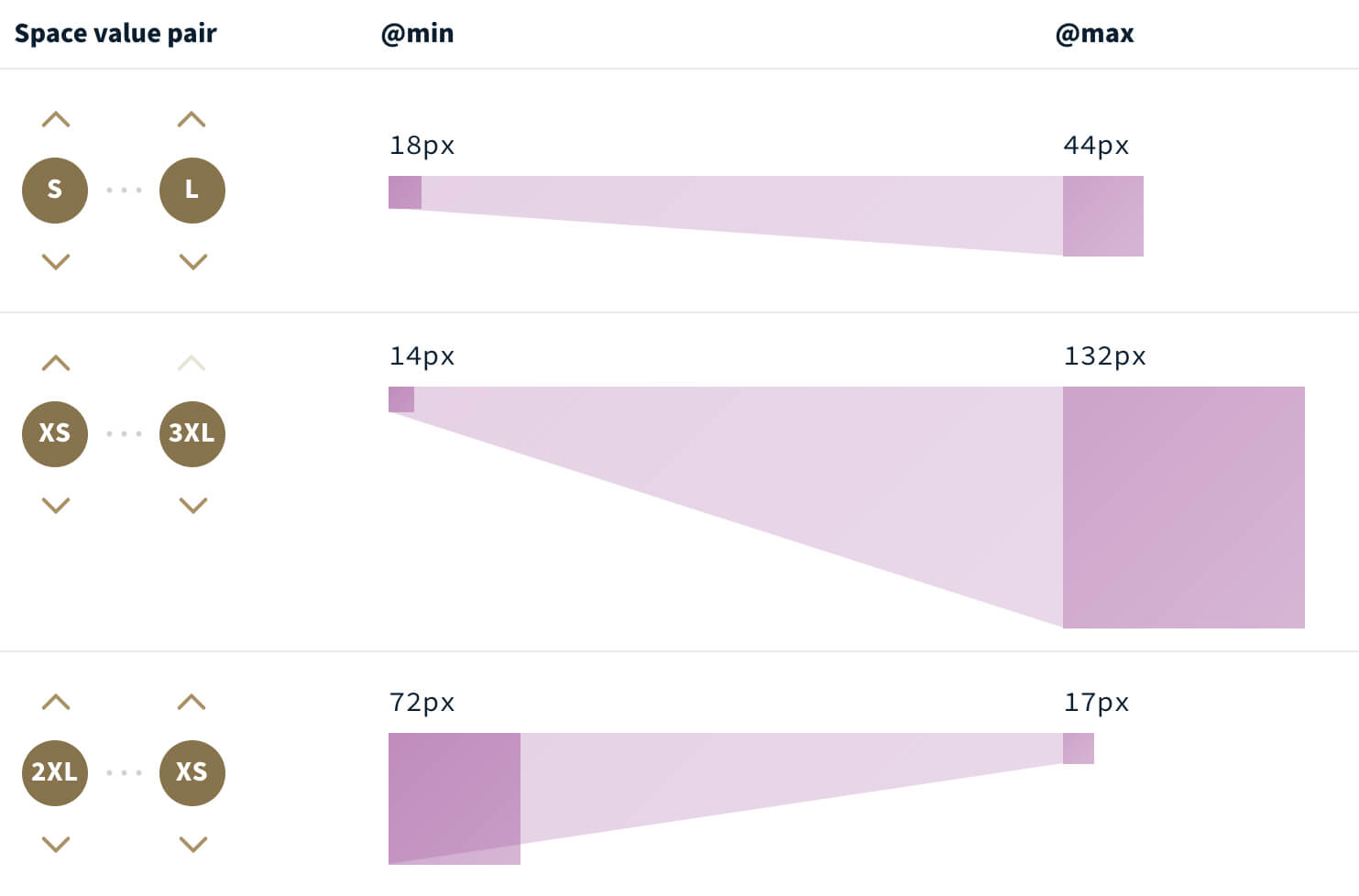
Where many systems swap space values at arbitrary breakpoints, Utopia has an alternative take. Each individual space unit can interpolate to a different unit between your min and max breakpoints. Out of the box, Utopia creates “single-step pairs” that take one step up the ladder of sizes (2XS → XS, XS → S, etc) but the tool also allows you to create any number of custom pairs.
These pairs can create incredibly steep slopes (XS → 3XL), perfect for handling spacing for hero slats, or even reverse slopes that get smaller as the viewport width expands (2XL → XS).

Designing With Fluid Space
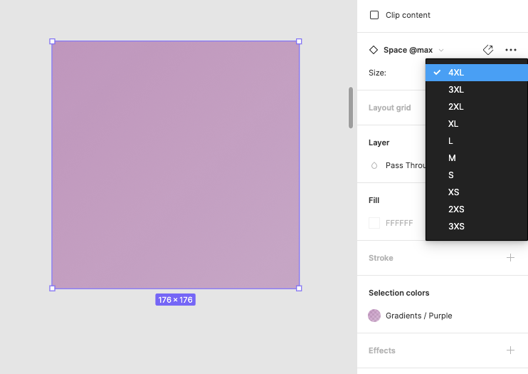
Within Figma, we’ll create a set of space components for min- and max-sized spaces. Using variants, we can easily swap between each T-shirt size. A Figma plugin that automates this process is on our roadmap.
Using these spaces as guides, we can place them between our components to ensure visual consistency. We’ve found that after a short period of time, the handful of space values commit themselves to your memory, and laying out conforming designs without the space guides becomes second nature.
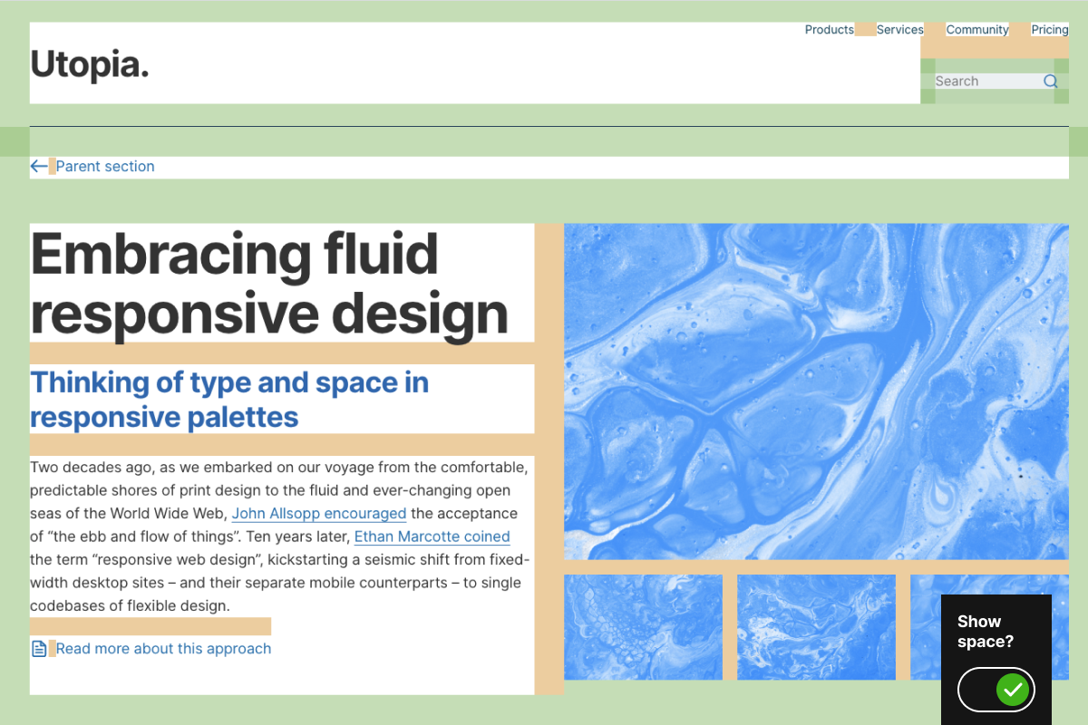
We’ve built a demo to show how this comes together in the browser, and how intentional space becomes with Utopia.

You can read more about designing with a fluid space palette on the Utopia blog.
Developing With Fluid Space
Much like the typographic tool, we can export CSS directly from the space calculator and implement it with custom properties or utility classes, like so:
.grid-of-two {
  display: grid;
  grid-template-columns: repeat(2, 1fr);
  grid-gap: var(--space-s-l); // (S) 18px → (L) 44px
  margin-bottom: var(--space-xs); // 14px → 17px
}
With a shared palette of fluid spaces, we’ve found we no longer need mockups of every element at multiple viewport widths. As a developer using Utopia, you now take on some of the responsibility for the nuance of the responsive design of your project. This space system empowers you to paint the appropriate fluid space across your interface as you see fit.
Where specific components require bespoke designs on smaller screens, a targeted mockup can be created. A site header is a good example. This allows the designer to spend their time more wisely, focusing on thorny design problems, rather than creating mockups of situations that are automatically resolved by Utopia.
It’s no exaggeration to say that this approach has revolutionized the way we develop for the web, and has rapidly increased the speed at which we can turn flat designs into harmonious, fluid, and intentional digital layouts. It might feel somewhat unintuitive to design this way at first but once it clicks, you won’t want to go back.
Recommended reading: Painting With A Fluid Space Palette
Utopia In The Real World
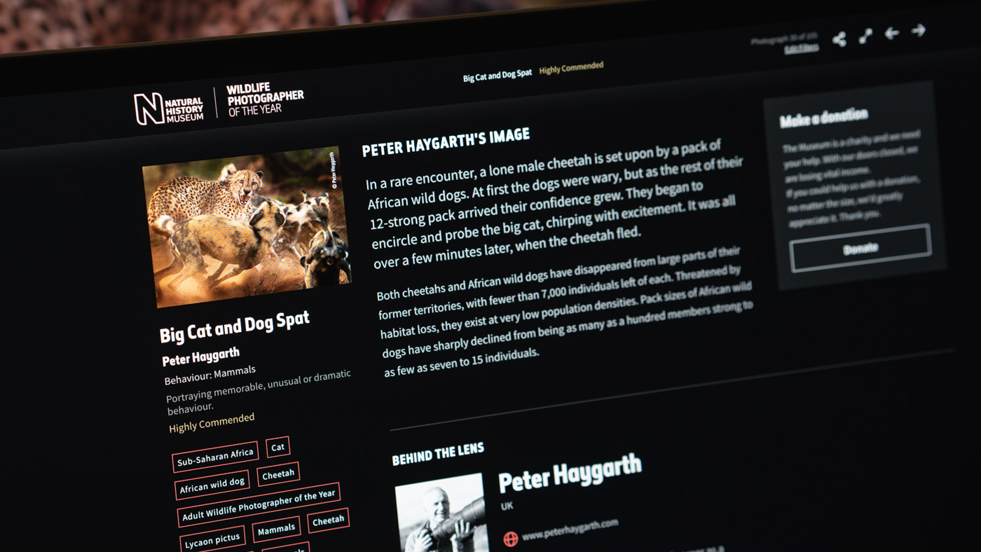
One of the key milestones in the development of Utopia was during Clearleft’s engagement with the Natural History Museum. We worked closely with the digital team to reimagine the Wildlife Photographer of the Year website, the online representation of the largest competition of its kind in the world.
In the physical exhibition, the photographs are thoughtfully arranged, the supporting information beautifully typeset and carefully positioned. We committed to the same degree of consideration for the digital version. Working with this collection of awe-inspiring assets, the job of the new website was simple: “Make the photograph the star”.
This mindset permeated through the design foundations and lent itself perfectly to applying our Utopian principles. If the aim was to display the imagery and associated content in the best possible way on every device, we had two options. We could either saturate our code with fixed breakpoints, or accept the ebb and flow, lean into the fluid medium of the web, and allow the computer to fit the content to its display.

The result of this project was an immersive digital incarnation of the physical experience, with every image given the space to breathe and feel in tune with its surroundings on any device. You can read more about the project in the case study, and hear about it on the Clearleft podcast.
Conclusion
With this approach, every character and every space in every component on every page is tied to a typographic step or space size. Although this approach shortcuts certain design decisions during the project, it’s not a substitute for good design — it takes a skilled designer to set up the appropriate type and space palettes and manage them as the design evolves.
Whether we’re making a design system or something smaller, the pros of a systematic approach almost always outweigh the cons. Depending on the size and scope of a project, introducing a system can feel like overengineering. The Utopia approach is designed to be as lightweight as possible, suitable for use on projects of all shapes and sizes.
Further Reading
- The Timeless Power Of Spreadsheets
- Mastering Typography In Logo Design
- Useful CSS Tips And Techniques
- Context And Variables In The Hugo Static Site Generator
 (vf, il, mrn)

