Guarding Against Disposable Design

Email Newsletter
Weekly tips on front-end & UX.
Trusted by 182,000+ folks.
 Celebrating 10 million developers
 Custom Web Forms for Angular, React, & Vue. Your backend.


Disposability is a tricky term to handle in the digital world. So many things are changing so quickly — programming languages, frameworks, and design trends to name but a few — that it often feels inevitable that the things we make will be outdated almost as soon as we finish making them. This is in many ways an exciting and positive thing, but it can also cause long-term thinking to be drowned out by short-term priorities.
This piece is about what I take disposable web design to mean, and the kind of trouble it can cause. It’s also about longevity in a digital context, with steps we can all take to find the sweet spot between re-inventing the wheel and twiddling our thumbs as the world rushes past us. There is a time and place for different approaches. Planning long-term in some areas allows for unbridled innovation and experimentation in others. Evolution and improvement are good. Cutting corners and putting the cart before the horse is not.
Let’s dive, Troy McClure’s style, into the do’s and don’ts of disposable design.
What Is Disposable Design?
First things first. I think most of us intuitively understand what disposable design means in a general sense: good and bad. Disposable design is single-use plastics. Its structures built using second-rate materials which crumble well before their time. At its worst, it’s short-term thinking and long-term headaches. At its best, it can be savvy and conscientious, like biodegradable tent pegs at a music festival, or scale models.
In this web design context, we’ll be focusing mostly on the ‘at its worst’ aspects, with similar nods to times when it can be (and is) very useful. Longevity is a more slippery concept online, but again we tend to recognize the sins when we see them. Here is a handful:
- Unpleasant UX.
We’ve all stumbled across websites warped out of shape due to lack of future-proofing. Elements out of place, buttons not working, and the site gently croaking ‘kill me’ are just a few of the things we notice in the seconds before clicking away, never to return. - Following design fads rather than shaping design around content.
Do you remember parallax scrolling? Carousels? There are perfectly good reasons for any feature in the right context; being cool is not one of them. Fads are even more egregious when they clash with the rest of the design. - Broken links, internal and external.
One of the Web’s greatest gifts is links. Dead links rob users of context, destroy the browsing flow, and perhaps worst of all, waste people’s time. - Ever-growing navigation drawers with no obvious pattern or logic.
Headers are supposed to make navigating the site easier, not harder. - Quick fixes.
This runs a gauntlet all the way from obvious hotfixes that were never followed up on to hardcoded snippets with uncanny knacks for breaking everything else on the site.
As well as being frustrating on a day-to-day basis, these kinds of issues tend to stem from the kind of approach that leaves sites needing replacing or redesigning far sooner than they should. Sometimes only a new website will do, but every year? There comes a point where such projects become a resource drain.
The Causes
In a way, disposable design is the tip of a bad practice iceberg. There are a lot of potential factors that lead to it which can wreak havoc elsewhere. Some I’ve witnessed (and to be frank, been guilty of) myself, others from afar.
Poor Planning
Fail to prepare, prepare to fail. The maxim rings true in the world of web development. Whether you’re building a portfolio, an e-commerce store, a magazine, a hotel booking site, or whatever else, flimsy planning will lead to flimsy design. If you don’t know what you need, the odds of you landing on the right answer by chance are pretty slim.
Design goes hand in hand with purpose. You wouldn’t build an airplane without a blueprint, would you? We need to know the purpose before steaming into building things. I touched on this in What Vitruvius Can Teach Us About Web Design, and there is a near-endless supply of great material on the topic. Below are just a handful:
- A Comprehensive Website Planning Guide (Part 1) by Ben Seigel
- A Comprehensive Website Planning Guide (Part 2) by Ben Seigel
- A Comprehensive Website Planning Guide (Part 3) by Ben Seigel
- Form Follows Function? by Steven Bradley
As ever there is a balance to be struck. Things like accessibility, navigation, and information architecture have to be baked into a website early on, while the styling of your hyperlinks can afford to evolve as the site settles. You can’t account for everything, but you can certainly point yourself in the right direction and give the project a decent shot at success. If you set yourself up with a working compass then you don’t necessarily need to know the exact path.
Following Fads
The Web evolves much faster than the natural world. Every day brings with it new ideas, new standards, new frameworks, new possibilities. All that is gold does not glitter, though. There is a fine line between progress and fads, but again we tend to intuitively recognize the difference when we see it.
![Every [REDACTED] Bootstrap Website Ever](https://archive.smashing.media/assets/344dbf88-fdf9-42bb-adb4-46f01eedd629/d71cf6e6-743e-4d30-adec-ff16d22a7b85/6-guarding-against-disposable-design.png)
Parallax scrolling may look snazzy, and that full-page video loop on the home page may have a certain wow factor, but are those things serving the site and its users? Sometimes the answer is yes, and that’s fine, but sometimes they feel like they’re overcompensating for a lack of substance.
A similar ethos applies to frameworks, though for slightly different reasons. As former Smashing editor-in-chief Rachel Andrew writes, HTML and CSS “is the bedrock of everything that we do,” but most projects larger than a few pages are likely to involve the likes of React or Vue. No-one likes a monopoly, but using established, supported frameworks is usually the sensible choice. That revolutionary new one you’ve been reading about certainly deserves attention, but maybe not on your client’s make-or-break online store.
- The Brutal Lifecycle of JavaScript Frameworks by Ian Allen
- Don’t Follow Web Design Trends: Set Them! by Dmitry Fadeyev
- What Should You Do When A Web Design Trend Becomes Too Popular? by Suzanne Scacca
In short, make choices based on what’s right for the project, not on what everyone else is doing in a given week.
Poor Documentation
Good documentation is so important. It forces you to clarify your own thinking as well as giving other people a fighting chance of understanding what on earth you’ve done. If you fled the country tomorrow would anyone else know how the site works? Can the client use it? Are they able to post blog entries themselves and update key content? Usage and handover documentation keep projects alive and growing.
Knowledge hoarding might be good for you, but it’s terrible for the project. Not only does it obscure the inner workings, but it also denies them the outside scrutiny that would likely make them better. Everyone being on the same page about the fundamentals allows you all to focus on the more inspiring stuff. (This also is a key benefit of using proven frameworks. People may come and go but at least there’s continuity in the tech, which requires less personalized explanation.)
Below are some good starting points for better documentation:
- How To Make Web Design Documentation Suck Less by Yona Gidalevitz
- MDN Web Docs is itself a fantastic source of inspiration for good documentation
- Write the Doc’s documentation guide, a superb collective wisdom resource
In fairness, some people have no interest in knowing how certain things work. I don’t like that as an excuse to skip documentation altogether, though. Anything worth doing is worth doing well for its own sake. Even documentation can be beautiful and inspiring. A friend of mine was working on Stripe integration a while back and linked me to their documentation. I was rather floored by how well done it is:
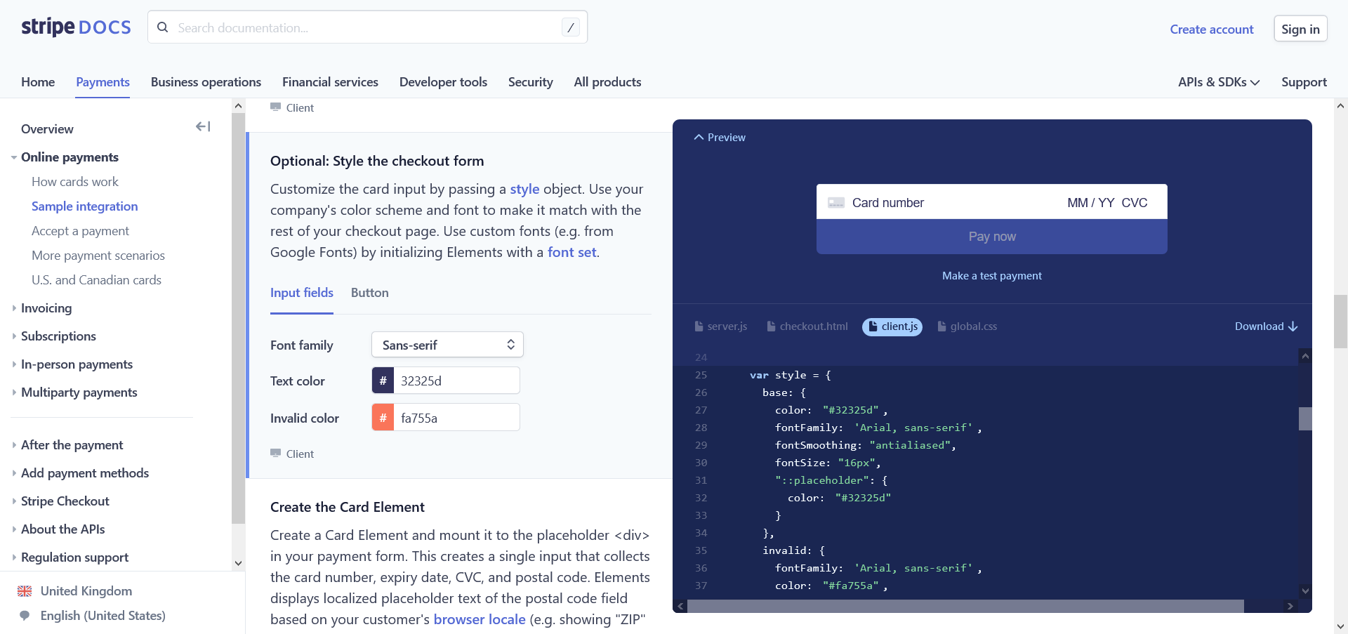
As you scroll through the documentation, a preview of example code scrolls along with you, highlighting the sections you’re reading. We don’t all have to go this far, by why aim for less than excellence?
Outsourcing
It’s tempting to embed third-party platforms on websites. It’s easy and it spares you the hassle of building something yourself. Why make an image gallery when I can just slap it on my Instagram feed instead? Why maintain a blog when I can just show my Twitter feed? Hell, why build a site at all? Squarespace templates are pretty cool and it’s not my money anyway.
The answer to most of these questions is: you don’t own the content that is not on your own website. You’re a guest playing by someone else’s rules, and usually paying more money for the privilege. As Ana Rodrigues wrote about in her case for the IndieWeb last year, a website is the beating heart of your web presence. If you outsource your content to third-party platforms, it’s not going to age well. It rings hollow.
Short-termism
A lot of this boils down to short-term thinking and rushed (or nonexistent) preparation. I’ve developed something of a nervous tick when it comes to the phrase ‘quick wins.’ They can be useful, but easily corrupted. Too many quick wins create disposable design, and a race to the bottom. There is no question time passes faster online, but that doesn’t mean longevity isn’t a worthy goal. If anything it’s all the more important.
What, then, does that look like?
Building To Last
In many ways, the ease with which sites can be chopped and changed is one of the web’s greatest strengths. In the real world, junk has a very real negative impact on the world — landfills of obsolete tech, abandoned buildings, beaches piled high with plastics. Not so online. When something is outdated you press delete and poof! it’s gone. There are no beaches piled high with discarded websites; it’s just code. (That said, the carbon footprint of the web is growing and not to be dismissed.)
What exactly is the benefit of longevity online? And how can it be sustainable given the relentless change we all have to deal with? Jeremy Keith’s presentation ‘The Long Web’ gets to the roots of those questions just as well today as when he delivered it in 2008. For me, it boils down to direction. If you understand what a site is for, where it’s going, and how it’s likely to change, you can separate what should be constant and what should be flexible.
In some areas consistency is essential. For example:
- URL structure.
Playing fast and loose with page slugs is generally a bad idea. It’s bad for SEO, it’s dreadful for UX, and it’s a real pain to tidy up. - Branding.
Familiarity breeds… familiarity. Let’s say you run an online store and make wholesale changes to the layout and navigation every couple of months. Eventually, customers are going to get tired of the constant reinventions. - Content strategy and tone of voice.
What we write and how we write it has a huge impact on a site’s character. Whether it’s a magazine or a weather forecast web app, unclear, inconsistent writing comes across as amateurish. On the flipside, a reliable voice connects past, present, and future. - Design best practice.
For all the trends in graphic design and UX, the fundamentals change much more slowly. A site that embraces the basics of typography, color palettes, grid systems, and navigation is setting itself up to last. - Accessibility.
You can’t retrofit fit website accessibility. Not well anyway. As Joy Heron writes in her recent piece on ‘Responsible Web Applications,’ failure to do so is frankly irresponsible (and I write that as someone guilty of it myself in the past).
In many ways disposable design makes change harder. It forces you to start from scratch when history tells us it’s generally better to iterate. Sometimes you have to go back to the drawing board — no doubt — but there comes a point where there is more to be gained on nailing down a core offering.
Sustainable Web Design
Longevity is different online than it is in, say, infrastructure or housing. If a pair of shoes lasts thirty years, what do you have? A good pair of shoes. If a building stands for centuries and remains structurally sound and useful, what do you have? A good building. If a website is the same now as it was thirty years ago, what do you have? Well, the Space Jam promo site. Iconic perhaps, but hardly the cutting edge of web design.
In the realm of web development, I’ve grown to think the International Space Station is a particularly good model to follow when seeking that sweet spot between durability and flexibility. Hear me out. The station has been operating since 1998. That’s right, it’s almost a quarter of a century old. How is that possible? Modular design and long-term thinking.


Is the total as cutting edge as a new one from scratch would be? Not by a long shot, but that is also a testament to its longevity. It’s already the most expensive thing ever built (over $100 billion, baby) so best make it last. And yes, one day there will have to be a successor to the ISS — a rebuild, if you will. They’re already preparing for it. New modules will be made with a view for them to detach as part of a separate station. Neat, huh?
Changeability is part of the design. It is modular rather than a monolith, changing organically over time. For a similar example in the natural world look no further than your own body, which replaces its own cells over time. By breaking up projects into different sections or repositories, it frees you up to innovate without having to rebuild the whole thing. Amendments are smoother than rewrites.
Resilience
Making a website’s design last in this way means solving not just current problems, but future problems too. Some things are impossible to predict, but others aren’t. Asking the right questions can make a huge difference to longevity. While discussing this topic with Vitaly Friedman, he summed up the process in three simple words: What happens if…?
Some examples to raise your blood pressure a few notches:
- What happens if… we have 50 items in the navbar, rather than 5?
- What happens if… we hit 100 blog posts, or 1,000?
- What happens if… we have a very dense table with 15 columns on this page?
- What happens if… we include a third-party widget that loads 10 external resources?
- What happens if… our heaviest page is being viewed on the worst possible mobile device with a poor 3G connection?
- What happens if… we want to flesh out our Progressive Web App functionality?
- What happens if… we want to translate our UI to other languages?
- What happens if… the text on a button is lengthy?
- What happens if… someone can only navigate the site with a screen reader?
That simple prompt can lead to all sorts of good follow-up questions, questions that you as a designer will need to answer. Of all things, I’m reminded of one of Kurt Vonnegut’s rules for writing fiction:
“Be a sadist. No matter how sweet and innocent your leading characters, make awful things happen to them — in order that the reader may see what they are made of.”
Give your websites the same treatment. Subject them to the kinds of (hypothetical) strains and mishaps you wouldn’t wish osn your worst enemy. Only then can you see what it is made of, and what you need to do to make it truly resilient.
From architecture to manufacturing to space exploration, the value of that inner sadist is immeasurable. Do you think the brains behind the International Space Station haven’t considered every possible way things could go wrong? They probably have a plan for an alien invasion, just in case.
Longevity Success Stories
If a space station can function for 20 years without becoming obsolete, websites can too. Indeed, many have. Conveniently for me, Wikipedia happened to hit that very benchmark in January. Despite being one of the most visited, most edited sites on the Web, its core offering now is the same now as it was in the early 2000s. If it ain’t broke…
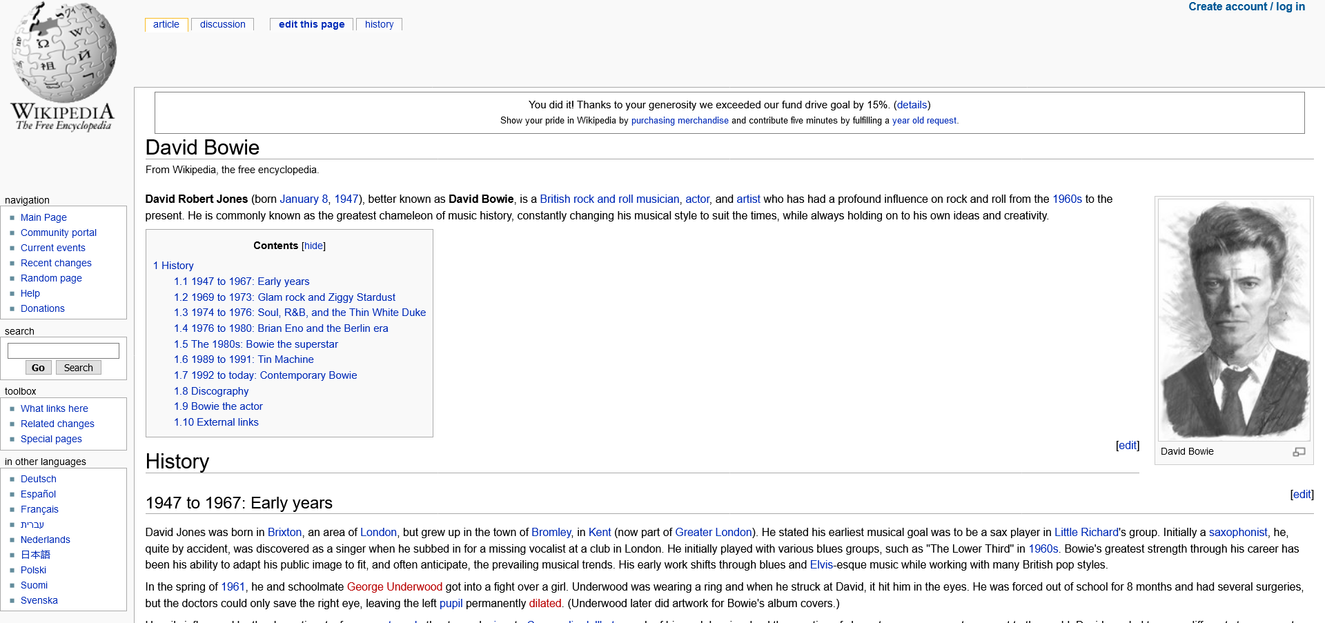
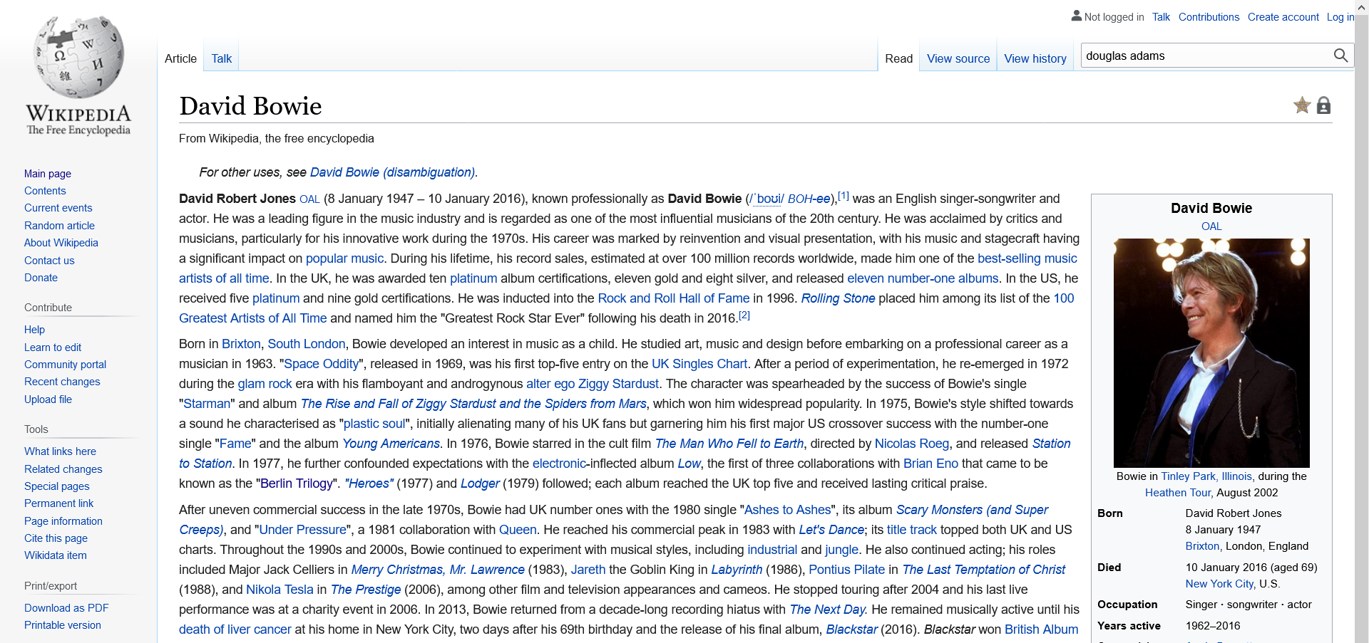
At the same time, few would argue the Wikimedia Foundation has been static or behind the times. Its Wikidata and Abstract Wiki initiatives, for example, serve as nodes, bringing new qualities to the table while enriching the project as a whole. Wikipedia and its ‘modules’ endure because they are shaped around a clear purpose and a long-term outlook.
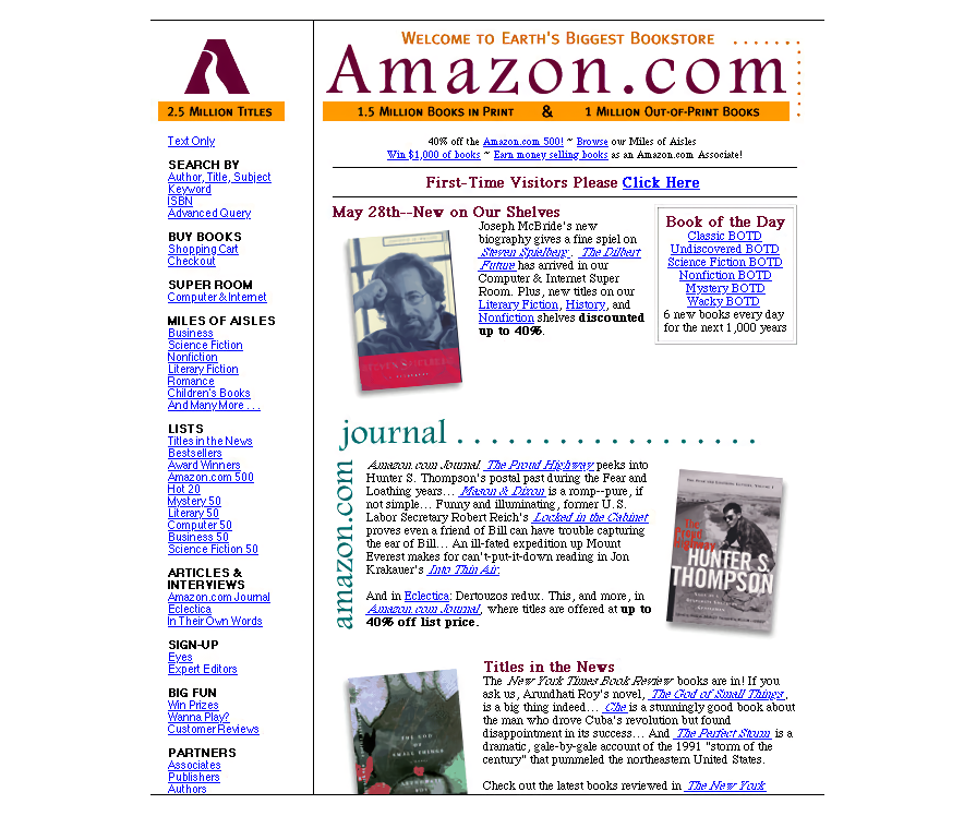
For a more commercial it’s hard to look past Amazon. Version Museum’s history of the site is fascinating. Today’s Amazon is wildly different from the Amazon of 1994, and yet there’s a smooth sense of evolution. Aside from some early teething, none of the design changes feel jarring.
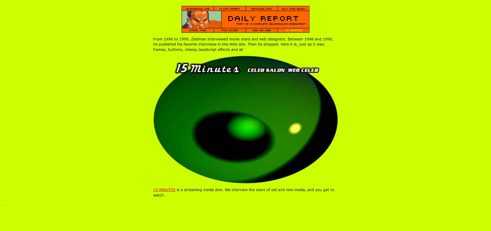
On a less gargantuan scale, I have nothing but respect and admiration for Jeffrey Zeldman’s preservation of content dating back to 1995. (See the ‘Pardon My Archives’ section at the bottom.) A solid 26 years of content. Now there’s a website built to last.
Meanwhile, under the hood examples run across a spectrum. Frameworks like React and Vue have modular design baked in via components. With them, a site is not a monolith, but a series of bite-sized parts which can be chopped and changed without breaking everything.
Further along the scale, you’ll find the likes of The Guardian, which publishes its source code on GitHub. From front-end website code to apps to in-house tools, there are tens of hundreds of repositories, modules which when pieced together result in an award-winning digital news product. Most of us don’t need thousands of repositories, but the ethos is the same.
There is no one-size-fits-all approach for sustainable web design, but there are recurring principles of purpose, evolution, and long-term thinking. Those are the qualities that allow sites to weather the constant tempests of the Web.
Sustainability Online
There is nothing wrong with redesigns, migrations, and exploring mysterious new online worlds. There is plenty wrong with doing those things for the wrong reasons, and it will catch up with you eventually. Jeff Huang’s Manifesto for Preserving Content on the Web lays out the basics in a way I like very much.
Below are just a few ways to start thinking about long-term:
- Don’t just think about next year.
What do you think it could look like in two years, or five? Or 20?! What can you do to meet that future gracefully? - Design for accessibility.
Not only is this right for its own sake, but it helps make content clearer, machine-readable, and better equipped to adapt to evolving technologies. - Think modular.
As is so often the case in life, breaking down big projects into smaller pieces makes them more manageable and more flexible. Channel your inner International Space Station.
Everyone’s needs are a little different, but the ethos holds true. By laying strong foundations you allow yourself, your peers, and your successors to focus on improvement rather than fixes. It gets us closer to a Web where dead links, by-the-numbers design, and third-party domination are exceptions rather than the norm.
Further Reading
- Interview With Björn Ottosson, Creator Of The Oklab Color Space
- Alternatives To Typical Technical Illustrations And Data Visualisations
- Rethinking The Role Of Your UX Teams And Move Beyond Firefighting
- Getting To The Bottom Of Minimum WCAG-Conformant Interactive Element Size
 (vf, yk, il, mrn)

