User-Friendly Mega-Dropdowns: When Hover Menus Fail

Email Newsletter
Weekly tips on front-end & UX.
Trusted by 182,000+ folks.
 Register for Free
 Celebrating 10 million developers

 Custom Web Forms for Angular, React, & Vue. Your backend.

Complex websites often rely on complex navigation. When a website houses thousands of pages, often combined with micro-websites and hundreds of subsections, eventually the navigation will go deep and broad. And with such a complex multi-level navigation, showing the breadth of options requires quite a bit of space. Think of large eCommerce retailers and large corporate sites, catering to many audiences and having plenty of entry points.
No wonder that a common way to deal with this complexity is to expose customers to a large amount of navigation quickly. That’s exactly why mega-dropdowns have become somewhat an institution on the web — albeit mostly for complex and large projects. A mega-dropdown is essentially a large overlay that appears on a user’s action. Usually it includes a mixed bag of links, buttons, thumbnails and sometimes nested dropdowns and overlays on its own.
For decades, a common behavior for this kind of navigation is to open the menu on mouse hover. And for decades, a common user’s complaint about this pattern has been the absolute lack of certainty and control about how and when the sub-navigation opens and closes.
Sometimes the submenu appears unexpectedly, and sometimes it suddenly disappears, and sometimes it stays on the screen for a while, although the mouse pointer is already in a very different part of the page, or on another page altogether.
Why Are Mega-Dropdowns Hover Menus Frustrating?
The main reason why mega-dropdowns can be cumbersome to use is because of a mismatch of intentions and expectations. With hover menus, we try to deduce and act on a particular intent by tracking mouse behavior, yet our customers might have very different objectives and very different limitations when accessing a page.
Customer’s behavior is usually unpredictable, even although our analytics might tell a slightly different story with data points gathered and normalized over a longer period of time. We just rarely can predict behavior accurately.
The common scenarios we usually explore are:
- The customer is aiming at the category link and travels there directly to explore the sub-navigation items in that category.
- The customer is moving the mouse towards a target on the screen, but the trajectory that the mouse has to travel covers a nav link that opens a mega-dropdown.
However, there are also plenty of other situations to consider. Just to name a few:
- The customer wants to look up mega-dropdown options while typing in a search autocomplete. To do that, they have to keep re-opening mega-dropdown, or use separate browse tabs, positioned side by side.
- The customer might use a trackpad (or a mouse) to operate a large secondary display, so pointer movements will be slower, abrupt and inaccurate. This would cause the mega-dropdown to open involuntarily every time the user pauses when traveling to CTAs or shopping cart at the top of the page.
- The customer wants to open the category page, so they travel to the category link, click on it, but experience flickering because a mega-dropdown appears delayed.
- With nested sub-menus within a mega-dropdown, the customer wants to explore similar items within the category in which they currently are, but because of nesting, they have to re-open the mega-dropdown over and over again, and travel the same hover tunnel over and over again.
- Imagine a situation when you want to resize the window, and just as you are about to snap to the right edge of the window, a hover menu keeps showing up — just because you’ve moved your mouse cursor too closely.
- The user starts scrolling down slowly to assess the content on a page, but the menu keeps popping up. And every time the user bumps away a cursor to read the contents of the mega-dropdown, the menu accidentally disappears.
The problem is that we need to support all these intentions and all these accidents, but at the same time we need to make sure that we don’t create an annoying and frustrating experience for any of these cases either. Of course, as designers and developers, we’ve invented a number of techniques to tackle this problem.
Hover Entry/Exit Delay
One of the first solutions, and also one of the most common ones still, is to introduce a hover entry/exit delay. We need to make sure that the menu doesn’t open and doesn’t close too early. To achieve that, we introduce a delay, usually around 0.5 seconds. That means that we give customers a buffer of around 0.5 seconds to:
- Cross the trajectory to a remote target if needed, or
- Indicate that they intent to explore the navigation by remaining on the mega-dropdown category link, or
- Correct a mistake if they left the boundaries of a mega-dropdown by accident.
In other words, as long as the customer stays within the mega-dropdown overlay, we keep displaying it. And we hide the overlay once the customer has moved their mouse cursor outside of the sub-navigation overlay for at least 0.5 seconds.
While it solves the problem of accidental flickering on the page, it introduces a lag in cases when a user has left the mega-dropdown for more than 0.5 seconds. As a result, it slows down every interaction with the mega-dropdown across the entire site. Unfortunately, it becomes very quickly very noticeable, especially if the navigation is used a lot.
Some implementations add a fade-in/fade-out transition to make the appearance of a mega-dropdown less sudden, but in practice it results in an increase of the entry/exit delay to 0.8–0.9s, which also introduces a more noticeable lag. An example of it is ADAC.de, with a 100ms fade-in delay and a 300ms fade-out transition. (The transition doesn’t apply when switching between different categories of the mega-dropdown though.)
Obviously, the longer the overlay stays visible, the harsher we penalize people who intentionally want to escape the overlay. In reality, this becomes a problem as we introduce a superficial timeout between the user’s action and the UI’s response.
Forgiving Mouse Movement Paths: Trajectory Triangle
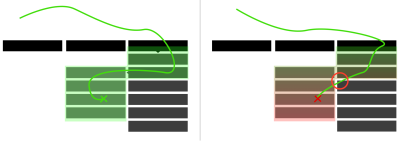
Instead of introducing a delay, we can try to be more generous with the paths that the customers will be traveling. Since mouse movements are inherently inaccurate, to minimize frustration, we can avoid narrow hover tunnels and make travel corridors larger.
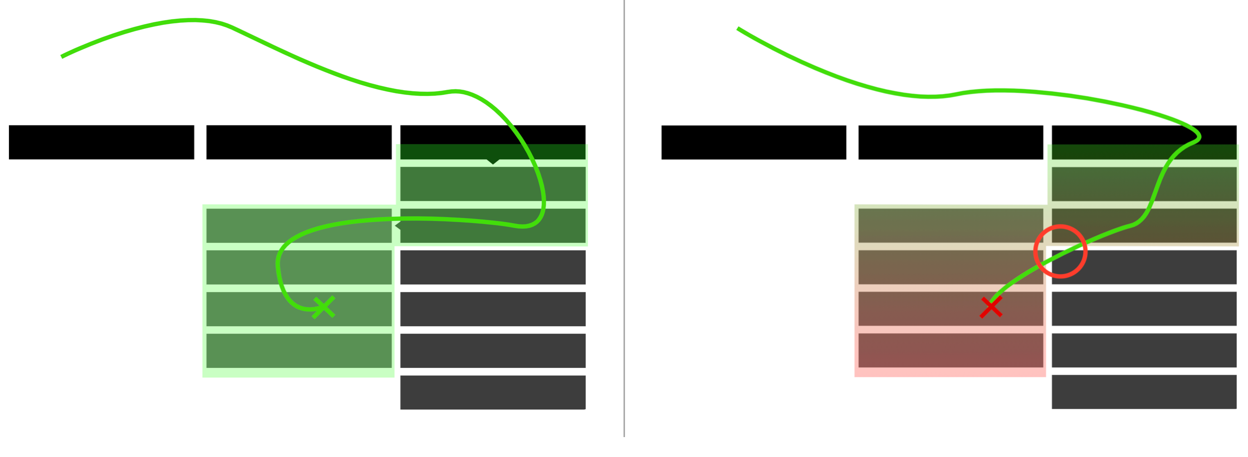
For example, we can use Amazon’s triangle technique, in which we built a trajectory triangle that connects the current position of the mouse pointer with the edges of the mega-dropdown area. If that area is supposed to appear next to the categories on the right (as displayed in the image below), we connect the mouse pointer with the right upper and right bottom edges of the container in which the categories are listed.
As long as the user stays within the triangle or within the entire mega-dropdown area, the overlay is still displayed. If the user chooses to travel outside of the triangle, the content of the mega-dropdown overlay will change accordingly. And of course it will disappear altogether immediately once the user has moved outside of the category list altogether.
Chris Coyier highlights some of the technical intricacies of this technique in his post on Dropdown Menus with More Forgiving Mouse Movement Paths, along with a vanilla JavaScript demo by Alexander Popov on “Aim-Aware Menus”.
With this technique we minimize the friction of sudden disappearance and re-appearance of sub-navigation. But it might become ineffective if category links are positioned too close to each other, or we display the hover menu by hovering over a larger button. We can do a bit better with SVG path exit areas.
SVG Path Exit Areas
When calculating a trajectory triangle with the previous technique, sometimes we would not only track the exact position of the mouse pointer, but also recalculate the triangle with every pointer movement — all the time. We can improve the strategy by calculating the overall SVG overlay area once and track whether the mouse pointer is inside it — without recalculating the triangle all the time. A great example of it is Hakim el Hattab’s implementation that draws the areas dynamically with SVG based on the position of the navigation item on the screen.
Hakim’s solution is actually responsive, so if the sub-navigation doesn’t fit on the screen, it will float next to the main navigation item, displayed in full width or height. The SVG path area will be recalculated accordingly, but only if the user scrolls vertically or horizontally. You can see a working demo of the technique in action on Hakim’s debug view mode of the Menu pattern.
While this option is precise and entirely eliminates the lag we saw with hover delays, it will cause flickering when the customer accidentally travels across a large category list that prompts the mega-dropdown to open on every navigation item.
Again, the root of the problem is that customers don’t have any control on when mega-dropdowns open and close, nor do they often understand when these menus will appear or disappear. This lack of predictability often leads to mistakes and frustrations. But sometimes mega-dropdowns have even further, hidden accessibility issues.
Pitfalls Of Mega-Dropdowns Opening On Hover
As mentioned above, all of the techniques listed above share the same goal. They attempt to predict user’s intent to open and close the navigation menu, relying on some observations around the speed of mouse movements, the duration of the stay in a single area, or the exact position on the screen. These predictions will fail at some point or another for some customers, and there isn’t really much one could do about it.
Mega-dropdowns opening on hover have plenty of accessibility issues. Obviously, we need to support the navigation within the mega-dropdown for keyboard-only users, and we need to ensure that the items are properly announced to screen readers as well. But also in terms of general layout, we need to be cautious about where the mega-dropdown is placed.
Search Interrupted By A Mega-Dropdown
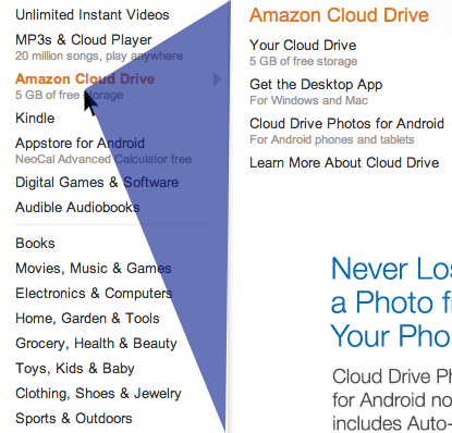
If any important feature is displayed close enough to the mega-dropdown navigation, this will usually cause a good amount of trouble and complaints. For example, if a search bar is displayed above the mega-dropdown area, this will eventually cause an incredible amount of friction and frustration.
Unless a long enough hover entry/exit delay is used, the mega-dropdown-overlay will always get in the way between search and search results, as it’s the case on Thesauraus.com below. Every time a user moves away from the search bar towards the results (and back), the mega-dropdown gets in the way.
Multiple Sub-Navigations Appearing With Delays
The experience is going to be cumbersome when there are multiple sub-navigations opening on hover delayed, one after another. An unfortunate example of it in action is the Vodafone website below. If in this case, every navigation item also acts as a standalone link to the category (additionally to opening a mega-dropdown), we should be expecting plenty of rage clicks all over the website.
In the example above, there are 4 levels of navigation displayed under each other, and 2 of them open on hover with a 300ms transition. At the same time, since each category title is a link to the category’s page as well, users can also jump straight to the category’s page. But once they’ve clicked — and while they are waiting for the new page to appear — the hover menu will briefly make its semi-broken appearance — often not having enough time to transition into the proper view to be registered by a customer.
Add to it any memory or processing issues on user’s slightly older device, a couple of heavy browser extensions, and an antivirus check running in the background, and the overall experience will quickly become unbearable.
Besides, since the 4th level of navigation appears only on hover if the 3rd level of navigation is akready open, and the 3rd level of navigation appears only on hover if the 2nd level of navigation is already open, to move between the pages of the 4th level, users have to re-open the navigation over and over again and remember where they clicked previously to hover tunnel to the 4th level.
We basically multiply the delays and hover tunnel issues we talked about earlier, always making users wait for the navigation to appear, and asking them to be very precise within a hover corridor once the navigation does appear. That’s where the frustration is coming from.

In case you do have to deal with a complex navigation of this kind, it might be worth testing if issues disappear when only one (rather than two) hover menu is used. That menu would be slightly larger and house all options within columns. Or if possible, for every category, consider displaying all navigation options within that category as a permanent navigation bar (sidebar or a sticky top bar) — usually it should eliminate all these issues altogether.
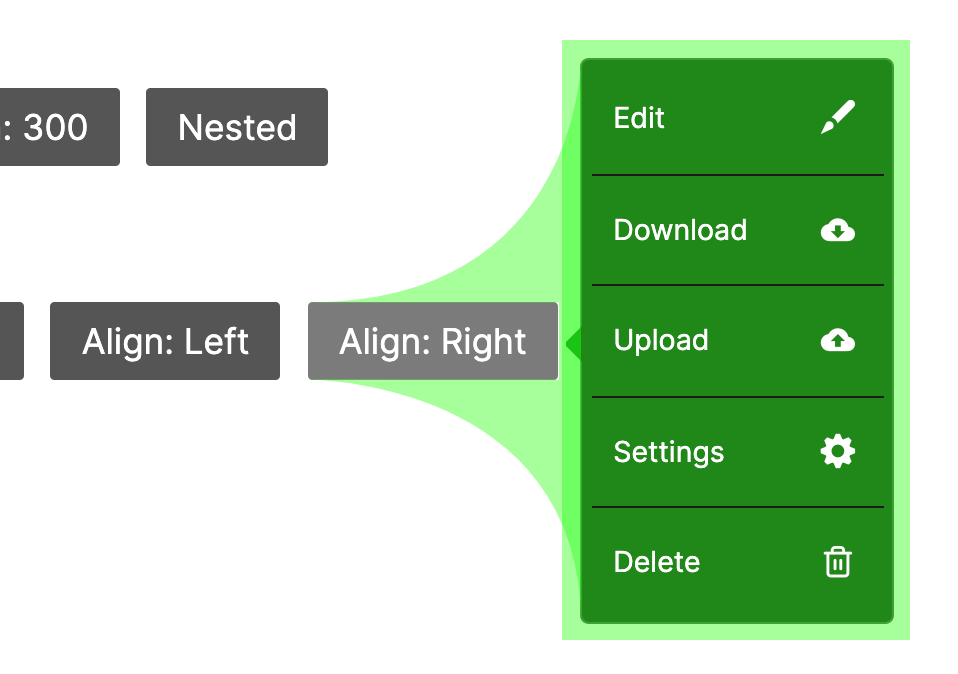
Category Titles Doing Too Many Things
As we’ve seen previously, sometimes category titles have two different functions. On the one hand, each category title could be linked to the category’s page, so customers could click on them to go straight to the page. On the other hand, they also could open a mega-dropdown overlay. So if the user is hovering over the title for a long enough time, the mega-dropdown will open, but the user might have clicked on a link already, and this will cause flickering. For customers, it’s difficult to have the right expectations when the interface doesn’t really provide any hints.
There are a few options to resolve this problem:
- To indicate that the category’s title is a link, it might be helpful to underline it,
- To make the distinction between the category title and a dropdown more obvious, add a vertical separator (e.g. vertical line) and an icon (chevron),
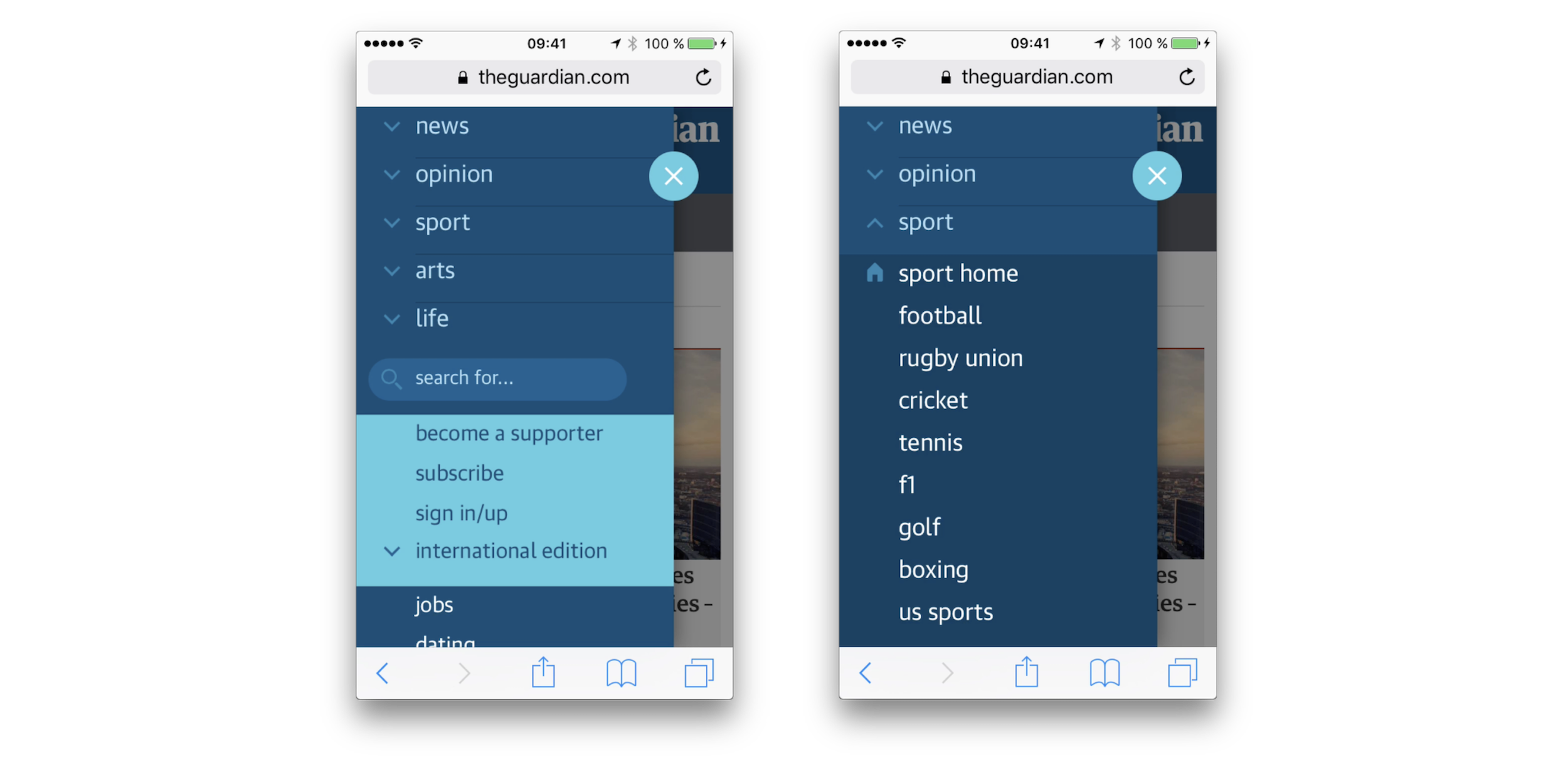
- Leave the category’s title opening only the mega-dropdown, and add a link to the category’s “Home” section within the mega-dropdown overlay. It could also be a prominent “See all options” button instead (see The Guardian example above).
As mentioned above, sometimes you can see an extra icon being used to indicate that the menu opens an overlay, while the category’s title is a link. In our usability tests, we noticed that whenever an icon is present (and it doesn’t matter which icon that is), users often make a mental distinction between the action that will be prompted by a click on an icon, and the action prompted by a click on the category title.
In the former case, they usually expect a dropdown to open, and in the latter case, the category page to appear. More importantly, they seem to expect the menu to open on tap/click, rather than hover.
Mailchimp is a good example of a mega-dropdown that avoids most of the issues described above, with category’s titles acting only to open a mega-dropdown. The dropdown is accessible for keyboard-users with a :focus style. Once selected, each category is highlighted as underlined, and it might lead some people to assume that the title has turned into a link, especially because the underline is exactly the same for the “Pricing” link at the top of the navigation. Perhaps highlighting it with a background color would be a bit more bulletproof. A great reference example to consider for hover menus.
In general, it seems to be a good idea to avoid overloading category titles with multiple functions. This goes not only for mega-dropdown menus, but pretty much for all menus, including accordions or tooltips: the entire area should serve as expansion, showing navigation options when tapped or clicked. In most cases, that’s just more straightforward and less frustrating this way.
Designing A Better Mega-Dropdown: Tap/Click Menu
One of the common reasons why mega-dropdowns often open on hover because many large companies want to expose their customers to the breadth of options available on the site, quickly. With the navigation options changing on hover, we can display more options faster, and the customer can explore more options faster as well. That’s why it’s difficult to imagine a large eCommerce retailer without a large navigation overlay, for example.
However, it’s a good idea to test if the engagement time and click-through rates remain the same (or increase) if the hover navigation is replaced with a tap/click navigation. In fact, most of the issues listed above can be resolved easily by doing just that: the mega-dropdown overlay would open and close only when the user explicitly prompts this particular action. Hence, there is no need to track the mouse pointer, or finetune hover entry/exit delays. Plus, since there is no hover on mobile anyway, we need to provide an option to open the menu on tap/click for mobile one way or the other, so we can just keep it this way for larger screens as well.
A good example of this in action is the Jewish Museum Berlin website. Not only does the top navigation bar open mega-dropdown menus on tap and click, but so does the icon-based sidebar navigation, too. Also, because the user has to actively open/close the overlay, we can highlight the selected category with the :focus/:active styles.
The website doesn’t use any icon to indicate that the menu could be open or closed, and the menu options aren’t links driving to a separate page. This makes the overall experience very calm and predictable, albeit probably slower in exposing navigation options compared with the hover menus.
However, as the website doesn’t have many navigation options to display, this seems to be working very well. And that’s a great reference example to keep in mind when working on an accessible mega-dropdown that’s opening on tap/click.
If you have quite a bit more navigation, a slightly more advanced example is Allianz.de. Instead of using one single large mega-dropdown overlay, sub-navigation is grouped into smaller dropdowns. However, the menu doesn’t always show all options for each category. Instead, it highlights the most important options, with a link to see all options at the bottom. The only detail that might be missing is a chevron indicating that a dropdown-menu would appear on click.
On mobile, the mega-dropdown is a group of accordions, with a good choice of color contrast and indentation to indicate hierarchy of the navigation. Each accordion never shows more than 4 navigation items at a time. A great reference example for a complex mega-dropdown navigation that works well.
If you are looking for a technical implementation, you can check In Praise of the Unambiguous Click Menu, in which Mark Root-Wiley shows how to build an accessible click menu. The idea is to start building the menu as a CSS-only hover menu that uses li:hover > ul and li:focus-within > ul to show the submenus.
Then, we use JavaScript to create the <button> elements, set the aria attributes, and add the event handlers. The final result is available as a code example on CodePen and as a GitHub repo. This should be a good starting point for your menu as well.
Accordions Vs. Overlays Vs. Split-Menus On Mobile
It goes without saying that not every mega-dropdown on tap/click is performing well though. Target.com is another interesting example for an accessible, large navigation that avoids multi-column layout and shows only one level of navigation on the time — all opening on tap/click.
The drop-down shows options in only one column at a time, so as you move within categories, you always stay focused within the same overlay on the screen. Every selected section takes over the entire column. The experience is predictable and calm, but yet again the customer might be seeing less navigation at a time.
Dinoffentligetransport.dk, a public transportation service website from Denmark, uses multiple columns instead, with the navigation at the top complemented with a chevron icon, and opening on tap/click as well.
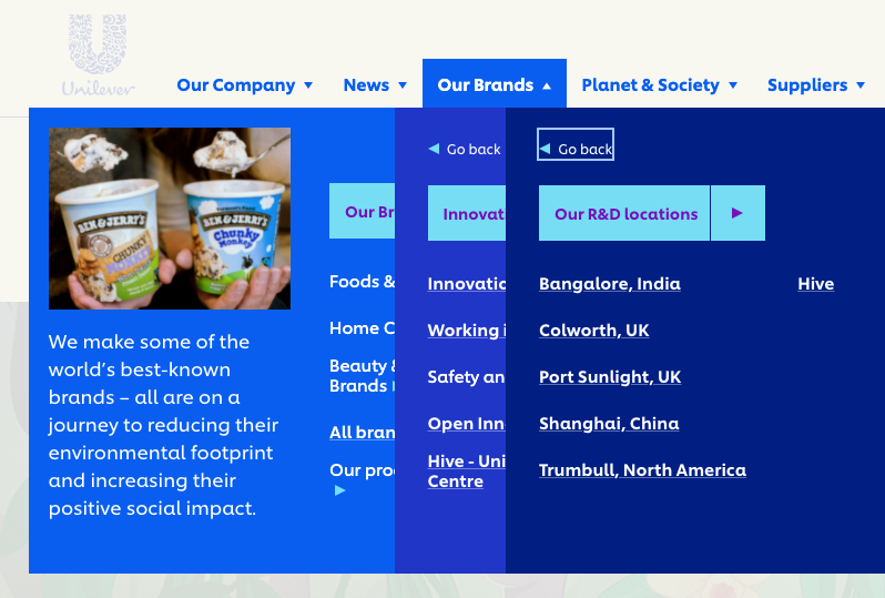
In some other implementations, one can see multiple overlays appearing on top of each other. In fact, that’s the case at Unilever (example below). The mega-dropdown opens on tap/click, with multiple chevrons displayed at the same time. What does each chevron represent? And what should the customer be expecting when clicking on them?

“Our brands” leads to a separate page while each label under it opens a new navigation overlay on top of the mega-dropdown. Did you notice that “All brands” is underlined, while the rest of the navigation option isn’t? One can see the intention of designers creating the menu. Indeed, “All brands” is a link, while the other labels open an overlay:
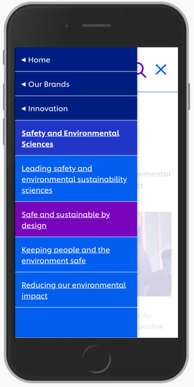
With all of these options in place, how would we go around displaying a mega-dropdown navigation on mobile? As it turns out, grouping such mega-dropdown overlays on mobile is difficult: usually there isn’t enough space nor visual aid to highlight different levels differently and make them easy to distinguish. In the example above, it might take a while to figure out on which page we actually have landed.
It’s a bit easier to understand at which level we currently are and what options we have with an accordion approach, as we can see on Dinoffentligetransport.dk. However, it might be a good idea to underline links within each subsection as they drive customers to the category’s page. Also, the entire category bar should probably be clickable and expand the accordion.
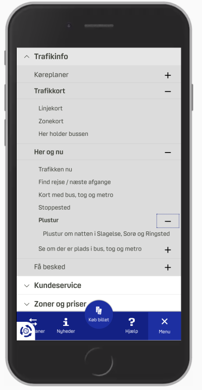
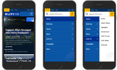
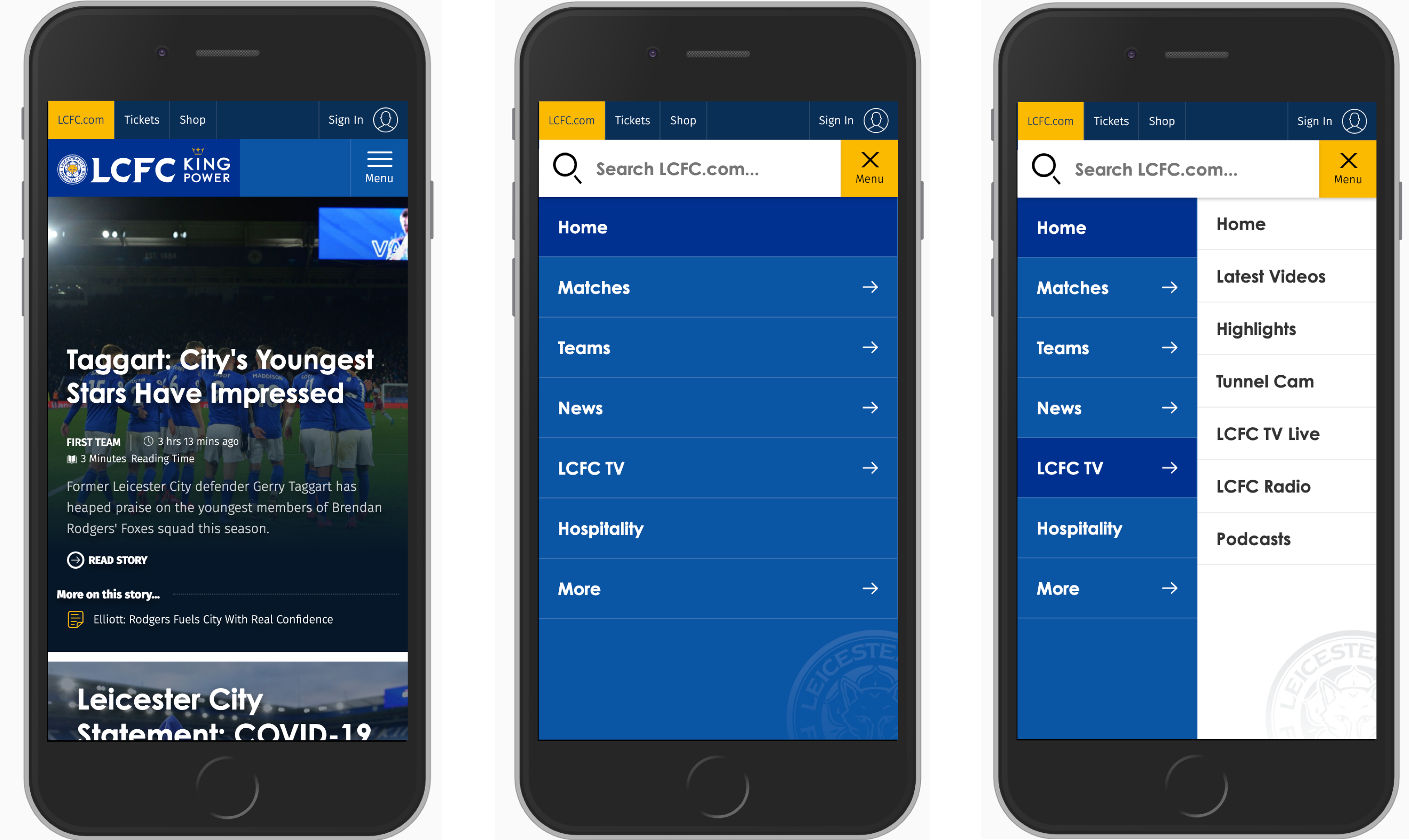
In the example above, most of the time we probably will be able to show a limited amount of navigation sections at a time. But if the titles of each sections are relatively short, we could split the screen horizontally and display multiple levels at the same time. LCFC.com is a good example of this pattern in action.
Which Option Works Best?
In my personal experience, when we compare the implementations of mega-dropdowns on mobile, vertical accordions appear to be faster and more predictable than overlays (be it single-column or multiple layers). And split-menus appear to be faster and more predictable than accordions.
There are a few advantages that both accordions and split-menus provide:
- There is no need to display a “Back” button to return to the parent page.
- The eye doesn’t have to jump between the top of the navigation menu and the section’s sub-navigation with every jump.
- Customers can navigate between multiple levels faster: instead of hitting “Back” multiple times, they can jump to the accordion that they find interesting.
- Customers can explore multiple sections at the same time (unless the implementation automatically closes one accordion when another one has been opened). It isn’t possible with overlays.
In general, accordions and split-menus appear to be a better option. But they don’t seem to be working well when there is a lot of navigation in place. Whenever each category has more than 6–7 items, it proved to be a good idea to either add a “Browse all” button underneath 6–7 items within another accordion (or on a separate page), or use overlays instead.
So depending on the amount of navigation, we can start out with split-menus, then if it’s not viable, move to accordions, and if the navigation is getting complex still, eventually turn accordions into overlays.
When Mega-Dropdown Might Not Be Needed After All
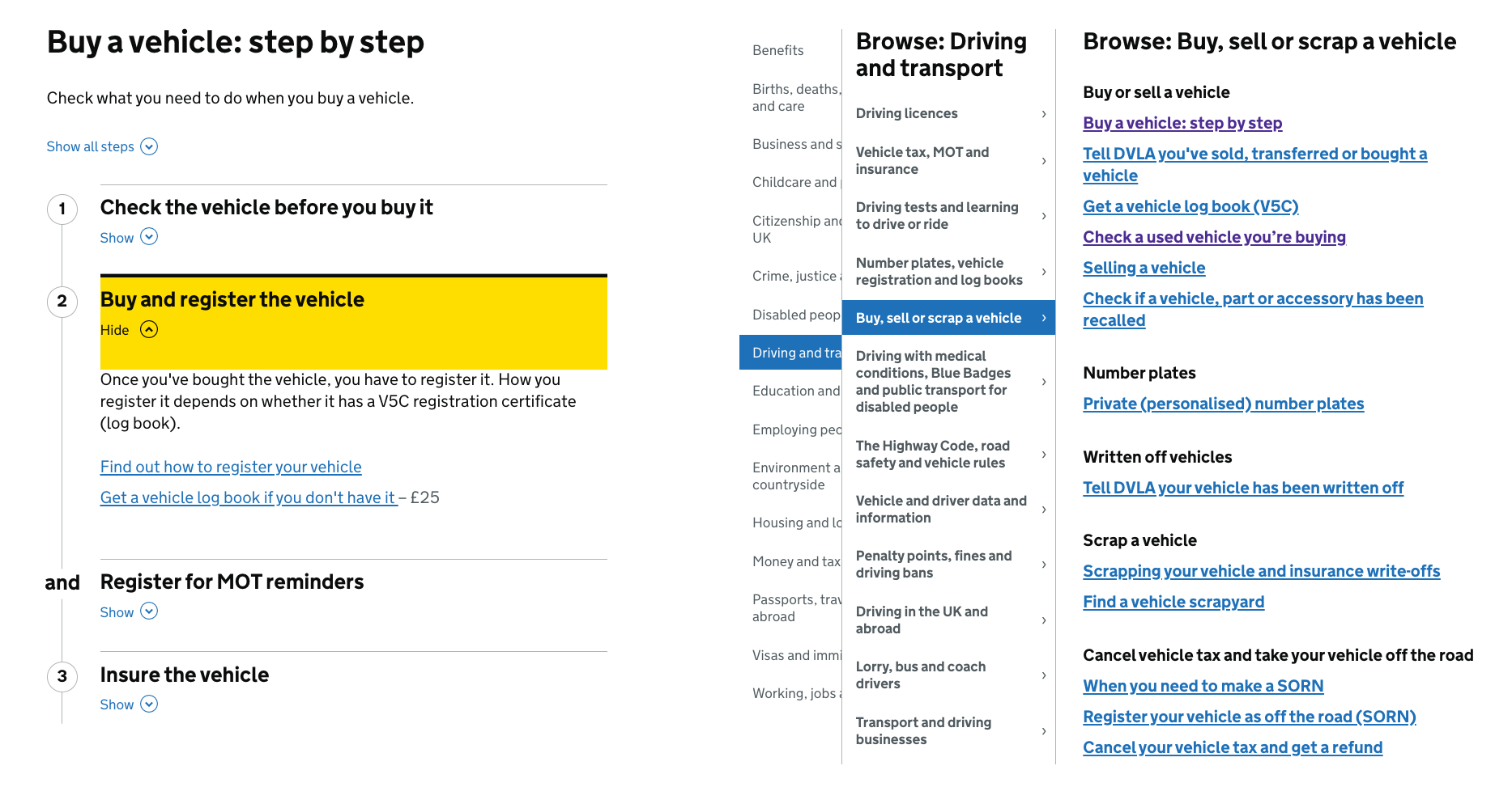
We’ve referenced the work of the Gov.uk team in the previous article already, but their insights are valuable in the context of mega-dropdowns as well. For large, multi-level navigation, the team has decided employed findings by form expert Caroline Jarrett’s one thing per page principle. According to Caroline, “questions that naturally ‘go together’ from the point of designers […] don’t need to be on the same page to work for users”. Caroline primarily applied it to the design of web forms, but we could apply it in the context of navigation as well.
The idea, then, is to avoid complex mega-dropdowns altogether, and provide customers with a clear, structured way to navigate through the trenches of the website, from one page to another. In the case of Gov.uk, it seems to be happening through a well-considered information architecture and guides, that lead the visitors through predictable steps towards the goal.
The Kanton Zürich is using the same pattern. Instead of layers of mega-dropdown navigation, all options are displayed in a structured way, with main topics featured on the top as “Top topics” and the navigation within each section displayed as a sticky navigation bar on the top.
An alternative approach is to use the “I-want-to” navigation pattern. In addition to the conventional navigation, we could provide a “navigation dropdown” to allow customers to construct a navigation query of their choice, and be directed straight to the page they are looking for. Basically, it’s a series of drop-downs that appear under another to let the user select what they intend to do or find on the website.
For a while, the pattern was used on Commonbond (see the video above), and it’s also used on Corkchamber.ie. An interesting, albeit unconventional way to provide access to a deep level of navigation without having to use a mega-dropdown at all.
Mega-Dropdown Navigation Design Checklist
Every time we bring up a conversation about mega-dropdown menus, everyone seems be settling in a few groups: some colleagues prefer hover, the others prefer tap and click, some prefer both, and the others don’t mind either as long as there is both a category link and an icon that opens the menu.
It’s impossible to say that one approach is always better than the others, but both in terms of technical implementation and UX, opening the menu on tap/click usually causes way less trouble and way less frustration while allowing for a simple implementation, and thus resulting in a predictable and calm navigation. Before moving to a hover menu, we could try keeping tap/click behavior first, measure the engagement, and study if hover is needed after all.
And as always, here are some general things to keep in mind when designing and building a mega-dropdown:
- Avoid placing important, frequently used items close to the mega-dropdown navigation (e.g. search bar, CTA, shopping cart icon) (if hover),
- Avoid multiple sub-navigations within mega-dropdown appearing after each other with delays (if hover),
- Avoid overloading category titles with multiple functions.
- Underline category titles to identify them as links to the category’s page (of course if they are linked to the category page).
- If you can, add a “Home” link or a “Browse all” button within each sub-category instead of linking the category directly.
- Avoid horizontal overlays and consider replacing them with vertical accordions and split-menus,
- Add an icon to indicate that a category title triggers a mega-dropdown on click (e.g. chevron) and always make it large enough for comfortable tapping (e.g. 50×50px),
- Avoid long fade-in/fade-out transitions when a mega-dropdown appears/disappears (at most 300ms),
- Consider testing a structured guide or a navigation query (“I-want-to” navigation pattern) instead or additionally to the mega-dropdown.
- Avoid mega-dropdown hover menus if possible.
Part Of: Design Patterns
- Part 1: Perfect Accordion
- Part 2: Perfect Responsive Configurator
- Part 3: Perfect Date and Time Picker
- Part 4: Perfect Feature Comparison
- Part 5: Perfect Slider
- Part 6: Perfect Birthday Picker
- Part 7: Perfect Mega-Dropdown Menus
- Part 8: Perfect Filters
- Part 9: Disabled Buttons
- Subscribe to our email newsletter to not miss the next ones.
Further Reading
- 50 Georgeous Nature Wallpapers
- 73 Creative Wallpapers – Best of
- How To Build And Launch Powerful Responsive Websites With Editor X
- Meet Penpot, An Open-Source Design Platform Made For Designers And Developers Alike
 (il, mrn)

