A Complete Guide To Accessibility Tooling

Email Newsletter
Weekly tips on front-end & UX.
Trusted by 200,000+ folks.
 Register!
 Flexible CMS. Headless & API 1st


Learning to build accessible websites can be a daunting task for those who are just starting to implement accessible practices. We’ve pulled together a wide range of accessibility tooling, ranging from single-use bookmarklets to full-blown applications, in order to help you get started with building more accessible websites.
ARIA
The WebAIM Million survey found that home pages with ARIA present averaged 41% more detectable errors than those without ARIA. ARIA is an essential tool for creating complex web applications, but the specification is strict and can be tricky to debug by those who do not use assistive technology regularly. Tooling can help us ensure that we are using ARIA correctly and not introducing more errors to our applications.
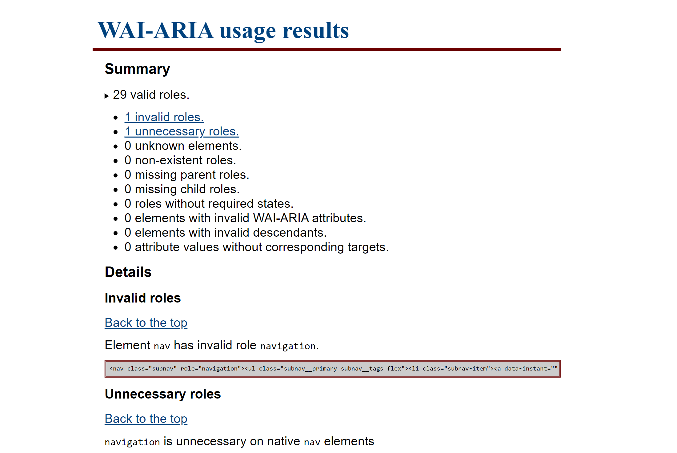
TPGi has created a WAI-ARIA bookmarklet which scans your page to make sure all elements and their given roles and ARIA attributes are valid. Upon activating the bookmarklet, the page is scanned for any errors, and a new tab will be opened with the results. The results include the total number of valid roles, any detected ARIA errors, and code snippets of where any errors were found so that you can easily debug your page.
One thing not explicitly tested in the above bookmarklet is the presence of duplicate ARIA roles. Certain landmark roles have names that sound like they might apply to several elements, but should only be used once per page, such as banner or contentinfo. Adrian Roselli has come up with a simple CSS-based bookmarklet to check if any of these ARIA roles have been duplicated. Activating the bookmarklet will add a red outline to any offending element.
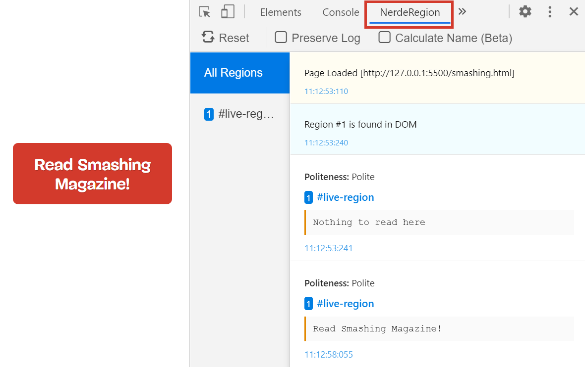
NerdeRegion is a Chrome extension that logs all the output of any aria-live regions. Can’t figure out why your screen reader is announcing something unexpectedly? NerdeRegion can let you keep track of timestamped announcements and the source element they originate from, all within a panel in DevTools. Since there can be bugs and inconsistencies with how aria-live regions are announced with different screen readers, NerdeRegion can be a great tool to figure out if an issue is potentially caused by your code or by the device combination.
Automatic Testing Tools
This class of tools can be used by the developer or tester to run automated tests on the output of your code, catching errors that may not appear obvious in the source code. There are many high-quality paid services and other tools beyond what we’ve mentioned here, but we’ve focused on tools with comprehensive free offerings in order to reduce barriers to entry. All of the listed tools can be run on pages that are not on the public internet, allowing them to be more easily incorporated into a development flow. It is important to note that accessibility testing is complicated and always requires manual testing to understand the full context of the site, but these automated testing tools can give you a solid head start.
A lot of tools use axe-core under the hood, so it may be redundant to use a combination of tools. Ultimately, what kind of tool you choose is more about what kind of UI you prefer, and the level of comprehensiveness in the results. For example, Lighthouse, the tool built into Google Chrome, uses a partial selection of axe-core rules, so if you manage to get a clean scan with axe DevTools, you shouldn’t need to run a Lighthouse scan as well.
Axe DevTools is available as a Chrome extension or Firefox extension and shows up as a panel in the developer tools. You can test a whole page or just part of a page, and all detected issues are sorted by severity and come with code snippets for easier debugging. Axe also lets you catch more errors than other automated tools with its Intelligent Guided Tests feature. Intelligent Guided Tests identify areas to test and do as much heavy lifting as possible, before asking the tester questions in order to generate a result. Axe also allows you to save and export results, which is useful for working through fixing errors as part of a longer and more cooperative development process.
Accessibility Insights also runs on axe-core, but has several features that differentiate it from axe DevTools. It can be run on various platforms, including Android, Windows, or as a browser extension. All versions of Accessibility Insights feature an inspector-like tool for looking up individual element information, as well as a way of running automated checks. The web extension also contains an Assessment feature, which has a combination of automated, guided and manual tests in order to allow you to generate a full report.
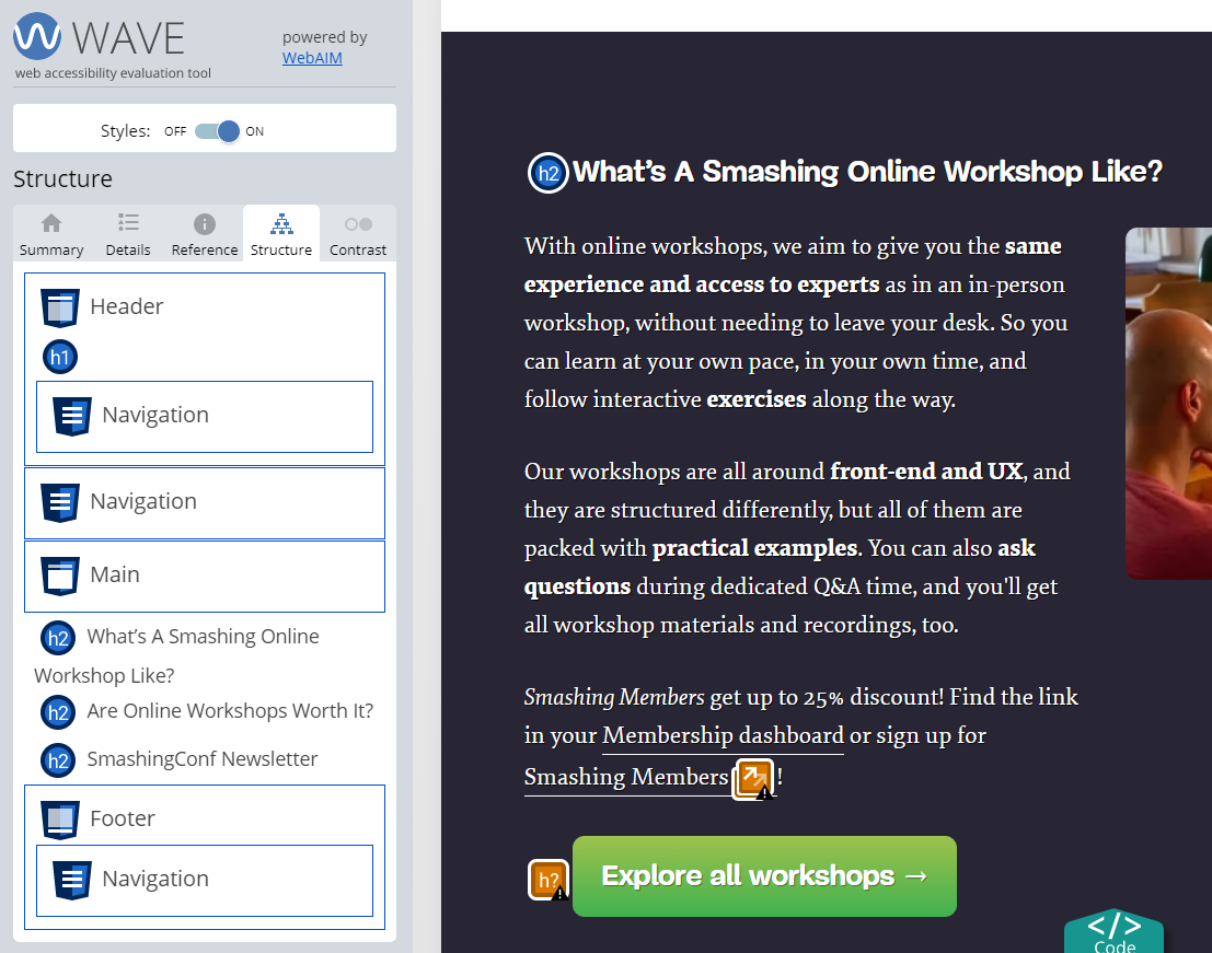
WAVE by WebAIM has been an integral part of my tool kit. Available in extension form as well as a mass testing service and an API, I find this tool best for checking my work as I develop due to its simplicity and speed. Everything is loaded as a panel on the side of your page, and you can get a holistic view of errors by scrolling through the page. If an error is displayed in the side panel but you aren’t sure where in the DOM it is, you can turn off styles to locate it within the markup. WAVE’s heading and landmark feature is one of my favorite things about it as it ensures that my document semantics are correct as I build.
SiteImprove has a free Chrome extension in addition to their paid service offerings. Like WAVE, you run the extension on a page and it lists errors in a panel on the side of the page, including filters for things like conformance level, severity and responsibility. The severity filter is especially useful as automatic testing always tends to produce some false positives.
Have you ever considered automating the accessibility tests of your source code with GitHub Actions? No matter if you haven’t gotten around to wrap your head around GitHub Actions yet or just need a little bit of help setting up a proper workflow, Adrián Bolonio’s tutorial is for you. It shows you step by step how to automate your accessibility tests with libraries like axe, pa11y, Lighthouse, and unit tests directly in your GitHub repository.
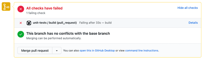
You’ll learn how to configure your repository so that GitHub Actions are executed as soon as you create or update a pull request to the main branch. If any of the GitHub Actions find accessibility vulnerabilities, the pull request will crash and disable merging until you’ve resolved the found errors. A small detail that makes a big difference.
Colors
Low contrast text errors were found on a whopping 86.4% of homepages last year. Developers often have limited control over a color palette, so it is important to try to establish an accessible color palette as early on in the process as possible.
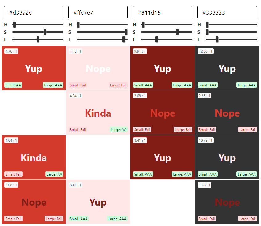
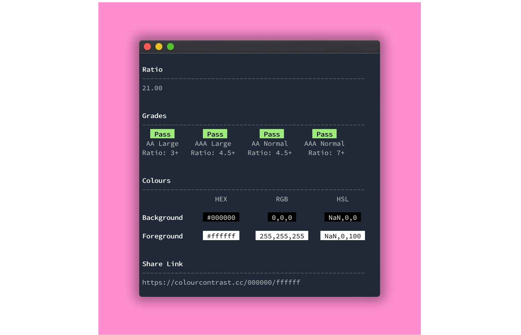
When you’re starting to design a color palette, an in-browser color picking tool may be helpful. Are My Colors Accessible is a tool that can help you figure out an accessible color palette. The basic mode calculates the contrast ratio between any two colors. The font size and font weight of your text can affect the contrast ratio required based on the level of conformance, and this tool helpfully lays out all the different standards it meets. It also features HSL range sliders so that you can tweak any of the colors, with the results automatically updating as you make adjustments. Palette mode lets you compare every color in a palette against each other and displays the contrast ratio and standards met, which is helpful for determining how you can combine different colors together. Making any color adjustments also updates the permalink, allowing you to easily share color combinations with your team. If you prefer a different interface for selecting colors, Atul Varma has built a similar tool that uses a color picker instead of HSL range sliders.
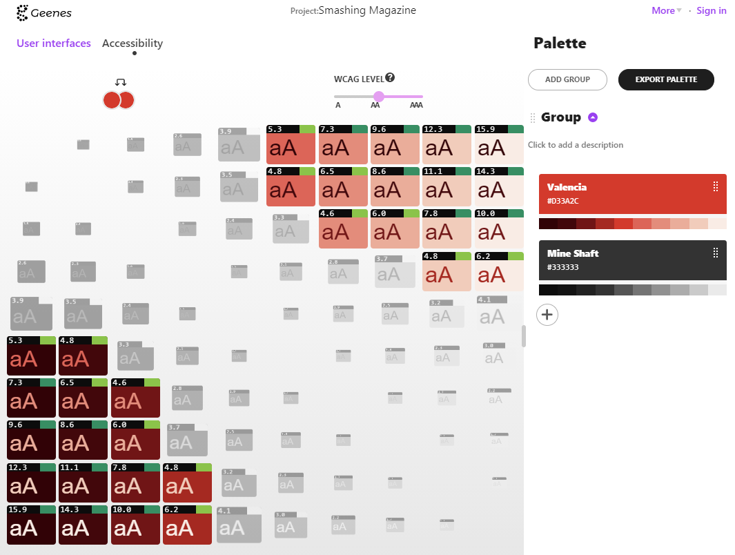
Geenes attempts to do it all by building out full tint/shade ranges for each color group you add, allowing you to design a full-color system instead of a limited palette. In addition to providing contrast ratios, Geenes also allows you to apply your palette to various mockups, and emulate different forms of color blindness. You can trial most features for free, and unlock multiple palettes with a donation.
Certain tools can help you solve specific color-related accessibility issues. Buttons in particular can be tricky, as not only do you have to worry about the text color with the background color, you also need to consider the button background with the page background, and the focus outline color with both backgrounds. Stephanie Eckles’s project ButtonBuddy explains these requirements in simple language and helps you pick colors for these individual parts.
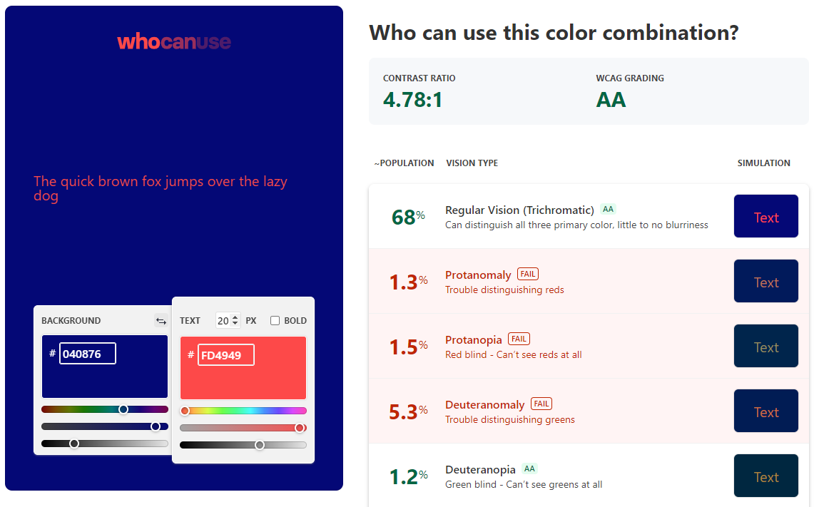
Some color combinations may technically meet contrast requirements when viewed by people without color blindness but could pose problems for specific kinds of color blindness and low vision. Who Can Use applies a visual filter to emulate different types of color blindness and then calculates an approximate color contrast ratio.
If you would like to test your color combinations in the context of an existing site, Stark is a color picker extension for Chrome that lets you simulate certain kinds of color blindness. Additionally, Anna Monus has created a helpful writeup of color blindness tools already built into Chrome. While this kind of emulation can never fully replace testing with real users, it can help us make better initial choices.
Sometimes as developers, we start working on a project where we may need to design as we go and begin writing code without a full, pre-established brand palette. Once development has started, it can be tedious to keep importing color palettes back and forth into external tooling. There are many options for checking color contrast within a code environment. Alex Clapperton has developed a CLI tool where you pass in two colors and it outputs the contrast ratio and passing standards right in the terminal. The BBC has published a JavaScript color contrast checker that takes two colors and determines whether or not it meets your desired standard. A tool like this can live in your codebase with your tests, or be implemented in your design system library like Storybook, PatternLab, and so on.
A11y Color Tokens takes it a step further and lets you automatically generate complementary color tokens in CSS or SASS. You pass in a color and desired ratio to generate a shade or tint of that color that meets requirements. If you need to quickly check the contrast ratio of something, Chrome and Firefox now show the color contrast information within their respective developer tools color selectors as well. If none of these tools suit your fancy, Stephanie Walter has covered many other color-related tool options in her blog post on color accessibility.
Compatibility
Building for assistive technology can often add another level of complexity when it comes to debugging. Because assistive technology is essentially another layer of an interface on top of the browser, we now need to concern ourselves with combinations of browser and assistive technology. A bug may be present in either the browser or the assistive technology, or it may be present only in a particular combination. It’s a good idea to keep this list of bug trackers on hand when trying to fix a specific issue. Some of these are public so that you can see if others experience the bug you are having, but others only offer a means to report bugs in private.
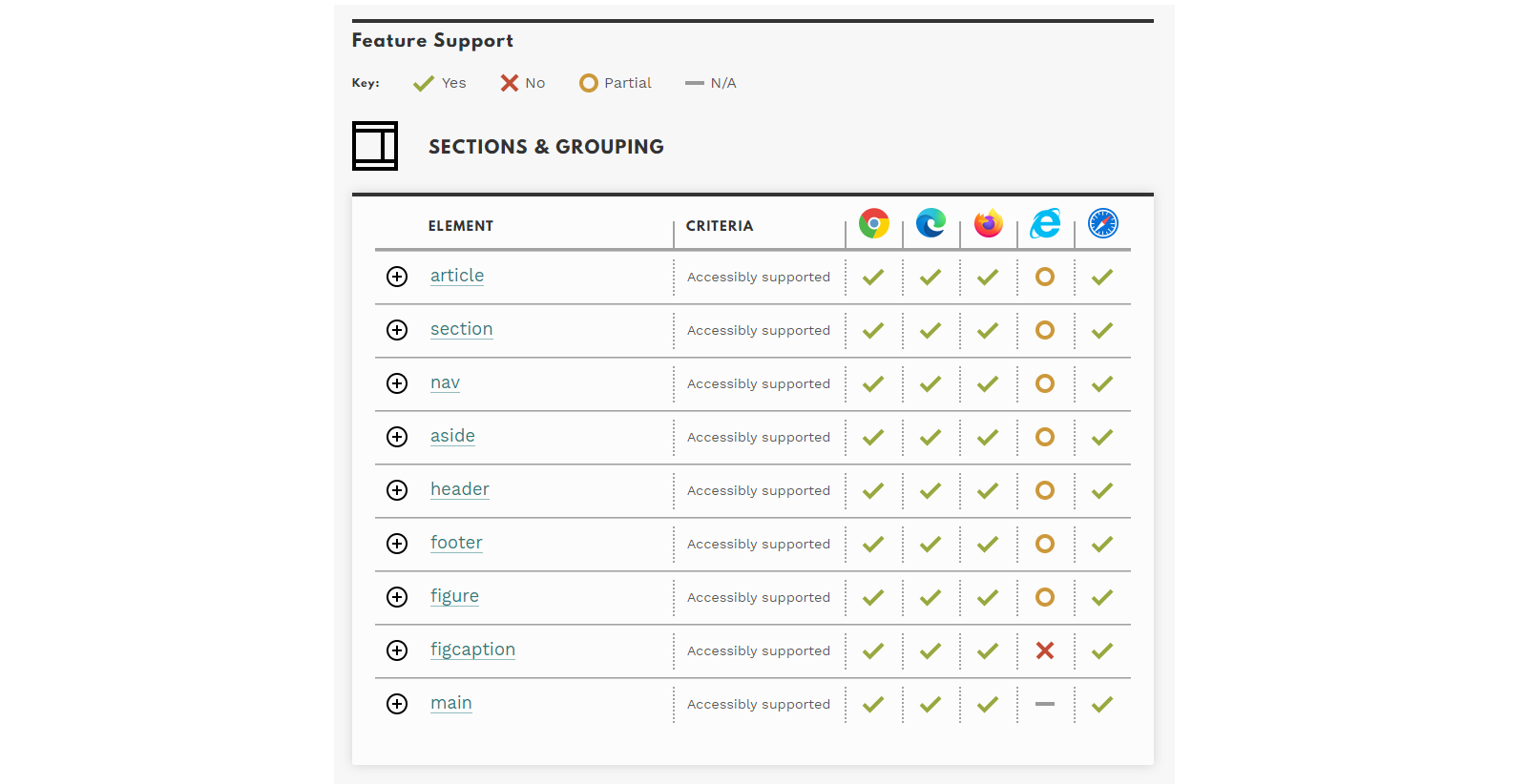
Not all browsers and screen reader combinations work well together, and not all accessibility features are equally supported across browsers. These tools can help you check if you are experiencing a bug on a specific combination of devices. HTML5 Accessibility is a list of newer HTML features and whether or not the default browser implementation is accessibly supported. In a similar vein, Accessibility Support provides a list of ARIA roles and their support in the most popular browser and screen reader combinations.
Documenting Accessibility
Accessibility is still an afterthought in a lot of UX design teams. An easy but very efficient strategy to help you adopt an accessibility mindset comes from Elise Livingston and her team at Qualtrics. They started to add accessibility docs to all design documents before handing them over to engineering. Not only to improve product accessibility but also to see potential accessibility issues much earlier in the design process.
Elise suggests tackling accessibility documentation in two steps: first, defining keyboard behavior, then, specifying semantic labels that can be understood by assistive technology. If you want to give it a try, Elise summarized everything you need to know about the approach in an article. A great opportunity to rethink your current process.
Focus Management
Managing focus is a necessary but often difficult part of making complex applications accessible. We need to consider that the focus order is logical, that focus is moved around correctly on any custom components, and that each interactable element has a clear focus style.
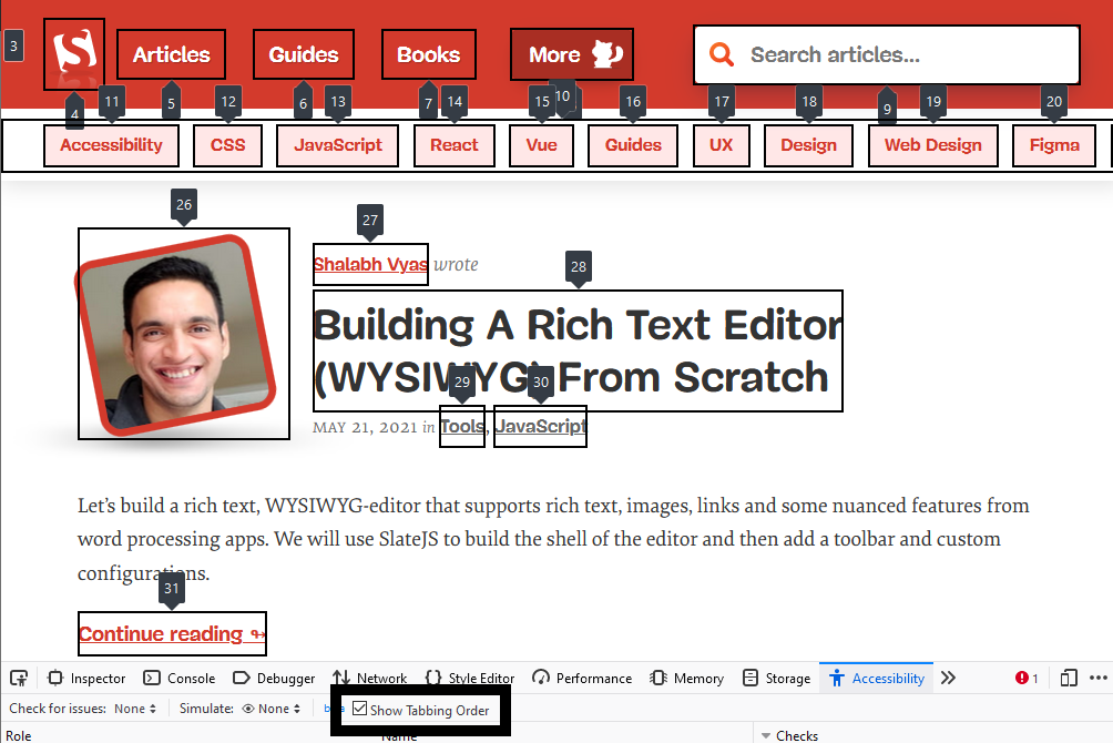
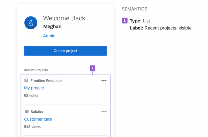
This bookmarklet by Level Access labels every focusable element on the page, so that you can check that the focus order matches the reading order. For the Firefox users out there, Firefox’s Accessibility Inspector has added this feature since version 84.
In complex codebases, where different components or third-party code might be moving focus around unexpectedly, this little snippet by Scott Vinkle can help you see what element currently has focus. If I’m struggling with the focus being moved around by other parts of my application, sometimes I also like to replace console.log with console.trace to determine exactly what function is moving the focus around.
In order to test all focus styles on a web page, we can use Scott O’Hara’s script as a starting point. Tabbing through every element can get cumbersome after a while, so a script to rotate through each element can help us make sure our focus styles look consistent and work within the context of the page.
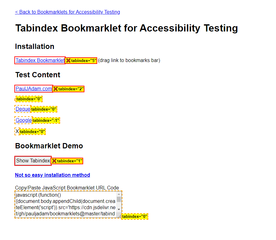
Setting a positive tabindex to try and fix the focus order is a common accessibility gotcha. Elements that have a positive tabindex will force the browser to tab to them first. While this may not technically be an error, this is often unexpected and can cause more problems than it solves. Paul J. Adam’s tabindex bookmarklet allows you to highlight all elements that have the tabindex attribute applied.
Layout Usability
The document reading order can sometimes fall out of sync with what a viewer might expect if a layout relies too heavily on the CSS Grid or Flexbox order property. Adrian Roselli has coded up a bookmarklet for keeping track of the reading order to help you make sure your site passes the meaningful sequence guideline.
The WCAG contains a text spacing criterion where all content should still work when certain text settings are applied. To test for this, Steve Faulkner has created a bookmarklet that automatically applies the required text spacing settings to all the text on a page. Avoiding things like fixed heights and allowing for overflow not only makes your site more accessible, it ensures that whatever content you put into your site won’t break the layout, something your content editors will thank you for.
Jared Smith built a bookmarklet to turn your cursor into a 44×44 pixel box so that you can hover it over your controls to make sure that they meet the recommended target size criterion.
Linters
Linters are a class of tools that catch errors by scanning the source code before the application is run or built. By using linters, we can fix smaller bugs before we even run or build the code, saving valuable QA time later.
Many developers already know and use ESLint in some capacity. Instead of learning new tooling, it’s possible to get a head start on your accessibility testing by including a new plugin into your existing workflow. Eslint-plugin-jsx-a11y is an ESLint plugin for your JSX elements, where any errors will be shown as you write your code. Scott Vinkle has written up a helpful guide on setting it up.
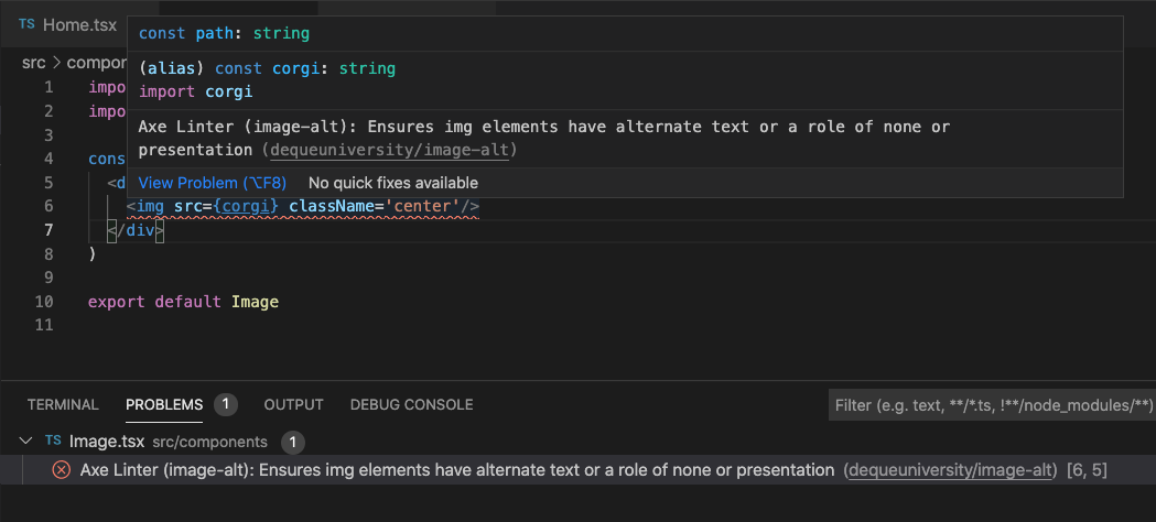
Deque has come out with axe Linter, available as a Github app or VS Code Extension. Axe Linter checks React, Vue, HTML and Markdown files against core rules without any configuration so it is easy to get up and running, although you are welcome to pass in your own options. One helpful feature is that it distinguishes between WCAG 2 and WCAG 2.1 which is useful if you are trying to meet a specific standard.
Markup
The web is built to be resilient. If you have broken markup, the browser will try its best to patch over any mistake. However, this can have unintended side effects, both from a styling perspective and an accessibility standpoint. Running your output through the W3C HTML validator can help catch things like broken tags, attributes being applied to elements that shouldn’t have them, and other HTML errors. Deque has created a W3C HTML Validator bookmarklet based on the same engine which lets you check the markup on localhost or password-protected pages that the regular validator cannot reach.
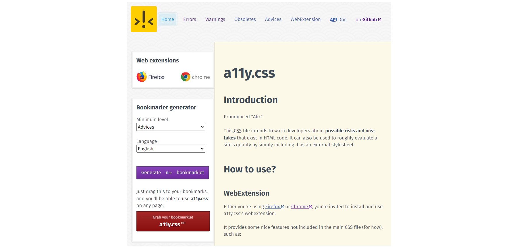
If you’re more of a visual person, Gaël Poupard’s project a11y.css is a stylesheet that checks for possible risks within your markup. Available in both extension or bookmarklet format, you can customize the language as well as the level of advice displayed. In a similar vein, sa11y is a tool that can be installed as a bookmarklet or integrated into your codebase. Sa11y is specifically designed for looking at the output of CMS content. It displays any warnings in non-technical language so that content editors can understand and make the necessary corrections.
Reading Level
An accessible site starts with accessible content. Cognitive accessibility has been a major focus of the ongoing WCAG 3 draft and is currently mentioned in Success Criterion 3.1.5, which suggests that authors aim for content to be understandable by a lower secondary (7-9th grade) reading level.
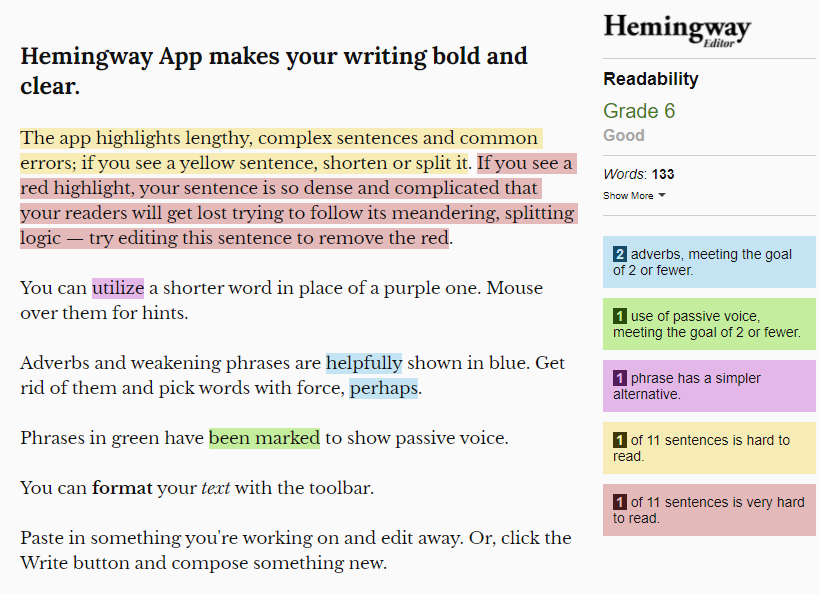
The Hemingway Editor calculates the reading level of your content as you write it, so that you can edit to make sure it is easily understandable. The panel on the side offers suggestions for how you can improve your content to make it more readable. If your site has already been published, Juicy Studio has produced a readability tool where you pass in a URL to the provided form and your site’s content is analyzed and graded using three different reading level algorithms. There is also a helpful explanation as to what each of these scores entails. However, one limitation of this particular tool is that it takes into account all the text rendered on the page, including things like navigation and footer text, which may skew the results.
Test Suites And Continuous Integration
The downside of most automated testing tools is that they require people to run them in the browser. If you are working on a single large codebase, you can incorporate accessibility testing into your existing testing process or as part of your continuous integration flow. When you write custom tests, you have an awareness of your application that automated testing tools don’t have, allowing you to perform customized, comprehensive testing in a more scalable way.
Once again, axe-core pops up as an open-source library that frequently underpins most of these tools, so whether or not a tool works for you will likely be based on how well it integrates with your code rather than any differences in testing results. Marcy Sutton has published a framework-agnostic guide for getting started writing automated tests for accessibility. She covers the difference between unit tests and integration tests and why you might want to choose one over the other in different scenarios.
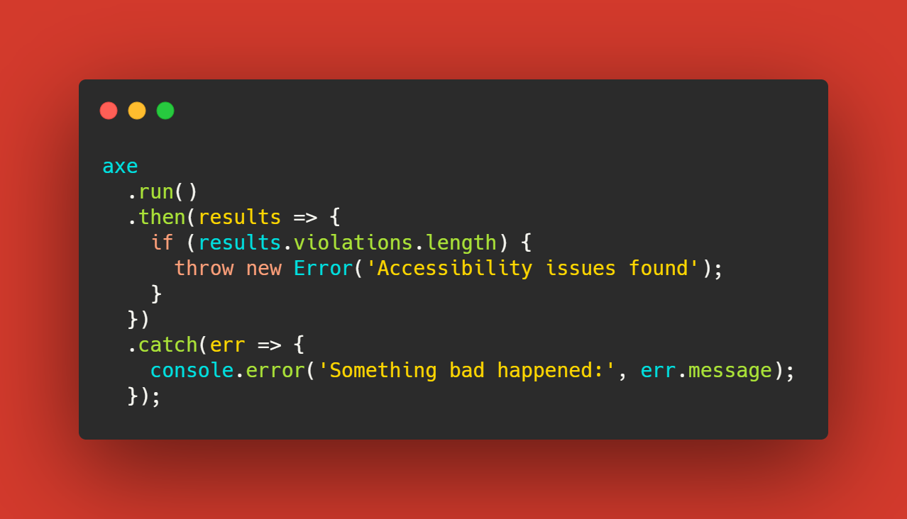
If you already have a test framework that you enjoy, there’s a high chance that there is already a library that incorporates axe-core into it. For example, Josh McClure has written up a guide that uses cypress-axe, and Nick Colley has produced a Jest flavored version in jest-axe.
Pa11y is a tool that provides a configurable interface around testing that is also available in a CI version as well. Its many configuration options can let you solve complex issues that can come up with testing. For example, the actions feature lets you pass an array of actions before running the tests and can be useful for testing screens that require authentication before accessing the page.
User Preferences
There are many new media queries to help detect the user’s operating system and browser preferences. These days, developers are often detecting these settings in order to set the default for things like motion preferences and dark mode, but this may also lead to bugs that are difficult to reproduce if you do not have the same settings.
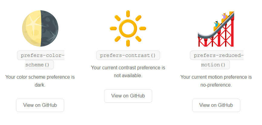
Magica11y is a set of functions that lets you determine your users’ preferences. Send the documentation page to non-technical testers or incorporate these into your app so that you can reproduce your user’s environments more accurately.
Wrapping Up
It’s estimated that automated accessibility testing can only catch 30% of all accessibility errors. Even as tooling continues to improve, it will never replace including disabled people in your design and development process. A sustainable and holistic accessibility process might involve having the whole team use tooling to catch as many of these errors as possible early on in the process, instead of leaving it all for testers and disabled users to find and report these issues later.
Need even more tooling? The A11y Project and Stark have curated lists of additional accessibility tools for both developers and users! Or feel free to leave any suggestions in the comments below, we’d love to hear what tools you incorporate into your workflow.
 (vf, yk, il)

