The Rise Of Design Thinking As A Problem Solving Strategy

Email Newsletter
Weekly tips on front-end & UX.
Trusted by 182,000+ folks.

 Celebrating 10 million developers


 Custom Web Forms for Angular, React, & Vue. Your backend.
Having spent the last 20 years in the world of educational technology working on products for educators and students, I have learned to understand teachers and administrators as designers themselves, who use a wide set of tools and techniques to craft learning experiences for students. I have come to believe that by extending this model and framing all users as designers, we are able to mine our own experiences to gain a deeper empathy for their struggles. In doing so, we can develop strategies to set our user-designers up to successfully deal with change and uncertainty.
If you are a designer, or if you have worked with designers any time in the last decade, you are probably familiar with the term “design thinking.” Typically, design thinking is represented by a series of steps that looks something like this:
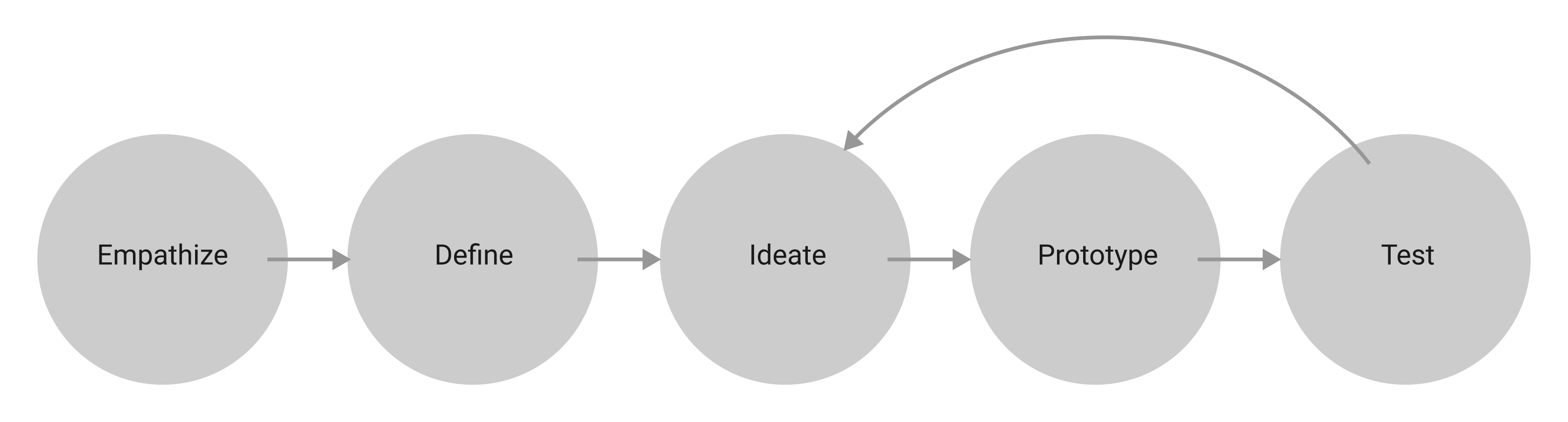
There are many variations of this diagram, reflective of the multitude of ways that the process can be implemented. It is typically a months-long undertaking that begins with empathy: we get to know a group of people by immersing ourselves in a specific context to understand their tasks, pain points, and motivations. From there, we take stock of our observations, looking for patterns, themes, and opportunities, solidifying the definition of the problem we wish to solve. Then, we iteratively ideate, prototype, and test solutions until we arrive at one we like (or until we run out of time).
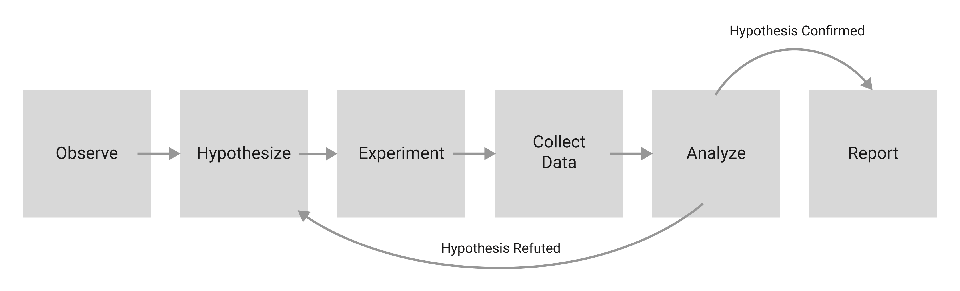
Ultimately, the whole process boils down to a simple purpose: to solve a problem. This is not a new purpose, of course, and not unique to those of us with “Designer” in our job titles. In fact, while design thinking is not exactly the same as the scientific method we learned in school, it bears an uncanny resemblance:
By placing design thinking within this lineage, we equate the designer with the scientist, the one responsible for facilitating the discovery and delivery of the solution.
At its best, design thinking is highly collaborative. It brings together people from across the organization and often from outside of it, so that a diverse group, including those whose voices are not usually heard, can participate. It centers the needs and emotions of those we hope to serve. Hopefully, it pulls us out of our own experiences and biases, opening us up to new ways of thinking and shining a light on new perspectives. At its worst, when design thinking is dogmatically followed or cynically applied, it becomes a means of gatekeeping, imposing a rigid structure and set of rules that leave little room for approaches to design that do not conform to an exclusionary set of cultural standards.
Its relative merits, faults, and occasional high-profile critiques notwithstanding, design thinking has become orthodoxy in the world of software development, where not using it feels tantamount to malpractice. No UX Designer’s portfolio is complete without a well-lit photo capturing a group of eager problem solvers in the midst of the “Define” step, huddled together, gazing thoughtfully at a wall covered in colorful sticky notes. My colleagues and I use it frequently, sticky notes and all, as we work on products in EdTech.

Like “lean,” the design thinking methodology has quickly spread beyond the software industry into the wider world. Today you can find it in elementary schools, in nonprofits, and at the center of innovation labs housed in local governments.
Amidst all of the hoopla, it is easy to overlook a central assumption of design thinking, which seems almost too obvious to mention: the existence of a solution. The process rests on the premise that, once the steps have been carried out, the state of the problem changes from ‘unsolved’ to ‘solved.’ While this problem-solution framework is undeniably effective, it is also incomplete. If we zoom out, we can see the limits of our power as designers, and then we can consider what those limits mean for how we approach our work.
Chaos And The Limits Of Problem Solving
An unchecked belief in our ability to methodically solve big problems can lead to some pretty grandiose ideas. In his book, Chaos: Making a New Science, James Gleick describes a period in the 1950s and ’60s when, as computing and satellite technologies continued to advance, a large, international group of scientists embarked on a project that, in hindsight, sounds absurd. Their goal was not only to accurately predict, but also to control the weather:
“There was an idea that human society would free itself from weather’s turmoil and become its master instead of its victim. Geodesic domes would cover cornfields. Airplanes would seed the clouds. Scientists would learn how to make rain and how to stop it.”
— “Chaos: Making a New Science,” James Gleick
It is easy to scoff at their hubris now, but at the time it was a natural result of an ever-heightening faith that, with science, no problem is too big to solve. What those scientists did not account for is a phenomenon commonly known as the butterfly effect, which is now a central pillar of the field of chaos theory. The butterfly effect describes the inherent volatility that arises in complex and interconnected systems. It gets its name from a famous illustration of the principle: a butterfly flapping its wings and creating tiny disturbances in the air around it on one side of the globe today can cause a hurricane tomorrow on the other. Studies have shown that the butterfly effect impacts everything in society from politics and the economy to trends in fashion.
Our Chaotic Systems
If we accept that, like the climate, the social systems in which we design and build solutions are complex and unpredictable, a tension becomes apparent. Design thinking exists in a context that is chaotic and unpredictable by nature, and yet the act of predicting is central. By prototyping and testing, we are essentially gathering evidence about what the outcome of our design will be, and whether it will effectively solve the problem we have defined. The process ends when we feel confident in our prediction and happy with the result.
I want to take pains to point out again that this approach is not wrong! We should trust the process to confirm that our designs are useful and usable in the immediate sense. At the same time, whenever we deliver a solution, we are like the butterfly flapping its wings, contributing (along with countless others) to a constant stream of change. So while the short-term result is often predictable, the longer-term outlook for the system as a whole, and for how long our solution will hold as the system changes, is unknowable.
Impermanence
As we use design thinking to solve problems, how do we deal with the fact that our solutions are built to address conditions that will change in ways we can’t plan for?
One basic thing we can do is to maintain awareness of the impermanence of our work, recognizing that it was built to meet the needs of a specific moment in time. It is more akin to a tree fort constructed in the woods than to a castle fortress made from stone. While the castle may take years to build and last for centuries, impervious to the weather while protecting its inhabitants from all of the chaos that exists outside its walls, the tree fort, even if well-designed and constructed, is directly connected to and at the mercy of its environment. While a tree fort may shelter us from the rain, we do not build it with the expectation that it will last forever, only with the hope that it will serve us well while it’s here. Hopefully, through the experience of building it, we continue to learn and improve.

The fact that our work is impermanent does not diminish its importance, nor does it give us the license to be sloppy. It means that the ability to quickly and consistently adapt and evolve without sacrificing functional or aesthetic quality is core to the job, which is one reason why design systems, which provide consistent and high-quality reusable patterns and components, are crucial.
Designing For User-Designers
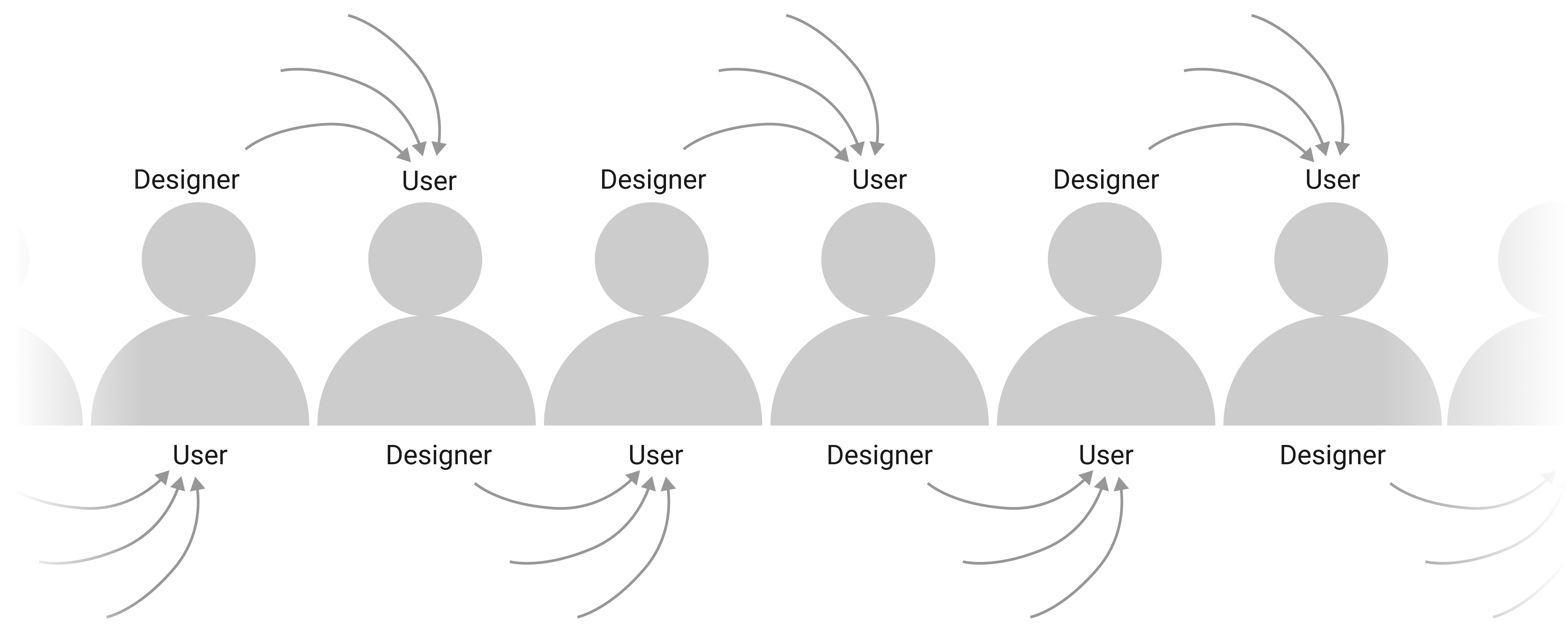
A more fundamental way to deal with the impermanence of our work is to rethink our self-image as designers. If we identify only as problem solvers, then our work becomes obsolete quickly and suddenly as conditions change, while in the meantime our users must wait helplessly to be rescued with the next solution. In reality, our users are compelled to adapt and design their own solutions, using whatever tools they have at their disposal. In effect, they are their own designers, and so our task shifts from delivering full, fixed solutions to providing our user-designers with useful and usable tools specific to their needs.
In thinking from this perspective, we can gain empathy for our users by understanding our place as equals on a continuum, each of us relying on others, just as others rely on us.
Key Principles To Center The Needs Of User-Designers
Below are some things to consider when designing for user-designers. In the spirit of the user-designer continuum and of finding the universal in the specific, in the examples below I draw on my experience from both sides of the relationship. First, from my work as a designer in the EdTech space, in which educators rely on people like me to produce tools that enable them to design learning experiences for students. Second, as a user of the products, I rely on them in my daily UX work.
1. Don’t Lock In The Value
It is crucial to have a clear understanding of why someone would use your product in the first place, and then make sure not to get in the way. While there is a temptation to keep that value contained so that users must remain in your product to reap all of the benefits, we should resist that mindset.
Remember that your product is likely just one tool in a larger set, and our users rely on their tools to be compatible with each other as they design their own coherent, holistic solutions. Whereas the designer-as-problem-solver is inclined to build a self-contained solution, jealously locking value within their product, the designer-for-designers facilitates the free flow of information and continuity of task completion between tools however our user-designers choose to use them. By sharing the value, not only do we elevate its source, we give our users full use of their toolbox.
An Example As A Designer Of EdTech Products:
In student assessment applications, like in many other types of applications, the core value is the data. In other words, the fundamental reason schools administer assessments is to learn about student achievement and growth. Once that data is captured, there are all sorts of ways we can then use it to make intelligent, research-based recommendations around tasks like setting student goals, creating instructional groups, and assigning practice. To be clear, we do try very hard to support all of it in our products, often by using design thinking. Ultimately, though, it all starts with the data.
In practice, teachers often have a number of options to choose from when completing their tasks, and they have their own valid reasons for their preferences. Anything from state requirements to school policy to personal working style may dictate their approach to, say, student goal setting. If — out of a desire to keep people in our product — we make it extra difficult for teachers to use data from our assessments to set goals outside of our product (say, in a spreadsheet), then instead of increasing our value, we have added inconvenience and frustration. The lesson, in this case, is not to lock up the data! Ironically, by hoarding it, we make it less valuable. By providing educators with easy and flexible ways to get it out, we unlock its power.

An Example As A User Of Design Tools:
I tend to switch between tools as I go through the design thinking process based on the core value each tool provides. All of these tools are equally essential to the process, and I count on them to work together as I move between phases so that I don’t have to build from scratch at every step. For example, the core value I get from Sketch is mostly in the “Ideation” phase, in that it allows me to brainstorm quickly and freely so that I can try out multiple ideas in a short amount of time. By making it easy for me to bring ideas from that product into a more heavy-duty prototyping application like Axure, instead of locking them inside, Sketch saves me time and frustration and increases my attachment to it. If, for competitive reasons, those tools ceased to cooperate, I would be much more likely to drop one or both.
2. Use Established Patterns
It is always important to remember Jakob’s Law, which states simply that users spend more time on other sites than they spend on yours. If they are accustomed to engaging with information or accomplishing a task a certain way and you ask them to do it differently, they will not view it as an exciting opportunity to learn something new. They will be resentful. Scaling the learning curve is usually painful and frustrating. While it is possible to improve or even replace established patterns, it’s a very tall order. In a world full of unpredictability, consistent and predictable patterns among tools create harmony between experiences.
An Example As A Designer Of EdTech Products:
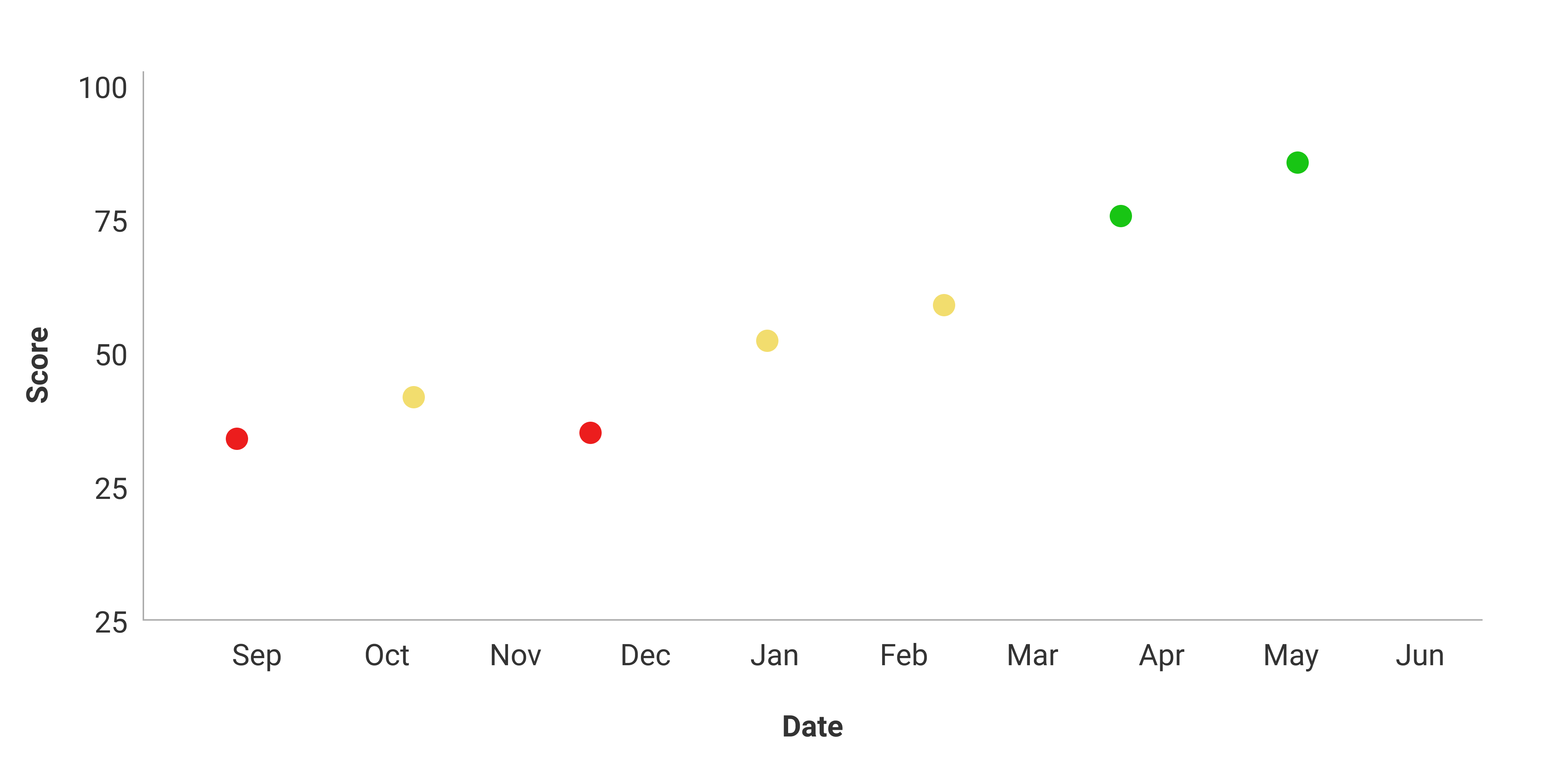
By following conventions around data visualization in a given domain, we make it easy for users to switch and compare between sources. In the context of education, it is common to display student progress in a graph of test scores over time, with the score scale represented on the vertical axis and the timeline along the horizontal axis. In other words, a scatter plot or line graph, often with one or two more dimensions represented, maybe by color or dot size. Through repeated, consistent exposure, even the most data-phobic teachers can easily and immediately interpret this data visualization and craft a narrative around it.
You could hold a sketching activity during the “Ideate” phase of design thinking in which you brainstorm dozens of other ways to present the same information. Some of those ideas would undoubtedly be interesting and cool, and might even surface new and useful insights. This would be a worthwhile activity! In all likelihood, though, the best decision would not be to replace the accepted pattern. While it can be useful to explore other approaches, ultimately the most benefit is usually derived from using patterns that people already understand and are used to across a variety of products and contexts.
An Example As A User Of Design Tools:
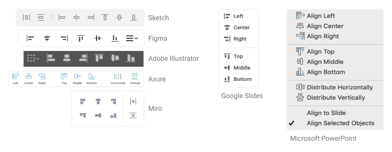
In my role, I often need to quickly learn new UX software, either to facilitate collaboration with designers from outside of my organization or when my team decides to adopt something new. When that happens, I rely heavily on established patterns of visual language to quickly get from the learning phase to the productive phase. Where there is consistency, there is relief and understanding. Where there is a divergence for no clear reason, there is frustration. If a product team decided to rethink the standard alignment palette, for example, in the name of innovation, it would almost certainly make the product more difficult to adopt while failing to provide any benefit.
3. Build For Flexibility
As an expert in your given domain, you might have strong, research-based positions on how certain tasks should be done, and a healthy desire to build those best practices into your product. If you have built up trust with your users, then adding guidance and guardrails directly into the workflow can be powerful. Remember, though, that it is only guidance. The user-designer knows when those best practices apply and when they should be ignored. While we should generally avoid overwhelming our users with choices, we should strive for flexibility whenever possible.
An Example As A Designer Of EdTech Products
Many EdTech products provide mechanisms for setting student learning goals. Generally, teachers appreciate being given recommendations and smart defaults when completing this task, knowing that there is a rich body of research that can help determine a reasonable range of expectations for a given student based on their historical performance and the larger data set from their peers. Providing that guidance in a simple, understandable format is generally beneficial and appreciated. But, we as designers are removed from the individual students and circumstances, as well as the ever-changing needs and requirements driving educators’ goal-setting decisions. We can build recommendations into the happy path and make enacting them as painless as possible, but the user needs an easy way to edit our guidance or to reject it altogether.
An Example As A User Of Design Tools:
The ability to create a library of reusable objects in most UX applications has made them orders of magnitude more efficient. Knowing that I can pull in a pre-made, properly-branded UI element as needed, rather than creating one from scratch, is a major benefit. Often, in the “Ideate” phase of design thinking, I can use these pre-made components in their fully generic form simply to communicate the main idea and hierarchy of a layout. But, when it’s time to fill in the details for high-fidelity prototyping and testing, the ability to override the default text and styling, or even detach the object from its library and make more drastic changes, may become necessary. Having the flexibility to start quickly and then progressively customize lets me adapt rapidly as conditions change, and helps make moving between the design thinking steps quick and easy.
4. Help Your User-Designers Build Empathy For Their Users
When thinking about our users as designers, one key question is: who are they designing for? In many cases, they are designing solutions for themselves, and so their designer-selves naturally empathize with and understand the problems of their user-selves. In other cases, though, they are designing for another group of people altogether. In those situations, we can look for ways to help them think like designers and develop empathy for their users.
An Example As A Designer Of EdTech Products:
For educators, the users are the students. One way to help them center the needs of their audience when they design experiences is to follow the standards of Universal Design for Learning, equipping educators to provide instructional material with multiple means of engagement (i.e., use a variety of strategies to drive motivation for learning), multiple means of representation (i.e., accommodate students’ different learning styles and backgrounds), and multiple means of action and expression (i.e., support different ways for students to interact with instructional material and demonstrate learning). These guidelines open up approaches to learning and nudge users to remember that all of the ways their audience engages with practice and instruction must be supported.
An Example As A User Of Design Tools:
Anything a tool can do to encourage design decisions that center accessibility is hugely helpful, in that it reminds us to consider those who face the most barriers to using our products. While some commonly-used UX tools do include functionality for creating alt-text for images, setting a tab order for keyboard navigation, and enabling responsive layouts for devices of various sizes, there is an opportunity for these tools to do much more. I would love to see built-in accessibility checks that would help us identify potential issues as early in the process as possible.
Conclusion
Hopefully, by applying the core principles of unlocking value, leveraging established patterns, understanding the individual’s need for flexibility, and facilitating empathy in our product design, we can help set our users up to adapt to unforeseen changes. By treating our users as designers in their own right, not only do we recognize and account for the complexity and unpredictability of their environment, we also start to see them as equals.
While those of us with the word “Designer” in our official job title do have a specific and necessary role, we are not gods, handing down solutions from on high, but fellow strugglers trying to navigate a complex, dynamic, stormy world. Nobody can control the weather, but we can make great galoshes, raincoats, and umbrellas.
Other Resources
- If you’re interested in diving into the fascinating world of chaos theory, James Gleick’s book Chaos: Making a New Science, which I quoted in this article, is a wonderful place to start.
- Jon Kolko wrote a great piece in 2015 on the emergence of design thinking in business, in which he describes its main principles and benefits. In a subsequent article from 2017, he considers the growing backlash as organizations have stumbled and taken shortcuts when attempting to put theory into practice, and what the lasting impact may be. An important takeaway here is that, in treating everyone as a designer, we run the risk of downplaying the importance of the professional Designer’s specific skill set. We should recognize that, while it is useful to think of teachers (or any of our users) as designers, the day-to-day tools, methods, and goals are entirely different.
- In the article Making Sense in the Data Economy, Hugh Dubberly and Paul Pangaro describe the emerging challenges and complexities of the designer’s role in moving from the manufacture of physical products to the big data frontier. With this change, the focus shifts from designing finished products (solutions) to maintaining complex and dynamic platforms, and the concept of “meta-design” — designing the systems in which others operate — emerges.
- To keep exploring the ever-evolving strategies of designing for designers, search Smashing Magazine and your other favorite UX resources for ideas on interoperability, consistency, flexibility, and accessibility!
Further Reading
- Alternatives To Typical Technical Illustrations And Data Visualisations
- Creating An Effective Multistep Form For Better User Experience
- Creating Custom Lottie Animations With SVGator
- When Friction Is A Good Thing: Designing Sustainable E-Commerce Experiences


