Color Tools And Resources

Email Newsletter
Weekly tips on front-end & UX.
Trusted by 182,000+ folks.
 Register for Free
 Custom Web Forms for Angular, React, & Vue. Your backend.


 Celebrating 10 million developers
Today, we’re shining the spotlight on color tools and resources for all kinds of projects, from all types of color palettes and generators to getting contrast and gradients just right for your projects. This collection is by no means complete, but rather a selection of things that the team at Smashing found useful and hope will make your day-to-day work more productive and efficient.
If you’re interested in more tools like these ones, please do take a look at our lovely email newsletter, so you can get tips like these drop right into your inbox!
CSS Variables And HSLA
How do you usually define colors in CSS? With HEX? RGBA? Or do you use HSLA? Maxime Heckel used a mix of HEX and RGBA, until he came across a clever pattern that helped him clean up the mess and lighten his codebase. The foundation: HSLA and CSS variables.
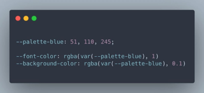
HSLA stands for Hue Saturation Lightness Alpha, the four main components necessary to define a color. When you use similar colors — different shades of blue, for example, — you will notice that they share the same hue and saturation. With Maxime’s approach, you can define a part of the hue and saturation through a CSS variable and reuse it to define your other color values — to build a color scale from scratch, for example. A fantastic example of how powerful CSS can be.
A Super-Fast Color Schemes Generator
Do you need to create a color palette? A handy tool to help you do this — and more — is Coolors. At the heart of Coolors is a sleek color palette generator: To start off, it suggests you a random palette that you can adjust by playing with shades or, if you prefer, change it completely by introducing new colors.
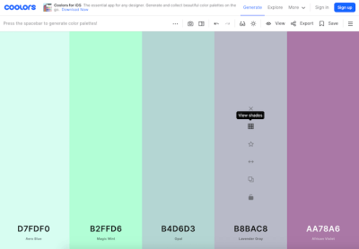
Coolors also lets you pick a palette from a photo and create collages, gradients, and gradient palettes. A contrast checker calculates the contrast ratio of text and background colors for you to ensure your color combinations are accessible. And if you just need a bit of inspiration, there are thousands of color themes waiting to be explored, too — just click the colors you like, and the hex values will be copied to your clipboard. Enjoy!
Overly Descriptive Color Palettes
Have you ever considered combining snail-paced soft pink with unsealed mahogany and lousy watermelon as a color scheme for your next project? Well, what might sound a bit weird at first, is the concept behind colors.lol, a color inspiration site with “overly descriptive color palettes”, as its creator Adam Fuhrer describes it.
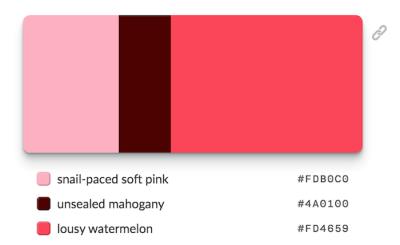
Created as a fun way to discover interesting color combinations, the palettes are hand-selected from the Twitter bot @colorschemez. The feed randomly generates color combinations and matches each color with an adjective from a list of over 20,000 words. Hiding behind the unusual names are of course real hex color values that you can use right away — #FDB0C0, #4A0100, and #FD4659 in the case of snail-paced soft pink and its fellas, for example. A fun take on color.
A Friendly Color Palette Generator
Picking colors that go well together can be a challenge. pppalette attempts to change that. All you need to do is pick a starter color, and the tool will automatically generate different color palettes based on it. You can then copy the individual color values or the entire palette as HEX, HSL, or RGB.
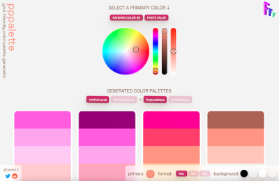
To create the color palettes, the generator uses different methods of color harmony: complementary colors, split complementary, analogous, triadic, tints, tones, shades, warm and cool, and you’ll also find a few variations like bright and dark complementary colors. If you want to create cohesive color palettes that unify the colors by blending a color over all the colors of the palette, pppalette has got you covered, too. A handy little helper.
Monochromatic Color Palettes Made Easy
If you’ve ever tried to generate a consistent monochromatic color palette, you know that this can be a boring task. After he once again messed around with infinite copy-paste commands to create a nice palette, Dimitris Raptis decided to change that. His solution: CopyPalette.
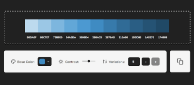
CopyPalette lets you create color palettes with ease. All you need to do is select a base color, the contrast ratio of the shades, and the number of color variations you’d like to have, and the tool generates a perfectly-balanced color palette that you can copy and paste into your favorite design tool. A true timesaver.
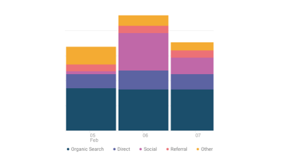
Color Scales For Data Visualizations
Different kinds of data visualizations have different needs when it comes to color. When you’re designing pie charts, grouped bar charts, or maps, for example, it might be a good idea to choose a series of colors that are visually equidistant. This ensures that they can be easily distinguished and compared to the key. The Data Color Picker powered by Learn UI Design helps you create such visually equidistant palettes based on two endpoint colors that you specify.
For those instances when you want to show the value of a single variable in your visualization and, thus, only need a color scale based on one color (with a darker variation representing a higher value and a neutral color a value closer to zero), there’s the Single Hue Scale generator.
Last but not least, divergent colors are most useful for visualizations where you’re showing a transition from one extreme through a neutral middle to an opposite extreme (a common example is a “how Democrat/Republican is each state in the US” map). The Divergent Color Scale generator helps you find the best scale for occasions like these. A powerful trio to take your data visualizations to the next level.
Real-World Color Palette Inspiration
There are a lot of fantastic sites out there that help you find inspiring color palettes. However, once you have decided on a palette you like, the biggest question is still left unanswered: How should you apply the colors to your design? Happy Hues is here to help.
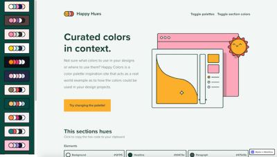
Happy Hues gives you color palette inspiration while acting as a real-world example for how the colors could be used in your design. Just change the palette, and the Happy Hues site changes its colors to show you what your favorite palette looks like in an actual design. Clever!
Color Shades Generator
Another useful tool for dealing with color is the color shades generator that Vitaly Rtishchev and Vlad Shilov built. You can enter a hex value and the tool will show you a series of lighter and darker shades.
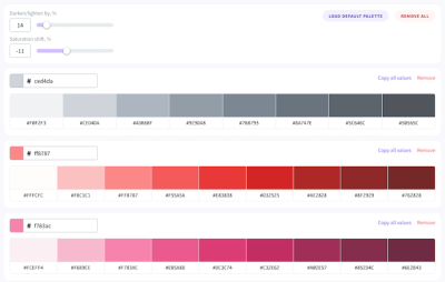
To customize the shade series, simply adjust the percentage by which you want to lighten/darken the original color and change the saturation shift. Once you’re happy with the result, you can copy the hex values of a color or the entire palette with one click.
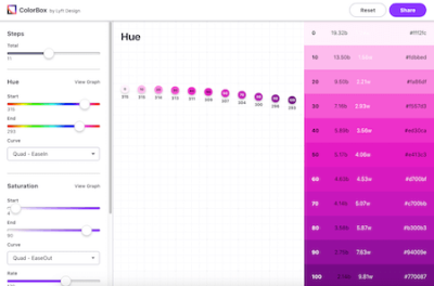
Color Made Simple
Speaking about color can be tricky. What one person refers to as purple, might be mulberry for the next. But what color do they actually mean? To prevent misunderstandings, the design team at Lyft came up with their very own color system which is easy to learn for designers and developers while taking accessibility into account at the same time. They’ve open sourced it, so your team can make use of it, too: Say hello to ColorBox!
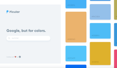
Google, But For Colors
You enter a search term and are presented a list of links. That’s how search engines usually work, right? Picular is different. Instead of searching for relevant sites, Picular presents you colors that match your search. “Summer”, for example, will return different shades of blue, along with some sandy yellows and browns, and a tad of pink. Each color is labeled with its hex value, so if you want to use it in a project, just click on it, and it’s copied to your clipboard.
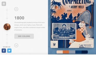
Color Inspiration From Forgotten Times
How about some color inspiration that is, well, a bit different? Brought to life by Brandon Shepherd, Color Leap takes you on a journey through 4,000 years of color history.
From 2,000 BC to the 1960s, the project showcases 180 color palettes from 12 distinct eras, each one of them representing the color language of its time. Fascinating!
Creating Accessible Color Palettes
Finding the perfect tint or shade of a color is not only a matter of taste but also accessibility. After all, if color contrast is lacking, a product could, in the worst case, even become unusable for people with vision impairments. A very detailed contrast checker to help you detect potential pitfalls ahead of time comes from Gianluca Gini: Geenes.
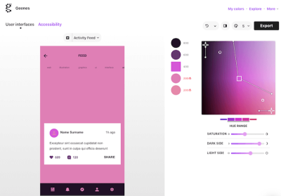
The tool lets you tinker with hue ranges and saturation and apply the color palettes to one of three selectable UI mockups. Once applied, you can trigger different kinds of vision impairments to see how affected people see the colors and, finally, make an informed decision on the best tones for your palette. To use the colors right away, just copy and paste their code or export them to Sketch.
Designing Accessible Color Systems
Getting color contrast right is an essential part of making sure that not only people with visual impairments can easily use your product but also everyone else when they are in low-light environments or using older screens. However, if you’ve ever tried to create an accessible color system yourself, you probably know that this can be quite a challenge.
The team at Stripe decided to tackle the challenge and redesigned their existing color system. The benefits it should provide out of the box: pass accessibility guidelines, use clear and vibrant hues that users can easily distinguish from one another, and have a consistent visual weight without a color appearing to take priority over another. If you’re curious to find out more about their approach, their blog post will give you valuable insights.
Getting Color Management Right
Color management is essential, but are the settings you have in place really the best ones for your assets and the platforms you’re designing for? After all, you need to be able to rely on what you see on your screen. Not only is it crucial when it comes to choosing colors, but also for assessing contrast and legibility.
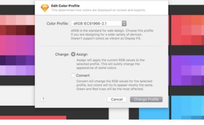
To help you improve your color management, the team at bjango summarized everything you need to know about it. You’ll learn to choose the best color space for your needs and when you should assign a color profile vs. when it’s better to convert to one. As a bonus, the article also takes a look at popular design programs and how to get the most out of their color management options.
CSS Gradient Generator And Resources
CSS gradients are a quick way to give your design a fresh and friendly touch. A fantastic little tool to help you generate and implement both linear and radial gradients is CSS Gradient. Once you’ve entered the colors you’d like to include in your gradient, you can adjust the position of the transitions on a slider. The CSS code mirrors the changes in real time and can be copied to the clipboard with just a click.
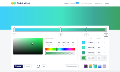
But there’s more than just the gradient generator, the site also features helpful content all around gradients: technical articles, gradient examples from real-life projects, tutorials, and references like collections of shades, gradient swatches, and more inspiration. A comprehensive look at gradients and how to use them.
Create CSS Color Gradients With Ease
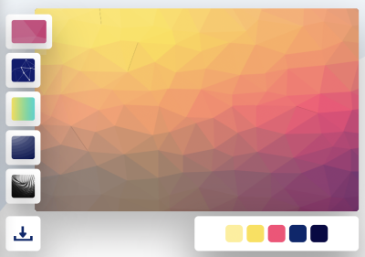
Hand-picking colors to make a color gradient requires design experience and a good understanding of color harmony. If you need a gradient for a background or for UI elements but don’t feel confident enough to tackle the task yourself (or if you’re in a hurry), the color gradient generator which the folks at My Brand New Logo have created has got your back.
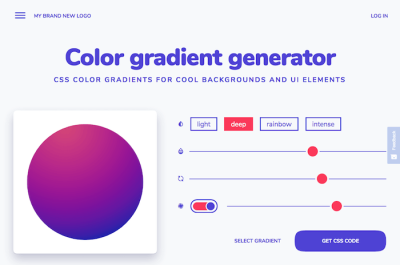
Powered by color gradient algorithms, the generator creates well-balanced gradients based on a color you select. There are four different styles of gradients that go from subtle to a mother-of-pearl effect and an intense, deep color gradient. You can adjust the gradient with sliders and, once you’re happy with the result, copy-paste the generated CSS code to use it in your project. Nice!
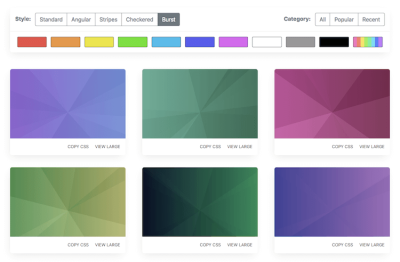
Easy-To-Use CSS Gradients
Another handy tool that takes away the trouble and makes using gradients a simple act of copying and pasting is Gradient Magic, a gallery of unique CSS gradients with everything ranging from standard gradients to angular, striped, checkered, and burst gradients. To find your favorite, you can browse the gallery by style and color. A great addition to any toolkit!
A Way Forward To Prettier Gradients
Gradients often don’t turn out looking as smooth as you’d hope them to be. The problem is hard edges, especially where the gradient starts and ends. To help you cater for prettier results, Andreas Larsen built a little Sketch plugin: Easing Gradient.
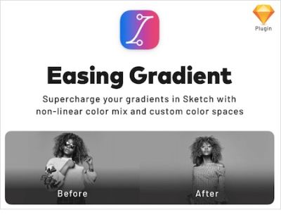
The plugin makes your gradients as invisible as possible so that they don’t interfere with text or UI that you place on top of them. You can install the plugin with Sketch Runner or download the package via GitHub. By the way, there’s also a PostCSS plugin available that does the same, as well as a hand-coded solution.
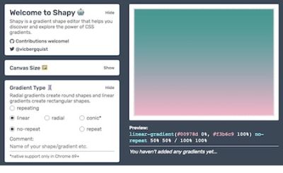
Explore The Power Behind CSS Gradients
Shapy. Hidden behind the cute name, is a powerful tool: a gradient shape editor created by Victoria Bergquist. Shapy lets you discover and explore the power of CSS gradients, creating shapes and images by layering and moving around gradients on a single div tag. Just use the sliders to customize the canvas size, gradient type, color stops, and box details, and, once you’re satisfied with what you see in the preview, you can copy the CSS with a click. Handy!
Rainbow Gradients With React
Josh Comeau loves creative experiments. On his lovely personal blog, he features accordions with sound effects, flashy confetti mode, unexpectedly friendly pop-ups, and many other things. Plus, a series of wonderful tutorials for doing all kinds of unusual effects with React.
For example, Josh has shared how he created Magical Rainbow Gradients with CSS Houdini and React Hooks (see GitHub repo). A wonderful little tutorial to make your website or app shine. Literally.
Beautiful Mesh Gradients
Mesh gradients take color gradients to the next level. If you want to create a mesh gradient based on an existing color palette, Meshy is for you.
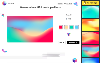
The tool uses four colors to create a gradient where each color is associated with a different amount of coverage area. To tailor the gradient to your liking, you can either use the “Randomize” button to generate random variants until you find the perfect gradient or you can choose from a set of curated mesh patterns. Once you’re happy with the result, you can download the gradient as PNG in the size of your choice.
Generate Colorful Backgrounds With A Few Clicks
A cool background graphic can draw attention to a blog post, enhance your social media profile, or simply freshen up your phone’s home screen. To make creating abstract and colorful backgrounds a breeze, Moe Amaya’s project Cool Backgrounds now unites the best JavaScript background generators in one place.
Quick Tips For High Contrast Mode
Designing for different display modes can bring along some unforeseen surprises. Windows High Contrast Mode in particular behaves differently than other operating system display modes and completely overrides authored colors with user-set colors. Luckily, there are often simple solutions to most high contrast mode issues.

In her article “Quick Tips for High Contrast Mode”, Sarah Higley shares five tips to solve high contrast mode bugs. They include custom focus styles, dealing with SVGs, using the -ms-high-contrast media query to respect a user’s color choices, as well as what you should keep in mind when testing. A handy little guide. If you want to dive deeper into the topic, Sarah also collected some further reading resources.
Button Contrast Checker
Do your buttons have enough contrast? The Button Contrast Checker built by the folks at Aditus helps you find out. Enter your domain and the tool tests if the buttons on the site are compliant with WCAG 2.1.
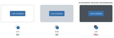
To cater for realistic results, the checker does not only test the default state of the buttons but also takes hover and focus states as well as the adjacent background into account. A nice detail: Each time you scan a page, the results are stored in a unique URL which you can share with your team. A precious little helper.
Dark Mode Switch Tutorial
A dark/light mode switch is a nice feature. But how do you actually implement it? Sebastiano Guerriero takes you through the necessary steps. His approach shows how to create a dark theme for your project and then use CSS Custom Properties to switch to it from a default light theme when a specific data attribute or class is added to the body element.
Wrapping Up
There are literally hundreds of resources related to color out there, and we hope that some of the ones listed here will prove to be useful in your day-to-day work — and most importantly help you avoid some time-consuming, routine tasks.
Happy bookmarking, everyone!
Further Reading
- Open-Source Meets Design Tooling With Penpot
- AI’s Transformative Impact On Web Design: Supercharging Productivity Across The Industry
- Sustainable Design Toolkits And Frameworks
- It’s Time To Talk About “CSS5”


