Designing Filters That Work: Best Practices and Guidelines

Email Newsletter
Weekly tips on front-end & UX.
Trusted by 182,000+ folks.


 Celebrating 10 million developers

 Custom Web Forms for Angular, React, & Vue. Your backend.
Filters are everywhere. While we often think of them appearing when booking flights or shopping online, filters are frequently used in pretty much every interface that features more than a handful of data points.
It’s not necessarily just the sheer amount of data that is difficult to make sense of though; it’s the complexity and lack of consistency that the data usually entails which requires some filtering — such a common scenario in data grids, enterprise dashboards, vaccine tracking and public records registries.
Part Of: Design Patterns
- Part 1: Perfect Accordion
- Part 2: Perfect Responsive Configurator
- Part 3: Perfect Date and Time Picker
- Part 4: Perfect Feature Comparison
- Part 5: Perfect Slider
- Part 6: Perfect Birthday Picker
- Part 7: Perfect Mega-Dropdown Menus
- Part 8: Perfect Filters
- Subscribe to our email newsletter to not miss the next ones.
Designing For The Comfortable Range
As customers, we use filters to reduce a large set of options to a more manageable and highly relevant selection. Perhaps just a few dozens of payment slips instead of thousands, or just a handful of blouses rather than the entire collection.
We have specific attributes of interest, a specific intent, that we need to somehow communicate to the interface. We do so by breaking our intent down into a set of available features. That intent might be fairly specific or quite general, but in both cases, the design should minimize the time needed for customers to get from the default state (when no filters are selected) to the final state (when all filters are successfully applied).

That’s only one part of the story though. Applying relevant filters is the easy part, but showing just enough relevant results is slightly more difficult. In fact, for every interface, and for every intent, we have a particular comfortable range in mind, that is a preferred number of options that we think we can manage relatively effortlessly.
This range of options doesn’t have to fit on a single screen, or be displayed on a single page, or be limited to a small shortlist that we can easily remember. It can be anything from dozens to hundreds of items scattered over a number of pages.
The important part is that this range meets our expectations that:
- we are looking at highly relevant options,
- we can easily understand what we are exploring,
- we can spot the differences between all options, and
- we can process everything within a reasonable, foreseeable timeframe.

Unlike sorting, which merely rearranges the results according to some preferred attributes (soft boundaries), filters always represent hard boundaries. They strictly limit the scope of results. Not enough proper filters and users shoot way over the comfortable range; too many filters and users end up with zero-results and abandon the site altogether.
The comfortable range varies significantly from a product to product. The cue to where it lies can be inferred from how different the options actually are. In usability tests, we see people having no issues exploring 20–30 kinds of vehicles, 40–50 kinds of sneakers, 70–80 bouquets of flowers, or even paginating through 100–200 payment slips. Yet they feel utterly overwhelmed when exploring 15 different types of sharpies or AAA-batteries. As a rule of thumb, it seems that the more different the options are, the more comfortable we feel with a slightly larger set of options.
The ultimate question, then, is how to find that delicate balance, when our interface helps users quickly arrive at just enough results. One answer to that question lies in something that sounds awfully obvious: eliminate any roadblocks on users’ path towards that comfortable range. It’s easier written than done though — especially when you have dozens or even hundreds of filters that have to be accessible on mobile, on desktop, and everywhere in-between.
The Complexity Of Filtering
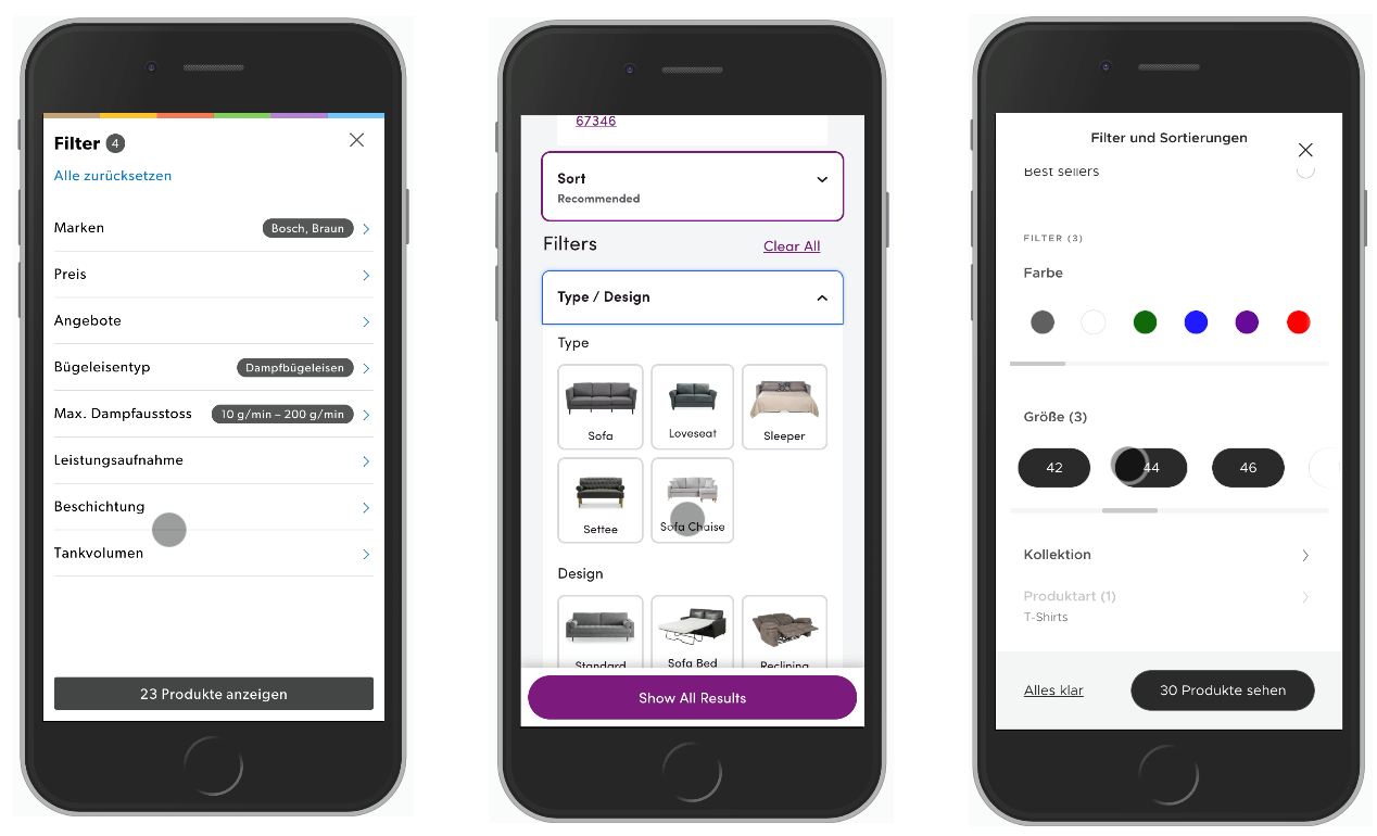
At the first glance, filtering doesn’t seem like a particularly complex endeavour. Of course we can have lengthy debates about the right form elements for different kind of filters — autocomplete, radios, toggles, select-dropdowns, sliders and buttons just to name a few — but in their essence, all of the form elements are just basic input, right?
Well, as it turns out, there are quite a few facets of the experience that make designing filters quite difficult:
- filters can come in various flavours and shapes, for pricing, ratings, colors, dates, times, size, brand, capacity, features, level of experience, age range, symptoms, product status etc.
- filters usually come in large numbers, and they need to be displayed across screens,
- filters often have different states (selected, unselected, disabled)
- filters often need sensible defaults, and they have to remember user’s input,
- filters can be interdependent, and these dependencies need to be obvious,
- filters can be difficult to validate, e.g. when users can type in complex data, such as time or dates,
- filters need to support and show meaningful error messages,
- and so many others.
Filters never exist on their own; in one way or another, they are always connected to the results that they are acting upon. This connection often causes filters and matching results to be somewhat synchronous, as the latter depend on how fast the UI registers an input, and how much time it needs to successfully process it.
Now, addressing all the fine intricacies of each of these challenges is nothing short of monumental work, yet some issues are slightly more frustrating than others, making the overall experience painful and annoying, and hence causing high abandonment and high bounce rates. Let’s explore some of the critical ones.
Avoid Tiny Scrollable Panes
After just a few usability sessions with customers who try to use filters on their own device, one can spot some common frustrations making rounds over and over again. One of the most annoying patterns comes from lengthy filter sections that contain dozens of options. These options often get tucked away in a tiny scrollable pane, showing 3–4 options at a time and requiring vertical scrolling to browse the options.
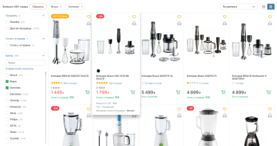
These sections often cause customers to scroll vertically, slowly, accurately, with extreme focus and precision. As they do so on mobile, some filters get activated by mistake, prompting the customer to be even more focused. A classic example of this pattern is the “Brands” filter, which often contains hundreds of options, sorted by popularity or by alphabet.
An alternative option would be to show as many as 7–10 options at a time with an accordion that would expand and show all options on tap/click. These options don’t have to be displayed in their full height, but can live in a larger scrollable pane. But then they shouldn’t be activated by scrolling through the pane.
It’s also a good idea to compliment the filter with a search autocomplete and an alphabetical view if some of the popular options are highlighted at the top. A good example of it is Rozetka.ua, an eCommerce retailer from Ukraine (see above).
Always Provide Text Input Fallback For Sliders
Whenever users can define a large range of values, be it pricing range in retail store, max duration of a train trip or a min/max coverage for an insurance plan, we probably will use some sort of a slider. All sliders have one thing in common: they are wonderful when we want to encourage customers to explore many options quickly, but they are quite frustrating when the user has something specific in mind and hence needs to be a little bit more precise.
Just think about the frustration we usually have to go through when bumping up the price a little bit, from $200 to $215, or adding another hour for the duration of a flight. Doing so with a slider is difficult because it requires incredible precision, and that always produces mistakes and causes frustration.
We’ve covered how to design a perfect slider in detail already, but probably the most important feature that every slider needs is to support different speeds of interaction. In fact, there are a few common types of interaction:
- when customers want to explore many options quickly, a good ol’ slider with a track and a thumb works perfectly fine;
- when customers want to be more precise in their exploration, we can help by adding steppers (+/-) for granular jumps forward and backwards,
- when customers have an exact value in mind, we can help by providing text input fields for min/max values, so users can type in values directly without having to use the slider,
- in all of these cases, solutions have to be accessible and support keyboard-only interaction.
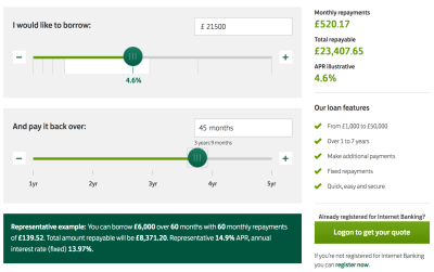
Take a look at the Lloydsbank’s example below. A personal loan calculator supports all types of interaction beautifully. Also, notice the focus styles when the thumb is activated, and ranges displayed below the interest rate slider at the top to indicate where the customer is currently navigating. The interest rate changes depending on how much money the customer would like to borrow.
Another interesting example of a well-designed slider comes from Made.com’s Sofasizer, which allows you to filter couches based on the dimensions that they need to have. Rather than using a set of input fields, Made.com chose to use a visual interface with a “Resize” icon. You can drag the handle to adjust the size, or you can type in exact values in the height and width input fields.
Never Auto-Scroll Users On A Single Input
You’ve been there before. Perhaps in the rush of excitement you head to the retail store, click on all the right category links, swipe left and right through sub-navigation, and eagle eye into that one shiny new laptop that you now finally ready to commit to. What’s expecting you next might not be quite the experience you were hoping to indulge yourself on. Take a look at the example below. Can you spot what seems to be happening?
In this example from Dell.com, as you choose your laptop features, only a single input is registered at a time. If you happen to be selecting multiple options quickly, only the last input will be applied. And as an input is registered, the page refreshes, jumping the customer all the way to the top of the filtering sidebar. That means that the more filters you want to use — and usually navigate from top to bottom — the more you’ll have to keep scrolling down to find the right filter.
A reason why this implementation is so common is not because we want to auto-scroll customers to the top of the filters area, but rather because we want to drive them towards the top of the products results with filters applied. Being stuck somewhere in the middle of the list won’t be particularly useful once you have new filters applied. And indeed, it is better to show the top of the results with every filter update, but it doesn’t mean that we need to auto-scroll filters as well.
In fact, even if you’d like to specify just 6–10 features this way, you’ll need to embark on a quite stubborn scrolling fight against the auto-scroll, with only a single filter registered at a time. It is possible to tap or click on multiple filters at a time, but in this case unfortunately the UI won’t respond as expected. The overall experience is quite frustrating and disorienting, also because the website feels slow, and it always takes more and more effort to continue filtering. Not the best example of minimize the time from the default state to the final state.
One way to tackle these issues would be to remove auto-scroll for filters altogether and find a better way to indicate that only one input can be made at a time. For example, we could freeze the entire interface and thus disable any input until the new data comes back from the server. Then we’d need to wait for new results to be injected into the DOM, and only then have the UI coming back. While it is slightly clearer than the previous solution, it turns out to have issues on its own.
Never Freeze The UI On A Single Input
Every time we freeze the UI on a single input, we actively slow down our customers in expressing their intent. We actually make it a bit more cumbersome for them to specify what they are interested in, prioritizing the display of results over the input. That seems to be a wrong prioritization though. Let’s take a look at the example below.
At Sears.com, every time a selection is made, not only is the UI fully blocked; the users are also pushed to the top of the page. That’s especially frustrating for filters that include accordions (“see more” link in “Brand”, for example). With every new filter, the user has to scroll down and open the accordion to find that particular attribute that they want to select. Walmart (see example below) follows the same pattern.
In these cases we need to rely on JavaScript to toggle between frozen and working states reliably, even if the data hasn’t come back from the server, or if it comes back slowly, or if it’s ill-formed. That’s a quite fragile assumption to rely on.
Now, of course we don’t know when the user has finished with their input, but it’s only reasonable to ensure that during the entire interaction with filters, the customer never has to wait for an interface to respond back. Now, if we look a bit closer at the three examples above, we’ll notice one similarity. All of them auto-apply every filter upon selection, disabling any further selection until the new results page comes back.
However, it’s remarkably common for customers to add multiple filters quickly, sometimes in the same category. The behavior of the UI doesn’t support this intent well.
So, do we have any alternatives? An obvious alternative is to hand over the decision to the user about when the results should be updated. That could mean adding an “Apply” button and encourage customers to select all filters first before seeing any results. But it’s not necessarily the only option. Actually, as it turns out, we can do both: seeing up-to-date results while interacting with the filter without any delay. We just need to move from synchronous display of results to its asynchronous counterpart.
Always Show Results Asynchronously
We mentioned already that filters and matching results are often somewhat synchronous. However, we could split the parts of the UI and render both of them separately, asynchronously. In that case, on every filter input, matching results could be updated asynchronously, while the filters always remain accessible and at the same place. With every new filter input, the user would see a flash of new content streaming in.
The BestBuy example above shows that pattern in action. As we select filters in the left sidebar, they get applied in the background while we can keep selecting more and more filters should we choose to do so. The product list gets updated asynchronously: there is never a disabled state as new content gets populated into the list of matching results every time the data gets back from the server.
We could make it a bit more obvious by showing that new products are being loaded in as new filters are being applied. A good example of that is Coolblue, with an asynchronous sidebar filtering UI appearing on the left hand-side.
It’s worth emphasizing at this point that every input in the filters area needs to be registered, and then applied to the product list. We’ve noticed that for many customers that’s an expected behavior, unless you keep a floating “Apply” button close to the filters area.
Avoid Layout Shifts On Filter Input
As long as the interface isn’t blocking input, of course customers expect that they can set a number of filters one after another. However, depending on where the filters are located, at times they might encounter accidental layout shifts, so they have to orient themselves on the page again, scroll up and down to find where they left off, and then continue with the next input. Take a look at the example below. What seems to be the problem on VictoriaPlum (displayed below)?
Every time users interact with a filter, once the new product items come in, there is a small shift happening in the filtering area. Usually there are three reasons why it happens:
- on every filter input, filter sections that have been expanded by the customer automatically collapse,
- filters that were available earlier become unavailable, and they become hidden, reducing the height of the filtering area,
- the overview of applied filters is located above the filters area, so as it grows in size with every new filter, it pushes the filters down as well.
To avoid the first issue, we need to maintain the state of accordions and keep them open, even if the user has set a new filter or refreshed the page. We also need to keep the settings of filtering upon refresh, or navigation. In fact, we see customers expecting the filters to still be applied even if they go back to previous categories or pages (e.g. with the “Back” button).
For the second issue, if filters aren’t available any longer, rather than hiding them automatically, we can disable them, but also explain why they are disabled (a friendly hint might help) and what needs to be done to re-enable them. We can then also add an option to “Hide all unavailable options”.
Finally, we might want to reconsider the position of applied filters above the filters area. There are really not that many options where they could live though, and a better option seems to be the area above filtering results.
Display Filters Above The Results
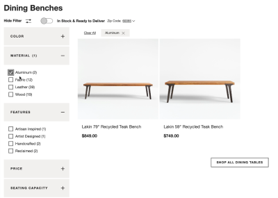
To avoid layout shifts altogether, we can display applied filters above the product results. That would keep the filtering area stable and predictable during the entire user interaction. In fact, it doesn’t have to be visible at all times. Crate & Barrel, in the example below, allows customers to hide and show filters on demand, while applied filters are added to the dedicated area above products. Note that an option to clear all filters is available as well. (The product page has changed since the video was recorded though.)
Another option is to turn all filter sections into overlays and display them on tap/click above the results. In fact, you could even use floating filters, so as a customer scrolls down the page, the filters are still accessible all the time.
An example of this pattern is Adidas (see the image below). The filters bar is persistent; even as users are scrolling down the page, the filter overlay won’t close automatically — it requires user’s input, again handing over the control to the user. However, it does close automatically once one of the filters is selected. If the user wants to select multiple filters, they have to re-open the same filter group over and over again. Keeping the filters persistent might be a better idea. Still, the result: no layout shifts, no frustrating scrolling in narrow corridors, and filters are always accessible.

Not to say that displaying filters above the results is always better by default. On Asos, every filter input causes jumps to the top of the page, so customers have to manually scroll down to continue filtering. Instead of re-rendering the entire page, it would make more sense to re-render the filters area and the product list separately.
In general though, the first two options (Crate & Barrel and Adidas) seem to work very well, and they leave more space for products to be displayed, while avoiding all the troubles that we discussed earlier. That’s a quite reliable pattern to use when we want to avoid roadblocks or confusion. But we can still do a bit more, for example with a good ol’ “apply” button.
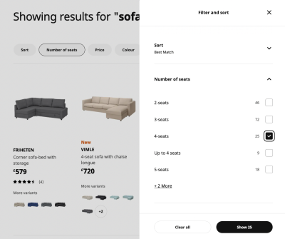
Show The Number Of Results On The “Apply” Button
It almost feels a little bit archaic to have an “Apply” button for filters in times when we are getting used to seamless and smooth interactions, fade-ins and timed animations. However, if we want to drive customers towards a comfortable range, there is hardly a better way of doing so than displaying the number of results as soon as possible.
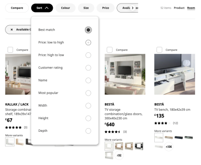
Ikea features filters at the top of the results. Sometimes filters appear in a drop-down overlay, and sometimes as a pill below the filters. But most of the time, unlike previous examples, when a filter is selected, it displays a sidebar mega-filter-overlay on the right with all available filtering options grouped there. As the customer is making their way through the filters, the product list is updated in the background asynchronously. More importantly, notice the “Apply” button which label changes depending on the input.
With every filter input, a new request is sent to the server, retrieving the number of results, and then showing that number in the UI. That’s a great way to give users a very clear sense of how far or how close they are towards their comfortable range.
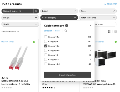
Another example is Galaxus.ch (see below), a Swiss eCommerce retailer that provides a first-class experience when it comes to filtering. The filters are displayed above product results; a filter overlay appears on tap/click. No slowdowns, fast response times and a lovely integration of active filters with the filters area. A great reference example that is worth considering when designing any kind of filter.
In general, having an “Apply” button along with real-time updates of the content area seems to be working best. It really combines the best of both solutions: showing results immediately when they arrive, while keeping filters accessible at all times.
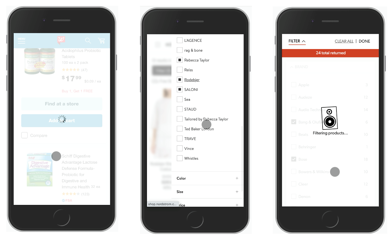
Avoid Split-Screens On Mobile
The issues that we’ve explored in the article apply equally to large and small screens. However, on small screens, and especially on slow connections, these issues become even more critical. Most of the time, interfaces tend to block the entire UI on a single filter input, causing massive delays for customers on the go (e.g. Crutchfield, Walgreens). On the other hand, it’s common to split the screen to display a filters overlay, while still showing the product list updated in the background (e.g. Nordstrom).
In general, though, it might be a better idea to experiment if a full-page overlay for filters would perform better. It gives more space to experiment with a multi-column view, or perhaps even display a swipeable area to choose filters without having to move between separate pages. In fact, using accordions that could collapse and expand instead of bringing the user to a separate page might be a good idea — similar to what we’ve discussed with mega-dropdowns.
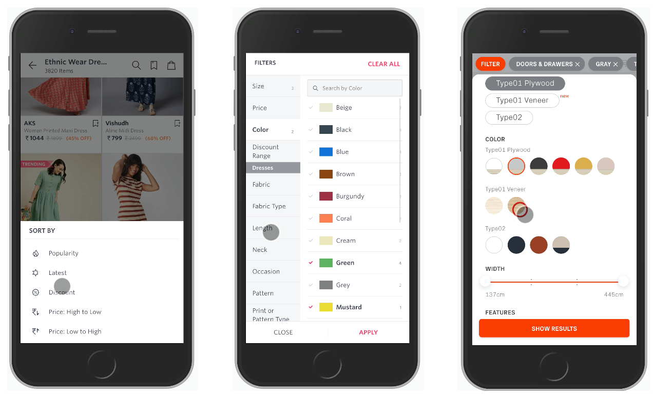
Unlike on desktop, having an “Apply” button in all these examples matters, and you can make it slightly more useful by adding the amount of products as a label on the button and keeping the button sticky at the bottom as the user is scrolling down.
Filtering Design Checklist
As usual, here are all the things to keep in mind when designing any kind of filter — a little helper to avoid missing important details before heading into conversations with your fellows designers and developers. You can find a full deck of Smart Interface Design Patterns Checklists at yours truly Smashing Magazine as well.
- Can we avoid a filter icon and show filters as they are?
- If not, what icon do we choose to indicate filtering?
- Is the icon + padding large enough for comfortable tapping?
- Do we put the icon at the top, bottom or floating (mobile/desktop)?
- What exactly happens when the user clicks/taps on the icon?
- How will the icon change on tap/click?
- Will we have some sort of animation or transition on click?
- Will filters appear as full page/partial overlay or slide-in?
- Can we avoid sidebar filtering as it’s usually slow?
- Do we expose popular or relevant filters by default?
- Do we display the number of expected results for each filter?
- Can we use a horizontal swiper to move between filters?
- Can we avoid drop-downs and use only buttons/chips + toggles?
- For complex filters, do we provide search within filters?
- Do we use icons to explain differences between various filters?
- Do we use the right elements for filters, e.g. sliders, buttons, toggles?
- Do filters apply automatically (yes, for slide-ins)?
- Do filters apply manually on confirmation (“Apply”) (yes, for overlays)?
- How do we communicate already selected filters?
- Can selected filters appear as removable pills, chips or tags?
- Do we recommend relevant filters based on selection?
- Do we track incompatibility between selected filters?
- How do error messages or warning appear in the UI?
- Do we allow customers to reset all filters quickly, at once?
- Are filters (or filters button) floating on scroll on mobile/desktop?
- Can users tap on the same spot to open/close filters?
Wrapping Up
Too often the filtering experience on the web is broken and frustrating, making it just unnecessarily difficult for customers to get to that shiny comfortable range of relevant results. When designing the next filter, take a look at some of the common issues that you might want to avoid, and hopefully avoid all the frustration that comes from broken and inaccessible implementations.
- Design for the comfortable range of options, for the case when a customer wants to add multiple filters quickly — one right after another.
- For lengthy filter groups, avoid tiny scrollable panes and show as many as 7–10 options at a time with an accordion that would expand and show all options on tap/click. Add a search autocomplete and an alphabetical view as well.
- Always add steppers (+/-) and text input fields when using sliders,
- Customer often want to set a number of filters of the same type. Never auto-scroll users on a single input and never collapse a group of filters automatically.
- Never freeze the UI on a single input, and never make your customer wait for an interface to respond back when setting filters.
- Always update filters and show results asynchronously, so that on every filter input, matching results could be updated asynchronously, while the filters always remain accessible and at the same place.
- Always avoid layout shifts on filter input and consider displaying filters above the results.
- On mobile, “Apply”-button could be sticky at the bottom of the screen. Update the count of products and show them on the button.
Articles Of The Series
If you find this article useful, here’s an overview of similar articles we’ve published over the years — and a few more are coming your way.
- Perfect Accordion
- Perfect Responsive Configurator
- Perfect Birthday Picker
- Perfect Date and Time Picker
- Perfect Mega-Dropdown
- Perfect Feature Comparison
- Perfect Slider
- Form Design Patterns Book by Adam Silver, published on SmashingMag
- Subscribe to our email newsletter to not miss the next ones.
Further Reading
- How To Harness Mouse Interaction Data For Practical Machine Learning Solutions
- Getting To The Bottom Of Minimum WCAG-Conformant Interactive Element Size
- The Feature Trap: Why Feature Centricity Is Harming Your Product
- A Designer’s Accessibility Advocacy Toolkit
 (il, mrn)

