You Can Do That With A JavaScript Data Grid?

Email Newsletter
Weekly tips on front-end & UX.
Trusted by 182,000+ folks.
This article has been kindly supported by our dear friends at Progress Kendo UI who are committed to giving developers the tools they need to harness and master the technological evolution shaping our society and the world. Thank you!

Data grids, also known as data tables, are essential in presenting massive amounts of data to users. Users should be able to view the data in a way that’s easy to understand, analyze, and manipulate. However, building data grid views with performance, speed, and user experience in mind can be a particularly daunting task. This is especially true when building them from scratch or using libraries with limited functionality and sub-par performance.
There is no shortage of libraries that bundle data grids. However, most only offer a limited set of grid features, common among them being pagination, filtering, sorting, and theming. Other data grid libraries are built as wrappers that rely on several dependencies. These kinds of libraries unfavorably impact the performance of your grid compared to their native counterparts. They are not built anew for every framework or language. As such these non-native libraries can be slow, may fail to take advantage of superior features of a framework/language, lack crucial functionality, and require additional setup to get working.
Another thing these libraries are characterized by is poor user experience. They often fail to implement responsive design for different screen sizes and orientations, are unable to lock or make parts of a grid sticky, and make accessibility an afterthought. Besides that, they only provide editing in forms separate from the grid, which often involves multiple actions to complete. This can be tiring and repetitive notably when editing numerous data items. Others don’t even offer editing. To add to this, they tend to lack data export functionality and leave users relying on web page printing for exports.
Due to their limited functionality and features, you have to supplement them with separate libraries to build an adequate grid. For example, to chart data, you’d have to use a different chart library since the grid library won’t offer it. Moreover, you’re unable to embed these unrelated components in the grid since support for them is not in-built.
To address these problems, you’d have to use a library that’s not only built to be native but also incorporates a range of complementary components and focuses on great user experience and performance. To demonstrate the features of an ideal data grid, we’ll use Kendo UI Data Grids as an example. These data grids are one of 100+ components available in a library bundle called Progress® Kendo UI®. The bundle consists of four component libraries built natively for several frontend frameworks. These are Kendo UI for Angular, KendoReact, Kendo UI for Vue, and Kendo UI for jQuery. The examples given throughout this piece will feature grids from all four of these libraries.
Responsive Design
When it comes to data grids, your users must have a full view of the data they are working with. Data that is hidden or difficult to access is frustrating to read and turns users completely off your grid. A lot of grid libraries do not make their grids responsive and it’s up to you to implement it using styling and some logic. This can be especially complicated with data containing very many columns. If you are building multiple grids with different types of data with varying representation needs, this further compounds the complexity. You have to figure out scrolling, media queries, font sizes, scaling, whether to omit some parts of the data, and so on.
Modern data tables should be able to respond to changes in orientation and display all data well on all screen sizes. For example, the Kendo UI Data Grids adjust their size depending on the viewport size and the number of rows it accommodates. For example, in the Angular Grid, you can set its height and the grid will become scrollable if some of its contents do not fit. Setting the height only involves specifying a value for the grid’s height CSS property and ensuring that the parent element also has a height set. No other configuration is required. You can see how this is done in this sample stock table here.
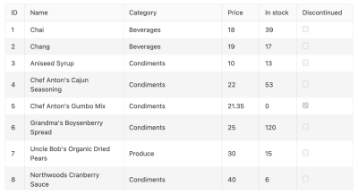
Besides that, you can choose to toggle the visibility of the columns in the grid while still displaying all required data. You achieve this by creating different columns for different screen size ranges and using the media property on a column to decide where to show them. For instance, in this Angular data table, for larger screen sizes (media="(min-width: 450px)"), the columns are on full display and look like this.
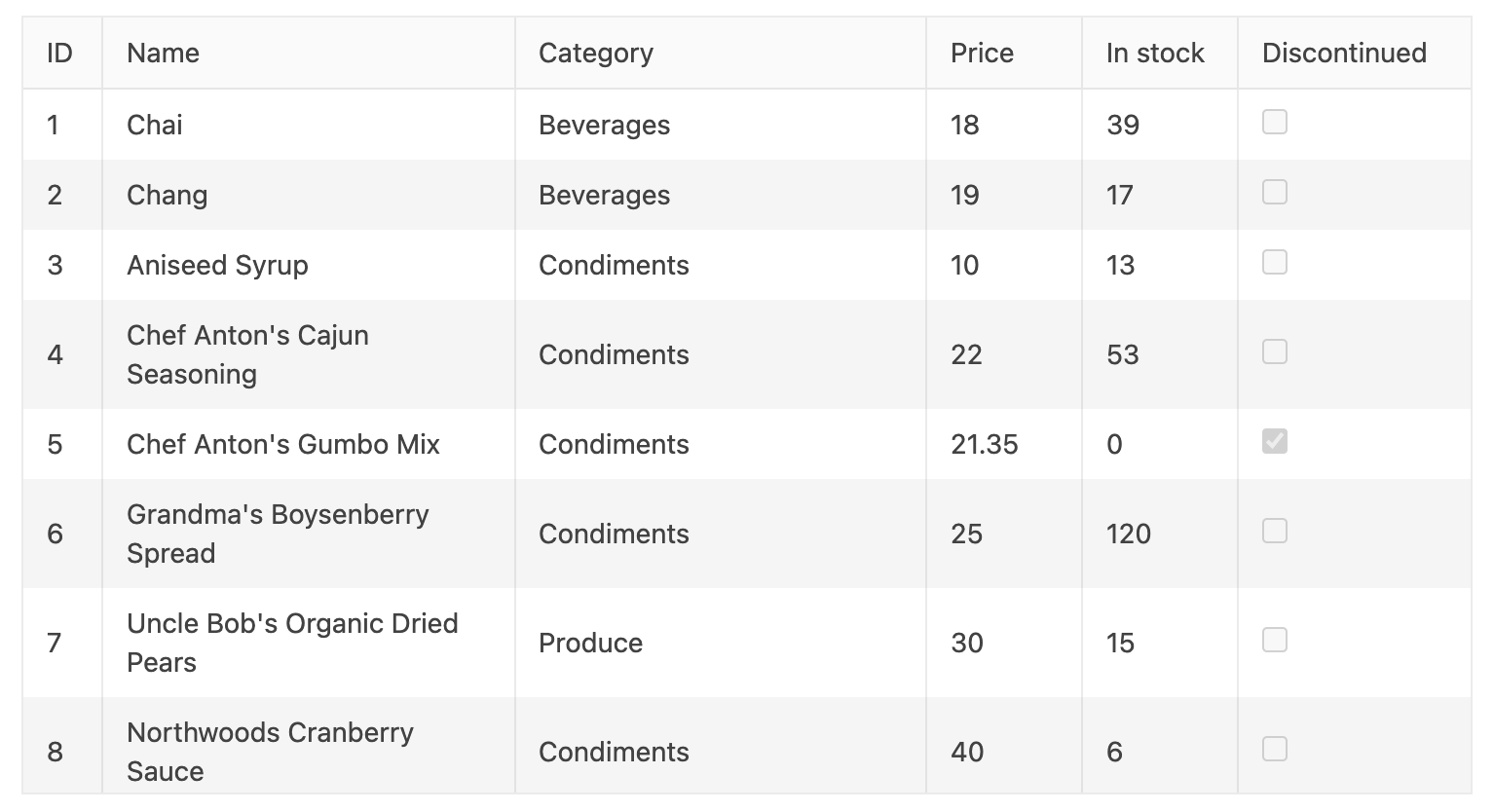
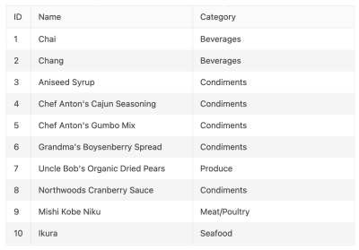
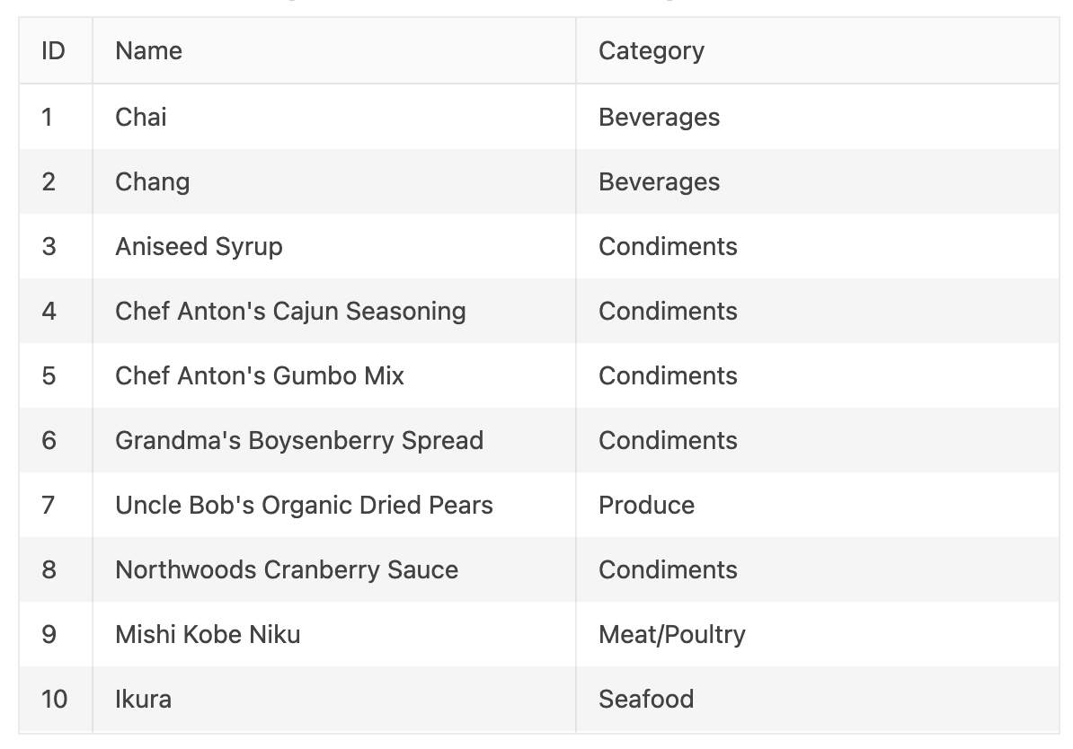
However, you can choose to hide the price, in-stock, and discontinued columns on medium displays (media="(min-width: 680px)"). This should look like this:
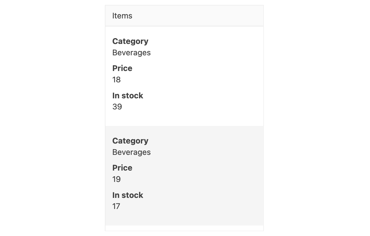
On smaller displays ( media="(max-width: 450px)" ) , you can create a single custom column to show all the data similar to this:

Kendo UI Data Grids also support Bootstrap 4 device identifiers like xs, sm, md, lg, and xl. Although this is easier to use, it’s not as versatile since it limits the number of queries you can include to one. For instance, with your own breakpoints you could have something like media="(min-width: 500px) and (max-width: 1200px)". Combining multiple identifiers is not possible with Bootstrap 4 device identifiers.
Accessibility Compliance
Making sure that your grid meets modern accessibility standards should be a priority. Doing this ensures that people with disabilities can engage with your grid and guarantees that there is equity among your users. Still, some libraries do nothing to make sure their grids are accessible. Others do only the bare minimum resulting in sub-standard grids when evaluated for accessibility. Augmenting these grids to be accessible involves a fair amount of work. This is further complicated by more intricate grid designs. Although this work will pay off later for you and your users, these libraries should have made accessibility a core part of their products.
Kendo UI Data Grids prioritize it by supporting the main accessibility standards like WAI-ARIA, Section 508, and WCAG 2.1. For example, KendoReact follows the Section 508 standard by ensuring that most of its components are completely accessible and support keyboard navigation. It follows WCAG’s Keyboard Accessible guideline by making the grid and all its embedded components keyboard operable. As a result, the React Grid achieves the highest WCAG conformance level of AAA. Being a web component, KendoReact Data Grid fulfills the WAI-RAI specification to ensure that users with disabilities can adequately interact with it on web pages. In this React data grid, for example, you can navigate to the different components and rows using a keyboard.
Virtual Scrolling
With virtual scrolling, only a segment of data is rendered within the grid. This is usually set as a number of records to fetch. When a user scrolls past this segment, another one of the same size is rendered. This helps with performance as rendering a large data set takes up a lot of memory and hobbles the performance and speed of your grid. Virtual scrolling gives the illusion of rendering all the data without any of the performance consequences.
Virtual scrolling is not often supported by grid libraries. Instead, they encourage pagination which may not be the best experience for users when viewing massive amounts of data. When attempting to render enormous data quantities, the grid’s performance suffers further contributing to a terrible user experience. For libraries that support virtual scrolling, it only applies to records in the data and not specific parts of the records. This is particularly limiting when the data has several columns.
Kendo UI supports virtual scrolling for both local and remote data. For example, in the Kendo UI for jQuery Grid, you enable it by setting the scrollable.virtual property of a grid to true. By setting this, the grid only loads the number of items specified by the pageSize property of the grid data source. You can see how this works in this jQuery data grid which uses local data.
<!DOCTYPE html>
<html>
  <head>...</head>
  <body>
    ...
    <div id="grid"></div>
    <script>
      var dataSource = new kendo.data.DataSource({
                            pageSize: 20,
              ...
            });
      $("#grid").kendoGrid({
                        dataSource: dataSource,
                        scrollable: {
                            virtual: true
                        },
        ...
      });
    </script>
  </body>
</html>
This same setting will work for remote data as seen in this jQuery data table. Additionally, you can use a similar setting to virtualize the columns of a grid if records contain several properties that may be costly to render all at once. The scrollable.virtual property needs to be set to true. However, virtualizing columns does not depend on the pageSize property. This example demonstrates this feature.
PDF And Excel Exports
Having the ability to export data from the grid is pivotal. Users may need to distribute or further manipulate it using applications like spreadsheets. Your users should have the option to painlessly share data without being confined to the grid. Grid data may also need extra processing not offered by your grid, like in spreadsheets and presentation software.
Although this is an essential use case, it is not catered for in many libraries. Users have to resort to printing whole web pages to get access to the data in PDF formats. When transferring data to external applications, they have to copy and paste it numerous times. This is understandably pretty infuriating.
Kendo UI Data Grids provide data exports from the grid in two formats: PDF and Excel. For instance, in the Kendo UI for Vue Data Grid, to process PDF exports, you would use the GridPDFExport component. With its save method, you would pass the data you’d like to include in the PDF export. The data could be paginated or the complete set.
<template>
    <button @click="exportPDF">Export PDF</button>
    <pdfexport ref="gridPdfExport">
        <Grid :data-items="items"></Grid>
    </pdfexport>
</template>
<script>
import { GridPdfExport } from '@progress/kendo-vue-pdf';
import { Grid } from '@progress/kendo-vue-grid';

export default {
    components: {
        'Grid': Grid,
        'pdfexport': GridPdfExport
    },
    data: function () {
        return {
            products: [],
            ...
        };
    },
    methods: {
        exportPDF: function() {
            (this.$refs.gridPdfExport).save(this.products);
        },
       ...
    },
    ...
};
</script>
The GridPDFExport component allows you to specify page sizes for the export, page margins, how to scale the grid on the page, etc. This is useful for customizing larger grids to fit the PDF pages. You would pass these as properties to the component. Here’s an example:
<pdfexport ref="exportPDF" :margin="'2cm'" :paper-size="'a4'" :scale="0.5">
        <Grid :data-items="products"></Grid>
</pdfexport>
You may choose to further customize the export using a template. Within the template, you can add styling, specify headers and footers, change the layout of the page, and add new elements to it. You would use CSS for styling. Once you’re done configuring the template, you would specify it using the page-template property of the GridPDFExport component.
To export Excel files from a Kendo UI Vue Grid, you would use the ExcelExportcomponent. With its saveExcel method, you pass the file name, the grid data, columns to display, etc. to it and call the method to generate the file. This Vue data grid is a great example of how you can achieve Excel exports with Kendo UI Vue Grid.
Sticky Columns
When a user scrolls through a grid horizontally, they may need to have some columns frozen or constantly within view. These columns usually contain crucial information like IDs, names, etc. Frozen/sticky columns always remain visible but may move either to the left or right edges of the grid depending on your scroll direction, or not move at all. For example, in this Vue data grid demo, the ID is frozen and the Discontinued column is sticky.
Sticky columns in grid libraries can be a rare occurrence. If not present, implementing it from scratch can be a difficult endeavor. It will require significant styling to accomplish and it may not scale well if you need numerous grids.
Setting up sticky columns in Kendo UI requires minimal setup. For instance, in a Kendo UI Vue Grid, you’ll need to set the locked property of a column to true to make it sticky. In this Vue data table, the ID and Discontinued columns are made sticky by setting the locked property. In the example below, the ID and Age are locked.
<template>
    <grid :data-items="people" :columns = "columns">
    </grid>
</template>
<script>
import { Grid } from '@progress/kendo-vue-grid';
import { people } from './people'

export default {
    components: {
        'grid': Grid
    },
     data: function () {
        return {
            people: this.getPeople(),
            columns: [
                { field: 'ID', title: 'ID', locked: true},
                { field: 'FirstName', title: 'FirstName' },
                { field: 'LastName', title: 'LastName' },
                { field: 'Age', title: 'Age', locked: true},
            ]
        };
    },
    methods: {
        getPeople() {
           return people;
        }
    }
};
</script>
Editing
A grid’s main use case is to view large amounts of data. Some libraries just stick to this and don’t consider the possibility that editing is needed. This disadvantages users as editing is a pretty useful feature. When users request it, developers are then forced to create a separate page for editing individual entries. To add to this, users are only able to edit one entry after another on one form. This is wearisome and makes for a bad user experience especially when handling large amounts of data.
One important use case for grid editing is facilitating batch editing. It’s useful for modifying large amounts of data all at once. This could involve deleting, creating, and updating the data.
Kendo UI Data Grids enables editing in two forms: inline and using pop-ups. With inline editing, all the data is edited within the grid. When a cell is clicked, it becomes editable. In a pop-up, a pop-up form is used to edit each entry individually. In this Kendo UI for jQuery table example, making a grid editable involves three steps: setting the grid’s editable configuration, establishing a data source, and configuring CRUD operations on the data source. These few steps reduce the complexity involved in setting up batch editing. Configuring pop-up editing follows the same steps but with different options at the start.
In addition to supporting edits, the Kendo UI for jQuery Grid enables input validation. For example, you can make inputs required or enforce a minimum length. Besides that, you can create custom input controls. Input controls are not just limited to text fields. You can use drop-downs, checkboxes, date pickers, range sliders, etc. These can be both inline and in pop-ups. In this jQuery data table, the Category field is a drop-down. Validation is also demonstrated in the same example. The unit price field has validation imposed, ensuring its least value is 1.
Supplementary Components
Most grid libraries have a singular purpose: to provide a grid. They do not ship with anything else, only the grid. You are limited to the features it provides. If you need to supplement the grid, it can be tricky because other libraries may not be compatible with it. So you just have to stick within the boundaries of the library when building a grid.
Kendo UI solves this because the approach of its creator is to offer a comprehensive library of components that easily integrate with each other instead of single components. The grid is part of a library of numerous components that allow you to do everything from data management, navigation, charting, editing, media presentation, chat facilitation,, and so on. You can choose to embed these components within the grid without having to perform some elaborate setup and possibly breaking it. Integrating them is seamless and requires minimal configuration. Take for example this Angular data table, its 1 Day column embeds a fully interactive chart for each row seamlessly. You can embed any number of components within a grid trusting that it will work and have all its features perform as expected.
Conclusion
Data grids need to be easy to understand, engaging, responsive, and accessible. They need to perform well and load data fast. However, building a data grid that meets these standards from scratch can take a long time and be a huge undertaking. You may opt to use data grid libraries but often these are not optimized for performance, are not accessible, and only ship with a single grid component.
Creating an appealing data grid that’s delightful to use requires a library that focuses on performance. It can do this by building natively and supporting virtual scrolling. The data grid it provides needs to be responsive and use sticky columns. This is so users can easily view the data no matter the screen size or orientation. Accessibility should be a core concern of grids. This guarantees that all users can have an equal experience using them.
Data tables should expand what a user can do with the data. This can be achieved through editing and facilitating exports in multiple formats. Besides that, these libraries should ship with other components to supplement the grid. Having compatible components in one library removes the need to use several different conflicting libraries in one application. A data grid library that provides these features will help you craft a great product for your users without much complication.
Further Reading
- Creating Accessible UI Animations
- The Things Users Would Appreciate In Mobile Apps
- Sticky Headers And Full-Height Elements: A Tricky Combination
- The Era Of Platform Primitives Is Finally Here
 (vf, il, mrn)