How To Build Resilient JavaScript UIs

Email Newsletter
Weekly tips on front-end & UX.
Trusted by 182,000+ folks.


 Custom Web Forms for Angular, React, & Vue. Your backend.
 Celebrating 10 million developers
Things on the web can break — the odds are stacked against us. Lots can go wrong: a network request fails, a third-party library breaks, a JavaScript feature is unsupported (assuming JavaScript is even available), a CDN goes down, a user behaves unexpectedly (they double-click a submit button), the list goes on.
Fortunately, we as engineers can avoid, or at least mitigate the impact of breakages in the web apps we build. This however requires a conscious effort and mindset shift towards thinking about unhappy scenarios just as much as happy ones.
The User Experience (UX) doesn’t need to be all or nothing — just what is usable. This premise, known as graceful degradation allows a system to continue working when parts of it are dysfunctional — much like an electric bike becomes a regular bike when its battery dies. If something fails only the functionality dependent on that should be impacted.
UIs should adapt to the functionality they can offer, whilst providing as much value to end-users as possible.
Why Be Resilient
Resilience is intrinsic to the web.
Browsers ignore invalid HTML tags and unsupported CSS properties. This liberal attitude is known as Postel’s Law, which is conveyed superbly by Jeremy Keith in Resilient Web Design:
“Even if there are errors in the HTML or CSS, the browser will still attempt to process the information, skipping over any pieces that it can’t parse.”
JavaScript is less forgiving. Resilience is extrinsic. We instruct JavaScript what to do if something unexpected happens. If an API request fails the onus falls on us to catch the error, and subsequently decide what to do. And that decision directly impacts users.
Resilience builds trust with users. A buggy experience reflects poorly on the brand. According to Kim and Mauborgne, convenience (availability, ease of consumption) is one of six characteristics associated with a successful brand, which makes graceful degradation synonymous with brand perception.
A robust and reliable UX is a signal of quality and trustworthiness, both of which feed into the brand. A user unable to perform a task because something is broken will naturally face disappointment they could associate with your brand.
Often system failures are chalked up as “corner cases” — things that rarely happen, however, the web has many corners. Different browsers running on different platforms and hardware, respecting our user preferences and browsing modes (Safari Reader/ assistive technologies), being served to geo-locations with varying latency and intermittency increase the likeness of something not working as intended.
Error Equality
Much like content on a webpage has hierarchy, failures — things going wrong — also follow a pecking order. Not all errors are equal, some are more important than others.
We can categorize errors by their impact. How does XYZ not working prevent a user from achieving their goal? The answer generally mirrors the content hierarchy.
For example, a dashboard overview of your bank account contains data of varying importance. The total value of your balance is more important than a notification prompting you to check in-app messages. MoSCoWs method of prioritization categorizes the former as a must-have, and the latter a nice to have.
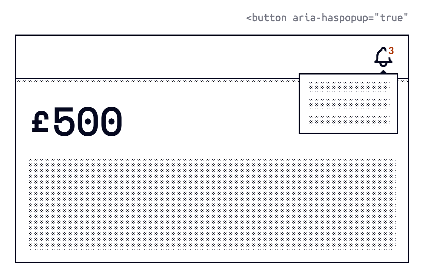
If primary information is unavailable (i.e: network request fails) we should be transparent and let users know, usually via an error message. If secondary information is unavailable we can still provide the core (must have) experience whilst gracefully hiding the degraded component.
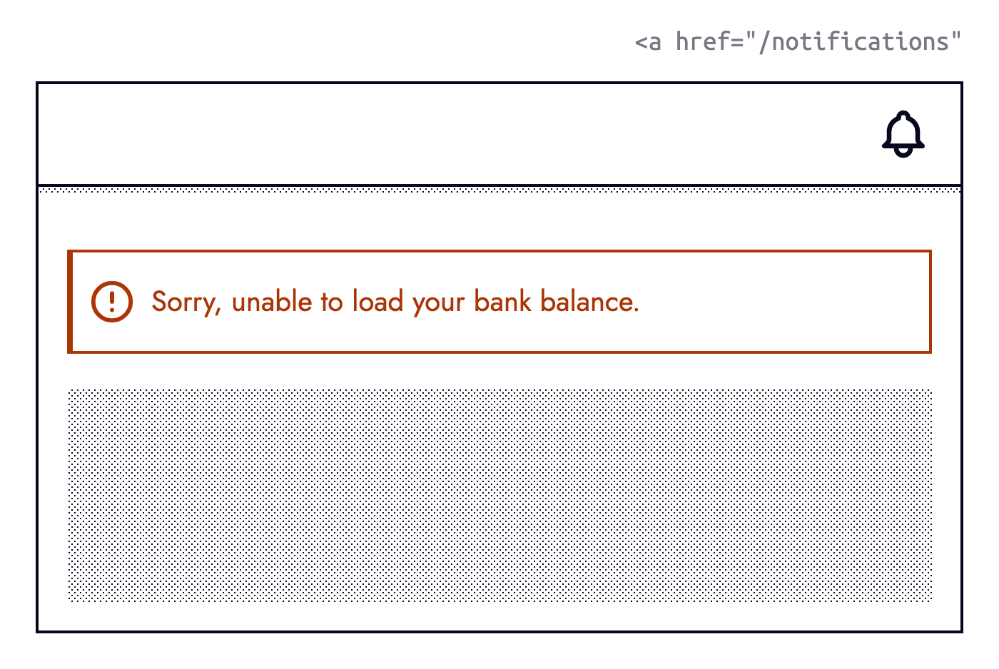
a href='/notifications' to the notification center. (Large preview)Knowing when to show an error message or not can be represented using a simple decision tree:
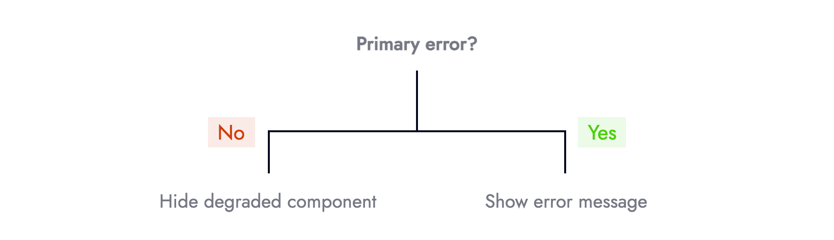
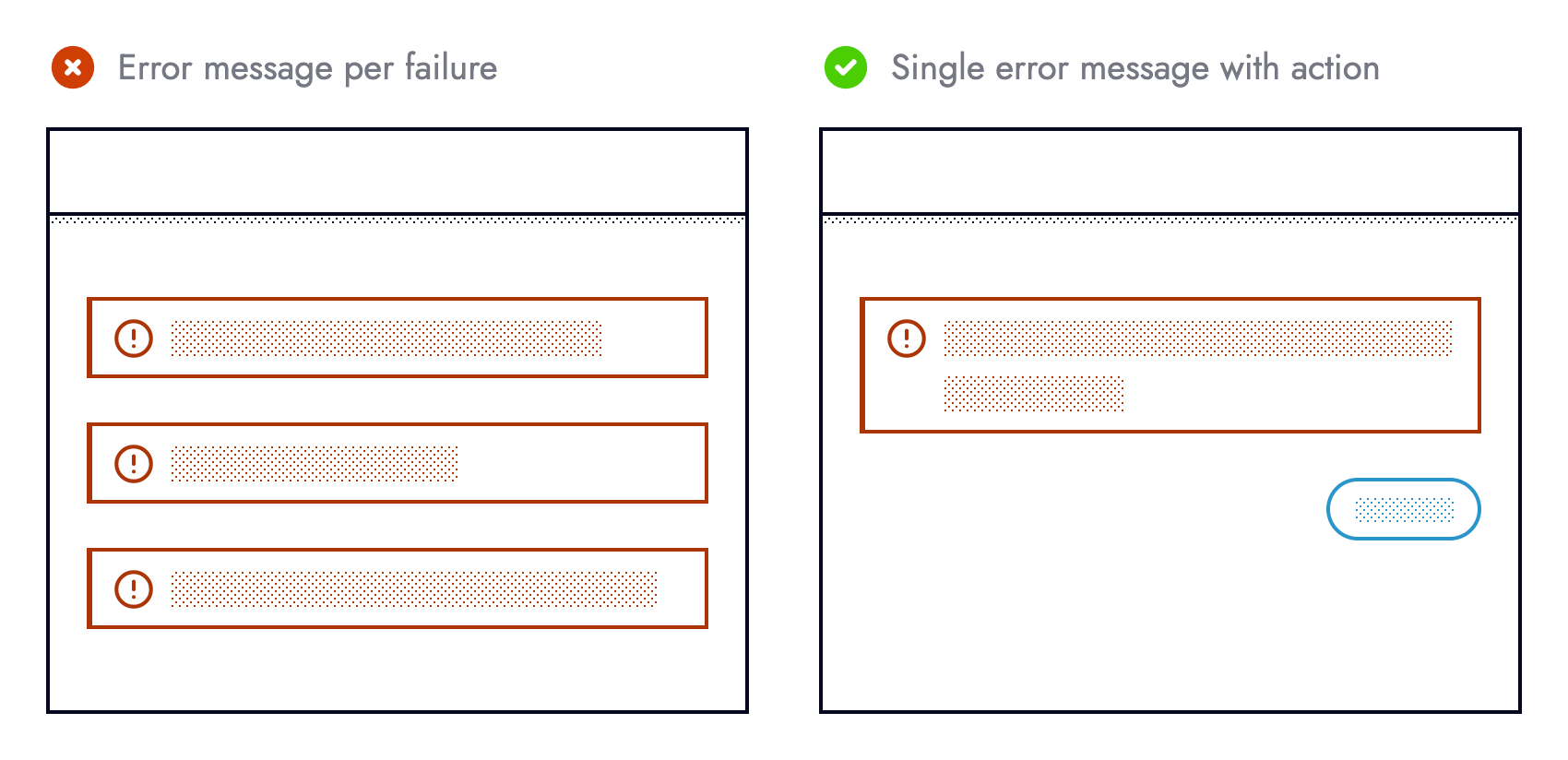
Categorization removes the 1-1 relationship between failures and error messages in the UI. Otherwise, we risk bombarding users and cluttering the UI with too many error messages. Guided by content hierarchy we can cherry-pick what failures are surfaced to the UI, and what happen unbeknownst to end-users.
Prevention Is Better Than Cure
Medicine has an adage that prevention is better than cure.
Applied to the context of building resilient UIs, preventing an error from happening in the first place is more desirable than needing to recover from one. The best type of error is one that doesn’t happen.
It’s safe to assume never to make assumptions, especially when consuming remote data, interacting with third-party libraries, or using newer language features. Outages or unplanned API changes alongside what browsers users choose or must use are outside of our control. Whilst we cannot stop breakages outside our control from occurring, we can protect ourselves against their (side) effects.
Taking a more defensive approach when writing code helps reduce programmer errors arising from making assumptions. Pessimism over optimism favours resilience. The code example below is too optimistic:
const debitCards = useDebitCards();

return (
  <ul>
    {debitCards.map(card => {
      <li>{card.lastFourDigits}</li>
    })}
  </ul>
);
It assumes that debit cards exist, the endpoint returns an Array, the array contains objects, and each object has a property named lastFourDigits. The current implementation forces end-users to test our assumptions. It would be safer, and more user friendly if these assumptions were embedded in the code:
const debitCards = useDebitCards();

if (Array.isArray(debitCards) && debitCards.length) {
  return (
    <ul>
      {debitCards.map(card => {
        if (card.lastFourDigits) {
          return <li>{card.lastFourDigits}</li>
        }
      })}
    </ul>
  );
}

return "Something else";
Using a third-party method without first checking the method is available is equally optimistic:
stripe.handleCardPayment(/* ... */);
The code snippet above assumes that the stripe object exists, it has a property named handleCardPayment, and that said property is a function. It would be safer, and therefore more defensive if these assumptions were verified by us beforehand:
if (
  typeof stripe === 'object' &&
  typeof stripe.handleCardPayment === 'function'
) {
  stripe.handleCardPayment(/* ... */);
}
Both examples check something is available before using it. Those familiar with feature detection may recognize this pattern:
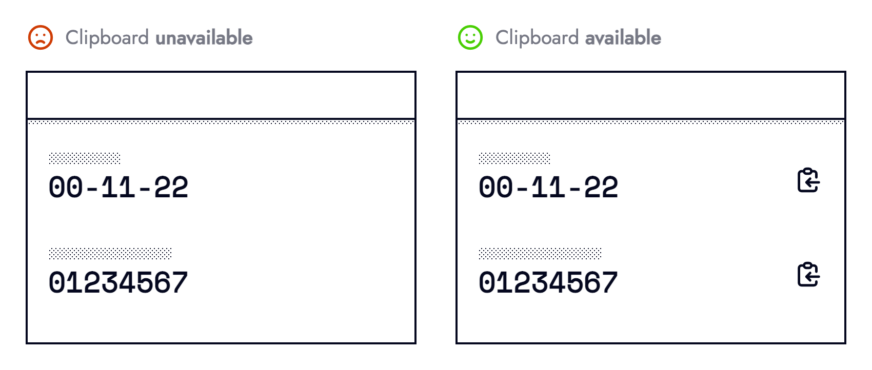
if (navigator.clipboard) {
  /* ... */
}
Simply asking the browser whether it supports the Clipboard API before attempting to cut, copy or paste is a simple yet effective example of resilience. The UI can adapt ahead of time by hiding clipboard functionality from unsupported browsers, or from users yet to grant permission.
User browsing habits are another area living outside our control. Whilst we cannot dictate how our application is used, we can instill guardrails that prevent what we perceive as “misuse”. Some people double-click buttons — a behavior mostly redundant on the web, however not a punishable offense.
Double-clicking a button that submits a form should not submit the form twice, especially for non-idempotent HTTP methods. During form submission, prevent subsequent submissions to mitigate any fallout from multiple requests being made.
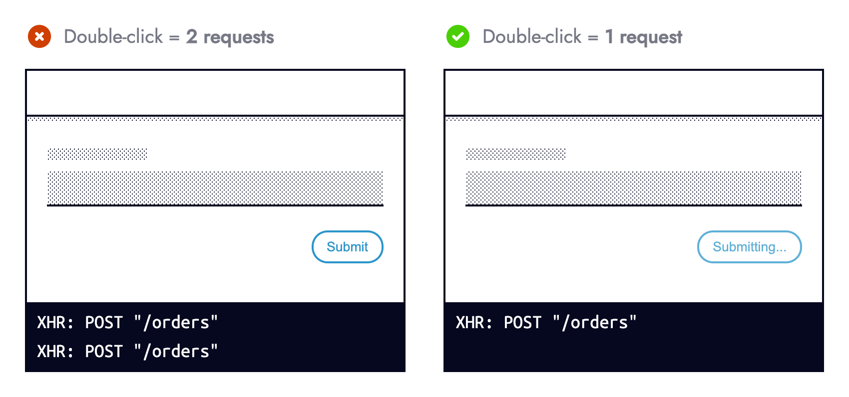
Preventing form resubmission in JavaScript alongside using aria-disabled="true" is more usable and accessible than the disabled HTML attribute. Sandrina Pereira explains Making Disabled Buttons More Inclusive in great detail.
Responding To Errors
Not all errors are preventable via defensive programming. This means responding to an operational error (those occurring within correctly written programs) falls on us.
Responding to an error can be modelled using a decision tree. We can either recover, fallback or acknowledge the error:
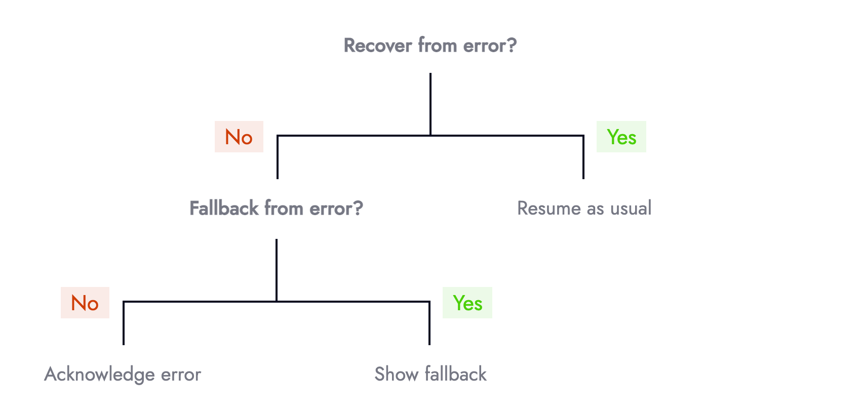
When facing an error, the first question should be, “can we recover?” For example, does retrying a network request that failed for the first time succeed on subsequent attempts? Intermittent micro-services, unstable internet connections, or eventual consistency are all reasons to try again. Data fetching libraries such as SWR offer this functionality for free.
Risk appetite and surrounding context influence what HTTP methods you are comfortable retrying. At Nutmeg we retry failed reads (GET requests), but not writes (POST/ PUT/ PATCH/ DELETE). Multiple attempts to retrieve data (portfolio performance) is safer than mutating it (resubmitting a form).
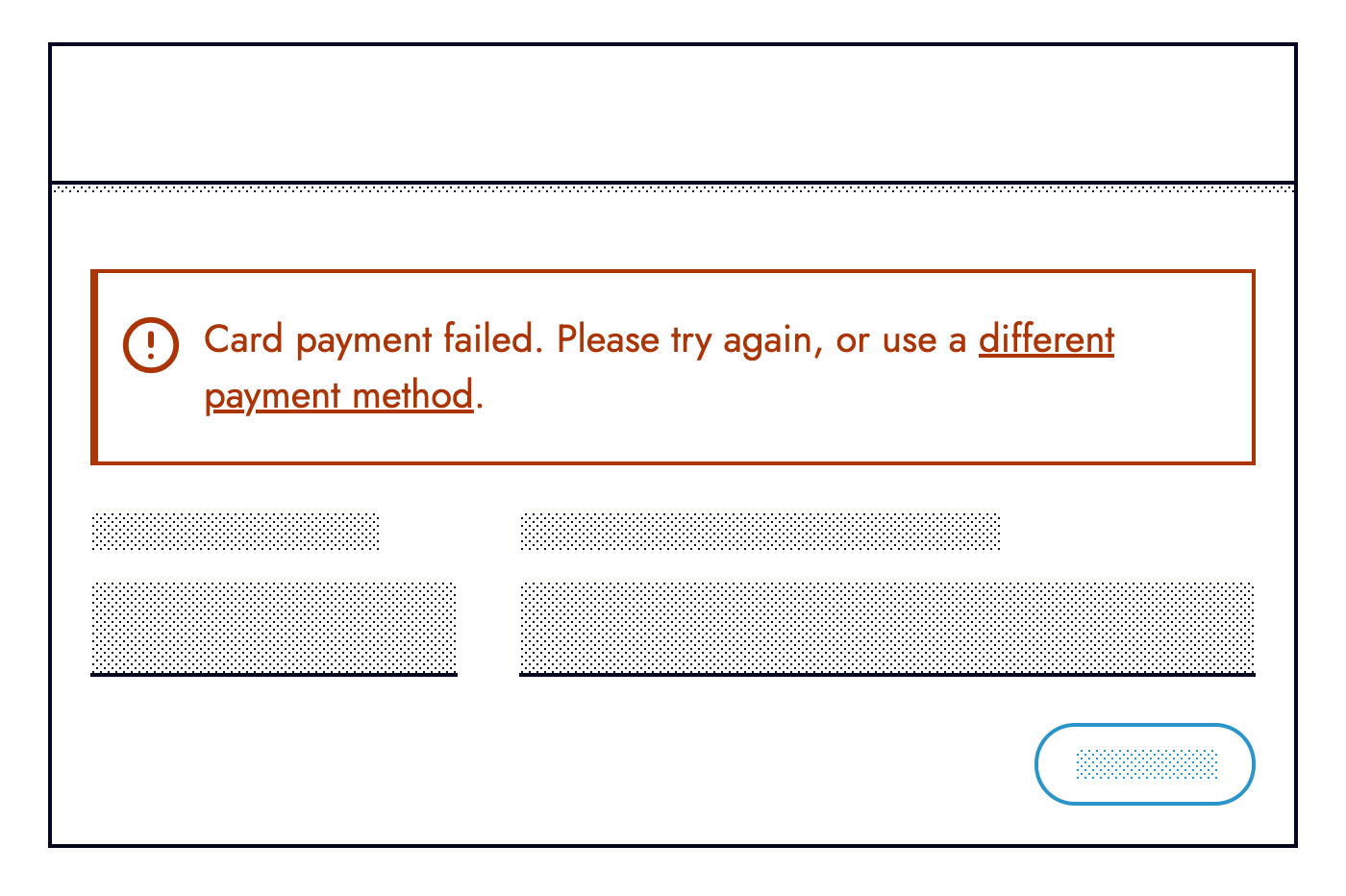
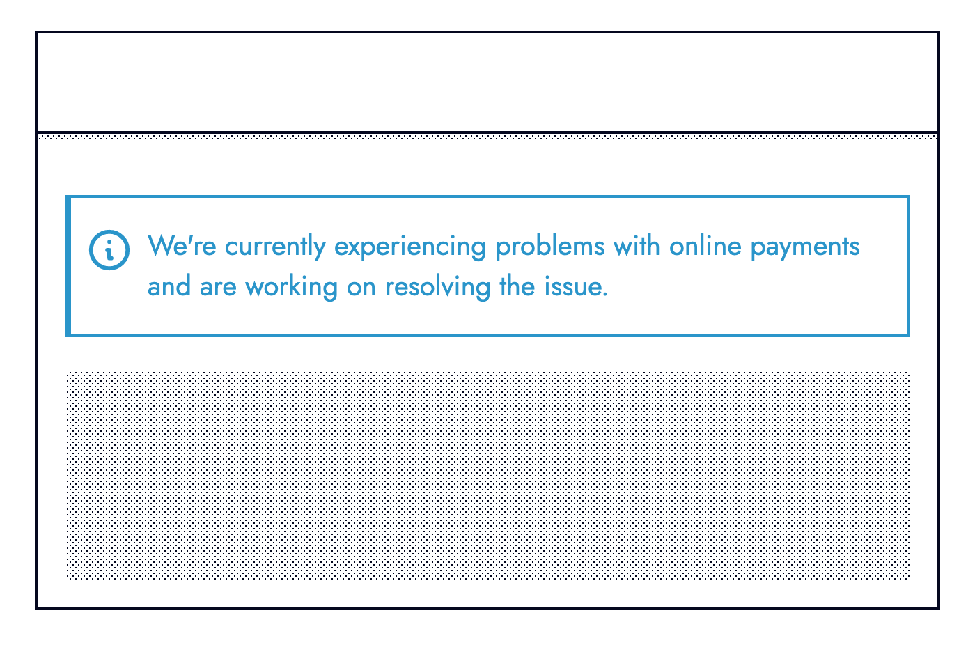
The second question should be: If we cannot recover, can we provide a fallback? For example, if an online card payment fails can we offer an alternative means of payment such as via PayPal or Open Banking.
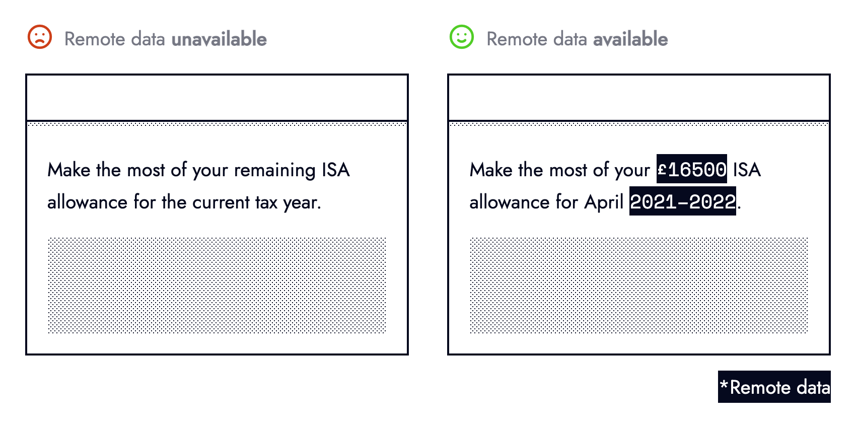
Fallbacks don’t always need to be so elaborate, they can be subtle. Copy containing text dependant on remote data can fallback to less specific text when the request fails:
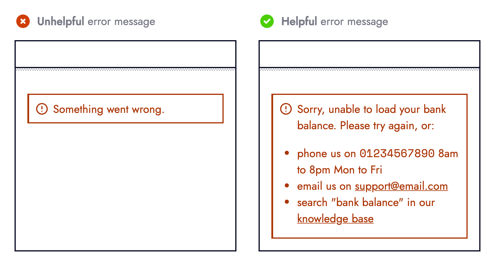
The third and final question should be: If we cannot recover, or fallback how important is this failure (which relates to “Error Equality”). The UI should acknowledge primary errors by informing users something went wrong, whilst providing actionable prompts such as contacting customer support or linking to relevant support articles.
Observability
UIs adapting to something going wrong is not the end. There is another side to the same coin.
Engineers need visibility on the root cause behind a degraded experience. Even errors not surfaced to end-users (secondary errors) must propagate to engineers. Real-time error monitoring services such as Sentry or Rollbar are invaluable tools for modern-day web development.
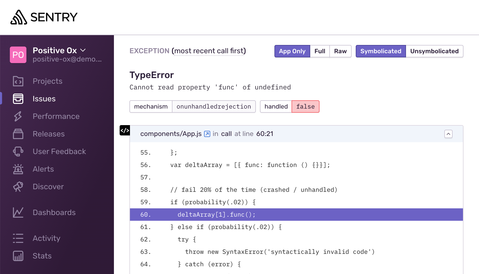
Most error monitoring providers capture all unhandled exceptions automatically. Setup requires minimal engineering effort that quickly pays dividends for an improved healthy production environment and MTTA (mean time to acknowledge).
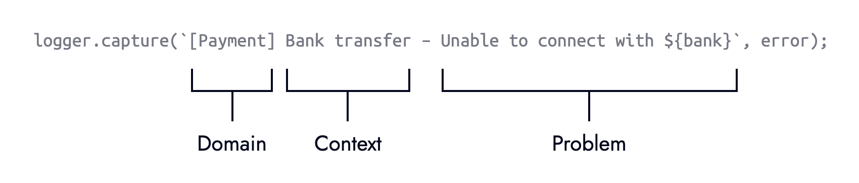
The real power comes when explicitly logging errors ourselves. Whilst this involves more upfront effort it allows us to enrich logged errors with more meaning and context — both of which aid troubleshooting. Where possible aim for error messages that are understandable to non-technical members of the team.
Extending the earlier Stripe example with an else branch is the perfect contender for explicit error logging:
if (
  typeof stripe === "object" &&
  typeof stripe.handleCardPayment === "function"
) {
  stripe.handleCardPayment(/* ... */);
} else {
  logger.capture(
    "[Payment] Card charge — Unable to fulfill card payment because stripe.handleCardPayment was unavailable"
  );
}
Note: This defensive style needn’t be bound to form submission (at the time of error), it can happen when a component first mounts (before the error) giving us and the UI more time to adapt.
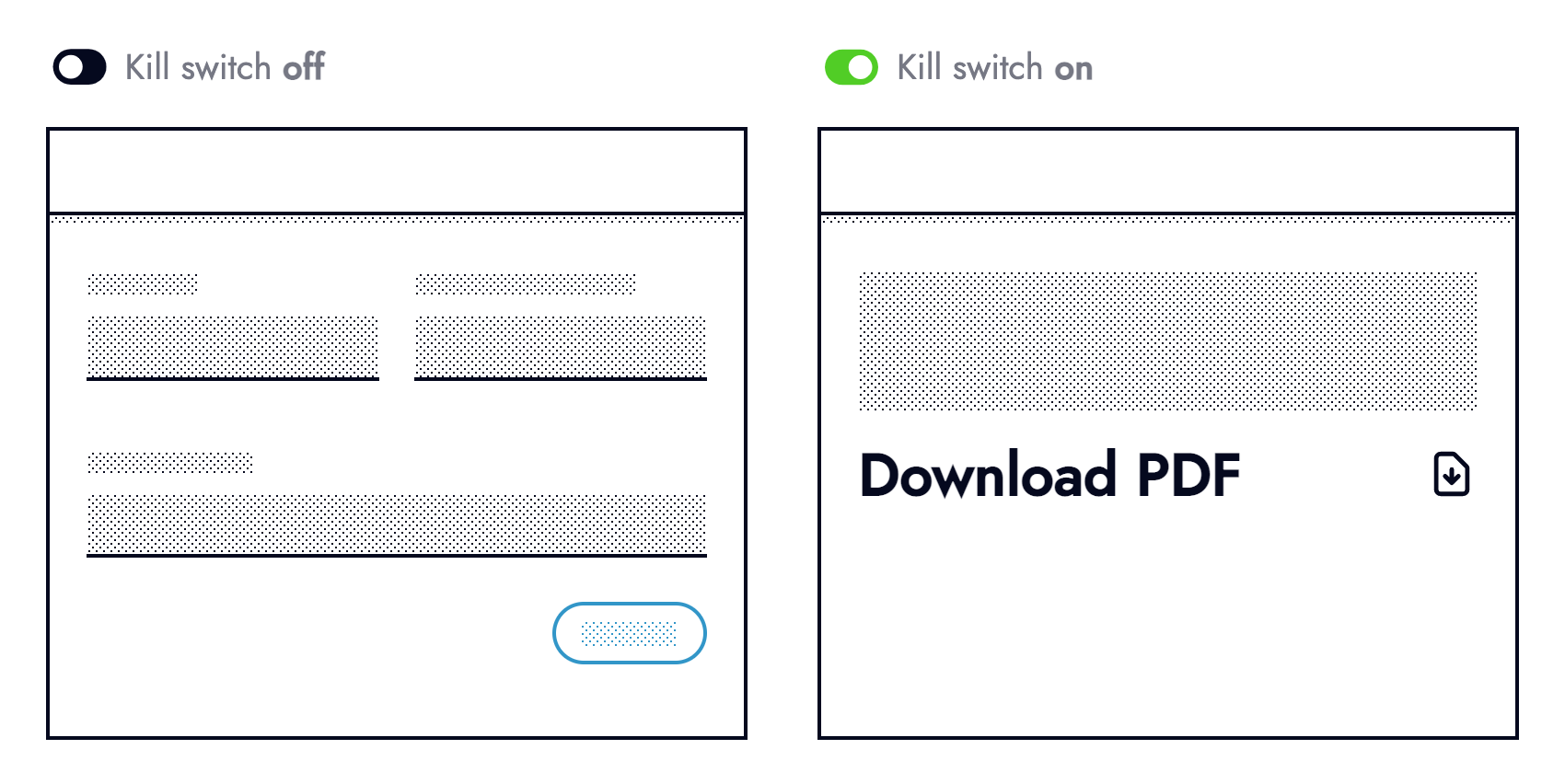
Observability helps pinpoint weaknesses in code and areas that can be hardened. Once a weakness surfaces look at if/ how it can be hardened to prevent the same thing from happening again. Look at trends and risk areas such as third-party integrations to identify what could be wrapped in an operational feature flag (otherwise known as kill switches).
Users forewarned about something not working will be less frustrated than those without warning. Knowing about road works ahead of time helps manage expectations, allowing drivers to plan alternative routes. When dealing with an outage (hopefully discovered by monitoring and not reported by users) be transparent.
Retrospectives
It’s very tempting to gloss over errors.
However, they provide valuable learning opportunities for us and our current or future colleagues. Removing the stigma from the inevitability that things go wrong is crucial. In Black box thinking this is described as:
“In highly complex organizations, success can happen only when we confront our mistakes, learn from our own version of a black box, and create a climate where it’s safe to fail.”
Being analytical helps prevent or mitigate the same error from happening again. Much like black boxes in the aviation industry record incidents, we should document errors. At the very least documentation from prior incidents helps reduce the MTTR (mean time to repair) should the same error occur again.
Documentation often in the form of RCA (root cause analysis) reports should be honest, discoverable, and include: what the issue was, its impact, the technical details, how it was fixed, and actions that should follow the incident.
Closing Thoughts
Accepting the fragility of the web is a necessary step towards building resilient systems. A more reliable user experience is synonymous with happy customers. Being equipped for the worst (proactive) is better than putting out fires (reactive) from a business, customer, and developer standpoint (less bugs!).
Things to remember:
- UIs should adapt to the functionality they can offer, whilst still providing value to users;
- Always think what can wrong (never make assumptions);
- Categorize errors based on their impact (not all errors are equal);
- Preventing errors is better than responding to them (code defensively);
- When facing an error, ask whether a recovery or fallback is available;
- User facing error messages should provide actionable prompts;
- Engineers must have visibility on errors (use error monitoring services);
- Error messages for engineers/ colleagues should be meaningful and provide context;
- Learn from errors to help our future selves and others.
Further Reading
- The Hype Around Signals
- Creating An Effective Multistep Form For Better User Experience
- AI’s Transformative Impact On Web Design: Supercharging Productivity Across The Industry
- How To Build A Multilingual Website With Nuxt.js


