Usability Pitfalls of Disabled Buttons, and How To Avoid Them

Email Newsletter
Weekly tips on front-end & UX.
Trusted by 200,000+ folks.


Imagine a world in which every button is disabled by default. Usually it’s grey, subtle and slightly out of focus, often with poor contrast and a subdued text label that’s a bit difficult to decipher. It’s not destined to remain disabled forever though. It does become active eventually once a well-formed input is provided. But before it can breathe life into the page with its full color gradient extravaganza, it just sits there calmly and silently, minding its own business. Would you like to live in this world?

Admittedly, there might be very good reasons for making buttons disabled by default. After all, as designers and developers, we want to make it more difficult for our users to make mistakes. We want to avoid wasteful jumps back and forth between error messages. We want to ensure that the input is perfectly correct before the data is even sent to the server. And we want to indicate that something important is missing before users continue to the next step.
So we invest time and effort into a resilient and reliable inline validation. And we try our best to provide helpful feedback as users make their way from one input field to another. And, of course, we make the buttons disabled by default to avoid premature clicks and taps that will only lead to the waltz with error messages.
This approach might work very well for some scenarios, but it turns out to be a disastrous design pattern for many scenarios, often to the point that customers are completely locked out, without a single chance to convey their intent to the interface. In this article, we’ll look into common usability issues with disabled buttons, how to fix these issues and when disabling buttons actually makes sense. We’ll start from the beginning, looking into when disabled buttons cause more trouble than help.
Part Of: Design Patterns
- Part 1: Perfect Accordion
- Part 2: Perfect Responsive Configurator
- Part 3: Perfect Date and Time Picker
- Part 4: Perfect Feature Comparison
- Part 5: Perfect Slider
- Part 6: Perfect Birthday Picker
- Part 7: Perfect Mega-Dropdown Menus
- Part 8: Perfect Filters
- Part 9: Disabled Buttons
- Subscribe to our email newsletter to not miss the next ones.
How Users Deal With Disabled Interfaces
Whenever anything in the interface is disabled, it’s an indicator that something is wrong. That seemingly obvious observation might not be obvious at the first glance though. For example, what if you want to uncheck a checkbox but the interface won’t allow you to do so? What exactly is the problem? Is there an issue with your Internet connection? Are there any issues with user privileges? Do you need to wait and hope for the best, or should you rather refresh the page? And if you do refresh the page, will all the data that you’ve so carefully and thoughtfully typed in persist in the form, or gone forever?
When we encounter a disabled button, the situation isn’t much different. We are blocked, but we don’t know why. It might be that something else is missing that’s required for us to move forward. Or we’ve overlooked some fine print somewhere. Or perhaps we’ve made a typo in one of the input fields. Or we didn’t fill in the data the right way. Or perhaps there is no mistake on our end at all, and it’s a system bug that’s absolutely out of our control.
There are so many things that could be causing the button to be disabled, and more often than not users are basically left in the woods having to figure out what’s the missing piece of the puzzle. In these situations, they usually show two kinds of slightly different behaviors, and these behaviors depend on what exactly is inaccessible in the UI.
When Large Parts Of The Interface Are Disabled
Observing customers interacting with disabled state reveals a few common usability patterns. When large parts of the interface are disabled, most customers will assume that the system is busy, and some process is happening in the background on the page. And because something is happening, they usually exercise a good amount of patience first. They’ll just sit there waiting for a spinner to appear, or the page to come back eventually. The more valuable the input, the longer they will be sitting there and waiting.

You probably will behave the same way. Why is that? As it turns out, we do so just to avoid any disruptions or interruptions of the ongoing process. Just like we don’t know if Schoredinger’s cat is alive or not without looking into the box, we just don’t know if the booking got through or not until we look into the system, or speak with someone who does.
If something unexpected happens during the booking process, or we accidentally hit a wrong button at a wrong time, we are just left out there not knowing what actually happened. We might be getting more reassurance once we receive a confirmation email, but even then, we won’t know for sure unless we can log into the system and verify our booking. And if the email does not arrive, we won’t be much smarter either.
If we do want to find out what happened, we have to embark on a long-winded journey full of hops from one customer support department to another, and sometimes spend hours in chat widgets trying to get reassurance that the card isn’t going to be charged twice, or we indeed did cancel a subscription.
Interrupting an ongoing process feels risky and unpredictable, so we’d rather just sit and wait in front of a disabled interface — the patience threshold is large enough for us to not jump into all that hassle and trouble of finding out right away.
However, eventually even that threshold is reached, and users will cautiously start moving their mouse pointer across the screen, or attempt to start tabbing around on their keyboard, or try to scroll up and down on their mobile devices. If that doesn’t work, they’ll move to the next stage, trying to bring the page back to life with a few dozens of stubborn rage clicks or taps.
And if this doesn’t work either, some will take a screenshot of the interface as a proof or as a reference, and perhaps will try to open the same page in another browser tab. Savvy users would go as far as opening the page in another browser altogether because some systems log out users trying to log into the same account from multiple tabs.
The reason for all of that trouble is that we, as users, don’t want to lose the state and the data of the disabled page. We might have typed in all the right data, and have chosen all the right settings, and perhaps even went to the trouble of finding a working discount code, and even have crafted a perfect gift message. So as a very least, we should try to capture all the work we’ve done already and re-fill that data in another tab or window, rather than doing all the hard work again.
When Only A Single Button Is Disabled
The behavior above might appear expected for pages that block user input entirely, but it surely should be different in cases when only a small part of the interface — let’s say a humble “Continue” button — isn’t accessible? Ironically, same issues appear with standalone buttons as well, albeit admittedly to a lesser degree.
With disabled buttons, because the rest of the interface is accessible, users seem to have more confidence that there is a problem directly related to their input. That’s why it’s uncommon to see people sitting and waiting for the “Continue” button to come back to life or change miraculously.
One problem that does show up though when users encounter a disabled button late in the process, especially on mobile. Many don’t realize if the button was disabled from the very start, or there is something in their input that actually made it disabled along the way. Some people will even re-open the same page in another tab to check what the initial state was.

So once the form on a page seems to be completed, users immediately head to the “Continue” button almost on auto-pilot. If that button is disabled, the very first thing that one can almost sense by looking at the movements of users is a massive slowdown of interaction. It’s literally as if users were hitting a wall. Some people will want to verify that the button is indeed disabled, by hovering over it, trying to click/tap on it, or tab to it with the keyboard — oftentimes clicking multiple times to see if it’s actually going to respond after all. Most of the time not much will be happening though.
If the button doesn’t respond, users first look out for the usual suspects — wrong formatting, missing punctuation or accent characters that caused the trouble. If it doesn’t help, most users will go through the entire form, often field by field, from top to bottom and backwards again, and try to eliminate all potential issues that might be causing the disabled state.
For example, it’s common to see people retyping the phone number, with and without +, with and without a leading zero, with and without empty spaces. Sometimes they even retype all the input again field-by-field, because they assume that the browser might have received “incorrect” data with the browser’s auto-fill that was used for some input fields.
In fact, they try out all possible combinations of street formatting, order number references, dates and times and last names and salutations and everything in-between — which in many ways is nothing more than guesswork because we never know how the application works and what input changes will affect its behavior.
Now, that’s a fine example of a truly frustrating experience. And of course usually we assume that all of this hassle is easily avoidable with a state-of-the-art inline validation that will catch errors early. As it turns out, often it’s not that straightforward.
Inline Validation Is Never Bulletproof
In theory, everything we’ve covered in the previous sections should never ever happen. After all, isn’t that what inline validation is supposed to fix in the first place? Rather than showing error messages after all the input has been done, we show them one-by-one as users are making their mistakes — usually after leaving the input field. But how often did it fail on you?
Has it ever happened that your delivery address wasn’t accepted by an address validator — maybe because the building has just been built recently? Or perhaps you’ve used a perfectly valid but slightly convoluted syntax to avoid spam, e.g. k.giraudel+smashing@bmx.de, yet the email validator has assumed that the + character can’t be a part of the email?
What if you don’t have a business email yet, but the service won’t accept a Gmail address? Or maybe there is some data that you didn’t want to provide — e.g. age, gender, birthday, or a phone number — and although they are highlighted as optional, the interface doesn’t let an empty value through?
While there are many scenarios when inline validation works well, there are just as many exceptions and edge cases when inline validation doesn’t work at all:
- when a postal address can’t be confirmed by a slightly outdated address validator or autosuggestions,
- when a non-conforming tax number (TIN/VAT) doesn’t validate although it’s perfectly valid but isn’t standardized across countries just yet,
- when some sort of anti-spam protection is used in the form, but it’s blocked by an aggressive ad-blocker,
- when the user blocks tracking but the location input desperately wants to detect user’s location and breaks,
- when third-party browser extensions fill in data (e.g. coupon codes), but are eventually blocked by the system, with no way to continue,
- when the user saves their input in a complex form one day, returns back eventually, but the “Continue” button is disabled because submitted documents are being processes.
- when any input is based on a particular group of frequent customers, and a perfectly valid input doesn’t match the requirements tailored to them,
- when an email has perfectly valid prefixes or characters, but the inline validation isn’t quite accurate and doesn’t recognize certain characters.
In practice, even the most sophisticated inline validation will be faulty at times. And when it fails, it fails big time. A user who happens to be blocked by an inline validator has absolutely no chance of submitting the form successfully because the submit button will always be inaccessible. That situation guarantees a 100% abandonment rate for these customers.
Of course there might be only a handful of people having this experience, or a few thousands on a given day. Tracking how many people actually end up in this situation is a good start to understand how severe disabled buttons are for your business.
Not only that is the cost though. By its nature, inline validation is a hard boundary with very specific, strict requirements. Yet very often users find themselves in complex situations which can’t be predicted ahead of time. Perhaps most details are known, and the deadlines are looming, yet some documents are missing, and hence the entire input has to be abandoned.
That usually results in an increase in customer support calls and inquiries, or just disgruntled customers who cancel their account and never look back.
In many ways, dealing with disabled buttons might feel a bit like rolling a dice. Users might be lucky and erroneous input fields will be highlighted, or they might be less lucky and the interface will provide no meaningful clues at all. They will then have to find and fix these issues, pass through validation, and then finally unlock the almighty button to continue. This is frustrating on desktop, but gets even more frustrating on mobile when the button is often not visible as it is off screen at the bottom of the page.
As Matthew Standage notes, “when we disable a button on a form we are often disabling the call-to-action — that thing on the page we trying to encourage users to click to proceed with their journey.“ And as such, it’s a quite dangerous and fragile undertaking, because we never know with absolute certainty how bulletproof our code is, even although it might be heavily tested.
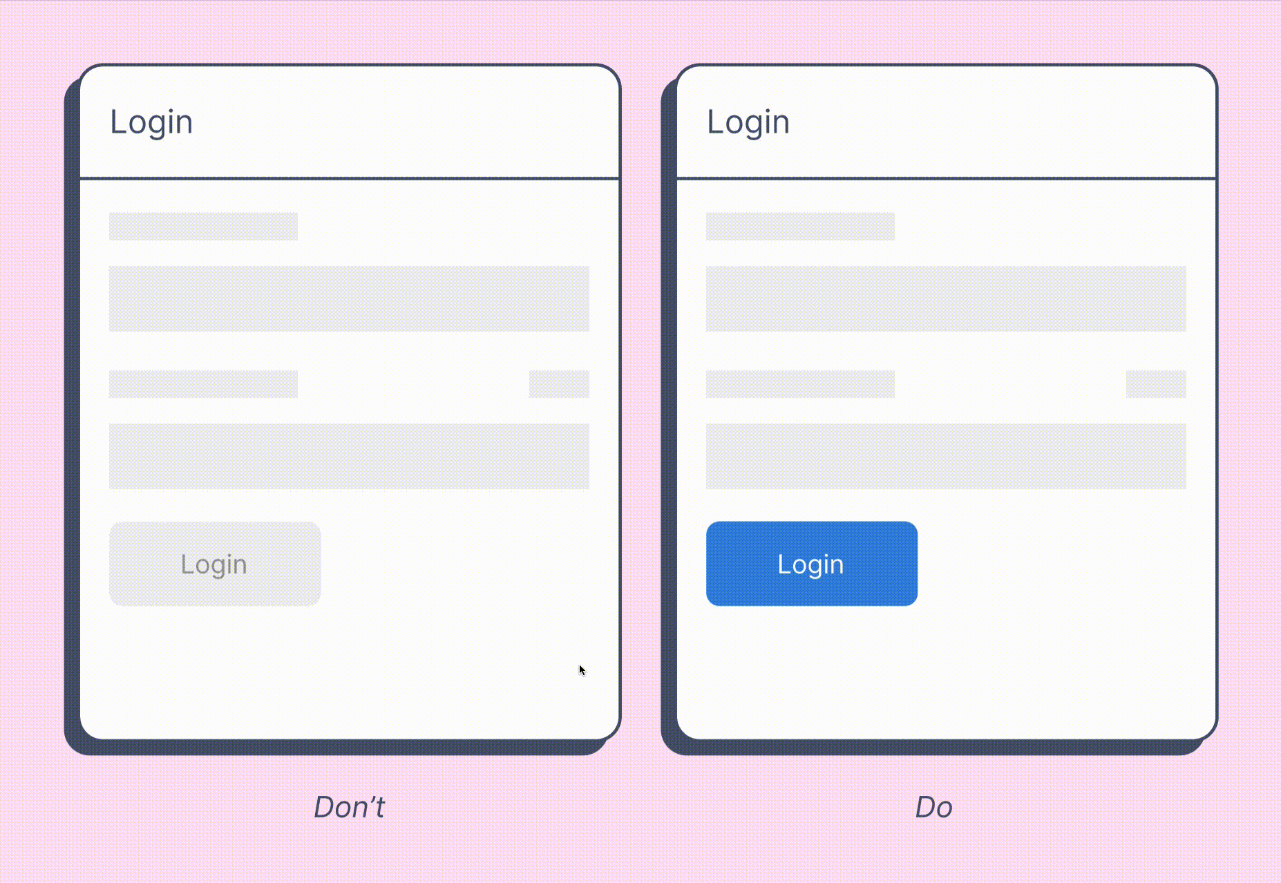
The Downsides Of Disabled Buttons
The examples above indicate a very common problem that lies in the very nature of many implementations. Disabled buttons don’t explain what’s wrong. They communicate that something is off, but very often it’s just not good enough. As a result, too often users are left wondering what’s actually missing, and consequently locked out entirely.
Not too mention plenty of accessibility nightmares that come along. As Adam Silver notes in his excellent book “Form Design Patterns”, usually disabled buttons are not focusable and hence users can’t reach them with a keyboard. The reason why we usually skip focus on these buttons is because they can’t really be interacted with. (We’ll see below that there is some room for improvement there as we will though).
By their nature, disabled buttons also suffer from insufficient contrast as they should look different compared to regular buttons. As such, they are also hard to read as they are usually greyed out. They rely on JavaScript and inline validation, and on the fact that users can spot and correct errors easily — which might be difficult to do in a complex form on a narrow screen, for example.
And then there is a question of timing. At which point should we enable a disabled button? Most implementations enable the button only if all required input seems to be well-formed, or/and has been verified by an inline validator. That’s definitely the latest time to flip the switch, but what about situations when it could be happening earlier?
What if a customer is opening their bank account, and they need to verify their place of tax residency, along with a few other documents? Or perhaps what if some input can not be verified immediately, but needs to be proxied through another service, yet this service keeps timing out? Or perhaps some vendors haven’t submitted their final quotes yet, but the project needs to be added into the system urgently?
In all of these scenarios, users don’t have all the required documents at hand at the time when they fill in the form. Now imagine that all these services provide a 14-days-window after opening the account when the missing documents could be submitted. Technically customers still should be able to proceed without these documents, but for that, they’d need to choose “Submit later” for each missing document as they are filling in the form.
So when should we enable the disabled button? Should we change the state only when the user has asked to submit the documents later for all of them, or should we let them through even if they haven’t opted in (and remind them that we need them to be uploaded within 14 days)? Most of us will agree that the first option is probably more obvious, but only if the user can spot the option to submit documents later. The second option is probably going to increase conversion and bring in more leads though.
The bottom line is: the more conditional logic of that kind we have in our user flows — and it can become quite convoluted in large enterprise and B2B-forms — the more cautious we need to be when flipping that switch.
All of that not to say that disabled buttons should always be avoided at all costs though. They work well when they serve a very small, and a very specific purpose.
When Disabled Buttons (And States) Work Well
Imagine you are purchasing a pair of jeans that happens to be on sale. The interface tells you that there is exactly one item left, so full of hope you rush to the product page, swiftly choose your size, add the item to the cart — just to realize that the item is no longer available. That’s not the most uplifting user experience. Here, making the “add to cart” button disabled when an option isn’t available is only reasonable to avoid confusion and frustration.
Or perhaps you are about to transfer large funds from one bank account to another. You’ve double checked all the input fields, the amount, the recipient, the IBAN and SWIFT, and reviewed all the fees, and you are ready to proceed — fortunately, a shiny green button is right there waiting for you to continue. And just at that moment, full of focus and excitement, your mouse slips away or your finger jumps over the touchscreen — and you hit that shiny green button twice.
What is going to happen? You probably don’t want to send the funds twice. And you don’t particularly enjoy back and forth-jumps between your 2-factor-authentication app and the bank interface either — however, the system has sent you two confirmation codes, and it’s not obvious which one you should use to confirm the payment.
So having a button turning disabled once you hit it once is a good indicator that the state has changed, and that something is happening, and that nothing else needs to be done for the operation to proceed, and that you need to just sit there and wait for the interface to come back. That’s where disabled buttons are helpful.
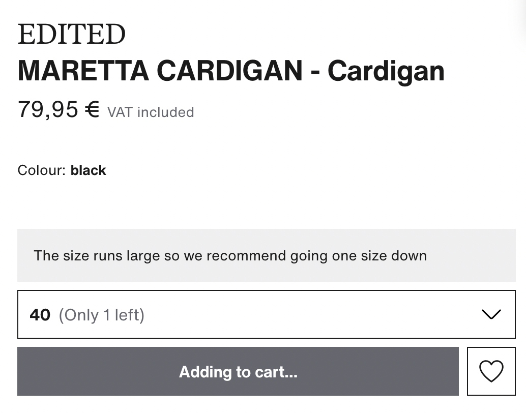
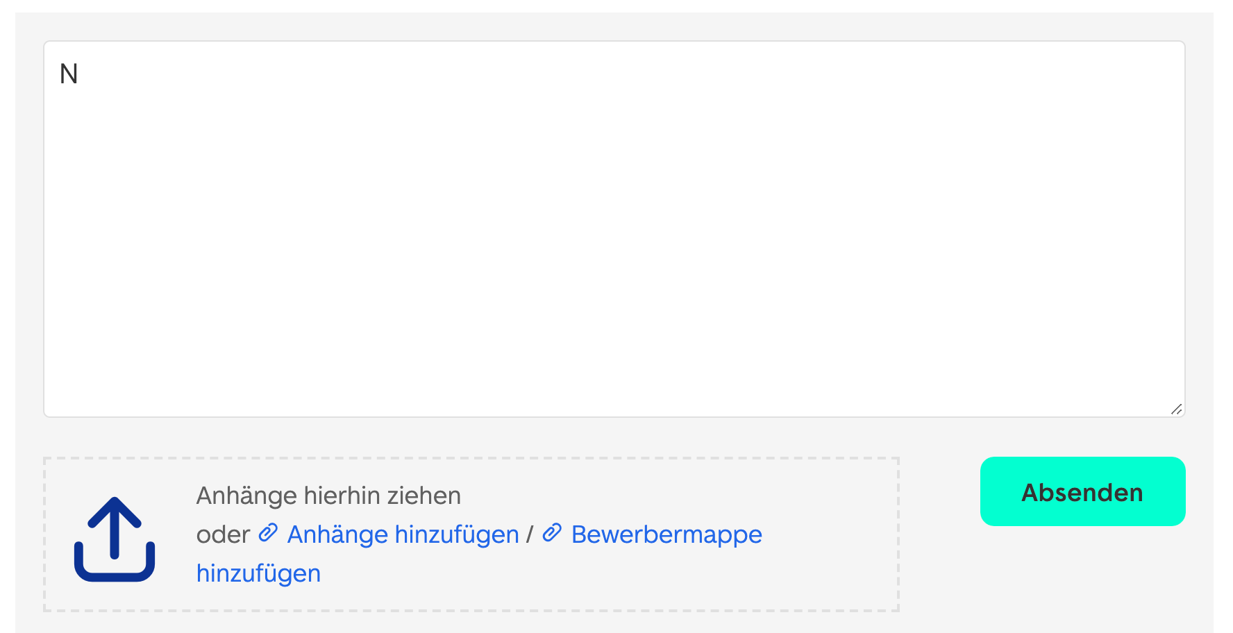
When an option or a feature isn’t available or something is happening in the background, we need to communicate it early and clearly. A visible change of the button helps there, but we can also explain why the button is disabled, and what exactly is happening. For example, we could change the label on the button to say “Adding to cart…” with a looping loading indicator to make it more obvious what exactly is happening.
Communicating that something isn’t possible is as important as preventing users from making costly mistakes. Here are a few scenarios where this might come in handy:
- to avoid wrong purchases: if the price depends on some attributes, it’s reasonable to disable the button and adjust its label while the price is being adjusted,
- to avoid double bookings: once a button is clicked, it’s reasonable to make the button disabled and replace a CTA with a progress spinner or change the label to “Waiting…”. A hint could provide more help and insight into what’s happening. We could then change the label yet again if it takes too much time to get a response from the server. Of course, we also want to stop listening to click/tap after the first click/tap (the exceptions are Undo buttons and steppers where you expect customers to tap on the same button multiple times — there having a disabled button is probably not a very good idea).
- to validate magic sign-in/SMS code or to validate a character count: there, keeping the buttons disabled until the input is complete might be reasonable. However, it’s a good idea to test if an active “Validate” button would work worse. Chances are high that it won’t.
Disabling buttons might be a good idea in some scenarios after all. But we can probably do better than a greyed out button with insufficient contrast. Let’s take a look at some techniques to make disabled buttons slightly more inclusive.
Making Disabled Buttons More Inclusive
So what if our implementation relies on disabled buttons, or due to technical limitations and legacy constraints it’s just incredibly difficult to move away from them? In her excellent article on Making Disabled Buttons More Inclusive, Sandrina Pereira highlights a couple of excellent techniques (and code snippets) to make disabled buttons better if you have to use them.
Here are a couple of useful strategies that Sandrina has suggested:
- change the cursor on a disabled button to indicate that users can’t interact with it (
cursor: not-allowed), - show a tooltip or a hint explaining why the button is disabled; if a customer uses a mouse/touch, we can show a tooltip on hover, click or tap, and when a user navigates to the button via the “Tab” key, we can trigger the tooltip as well (however, the button has to be focusable),
- prevent the click programmatically via JavaScript by using
aria-disabledattribute, and thus avoiding the temporary loss of the keyboard focus while the form is submitting (which would be the case with thedisabledattribute alone), aria-disabledwill still focus the button and announce that it exists, but that it isn’t enabled yet; the same way you might perceive it visually,- use ARIA live regions to announce dynamic content,
- avoid
pointer-events: nonein CSS; it does indeed prevent a mouse click, but it won’t prevent focus and keyboard navigation.
Sandrina also provides a full code snippet on CodePen that you can integrate in your projects as well. Overall, a fantastic set of techniques and little helpers that have been tested with screen readers and VoiceOver, along with general usability improvements such as announcing how to make the button accessible when the disabled button is focused.
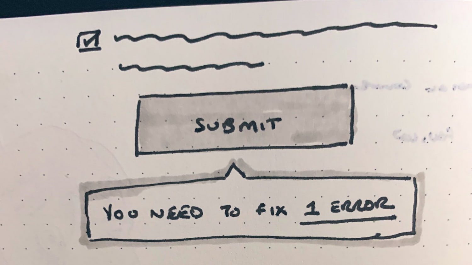
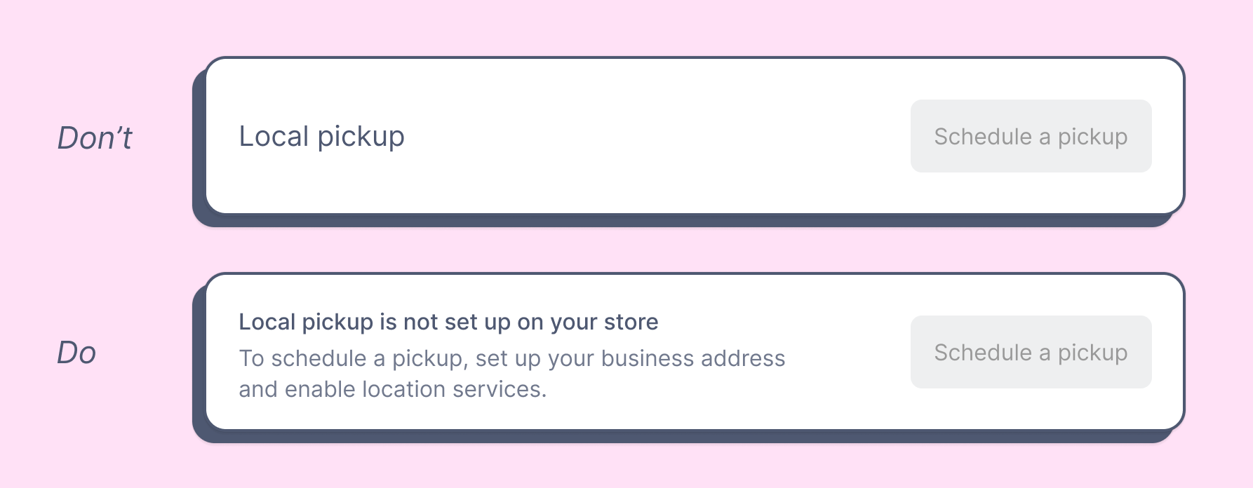
Alternatively to the tooltip or hint, we could guide the user to the errors in the form, either with a link to the error summary at the top of the page, or with jump-links to specific input fields that seem to contain errors. And we could just include a hint next to the disabled button to explain why it’s disabled (as shown below).
With all these little helpers in place, we can explain much better what’s actually wrong and how to fix it. But if we want to reduce the rates of dead-ends and abandonments more aggressively, we can take it a little bit further.
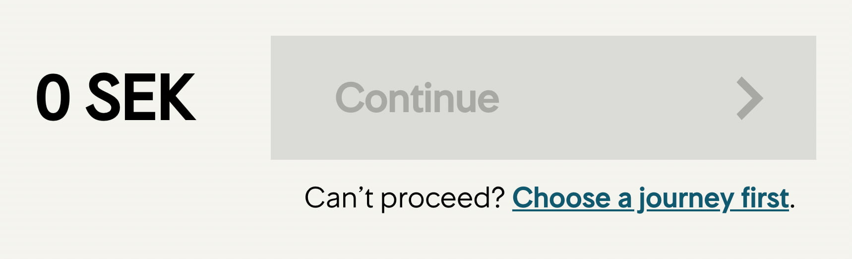
Always Provide A Way Out
As reality is complex, sometimes it’s incredibly difficult for an interface to predict all the options that customers might want to choose ahead of time. Often user’s context is simply unpredictable, and is influenced by things that are outside of our reach. So in the case of an ill-formed input or an error, we should give our customers the benefit of the doubt and provide a way out to complete the form, even although it doesn’t entirely meet our requirements or expectations.
A useful technique that we discovered in user testing is to not only add a hint next to a disabled button that explains what’s wrong, but also add a “way out”-link under it. The link prompts the customers to get in touch with the customer support in case they can’t proceed.
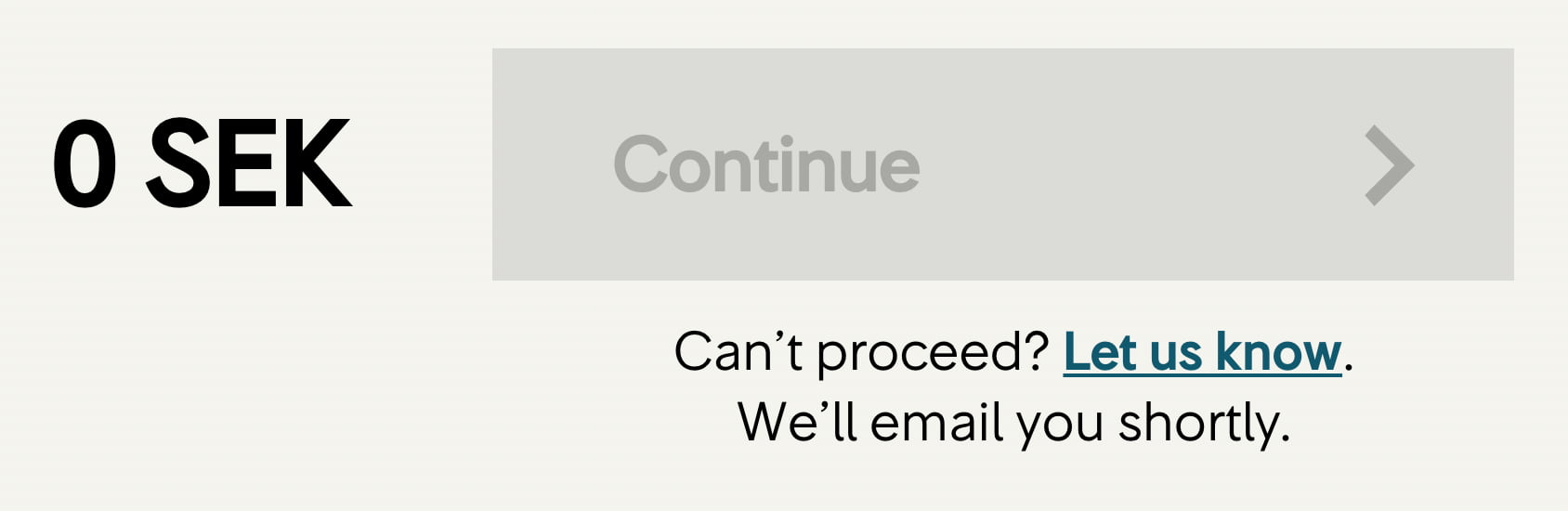
The button literally says: “Can’t proceed? Let us know and we’ll get back to you.” By clicking on the link, users can leave their email or phone number and choose to be contacted by customer support. Or we can go even further by automatically sending an email to the customer support with all the details typed in the form on behalf of the customer, with an option to call back or reply via email.
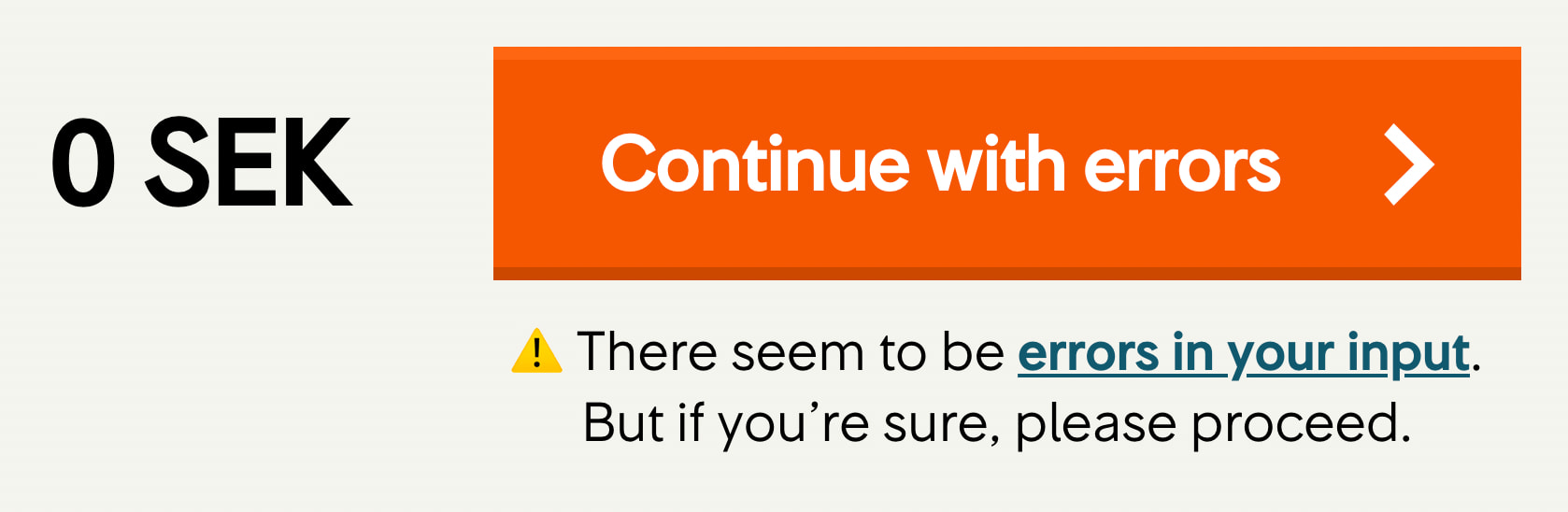

Another option is to allow customers to continue despite errors, e.g. even if the postal address doesn’t seem to be right, or a phone number seems to be off. Of course we need to notify them that something seems to be wrong, ask them to review and verify their input, and ask for a permission to contact them in case any issues show up. We might want to refer to errors one more time before they hit the ‘Purchase now’ button though.
Now, these minor changes won’t bring abandonment to 0, but at least they give us a chance to keep the customer in case they can’t proceed, and get their business by resolving technical difficulties for them, rather than offloading these issues on them.
Do We Need Inline Validation?
With these enhancement in place, it might be a good idea to revisit the role of inline validation. There are so many questions that need a discussion — when should we start validating, when do we trigger a validator if a user is editing a valid or invalid field, when do we show error messages or confirmation that the input is correct. All these questions deserve a separate article, but in general, keeping inline validation while providing a way out is reasonable, yet it doesn’t need to go hand in hand with disabled buttons.
In fact, inline validation is likely to be more helpful without a disabled button as users might get a better overview of the correct and incorrect input by having erroneous input fields highlight on submit. That, of course, requires buttons to be accessible at all times. In fact, it’s not such a bad idea at all.
An Alternative To Disabled Buttons
To avoid all the hassle customers have to endure with disabled buttons, we could make the experience much more straightforward by keeping the “Continue” button accessible at all times, and using the click to communicate to the user what’s actually wrong.
Below is a good overall strategy that always proves to be working without any usability issues:
- validate the input on submit,
- on submit, explain that there are errors and show how many errors there are (as a tooltip or an error message),
- if there is only 1 error, point users directly to the input fields that contains the error (with a simple text link),
- if there are more errors, show an error summary on the top of the page and show a link to the error summary on submit.
Simple, straightforward, accessible, easy to implement, and without any reliance on code to be working flawlessly to bring a disabled button back to life.
If, however, user’s selection needs to done, perhaps we could get away by relying on frequently used default values instead of asking the user to make a selection explicitly. For example, Blue Apron provides a default selection for its number of recipes delivered per week, and so the “Select” button is active because it always indicates the next step.

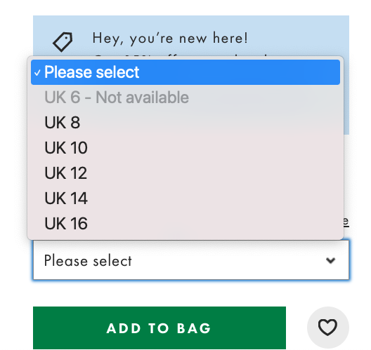
And sometimes disabled buttons could be replaced with something slightly more actionable. In the case when an item is no longer available, for example, we could include the number of available items in the size selector. If an option is unavailable, we could show that the option isn’t available rather than hiding it altogether.
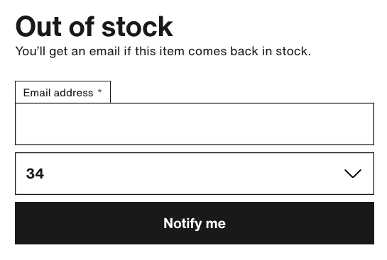
Alternatively, we could add a hint above the button explaining that the item is out of stock, or even allow users to get notified once it’s back in stock again. Below is an example of this pattern on Zalando.
Whenever dealing with disabled buttons, we might want to ask ourselves if there is any better way to communicate the options that the user has, and think about the ways connect with them despite the errors — with a default selection, tooltips and hints, as well as actionable calls to action (e.g. be notified about updates).
Wrapping Up
You can’t know what you can’t measure. If you already have an implementation with a disabled button, study how many people actually end up in locked-out situations and can’t proceed. That will give you a good start to understand how severe disabled buttons are for your business.
If you need to use disabled buttons, consider ways to make them focusable and useful by also making them more inclusive and providing a way out for customers to send all the details to the customer support. If you don’t need to make the buttons disabled, validate on submit and guide users directly to errors with sensible error messages. Either way, inline validation can be helpful in giving users a sense of progress as they are making their way through the form, but make sure that users can proceed even if inline validation fails.
That should be enough to avoid frustration and hassle when dealing with disabled buttons, and hopefully will clear a path towards an accessible and simple form that has fewer abandonments and faster completion.
Disabled Buttons Checklist
As usual, here’s a checklist with pretty much everything to ask and double check when designing or building an interface with disabled buttons:
- Do we need the button to be disabled by default (e.g. item is unavailable)?
- If not, can we keep it enabled and validate user input on submit?
- If not, can we rely on default values to keep the button enabled by default?
- When should the button become disabled (e.g. prevent double bookings)?
- Do we want to grey out any part of the interface along with the disabled button?
- Do we want to use a skeleton screen animation along with the disabled button?
- Do we want to use a loading spinner for the UI to indicate that the system is busy?
- Do we want to use a progress indicator on the button to indicate progress?
- Should the wording on the button be different when it’s disabled?
- Does it have sufficient color contrast in the disabled state?
- Do we want to add a note under the button explaining why it is disabled?
- Do we keep the disabled button focusable?
- What happens when a user hovers or taps on the disabled button?
- What happens when a user tries to activate or focus on the disabled button?
- Do we change the cursor to
not-allowedto indicate that the action isn’t allowed? - Do we want to use a tooltip explaining why the button is disabled?
- Do we prevent the click via JavaScript by using
aria-disabled? - Do we use ARIA live regions to announce dynamic content?
- Do we avoid
pointer-events: noneas it doesn’t prevent focus/keyboard navigation? - Do we guide users towards errors when they tap/click/tab to the disabled button?
- When do we enable a disabled button?
- Can we add a link that sends all user’s input to support if they are locked out?
- In that case, do we ask users for their consent to be contacted?
- Do we use inline validation (positive or negative)?
- When and how do we show error messages?
- Do we include an option to continue even if inline validation fails?
- Do we need to update the state of the button after every user input?
- How will the button change while updating its state?
- Do we change the label of the button (“Updating…”) while it’s updating?
- Do we change the colors of the button while it’s updating?
- Do we want to add a loading spinner while the button is updating?
- Should we stop listening to click/tap after the first click/tap?
- Do we not stop listening to click/tap for Undo buttons and steppers?
- Can we make the disabled button sticky on narrow screens?
- Do we track how many people can’t proceed and abandon the flow altogether?
- If applicable, can we test if a design without disabled buttons performs better?
Part Of: Design Patterns
- Part 1: Perfect Accordion
- Part 2: Perfect Responsive Configurator
- Part 3: Perfect Date and Time Picker
- Part 4: Perfect Feature Comparison
- Part 5: Perfect Slider
- Part 6: Perfect Birthday Picker
- Part 7: Perfect Mega-Dropdown Menus
- Part 8: Perfect Filters
- Part 9: Disabled Buttons
- Subscribe to our email newsletter to not miss the next ones.
Further Resources
- “Why Heuristics Are Only Rules Of Thumb: The Case Of The Disabled Button,” Matthew Standage, UX Collective
- “Why You Shouldn’t Include Disabled Interaction Elements In Your Design System,” Chris Atherton, UX Collective
- “Disabled Buttons Suck,” Hampus Sethfors, Axess Lab
- “Disabled Buttons Don’t Have To Suck,” Justine Win, Medium
Further Reading
- The Big Difference Between Digital Product And Web Design
- How A Bottom-Up Design Approach Enhances Site Accessibility
- Creating An Effective Multistep Form For Better User Experience
- How To Harness Mouse Interaction Data For Practical Machine Learning Solutions
 (il, mrn)

