A Deep Dive Into The Wonderful World Of SVG Displacement Filtering
Email Newsletter
Weekly tips on front-end & UX.
Trusted by 182,000+ folks.
 Custom Web Forms for Angular, React, & Vue. Your backend.
 Celebrating 10 million developers


Even today, the magic, wicked realm of SVG Filter Effects is largely uncharted territory. The art of SVG filtering is still surrounded by an aura of alchemy: you have to bravely dive into a dark world of inconsistencies, your dedication will repeatedly be tested by buggy implementations and nerve-wracking side effects, and you must learn complicated incantations. But, once mastered, it gives you unprecedented power — a means to switch the total appearance of elements and websites by the snap of a finger.
In this article, we’ll be diving into one of the most spectacular filter effects: the SVG feDisplacementMap filter primitive. In order to make it all easier to digest, I’ve divided the article into three parts in which we’ll be exploring:
- how the
feDisplacementMapworks, i.e. how to apply it and how to control its output in a predictable manner; - we’ll then explore methods to create fancy displacement maps in SVG (slightly more interesting as we will start playing with JavaScript);
- and finally, we’ll take a look at some of the methods to animate the filter and create dramatic visual effects.
As this will be a rather long read, the impatient ones may want to check out the demos we’re going to encounter before continuing. All the demos in this article have been optimized for the latest versions of the three major browser engines.
To get the most out of this article, you should already have a basic understanding of SVG filters. If you are a filter novice, you may want to take a short detour to Sara Soueidan’s introduction or head over on to my humble take on the subject first.
Be warned though: not applied properly, SVG Filters can hurt the performance of your site drastically. Always test extensively if you roll out one of the techniques described here.
A Short Primer On Displacement Filtering
So what’s a displacement filter? A displacement operation can visually distort any graphic it is applied to. You can create warp effects, twirls or ripples like you would do with a Photoshop distortion filter. Displacement filtering is an important tool in VFX, and most likely you already saw some displacement mapping operations on film and TV, created with a VFX tool like After Effects or GiantRed.
To achieve a distortion effect the filter needs two images as input:
- The actual source graphic should be distorted (from now on just “source”);
- The “displacement map” (from now on just “map”). This map contains information on how we want the source to be distorted.
Most of the time, a map will be some Bitmap image, but in the next part, I will demonstrate how to use SVG images or fragments as an input.
Let’s see what happens when we use an image of Barcelona’s famous La Sagrada Familia to “distort” the Mona Lisa:
See the Pen [Simple example of `feDisplacementMap` filtering](https://codepen.io/smashingmag/pen/NWgNbmg) by Dirk Weber.
feDisplacementMap filtering by Dirk Weber.<filter id="displacement-filter" width="100%" height="100%" color-interpolation-filters="sRGB">
<feImage href="lasagrada.jpg" result="FEIMG" />
<feDisplacementMap in="SourceGraphic" in2="FEIMG" scale="500" xChannelSelector="R" yChannelSelector="B" />
</filter>
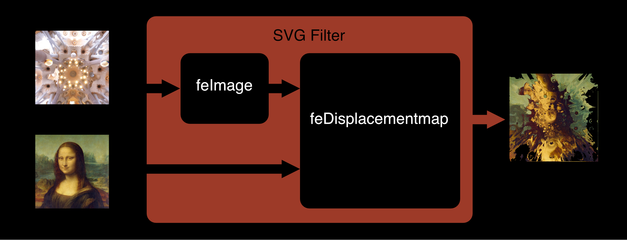
- The first filter primitive is
feImagewhich holds a reference to the map (there are other filter primitives that can be used as an input. You will find several fascinating demos out there wherefeTurbulenceis used as displacement map, but in this article, we will mostly focus onfeImage). - This feImage is then fed into a
feDisplacementMapprimitive where the actual distortion happens:- A positive or negative
scaleattribute defines the strength of the distortion. - The purpose of
xChannelSelectorandyChannelSelectoris to determine which of the input image’s four-color channels (red, green, blue, alpha) should be applied to which axis for distortion. Both attributes default to the map’s alpha channel (which means if you’re using a map without alpha channels and omit these attributes, you’ll see nothing more than a diagonal shift of the source).
- A positive or negative
We then apply the filter with CSS:
.filtered {
  filter: url(#displacement-filter);
}
It may be fun to play around distorting images this way but it is unpredictable how the result will look and most of the time it’s not aesthetically pleasing at all. Is there a way to get pixel-perfect control over the output? Here’s what the spec says:
"This filter primitive uses the pixels values from the image from in2 to spatially displace the image from in. This is the transformation to be performed:
P'(x,y) ← P( x + scale * (XC(x,y) - .5), y + scale * (YC(x,y) - .5))
The displacement map, in2, defines the inverse of the mapping performed."
OK, looks complicated at a first glance, but it is actually pretty easy to understand when broken down:
P'(x,y)stands for the coordinates of a pixel in the result;XandYare the coordinates of this pixel in the unfiltered source;XCandYCare the normalized(1/255)RGB color values of the given pixel in the map;- Finally, the result of the operation must be inverted (which basically means every
+in the formula must be replaced by a-).
We will run some simple experiments to verify our formula by feeding primitive bitmaps into a filter, consisting of only one single color. Let’s say the map is filled with rgb(51, 51, 51), how would we expect the coordinates of a source pixel at x=100 / y=100 to be transformed when fed into a displacement primitive with a scale value of 100?
X: 100 - 100 * (51/255 - .5) = 130
Y: 100 - 100 * (51/255 - .5) = 130
See the Pen [`feDisplacementMap` filtering apply rgb(51, 51, 51)](https://codepen.io/smashingmag/pen/gORrLNw) by Dirk Weber.
feDisplacementMap filtering apply rgb(51, 51, 51) by Dirk Weber.The resulting pixel will be moved to coordinates 130⁄130. It will be shifted to 30px to the right and 30px to the bottom. What happens when we change the map to a 50% grey as in rgb(127,127, 127)?
See the Pen [`feDisplacementMap` filtering apply 50%](https://codepen.io/smashingmag/pen/zYzqogy) by Dirk Weber.
feDisplacementMap filtering apply 50% by Dirk Weber.Obviously, a neutral color doesn’t have a recognizable effect. The resulting pixels stay in place. And if we change the color values to something above 128, let’s say rgb(204, 204, 204)?
See the Pen [`feDisplacementMap` filtering apply rgb(204, 204, 204)](https://codepen.io/smashingmag/pen/qBjZRWe) by Dirk Weber.
feDisplacementMap filtering apply rgb(204, 204, 204) by Dirk Weber.The coordinates have been shifted to 30px to the left and 30px to the top.
By now we have learned enough to sum up the inner mechanics of the displacement filter in these three simple sentences:
- Any color value above 127 will shift the corresponding pixel into the direction of the scale value;
- Any color value below 127 will shift the corresponding pixel into the opposite direction;
- A color value of 127 will have no effect.
From intuition, one would tend to believe that the color black wouldn’t have any effect, but by now it should be clear that this isn’t the case. In fact, black and white will result in the maximum possible shift to or away from the scale value.
The Absolute Map
At this point, I should introduce you to the one special map that will be the foundation for all the effects we will see from now on. It is a map that will perform a very simple distortion: scale an image proportionally. We’ll call it the identity map or the absolute map from now on.
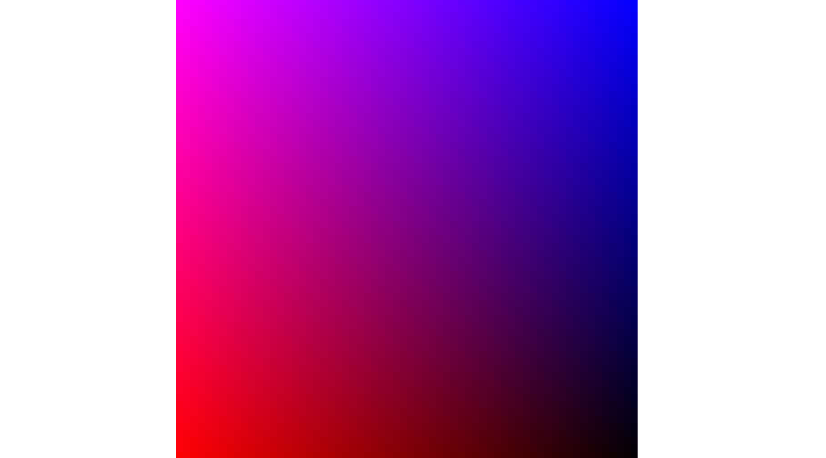
identity– or absolute map leveraging the red and blue color channels. (Large preview)To scale an image equally in all directions, the color values must gradually decline from a maximum at one edge to a minimum at the opposite edge. We will use red for X and blue for Y from now on, but in the end, it doesn’t matter which color you chose for x- and yChannelSelector.
- In your favorite Image editor, open a new document;
- Set the background color of the document to black;
- Create a new layer and fill it with a left to right gradient from
rgb(255, 0, 0)torgba(255, 0, 0, 0); - Add a second layer and add a top to bottom gradient from
rgb (0, 0, 255)torgba(0, 0, 255, 0); - Set the blending mode for this layer to
screen.
Et voilà, you’ve built an absolute map! This map will serve as a solid foundation for all kinds of image distortions:
- By applying Photoshop-like distortion filters to this map, we are able to use these effects in CSS filters!
- We can control the scaling of the x- and y-axis independently by altering the transparency of the blue or red gradient.
- It is possible to “mask” parts of the map with a “neutral” color (
rgb(127, 0 ,127)or#7F007F) to prevent the corresponding parts in the image from displacing.
See the Pen [Variations of displacement maps and their application](https://codepen.io/smashingmag/pen/KKqzaKo) by Dirk Weber.
Exploring Different Maps In Action
To get a better understanding of the process I made a little app to explore various displacement maps. All maps have been created by applying simple Photoshop distortion filters to the absolute map.
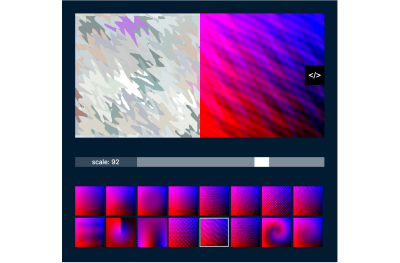
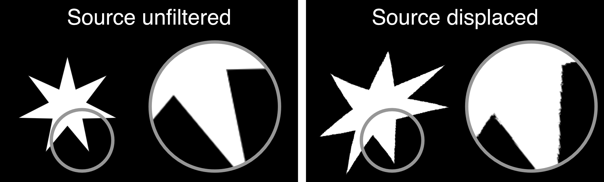
maptester on Codepen (Click to launch →)The Problem With Jagged Edges
You may have noticed the pixelated edges that sometimes appear in the output image. Especially source material with high contrast, e.g. typography or vector artwork, is prone to this effect.

This is caused by several reasons:
- The filter will take the source image as a bitmap:
If there exist antialiased edges in the source, the filter will not “re-initialize” them after displacing the source. Any pixel will be transformed to its new location, that’s it. - Rounding errors:
Maybe a pixel from100,100must be shifted to83.276, 124.217. The filter must somehow map these coordinates to non-decimal pixel values. - Gaps after displacement:
Maybe two neighboring pixels, say at coordinatesx1:100,x2:101are shifted to different locations, maybex1:207.4,x2: 211.3. How will the filter fill the space in between? Hint: not at all. The spec clearly states:
“Sometimes filter primitives result in undefined pixels. For example, filter primitivefeOffsetcan shift an image down and to the right, leaving undefined pixels at the top and left. In these cases, the undefined pixels are set to transparent black.”
— Filter Effects Module Level 1, W3C
My weapon of choice to fix this issue is to add a slight blur, then increase the contrast with a feConvolveMatrix. Not perfect, but good enough for most situations. Here’s a demo on CodePen:
See the Pen [`FeDisplacementMap`: handling jagged edges](https://codepen.io/smashingmag/pen/PojNWwW) by Dirk Weber.
FeDisplacementMap: handling jagged edges by Dirk Weber.Don’t Give Up On Webkit!
And then there’s WebKit. It’s the browser you will spend most of the time debugging your filters in. Since my first article on the subject WebKit has improved drastically. One of the most fun parts of SVG filters is to apply them to HTML content via CSS and in fact, Webkit is now able to apply even complicated filters to HTML. At the time of this writing, this sadly still doesn’t hold true for any filter with feImage in its rendering chain. Webkit will not display the element at all. Sometimes it helps to apply the filter to a <forgeignelement/> that has been wrapped around your HTML content, but currently, there’s another bug in WebKit that leaves any element that has a position or transform CSS attribute unfiltered, so this method is far from bulletproof. For the sake of this article, we will avoid filtering HTML elements.
A Quiz
We will finish this chapter with a little quiz: how would you expect the displaced image to look after this gradient has been applied as map? Think a moment before taking a peek at the solution.
See the Pen [SVG Dispacementquiz](https://codepen.io/smashingmag/pen/wveGgmm) by Dirk Weber.
Creating SVG Displacement Maps And Getting Them Into The Filter
We want to be able to create our displacement map in a way that allows us to alter them with JavaScript and CSS dynamically and we want to be able to animate them. What could be more reasonable than to create the map in SVG altogether?
Here’s the recipe for how to build an absolute map in SVG:
- Create two rects;
- Apply the gradients;
- Merge them with CSS
mix-blend-mode: screen; - You’re all set! (view on CodePen →)
Hint: Never forget to declare width and height in pixel values within the SVG. Otherwise, it won’t show up in Firefox and will render blurry in Chrome.
See the Pen [Universal SVG Identitymap](https://codepen.io/smashingmag/pen/QWgNdba) by Dirk Weber.
The SVG map is ready, but getting it into a filter is not as straightforward as you may think. There are basically 3 ways to reference an SVG from feImage, where the first two are suffering from an unfortunate combination of security concerns regarding SVG filters and buggy browser behavior:
- As external resource:
<feImage href="mymap.svg" />, a method that doesn’t work in Webkit/Safari (who would have guessed?) - As SVG fragment:
<feImage href="#mymapfragment" />, a method that doesn’t work anywhere except Safari (you didn’t see that coming, did you?), which leaves us with the only reliable cross-browser method… - As data URL:
<feImage href="data:image/svg+xml;charset=utf-8,…"/>
This means that an SVG map always must be URL-encoded in advance (manually or with a build tool), or the conversion must happen on the client as demonstrated in this example:
const feImage = document.querySelector('#myFeImage');
const url = feImage.getAttribute('href');

fetch(url)
  .then((response) => {
    return response.text();
  })
  .then((svgText) => {
    const uri = encodeURIComponent(svgText);
    feImage.setAttribute('href', `data:image/svg+xml;charset=utf-8,${uri}`);
  })
  .catch((error) => {
    feImage.setAttribute('href', someFallbackURI);
  });
You may want to set mode to CORS if you need to load images from another domain or a CDN:
fetch('mymap.svg', {mode: 'cors'})
    .then(…)
Alternatively, a fragment can be converted into a data URL:
const myFragmentId = myFeImage.getAttribute('href');
const myFragmentHTML = document.getElementById(myFragmentId).outerHTML;
const myFragmentDataURL = encodeURIComponent(myFragmentHTML);

myFeImage.setAttribute('href', 'data:image/svg+xml;charset=utf-8,${myFragmentDataURL}');
Hint: Any SVG element can be a fragment. But a URL encoded fragment has to be an SVG Element with a namespace attribute.
For very large SVG or bitmaps loaded from another domain a blob may be the better choice:
fetch('mymap.svg')
  .then((response) => {
    return response.blob();
  })
  .then((blob) => {
    const objURL = URL.createObjectURL(blob);
    feImage.setAttribute('href', objURL);
  });
Note: This is a useful trick to circumvent cross-domain problems with images on CodePen.
Building A Magnifying Glass
It’s time to put our new knowledge into practice. This demo shows how to dynamically alter an SVG displacementmap that has been applied to a beautiful NASA Mars panorama with the Curiosity lander at its center.
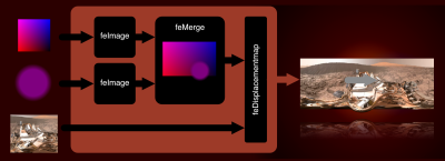
- Insert a
feImageprimitive with a reference to theabsolutemap; - Create the “magnifying glass”, an SVG containing a circle filled with a radial gradient, starting at
rgba(127, 0, 127, 0)and ending atrgba(127, 0, 127, 1); - Insert a second
feImagewith a reference to the “magnifying glass”; - Merge both images into an feMerge primitive and make the result the
feDisplacementMap’sin2. As you may have noticed we’re using a negative scale factor here to make sure the image will be scaled down outside and is displayed at its normal size inside the “magnifying glass”; - Add some JavaScript so that the
xandyattributes of the feImage referencing the “magnifying glass” match the mouse position.
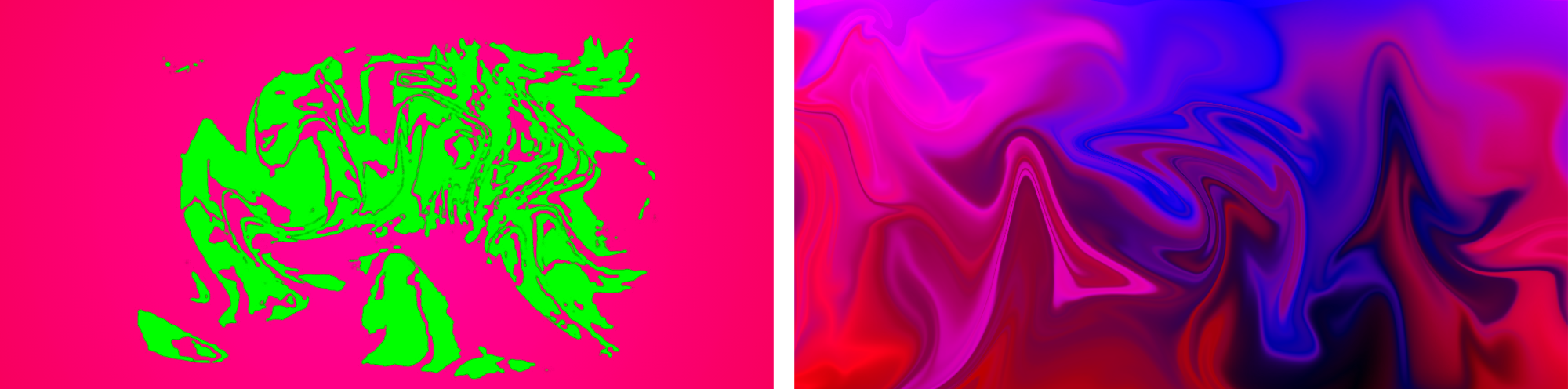
Generating Arbitrary Maps With Blurred Paths
A totally different way to build an SVG displacement map is by making use of extremely thick blurred bezier paths instead of gradients. Here’s a little app that lets you change the bezier anchor points in a map created this way.
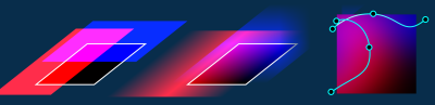
It’s possible to create some pretty rad maps this way, but you should keep in mind that blurring has an impact on rendering performance. Firefox even has a threshold of 100px on how much blurring is allowed.
Animation
By now we learned everything about the main principles behind displacement filtering and how to create displacement maps in SVG. We are ready for the fun part: how to set everything into motion.
SVG filters can be animated and transitioned. A big problem is the fact that filter values referencing a URL will not be interpolated, but swapped out immediately without any transition in-between, a behavior that is in line with the spec. Can be ok in some situations, but boring most of the time. We want animated twirls, ripples, warps, and morphs!
When thinking of animated maps, the first thing that comes to mind is an animated gif or WebP. Well, animated images will work in every browser somehow. But performance varies greatly from quite bad to extremely bad. And then there are platform-related limitations: e. g. Blink is not able to apply this animated displacement filter to elements that contain other animated elements. And we didn’t talk about file size yet. Instead we will focus on the two most reliable animation techniques IMHO: SMIL (yes, SMIL still is a thing these days) and JavaScript.
A filter will usually be constructed from a variety of different primitives and every attribute that was added to a node, like x, y, width, height or scale can be animated with SMIL.
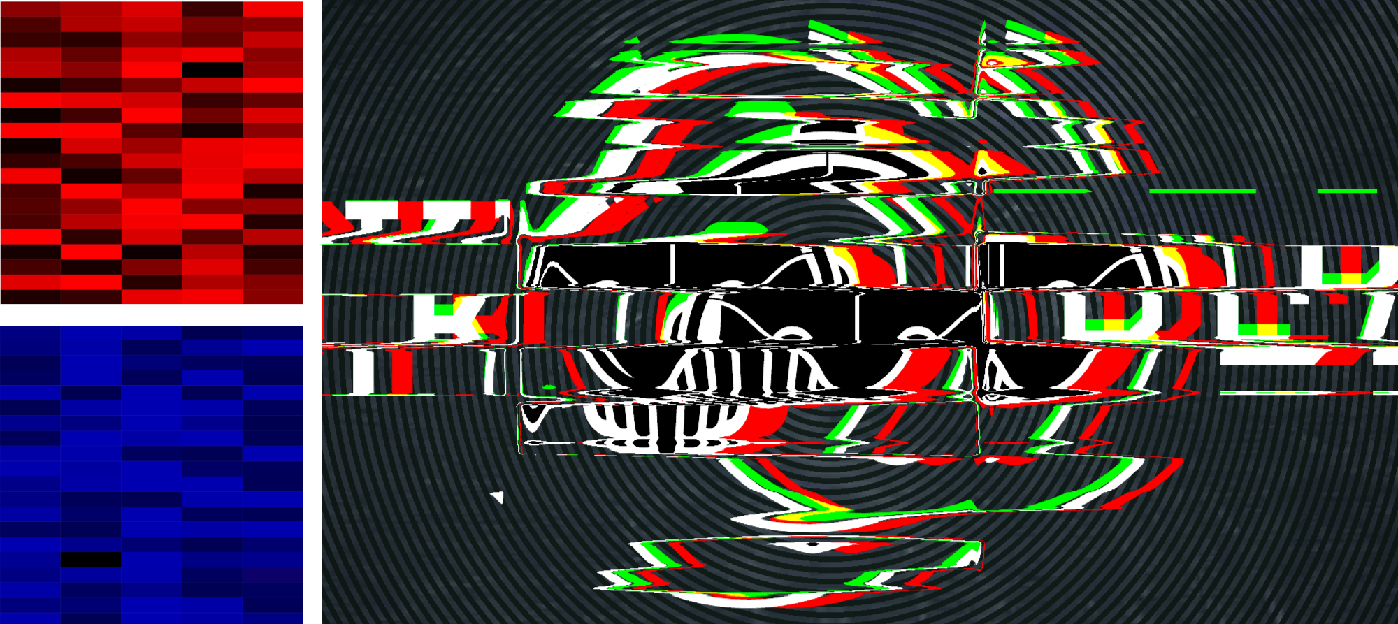
A Simple Glitch Effect
Here’s a very simple example: making use of an animated feFlood primitive to create a basic glitch effect:
See the Pen [`deDisplacementMap`: A simple glitch](https://codepen.io/smashingmag/pen/XWgdpXO) by Dirk Weber.
deDisplacementMap: A simple glitch by Dirk Weber.- There are two
feFloodprimitives in this filter. The first one covers the whole source and is filled with the neutral maprgb(127, 0127)to make sure no displacement happens here. - The second
feFloodis filled withrgb(255, 0, 127)to create a horizontal displacement and gets only a fraction of the filter’s height. - Now it’s easy to add SMIL animation nodes for the
yandheightattributes. - A
feMergeprimitive merges both feFlood into one output, providing thefeDisplacementMap’sin2.
A Moving Displacement Map
A feImage’s position is animatable. In this example, we create a trippy psychedelic type animation by moving a repeating warped map along the x axis:

This effect can be leveraged even more by throwing masks, blurs, and some colors into the mix. Here’s a pimped-up version of the effect using the same techniques, but in a more advanced way.

You may have noticed that depending on your browser and CPU, the performance of these demos can vary drastically. It’s a disappointing fact that SVG Filters are still not optimized for performance. Your GPU will accelerate some simple primitives (e. g. color operations), but when you build a compound filter chaining and merging many primitives you will quickly find framerates dropping and fans going up — especially in WebKit and Firefox. Browser vendors have a lot of topics on their to-do lists and SVG Filter Effects don’t have the highest priority there, especially as they still are not found that often out in the wild.
This doesn’t mean that you can’t use animated SVG Filters now, but you should apply them in a responsible way: preferably limit the dimensions of the animated paint area to the smallest possible rectangle, limit the number of iterations to the minimum, be careful with blurs and blending operations and test test test on many browsers and devices.
A good use case for animated filter effects are small, locally constrained animations applied to UI elements. Below is a demonstration of how the animated feImage effect from above can be used to spice up a rather boring progress bar:
See the Pen [SVG `feDisplacementMap`: Download Progressbar](https://codepen.io/smashingmag/pen/wveGgzr) by Dirk Weber.
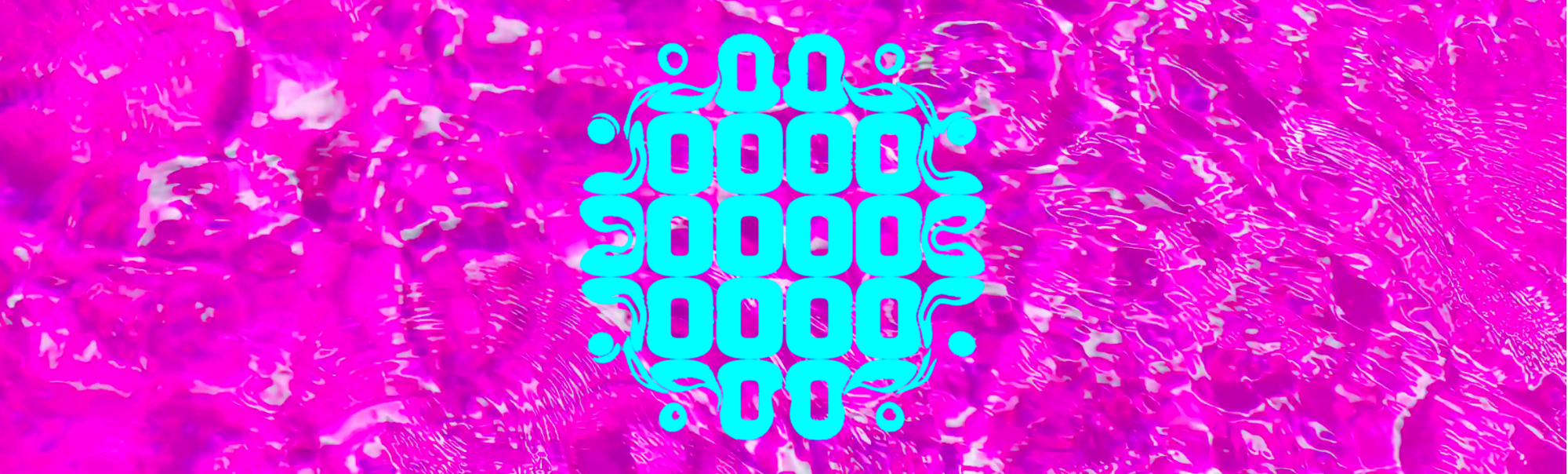
feDisplacementMap: Download Progressbar by Dirk Weber.Here’s another example of a UI component, enhanced with a small and simple effect. A play button that morphs into a pulsating animated soundwave:
See the Pen [SVG `feDisplacementmap`: Play](https://codepen.io/smashingmag/pen/abwNpmg) by Dirk Weber.
feDisplacementmap: Play by Dirk Weber.This time, the displacement map was created by blurring several feFlood primitives as seen in the image below, then animating the feDisplacementMap’s scale attribute.
A Glitch Transition Between Elements
- Create 2 different SVGs for each channel in our map. For each color create a grid of rectangles with randomly varying color intensity.
- Create 2 different
feImageprimitives. URL-encode each SVG, then put it into thehref-attribute of eachfeImage. - Add SMIL animations for
width,height, andyattributes. - Insert a
feBlendand blend bothfeImagesinto a single output. - Add some colored
feDropShadowsfor a cool split-color effect. - Blend everything, then feed it into a
feDisplacementmap. - Animate the
scaleattribute with SMIL. - Feel free to experiment by changing forms (e. g. use circles instead of rects), applying different timings, adding blur effects, and more.

y, width and height attributes of each image are added. (Source: DirkWeber) (Large preview)Animating The Map Itself
So far we have learned that animating filter attributes with SMIL can help us to achieve really cool visual effects. On the other hand, we already saw how SVG fragments can be used as a displacement map. As SVGs are animatable with JavaScript, SMIL and CSS, it would seem obvious that we can apply animations directly to an SVG map right?
Unfortunately, SMIL and CSS animations in SVG images used
as input for feImage will not run when the SVG or fragment is URL
encoded. We will need to write some JavaScript for a reliable solution and take into account that two different approaches for Webkit and Blink/Quantum browsers are necessary. In a first step, let’s see how the “ideal” way of animating a map will look:
- Create the SVG fragment containing your map;
- Reference it from the
feImagethat controls yourfeDisplacementMap’sin2; - Feel free to animate everything in your fragment with JavaScript as you like. Roll your own script or use your favorite library.
“This sounds too easy. Where’s the catch?” Of course, you are right. The method described above is the ideal path, the way things should work but, here’s a strange matter of fact: It will not work anywhere but Webkit. In order for our animation to run in Blink and Firefox, we must implement a rather hacky solution and you won’t like it:
- Create the SVG fragment containing your map.
- In every frame of your animation, change all the values of every animated attribute.
- In every frame of your animation create a new URL encoded string containing a “snapshot” of the fragment and write it into the feImages
hrefattribute.
You’re probably thinking: “This is ugly! I don’t like it and you are a despicable person!”. I feel your pain. The front end is a hostile habitat and sometimes we must do abhorrent things to survive (fun fact: the “ugly” method performs better in Blink than the “pure” method in Webkit will).
Let’s Rock!
Let’s solve a real-world problem with this approach: here’s what happens to “The Rock” when we apply these two simple displacement maps:
See the Pen [SVG `feDisplacementmap`: Start- and endpoint of Warp](https://codepen.io/smashingmag/pen/jOwqyVx) by Dirk Weber.
feDisplacementmap: Start- and endpoint of Warp by Dirk Weber.And here’s how an animated warp from one map to the other will look:
See the Pen [SVG `feDisplacementmap`: Animated Warp](https://codepen.io/smashingmag/pen/PojNWWj) by Dirk Weber.
feDisplacementmap: Animated Warp by Dirk Weber.Breaking Down The Animation
The first thing to do is a feature detection, so we can decide which of the two approaches must be applied. Here’s a little script that draws a tiny SVG into a HTML5 canvas:
async function testSVGFragmentToFeImg() {
  if (!document.createElement("canvas").getContext) {
    return false;
  }

  const testCode = '<svg width="10" height="10" xmlns="https://www.w3.org/2000/svg">
        <defs>
            <rect id="m" x="0" y="0" width="10" height="10" fill="rgb(255, 0, 127)" />
            <filter id="fltr" x="0" y="0" width="10" height="10" color-interpolation-filters="sRGB">
                <feImage width="10" height="10" x="0" y="0" result="FEIMG" href="#m" />
                <feDisplacementMap in="SourceGraphic" in2="FEIMG" scale="10" xChannelSelector="R" yChannelSelector="B" />
            </filter>
        </defs>
        <rect x="0" y="0" height="10" width="10" fill="rgb(0, 0, 255)" />
        <rect filter="url(#fltr)" x="0" y="0" height="10" width="10" fill="rgb(0, 255, 0)"/>
    </svg>';
  const imgURI = 'data:image/svg+xml;charset=utf-8,${encodeURIComponent(
    testCode
  )}';
  const cnvs = document.createElement("canvas");
  const ctx = cnvs.getContext("2d");
  cnvs.width = 10;
  cnvs.height = 10;
  ctx.fillStyle = "rgb(0,0,0)";
  ctx.fillRect(0, 0, 10, 10);

  const isSupported = new Promise((resolve) => {
    const svg2img = new Image(10, 10);

    svg2img.onload = () => {
      ctx.drawImage(svg2img, 0, 0);
      const colA = ctx.getImageData(1, 1, 1, 1).data;
      const colB = ctx.getImageData(9, 1, 1, 1).data;

      resolve(colA[1] !== colB[1]);
    };

    svg2img.onerror = () => resolve(false);
    svg2img.src = imgURI;
  });

  return await isSupported;
}
By measuring the color values in the rendered image we can find out if the current browser supports having SVG fragments as input in feImage, so we can decide which version of our animation we should use.
The SVG Map
The map is constructed from two elements: an absolute map and an animated SVG polyline. As the absolute map will not change during the animation, we will convert it into a data-URI and put it directly into a feImage primitive.
A second feImage will contain the reference to the polyline. Both primitives are then merged into one with the help of the feMerge primitive:
<filter id="filter"
    x="0"
    y="0"
    width="1"
    height="1"
    color-interpolation-filters="sRGB"
    />

    <feImage
        id="feimage-abs-map"
        x="0"
        y="0"
        width="100%"
        height="100%"
        result="ABSOLUTEMAP"
        preserveAspectratio="none"
        href="data:image/svg+xml;charset=utf-8,…"
    />

    <feImage
        id="feimage-polyline"
        x="0"
        y="0"
        width="100%"
        height="100%"
        result="POLYLINE"
        preserveAspectratio="none" href="[polyline as data-uri or url(#feimage-polyline)]"
    />

    <feMerge result="MERGE_IMG">
        <feMergeNode in="ABSOLUTEMAP" />
        <feMergeNode in="POLYLINE" />
    </feMerge>

    <feDisplacementMap
        in="SourceGraphic"
        in2="MERGE_IMG"
        scale="-200"
        xChannelSelector="R"
        yChannelSelector="B"
    />
</filter>
The Animation
Depending on which browser it runs in, our script has to do different things on every frame: in Blink/Quantum-based browsers it must update a string and a href attribute, in WebKit it must update the polyline’s point attribute. Did I mention that the animation should still look the same in every environment?
Luckily for us, the fantastic Animejs JavaScript animation library is predestinated for exactly this kind of task. Besides having everything on board to expect from an animation library (such as easing functions, keyframes timelines and more), it is able to change values in a JavaScript object and call an update function on every frame. Exactly what we need here.
Let’s dig through the code:
// The feImage filter primitive that will get the reference to the polyline:
const feImagePolyline = document.getElementById('feimage-polyline');

// The polyline’s "points" attribute start coordinates:
const pStart = '141,90 220,168 118,210 138,210 36,168';

// The polyline’s "points" attribute end coordinates:
const pEnd = '140,40 230,105 30,190 220,190 26,85';

// An animejs configuration object containing base values:
const animeBaseConfig = {
    duration: 4000,
    loop: 100,
    direction: 'alternate',
    easing: 'easeInOutQuad',
    round: 10
};

// We create an array with two string segments containing parts of the SVG fragment:
let polyTpl = '
    <svg id="polylinemap" width="256" height="256"
    preserveAspectRatio="none" version="1.1"
    xmlns="https://www.w3.org/2000/svg">
        <defs>
            <filter id="blurfilter" color-interpolation-filters="sRGB">
                <feGaussianBlur stdDeviation="7" />
            </filter>
        </defs>
        <polyline id="line" filter="url(#blurfilter)" fill="rgb(127, 0,127)"
        points="~" />
    </svg>
    '.split(‘~');

// This variable will store the animation specific animejs configuration settings:
let animeConfig;

// Time for action. We call the feature detection script and,
// as soon as the promise fulfils,
// conditionally create an animejs configuration object:
testSVGFragmentToFeImage().then((fragmentInFeImageSupported) => {
    if (!fragmentInFeImageSupported) {
    // Fragments in feImage are not supported. This must be a Blink/Quantum based browser.

    // We store the polyline’s point coordinates in this JavaScript object.
    // It’s the animation target for Animejs that will be updated in every frame
    const points = {
        p: pStart
    };

    // Of course we do not want to url encode the string on every
    // frame again and again (performance!), we only do it once in advance:

    polyTpl = polyTpl.map(part => encodeURIComponent(part));

    // The animejs configuration for Blink/Quantum based browsers:
    animeConfig = {
        targets: points,
        p: pEnd,
        update: function () {
            // this function is called in every frame of the animation.
            // It will update the feImage’s “href” value with a "snapshot" of the current polyline:
            const href = `data:image/svg+xml;charset=utf-8,${polyTpl[0]}${points.p}${polyTpl[1]}`;
            feImagePolyline.setAttribute('href', href);
        }
    };
} else {
    // This must be a Webkit browser. Let’s give it another treatment:
    const filter = document.getElementById('filter');

    // An animejs configuration for Webkit based browsers:
    animeConfig = {
        targets: '#line',
        points: pEnd
    };

    // Finally we insert the Fragment into the DOM:
    filter.insertAdjacentHTML('beforebegin', `${polyTpl[0]}${pStart}${polyTpl[1]}`);
    feImagePolyline.setAttribute('href', '#polylinemap');
}

// Now we are safe to trigger the animation by calling animejs with the
// merged base and specific configuration objects:
anime({
    ...animeBaseConfig,
    ...animeConfig
});
This was a very simple example of an animated feDisplacementFilter input. Let’s end this deep dive by looking at three more examples of filter animations.
1. A “Ripple” Fade Applied To A Modal Box
We are all used to modal dialog boxes fading in and out. Why not use a water effect to make the dialog appear? Here we animate the radial gradient in a map to create this example of a ripple animation:

2. Using Animejs’ Grid Animation
Animejs’ staggering and “grid” properties can help you create really cool typographic effects. This effect was created by animating a grid of circles:

3. A “Waving Flag” Menu
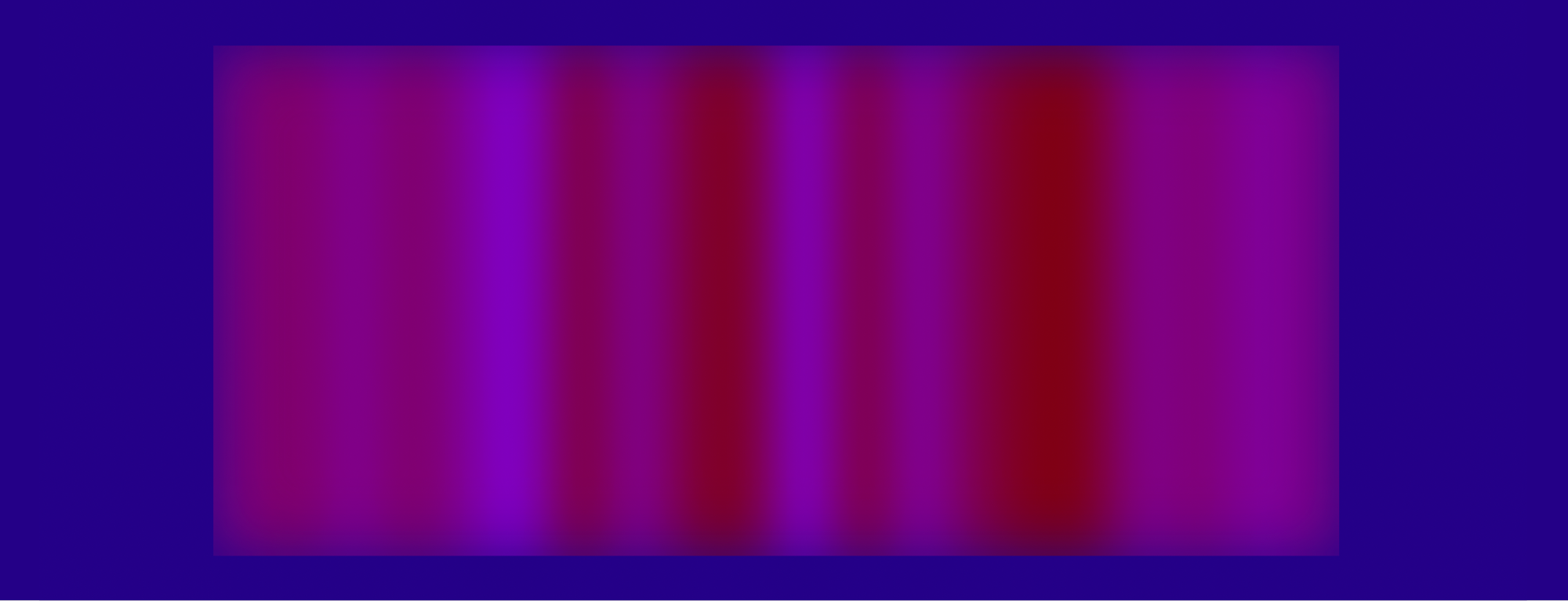
An unconventional way of swapping a second-level submenu. The fade-in effect is achieved by moving a striped map horizontally:

Please note that the demos shown above are highly experimental and mainly intended to demonstrate the concept of animated displacement maps. If you want to use any of these techniques in a live project, always take my earlier recommendations to heart. And forgive me for not going into detail on every example — it simply would exceed the scope of this article.
Further Reading
- Mastering SVG Arcs
- The Design Leader Dilemma
- Regexes Got Good: The History And Future Of Regular Expressions In JavaScript
- Mastering Typography In Logo Design
 (vf, il, yk, mrn)

