Reducing The Need For Pseudo-Elements

Email Newsletter
Weekly tips on front-end & UX.
Trusted by 182,000+ folks.


 SurveyJS: White-Label Survey Solution for Your JS App
 Celebrating 10 million developers

 Register Free Now
Per the W3C spec, “a pseudo-element represents an element not directly present in the document tree”. They have been around since version 1 of the CSS specification, when ::first-letter and ::first-line were introduced. The popular ::before and ::after pseudo-elements were added in version 2 — these represent content that does not exist in the source document at all. They can be thought of as two extra elements you can “tack onto” their originating element. When front-end developers hear “pseudo-elements”, we think of ::before and ::after more often than not, as we use them in various ways to add decorations to our elements.
There are additional pseudo-elements beyond these. They are listed in the spec across three categories: typographic, highlight, and tree-abiding.
Interestingly, after years of web development, I never found myself using ::first-line, but it’s pretty neat and responds well to window resizing! Check it out.
See the Pen [`::first-line`](https://codepen.io/smashingmag/pen/gORgXxN) by Marcel.
::first-line by Marcel.::selection is another pseudo-element many reach to. When a user highlights text, the highlight color will be a color that you specify.
See the Pen [`::selection`](https://codepen.io/smashingmag/pen/rNwjYGz) by Marcel.
::selection by Marcel.Quick Tip
Pseudo-elements used one colon in versions 1 and 2 of the CSS spec, but have used two colons from version 3. This differentiates them from pseudo-classes, which describe an element’s state. Pseudo-classes use one colon.
- Use two colons for pseudo-elements (e.g.
::before,::after,::marker).- Use one colon for pseudo-classes (e.g.
:hover,:focus).
Pseudo-Elements Aren’t Always Needed
Pseudo-elements still have a place. This article is not “never use pseudo-elements” but rather “we no longer have to use pseudo-elements as much”. We can style a number of popular user interface elements without the need for pseudo-elements. By relying less on pseudo-elements, we can write less CSS, eliminate nested elements, ignore stacking context issues, and forget about positioning.
Take Another Look At Trusted Techniques With New CSS Properties
For years, we waited patiently for browsers to adopt CSS technology faster. A turning point for many front-end developers came when some major players announced they would cease Internet Explorer (IE11) support:
- All Microsoft 365 web apps stopped supporting IE11 on August 21, 2021.
- Google Workspace (Gmail, Calendar, Drive, etc) stopped IE11 support on March 15, 2021.
This has allowed many of us to explore newer CSS technologies more freely: CSS Grid, clamp(), background-blend-mode, and more. The state of CSS property support is great. And with updatable browsers, support is accelerating.
Bring On The Examples!
Angled Buttons
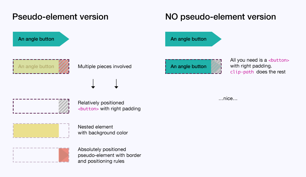
Many front-end developers are familiar with using ::before and ::after pseudo-elements and CSS border rules to create shapes. There are many generator tools dedicated to this purpose — this is one that I have bookmarked. These tools guide you in choosing a shape (often triangles), giving you the proper CSS rules.
These tools are life-savers when creating angled buttons. For angled buttons, they’re no longer necessary.
Pseudo-Element Version
Many of you reading this will be accustomed to a pseudo-element version:
- We use a relatively positioned wrapper element with large right padding to accommodate our angle — this is our
<button>; - Many of us, students of the sliding doors technique, are accustomed to nesting an element to take on the button’s background-color;
- Finally, we absolutely position a pseudo-element with its border rules into our
<button>’s right padding empty space — we use::beforefor this.
Aside from those steps, our hover styles must account for both our nested element and pseudo-element. This might seem manageable for you, but the more complicated our button designs get, the more overhead we have with hover styles. Also, with this version, buttons with word wrapping just plain fail.
See the Pen [Button angle with pseudo-element](https://codepen.io/smashingmag/pen/xxrgPpj) by Marcel.
No Pseudo-Element Version
This is much easier without a pseudo-element.
- We use one wrapper element — our
<button>. - We reach for the
clip-pathproperty to only show the parts of our button we want, usingcalc()along with a CSS custom property to size our angle — these sets of points correspond to top left, top right, middle right, bottom right, and bottom left:polygon(0% 0%, calc(100% - var(--angle-width)) 0%, 100% 50%, calc(100% - var(--angle-width)) 100%, 0% 100%)
In the CodePen example, you change the --angle-width custom property from 2rem to another value to see our button’s angle adjust accordingly.
Our hover styles only need to account for one element — our button. Also, buttons with word wrapping act in a more graceful manner.
See the Pen [Button angle with NO pseudo-element](https://codepen.io/smashingmag/pen/PojWOQY) by Marcel.
More Angled Button Styles In The Showcase
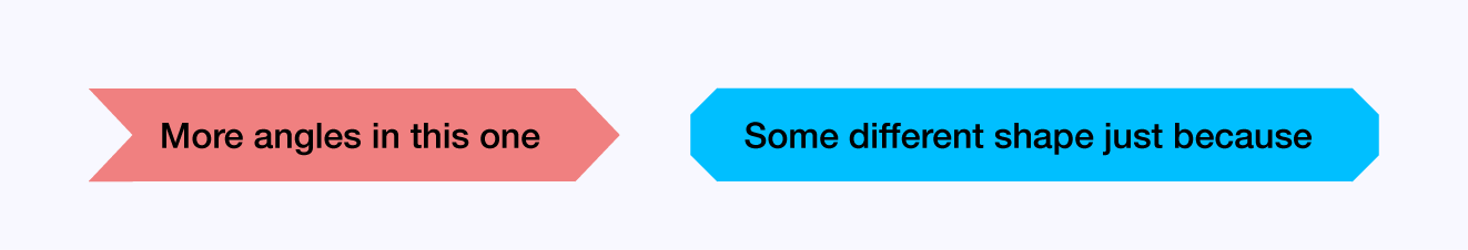
Visit the final showcase to see these other button styles made easier without pseudo-elements. In particular, the blue bevel button’s pseudo-element version is pretty brutal. The amount of overall work is greatly reduced thanks to clip-path.
Button Wipes
A wiping effect is a popular button style. I’ve included left-to-right and top-to-bottom wipes.
Pseudo-Element Version
This can be achieved by transitioning a pseudo-element’s transform.
- We absolutely position a
::beforepseudo-element and give it atransform: scaleX(0)so it’s not visible. - We also must explicitly set its
transform-origin: 0 0to ensure the wipe comes in from the left rather than center (transform-origindefaults to center). - We set up
transitionson thetransformfor some smooth jazz animation on/off hover. - Because our pseudo-element is absolutely positioned, we require a nested element to hold the button’s text,
position: relativeon this nested element creates a new stacking context so our text stays on top of our wiping pseudo-element. - On hover, we can target our pseudo-element and
transitionitsscaleXto now be1 (transform: scaleX(1)).
See the Pen [Button wipe with pseudo-element](https://codepen.io/smashingmag/pen/KKqayGW) by Marcel.
No Pseudo-Element Version
Why worry about nested elements, pseudo-element positioning, stacking contexts, and sprawling hover rules if we don’t have to?
We can reach for linear-gradient() and background-size to nail this down.
- We give our
<button>abackground-colorfor its default state, while also setting up alinear-gradientviabackground-image— but thebackground-sizewill be0, so we won’t see anything by default. - On hover, we transition the
background-sizeto100% 100%which gives us our wipe effect!
Remember, linear-gradient() uses the background-image property and background-image supersedes background-color, so this is what takes precedence on hover.
That’s it. No nested element required. Want a vertical wipe? Just change the linear-gradient direction and the background-size values. I’ve changed those via CSS custom properties.
See the Pen [Button wipe with NO pseudo-element](https://codepen.io/smashingmag/pen/MWoJOVo) by Marcel.
Tiles With Screen Color Overlays
This is a common pattern where a semi-transparent color overlays a tile/card. Our example’s tile also has a background-image. It’s often important in this pattern to retain a set aspect-ratio so that tiles look uniform if more than one appears in a set.
Pseudo Version
Some of the same things come into play with our pseudo-element version:
- We use the aspect-ratio “padding-trick”, setting a 60% padding-top value (5:3 ratio) for our tile.
- We must position our screen color overlay pseudo-element, giving it a 100%
widthandheightto fill the tile — we target this pseudo-element on hover to change itsbackground-color. - Due to the pseudo-element’s absolute positioning, we must use a nested element for our text content, also giving it
position: absolutein order for it to appear above our screen color overlay in the stacking order and to ensure it appears where it should within the tile.
See the Pen [Tile screen color overlay with pseudo-element](https://codepen.io/smashingmag/pen/YzQNEOM) by Marcel.
No Pseudo-Element Version
It can be much simpler thanks to the aspect-ratio and background-blend-mode properties.
Note: aspect-ratio does not work in Safari 14.x, but will in version 15.
That said, as of this writing, caniuse lists it with 70%+ global support.
- The “padding-trick” is replaced by
aspect-ratio: 400/240(we could use any 5:3-based value here). - We use both
background-imageandbackground-colorproperties in conjunction withbackground-blend-mode— simply change thebackground-colorof our tile element on hover.
Background-blend-mode
background-blend-mode blends a background-color with an element’s background-image. Any Photoshop users reading this will find background-blend-mode reminiscent of Photoshop’s blending modes. Unlike mix-blend-mode, background-blend-mode does not create a new stacking context! So no z-index hell!
See the Pen [Tile screen color overlay with NO pseudo-element](https://codepen.io/smashingmag/pen/mdwRqjN) by Marcel.
- You can find the full showcase demo here →
Conclusion
Front-end development is exciting and fast-moving. With newer CSS properties, we can brush the dust off our old techniques and give them another look. Doing this helps foster reduced and simpler code. Pseudo-elements are helpful, but we don’t need to reach for them as much.
Further Reading
- An Introduction To CSS Scroll-Driven Animations: Scroll And View Progress Timelines
- The Design Leader Dilemma
- The Hype Around Signals
- Sticky Headers And Full-Height Elements: A Tricky Combination
 (vf, yk, il, mrn)

