Smart CSS Solutions For Common UI Challenges

Email Newsletter
Weekly tips on front-end & UX.
Trusted by 182,000+ folks.


 Custom Web Forms for Angular, React, & Vue. Your backend.
 Celebrating 10 million developers

It’s incredible to see what we can do with CSS today, especially if you still remember how difficult it once was to figure out stacking contexts or why margins collapsed and why top: float didn’t work. In this post, we’ll look at just that: exciting and fun things we can do with CSS, exploring common problems and use cases we all have to face in our work.
Related Articles On CSS:
Richer, Life-Like Shadows With CSS
Shadows help convey meaning and add extra value to a UI. However, a lot of shadows that we see on the web these days don’t use their full potential. Let’s change that!
A comprehensive deep-dive into all things shadows comes from Rob O’Leary. His article on CSS Tricks explores how light affects shadows and how to define a light source — the foundation to creating authentic shadow effects. Once that base is set, you’ll learn how to use shadows to evoke depth, elevate elements, and inset them, how to layer shadows, and, of course, which CSS property to use for which use case. Rob also takes a look at the accessibility and performance implications that shadows bring along, as well as how to animate them.
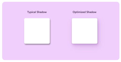
Another fantastic article on the topic comes from Josh W Comeau. To put an end to those “fuzzy grey boxes that don’t really look much like shadows”, as Josh describes the current state of most shadows on the web, he shows how to transform typical box-shadows into beautiful, life-like ones. A little detail that makes any UI a lot more tactile.
CSS Paper Cut-Out Effect
If you ever wanted to create a paper cut-out effect for a heading, you might have struggled quite a bit. Perhaps you need to set up two separate divs that then would be overlapped on top of each other. The spacing would need to be defined in relative units, of course, that might be a bit difficult to get right across screens.
Stephanie Eckles’ CSS Paper Cut-Out Effect solves the problem for good with CSS custom properties, CSS Grid, CSS transforms and a good ol’-fashioned CSS function attr(). Stephanie is using a data-attribute on h1 along with a span inside it. attr() picks up the value of the data-attribute, which is then used for the content-property in a :after-pseudo element. The highlights, shadows and colors can then be adjusted with CSS Custom Properties. Reusable and simple to maintain!
And if you are interested in more magic by Stephanie and other wonderful people who love CSS, take a look at StyleStage, where modern CSS gets the spotlight it deserves.
Also, take a look at Ahmad Shadeed’s piece on Thinking About The Cut Out Effect, which goes into all the fine detail of deciding when SVG might make more sense, and how to implement in a real-life scenario. The article also provides plenty of code examples to get started with!
The Minimap For The Web
We’ve seen them before: tiny horizontal bars that usually live at the top of the page. As a user is scrolling down, the horizontal bar is filling up, so the user knows how much is actually left to scroll.
What if we make it a bit more contextual though? Perhaps the page includes some images and videos, or quotes and distinct sections — wouldn’t be interesting to highlight them differently, while also allowing readers to pin a position on the page and jump back if needed? Well, Rauno Freiberg thought so, too.
Rauno’s minimap for the web (currently works only in Firefox) makes it trivial to create a minimap representation of the entire page, while also allowing readers to pin section of the page and navigate between them. To achieve it, Rauno uses an experimental CSS property element() to display a live image from an arbitrary HTML element (which currently only available in Firefox).
Conditional Border Radius In CSS
When designing cards, you might want a border-radius to have a quite sizeable value when there is enough space to display it along with other cards. Yet when there is no space and perhaps no margin either on the card — as it might be the case on smaller screens — you might want to reduce border-radius to 0. How would you achieve that?
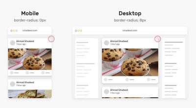
Ahmad Shadeed has looked into this problem in quite a bit of detail in his article on Conditional Border Radius In CSS. The idea, originally suggested by Heydon Pickering and Naman Goel, is to use a large enough number to trigger one state or the other. On smaller screens, if the difference between 100vw and 100% is 0, then the radius will be 0, too; but if the difference is larger, a larger value would be used. You can take a look at the CodePen as well.
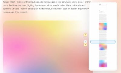
CSS Grainy Gradients
What if you wanted to add some noise to bring a bit of texture to an image? Of course you could export images as PNGs, WebP or AVIFs, but ideally we’d want to add “noise” on top of SVGs, so we can always turn and off noise if we wanted to.
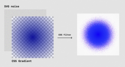
In his CSS-Tricks article on grainy gradients, Jimmy Chion explains how we can generate colorful noise to add texture to a gradient with just a sparkle of CSS and SVG. As Jimmy explains, the idea is to use an SVG filter to create the noise, then apply that noise as a background. Then we layer it underneath a gradient, refine the brightness and contrast, and — voilà — you have gradient that gradually dithers away.
Issue solved! You can also explore the Grainy Gradient playground that Jimmy has set up.
Multi-Line Background Gradient
Some things might seem impossible to do with CSS — well, until someone finds a hack to make it happen. Like in this case: Can you achieve a multi-line padded text with a gradient that doesn’t reset for each line?
Yes, as Matthias Ott shows. Matthias’ solution is a bit hacky, but it leads to the desired result thanks to a pseudo-element that is added on top of the text. An interesting idea to tinker with.
Form Field Focus Without Outlines
Who said forms need to be boring? Hakim El Hattab created a demo that proves that even something as simple as a form asking for name, email, and password is an occasion to think outside the box and cater for a spark of delight.
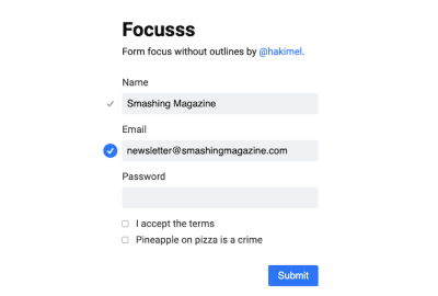
To achieve that, Hakim combines form focus and validation in a subtle yet surprising animation that gets by without any focus outlines on the fields themselves. Instead, a dot marks the field that is focused. When the focus switches to another field, the animation is triggered, and the dot jumps to the new active field, drawing a connection between the two. Form field validation is also integrated seamlessly, with the dot expanding and showing a checkmark. If you’d like to dive deeper into the code, Hakim also published a demo on Codepen. Inspiring!
Transitioning CSS Gradients
If you’ve ever tried to transition gradients in CSS, you probably have noticed that it actually doesn’t work. Instead of gradually fading from one gradient to another, the change is happening immediately, abruptly, with no smooth transition between the two.

As Keith J. Grant has discovered, we can achieve the transition with a clever workaround though. We use a pseudo-element and opacity transform for that. First, we apply one gradient to the element, then position its pseudo-element to fill the element, and then apply the second gradient to it. And we “transition” between two gradients by transitioning the opacity of the pseudo-element. You can check a full working example on CodePen.
Improving Image Performance With image-set()
Have you heard of image-set() already? You can think of it as a CSS background equivalent to the HTML srcset attribute for img tags. Chromium-based browsers and Safari have supported it for some years now, Firefox followed just recently. Ollie Williams takes a look at what we can and what we can’t do with it today.
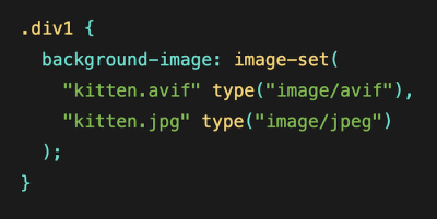
image-set() can be used to serve different background images to different users. (Large preview)As Ollie describes, one use case for image-set() is to provide multiple resolutions of a background image and leave it to the browser to decide which image is served to a user — a high-res version for users on fancy devices and a lower-res image for those on slow connections or screens with a lower pixel density, for example.
Another very promising use case is still lacking browser support, unfortunately: the idea to use new image formats like AVIF, WebP, or HEIF while adding a fallback for older browsers. If you want to achieve something like that already today and don’t need background-image, the <picture> element might be an alternative worth considering, as Ollie suggests. A great read to help you improve image performance.
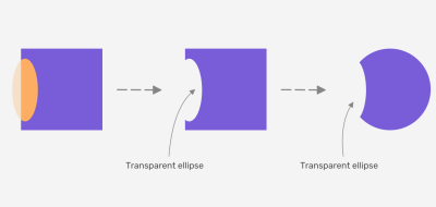
Clip-Path Pop-Out Effect
With clip-path: path() supported by major browsers, it’s time to get creative. Mikael Ainalem shows a beautiful use case for the rather new feature: a buttery-smooth pop-out effect.
clip-path: path(). (Large preview)Mikael uses clip-path: path() to set a photo of a person apart from its circle-shaped background. As you hover over it, the person seems to rise from the inside of the circle, creating a cool 3D impression. Perfect for “About Us” pages.
Whimsical 3D Button
Details matter. Designing a lovely button doesn’t seem to be a big complicated endeavor: a bit of padding here and there, a funky color, accessible text, and a few button states. Well, Josh Comeau has gone all the way to design a truly whimsical 3D button that you might want to click more than once.
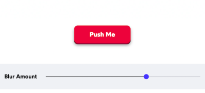
The idea is simple: we create two layers and offset the foreground layer a little bit at first. On hover, we shift the front layer down. Then, we adjust the focus outline with outline-offset, or use :focus:not(:focus-visible) to hide the outline when the button is focused and the user is using a pointer device.
Then we shift the button up by a few pixels when they hover, animate the transform a lil’ bit, adjust the Bezier curve for animation and add a bit of blurring, for a softer, more natural shadow. And voilà — we have a whimsical 3D button that is accessible, works on mobile and on desktop, and is a pleasure to tap and click on. Of course, you can find the full code snippet on Josh’s blog.
CSS Charts
Perhaps you need to design a column chart, or a bar chart, or even a multi-dataset column chart or stacked columns. Where do you even start? Perhaps with Charts.css, a CSS data visualization framework that uses CSS utility classes to style HTML elements as charts.

Created by Lana Gordiievski and Rami Yushuvaev, the framework supports many chart types, has no dependencies, and is very lightweight. It also includes thorough documentation on its components and built-in chart types, plus the source code is available on GitHub (licensed under MIT). And if you need slightly more creative approaches, Preethi explains how to create CSS Charts with interesting shapes on CSS-Tricks as well.
The New CSS Reset
What do you use to normalize styles across browsers? As of recently, there were new approaches to reduce the size of the global CSS reset, and perhaps they would be good candidates for your projects as well.
With his Modern CSS Reset, Andy Bell has reduced the CSS reset to its minimum by adding box-sizing rules, removing default margins, set core root default and body defaults. Along with it Andy removes all animations, transitions, and smooth scroll for people that prefer not to see them, and has added modern properties like scroll-behavior and text-decoration-skip-ink by default.
The New CSS Reset by Elad Shechter takes a slightly more aggressive approach. Elad removes all the default styles which we are getting on specific HTML elements except the display property. Both approaches are worth looking into!
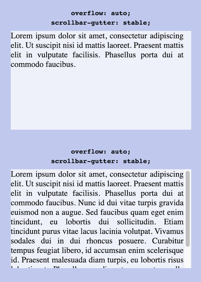
Stable Scrollbar Gutters With CSS
Ah, the good ol’ layout shifts! As Bramus Van Damme explains, one of the slightly more obscure reasons for layout shifts comes due to different types of scrollbars on the web. While overlay scrollbars on iOS/macOS are placed over the content (and aren’t shown by default), other scrollbars are placed in the “scrollbar gutter”, i.e. the space between the inner border edge and the outer padding edge.
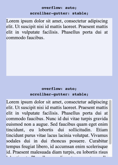
When the content of a box becomes too large, the browser will — by default — show a scrollbar. In the latter case, it will cause a layout shift. Fortunately, this problem might be gone for good soon. Meet a shiny new scrollbar-gutter property: by setting it to stable, we can have the browser always showing the scrollbar gutter, even if the box is not overflowing.
And to keep things symmetric, we can use scrollbar-gutter: stable both-edges. The feature isn’t available yet, but coming in Chromium very soon, with other rendering engines hopefully following soon.
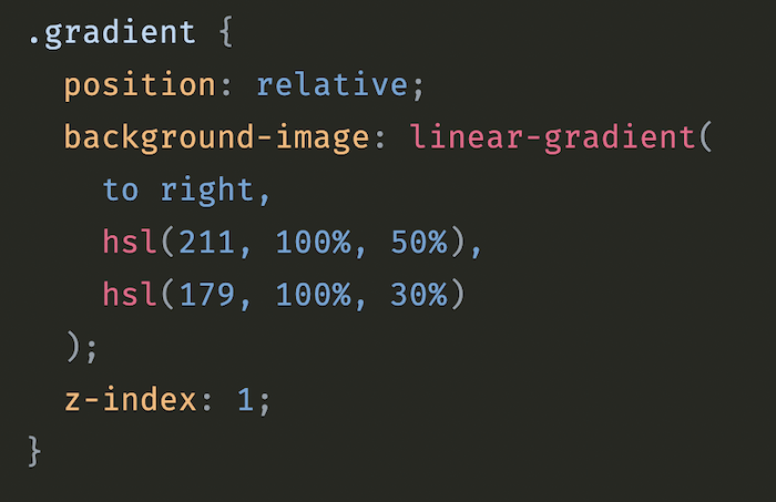
The Surprising Things That CSS Can Animate
When you think of animating CSS properties, which ones come to your mind? Will Boyd looked at the question from a different perspective and decided to explore the properties that don’t come to mind immediately, the ones that aren’t typically associated with animation, but turn out to be animatable.
z-index is one of the surprising things that CSS can do. (Large preview)In his post “The Surprising Things That CSS Can Animate”, Will dives deep into these unexpectedly animatable properties — and, of course, the nifty things you can do by animating them. z-index, for example, can be used for layered animations, opacity helps you fade out a modal just with CSS. A great reminder of how powerful CSS is.
Learning Resources
Learning never stops, right? Below we compiled some useful — and fun! — resources that are perfect to take your CSS skills to the next level. And if you’re already a CSS pro, there are also challenges to put your knowledge to the test. Enjoy!
CSS Vocab And Cheatsheets
You might have been there before. Just when you are working on a tight deadline, you need to look up something quickly. For CSS, you will never go wrong with CSS Tricks Almanac.
Learn Flexbox The Fun Way
What do frogs, zombies, and towers have in common? Well, they are your best friends when learning Flexbox. Because, let’s be honest: Flexbox is very powerful once you understand it, but getting there can be quite hard. So let’s make learning a bit more fun.
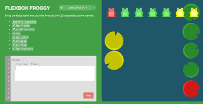
In the game Flexbox Froggy, you help a little frog and its friends find their lilypads by, you guessed it, writing CSS. The game consists of 24 levels that take you from the very basics of Flexbox positioning to more advanced challenges.
If zombies are more down your alley, Flexbox Zombies is for you. Each section of the game unravels part of the plot, introduces a new Flexbox concept, and presents so-called “zombie survival challenges” that help you solidify your new skills.
Last but not least, you might also want to take a look at Flexbox Defense. Inspired by tower defense games, your job is to stop incoming enemies from getting past your defenses — by positioning your towers with CSS, of course. All three games run right in your browser. Happy flexbox’ing!
CSS Grid, CSS Selectors, And Other Competitions
Do you want to take your CSS skills to the next level? These three little games help you do just that — quite literally. In Grid Garden, you’ll become the proud owner of a carrot garden. 28 levels are waiting for you in which you need to take good care of your crop with the help of CSS grid.
If you feel your CSS selectors skills could need some polishing, CSS Diner is for you. Plates, apples, pickles — in each of the 32 challenges, you’ll need to use a different CSS selector to select specific items on a table.
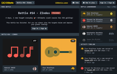
And if you’re up for some competition, be sure to also check out CSSBattle. In the CSS golfing game, you’ll be using your CSS skills to visually replicate targets with smallest possible code to get to the top of the leaderboard. Each of the challenges is dedicated to a specific topic like visibility, display, transition, or z-index.
Wrapping Up
Have you come across a CSS resources or technique recently that changed the way you approach a particular challenge? Let us know in the comments below! We’d love to hear about it.
Further Reading
- The Fight For The Main Thread
- How To Animate Along A Path In CSS
- Core Web Vitals Tools To Boost Your Web Performance Scores
- Sustainable Design Toolkits And Frameworks
 (vf, mrn)

