Designing Better Links For The Web

Email Newsletter
Weekly tips on front-end & UX.
Trusted by 182,000+ folks.

 Celebrating 10 million developers
 Custom Web Forms for Angular, React, & Vue. Your backend.


Why are “click here” and “by this link” poor choices? And is it acceptable to use “read more”? All these phrases have become so common that many people don’t see any problems with them.
How many times have you encountered or composed the following on websites, in emails, or intranets?
- Fill in this form by the end of the day.
- Check the equipment policy by the link.
- You can find more information here, here, and here.
In this article, I’ll explain popular wording and formatting mistakes and will show more accessible and informative alternatives. Let’s go!
Meaningful Links
So what exactly is a hyperlink? It’s a combination of a web address (URL) and a clickable element (oftentimes a word or phrase, sometimes an image). While this is a vast topic, we’ll focus on text links, namely their usability and accessibility.
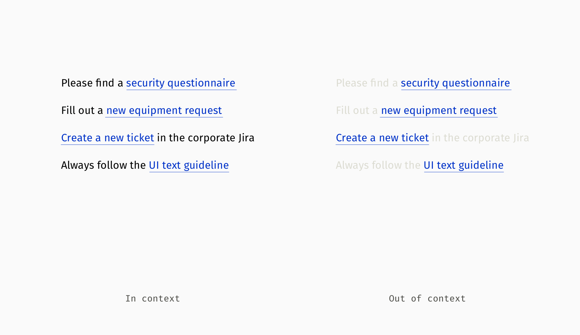
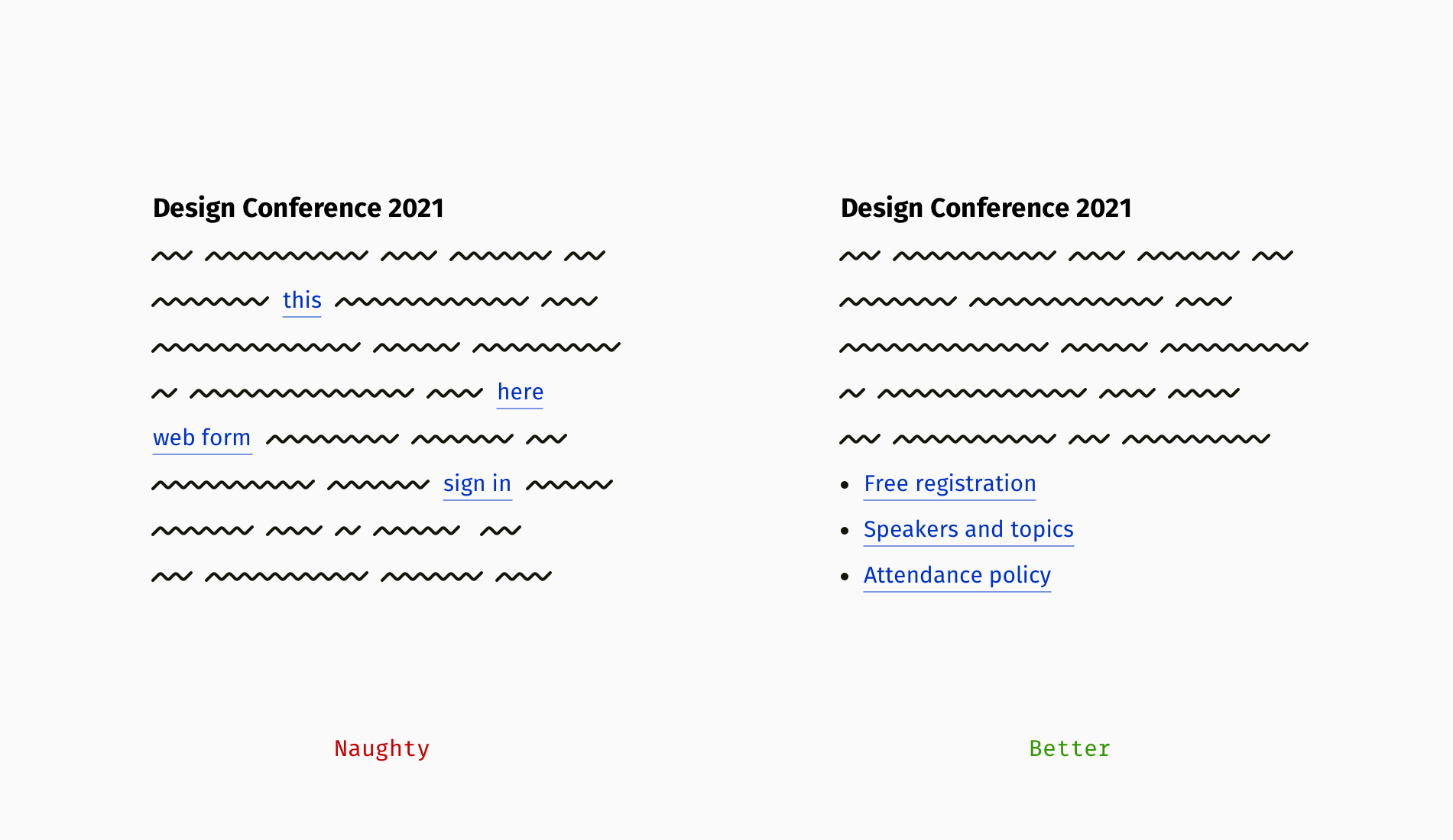
Thoughtfully composed links express respect to readers, whereas jumbled-up ones cause confusion and suspicion. When a link is presented as “here” or “this,” it’s harder to aim it with a cursor or finger. Also, it lacks transparency. What is hidden behind it: a page or file, an article or web form? One should re-read the whole sentence or paragraph to guess.
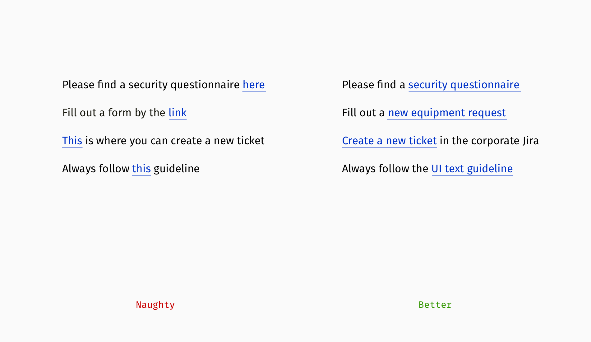
On the contrary, URLs attached to concise self-explanatory phrases inform people about the destination and are more convenient targets for clicking or tapping. Moreover, a well-composed link makes sense out of context and typically combines a topic (e.g. security, brand, marketing) and format (questionnaire, request form, guideline, policy, and so on).
Exposing URLs
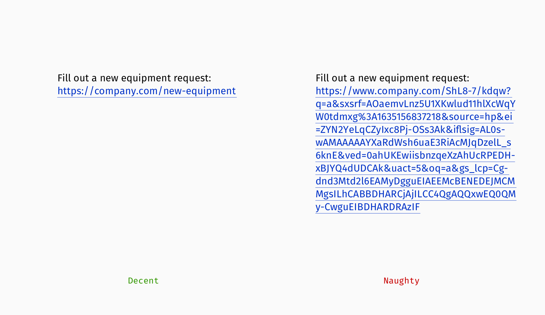
If a web address is short and doesn’t look like M$c0P88%X4LHr&dxQ1A, then exposing it right away will work quite well, too, especially if the audience is supposed to copy it and paste it somewhere else.
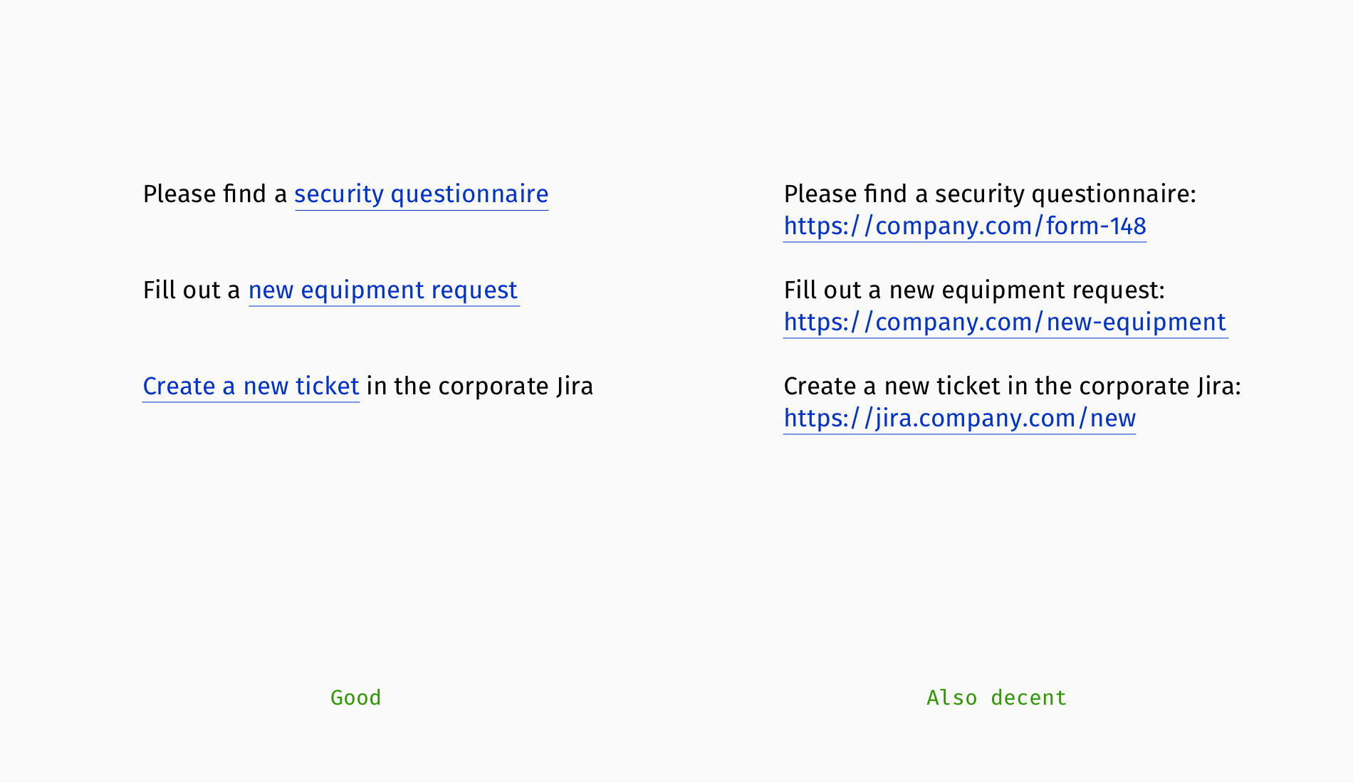
And if you’ve got a long indecipherable chain of symbols, exposing it isn’t a great idea in most situations. In this case, consider embedding a URL into a succinct phrase or shortening the address in tools like Bitly or Cuttly.
However, these tools aren’t silver bullets: you do get a shorter link, but its meaningful parts will be replaced with random symbols, which are suspicious and not informative. Customizing shortened URLs is possible, but it’s typically a paid feature.
Compare the following examples:
bit.ly/30SjUa4y(suspicious and unreadable);bit.ly/smashing-books(readable topic);smash.ing/30SjUa4y(recognizable domain);smash.ing/books(fully transparent).
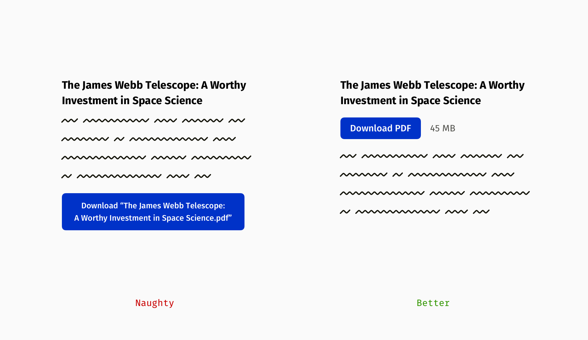
Download Links
A link that guides to some downloadable resource needs a slightly different treatment. Besides embedding it into a meaningful phrase, you should also inform users about the file format and size:
- The format gives clues to what you can do with this data (e.g. if the information is read-only or editable);
- The file size is crucial for people with costly internet, slow connection, or limited local storage.
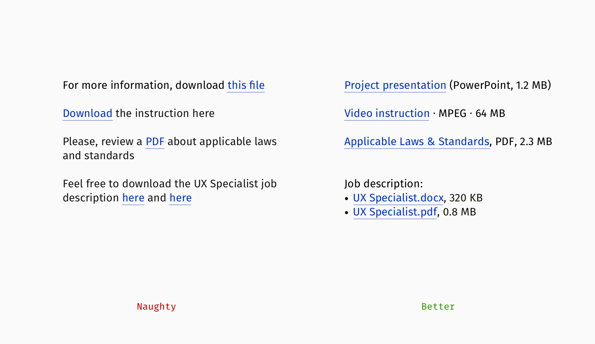
When you share a bunch of files (let’s say in different formats or versions), it’s not enough to design each link correctly. The whole series should be well-scannable and easy to use.
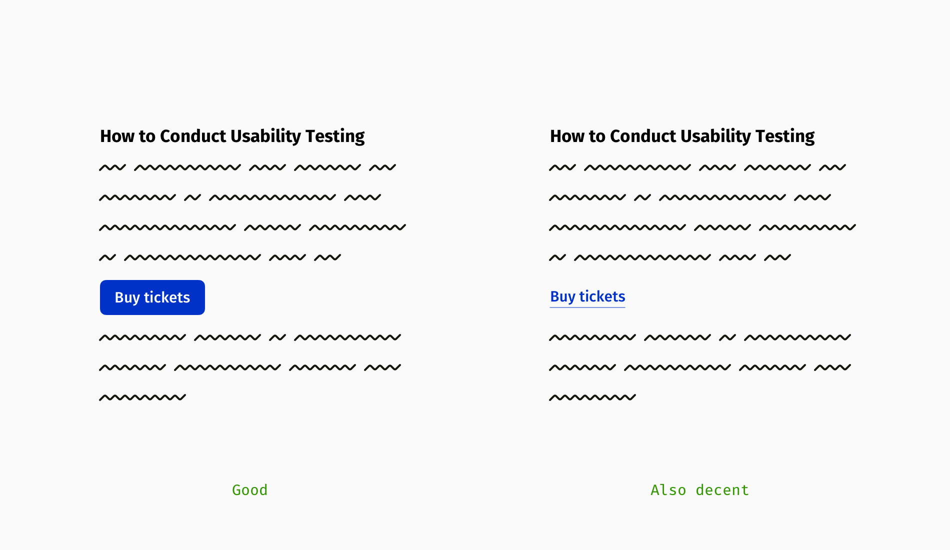
Links Vs. Buttons
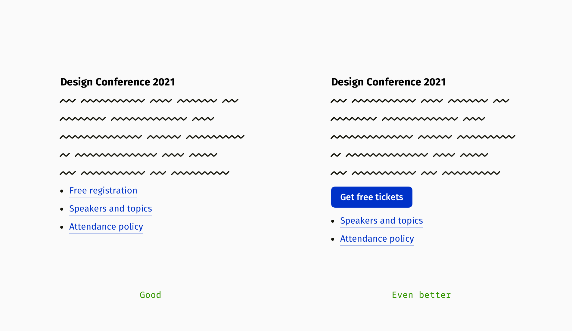
Not all links on a page or in an email are equally important. Authors often want their audience to click on the primary link, whereas other links can be skipped. If you’re going to draw people’s attention to the main action, think of presenting it as a button:
- “Subscribe to the newsletter”
- “Buy tickets”
- “Get the white paper”
- “Download the recording”
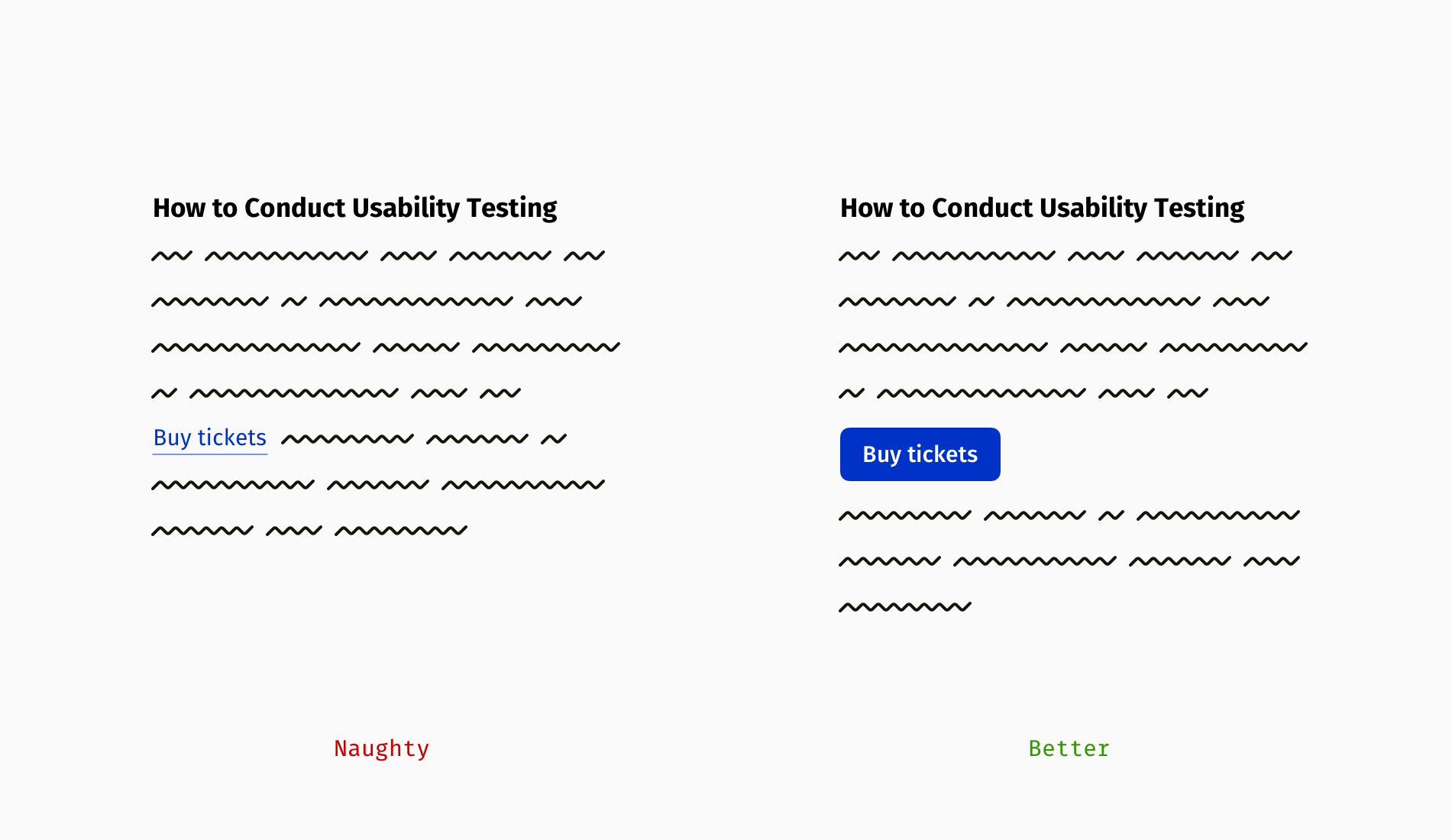
If you cannot create a button because of technical or time constraints, go for a quick-and-dirty solution: put that link in a separate line, make it bold, add spacing above and below, and so on.
Of course, button text should follow corresponding patterns so that you don’t cross the line between motivating readers and manipulating them:
- Be concise (up to 4–5 words);
- Ideally, start with a verb (e.g. “get”, “buy”, “download”, “apply for”, and so on);
- Call the action honestly (i.e. avoid hushing up unpleasant steps like watching ads, registration or submitting personal data).
Compare “Download the report,” which assumes that downloading starts immediately after clicking, and “Get the report,” when a user downloads the file in exchange for their name and contact details.
Link-Rich Texts
Links enable the functioning of the Internet, however, vigorously pumping URLs into each sentence isn’t a good practice (of course, unless you contribute to a Wikipedia-like knowledge base that is cross-connected by nature).
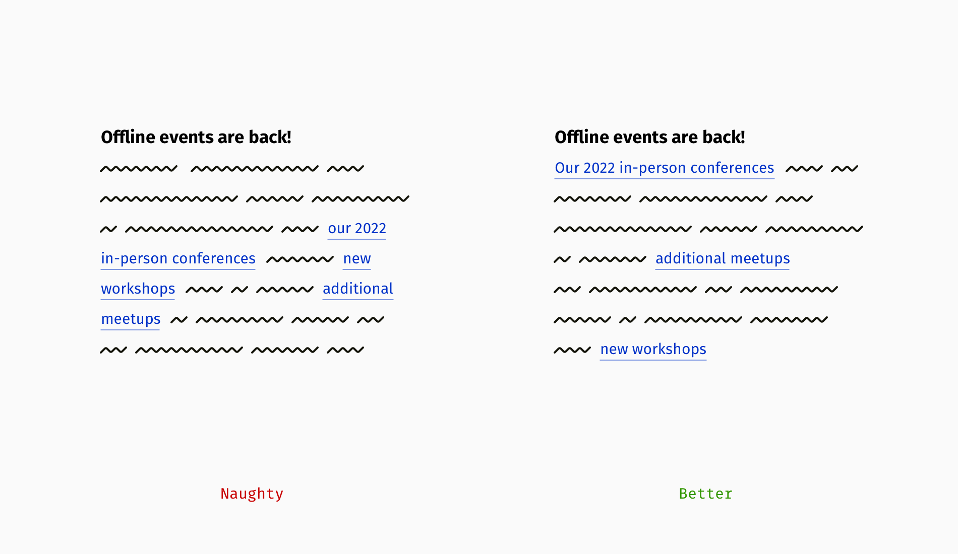
Step zero is to make sure you really—*really*—need all the links. If you can edit something out, there won’t be a problem to solve. Otherwise, try to group the links: as a bulleted list, on the side of related paragraphs, or under a suitable title (e.g. “Recommended materials” or “Resources”).
Grouping the links helps a lot, but if the goal is to trigger action, the primary link should stand out. So, why not make it a button, then?
In the previous sections, we figured out how descriptive links increase usability and accessibility. At the same time, such links are longer, and consequently, can appear divided in a paragraph, when the first part of a link remains at the end of the previous line, and the second part jumps to the next line. It seems trivial compared to bigger flaws, but distorted links are a bit annoying in link-crowded texts.
If a paragraph width is fixed, compose text the way all links fit into lines, for example, try to start a paragraph with a link. However, browsers and devices render content differently, and links will still shift for some users. That’s why lists are a safer option for a set of links.
Link Accessibility
Accessible links are not only the ones that look tidy and clear; they should also be properly working. Web Content Accessibility Guidelines (WCAG), the world’s most famous digital accessibility standard, includes recommendations about hyperlinks, including some non-visual features.
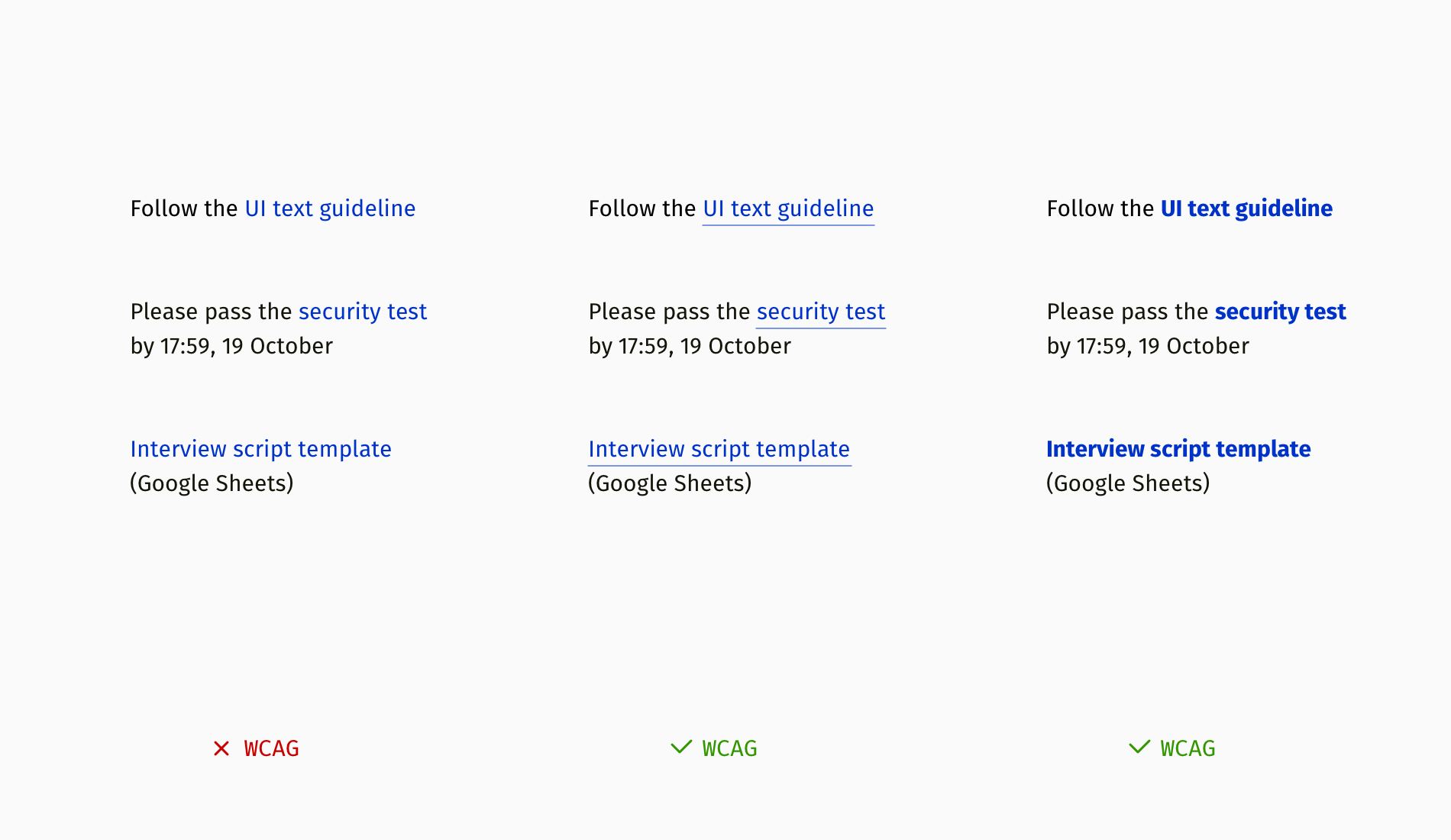
Distinction
One of the WCAG requirements is not to rely on color only when you want to distinguish a button or link from the rest of the text. Painting links in blue or another color doesn’t suffice since it still might not be visible for people with color blindness. The most typical method is underlining links; they can also appear in bold font.
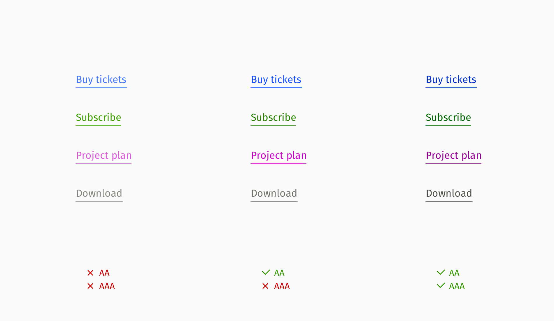
Color Contrast
Links are essential interactive elements and have to comply with contrast recommendations. WCAG has two levels of contrast compliance:
- AA: medium, used by many websites for a mass audience;
- AAA: high, primarily applied on governmental sites and by communities of people with disabilities.
For example, the AA level requires maintaining a contrast between a link and background of at least 4.5:1 for normal font size and 3:1 for large text.
Note: You can always check your colors with the help of the online Contrast Checker or Figma’s Contrast plugin.
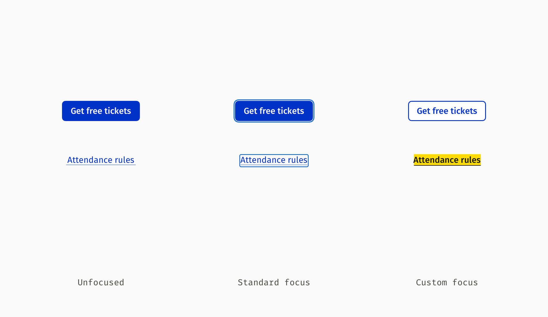
Focus State
Like all interactive components, links should have a visible keyboard focus. All popular browsers have an embedded accessible focus by default (you might have seen this bold blue frame around input fields, dropdowns, buttons, and links in Google Chrome). Unfortunately, on some sites, focus gets manually removed or visually customized so that a focused link can look even less noticeable (e.g. faded out).
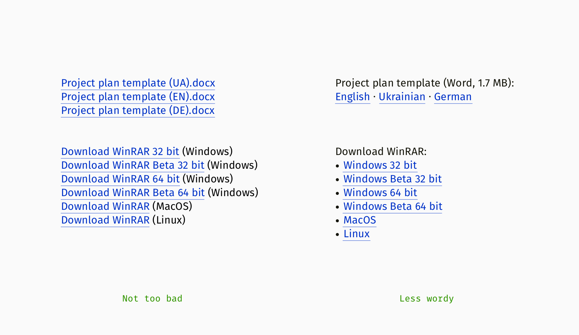
Optimization For Screen Readers
Blind users don’t see the web — they listen to it by means of “screen readers,” assistive programs that transform a written text into fast robotic speech. They navigate with a keyboard and remember dozens of handy shortcuts to jump between headings, buttons, or links instead of obediently listening to the entire content on a page.
So, when you remove wordiness for sighted people (for example, in the lists of different language versions or formats), it’s important to keep links clear for screen reader users, too. Otherwise, blind visitors will hear the following:
“Ukrainian — link, English — link, German — link”
The self-explanatory should be heard instead:
“Download project plan template in Ukrainian — link, download project plan template in English — link…”
And probably the most annoying thing on a news website is to hear this:
“Read more — link, read more — link, read more — link”
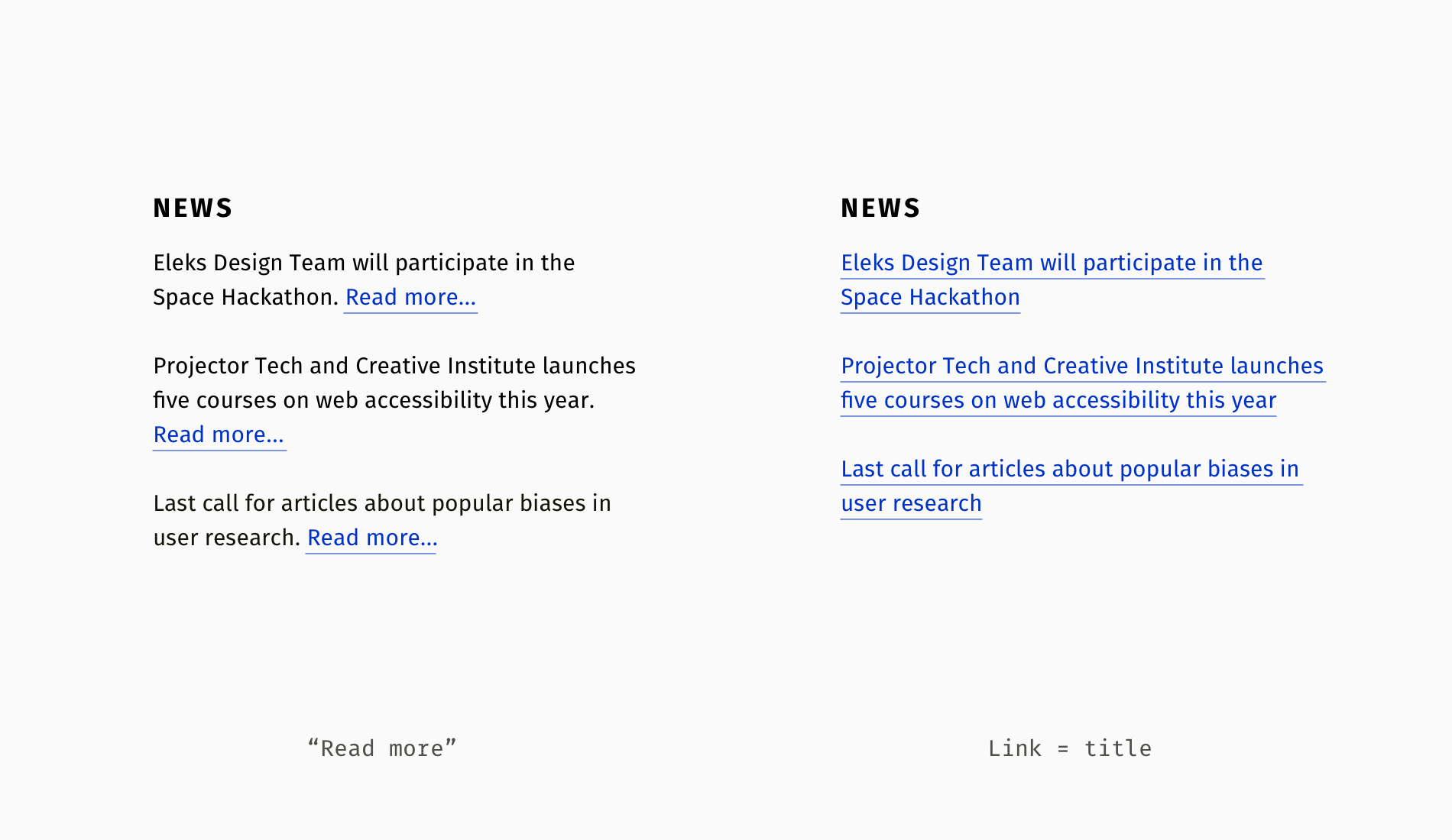
Sighted people can guess that “Read more…” relates to the nearest title, and blind people need individualized read-mores. Fortunately, the HTML attribute aria-label comes in handy here; it enables attaching explanatory text for screen reader users.
It’s often a designer’s responsibility to compose accessibility-related text and collaborate with a developer around optimal implementation, so here is a simplified code example:
<h4>News</h4>
<p>Eleks Design Team will participate in the Space Hackathon.
<a href="aerospace-hackathon.html" aria-label="Read more about Eleks participation in the Space Hackathon">Read more...</a>
</p>
<p>Projector Tech and Creative Institute launches five courses on web accessibility this year.
<a href="new-courses.html" aria-label="Read more about new courses on accessibility by Projector Institute">Read more...</a>
</p>
As you can see, each “Read more” has an extended explanation for screen readers. However, you won’t need to take care of article links with aria-label if each title is a link itself.
<h4>News</h4>
<h5><a href="aerospace-hackathon.html">Eleks Design Team will participate in the Space Hackathon</a>
</h5>
<h5><a href="new-courses.html">Projector Tech and Creative Institute launches five courses on web accessibility this year</a>
</h5>
Duplicated links
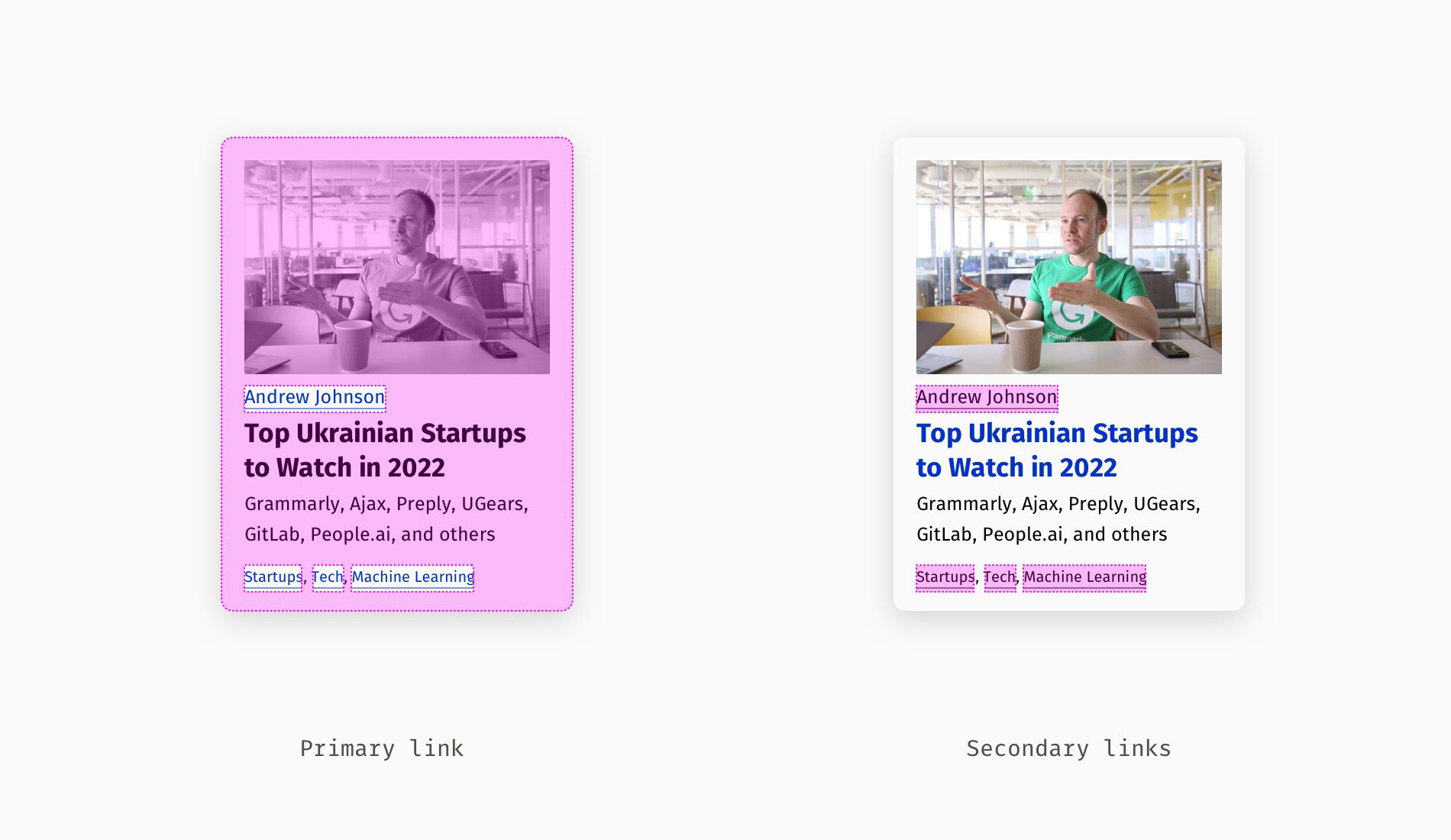
Multiple identical links are yet another widespread controversial practice. For example, on a web page, it means that the same web address is attached to an article title, hero image, and intro sentence. At first glance, nothing’s wrong: wherever you click — you get to the article. But for blind users, it means repeating the same information thrice, which extends the time they need to sift through content to what they are interested in.
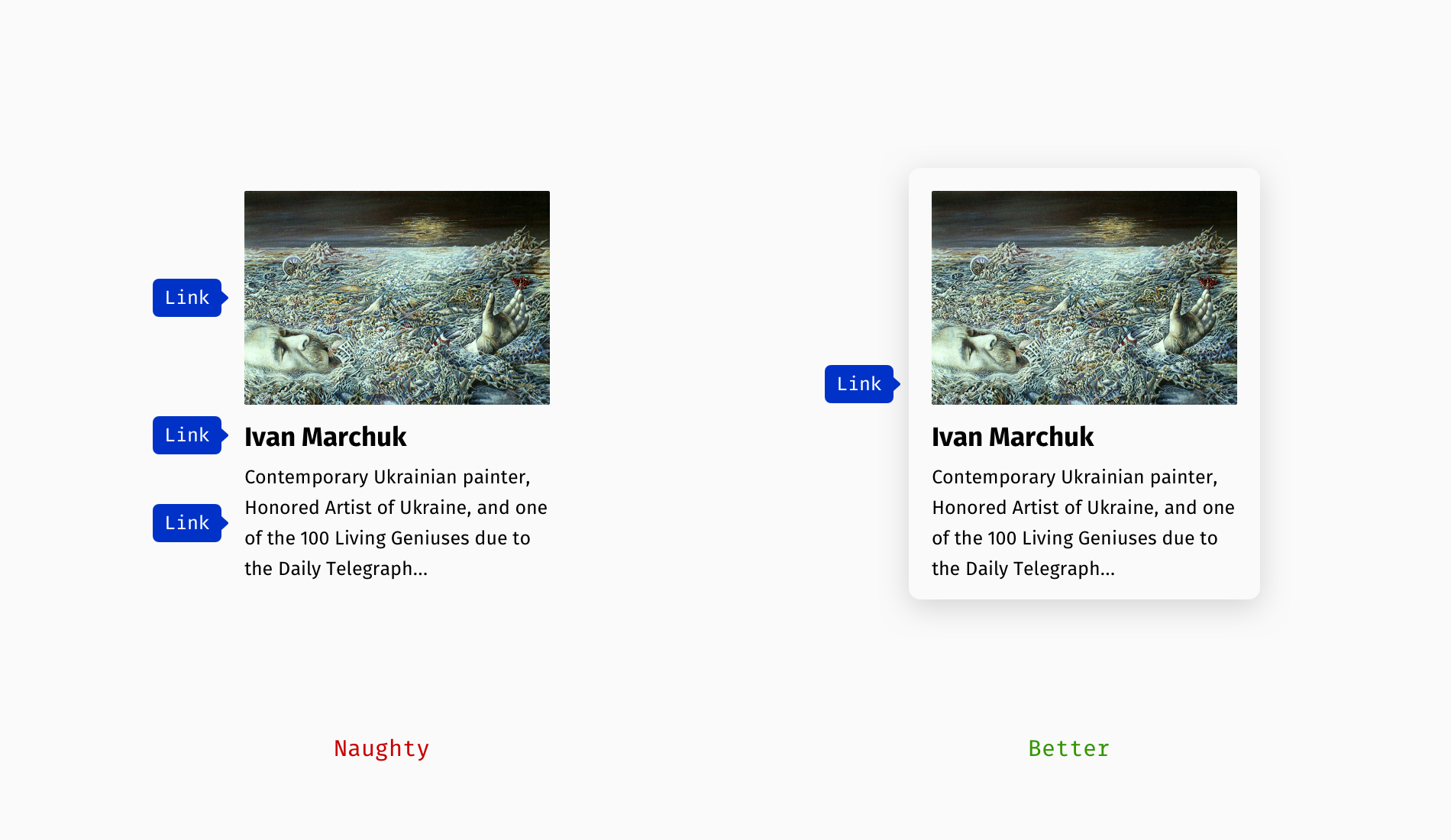
An important note: We are now talking about identical destinations, but a card can include different ones, for instance, a link to the article, author’s profile, and tags. In this case, minor links can appear “wrapped” in the main one.
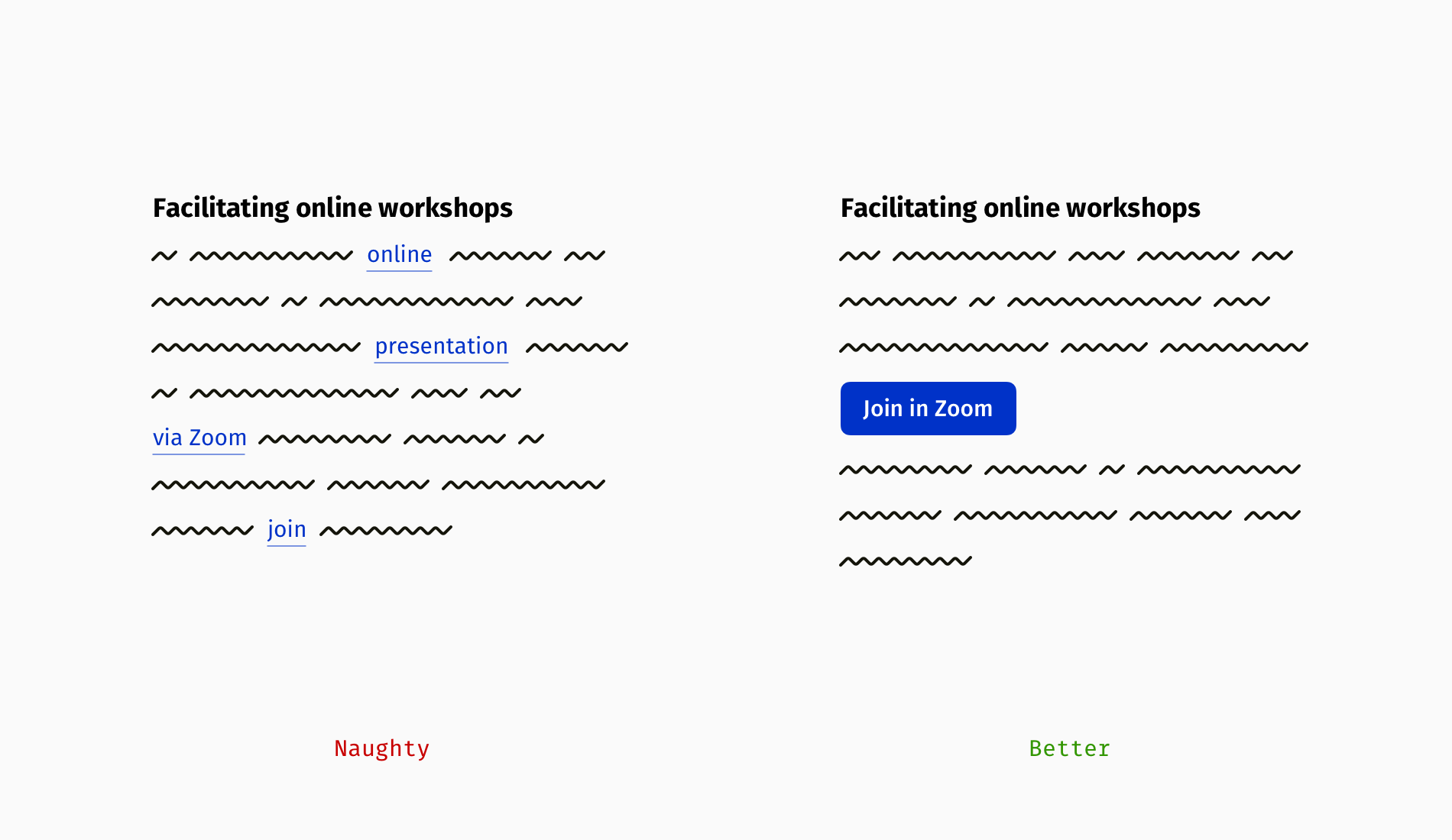
Now, emails. Let’s say we have an invitation to some online event, where a Zoom link repeats several times. In the event description, “what/when/where” section, and closing part. Not only will it create an impression of mess for sighted users, but also visually impaired users will be troubled with jumping between duplicated links.
Recommended Reading
In this article, I wanted to suggest options instead of showing the topic in black and white. There are multiple shades of good design, and you can find yours on the overlap of best practices and your particular case. Meanwhile, some additional reading on this topic:
- “Using
aria-labelFor Link Purpose,” Web Content Accessibility Guidelines (WCAG) - “How To Make ‘Read More’ Links Accessible,” Vision Australia
- “Writing Hyperlinks: Salient, Descriptive, Start With Keyword,” Marieke McCloskey, Nielsen Norman Group
Further Reading
- Navigating The Challenges Of Modern Open-Source Authoring: Lessons Learned
- An Accessibility-First Approach To Chart Visual Design
- Getting To The Bottom Of Minimum WCAG-Conformant Interactive Element Size
- The Role Of Illustration Style In Visual Storytelling
 (vf, yk, il, mrn)

