Infinite Scroll UX Done Right: Guidelines and Best Practices

Email Newsletter
Weekly tips on front-end & UX.
Trusted by 182,000+ folks.

 Celebrating 10 million developers

 Custom Web Forms for Angular, React, & Vue. Your backend.
We’ve all been there. You might have a long-winded list of search results, products, orders or data entries. Of course, you have all kinds of filters and sorting and search already in place. However, you also need to help customers explore relevant entries, and to do so, you need to support and speed up browsing through entries.
Your natural design instinct might tell you to stay true to good old-fashioned pagination at first. Yet before you know it, you might start wondering if infinite scroll might be a good option to consider, given the very unique use case that you have. So is infinite scroll actually a good idea? Well, we all have strong opinions about infinite scroll, and usually not very good ones. This has a number of good reasons.
This article is part of our ongoing series on design patterns. It’s also a part of the upcoming 4-weeks live UX training 🍣 and will be in our recently released video course soon.
Problems With Infinite Scroll
The issues with infinite scroll are well-known. The most obvious one is the sheer amount of options on the page which is often too overwhelming and too difficult to manage. It really feels like drowning in an information abyss with no end in sight. No wonder that once the number of displayed options is beyond the comfortable range, a good number of users abandon the page altogether as a reaction to that.
Also, we don’t have any control over when and how many items appear on scroll. Just like there is no easy way to navigate between the “old” and “new” segments of the infinite scroll as they all fall into the same stream of items. Once you scroll up and down a few items, it’s hard to see immediately what we have seen already and what we haven’t seen yet — unless we meticulously scan through the last few items a couple of times.
Sometimes the URL in the address bar changes on scrolling, but more often it does not, leaving us out there starting all over again if we want to continue browsing later. And if we want to send the URL to ourselves or to our loved ones to explore a particular set of items at once, that’s usually painful as we can’t really bookmark a location in the list.
Should we want to reach the footer, every time we scroll, we need to scroll just a little bit faster to get a miraculous chance to reach the footer before the new stream of items comes in. Sometimes users find themselves taking on a scrolling challenge while hitting Esc at the same time — to cancel the infinite scroll just in time. (Usually unsuccessfully.)
On top of that, infinite scroll breaks the scroll bar as the user’s expectations of the page length have to be recalibrated with every scroll. The scrollbar is a promise of how lengthy the page actually is, but with newly loaded items, the promise is always faulty. Not to mention accessibility issues of announcing the newly loaded items properly to screen readers as well as performance issues on choppy connections.
All of the issues listed above are just poor usability. So it’s not surprising that we often disregard infinite scroll as a fashionable technique that produces more problems than solutions. And it’s not surprising that as designers, we tend to use other options instead: pagination and “load more” buttons.
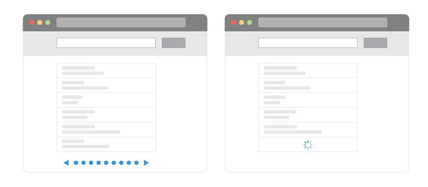
Pagination And “Load More”
We can avoid all infinite scroll issues by falling back to the usual suspect: pagination. And it has plenty of benefits. With it, the user always has a clear beginning and a clear end. As users finish a page and move to the next one, there is a very clear “cut” of what has and what hasn’t been seen yet, along with a sense of completion during that navigation.
Plus, there is a sense of control how much data is being displayed on a given page (usually with controls to change the number of items per page), the URL is different for every page, the footer is easy to reach and the options appearing on pages are easier to manage.
Unfortunately, in usability tests, sometimes pagination doesn’t perform well at all. It’s much more predictable and easier to manage, but also much slower compared to infinite scroll, so users often browse significantly less and often feel “slowed down”. There seems to be more time spent on the first few pages, and filters and sorting are used more often in that time, but compared to infinite scroll, they view fewer items in total and are often less engaged.
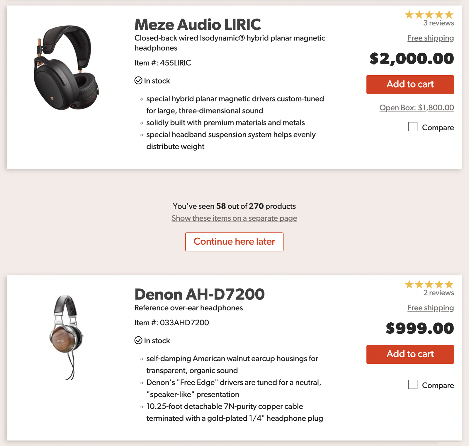
If we want to keep the benefits of pagination but avoid overwhelming users with infinite scroll, we can use a “Load more” pattern instead. With it in place, as users start scrolling, eventually they can choose to load more items on tap or on click. In some implementations, as users start scrolling down, more items appear automatically at first, but then the “Load more” button appears, once a certain threshold is reached.
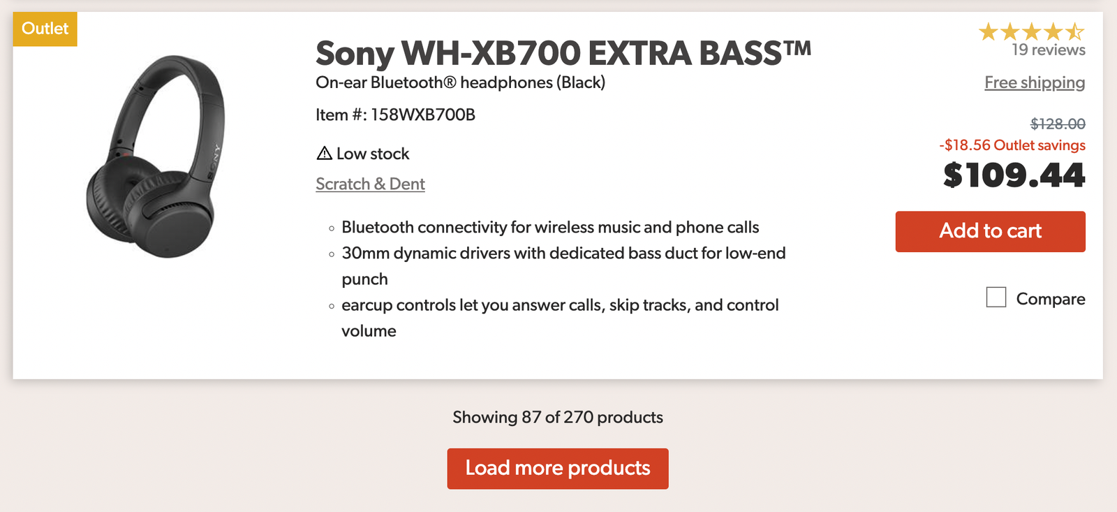
For example, we could display 10–30 products on the initial page load (10 on mobile, 30 on desktop). When the user reaches the end of the listing, we can use automatically fetch the next 10–30 products. When the user reaches 30–70 items, we then switch to “Load more”. We also provide an option to go back with the “Back” button, so users always have a sense of control about where they navigate.
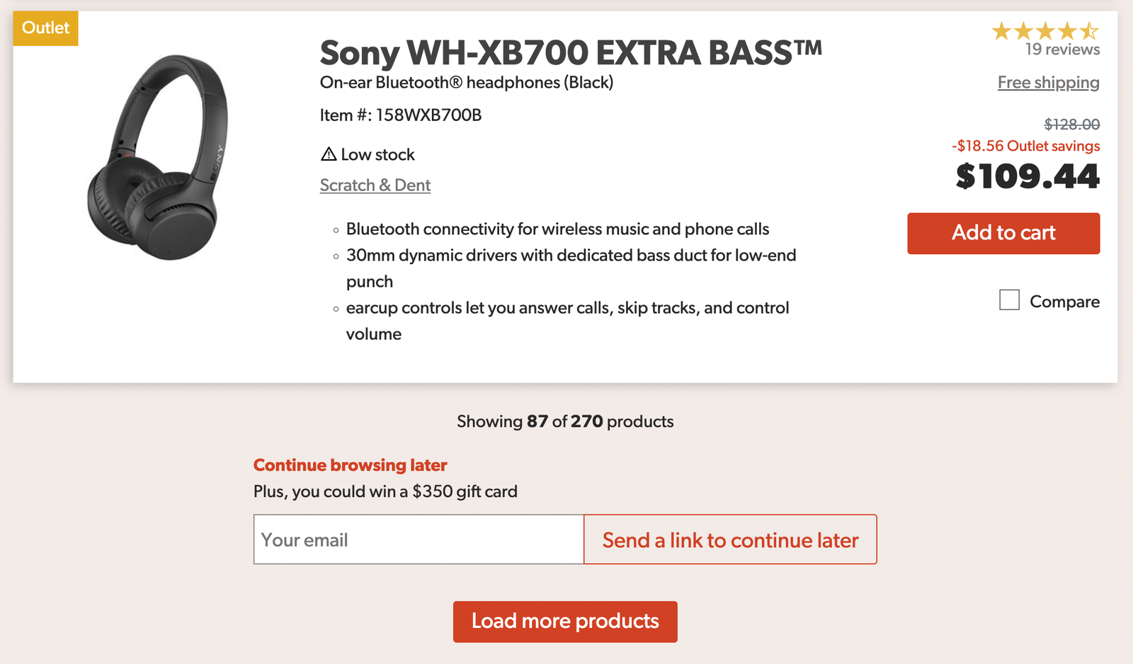
We could also provide an option to continue browsing later by allowing users to type in their email and get a link that later would bring them to the position in the list where they currently are. This solves the problem of not being able to continue browsing later, perhaps on another device, or at a different time.
“Load more” works very well in eCommerce — users have control of what they see as all items appear on a single page and the footer is always in reach. Plus, if the URL is changed every time a user hits the “Load more” button, we bring together the speed of infinite scroll with the comfort and security of pagination. Users do seem to be browsing more and are more engaged. This makes this pattern a good option to consider for lengthy lists.
Does it mean that we can abandon infinite scroll altogether? Not necessarily. An important benefit of infinite scroll is the speed of displaying results — displaying new items just when users want to see more. As it turns out, there are a few techniques and strategies to make infinite scroll better. But it requires solving all of the issues we’ve outlined earlier.
Bookmarking The Position In The List
The easiest way to improve infinite scroll is by marking the breaks between “new” and “old” items in the list. When a new batch comes in, we separate the items visually and allow users to mark the position in the list from which they want to continue browsing later. We could also allow them to see all products they’ve seen on a separate page, so they can separate viewed options from the infinite stream of all options. An example of this interaction is displayed below.
Once a user clicks on the “Continue here later”, we could either show a checkmark and store the position in the browser, or display a modal asking users for their email address.
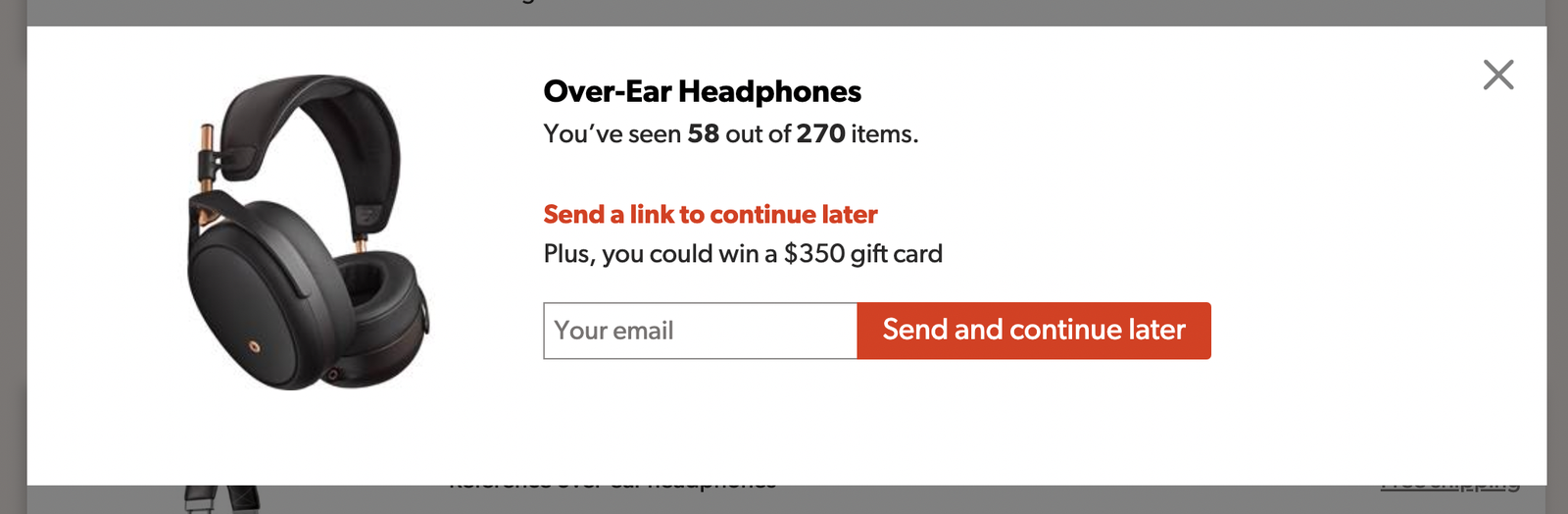
Alternatively, we could display the newsletter box directly, allowing users to copy a link to the current position on the page as well. As a positive side effect, this also gives us an option to collect users’ emails to send them a reminder about new items later.

Footer Reveal
The solution above might solve the problem with the lack of understanding of where users are, but since items will be loaded in automatically, we still have some other issues — e.g. reaching the footer. This is quite easy to solve though.
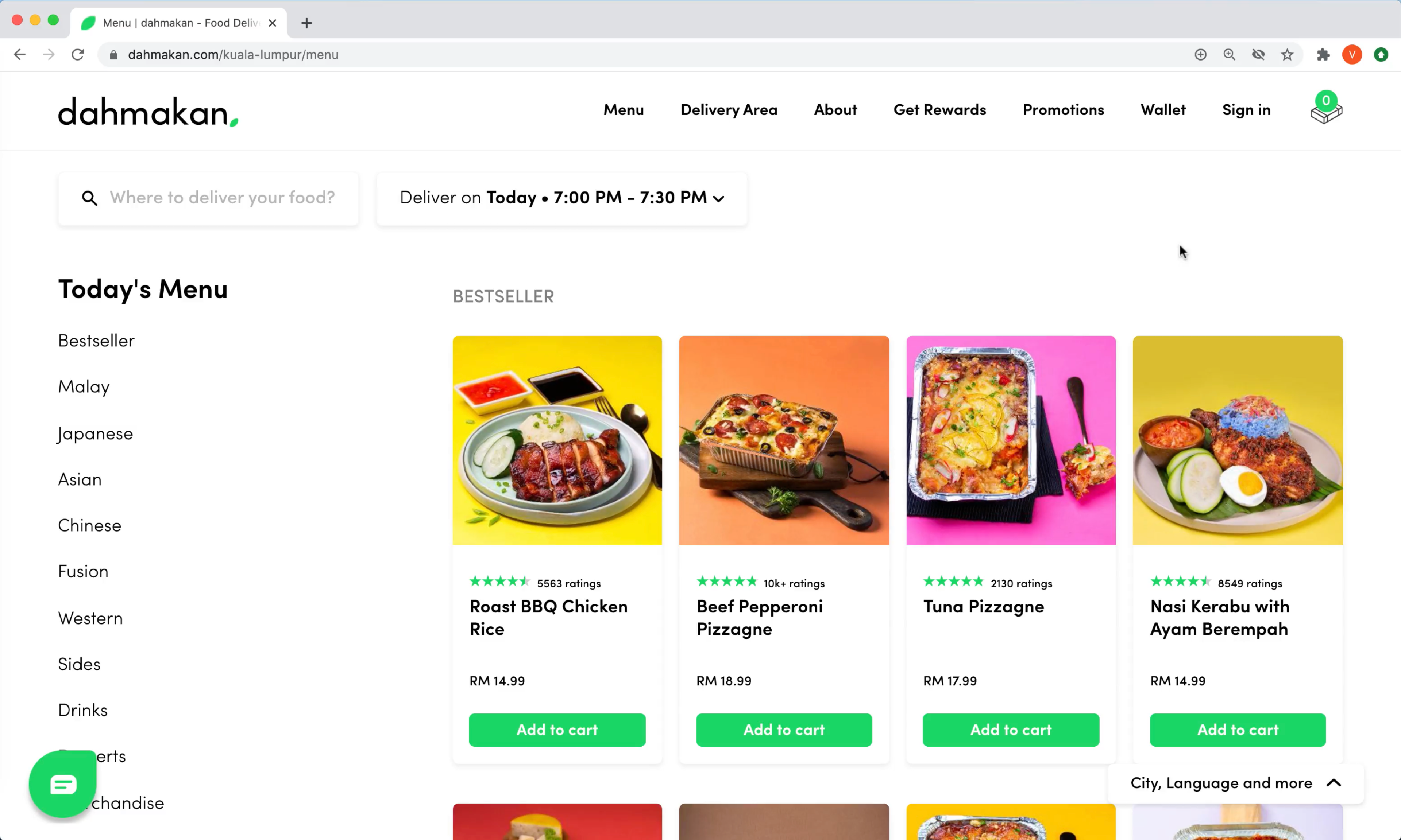
Just like we are used to sticky headers, we could integrate a footer reveal: a little helper that would stay persistent at the bottom right bar, and display the footer if needed while the rest of the page uses infinite scroll. A good example of it in action is Dahmakan, a food delivery service from Kuala-Lumpur in Malaysia (no infinite scroll in use at the moment). It’s worth emphasizing that the footer should be accessible via keyboard navigation as well, rather than just opening on click or on tap.
Combine Pagination And Infinite Scroll
As users scroll down a page and items are loaded in, we can present it as dynamic pagination to users (see Pepper.pl). On scroll, the URL of the page changes, and the page number is updated in the sticky bottom bar. Users can also navigate to a specific page in a pagination drop-down. And of course, an accordion opens up a footer on tap or click as well. Check the video example.
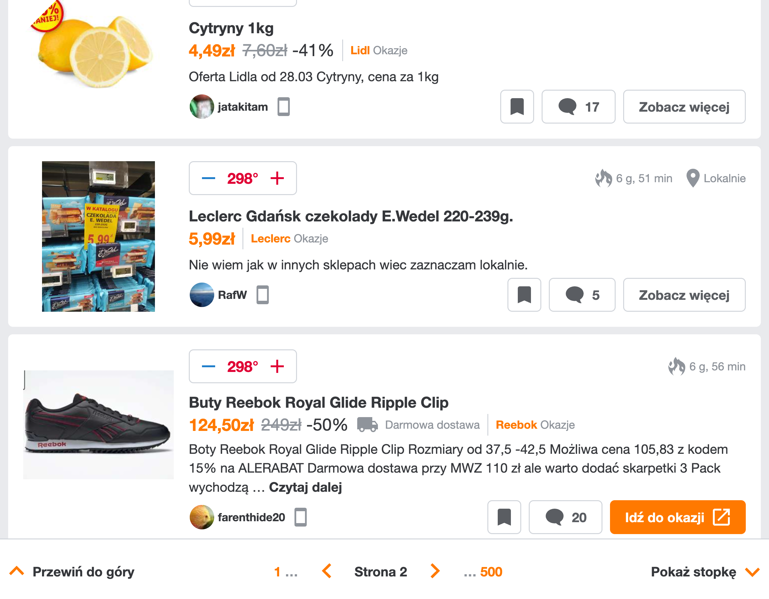
What do we do with the “Back” button though? For example, once a user has browsed through “pages” 1, 2 and 3 and now has landed on “page” 4, should a click on a “Back” button bring them from page 4 to page 3, or to the previous page that they visited before getting to the page 1 in the first place? In general, we probably don’t want to pollute users’ browsers’ history by adding every step of the infinite scroll in there. So selecting a specific page with a drop-down is indeed a good idea.
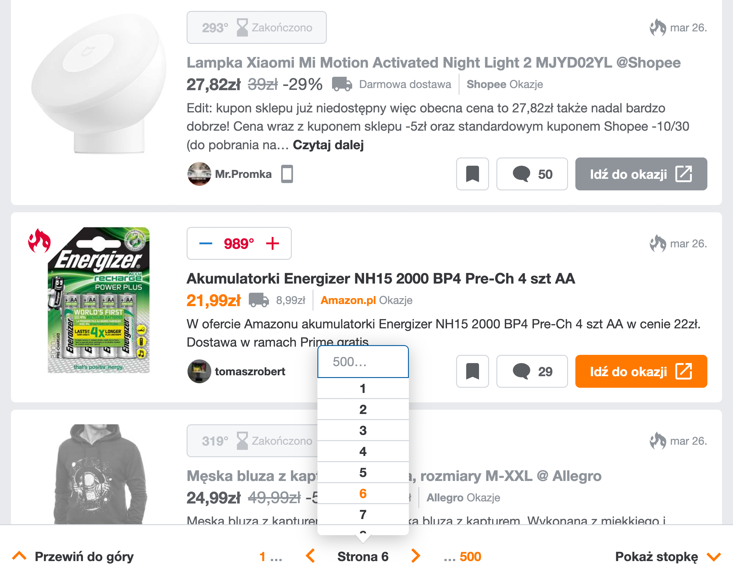
A great example of combining pagination and infinite scroll in one place; the only refinement could be slightly better focus styles and better navigation jumps for accessibility. Additionally, it would be fantastic to add some sort of a drop-down chevron next to the current page to make it obvious that one can actually jump to a specific page. The “Back” button, then, would bring the user back to the page from which they came to the list they have in front of them at the moment.
Scrollbar Range Intervals
Another useful technique is suggested by Baymard Institute, a research company for testing eCommerce sites. The idea is to make scrollbars more helpful by adding dynamic labels that are spaced out vertically. These would indicate to users where they currently are and where they can jump to. As users keep scrolling down, the labels would be shifting as the scrollbar is growing. Could be used by any criteria a user has chosen to sort the items by.

Pinning Sections On A Mini-Map
We could make it even more useful by allowing users to pin, or bookmark, areas of interest in the list, so they can return to favorites faster. An interesting prototype of such an experience is Minimap experiment (currently works only in Firefox), created by Rauno Freiberg, along with many other wonderful experiments.

Wrapping Up
With all of these techniques in place, we solved many problems that infinite scroll is known for. We now have better control of how many items appear on scroll, and can always stop browsing and continue later. We can easily spot “old” and “new” segments. The URL is being updated as the user scrolls down the page, and we allow them to copy the URL to the current position in the list as well.
Users can always reach the footer, and the scrollbar indicates where they currently are and where they can jump to. They can also jump to any specific page since we provide pagination as well. Additionally, we still need to implement infinite scroll in a way to ensure accessibility for the keyboard and announce new items. But: we make use of all the benefits that infinite scroll provides: especially the speed of browsing.
Now, all of this seems like a lot of work just to make infinite scroll better. The ultimate question of whether all the work is worth it has to be answered by the goals your users are supposed to achieve. Infinite scroll is not for every website, and an endless list of options needs to be complemented with proper filtering, sorting and search. In general, if your users are more likely to compare options or find very specific content, infinite scroll probably won’t be very useful.
However, if your users often explore many options, and browsing is a very typical attribute on your site, especially when customers add multiple items in a shopping cart or operate on a large set of data entries at once, infinite scroll might be very well worth it — but only if accessibility and performance considerations are the very heart of its design.
The ideas highlighted in this article are just that — ideas. Some of them might fail miserably in your usability tests, while others might perform fairly well. But: if you absolutely need to make infinite scroll work, there are ways and workarounds to do so — it’s just not as straightforward as it might appear at first.
Infinite Scroll Checklist
As usual, here’s a general checklist of a few important guidelines to consider when designing a better infinite scroll:
- If in doubt, always prefer pagination.
- With infinite scroll, always integrate a footer reveal.
- Consider separating “old” and “new” items visually.
- Provide an option to continue browsing later.
- Consider using “load more” + infinite scroll together.
- Consider using pagination + infinite scroll together.
- Change the URL as new items are loaded in and expose it to users.
- Allow users to jump to any page with a pagination drop-down.
- Consider using scrollbar range intervals.
- Consider allowing users to pin or bookmark items/areas of interest.
- Make sure accessibility and performance are major considerations in the implementation.
Meet Smart Interface Design Patterns
If you are interested in similar insights around UX, take a look at Smart Interface Design Patterns, our shiny new 10h-video course with 100s of practical examples from real-life projects. Design patterns and guidelines on everything from mega-dropdowns to complex enterprise tables — with 5 new segments added every year. Just sayin’! Check a free preview.

100 design patterns & real-life
examples.
10h-video course + live UX training. Free preview.
Useful Resources
- “Infinite Scrolling Is Not For Every Website,” Hoa Loranger, Nielsen Norman Group
- “UX: Infinite Scrolling vs. Pagination,” Nick Babich, UX Planet
- “Infinite Scroll: Let’s Get To The Bottom Of This,” Yogev Ahuvia, Smashing Magazine
- “Infinite Scrolling, Pagination Or “Load More” Buttons? Usability Findings In eCommerce,” Christian Holst, Smashing Magazine
If you find this article useful, here’s an overview of similar articles we’ve published over the years — and a few more are coming your way.
Related Articles
- Designing A Perfect Accordion
- Designing A Perfect Responsive Configurator
- Designing A Perfect Birthday Picker
- Designing A Perfect Date and Time Picker
- Designing A Perfect Feature Comparison
- Designing A Perfect Slider
- “Form Design Patterns Book,” written by Adam Silver
Further Reading
- How A Bottom-Up Design Approach Enhances Site Accessibility
- The Role Of Illustration Style In Visual Storytelling
- Creating An Effective Multistep Form For Better User Experience
- Alternatives To Typical Technical Illustrations And Data Visualisations


