A Guide To Hover And Pointer Media Queries

Email Newsletter
Weekly tips on front-end & UX.
Trusted by 182,000+ folks.
 Custom Web Forms for Angular, React, & Vue. Your backend.

 Celebrating 10 million developers

hover, pointer, any-hover and any-pointer.The Internet is filled with a lot of interactivity, and more often than not the way we choose to show we can interact with an element is by using the hover pseudo-class. After all, changing an element a bit when you put the cursor on it ends up being a good indicator of whether the element is interactive or not.
The main issue with this approach is when we remember the vast amount of devices we can use to browse the web: you could be reading this article right now on a cellphone, a tablet, or even on a Smart TV!
This usually isn’t a problem, because the loss of interaction isn’t a big deal. But in some cases, not taking into account the variety of devices people use can create some usability and accessibility issues on your site.
Thanks to CSS, we can detect those nuances by using four media queries (or, to be more specific, media features): hover, pointer, any-hover, and any-pointer. In this article, I will talk in detail about each one of them and show some examples of how to use those media queries to adapt your sites to the different devices available today.
Media Query Hover: Detecting A Pointer
The hover media query allows us to detect the user’s primary input mechanism can hover over elements. It can have two values:
nonedetects when the primary input mechanism can’t hover or can’t conveniently hover, like most cellphones and tablets.hoverdetects when the primary input mechanism can hover over elements (for example, desktop computers, laptops, and smartphones with a stylus).
Keep in mind that although a cell phone doesn’t have an input mechanism that can hover over elements, it can emulate this function with a long tap which can be inconvenient and create some usability issues.
With that said, let’s make a small example showing how to use this media query in action:
Let’s suppose, we have this button, and we want to change its color and its size when we hover over it, but we want this to happen only in devices that support hover. In that case, the only thing we’d have to do is to put the .button:hover rule inside the media query hover, as you can see here.
<style>
  .button {
    padding: 0.5em 1em;
    font-size: 1.125rem;
    border-radius: 0.6em;
    background-color: coral;
    font-weight: bold;
    border: 1px solid transparent;
    transition: background-color 200ms ease-in-out;
  }

  @media (hover: hover) {
    .button:hover {
      background-color: hotpink;
    }
  }
</style>

<button class="button">Hover over me</button>
This is a very basic example that doesn’t affect usability in non-hover devices. Honestly, it’d be one I’d even leave in that kind of device! Now let’s check a more complex one, where usability could be compromised at some level. Let’s take a look at this card.
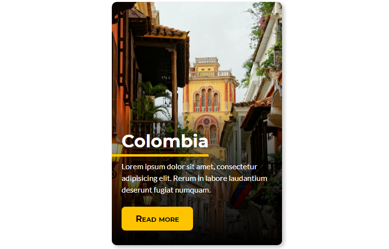
And these are the animation requirements we need to add:
- Initially, only the title (without the underline) will be visible.
- When the user hovers the card, it’ll move up revealing the space of the rest of the content.
- The card will also increase its size slightly, and the image in the background will zoom in as well.
- After that, the underline will appear at the left and will expand until the end of the title.
- When the underline animation ends, the text and the button will fade in.
With those requirements in mind, let’s add the markup and the stylesheet of this card without animations.
<article class="card">
  <img
    class="card__background"
    src="https://i.imgur.com/QYWAcXk.jpeg"
    alt="Photo of Cartagena's cathedral at the background and some colonial style houses"
    width="1920"
    height="2193"
  />
  <div class="card__content | flow">
    <div class="card__content--container | flow">
      <h2 class="card__title">Colombia</h2>
      <p class="card__description">
        Lorem ipsum dolor sit amet, consectetur adipisicing elit. Rerum in
        labore laudantium deserunt fugiat numquam.
      </p>
    </div>
    <button class="card__button">Read more</button>
  </div>
</article>
@import url("https://fonts.googleapis.com/css2?family=Lato:wght@400;700&family=Montserrat:wght@700&display=swap");

:root {
  /* Colors */
  --brand-color: hsl(46, 100%, 50%);
  --black: hsl(0, 0%, 0%);
  --white: hsl(0, 0%, 100%);
  /* Fonts */
  --font-title: "Montserrat", sans-serif;
  --font-text: "Lato", sans-serif;
}

/* RESET */

/* Box sizing rules */
*,
*::before,
*::after {
  box-sizing: border-box;
}

/* Remove default margin */
body,
h2,
p {
  margin: 0;
}

/* GLOBAL STYLES */
body {
  display: grid;
  place-items: center;
  height: 100vh;
}

h2 {
  font-size: 2.25rem;
  font-family: var(--font-title);
  color: var(--white);
  line-height: 1.1;
}

p {
  font-family: var(--font-text);
  font-size: 1rem;
  line-height: 1.5;
  color: var(--white);
}

.flow > * + * {
  margin-top: var(--flow-space, 1em);
}

/* CARD COMPONENT */

.card {
  display: grid;
  place-items: center;
  width: 80vw;
  max-width: 21.875rem;
  height: 31.25rem;
  overflow: hidden;
  border-radius: 0.625rem;
  box-shadow: 0.25rem 0.25rem 0.5rem rgba(0, 0, 0, 0.25);
}

.card > * {
  grid-column: 1 / 2;
  grid-row: 1 / 2;
}

.card__background {
  object-fit: cover;
  max-width: 100%;
  height: 100%;
}

.card__content {
  --flow-space: 0.9375rem;
  display: flex;
  flex-direction: column;
  justify-content: space-between;
  align-self: flex-end;
  height: 55%;
  padding: 12% 1.25rem 1.875rem;
  background: linear-gradient(
    180deg,
    hsla(0, 0%, 0%, 0) 0%,
    hsla(0, 0%, 0%, 0.3) 10%,
    hsl(0, 0%, 0%) 100%
  );
}

.card__content--container {
  --flow-space: 1.25rem;
}

.card__title {
  position: relative;
  width: fit-content;
  width: -moz-fit-content; /* Prefijo necesario para Firefox  */
}

.card__title::after {
  content: "";
  position: absolute;
  height: 0.3125rem;
  width: calc(100% + 1.25rem);
  bottom: calc((1.25rem - 0.5rem) * -1);
  left: -1.25rem;
  background-color: var(--brand-color);
}

.card__button {
  padding: 0.75em 1.6em;
  width: fit-content;
  width: -moz-fit-content; /* Prefijo necesario para Firefox  */
  font-variant: small-caps;
  font-weight: bold;
  border-radius: 0.45em;
  border: none;
  background-color: var(--brand-color);
  font-family: var(--font-title);
  font-size: 1.125rem;
  color: var(--black);
}

.card__button:focus {
  outline: 2px solid black;
  outline-offset: -5px;
}
Now, if we add rules for the animation, as we normally do, that’d the card’s initial state on all devices:
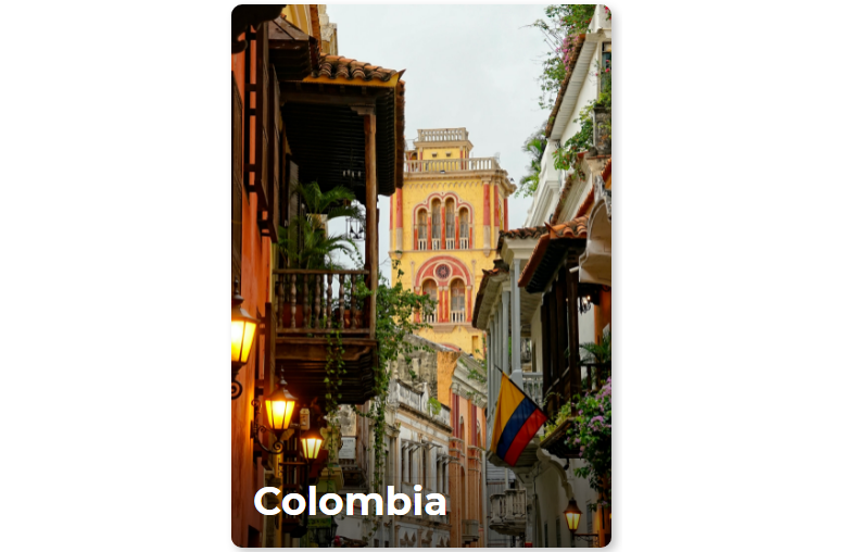
It doesn’t seem to be a problem at all in devices with a hover, but with a non-hover device the user would have to tap to see the card’s information, and that could be awkward and non-intuitive for that kind of device. Our best way to solve this is putting all the animation’s related rules inside our media query hover as follows:
@media (hover: hover) {
  .card__content {
    transform: translateY(62%);
    transition: transform 500ms ease-out;
    transition-delay: 500ms;
  }

  .card__title::after {
    opacity: 0;
    transform: scaleX(0);
    transition: opacity 1000ms ease-in, transform 500ms ease-out;
    transition-delay: 500ms;
    transform-origin: right;
  }

  .card__background {
    transition: transform 500ms ease-in;
  }

  .card__content--container > :not(.card__title),
  .card__button {
    opacity: 0;
    transition: transform 500ms ease-out, opacity 500ms ease-out;
  }

  .card:hover,
  .card:focus-within {
    transform: scale(1.05);
    transition: transform 500ms ease-in;
  }

  .card:hover .card__content,
  .card:focus-within .card__content {
    transform: translateY(0);
    transition: transform 500ms ease-in;
  }

  .card:focus-within .card__content {
    transition-duration: 0ms;
  }

  .card:hover .card__background,
  .card:focus-within .card__background {
    transform: scale(1.3);
  }

  .card:hover .card__content--container > :not(.card__title),
  .card:hover .card__button,
  .card:focus-within .card__content--container > :not(.card__title),
  .card:focus-within .card__button {
    opacity: 1;
    transition: opacity 500ms ease-in;
    transition-delay: 1000ms;
  }

  .card:hover .card__title::after,
  .card:focus-within .card__title::after {
    opacity: 1;
    transform: scaleX(1);
    transform-origin: left;
    transition: opacity 500ms ease-in, transform 500ms ease-in;
    transition-delay: 500ms;
  }
}
This is how we can solve usability issues by using media queries, but that’s not all we can do with media queries. Detecting if a dispositive has or not a hover mechanism can help us to cover some scenarios, but sometimes you need to check how accurate a pointer is, which is a nuance the hover media query can’t detect. This is where our next media query enters and helps us solve quite a common accessibility issue.
Media Query Pointer: Detecting A Pointer’s Accuracy
Sometimes detecting if a dispositive has a pointer is not enough. In some cases, it’s important to detect how accurate the pointer is. This is where our next media query enters the scene. The pointer media query helps us to detect how accurate the primary pointer device is. This media query has three values:
nonedetects when the main input mechanism doesn’t have a pointer device (for example cellphones);coarsedetects when the main input mechanism has a pointer device with limited accuracy (like the remote control of a Smart TV or some video game consoles);finedetects when the primary input mechanism has an accurate pointer device (like a mouse, touchpads, or stylus).
Now, this media query can help us to solve some common accessibility issues that happen if we don’t take into consideration that some elements on our site can be hard to interact with if you don’t have an accurate pointer. Let’s check that with an example.
Let’s create and style a quick form to check what could happen for limited-accuracy pointer device users:
<form action="post">
  <fieldset>
    <legend>Which programming languages do you want to learn?</legend>
    <div class="form-grid">
      <label for="c"> <input type="checkbox" id="c" /> C </label>
      <label for="c+"> <input type="checkbox" id="c+" /> C+ </label>
      <label for="c++"> <input type="checkbox" id="c++" /> C++ </label>
      <label for="c-sharp"> <input type="checkbox" id="c-sharp" /> C# </label>
      <label for="kotlin"> <input type="checkbox" id="kotlin" /> Kotlin </label>
      <label for="java"> <input type="checkbox" id="java" /> Java </label>
      <label for="javascript">
        <input type="checkbox" id="javascript" /> JavaScript
      </label>
      <label for="go"> <input type="checkbox" id="go" /> Go </label>
      <label for="objective-c">
        <input type="checkbox" id="objective-c" /> Objective-C
      </label>
      <label for="php"> <input type="checkbox" id="php" /> PHP </label>
      <label for="python"> <input type="checkbox" id="python" /> Python </label>
      <label for="ruby"> <input type="checkbox" id="ruby" /> Ruby </label>
      <label for="rust"> <input type="checkbox" id="rust" /> Rust </label>
      <label for="scala"> <input type="checkbox" id="scala" /> Scala </label>
      <label for="swift"> <input type="checkbox" id="swift" /> Swift </label>
      <label for="other"> <input type="checkbox" id="other" /> Another </label>
    </div>
    <button type="button">Submit</button>
  </fieldset>
</form>
@import url("https://fonts.googleapis.com/css2?family=Fira+Sans:wght@400;700&display=swap");

body {
  font-family: "Fira Sans", sans-serif;
}

fieldset {
  padding: 0.6em 1em 2em;
  border-radius: 1em;
  border-color: #722f37;
  box-shadow: 0.25rem 0.25rem 0.2rem rgba(0, 0, 0, 0.25);
}

legend {
  font-size: 1.3rem;
  text-align: center;
  font-weight: bold;
}

form {
  max-width: 53.125rem;
  margin: 0 auto;
}

input[type="checkbox"] {
  margin-inline-end: 0.5em;
  accent-color: #722f37;
}

input[type="checkbox"]:focus {
  outline: 2px solid #722f37;
  outline-offset: 0.2em;
}

label {
  display: flex;
  align-items: center;
}

.form-grid {
  display: grid;
  grid-template-columns: repeat(auto-fit, minmax(8rem, 1fr));
  gap: 0.3em;
  margin-bottom: 1.2em;
  align-items: center;
}

button[type="button"] {
  display: block;
  margin: 0 auto;
  padding: 0.3em 1em;
  color: white;
  font-weight: bold;
  background-color: #722f37;
  font-size: 1.25rem;
  border: none;
  border-radius: 0.5em;
}

button[type="button"]:focus {
  outline: 2px solid #722f37;
  outline-offset: 0.4em;
}
This form is totally fine for desktop computers or laptops, even for a stylus device, but if you need to use your fingers, you’ll find choosing an option can be bothersome — you could select an option you don’t want because of that.
This is something that happens quite often on some sites, and it could be solved if we used the pointer media query to make some minor changes for limited accuracy devices. Let’s look at some changes I made to this form to mitigate this issue:
@media screen and (pointer: coarse) {
  .form-grid {
    gap: 0.5em;
  }

  label {
    font-size: 1.05em;
  }

  input[type="checkbox"] {
    width: 1.625rem;
    height: 1.625rem;
  }

  button[type="button"] {
    min-height: 3rem;
  }
}
To summarize the changes:
- I increased the gap between options (from 4.8px to 8px), so there is less room for choosing the wrong choice. 8px is the suggested space area between tappable elements.
- Input elements’ size are bigger (from 16px to 26px), so they can be selected easier. I also increased the label size to match the input’s size increase without looking mismatched.
- Submit button’s height is now 48px, which is the average size of a tap area, just to make it easier to select the button. The button was probably big enough before this change, but I decided to increase it as an extra layer of prevention.
As you can see, with some simple changes, our site can be more accessible for users that depend on a limited accuracy pointer to navigate our site. This is pretty useful, but the real magic of the mentioned media queries happens when we start combining them to check more specific scenarios.
Combining Media Queries
Media queries’ hover and pointer are pretty interesting tools, but when you start considering certain scenarios and adding more complex interactions to your site, you’ll start noticing that using only one or another can lead to incorrect conclusions and by extension harm your site’s usability. Just to make a point, let’s come back for a moment to the card in the first section of this article (which, by the way, is a modification of this animated card made by Kevin Powell). I showed it to a friend to test if it indeed worked, and the result was… It’s still required to be tapped to show its information.
Why? Well, my friend’s phone is a Samsung Galaxy Note 9. This cell phone has a stylus as its main navigation mechanism which acts as an accurate pointer and a hover mechanism. I put the animation rules inside the media query hover with the value hover, so it’ll still show in stylus-based devices.
Do we want that for our users? That’s up to you, I honestly don’t think so, even if a cellphone has a stylus, I have seen most people prefer to use their thumbs, so I’d prefer to adapt a site keeping that into consideration.
How can we solve that? Let’s remember we can create complex media queries combining two or more media queries, and in this case, we can combine media queries hover and pointer to check specific devices.
After everything I’ve learned by talking with my friend, I decided my card should only have this animation on desktop computers and laptops. Let’s think a bit about their properties: computers are devices that have a hover input mechanism, so we should use @media (hover: hover), and said input mechanism is accurate, so we should use @media (pointer: fine), so if we put all animation rules in the media query @media (hover: hover) and (pointer: fine), our animations will display only on computers.
With that said, what kind of devices can we detect with this technique? You can check it out in this table:
| Media query hover’s value | Media query pointer’s value | Device |
|---|---|---|
| none | coarse | Smartphones, touchscreens |
| none | fine | Stylus-based screens |
| hover | coarse | Smart TVs, video game consoles |
| hover | fine | Desktop computers, laptops, touchpads |
You might think that will cover all use cases of devices and you’d be mostly correct, but some specific scenarios are not possible to detect with what we have learned here but are worth taking a look at.
Media Queries Any-hover And Any-pointer
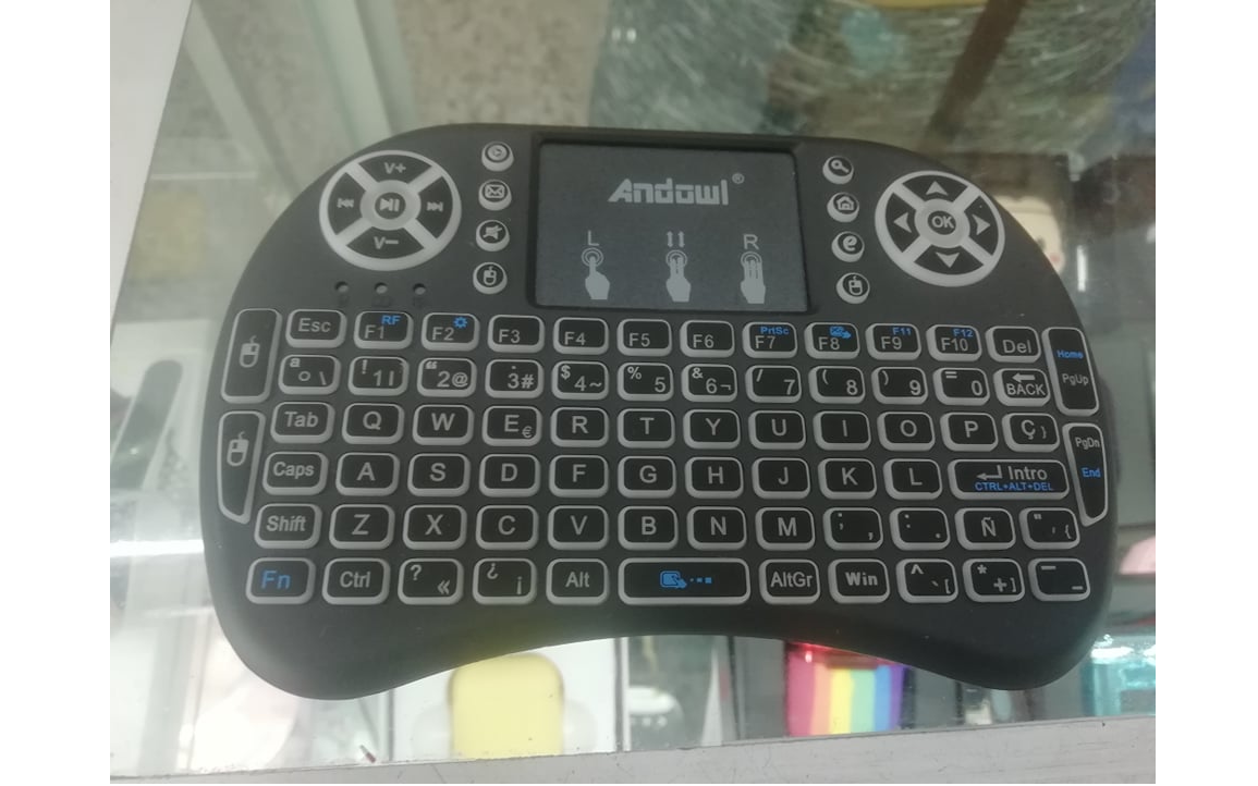
Let’s take a look at those pictures:
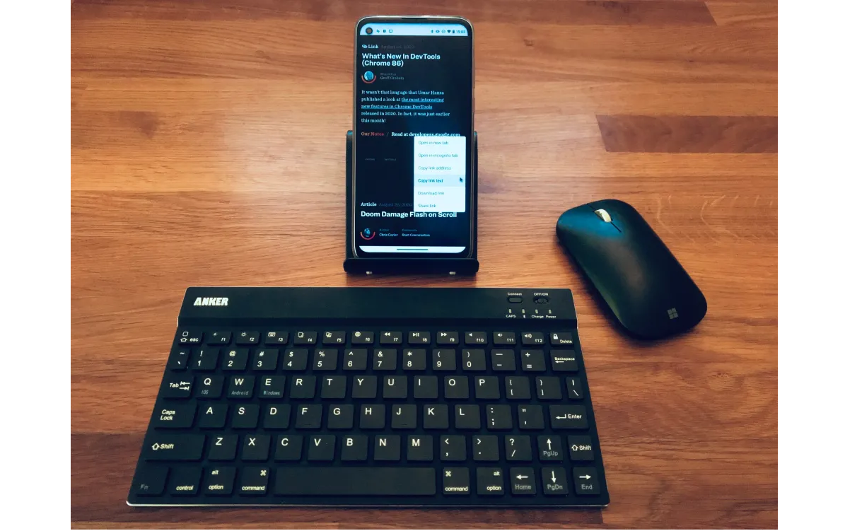
The first one is a cellphone that has a keyboard and a mouse connected via Bluetooth, while the primary pointer device of this cell phone is a touchscreen, the addition of a mouse adds an accurate pointer to it.
The second one is a mini wireless keyboard that can be used for devices like Smart TVs, X-Box, or even mobile vehicle TVs. Smart TVs’ are not very accurate, but this control has a touchpad that adds an accurate pointer to this device.
What do those two elements have in common? Both of them won’t be detected by the previously mentioned media queries, because both of them detect the primary input mechanism. How do we detect those cases? This is where once again CSS brings us two more tools to help us: media queries any-hover and any-pointer.
Those media queries have the same values as the previous one: hover and none for any-hover, and none, coarse and fine for any-pointer. The difference is that instead of detecting the main input mechanism, it’ll detect if at least one of the device’s input mechanisms meets the condition.
For example, with (any-pointer: coarse) we would be able to detect touchscreen devices, but it’ll also detect it if said device would have a mouse as well. This is important because it’ll let us detect more scenarios, such as the ones described at the start of this section.
We can even combine all 4 media queries we have seen to detect some other scenarios. For example, we could use @media (pointer: fine) and (any-pointer: coarse) to check if the main input mechanism of the device has an accurate pointer and at the same time has a limited accuracy one. This would cover devices like stylus-based smartphones or desktop computers/laptops with a touchscreen. This could be useful for adapting interactive elements like inputs and buttons and adapting them to prioritize touch interaction, in the case the user does not want to use the accurate pointer and prefers to use the touchscreen (such as the form we made in the media query pointer section).
Even if combining those media queries can be useful, you need to be careful with something in particular: the combination of browsers and pointer devices can create some unexpected bugs. As you can see in this data compiled by Patrick H. Lauke some interactions between hardware and browsers have wrong results, which can be misleading in some specific cases. This data is a bit old, but it shows us a problem that needs to be pointed out with this approach. What can we do in that case to avoid as many problems as possible with those media queries?
In my opinion, the answer to that is in keeping in mind CSS’ philosophy itself. As Myriam Suzanne mentions in her video “Why is CSS so weird?” in two moments:
“In reality, we're designing for an unknown infinite canvas, and we don't have all the variables. Rather than designing with this control over exactly what we should ship, we're designing for change, and for movement, and for adaptation.”
“So as a designer I'm no longer controlling the output, I'm suggesting and that's why CSS is a declarative language. That means that rather than describing, as we might in JavaScript, the steps to take to recreate a specific outcome, I instead describe the intent of my outcome. What am I going for? What am I pushing towards? And I'm trying to give the browser as much meaningful information as possible, subtext and implications so that the browser can make smart decisions about what to do with those styles.”
Why do we need to take this into consideration? Because how a user decides to navigate our site is one of the many things that are not under our control. Sure, the user may have a laptop with a touchscreen and normally uses the touchpad/mouse, but maybe at a moment the user wants to use the touchscreen, and if your site is not adapted for that situation, it could create a usability problem.
How can we keep as many possible scenarios into consideration then? I think the answer is that rather than applying a set of specific rules for specific scenarios, we could use what we have learned to give some directives to our site to make our site take all into consideration based on a design philosophy that includes as many users as possible.
In my opinion, a good set of practices, we should take into consideration to adapt our sites to the multiple input mechanisms we can use to browse the web, should include:
- Prioritize touch experience.
Mobile browsing is the new default, and we should keep that in mind when we design our sites. Actions like making sure interactive elements like inputs or buttons have enough size to be used in those devices (which can be checked with the media queryany-pointer: coarse) can help a lot in this task. - Don’t rely only on
pointerandhover.
The main input mechanism is not necessarily the pointer your users will rely on. However, you can use both of them to adapt your interface to specific devices, as we have seen in the previous section. That’s a good approach but use it sparingly because it can create some incorrect assumptions. - Don’t forget keyboard users.
Sure, this article is about pointers, but let’s not forget, they’re not the only way to use a site. If you are going to make an element on your site react in a complex way with a hover, you should make sure it reacts with keyboard navigation as well! Take a look at the card of the first section, it reacts to hover, but the animation is triggered by keyboard navigation using the pseudo-class:focus-within, so keyboard users’ experience doesn’t seem affected. You can alsotabindex=0attribute on an element that is not naturally navigable with a keyboard if needed. - Test your site with different hardware and browsers.
Remember, sometimes a combination of those two elements can create unexpected behaviors, so the more you test with different devices and browsers the more certainty you’ll have that your site usability works.
Use Of JavaScript At Pointer Detection
It’s also worthy to note, there are some solutions with JavaScript to the same problem, as the one explained in this article made by Mezo Itsvan. It was a plausible solution where those media queries weren’t as widely supported as now (you can see browser support for those media queries in the next links: hover, pointer, any-hover, and any-pointer)! However, in this more recent web development environment, those hacky solutions are not necessary and can generate some problems:
- Some users prefer to disable JavaScript for some reasons (like not having to deal with ads on a website), so using JavaScript to solve this problem is not always reliable.
- It can detect an existing touch device now, but what about some months later when there is a new device in the market that JavaScript can’t detect? It’d create some usability and accessibility issues in those devices which can be inconvenient.
- As Mezo himself mentions in his article, “When employing a component-based JS framework with encapsulated styles, this solution just throws a huge wrench in it. Any time hover effects are used, that component’s styles must reference this global class.” — which can be a bit inconvenient to maintain.
Even if it’s better to let this trouble to a more resilient layer of web development as CSS is, that doesn’t mean JavaScript doesn’t have a space in this matter! Something JavaScript can help us with is letting us create a choice where the user can select if our interface will be used for mouse or touch devices (in a similar vein as a dark/light mode toggle button), so you can add that extra layer of customization to your site.
Other Resources
The hover, pointer, any-hover, and any-pointer media queries have been available for a while, so many resources still apply to this day. And I didn’t cover all possible topics about pointer detection, such as using JavaScript for some cases or even the possibility to give users a choice to switch between mouse or touch layouts. You can find more information about it in these resources:
- “Interaction Media Features And Their Potential (For Incorrect Assumptions),” Patrick H. Lauke
- “Detect A Touch Device With Only CSS,” Riccardo Andreatta
- “Accessible Tap Targets,” Dave Gash, Meggin Kearney, Rachel Andrew and Rob Dodson
- Media Queries
hover,pointer,any-hoverandany-pointer, MDN Web Docs
Wrapping Up
Browsing a site is a process that can be made in multiple ways and devices. Keeping this in mind is very important because some of those cases require our site to adapt to their specific needs. CSS has media queries that can help us with this task — to give our users the best experience possible. Do you know any use of those media queries? Let us know in the comments, so we all can learn about how to use those tools to give a better user experience!
Further Reading
- Sticky Headers And Full-Height Elements: A Tricky Combination
- The Design Leader Dilemma
- Solving Media Object Float Issues With CSS Block Formatting Contexts
- Build A Static RSS Reader To Fight Your Inner FOMO
 (vf, yk, il, mrn)

