UX Metrics That Matter: A Guide To Design KPIs

Email Newsletter
Weekly tips on front-end & UX.
Trusted by 182,000+ folks.


 Celebrating 10 million developers

 Custom Web Forms for Angular, React, & Vue. Your backend.
Imagine that you’ve just received an invite to a new meeting. The description is a bit vague, but the title is sitting right there, with its heavy weight, making you a bit worried: design KPIs. Now, what do you think the meeting is going to be about?
It wouldn’t be surprising to hear about conversion rates, new A/B testing results and bounce rates; perhaps exit pages and SERPs and funnel drops. We might expect data from Google Analytics, and perhaps a report about generated leads.
What we expect to see are data points scattered across charts. Each of the data points represents a unique experience, and when put together, they represent an average behavior in our products. The average user doesn’t exist, of course, but the data helps us identify trends and changes over time. These trends are indeed valuable insights. But they also are only one part of the full story.
Hidden Costs
Over the decades, we’ve become remarkably good in digital design. We’ve learned how to craft truly beautiful interfaces and well-orchestrated interactions. And we’ve also learned how to encourage action to meet project’s requirements and drive business metrics. In fact, we can make pretty much anything work really.
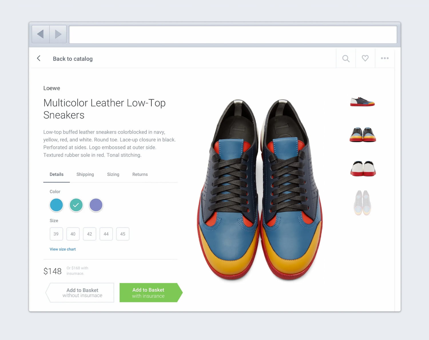
For example, in the mock-up above, the option “Add to basket” is beautifully highlighted in green, indicating a way forward, with insurance added in automatically. That’s a clear dark pattern, of course. The design, however, is likely to drive business KPIs, i.e. increase a spend per customer. But it will also generate a wrong purchase. The implications of it for businesses might be severe and irreversible — with plenty of complaints, customer support inquiries and high costs of processing returns.
Many organizations focus on a few selected business metrics, mostly leads and conversion; yet they don’t have a holistic overview of all key metrics that have an impact on the entire business. In fact, as Paul Boag explains in his recent book, there are plenty of hidden costs that often stay in the shadows of business KPIs. This usually leads to short-term improvements with expensive long-term implications.
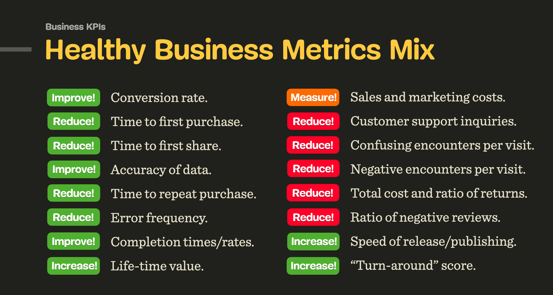
A healthy business metrics mix usually includes KPIs that go a bit beyond data from Google Analytics. We also need to consider life-time value, time to first purchase, time to upgrade, loss in processing returns, cost of support, sales, marketing, customer acquisition and ratio of negative reviews, to name a few. That’s also where another significant set of metrics comes into play — design KPIs.
Design KPIs
How can we speak objectively about a particular design? It appears to be such a subjective thing, with plenty of personal opinions and individual experiences that flow into every individual design process. Yet ultimately design solves problems, and we surely should be able to measure how well a particular problem is being solved.
In fact, just like we define performance KPIs or business KPIs, we can also establish design KPIs and track their performance over time. Design KPIs are key attributes that capture customers’ experiences for top tasks that users frequently perform in a product.
Recently I’ve started setting up dashboards of design KPIs in organizations that I work with. Together, we decide on key attributes that are important to provide a better UX, and then we track them repeatedly over time, very much like we would track other metrics in the organization.
One thing that I learned quickly is that these metrics can’t exist in isolation; they need to be connected with the business goals, e.g. describe the accuracy of submitted data, or the quality of leads, or error recovery rate. While organizations often focus on end goals alone (leads, for example), we try to discover all key attributes that contribute to reaching these end goals. These, in fact, are design KPIs.
There are, as it turns out, plenty of helpful design KPIs, but these are the ones that usually deserve special attention:
- top tasks completion rates,
- top tasks completion times,
- accuracy of data submitted by users,
- ratio of content vs. navigation (mobile/desktop),
- error frequency,
- error recovery rate (= quality of error messages),
- quality of leads,
- time to publish,
- time to release,
- time to first purchase,
- time to upgrade,
- conversion rate,
- carbon footprint impact,
- System Usability Scale Score (ideally over 75),
- accessibility score,
- web performance score.
Obviously every organization will have their own set of design KPIs. To establish them, we need to understand what attributes have an impact on business goals. One strategy that seemed to be working for me is to explore the pain points and slowdowns that the organization is aware of. This usually requires a few rounds of interviews, starting from customer support and service desk to design and engineering teams.
The metrics listed above are much more focused around the actual user experience and user behavior, rather than ambiguous data points in analytics that represent an average behavior. Of course, we also need to keep track on these KPIs as time evolves. And this requires measurements.
Measuring Design KPIs
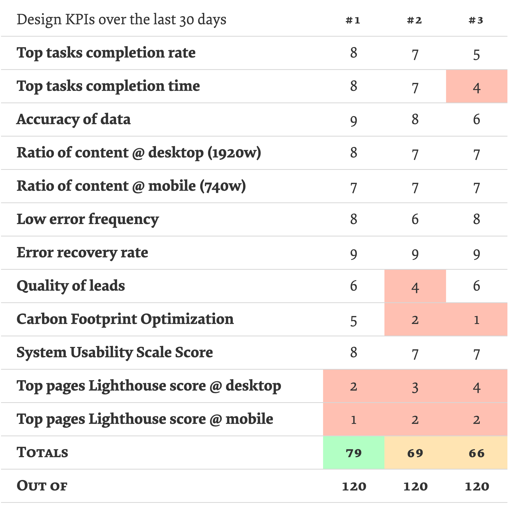
Once we have defined the KPIs, how do we measure them? We can rely on Gerry McGovern’s Top Tasks approach and identify the most frequent tasks that users complete in a product. We conduct research to discover the most important tasks. We study search queries and server logs, run user interviews and workshops with stakeholders.
Once we have that list, we bring users in to vote on the tasks that they consider to be important for them. Then we write down task instructions for each top task. These instructions will be handed to users in usability tests to validate that they can actually complete these tasks successfully. Usually, you might not need more than 20-30 people to participate in each test.
Finally, we run tests with the same task instructions to the same segments of users, repeatedly, every 8–12 weeks. Based on these tests, we measure and plot success rates and completion times over time. As long as we improve our design KPIs, we should be on the right path. And we have data to prove it!
Design KPIs help us stay on track in driving metrics that actually matter. With them, we can gradually improve UX over time and gain evidence that our design decisions are actually effective in practice.
Wrapping Up
It’s worth noting that the definition of design KPIs should have a significant impact on how the quality of work is measured. Rather than focusing on the amount of produced pages or websites, bounce rates or click rates alone, we should be aligned towards producing quality content that is useful for people consuming that content.
Next time you are working on a project, consider establishing design KPIs alongside business KPIs and create a more holistic and healthy mix of metrics that capture user experience and business goals. In the end, both sides will only benefit from it, with a sustainable and effective strategy that keeps users and business stakeholders happy.
One More Thing
If you are interested in similar insights around UX, take a look at Smart Interface Design Patterns, a 10h-video course on UX and interface design, from accordions and dropdowns to complex tables and intricate web forms. Check a free preview.

100 design patterns & real-life
examples.
10h-video course + live UX training. Free preview.
Further Reading
- The Role Of Illustration Style In Visual Storytelling
- The Human Element: Using Research And Psychology To Elevate Data Storytelling
- Navigating The Challenges Of Modern Open-Source Authoring: Lessons Learned
- The Case For Minimal WordPress Setups: A Contrarian View On Theme Frameworks


