Manage Accessible Design System Themes With CSS Color-Contrast()

Email Newsletter
Weekly tips on front-end & UX.
Trusted by 200,000+ folks.


alt text for images and labels for form fields, but another to define an accessible color palette. From working with design handoffs to supporting custom themes in a design system, the CSS color-contrast() function can become a cornerstone for developers in enforcing sufficiently contrasting and accessible UIs.There’s certainly no shortage of design systems available to use when building your next project. Between IBM’s Carbon, Wanda and Nord, there are plenty of terrific design systems to choose from. Yet, while each one contains its own nuances and opinions, most share a similar goal — simplifying the development process of creating beautifully accessible user interfaces.
It’s an admirable goal and, honestly, one that has led me to shift my own career into design systems. But a core feature at the foundation of many design systems is the extensibility for theming. And why wouldn’t it be? Without some flexibility for branding, every product using a particular system would look the same, à la Bootstrap around 2012.
While providing support for custom themes is vital, it also leaves the most well-intentioned system’s accessibility at the mercy of the implementation. Some teams may spend weeks, if not months, defining their ideal color palette for a rebranding. They’ll labor over each shade and color combination to ensure everything is reliable, informative, and accessible.
Others simply can’t and/or won’t do that.
It’s one thing to require alt text on an img element or a label for an input element, but enforcing accessible color palettes is an entirely different beast. It’s a beast with jagged yellow teeth, fiery-red eyes, and green scales covering its body like sheets of crocodile armor.
At least you think it is. For all you know, it could be a beast of nothing more than indistinct shades of black and slightly darker black.
And therein lies the problem.
The CSS Color-Contrast() Function
"Building inclusive products doesn’t mean supporting devices but supporting the people using them."
The CSS color-contrast() function is an experimental feature which is currently a part of Color Module 5. Its purpose — and the reason for the excitement of this article — is to select the greatest contrasting color from a list when compared against a base color.
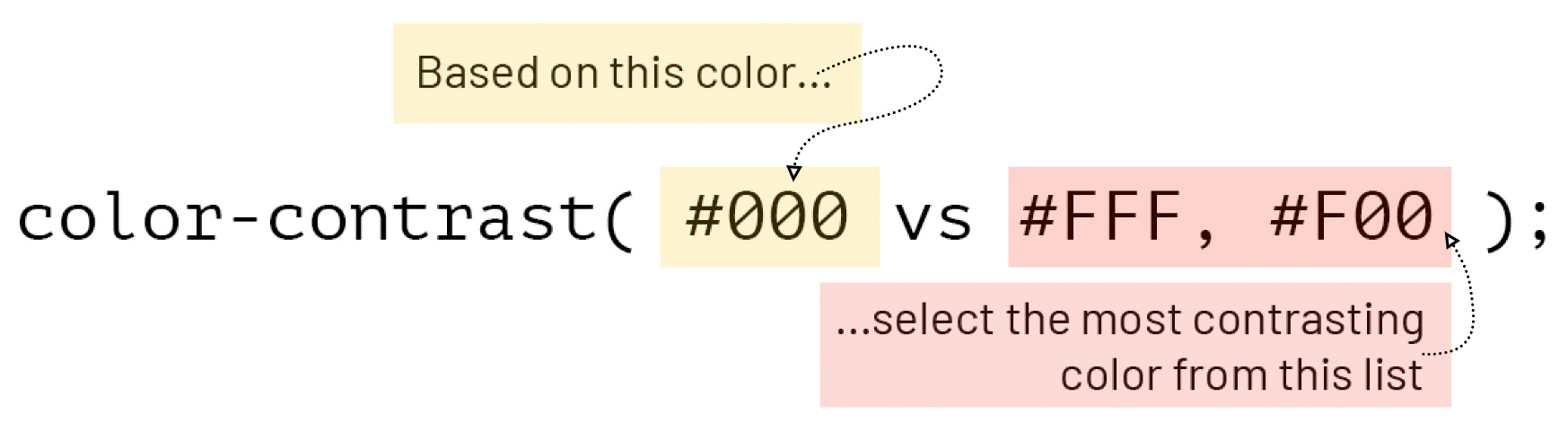
color-contrast requires a base color and a color list. (Large preview)For the sake of this article, we will refer to the first parameter as the “base color” and the second as the “color list.” These parameters can accept any combination of browser-supported CSS color formats, but be weary of opacities. There’s an optional third parameter, but let’s look at that later. First, let’s define what we mean by this being an experimental feature.
At the time of writing, the color-contrast() feature is only available in the Safari Technology Preview browser. The feature can be toggled through the Develop and Experimental Features menus. The following demos will only work if the feature is enabled in that browser. So, if you’d like to switch, now wouldn’t be the worst time to do so.
Now, with the base syntax, terminology, and support out of the way, let’s dive in. 🤿
Color Me Intrigued
It was Rachel Andrew’s talk at AxeCon 2022, “New CSS With Accessibility in Mind”, where I was introduced to color-contrast(). I scribbled the function down into my notebook and circled it multiple times to make it pop. Because my mind has been entirely in the world of design systems as of late, I wondered how big of an impact this little CSS feature could have in that context.
In her presentation, Rachel demoed the new feature by dynamically defining text colors based on a background. So, let’s start there as well, by setting background and text colors on an article.
article {
  --article-bg: #222;

  background: var(--article-bg);
  color: color-contrast(var(--article-bg) vs #FFF, #000);
}
We start by defining the --article-bg custom property as a dark grey, #222. That property is then used as the base color in the color-contrast() function and compared against each item in the color list to find the highest contrasting value.
| Base Color | Color List | Contrast Ratio |
|---|---|---|
#222 | #FFF | 15.9 |
#222 | #000 | 1.31 |
As a result, the article’s color will be set to white, #FFF.
But this can be taken further.
We can effectively chain color-contrast() functions by using the result of one as the base color of another. Let’s extend the article example by defining the ::selection color relative to its text.
article {
  --article-bg: #222;
  --article-color: color-contrast(var(--article-bg) vs #FFF, #000);

  background: var(--article-bg);
  color: var(--article-color);

  ::selection {
    background: color-contrast(var(--article-color) vs #FFF, #000);
  }
}
Now, as the text color is defined, so will its selection background.
See the Pen [CSS Color-Contrast() - Text and ::selection Demo [forked]](https://codepen.io/smashingmag/pen/ZErWwqy) by Daniel Yuschick.
color-contrast() for text and ::selection colorsThe color-contrast() function isn’t limited to only comparing HEX codes either. In fact, it can compare multiple color types at once. The previous example can be modified to use different color types while returning the same results.
article {
  --article-bg: rgb(34, 34, 34);
  --article-color: color-contrast(var(--article-bg) vs hsl(0,0%,100%), black);

  background: var(--article-bg);
  color: var(--article-color);

  ::selection {
    background: color-contrast(var(--article-color) vs hsl(0,0%,100%), black);
  }
}
From Pseudo-Elements To Pseudo-Classes
Setting text and ::selection colors dynamically can be intriguing, but it’s not exactly like being in a high-speed car chase with Burt Reynolds either — at least, I wouldn’t think. Text and background colors tend to be quite static. Once they’re rendered, they don’t often change.
So, let’s shift gears and focus 🥁 on interactive elements and their pseudo-classes.
"It’s essential that all interactive elements have compliant focus indicators, but it’s rarely as straight forward as creating a single, universal style."
When navigating a page by keyboard, there tends to be quite a variety of tab stops along the way — links inside of body text, buttons, and inputs, maybe even a card or a linked image. While it’s essential that each of these elements have a compliant focus indicator, it’s rarely as straightforward as creating a single, universal style. Using color-contrast() can help.
:root {
  --body-bg: #131e25;
}

button {
  --btn-bg: #ffba76;
  --btn-color: color-contrast(var(--btn-bg) vs #fff, #000);

  background: var(--btn-bg);
  color: var(--btn-color);

  &:hover {
    --btn-bg: #b15900;
  }

  &:focus {
    --color-list: var(--btn-bg), var(--btn-color), #bbb, #555;
    box-shadow: 0 0 1px 3px
      color-contrast(var(--body-bg) vs var(--color-list));
  }
}
There’s a lot going on in this snippet demonstrating the potential of color-contrast(), so let’s go through it.
The --btn-bg custom property is used as the base color in selecting the --btn-color value. Anytime --btn-bg changes, --btn-color will be redefined as well. This is leveraged in the :hover state, doing away with pairing button colors manually and letting color-contrast() do it automatically.
The :focus styles is where this approach can be expanded by using the --body-bg custom property as the base color. It’s compared to the current button styles. What this provides is the ability to have contextually-aware focus styles. Should the default focus styles be too low contrast given the element’s background placement, a color matching that element can be used. Of course, the color list can also contain safe fallbacks, just in case.
See the Pen [CSS Color-Contrast() - Button and :focus Demo [forked]](https://codepen.io/smashingmag/pen/JjpXxVB) by Daniel Yuschick.
color-contrast() on button :hover and :focus pseudo-classesThe requirements for compliant focus indicators stretch beyond the scope of this article, but Stephanie Eckles’ presentation, “Modern CSS Upgrades To Improve Accessibility” covers them in great detail and with clear examples.
Define A Target Contrast Ratio
Earlier, I may have been a touch blasé about the optional third parameter for color-contrast(). When in reality, this is where the feature showcases its potential.
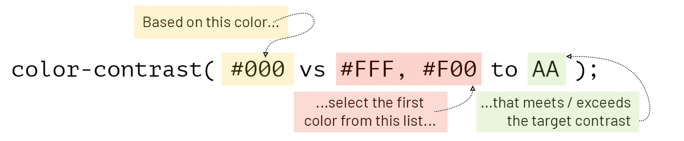
color-contrast. (Large preview)The optional third parameter for color-contrast() defines a target contrast ratio. The parameter accepts either a keyword — AA, AA-large, AAA, and AAA-large — or a number. When a target contrast is defined, the first color from the color list that meets or exceeds it is selected.
See the Pen [CSS Color-Contrast() - Target Contrast Ratio Demo [forked]](https://codepen.io/smashingmag/pen/dydMryr) by Daniel Yuschick.
When a target contrast is defined, color-contrast() will return the first value from the color list that meets the target. However, when no value in the color list meets the target contrast, it’s where the magic happens.
h1 {
  color: color-contrast(#000 vs #111, #222 to AA);
}
Looking at the base color of black and the color list of two dark shades of grey, there’s no value that would meet the AA (4.5) target contrast. So, what happens?
If the color list does not contain a value that meets the target contrast, CSS will fill in the blanks with one that does — either black or white.
See the Pen [CSS Color-Contrast() - Target Contrast Demo [forked]](https://codepen.io/smashingmag/pen/XWZdGmq) by Daniel Yuschick.
This is where color-contrast() could really empower design systems to enforce a specific level of accessibility.
Let’s break this down.
.dark-mode {
  --bg: #000;
  --color-list: #111, #222;
}

.dark-mode {
  background: var(--bg);
  color: color-contrast(var(--bg) vs var(--color-list));

  &.with-target {
    color: color-contrast(var(--bg) vs var(--color-list) to AA);
  }
}
The magic here happens when the two color declarations are compared.
The base .dark-mode class does not use a target contrast. This results in the color being defined as #222, the highest contrasting value from the color list relative to its base color of black. Needless to say, the contrast ratio of 1.35 may be the highest, but it’s far from accessible.
Compare this to when the .dark-mode and .with-target classes are combined, and a target contrast is specified. Despite using the same base color and color list, the result is much different. When no value in the color list meets the AA (4.5) target contrast, the function selects a value that does. In this case, white.
This is where the potential of color-contrast() is the brightest.
In the context of design systems, this would allow a system to enforce a level of color accessibility with very granular control. That level could also be a :root-scoped custom property allowing the target contrast to be dynamic yet global. There’s a real feeling of control on the product side, but that comes at a cost during the implementation.
There’s a logical disconnect between the code and the result. The code doesn’t communicate that the color white will be the result. And, of course, that control on the product side translates to uncertainty with the implementation. If a person is using a design system and passes specific colors into their theme, why are black and white being used instead?
The first concern could be remedied by understanding the color-contrast() feature more deeply, and the second could be alleviated by clear, communicative documentation. However, in both cases, this shifts the burden of expectation onto the implementation side, which is not ideal.
In some cases, the explicit control will justify the costs. However, there are other drawbacks to color-contrast() that will need to be considered in all cases.
Not All That Glitters Is Gold
There are inevitable drawbacks to consider, as with any experimental or new feature, and color-contrast() is no different.
Color And Visual Contrasts Are Different Things
When using color-contrast() to determine text color based on its background, the function is comparing exactly that — the colors. What color-contrast() does not take into consideration are other styles that may affect visual contrast, such as font size, weight, and opacity.
This means it’s possible to have a color pairing that technically meets a specific contrast threshold but still results in an inaccessible text because its size is too small, weight is too light, or its opacity is too transparent.
To learn more about accessible typography, I highly recommend Carie Fisher’s talk, “Accessible Typography Essentials.”
Custom Properties And Fallbacks
Since CSS custom properties support fallback values for when the property is not defined, it seemed like a good approach to use color-contrast() as a progressive enhancement.
--article-color: color-contrast(#000 vs #333, #FFF);
color: var(--article-color, var(--fallback-color));
If color-contrast() is not supported, the --article-color property would not be defined, and therefore the --fallback-color would be used. Unfortunately, that’s not how this works.
An interesting thing happens in unsupported browsers — the custom property would be defined with the function itself. Here’s an example of this from Chrome DevTools:

color-contrast() as a value. (Large preview)Because the --article-color property is technically defined, the fallback won’t trigger.
However, that’s not to say color-contrast() can’t be used progressively, though. It can be paired with the @supports() function, but be mindful if you decide to do so. As exciting as it may be, with such limited support and potential for syntax and/or functionality changes, it may be best to hold off on sprinkling this little gem throughout an entire codebase.
@supports (color: color-contrast(#000 vs #fff, #eee)) {
  --article-color: color-contrast(var(--article-color) vs #fff, #000);
}
The Highest Contrast Doesn’t Mean Accessible Contrast
Despite the control color-contrast() can offer with colors and themes, there are still limitations. When the function compares the base color against the list and no target contrast is specified, it will select the highest contrasting value. Just because the two colors offer the greatest contrast ratio, it doesn’t mean it’s an accessible one.
h1 {
  background: #000;
  color: color-contrast(#000 vs #111, #222);
}
In this example, the background color of black. #000 is compared against two shades of dark grey. While #222 would be selected for having the “greatest” contrast ratio, pairing it with black would be anything but great.
No Gradient Support
In hindsight, it was maybe a touch ambitious trying gradients with color-contrast(). Nevertheless, through some testing, it seems gradients are not supported. Which, once I thought about it, makes sense.
If a gradient transitioned from black to white, what would the base color be? And wouldn’t it need to be relative to the position of the content? It’s not like the function can interpret the UI. However, Michelle Barker has experimented with using CSS color-mix() and color-contrast() together to support this exact use case.
It’s not you, color-contrast(), it’s me. Well, it’s actually the gradients, but you know what I mean.
Wrapping Up
That was a lot of code and demos, so let’s take a step back and review color-contrast().
The function compares a base color against a color list, then selects the highest contrasting value. Additionally, it can compare those values against a target contrast ratio and either select the first color to meet that threshold or use a dynamic color that does. Pair this with progressive enhancement, and we’ve got a feature that can drastically improve web accessibility.
I believe there are still plenty of unexplored areas and use cases for color-contrast(), so I want to end this article with some additional thoughts and/or questions.
How do you see this feature being leveraged when working with different color modes, like light, dark, and high contrast? Could a React-based design system expose an optional targetContrast prop on its ThemeProvider in order to enforce accessibility if the theme falls short? Would there be a use case for the function to return the lowest contrasting value instead? If there were two base colors, could the function be used to find the best contrasting value between them?
What do you think?
Resources
- “New CSS with Accessibility in Mind”, Rachel Andrew
- “Exploring
color-contrast()for the First Time”, Chris Coyier Color-Contrast()on MDN- Support stats on caniuse.com
Color-Contrast()on W3 Color Module Level 5
Further Reading
- “When CSS Isn’t Enough: JavaScript Requirements For Accessible Components”, Stephanie Eckles
- “A Complete Guide To Accessible Front-End Components”, Vitaly Friedman
- “Making A Strong Case For Accessibility”, Todd Libby
- “Translating Design Wireframes Into Accessible HTML/CSS”, Harris Schneiderman
 (yk, nl, il, mrn)

