Designing A Perfect Language Selector UX

Email Newsletter
Weekly tips on front-end & UX.
Trusted by 182,000+ folks.

 Celebrating 10 million developers

 Custom Web Forms for Angular, React, & Vue. Your backend.
Imagine that you’ve just arrived in Tokyo. Full of impatience and excitement, you are just about to hit the road, yet there it comes: an urgent warning from your mobile provider, nudging you to top up your dwindling balance. With some justified concern, you go to the website, just to be redirected to the Japanese version of the site. You can’t read Japanese just yet, yet there is no obvious option to change the location, and there is no option to change the language either.
As the data keeps dwindling, you juggle between auto-translation and your limited VPN options — just to run out of data in the middle of the session. The language selector is somewhere there, yet it’s disguised between cryptic symbols and mysterious icons, nowhere to be found on the spot.

Chances are high that at some point you had a similar experience as well. As designers, we can of course make language selectors more obvious and noticeable, yet most of the time, the appearance of a component is only a part of the problem.
Too often, when we design interfaces, we subconsciously embed our personal assumptions, biases and expectations into our work. Of course, we can’t possibly consider all exceptions and all edge cases, along with all happy or unhappy coincidences. So we focus on the most common situations, eventually breaking a beautifully orchestrated user experience entirely for some of our disgruntled users.
Can we fix it? Absolutely! We just need to decouple presets, allow for overrides and allow users to specify their intent. But before we dive in, let’s explore what options we have in front of us.
This article is part of our ongoing series on design patterns. It’s also a part of the upcoming 4-weeks live UX training 🍣 and will be in our recently released video course soon.
The Fine Little Details Of A Language Selector
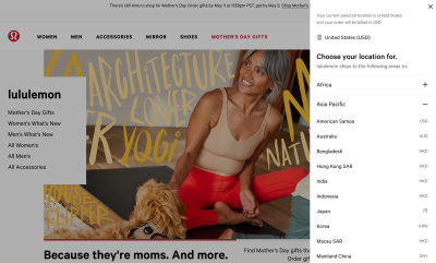
Usually, we know when we need a language selector. Every multi-lingual website will need one, and this definitely holds true for public services and companies residing in countries with multiple national languages. It is also necessary for global brands, organizations and the hospitality industry — as well as eCommerce where goods might be paid in various currencies and shipped to various destinations around the world.

Where do we place a language selector? Well, users have their usual suspects of course. In my experience, when asked to change a country or language, a vast majority of users will immediately head to the header of the page first, and if they can’t find it there, they’ll jump all the way to the bottom of the page and scout the footer next.
As for indicators of country selection, flags actually do work fairly well, and if users can’t spot them, they seek other icons that might represent a language in one way or the other — such as the globe icon or a “translation” icon. Obviously, when it comes to translations of articles or specific pages, users rely on the laws of locality and search for a selection of language next to the title of the article. So far so good.
Design-wise, however, there are plenty of intricate details that we need to account for. Surely the selector on its own will live somewhere in the footer of the page, and it is also very likely to make its appearance in the header as well. However, we could also auto-redirect users based on their location and auto-detect language based on the browser’s preferences, or prompt a modal window and ask users to select a region first. We could be using text labels or abbreviations, icons or flags, native or custom dropdowns, preferences panes or sidebars, toggles, or standalone pages.
As we will see, many of these solutions have usability issues on their own; and if we want to maximize clarity and reduce ambiguity, we need to come up with a proper strategy of how to label and group languages, how to present them, and how to make the language selector obvious to users — without running into a wild mixture of accessibility and auto-translation problems down the line.
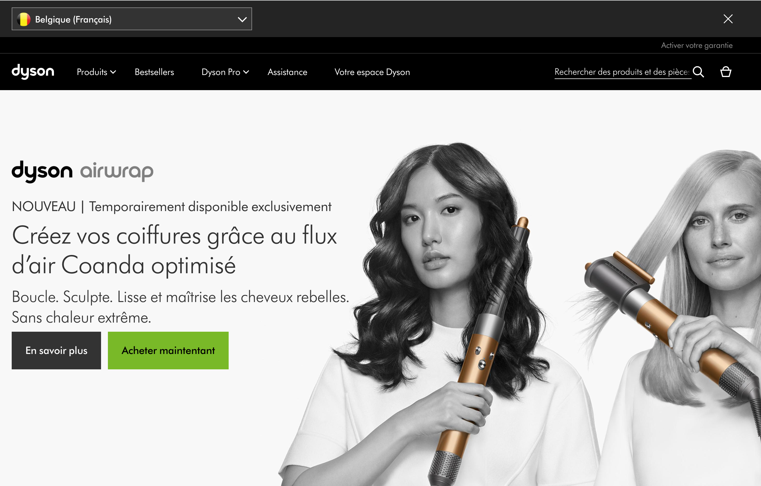
Let’s start with something that is probably obvious, but worth stating nevertheless — auto-redirects might be helpful, but they often cause more frustration and annoyance than a help.
Avoid Auto-Redirects
Many websites rely on redirects based on user’s location (IP) or browser’s language. However, if a person is located in Tokyo, it doesn’t necessarily imply that they fluently read Japanese. And if their preferred locale is Dutch, it doesn’t mean that they want to deliver physical items to the Netherlands. In the same way, if the preferred locale is French, yet it isn’t available on the site, a user might encounter a fallback language that isn’t necessarily the language that they are most comfortable with.
We can’t confidently infer users’ preferences without asking them first. That doesn’t mean that we should avoid redirects at all costs though. If a user happens to be connecting to a US website from Germany, it‘s perfectly reasonable to nudge them towards a German website. But if they happen to be connecting to a German website with an English locale preferred, it would be confusing to redirect them to the UK or US version of the site — even though it might very well be the user’s intent in some rare cases.
In general, redirects based on location are probably more instructive than redirects based on the browser’s language, but they are error-prone, too.

On the very first visit, Dyson.com nudges visitors to select the preferred region and language in the header on the page. Users can dismiss the bar and locate the language selector in the footer of the page again.
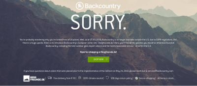
Backcountry, a US company for outdoor gear and clothing, automatically redirects its users to another site. Since 2018, the website is no longer available outside the U.S. as an answer to the GDPR regulations. Without a VPN, it’s impossible to reach the website, for example, to purchase and deliver a gift for a friend located in the U.S.
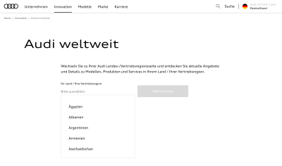
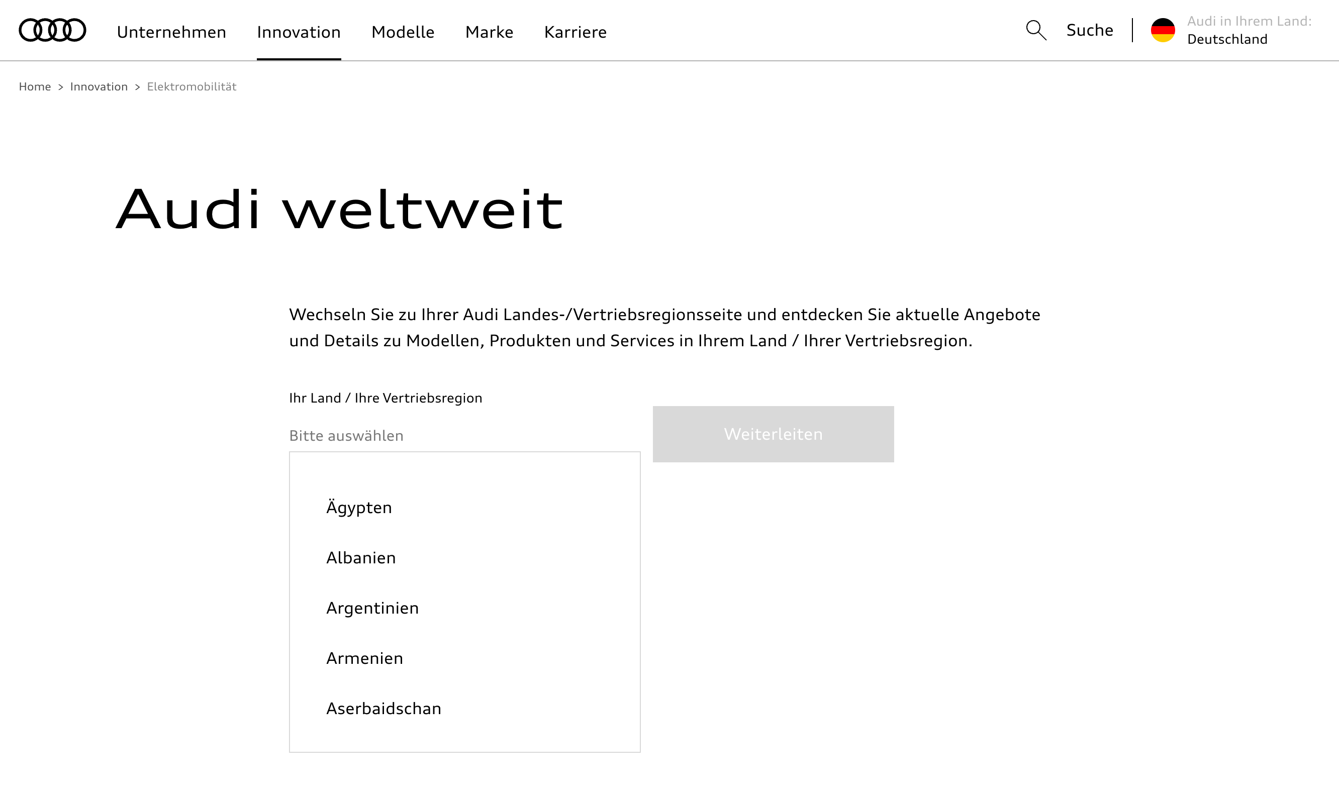
Audi automatically redirects users to a country deemed as a best fit. However, users can choose their country by clicking on the language selector in the right upper corner. On click, a modal shows up with autocomplete and a disabled “Continue” button.
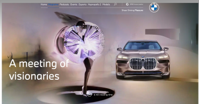
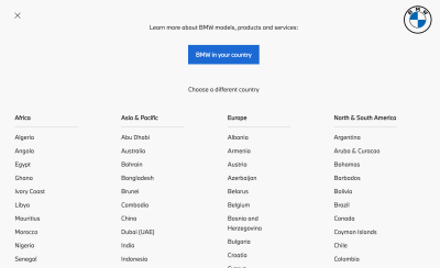
A global BMW website doesn’t automatically redirect users to any website. Instead, you can locate the “BMW in your country” option in the right upper corner of the header. It opens a modal with all the options listed, along with the prominent button at the top “BMW in your country”, which, on click, redirects users to the website considered to be the best fit for them.
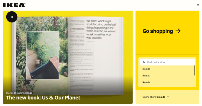
IKEA, without an automatic redirect, but with a very large country selector that understands domains, endonyms and languages of the largest countries in the world. The “Go shopping” button might be the biggest button in the world and might deserve a spot in the World Guinness Records Book. Unfortunately, on the site, you can change the country, but not always the language.
While polite nudging is reasonable, automatic redirects are not. Once we start moving users from one site to another without asking them at all, we start baking our assumptions into the design, and that’s usually a red flag. We shouldn’t be surprised by increased levels of frustration and abandonment as a result. Ironically, this data is rarely tracked or known as the abandonment is happening on the “other” website, with different departments and teams on the other side of the globe.
Either way, whether we want to nudge users towards a different website, or we absolutely need to use an auto-redirect, it’s definitely a good idea to always allow users to override redirects with manual preferences. This requires us to tame our assumptions and decouple our presets.
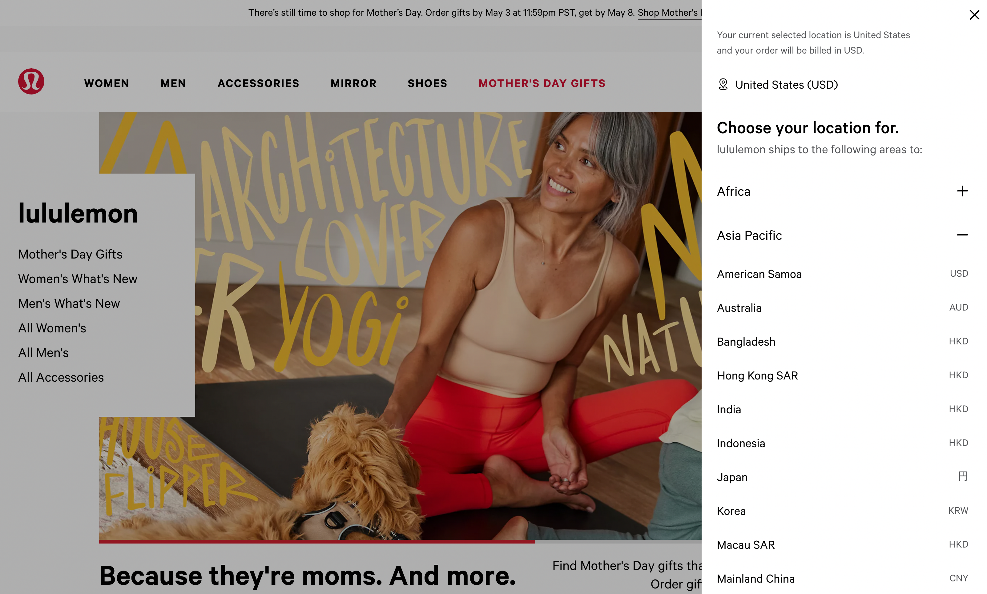
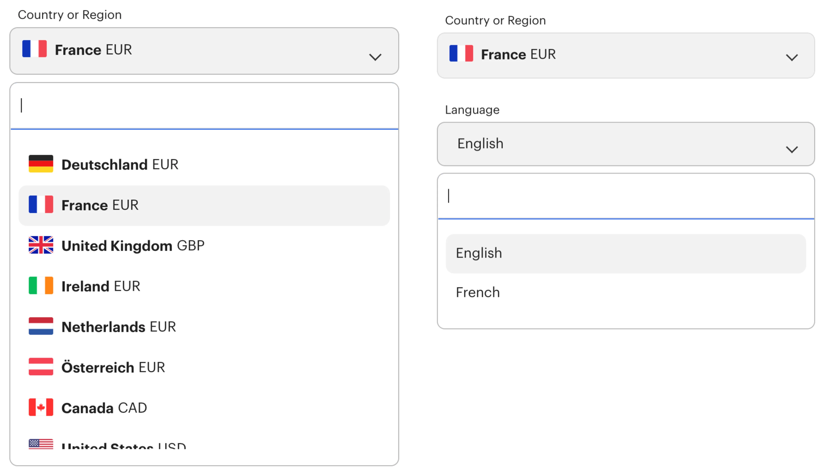
Decouple Location And Language Presets
Many websites rely on an assumption that location, language and currency are usually tightly coupled. After all, if a user chooses a location in Germany, they are very likely to prefer the German language and see prices in Euro. However, this is based on assumptions that work for many people, but break the experience entirely for others.
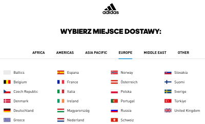
For example, if you want to purchase sneakers on Adidas from Germany but deliver them to your friend in Poland, you need to be able to make sense of the Polish language when checking out. You can either choose the German language with delivery to Germany or the Polish language with delivery to Poland. It’s impossible to select the English language with delivery options to Poland, for example. In other words, both language and location are tightly coupled.
As it turns out, there are plenty of scenarios where this assumption doesn’t work:
- A person is using a German VPN, but not be located in Germany nor understands German;
- A person is connecting from Germany, but be visiting for a few days, and they might not speak nor read German at all;
- A person is living in Germany, access a website in German, but prefers to pay with a company’s credit card in USD, rather than in EUR;
- A person is living in Germany might want to deliver an item from an American store to an American friend, but keeps getting redirected to a German website;
- A person is connecting from the USA but needs to be able to provide a VAT number because the product will be purchased by a German office with a German credit card.
Of course, we might consider all these situations to be very rare edge cases and dismiss them. But first, we need to track how many people actually experience such issues and end up leaving as a result. In practice, especially for global brands, these numbers might be more significant than one might think.
These problems appear because we frame common situations in tightly coupled and rather inflexible presets. Surely presets are useful as default options, but they break down when defaults aren’t good enough. That’s why it’s usually a good idea to decouple all presets, and allow users to make standalone choices.

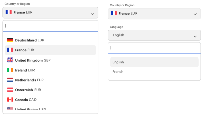
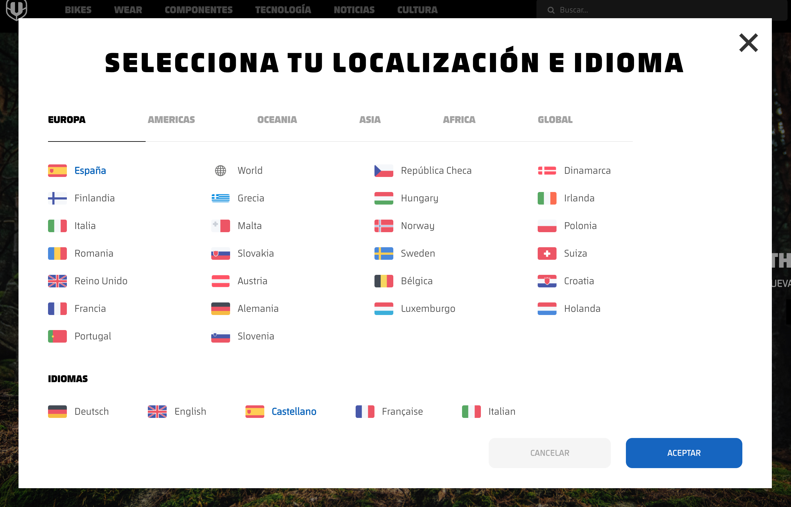
On Mondraker, users select location and language separately. All countries are grouped into tabs, and at the bottom users can choose the language of their preference. A very similar design, but a quite different approach. A downside: labeling all countries in a selected language is probably not as effective as using corresponding native labels instead.
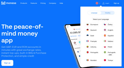
Monese shows two tabs in the right upper corner of the header. Users can switch between language and country, defining preferences for each separately.
User preferences don’t have to be limited by country and language alone. We can allow users to customize further parts of the UI, from currency and auto-translation to units of measurement and date formatting.
Allow Users To Set Custom Preferences
For many sites, language and location are just the first important attributes that convey what website might be a good fit for a customer. However, to deliver value to users, we might want to go a little bit beyond that.
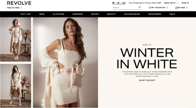
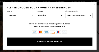
Revolve.com uses language, country and currency presets based on the user’s IP and their browser’s locale. However, users can override these presets with custom preferences. They can choose a country for shipping, the language on the site and the currency. The hint for preferences is located in the header, with a combination of a language abbreviation, flag and a currency indicator.
These details are enough to show all products with the final price that includes delivery costs to their country and in the currency that’s most familiar to them. That’s what the perfect decoupling of location, language and currency is.


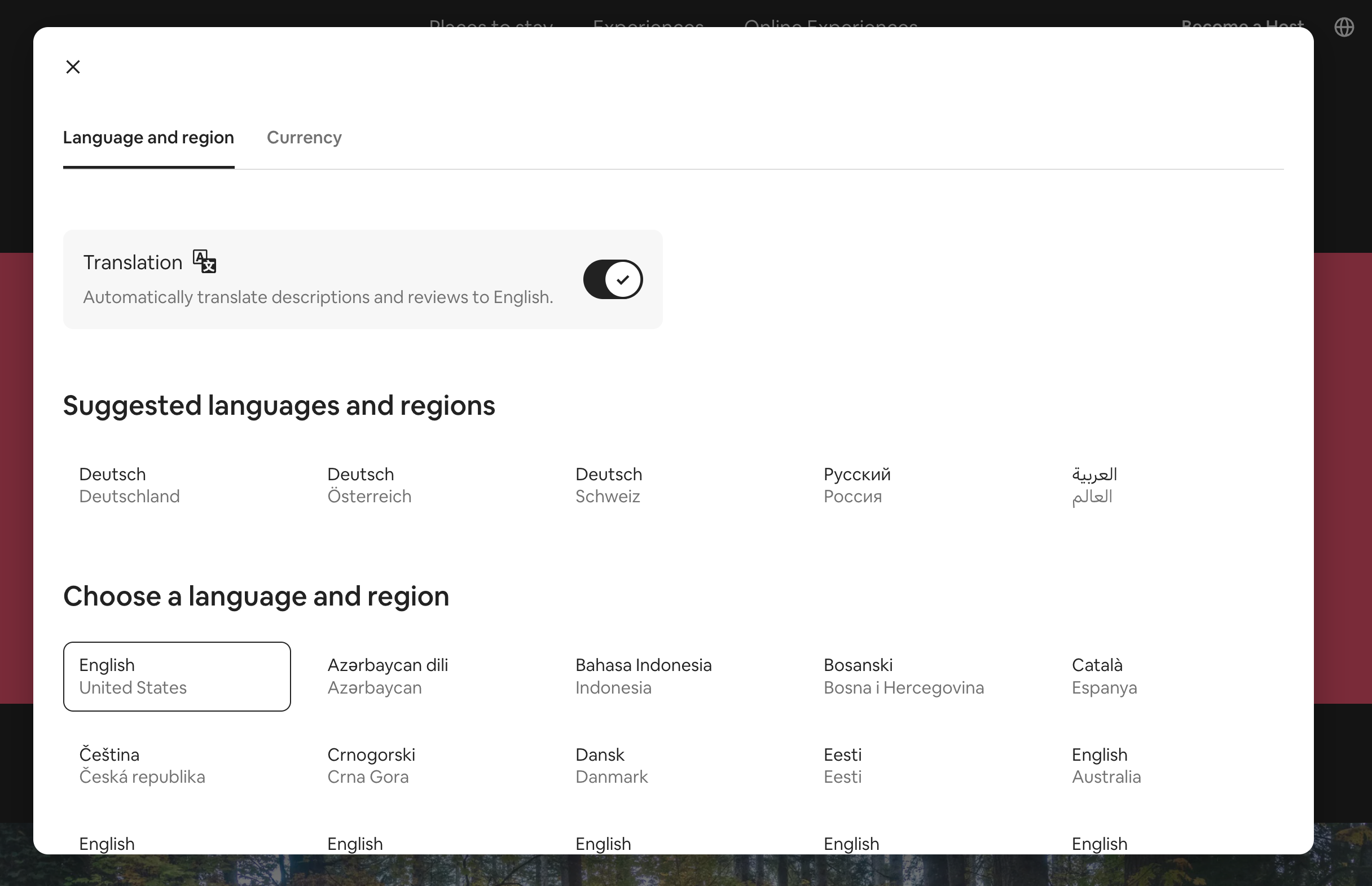
AirBnB suggests languages and regions in groups, but also allows users to adjust their preferences and choose a language and region of their choice. Additionally, users can opt-in to automatically translate descriptions and reviews to English. The modal is prompted by a tap on the globe icon in the right upper corner of the header.
Once the settings are set, users can jump from one location to another, compare prices in the same currency and see reviews automatically translate to a language that they might understand better. That’s undoubtedly a win for the users.

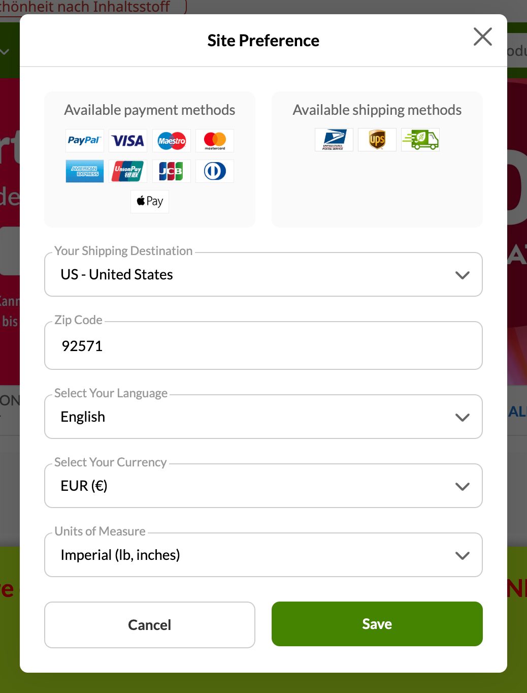
iHerb goes the extra mile by providing a whole range of additional preferences for their users. Not only can users choose their language, preferred currency and shipping destination (and specify it with ZIP code for US destinations) — they can also choose preferred units of measure and check available payment methods and available shipping methods. Bonus points for smart autocomplete input rather than a not-so-good old-fashioned <select>-dropdown.
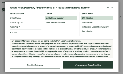
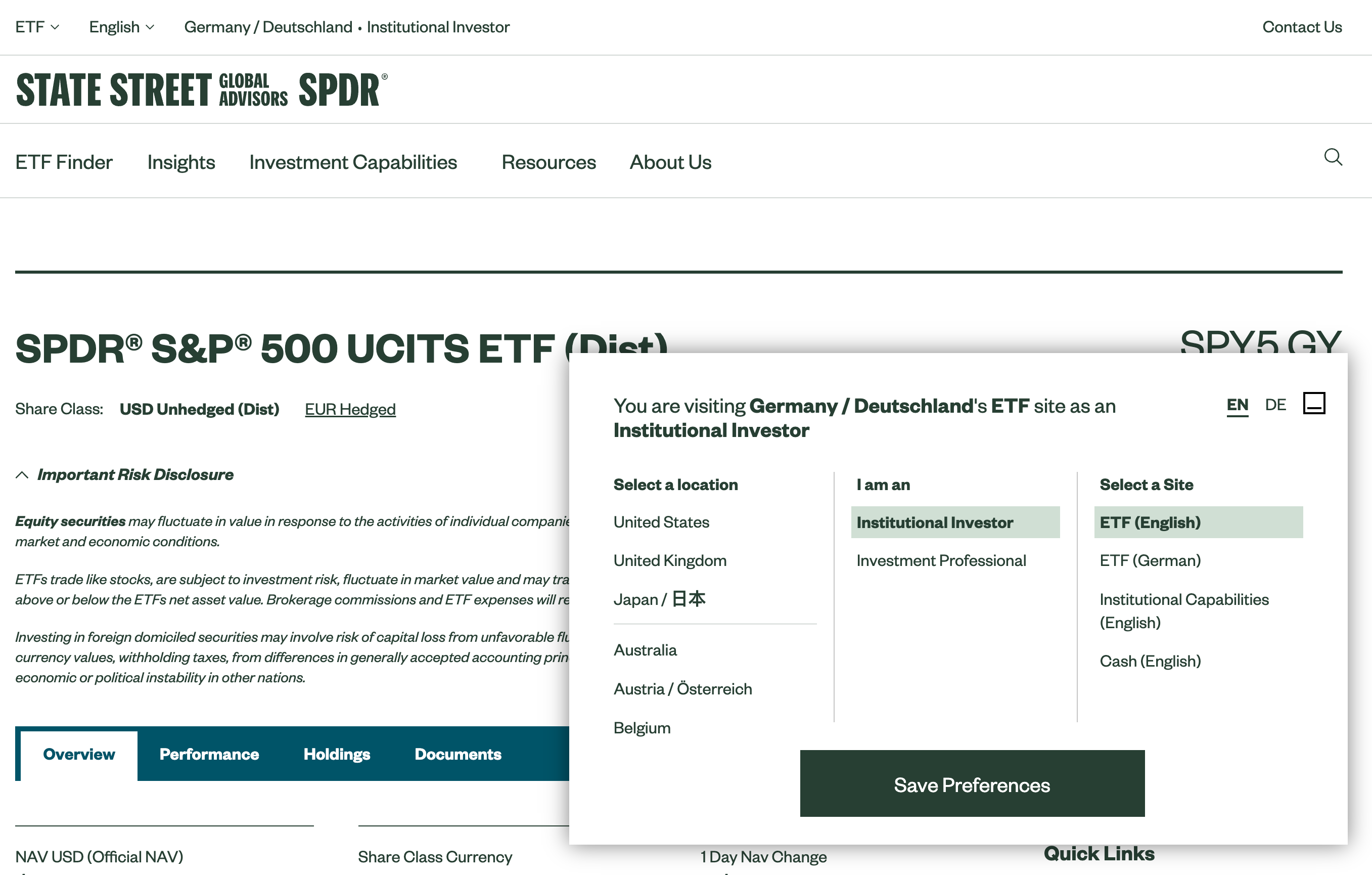
Some slightly different preferences can be defined on the State Street of Global Advisors. On the first visit, a modal window appears explaining to users some of the assumptions that the interface is making about the location and their interests. Within the modal window, users can change a location, specify their role and choose a preferred type of site for their visit.
In general, these are some of the useful adjustments that we could allow users to specify to customize the entire experience for them:
- Shipping location
- Preferred currency
- Units of measure
- Time/date formatting
- Time zones preferences
- Level of experience
The question, of course, is how to surface all these settings to the user — in a separate settings page, as a sidebar, in the header, or the footer? One disputable option is to show the settings in a modal or non-modal window upon entry to the site.
A Case For Non-Modal Dialogs
Admittedly, modal windows are rarely a good idea. They are disruptive and annoying as they require immediate attention. However, they are appropriate when we need to draw the user’s attention to important details — be it loss of data, mutually exclusive preferences or critical errors.
Some of the websites listed above prompt a modal window on the very first visit, asking users to specify their intent and their preferences before using the site. On others, default presets are silently applied, with an option to adjust them if needed — sometimes in a modal, and sometimes on a dedicated page.

While modal windows will always be noticed, usability tests show that they are often instinctively dismissed, sometimes even before users realize what content they contain. On the other hand, users often don’t pay attention to any accessory navigation such as choice of currency, measurements or shipping location as they are very much focused on products. It’s only if the change of the language is necessary that they might notice that further settings can be adjusted as well.
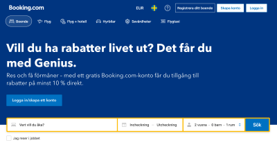
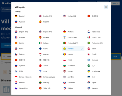

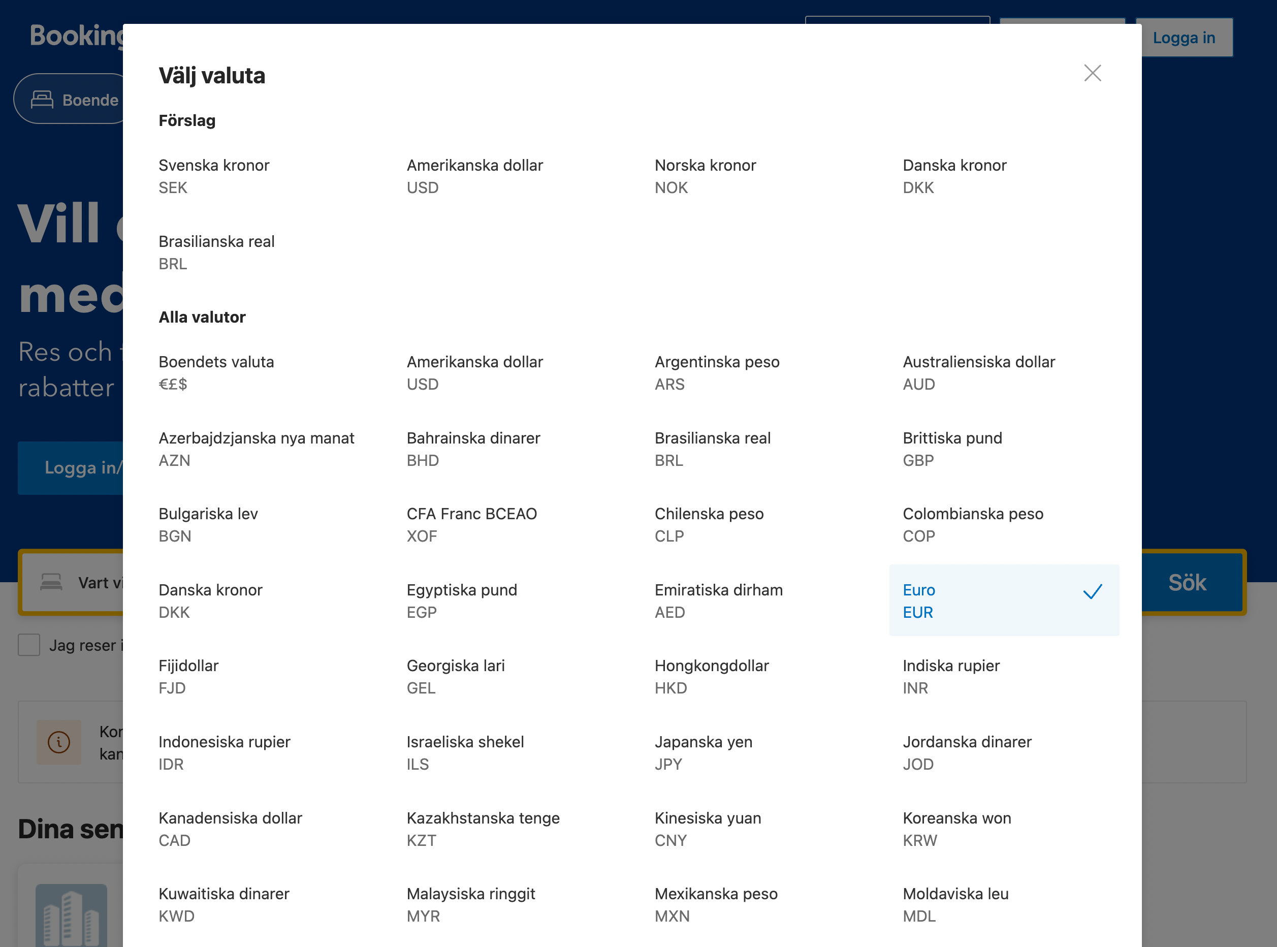
Rather than using one modal with tabs, Booking uses separate buttons in the header for currency and language. The interface infers some settings from the user and applies them directly, with an option to override these settings. Rather than using a <select>-dropdown, which is often the slowest form component, all options are displayed in plain text, hence being searchable by in-browser search.
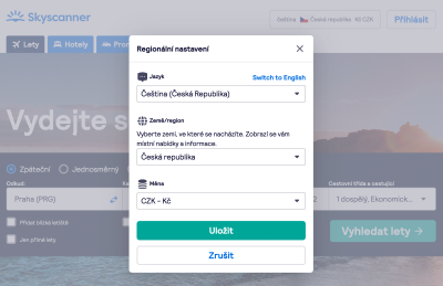
For comparison, Skyscanner allows users to prompt all customization options with one large button, grouping all options in a few drop-downs. Also, the interface always allows users to fall back to the English language if they’ve accidentally made a mistake.
Which option is better? Ultimately, this will of course be decided by usability tests. In this particular case, showing a modal window upon entry might not be a bad idea since it provides tangible value to users — a value that they might not be able to spot otherwise. However, there might be an alternative option that could work even better — using a non-modal dialog instead.
Upon website entry on Patagonia, a sticky non-modal dialog appears in the left bottom corner. Users can choose location and language and save their preferences as a cookie. They can also always bring the selection back by accessing the preferences bar in the footer.

In the mock-up above, the important content isn’t blocked by the modal; users can scroll, navigate, select and copy-paste. However, the preference pane appears in the bottom right section of the screen. It can also be collapsed or minimized, but it does require an action from the user. It is a little bit more intrusive than when silently placed in the global navigation, but is easier to discover as well.
If you aren’t certain about the best option for your project, consider adding a link in the navigation bar first. Measure design KPIs and test how they change with a non-modal option — a much less intruding and more friendly option — and ultimately a modal. Chances are high that the modals might perform better than one might think.
Click-Through Menus For Countries
Large corporations know the problem too well: navigating dozens of options in a small overlay, or even a large modal is quite cumbersome and requires a healthy dose of scrolling. So it’s not very surprising that often websites present all available options on separate pages, broken down by regions and sometimes illustrated with country flags.

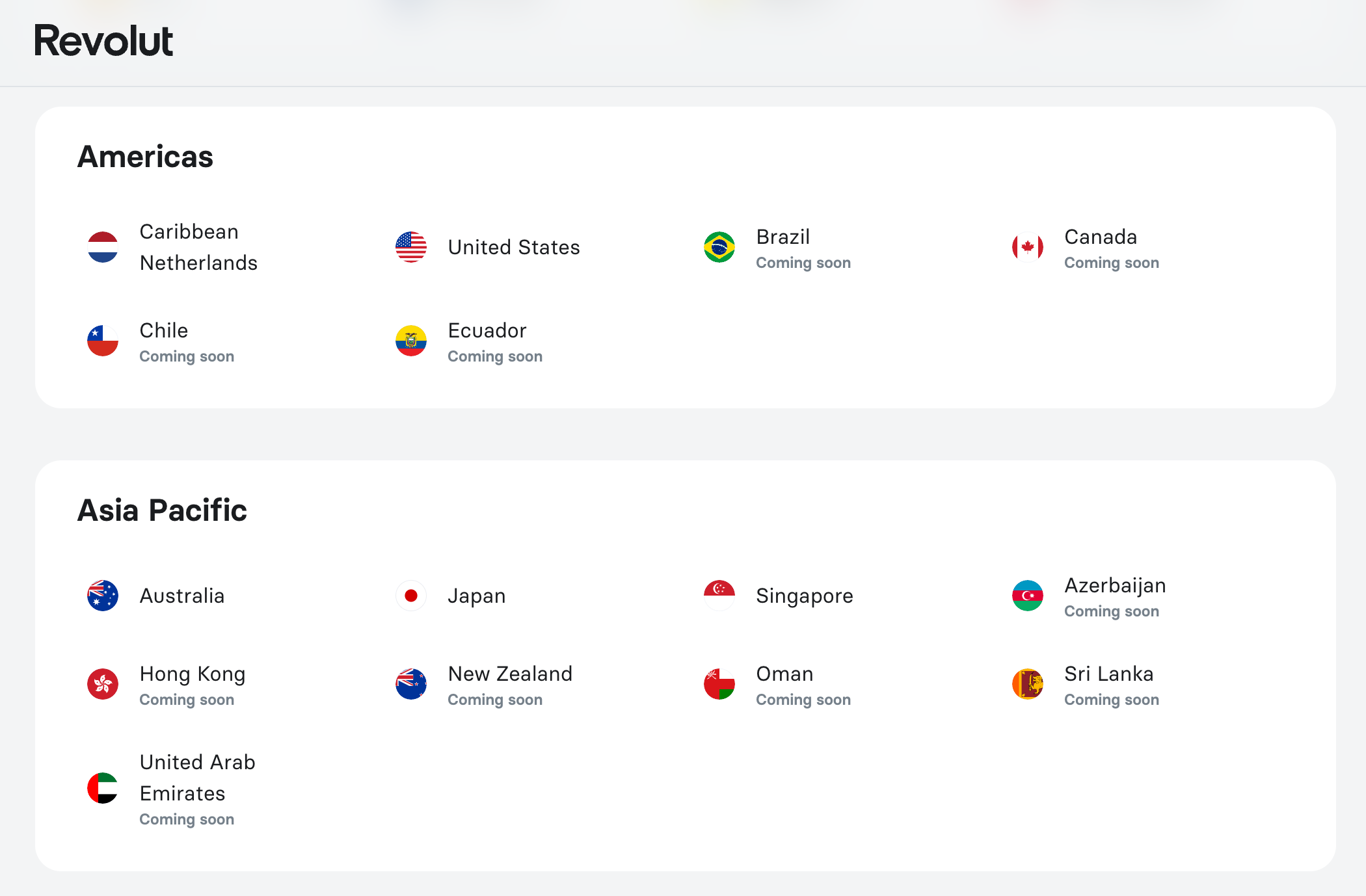
Revolut displays all available options on a separate, dedicated page. The countries are written in the English language, organized in groups and listed alphabetically. However, the page doesn’t only showcase available locations, but also locations that aren’t available yet. For this particular case, it might be a good idea to allow users to filter — e.g. hide all unavailable locations, perhaps with a toggle or tab above the list.
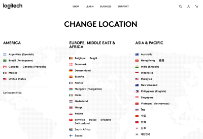
Logitech displays most languages in their local format — e.g. “Deutschland” for Germany, and “中文” for China. This eliminates the assumption that the user needs to understand English to find the country or language of their choice. On the page, all countries (and available languages) are grouped by geography and displayed across columns, making it easier for users to discover them.
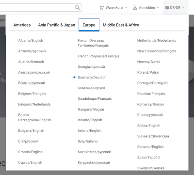
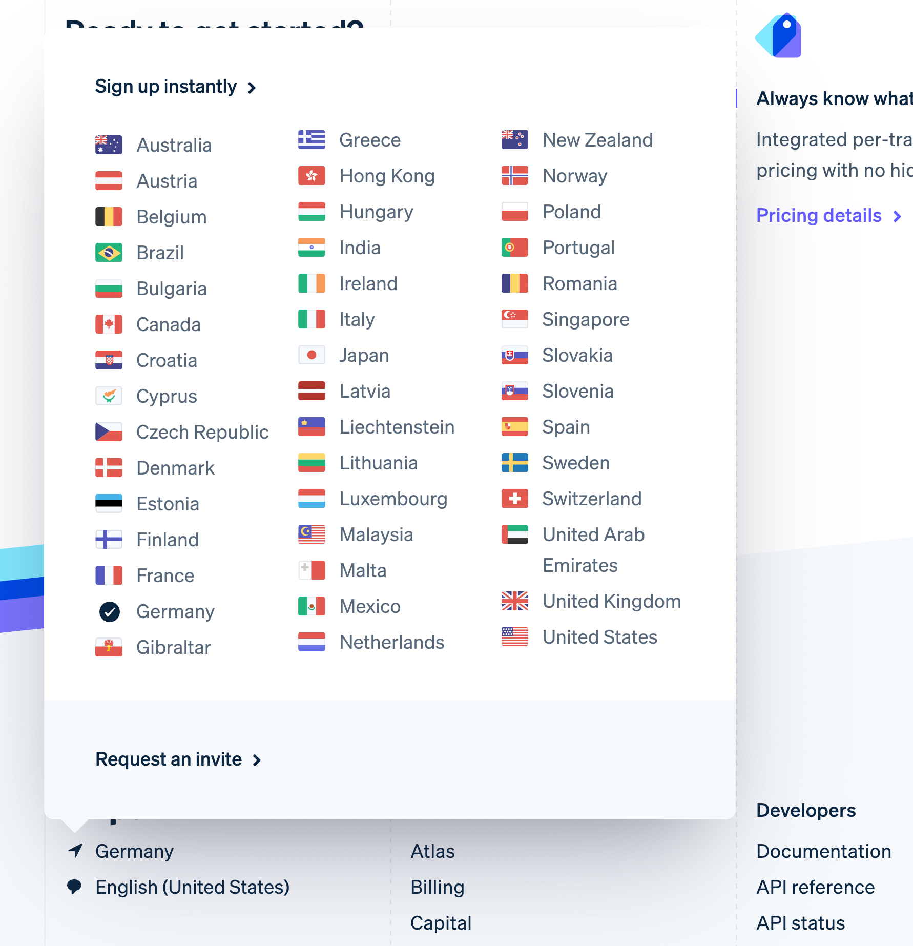
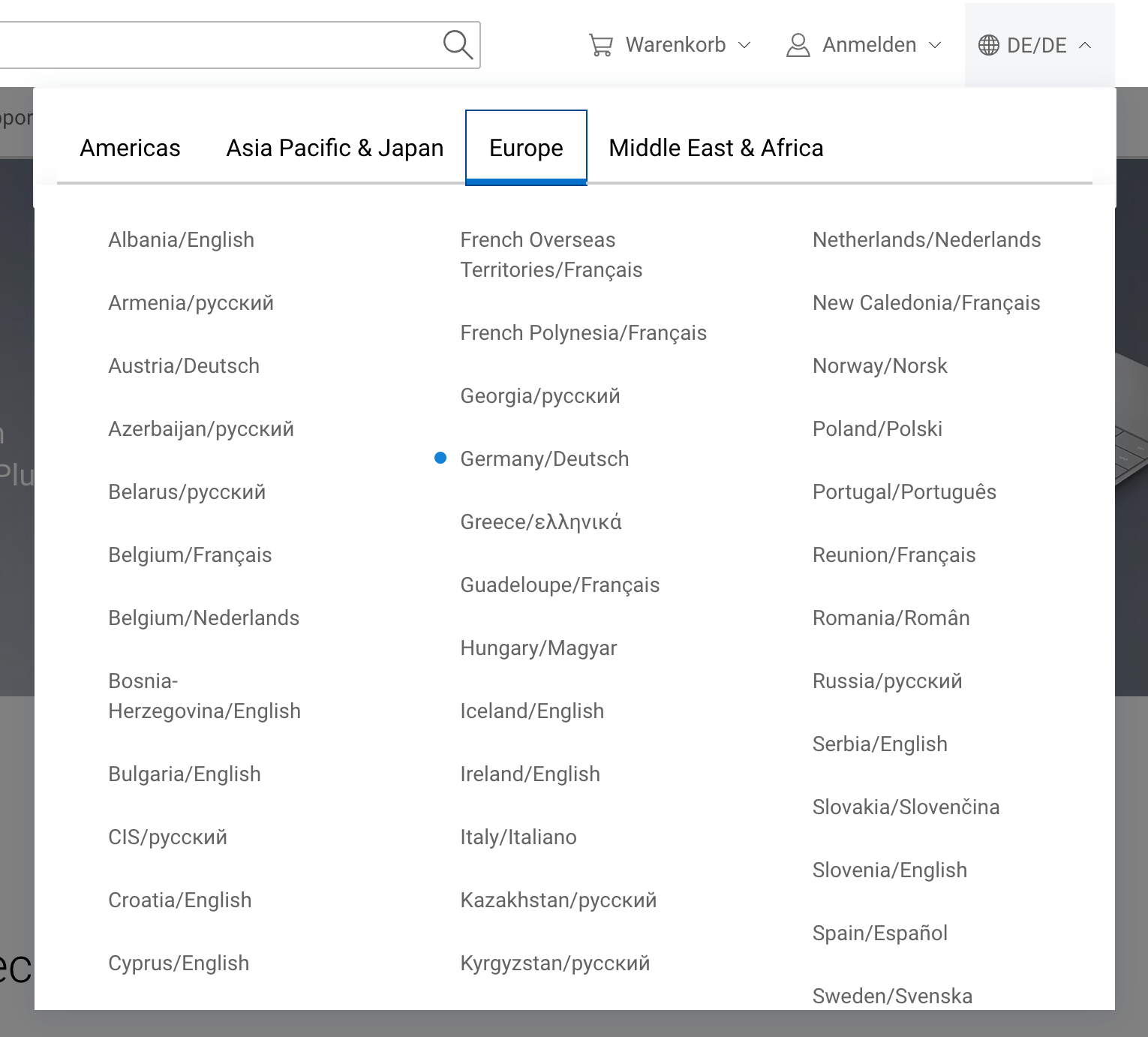
Rather than displaying all available options on one long page, Dell breaks countries by regions within tabs. No flags are being used, making the scanning a bit more difficult. Countries and languages are combined. In this case, less scrolling is required to find a location that would fit users best.
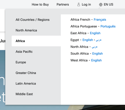
Not all tabs are alike though. Cisco uses a small overlay with vertical tabs, rather than horizontal ones. This makes the selection very compact, and the solution very straightforward. It’s worth noting that the main disadvantage of tabs is that they make the content inaccessible with an in-browser search (well, for now). The user always has to select a region first.
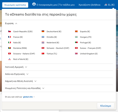
Another option, of course, is to group the countries with a vertical accordion, as it’s done on eDreams, for example. You might need a bit more vertical space as a result, but all options can be scanned from top to bottom in one go.
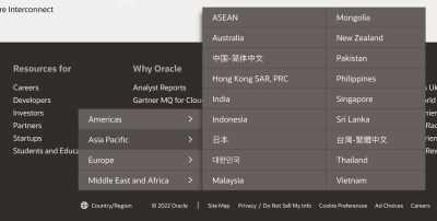
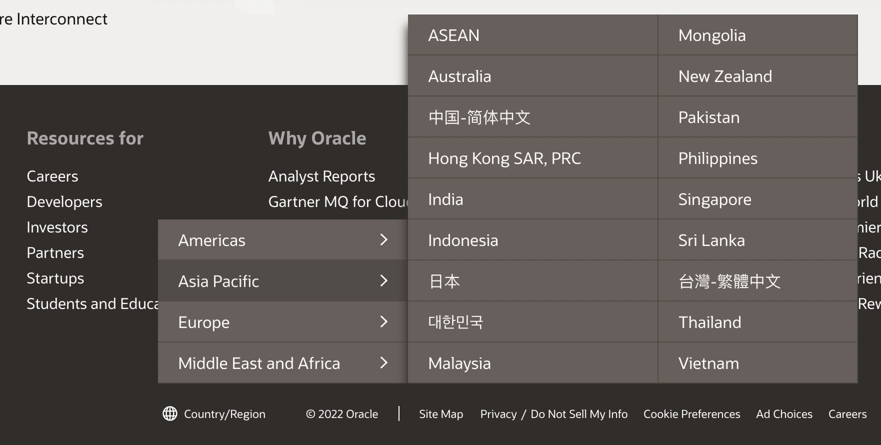
A slightly different kind of country selector on Oracle: a click-through overlay menu, with all countries grouped, rather than displaying a standalone page. That’s a very compact and straightforward solution.
If you need to display a wide range of languages, explore if you can group and display them on a single page. If it’s getting too overwhelming, consider grouping them within accordions or tabs — assuming that tabs appear like tabs and don’t contain cryptic labels. Or even better: provide users with poignant autocomplete suggestions.
Show Autocomplete Suggestions
Getting autocomplete right isn’t an easy task. This is especially difficult if we are dealing with multiple pieces of information at once, i.e. both country and language. For it to work well, we need to support frequent abbreviations, endonyms, and shorthands for all available options. And then, of course, our autocomplete suggestions should display both countries and languages, with an option to choose one option or another. Plus, we also might want to consider the support of multiple “primary” languages (English, French, Spanish, to name a few). Thats’ not easy at all!
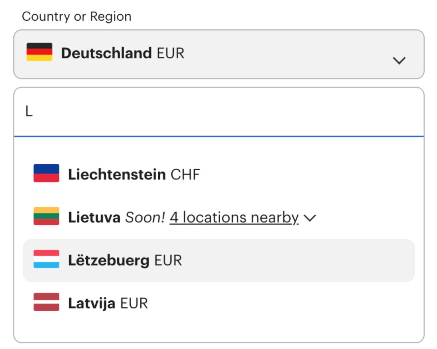
On Framework, users can select country and language separately, both with autocomplete, with the most frequent options highlighted on focus. There is no need to scroll through the list of countries to find the preferred option. While this might be perfectly enough for some scenarios, it might not be sufficient in a situation when the user’s country isn’t available in the list. Instead, we could indicate the closest locations to the preferred option, rather than guiding a user to a dead end.
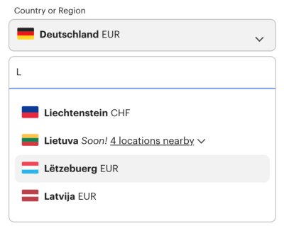
In the mock-up above, “4 locations nearby” could open an accordion, highlighting the closest locations next to Lithuania (Lietuva), indented. This pattern might not be applicable when a user is trying to open a new bank account, but it might be useful when a user is looking for a particular office in their country, but can’t locate it.
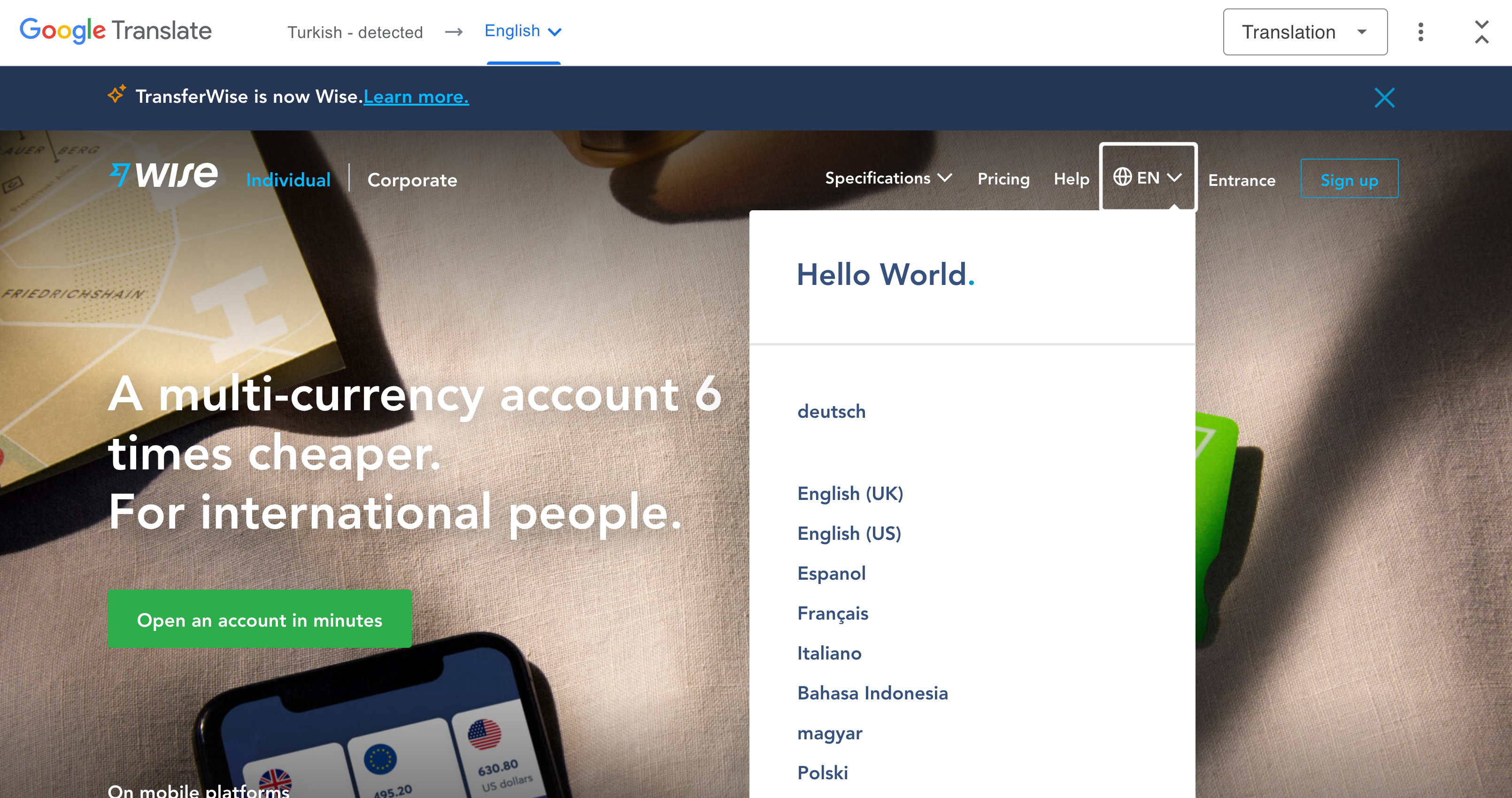
Wise also includes autocomplete for language settings. If the same language appears in multiple items, the autocomplete specifies what country it refers to. All language options are presented in their local format.
Porsche uses an accordion along with autocomplete as a page overlay. The interface supports abbreviations and indicates available options with flag icons.
Undoubtedly autocomplete is a great addition to language selection. However, when testing it, explore how people use autocomplete, and what they are actually typing to find their country. Sometimes the fine-tuning of making autocomplete work for many different languages might be an effort way too underestimated and way too time-consuming.
Grouping Countries
Not every location or language has to represent with a separate entry in the language selector. If multiple countries are speaking the same language, what if indicated by grouping countries within one option?

Daniel Marchini has come up with an interesting concept of grouping flags within a single selection. If the content will appear exactly the same for multiple countries, is it really necessary to show them separately? For example, the Portuguese language is displayed as an option for Portugal and Brazil, while the Spanish language is highlighted for Mexico and Spain. Obviously, not all countries could be grouped this way, but if you target users from specific countries, this might be worth a shot.

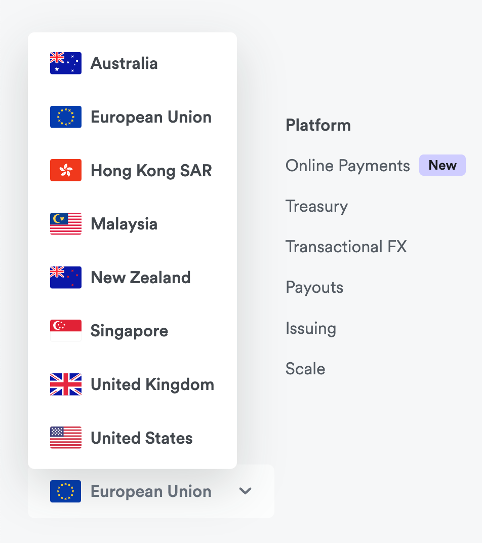
Airwallex’s country selector groups all European countries as “European Union”. The service is available in the entire European Union, so it’s not necessary to select an individual country. However, if you have a slightly longer list of options, and you are looking for an option to open a bank account in the Netherlands, you might need a bit of time to realize that the Netherlands is assumed as a country within the European Union.
Use Flags For Countries, Text Labels For Languages
When designing a country selector, it feels almost natural to think about the flags they are represented by. After all, compared to just plain text, it should be much easier for users to locate the icon that they can immediately recognize. This is indeed true, however, as James Offer has suggested in his wonderful blog on Flags are not languages, flags are specific to countries, but languages often cross borders.
We can find French-speaking people in Canada, Vietnam, Senegal, Switzerland, and many other countries. It would be inaccurate to assume that all users from these countries associate their choice of language with a French flag.

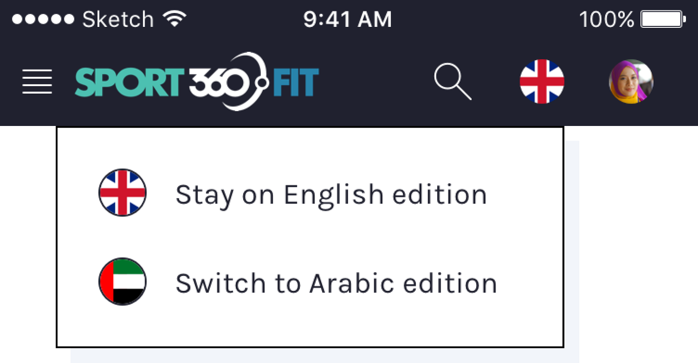
In the article “My Take On Language Selectors”, Zsolt Szilvai shows an interesting example of such a conundrum. During the usability tests of an application designed for the UAE, many people found the fact that the Arabic language was visualized with one single flag, as it is used in many countries and cannot be identified with any particular flag alone.

Curve.com opts in for a default international version which is available in English. There are a few other options available as well but one might wonder about the difference between “International (English)” and “English (United States)”. When flags are used to indicate languages, it can quickly become a little bit confusing.

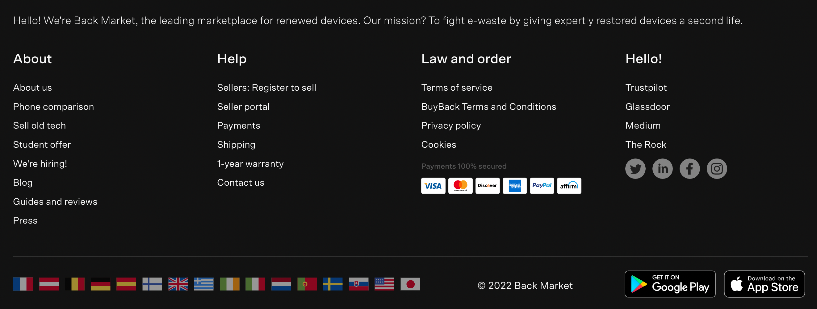
Backmarket includes a list of flags in the footer of the page to indicate local sites of the marketplace. When we want to drive users to specific local websites, we can safely use flags that best represent countries, rather than languages. Many sites also just add links in the footer instead, making language labels easier to find with an in-browser search.

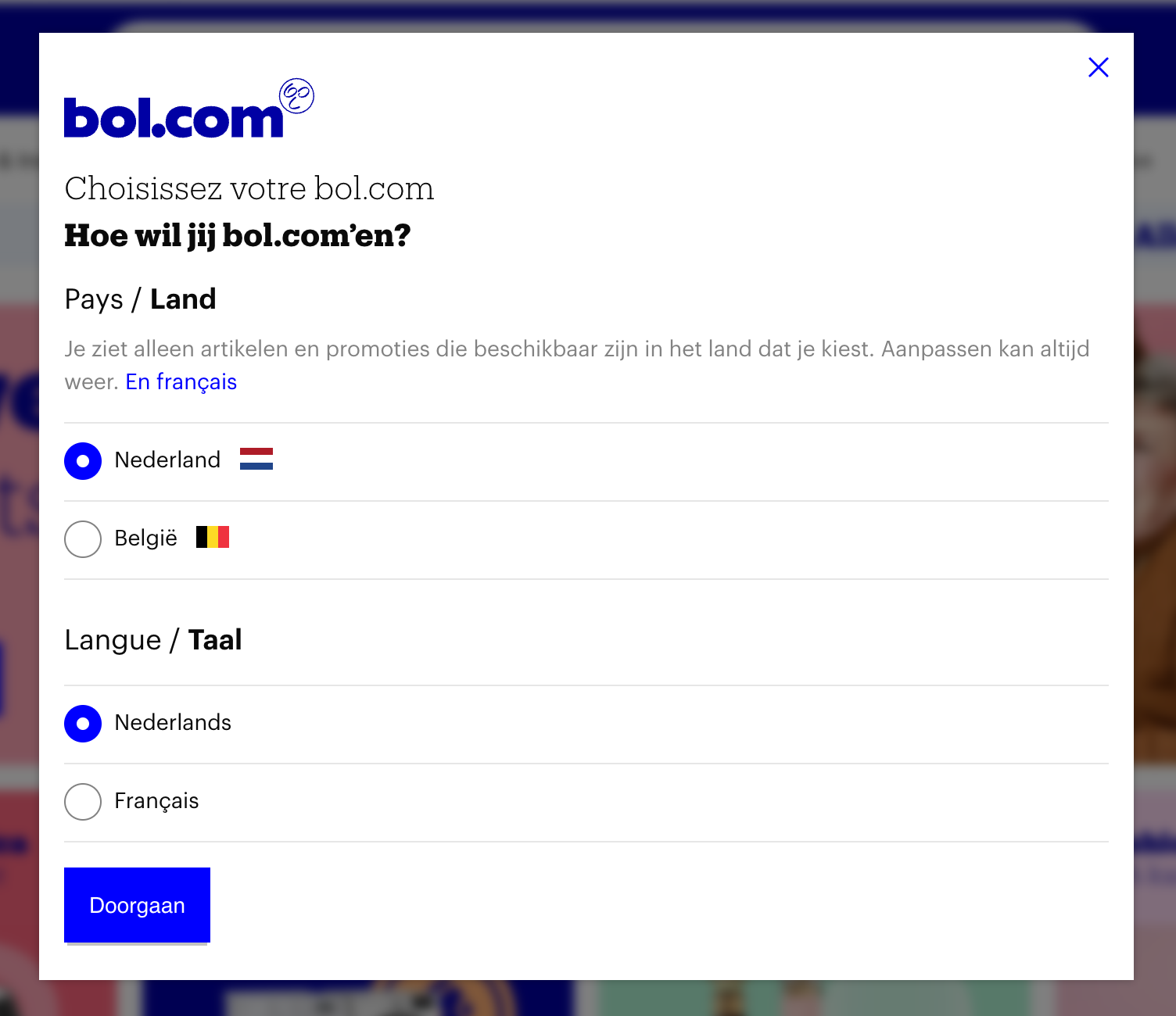
Flags for countries, and plain text for languages. Everything seems to be about right on Bol.com. The country selector (with a flag) is located in the right upper corner, where most users expect it.
To avoid misunderstandings, make sure that you use flags if your users need to select a specific country. However, if you’re providing users with a choice of a specific language, then flags are probably not going to work well. There, an autocomplete with all available countries and labels for languages written next to them might work better.
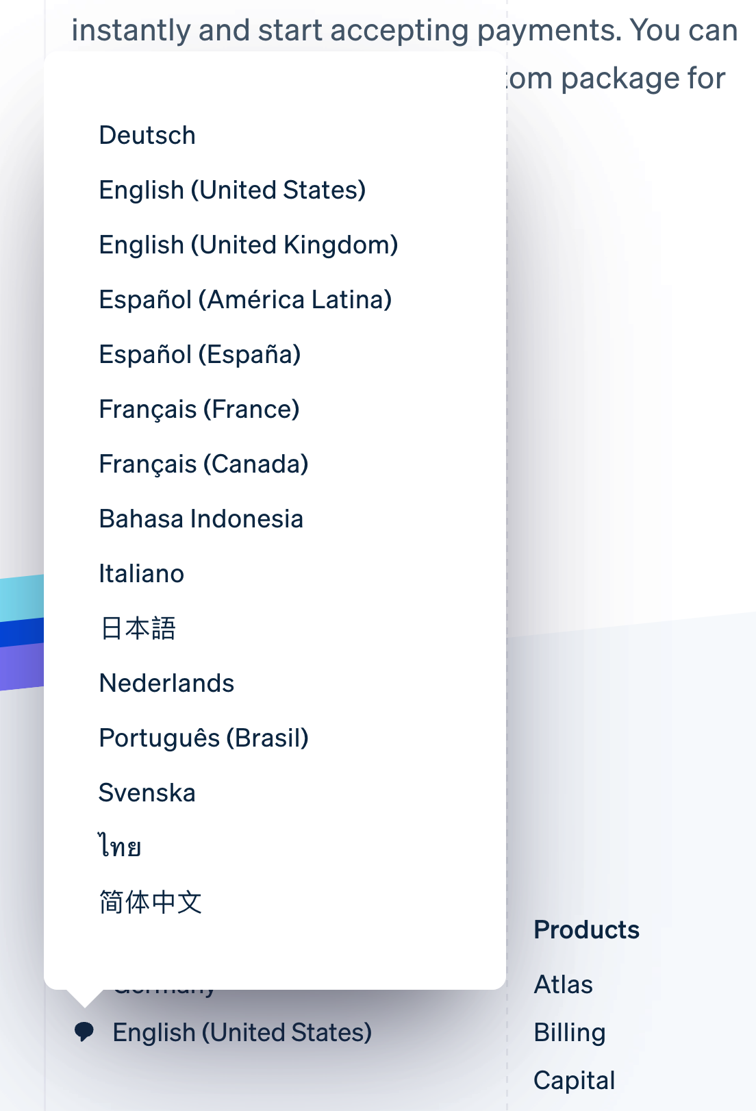
This of course brings up a question: how should these labels actually be written? In English or in a language’s local format?
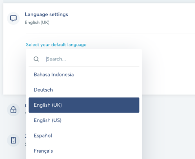
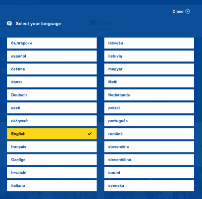
Label Languages Locally
Assumptions are error-prone, and if it goes for combinations of currency, language and location, this holds true for how we label languages as well. We shouldn’t assume that a user will be speaking one of the languages we choose to see as a default option. Instead, when users select a language, usually it’s better to always use the name of the language in its local format.
So rather than offering a choice of German and Chinese, assuming that users understand English, we can label these options as Deutsch and 中文.

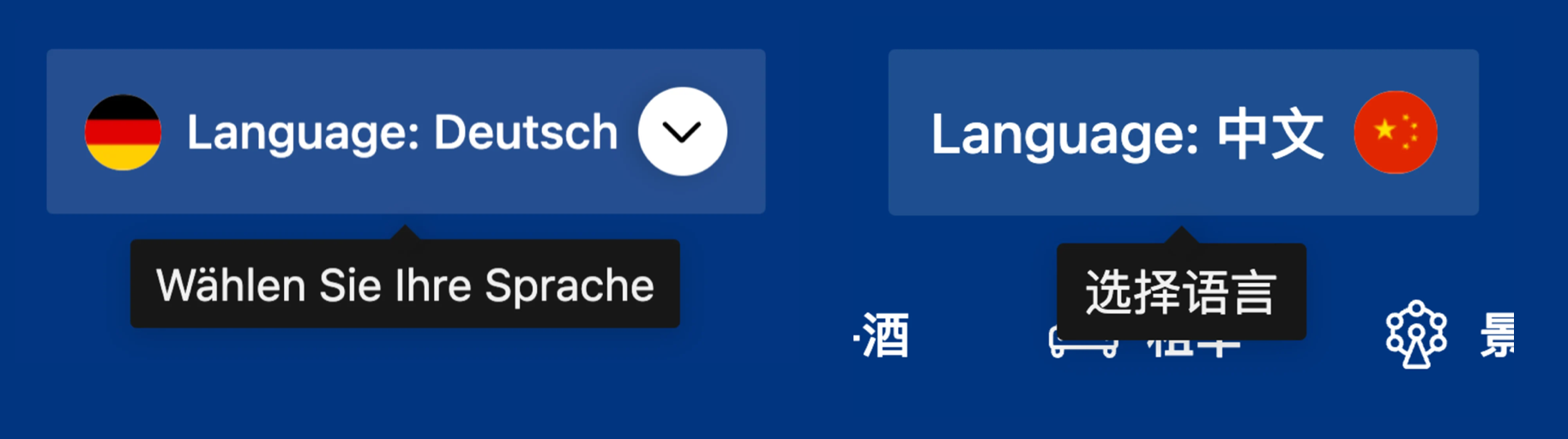
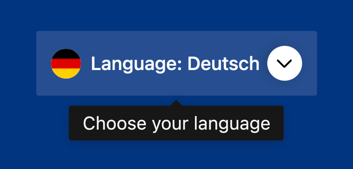
But if the languages are labeled locally, somebody who happens to be in China might be experiencing issues switching to a slightly more familiar language. Surely flags would help to locate a button that would allow for that, but we could also prefix the selected language with a label, for example, “Language” to make it easier to spot the selector. Or we could just add a link saying “English” in the header. This of course relies on assumptions we are making, but it might be easier than hopping through the navigation bar and view-source with fingers crossed.

Booking provides a hint to indicate that users can change the language in a local language. If you prefer to show a hint on hover, that’s one of the very few cases where one might consider using a language that many users would understand, and it could be English.

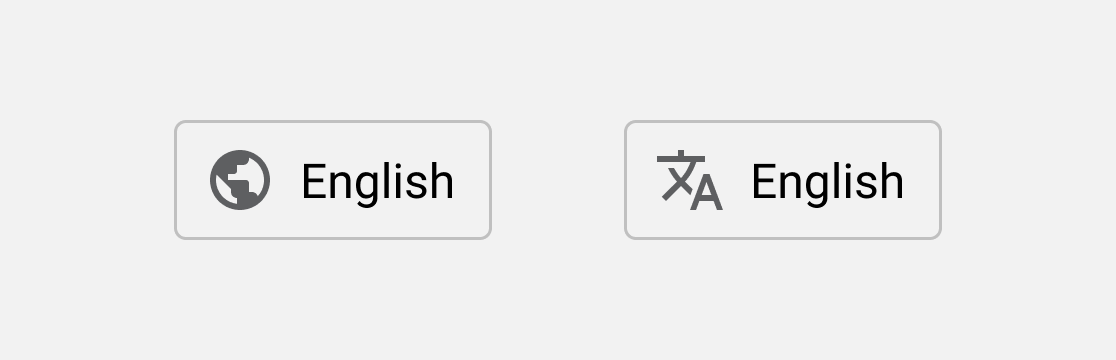
The Globe And Translate Icons
Since flags can be somewhat problematic, what would be a reasonable alternative to them? As briefly mentioned at the beginning of the article, we can also use icons such as “Globe” or “Translate” to indicate the choice of locales. There is as well an official language icon, which is free to use, but unfortunately is still not as recognizable as the other icons.
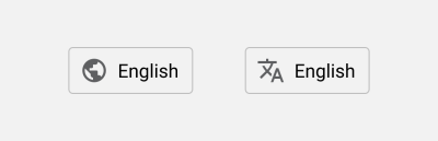
Surely not everybody will be able to understand the icon in combination with a word that they can barely decipher, but if it’s prominently located in the header or the footer, the chance to be discovered are significantly higher.

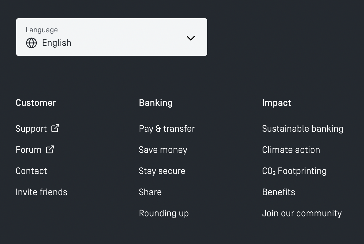
Tomorrow.one displays a large drop-down selector with a globe icon in the footer of each page. It’s not available in the header on the site. Because pages aren’t very long, that’s probably not a big problem, but users might give up if they have to embark on a long-running scrolling marathon, or if the infinite scroll prevents them from reaching the footer.

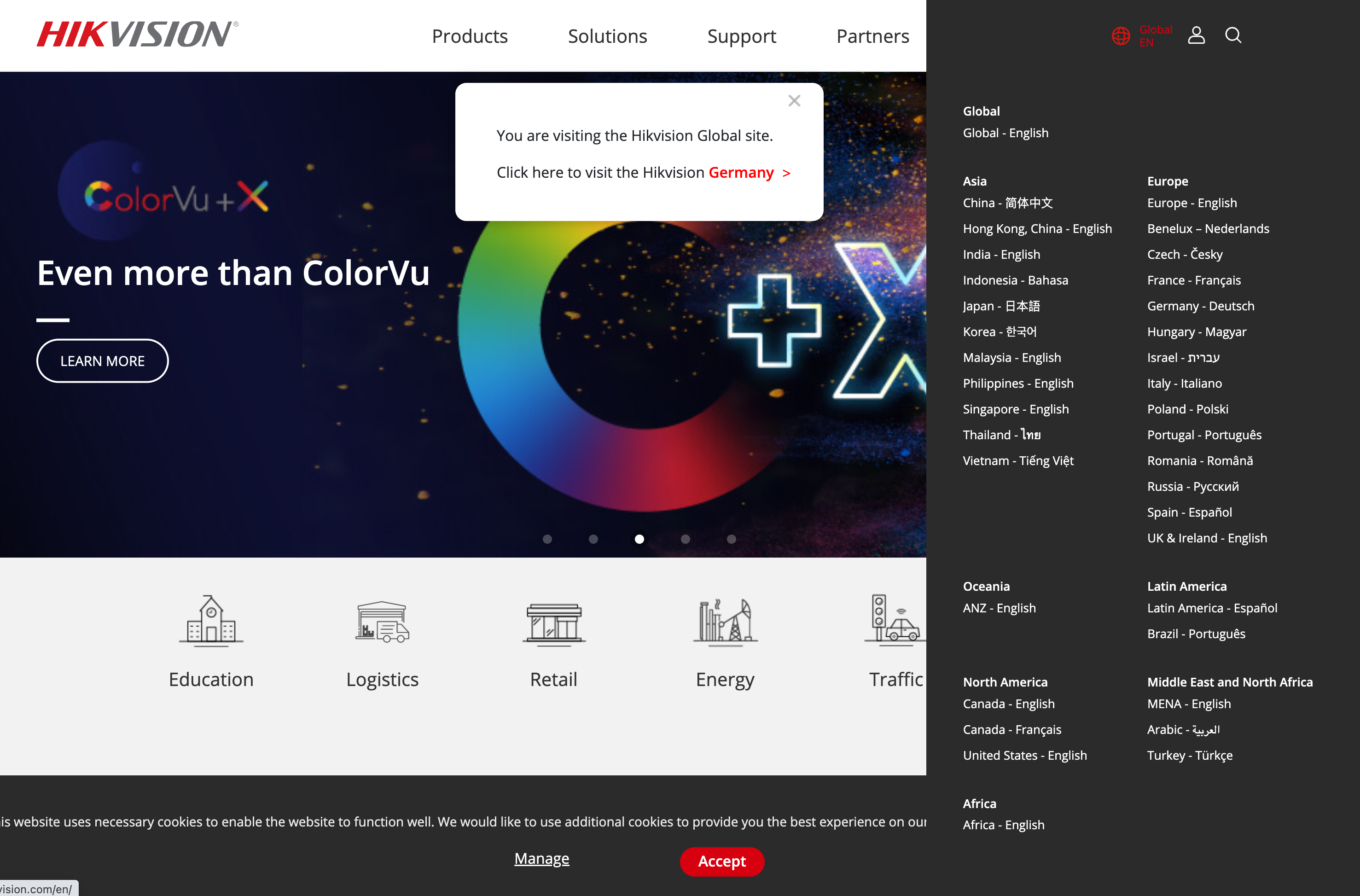
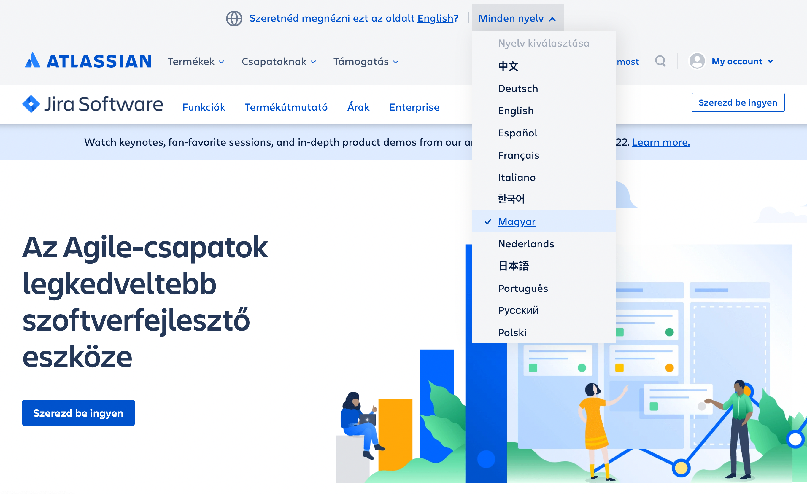
On Atlassian, the language selector is tucked at the very end of the page in the footer, with a globe icon indicating the selection. However, if the user with a different browser language preference enters the site, it suggests changing the language at the very top of the page, with a globe icon appearing there, too.
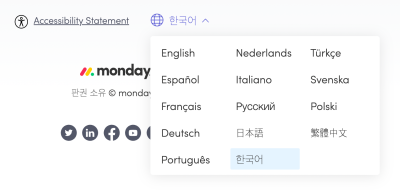
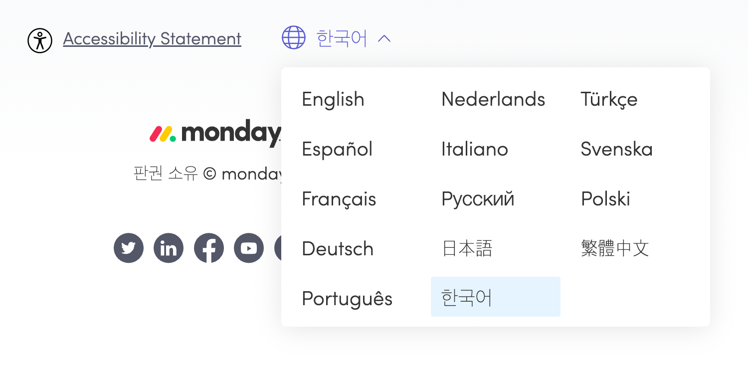
Monday.com keeps the language selection at the very top of the page, in the left upper corner. All options are presented in three columns, with the current selection highlighted in blue.
The European Commison website doesn’t use flags but rather labels that are ordered by alphabet, in the language’s local format. The alphabet helps users find their options. Also, the active selection is clearly highlighted as such. That’s an alternative to flags.
While flags are easier to recognize, icons can work as an alternative option as well, especially if you need to provide users with language options, rather than choices for location. Even if the selection is provided in the header, it’s a safe bet to also place it at the bottom to ensure that users can find it when they need to.
Avoid Language Shorthands Or Initials
Another interesting problem that Zsolt Szilvai has discovered in testing is related to the use abbreviations, initials or shorthands to indicate a particular language. When we are running out of space in navigation, we could be using “EN” for English, or “DE” for Germany, or “UA” for Ukraine. Indeed, these shorthands are often well-understood, but they bring surprising results when a user’s browser auto-translates all websites in a particular language.
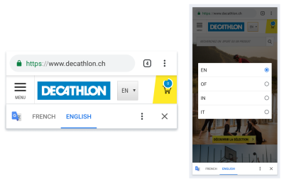
Not only does it often result in broken menus and surprising layouts; browsers also translate language shorthands, producing an interface that might be very difficult to make sense of. However, were the shorthands avoided in favor of the full local name of the language, the user wouldn’t have to deal with these issues at all. Instead, the translator would help them find a language that would work better for them.
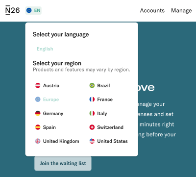
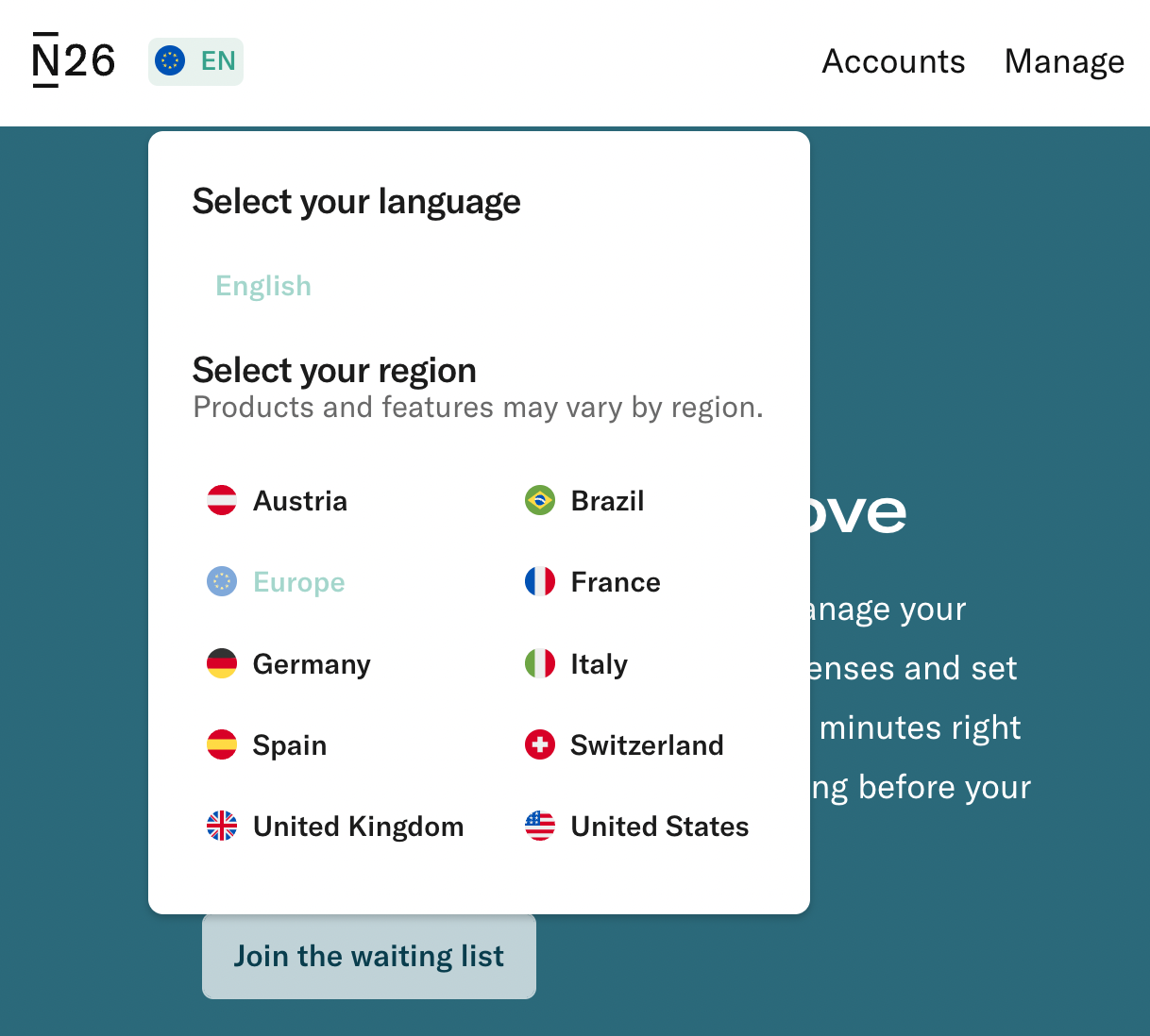
N26.de uses a shorthand “EN” for “English”. The selected language is disabled in the list of options, but it’s probably a good idea to increase the color contrast a little. As users scroll down the page, the header remains sticky, so there is really no need to display the language selector in the footer as well.
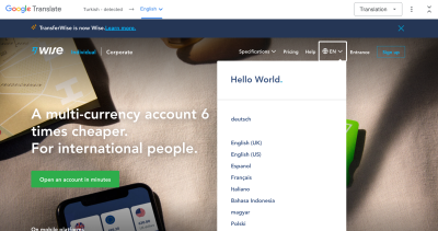
Wise uses shorthands for language selection in the right upper corner, but displays the languages in full on click, with a noticeable focus style to indicate where a user currently is. This avoids the problem of auto-translation that often turns abbreviations into seemingly random strings.
Wrapping Up
The country and language selector might appear like a quite trivial design challenge, but there are plenty of fine details that make or break the experience. When designing one, always decouple presets and reduce assumptions about groups that are likely to go together. Users expect the language selector to be located in the header or the footer of each page, and they often watch out for flags, “Globe” or “Translate” icons to find it.
If you have just a few languages, a drop-down overlay might be perfectly enough. If you need 10–15 languages, perhaps it’s worth exploring the option of a non-modal overlay with autocomplete. If there are even more options to display, consider using a standalone page, with countries grouped into tabs or accordions.
Language Selector Checklist
As usual, here’s a general checklist of a few important guidelines to consider when designing a better language selector:
- Nudge users, but avoid auto-redirects.
- Decouple presets, be it location, language, or anything else.
- Allow users to set custom preferences (currency, time zones, units of measure).
- Consider using a non-modal dialog.
- Organize countries and languages in sections, tabs, and accordions.
- Provide input with autocomplete suggestions.
- Use flags for countries, but avoid them for languages.
- Consider the Globe and Translate icons instead of flags.
- Label languages locally, e.g. Deutsch instead of German.
- Avoid language shorthands or initials.
- For accessibility reasons, make sure the country selector appears in the header as well as in the footer, and is keyboard-accessible.
Meet Smart Interface Design Patterns
If you are interested in similar insights around UX, take a look at Smart Interface Design Patterns, our shiny new 10h-video course with 100s of practical examples from real-life projects. Design patterns and guidelines on everything from mega-dropdowns to complex enterprise tables — with 5 new segments added every year. Just sayin’! Check a free preview.

100 design patterns & real-life
examples.
10h-video course + live UX training. Free preview.
Resources
- Flags are not languages, a blog by James Offer
- “My take on language selectors” + accessible implementation details, by Zsolt Szilvai
- UX practice: Skyscanner’s language selector
- Language switching UI/UX on multilingual sites, by Robert Jelenic
- Best practices for presenting website language selection
- Interesting language selector patterns on Siemens Design System
- Designing a language switch: Examples and best practices, by Thomas Peham
Related Articles
If you find this article useful, here’s an overview of similar articles we’ve published over the years — and a few more are coming your way.
- Designing A Better Infinite Scroll
- Designing Better Breadcrumbs
- Designing A Better Carousel UX
- Designing A Better Accordion
- Designing A Better Responsive Configurator
- Designing A Better Birthday Picker
- Designing A Better Date and Time Picker
- Designing A Better Feature Comparison
- Designing A Better Slider
- “Form Design Patterns Book,” written by Adam Silver
Further Reading
- Getting To The Bottom Of Minimum WCAG-Conformant Interactive Element Size
- Human-Centered Design Through AI-Assisted Usability Testing: Reality Or Fiction?
- A Designer’s Accessibility Advocacy Toolkit
- The Importance Of Graceful Degradation In Accessible Interface Design
 (il, mrn)

