What’s That (Dev) Tool?

Email Newsletter
Weekly tips on front-end & UX.
Trusted by 182,000+ folks.
 Celebrating 10 million developers


 Custom Web Forms for Angular, React, & Vue. Your backend.
Have you ever looked to see what other tools were available to you within the DevTools toolbox? You’re probably using the same few panels over and over again — I know I am!
It turns out there are more than thirty (30!) individual panels in Chrome DevTools (as well as other Chromium-based browsers, such as Edge). Safari and Firefox have fewer panels but still probably more than you use on any given day.
When I realized this, it gave me an idea for a silly game where you’d try to name as many panels as you could in under one minute. Play it here and try your luck (no cheating, OK?): What’s That Tool?

This game is silly, of course. As a web developer, remembering the exact names of each and every tool in DevTools isn’t important. It’s more important to know how to use these tools when needed.
But the game does prove a point: there are many more tools than what people use or even know about! The whole goal of this game is — by the time the minute is gone and the full list is displayed — to realize, “oh wow, that’s a lot of tools I had no idea even existed.”
So, why are there so many? Let’s face it, DevTools is crammed with buttons, tabs, and features. How did we get here, and is there a way out?
The Story Of An Explosion
In the early 2000s, web development was very different than it is now. Back then, most of the complexity lay in generating the right HTML code from your server. The browsers’ ability to “view source” was enough to debug the odd table colspan problems. JavaScript was only getting started on the web, and CSS was nowhere near the feature-full language it is now.
So, on top of the old alert() debugging trick, the very few tools we used for front-end code debugging were very specialized; they only did one thing. Venkman only did JavaScript debugging, Aardvark was focused on inspecting elements, and Console2 displayed nice JavaScript log messages.
Joe Hewitt brought it all together under one tool called Firebug which was a Firefox extension. It was an absolute revolution for web developers throughout the world! Around 2010, Firebug was probably the most used front-end debugging tool, and Firefox was a dominant browser. Crazy! Right?
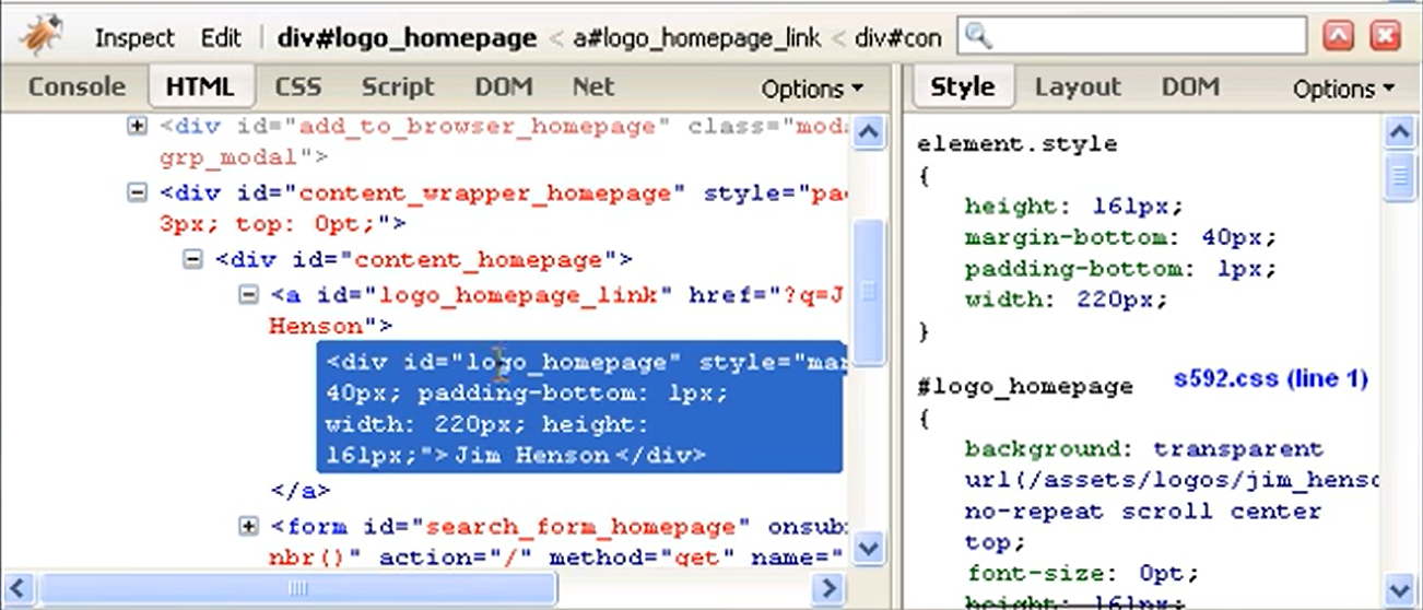
Even if you have never used Firebug and started your web development journey in more recent times, I’m willing to bet this user interface feels familiar.
Though the DevTools we use now aren’t very different from what Firebug used to look like, it felt like we had fewer things to worry about back then and, therefore, fewer tools to help them with.
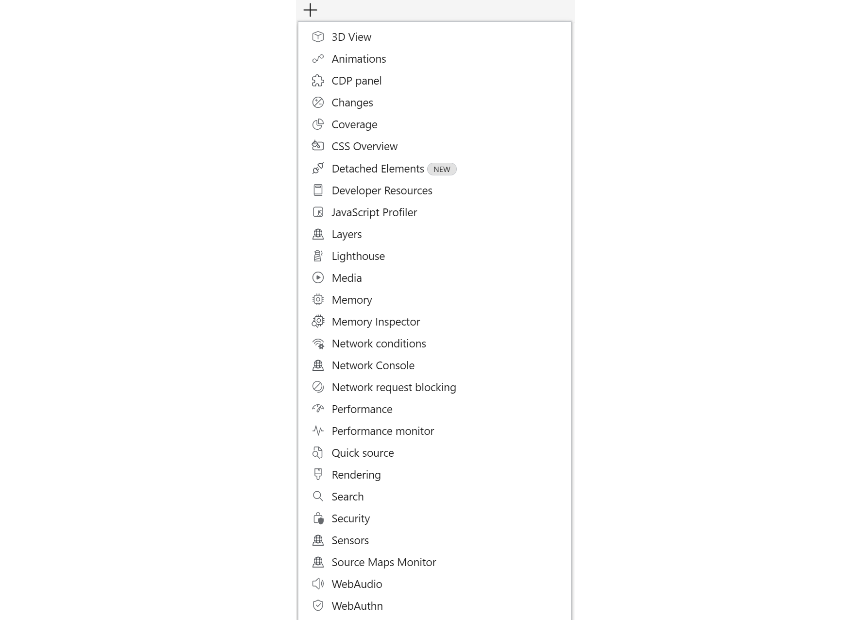
As the screenshot above shows, there weren’t many tools at all:
- Console to view logs and execute JavaScript,
- HTML tab to view and edit the page’s DOM and the applied CSS styles,
- JavaScript debugger,
- Network tab to check the downloaded resources and HTTP requests.
Fast forward to 15 years in the future, to now. The user interface of the browser tools we use hasn’t changed much, but the sheer number of panels skyrocketed! Here’s a quick and incomplete (and very approximative) history of when new panels got introduced in Chrome DevTools:
| Year | Panels |
|---|---|
| 2008 | Console, Elements, Sources, Network, JavaScript profiler |
| 2010 | Performance (called Timeline at the time) |
| 2013 | Rendering, Layers |
| 2014 | CSS Overview, Network Conditions |
| 2015 | Security, Memory |
| 2016 | Animations |
| 2017 | Coverage, Lighthouse (called Audits at the time), Performance Monitor, Network Request Blocking |
| 2018 | Changes, Accessibility |
| 2020 | Media, WebAuthn, WebAudio, Issues |
| 2021 | Memory Inspector, Recorder |
| 2022 | Performance Insights |
There are many reasons why the number of new panels keeps growing. Some of them are good, while others are more questionable:
- The number of features and APIs available to the Web platform is constantly and quickly increasing. Now, there are many more things a web developer can do on the web than 15 years ago. Some of those things can’t easily be debugged with the 4 or 5 tools we had back then, thus it required new panels in DevTools.
- Our discipline is way more developed than it used to be. Front-end web development was maybe regarded as a little less interesting or important 15 years ago. It has now proven itself as a much deeper field of computer engineering that requires knowledge of not only programming but also performance optimization, accessibility, user experience, progressive enhancements, and more.
These things tend to sometimes require specialized tools too. - People who write the code for the browsers and DevTools also need tools themselves, and sometimes they end up as new panels. The Protocol Monitor panel in Chromium is a great example of this.
- Deleting things is really hard! You’re bound to break people’s workflows if you do it. So, things tend to accumulate over time. Chrome, for example, has three tools to do performance optimizations: Performance, Performance Insights, and JavaScript profiler.
- Finally, there seems to be a general tendency to add new things rather than improve what’s already in place. I get it; it’s more exciting to most people to build new things rather than fix bugs. But it tends to make the software more complicated over a long period of time. And this has most probably been at play in DevTools, too.
In any case, we’re here now with probably what’s one of the most advanced tooling suites any application platform could dream of. But it’s also one of the most complex that no one uses to its full potential.
Is This A Problem?
Yes! Put simply, DevTools is a very complicated product, and its user interface can be scary.
Where other products have five main user scenarios, DevTools has dozens, if not hundreds. Do you need to simulate a mobile screen? Detect color contrast? Convert between font units? See JSON responses? DevTools can do it all! And these are just a few random examples.
So, with that many options and features, it isn’t a surprise that the user interface is complex so much that new users can feel very overwhelmed in their first-run experience. But even experienced users don’t necessarily know what’s available outside of the same few panels they’re used to.
This is starting to become a serious usability problem, in my opinion, one that may sometimes discourage new people in their learning journey. People coming to DevTools today are likely to be used to newer development products that are much easier to use. The digital tool space is undergoing a big change in this direction, and the browser DevTools haven’t started moving yet.
This isn’t a simple problem to solve either. As I said before, there are some really good reasons why we need a lot of specialized tooling. So, the complexity is needed, but I believe it should be opt-in rather than opt-out!
Indeed, the DevTools learning curve is getting very steep because so much information is presented to users right from the start, and people have to learn to ignore the parts they don’t know about or think they don’t need.
Why Don’t We Just Clean It All Up?
Well, it’s complicated. There are many user scenarios built in DevTools, and there are probably as many workflows as there are people using DevTools out there. Even the most rarely used tools are here for a reason, and the few people who use them may depend on them.
In my experience working on DevTools, removing old/un-maintained/rarely used panels for the sake of making the codebase easier to work with always proved to be a bad idea, especially when done without enough customer research.
In fact, while I worked on Firefox, we tried removing the Fonts panel at some point in Firefox DevTools, and the response was pretty instant and strong — so much that we put it back in! We lacked the necessary customer understanding of how this tool was being used and what unique scenarios it supported.
In 2016, the 3D view panel had to be removed because it wasn’t supported anymore by the new (back then) Firefox architecture. To this day, more than six years later, people still complain that it’s gone (note that you can still use it in Edge)!
As a final example, the Chrome team removed the Properties sidebar pane in 2020 but later added it again after seeing how much people needed it.
Usage numbers alone aren’t a good measure of a tool’s worth. Some tools may be used by a few people only, but they may depend on them to do their jobs. Proper user research and understanding of the various user roles and scenarios (and DevTools has a lot of them!) are needed to be able to simplify the product.
A Way Out?
I want to propose two directions that I think have a lot of potential when it comes to improving the situation with DevTools:
- simplifying the DevTools core and opening it up to more powerful extensions, so that users make their own tools;
- being bold and taking risks with a radically user-friendly user interface.
A Powerful But Simple Core, Boosted With Extensions
Visual Studio Code is such an amazing product! Many people use it and not only web developers. It’s built on a very strong core that can be extended tremendously.
This way, the people who work on VS Code don’t have to worry about all of the features that people might need. VS Code is a bit like DevTools in the sense that no two people have the same needs and workflows, and there are hundreds of ways to use the product.
So, the team’s job is to build a solid foundation that allows basic editing and top that up with an extension API that lets other people dig deep into the platform and add extra features.
There are many advantages to this, but one that is of particular interest to me here is that complexity is opt-in. When you install VS Code the first time, it’s not overwhelming. It’s a text editor, and you can use it to edit text right off the bat. But if your project has special needs, like checking code quality or doing some custom syntax highlighting, then you can install all the fancy extensions you want and get the extra functionality you need.
The VS Code extension API goes really deep into how much you can customize the editor, and I believe this is largely responsible for its success.
DevTools, however, is built differently. You can also install extensions in the browser to add new panels to DevTools, but there aren’t very many useful extensions available outside of the major framework ones (React, for example). The teams who work on DevTools are the ones who pretty much do all the tools that a web developer might need.
By using the browser extensions API, creating a new panel in DevTools isn’t too hard, but the API isn’t as advanced as in VS Code. In particular, there is no way to extend the existing tools to augment their functionality. This is a serious limitation that I think is responsible for the low number of useful extensions we have at our disposal.
As an example, the amazing Motions DevTools extension allows you to view and edit animations on the web. But it’s limited to its own panel container, and it can’t integrate with the Elements panel right next to it, which would have been useful to simplify user workflows and re-use existing components, such as the color picker.
I believe we need to go further than that. We need a more powerful set of APIs that makes it possible to create the specialized features that some people might need without complexifying the default DevTools experience for everyone else.
The Extensible Web Manifesto is very similar to this approach. It advocates for providing low-level capabilities for third-party developers to create their own experiences before they — perhaps one day — become part of the core if they prove to be popular.
Taking Risks And Designing A Radically User-Friendly UI
Another very much-needed way to move forward and improve the status of our DevTools is to be willing to take a few risks, be bold, and test new UI ideas.
As I said in the intro, the shape of DevTools hasn’t really changed in about 15 years. I think we’re very much overdue for at least some re-design. We need to bring the UI into the 2020s, start using more modern interface patterns, and make the overall experience less daunting.
The folks working on Safari Web Inspector at Apple tried something like this around 2013. They applied some of their design principles from other products like XCode or iTunes in an attempt to simplify their DevTools toolbar.
Although they have now gone back to a more traditional tabbed navigation which seems to work better with developers, I appreciate this early attempt to make a more user-friendly interface that’s also more consistent with what people knew at the time.
This also goes to show that very special care needs to be taken to bring developers along a journey of user interface change in DevTools.
This brings me to the team working on the Edge DevTools now (which, full disclosure, I am part of). I believe this is currently the only team doing something in this area.
Our current experiment is called Focus Mode, and it is effectively the first attempt at redesigning the entire DevTools product UI.
Focus Mode is available to users of DevTools on the Canary and Dev pre-release channels of Microsoft Edge by enabling the “Focus Mode” experiment from the DevTools Settings. Most users of these channels should in fact already have it on, as our team is gradually rolling out the feature and listening to user feedback in order to ensure this is not disruptive to existing workflows and a welcome change.
Based on this feedback, we will continue rolling out Focus Mode to users of the Beta channel and eventually to the normal release version of Edge.
Now, it might not seem like a big change at first, but this is only a first step in an iterative approach to creating a more approachable user interface. Again, changing things in this product is complicated, so our team is taking things slow.
But if you look closely, there are a few major changes to the UI that try to make things less cluttered and more streamlined.
The most visible changes are located in the top toolbar. Here is an animation showing a comparison of what the toolbar looks like with and without Focus Mode:

- The list of warnings, errors, and infos is now gone from the toolbar, and instead, it appears as colored badges on the Console and Issues panel tabs, removing some clutter.
- The Settings, Feedback, and main menu icons have been grouped under just one menu button in the top-right corner, further reducing clutter.
- Tabs now have icons, so they’re easier to see and tell apart.
Here are a few more things coming with Focus Mode.
The + button in the toolbar shows all available tools with their icons making it easier to re-open a tool you’ve closed before and maybe more inviting to try tools you haven’t tried yet.
It’s also possible to switch the tabs to a vertical orientation. Being positioned to the left and hiding the labels further reduces the noise in the central part of the window, letting you focus on the code. Additionally, it matches UI patterns that people are growing used to in other tools (for example, the Activity bar in VS Code or vertical tabs in Edge).
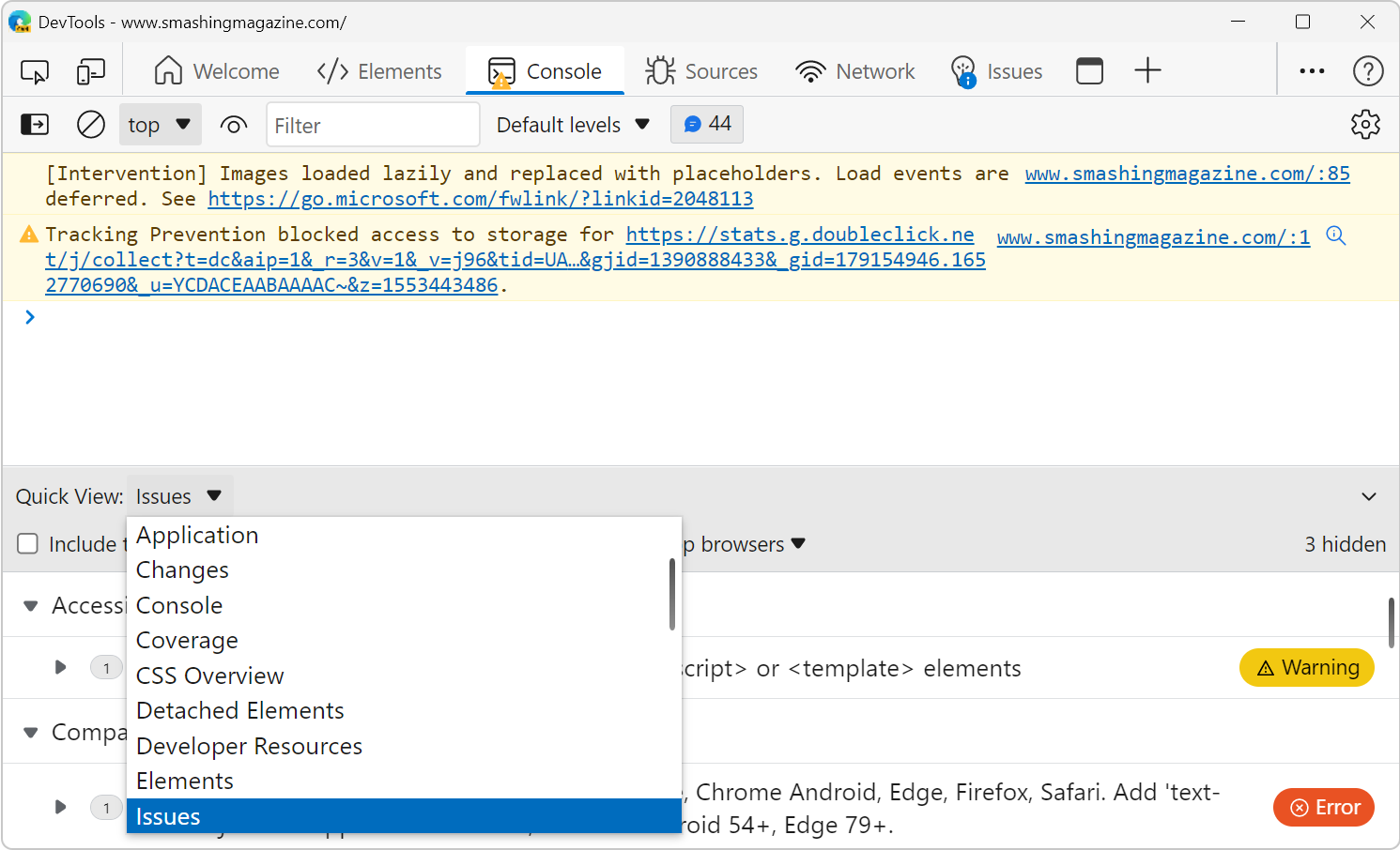
And finally, the drawer in DevTools was re-designed. The drawer is this area of the user interface that appears at the bottom when you press the Esc key on the keyboard, and that normally contains the Console.
It was introduced as a way to have access to the Console at the same time as other tools, and all browser DevTools have this now. But over the years, the Chrome team added more and more things to the drawer, in particular secondary tools that were useful but not quite popular enough for a spot on the main tab bar (e.g., the Rendering panel was added there).
I think it’s come to a point where it’s hard to know for sure which tool is available in which area. Edge — with Focus Mode — is taking a different approach. The drawer is now called Quick View, which is always visible at the bottom of the toolbox (so you don’t even have to know to press Escape) and can be used to display any tool you want.
I’m very excited about where Focus Mode is going, and I can’t wait for our team to start exploring what’s next in this area.
If you want to try Focus Mode out, make sure you have a copy of Edge (you can also get a pre-release version if you prefer to have the latest changes), open DevTools, and if you don’t already have it ON, press F1, then go to Experiments and check the Focus Mode box.
Let the team know what you think about it — and if you have other ideas — by filing new issues on our DevTools GitHub repository.
I believe that a user-friendly DevTools that is both more welcoming to learners and inclusive of everyone’s needs is possible, and together, we can make it happen. As a community, let’s demand more from our friendly DevTools teams!
There are full-time dedicated DevTools product engineering teams working for each browser vendor. They keep adding new features and fixing bugs, but they can only do a good job with our collective help.
Tell them if the UI doesn’t work for you. Let them know about your most common workflows. How many clicks did you need? Do you often forget where things are? Do you wish things were named differently? Input like this can lead to changes that make a big difference for millions of users.
As mentioned, we’re actively seeking feedback on this experiment and other DevTools features. You can leave comments on our GitHub repository. Other browsers also like to hear feedback on their DevTools which you can do at the Mozilla bugzilla tracker for Firefox, on the Chromium bug tracker for Chrome, and on the WebKit bugzilla tracker for Safari.
Thanks for reading! And see you next time.
Further Reading
- Transitioning Top-Layer Entries And The Display Property In CSS
- Motion Controls In The Browser
- Accessibility In Chrome DevTools
- Svelte 5 And The Future Of Frameworks: A Chat With Rich Harris


