You Don’t Need A UI Framework

Email Newsletter
Weekly tips on front-end & UX.
Trusted by 200,000+ folks.


Every now and then, someone will ask for my recommendations on UI frameworks. By “UI framework”, I mean any third-party package that is focused on providing styled UI components. It includes CSS frameworks like Bootstrap, as well as JS component libraries like Material UI or Ant Design.
My answer to this question tends to catch people off guard: I don’t use them, and I don’t think they should be used for most consumer-facing products. 😅
To be clear, I have nothing against these tools, and I do think there are some valid use cases for them. But I’ve seen so many developers reach for these tools with unrealistic expectations about the problems they’ll solve, or how easy it’ll be to build applications with them.
In this article, I’m going to make my case for why you probably don’t need these tools. I’ll also share some of my go-to strategies for building professional-looking applications without a design background.
The Appeal Of UI Frameworks
There are lots of reasons that developers reach for a UI framework. Here are the three most common reasons I’ve seen:
- They want their app/site to look polished and professional, and these tools provide nicely-designed UI components.
- They want to get something up and running quickly without spending a bunch of time building everything from scratch.
- They recognize that many UI components — things like modals, dropdowns, and tooltips — are really hard to get right, especially when considering accessibility, so they want to make sure they get it right.
These are totally reasonable things to want, and I can absolutely see the appeal of finding a solution for these problems. But in some cases, I think there’s a mismatch between expectation and reality. In others, I think there are better tools for the job.
Let’s get into it.
Professional Design
This first reason might be the most common. There are tons of developers who want to build stuff, but who don’t have a design background. Rather than spend years learning how to design, why not use a third-party package that provides beautifully-designed components right out of the box?
Here’s the problem, in my opinion: design is about so much more than nice-looking pieces.
A little while ago, I received a LEGO Nintendo Entertainment System as a gift:
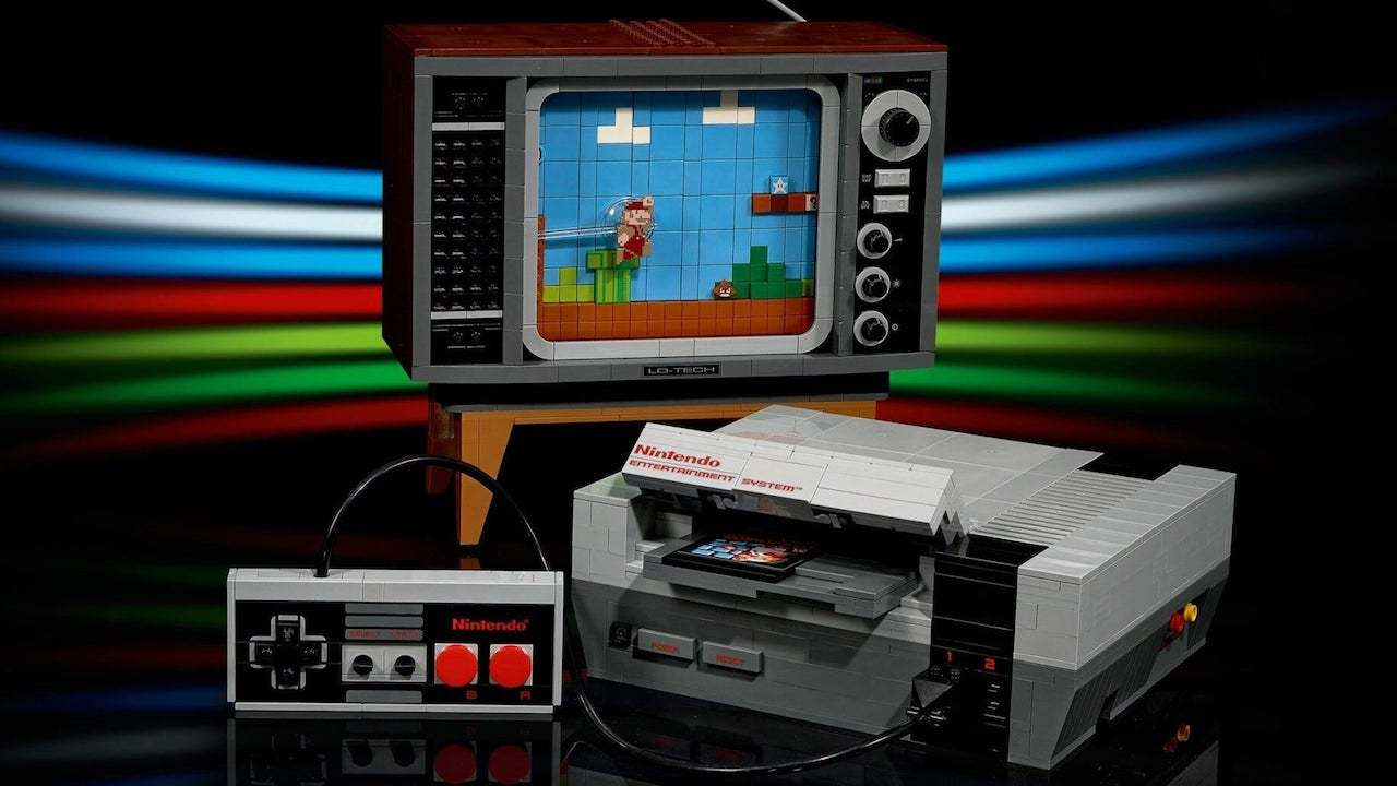
It was a really fun kit to build. If you’re a LEGO fan, I highly recommend checking it out!
Here’s the thing, though: I was able to build this model because the kit came with a 200-page book that told me exactly where to place each brick.
If I was given all of the pieces but no instructions, my NES would look much worse than it does. Having high-quality bricks isn’t enough, you also need to know how to use them.
A component library can give you nice buttons, date pickers, and pagination widgets, but it’s still your job to assemble them.
The blocks in a design system like Material Design were built by a talented design team. That team understands the framework, and they have the skills to assemble the pieces into beautiful interfaces. We have access to the same pieces, but that doesn’t mean we’ll automatically achieve the same results.
I remember hearing a designer say that only Google can make Material Design apps that look good. The Android App Store is full of third-party apps that use the same professionally-designed components but don’t look professional at all.
There are so many intangible aspects to good design — things such as balance, spacing, and consistency. To use a component library effectively, you need to put yourself in the shoes of the designers who created it and understand how they’re intended to be deployed.
Plus, no matter how comprehensive the library is, it’ll never have all the pieces you need. Every app and website is unique, and there will always be special requirements. Creating a brand-new component that “blends in” with an existing third-party design system is really friggin’ hard.
I don’t think it’s impossible — I’m sure there are examples of professional-looking apps with third-party styles. But if you’re able to make it look good, you probably have some pretty significant design chops and don’t need these tools in the first place.
I empathize with developers who want to launch a professional-looking project without any sort of design intuition… But it doesn’t usually work out that way, from what I’ve seen.
Saving Time
The next reason I’ve heard is that UI frameworks help save time. Building a whole component library from scratch is a significant undertaking and one that can be skipped by relying on a UI framework.
There’s some truth to this, but from what I’ve seen, it’s often a tortoise-and-hare situation.
I spent a few years teaching web development fundamentals to bootcamp students at Concordia University. The program culminates in a 2-week personal project. Students decide what to build, and it’s up to them to do it. As an instructor, I’d answer questions and help get them unstuck.
We noticed a trend: students who pick a UI framework like Bootstrap or Material UI get off the ground quickly and make rapid progress in the first few days. But as time goes on, they get bogged down. The daylight grows between what they need, and what the component library provides. And they wind up spending so much time trying to bend the components into the right shape.
I remember one student spent a whole afternoon trying to modify the masthead from a CSS framework to support their navigation. In the end, they decided to scrap the third-party component, and they built an alternative themselves in 10 minutes.
Writing your own styles feels a bit to me like writing tests: it’s a bit slower at first, but that early effort pays off. In the long run, you’ll save a lot of time, energy, and frustration.
Usability And Accessibility
The final reason I’ve heard is a super valid one. The web doesn’t have a very robust “standard library” when it comes to things like modals, dropdowns, and tooltips. Building a modal that works well for mouse users, keyboard users, and screen-reader users is incredibly difficult.
UI frameworks have a hit-or-miss record when it comes to usability and accessibility. Some of the libraries are actually quite good in this respect. But in most cases, it’s a secondary focus.
Thankfully, there’s another category of tools that focuses exclusively on usability and accessibility, without prescribing a bunch of styles.
Here are some of my favorite tools in this category:
- Reach UI
A set of accessibility-focused primitives for React. Built by Ryan Florence, co-creator of React Router and Remix. - Headless UI
A set of unstyled, fully accessible UI components for React and Vue. Built and maintained by the Tailwind team. - Radix Primitives
A set of unstyled, accessibility-focused components for React. This library has a very broad set of included components, lots of really neat stuff! - React ARIA
A library of React hooks you can use to build accessible components from scratch.
Note: I realize that this list is very React-heavy; there may be similar tools for Angular, Svelte, and other frameworks, but I’m not as active in those communities, so I’m not sure. Feel free to let me know on Twitter if you know of any!
Nobody should be building a modal from scratch in the year 2022, but that doesn’t mean you need an enormous styles-included UI framework! There are tools that precisely solve the most important accessibility challenges while remaining totally agnostic when it comes to cosmetics and styles.
Rebuttals
I’ve been speaking with developers about this subject for a couple of years now, and I have heard some pretty compelling rebuttals.
Familiarity
First, Daniel Schutzsmith pointed out that “industry-standard” tools like Bootstrap have one big advantage: familiarity.
It’s easier to onboard new developers and designers when using tools that are widely understood. New teammates don’t have to spend a ton of time learning the ins and outs of a custom framework, they can hit the ground running.
From the perspective of an agency that takes on lots of short/medium-term projects, this could make a lot of sense. They don’t have to start every new project from zero. And as the team gets more and more comfortable with the tool, they learn to use it really effectively.
I haven’t done much agency work, so it’s hard for me to say. I’ve spent most of my career working for product companies. None of the places I’ve worked for have ever used a third-party UI framework. We always built something in-house (eg. Wonder Blocks at Khan Academy, or Walrus at DigitalOcean).
Internal Tools
I think that it can make sense to use a UI framework when building internal tools or other not-for-public-consumption projects (eg. prototypes).
If the goal is to quickly get something up and running, and you don’t need the UI to be 100% professional, I do think it can be a bit of a time-saver to quickly drop in a bunch of third-party components.
What About Tailwind And Chakra UI?
So, I don’t consider Tailwind or Chakra UI to be in this same category of “UI frameworks”.
Tailwind doesn’t provide out-of-the-box components, but it does provide design tokens. As Max Stoiber says, Tailwind gives developers a set of guardrails. You still need a design intuition to use it effectively, but it isn’t quite as daunting as designing something from scratch.
Chakra UI does provide styled-components out of the box, but they’re very minimal and low-level. They mostly just look like nicer versions of platform defaults.
My good friend Emi mentioned to me that she likes using Chakra UI because it provides her with a set of sensible defaults for things like checkboxes and radio buttons. She’s good enough at design to avoid the customization pitfalls, but not so confident that she’d be comfortable creating a whole design system from scratch. This tool is the perfect middle ground for someone in her situation.
I think the difference is that these solutions don’t claim to solve design for you. They help nudge you in the right direction, but they make sure that everything is customizable, and that you aren’t locked into a specific design aesthetic.
My Suggested Alternative
So, if you’re a solo developer who wants to build professional-looking websites and applications, but who doesn’t have a design background, what should you do?
I have some suggestions.
Develop A Design Intuition
So, here’s the bad news: I do think you should spend a bit of time learning some design fundamentals.
This is one of those things where a little bit goes a long way. You don’t need to go to an art school or dedicate years to learning a new craft. Design is hard, but we aren’t trying to become world-class designers. Our goals are much more modest, and you might be surprised by how quickly they can be attained, or how far along you are already!
Even if you’re not that interested in design, I think building a design intuition is a critical skill for front-end developers. Believe it or not, we’re constantly making design decisions in our work. Even the most detailed high-fidelity mockup is still missing a ton of important context.
For example:
- If we’re lucky, we might be given 3 screen sizes, but it’s up to us to decide how the UI should behave between those screen sizes.
- Data is rarely as clean as it appears in mockups, and we have to decide how to handle long names, missing data, etc.
- Loading, empty, and error states are often missing from mockups.
One of my super-powers as a developer is having enough design sense to be able to figure out what to do when I run into a situation not clearly specified in the design. Instead of being blocked, while I wait for the designer to respond to my questions, I can rely on my intuition. I won’t always get it right, but I usually will (and when I don’t, it’s another opportunity to improve my design intuition!).
How do you develop a design intuition?
If you work with a product/design team, you have a tremendous resource available to you! Think critically about the designs they produce. Ask lots of questions — most designers will be delighted to help you understand how things are structured, and why they made the decisions they did. Treat it as an engineering challenge. You can learn the systems and processes that lead to good designs.
I wrote a blog post a while back, called “Effective Collaboration with Product and Design”. It goes a bit deeper into some of these ideas.
If you don’t work with any designers (or have any designer friends), you can try to reverse-engineer the products you use every day. Take a note of how things are spaced, and what font sizes are used. With a critical eye, you’ll start to see patterns.
Steal
Alright, so even with a keen design instinct, it’s still really hard to come up with a design from scratch. So, let’s not do that.
Instead, let’s try and find some professional designs that are similar to the thing we’re trying to build. You can search on designer-community sites like dribbble or behance or use archives like awwwards.
For example, let’s say we’re building an Uber-for-dogs startup, and we’re trying to design the driver dashboard. A Dribbble search for “dashboard” turns up a ton of interesting designs:
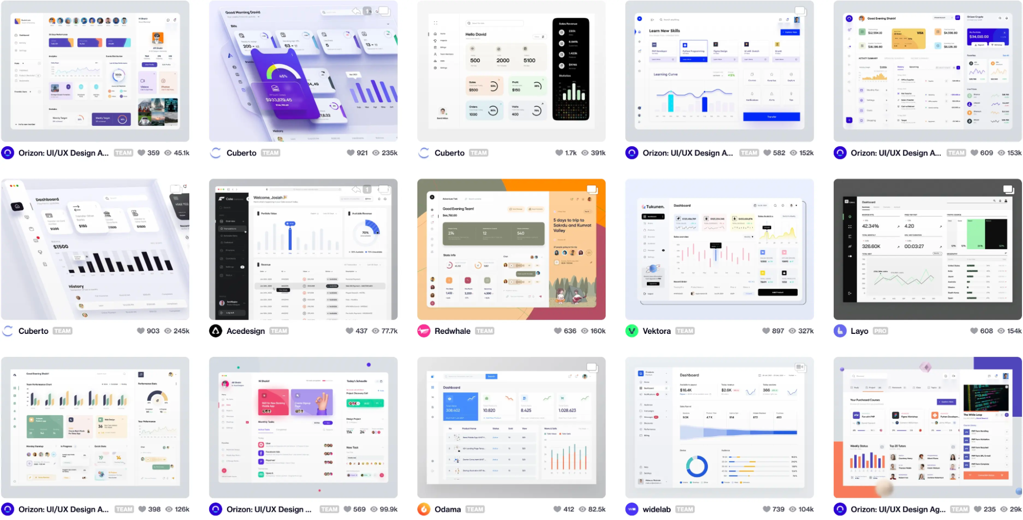
Dribbble tends to skew very “designery”, and so you might want to use real-world products for inspiration. That works too!
The trick is to use multiple sources. If you steal 100% of a design, it’s plagiarism and a bad form. People will notice, and it’ll cause problems.
Instead, we can mix 3 or 4 designs together to create something unique. For example, maybe I’ll take the color scheme from one site, the general layout and spacing from another, and the typography styles from the third!
When I’ve mentioned this strategy to actual designers, they laugh and say that it’s what they all do. I think this is their version of the “joke” that programmers spend half their time googling things.
This strategy feels like such a life hack. It’s not effortless, and it does require some design chops. The designs you use for inspiration won’t 100% match the thing you’re building, and you’ll need to use your intuition to fill in the gaps. But it’s by far the fastest way I’ve found to come up with a professional-looking design without a design background.
Putting It All Together
As developers, it can be tempting to believe that a UI framework will absolve us from needing to learn anything about design. Unfortunately, it doesn’t usually work out that way. At least, not from what I’ve seen.
Here’s the good news: you can definitely build a professional-looking product without a designer! With a few high-quality reference designs and a dash of design intuition, you can build something that hits the “good-enough” threshold, where a product feels legitimate and “real”.
There’s one more aspect we haven’t really spoken much about: CSS.
Lots of front-end developers struggle with CSS. I struggled with it too! CSS is a deceptively complex language, and it can often feel inconsistent and frustrating, even after you have years of experience with the language.
This is a problem I feel very passionately about. I spent all of last year focused full-time on building and developing a CSS course, to help developers gain confidence with the language.
It’s called CSS for JavaScript Developers. It’s made specifically for folks who use a JS framework like React or Angular. The course is focused on giving you a robust mental model so that you have an intuitive understanding of how CSS works.
If you feel like CSS is unpredictable, I really hope you’ll check it out. 9000+ developers have gone through the course, and the response has been overwhelmingly positive.
You can learn more here: css-for-js.dev.
Further Reading
- What Are CSS Container Style Queries Good For?
- The Things Users Would Appreciate In Mobile Apps
- The Case For Minimal WordPress Setups: A Contrarian View On Theme Frameworks
- How OWASP Helps You Secure Your Full-Stack Web Applications


