Simplify Your Color Palette With CSS Color-Mix()

Email Newsletter
Weekly tips on front-end & UX.
Trusted by 200,000+ folks.


color-mix() only blends two colors together, this little function may be the key to maximizing your colors without maximum effort.There’s a reason for all the new, experimental color features CSS is introducing. And there’s a reason for all the excitement they’re stirring up.
Colors are hard. Defining a base color palette can be time-consuming and involve quite a few stakeholders. And that’s not even considering contextual colors, like hover, active and inactive states. Defining these values requires even more time and more attention to accessibility. This can result in a bloated palette and an even more bloated set of design tokens.
It can be a lot to juggle. 🤹
While the CSS color-mix() function may only blend two colors together, could it be used to simplify color palettes and streamline contextual values across themes?
The CSS Color-Mix() Function
The CSS color-mix() function is an experimental feature that is currently a part of the Color Module 5. True to its name, the function will accept any two colors, mix them together and return a little color Frankenstein.
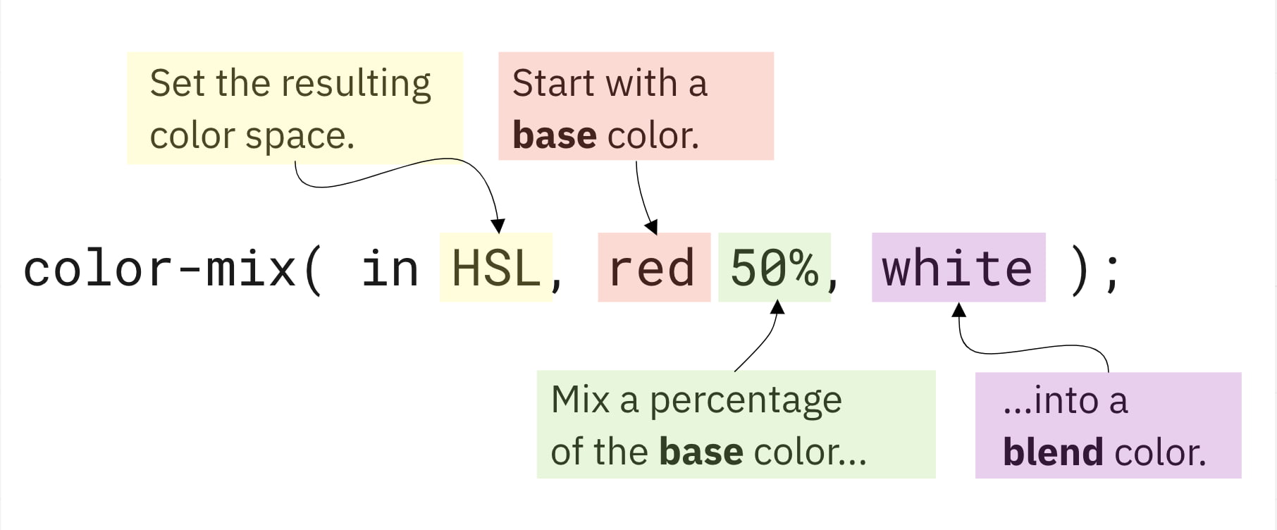
For the sake of this article, let’s define how these arguments will be called while using this example.
- Color Space would refer to
HSL; - Base Color would refer to
red; - Base Percent would refer to
50%; - Blend Color would refer to
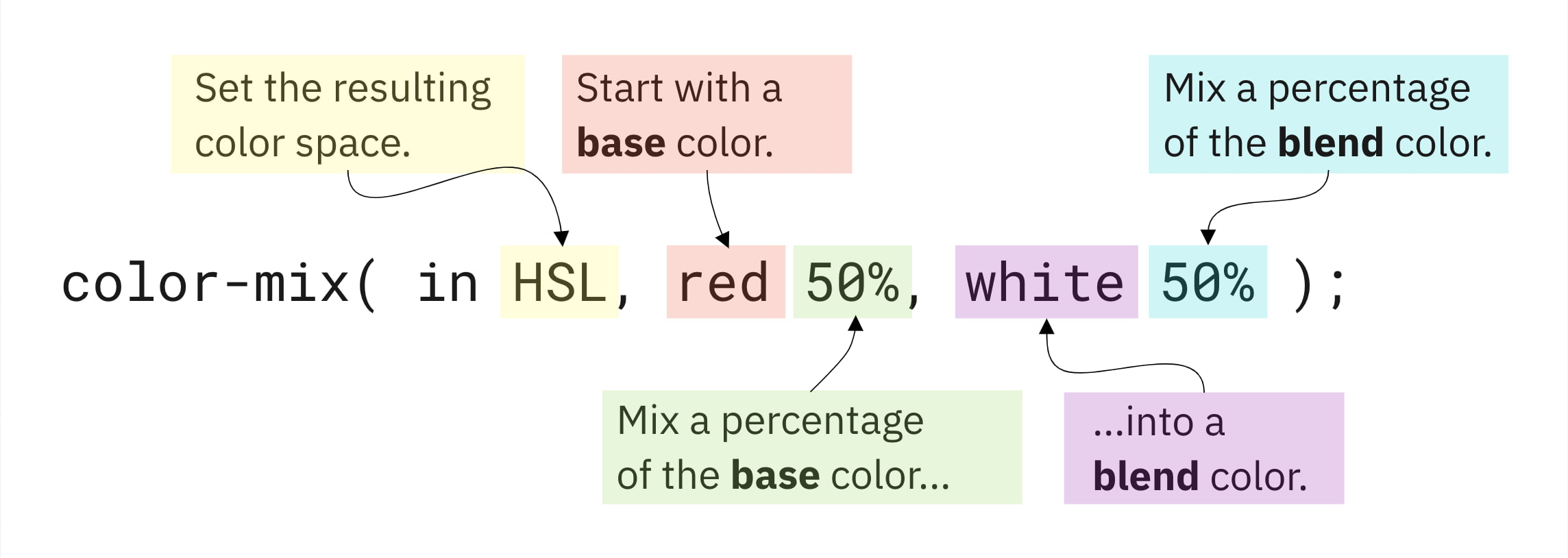
white; - Blend Percent, not shown in this example, will refer to a value covered later.
There are quite a few moving pieces here, so let’s have a quick interactive visual to simulate the base color, base percent, and blend color.
See the Pen [CSS Color-Mix – Base Color Percentage Demo](https://codepen.io/smashingmag/pen/jOZvVqM) by Daniel Yuschick.
Like with any experimental feature, the syntax or features could change before widespread browser adoption. However, the features in Color Module 5 seem stable enough to, at the very least, begin tinkering ourselves.
At the time of writing this article, browser support is very limited (as in, all but non-existent). The feature can be toggled behind development flags in both Firefox and Safari Technology Preview. But the web moves fast, and it’s probably worth visiting Color-Mix() On Caniuse to see the latest (and hopefully greatest) support.
Now, with the formalities out of the way, grab some dark rum, ginger beer, and lime juice, and let’s get mixing.
Throwback Art Class 🎨
Do you remember learning about the color wheel in art class?
The primary colors anchored the wheel, and when blended, they formed the secondary layer. Lastly, by blending the secondary layer, the tertiary colors were formed. The wheel was complete.
Disregarding the lack of a visual wheel here, CSS color-mix() can be used to create the same effect.
See the Pen [CSS Color-Mix – Art Class Demo](https://codepen.io/smashingmag/pen/GRQXNZb) by Daniel Yuschick.
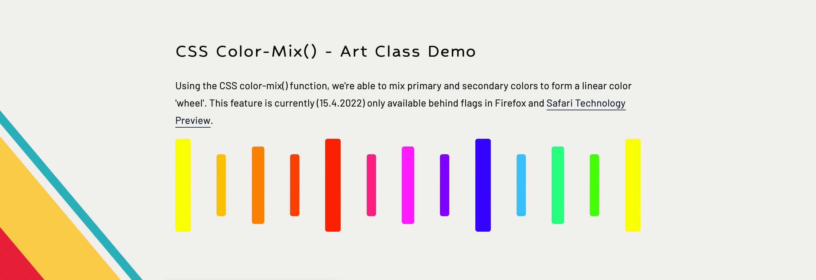
Building the linear color wheel was a lot of fun and a great dive into using color-mix(). It often helps when experimenting with a new feature to already know what the visual outcome should be.
So how does this work?
First: Define the base primary colors.
--primary-1: #ff0;
--primary-2: #f00;
--primary-3: #00f;
Next: Mix the primary colors to create the secondary colors.
--secondary-1: color-mix(in srgb, var(--primary-1) 50%, var(--primary-2));
--secondary-2: color-mix(in srgb, var(--primary-2) 50%, var(--primary-3));
--secondary-3: color-mix(in srgb, var(--primary-3) 50%, var(--primary-1));
Last: Mix the primary and secondary colors to create the tertiary colors.
--tertiary-1: color-mix(in srgb, var(--primary-1) 50%, var(--secondary-1));
--tertiary-2: color-mix(in srgb, var(--secondary-1) 50%, var(--primary-2));
--tertiary-3: color-mix(in srgb, var(--primary-2) 50%, var(--secondary-2));
--tertiary-4: color-mix(in srgb, var(--secondary-2) 50%, var(--primary-3));
--tertiary-5: color-mix(in srgb, var(--primary-3) 50%, var(--secondary-3));
--tertiary-6: color-mix(in srgb, var(--secondary-3) 50%, var(--primary-1));
Of course, when I was in art class, there was only one set of paints. So if you wanted yellow, there was only one yellow. Red? There was only one red. Blue? Well, you get the idea.
But the web and CSS offer a much wider selection of colors in the way of ‘color spaces.’ Some of these color spaces may already be familiar, but there were quite a few I hadn’t used before, including four new CSS color features which are gradually gaining support.
Color spaces can calculate their colors differently from one another. Newer color spaces provide wider palettes with more vivid shades to maximize the latest screen technologies — like ultra-high-definition retina displays. It means that a single color may appear differently across each color space.
Knowing the CSS color-mix() function supports using different color spaces, let’s experiment with color spaces by replacing the use of srgb from the previous example with a custom property to see how the color wheel changes.
See the Pen [CSS Color-Mix – Color Space Demo](https://codepen.io/smashingmag/pen/ZErMBOy) by Daniel Yuschick.
The color-mix() function isn’t limited to only blending HEX codes either. In fact, it can mix multiple color types at once. The previous example can be modified to use different color types while returning the same results.
First: Define the base primary colors
--primary-1: yellow;
--primary-2: rgb(255,0,0);
--primary-3: hsl(240,100%,50%);
Next: Mix the primary colors to create the secondary colors
--secondary-1: color-mix(in srgb, var(--primary-1) 50%, var(--primary-2));
--secondary-2: color-mix(in srgb, var(--primary-2) 50%, var(--primary-3));
--secondary-3: color-mix(in srgb, var(--primary-3) 50%, var(--primary-1));
Mixing N’ Matching
Recreating childhood art class is fun, but those concepts can be taken further and applied more practically to our adulthood hobbies and careers.
"A lot of time can be spent defining every color variation and shade, but color-mix() can blend theme values together to fill in those variation gaps."
Let’s take a look at contextual UI colors, like button :hover and :active states. A lot of time can be spent defining these values to ensure they’re cohesive with the current theme and accessible. But when themes often include primary dark and light colors already, could these values be mixed to create contextual colors a bit more automatically?
See the Pen [CSS Color-Mix() – Contextual Button Demo](https://codepen.io/smashingmag/pen/gOvdLMV) by Daniel Yuschick.
While a similar effect could be created with the HWB color function by increasing the button color’s blackness value, sometimes darkening a button isn’t just a matter of mixing in a splash of black. Just ask anybody who’s ever struggled finding the perfect dark mode theme. This is also where color-mix() stands out from Sass darken() and lighten() functions. The color-mix() function gives greater and granular control of how colors are adjusted, and it does so natively to CSS.
By mixing a specific theme value, like --color-dark-primary , the pseudo-states can be created while remaining visually cohesive with the rest of the theme.
Additionally, a color-mix() result can be used as the base color in another color-mix() function. This is done in the demo to define the buttons’ :active states relative to their :hover state.
"When specifying a base percentage, the blend color is mixed with a percentage that would total 100%. If the base percentage is 75%, the blend percent will be 25%."
 :root {
  --color-dark-primary: #dedbd2;
}

button {
  --btn-bg: #087e8b;
  --btn-bg-hover: color-mix(in srgb, var(--btn-bg) 75%, var(--color-dark-primary));
  --btn-bg-active: color-mix(in srgb, var(--btn-bg-hover) 80%, var(--color-dark-primary));

  background: var(--btn-bg);

  &:hover {
    background: var(--btn-bg-hover);
  }

  &:active {
    background: var(--btn-bg-active);
  }
}
In this example, the --btn-bg-hover value is defined by mixing 75% of --btn-bg with --color-dark-primary. Then, --btn-bg-active is set by mixing 80% of --btn-bg-hover with --color-dark-primary again.
It’s important to note when specifying a base percentage that the blend color is mixed with a percentage that would total 100%. If the base is 75%, the blend percent will be 25%.
However, this becomes a bit complicated when introducing a separate blend percent.
Mixing Mastery With Blend Percents
As an optional argument for color-mix(), the blend percent introduces an additional level of mix mastery. In the previous examples, without a blend percentage, the blend color would automatically use a value that, when added to the base percent, totaled 100.
If the base percent was 50, the blend percent would be 50. If the base percent was 99, the blend percent would be 1.
However, specifying a custom blend percent means the percentage total may not always round out so evenly.
While the W3 docs explain the calculations behind this functionality quite well, the math is a tad beyond my abilities to explain clearly — this is art class, after all. But, as best as I can put it:
--math-bg: color-mix(in srgb, red 20%, white 60%);
In this example, the base percentage is 20 while the blend percent is 60 creating a total of 80. This gives us, what’s called, an alpha multiplier of 0.8 where 1 = 100 and 0.8 = 80%.
To fill in the gaps, the function will multiply the base and blend percentages by this alpha multiplier to scale them up to 100% while remaining relative to their original weights.
20% * 100/80 = 25%
60% * 100/80 = 75%

--math-bg: color-mix(in srgb, red 25%, white 75%);
If the base and blend percentages total more than 100, the inverse of this approach would be taken to round down to 100. Again, the math behind the scaling of these values, along with the general mixing calculations, is beyond my depth. For those interested in digging deeper into the technicalities of color-mix(), I would point to the W3 docs.
However, that mathematical understanding isn’t required for the below demo, where both the base and blend percentages can be adjusted to view the result.
See the Pen [CSS Color-Mix – Blend Color Percentage Demo](https://codepen.io/smashingmag/pen/rNJZWMY) by Daniel Yuschick.
Actin’ Shady With Transparencies
Colors with transparency add another level to the color-mix() function. The concept seemed complicated, but after experimenting, opacities look to mix similar to the opaque mix percentages.
 :root {
  --base-opacity: 50%;
  --blend-opacity: 50%;
  --base-color: rgba(255, 0, 0, var(--base-opacity));
  --blend-color: rgba(0, 0, 255, var(--blend-opacity));
}

#result {
  background: color-mix(in lch, var(--base-color) 50%, var(--blend-color));
}
In this sample, the base color is red, and the blend color is blue. In normal circumstances, these colors would mix to create pink. However, each color is defined using rgba and a 50% opacity.
The result is the expected pink shade but with an averaged opacity. If the base opacity is 100% and the blending opacity is 0%, the resulting opacity will be 50%. But regardless of the resulting opacity, the 50⁄50 color mix keeps its consistent pink shade.
See the Pen [CSS Color-Mix – Opacities Demo](https://codepen.io/smashingmag/pen/mdXGOrZ) by Daniel Yuschick.
A Dash Of Caution
There are inevitable drawbacks to consider, as with any experimental or new feature, and color-mix() is no different.
Custom Properties And Fallbacks
Since CSS custom properties support fallback values for when the property is not defined, it seemed like a good approach to use color-mix() as a progressive enhancement.
--background-color: color-mix(in srgb, red 50%, blue);
background: var(--background-color, var(--fallback-color));
If color-mix() is not supported, the --background-color property would not be defined, and therefore the --fallback-color would be used. Unfortunately, that’s not how this works.
An interesting thing happens in unsupported browsers — the custom property would be defined with the function itself. Here’s an example of this from Chrome DevTools:

Because the --background-color property is technically defined, the fallback won’t trigger.
However, that’s not to say color-mix() can’t be used progressively, though. It can be paired with the @supports() function, but be mindful if you decide to do so. As exciting as it may be, with such limited support and potential for syntax and/or functionality changes, it may be best to hold off on mixing this little gem into an entire codebase.
@supports (background: color-mix(in srgb, red 50%, blue)) {
  --background-color: color-mix(in srgb, red 50%, blue);
}
CurrentColor Is Not Supported
A powerful little piece of CSS is being able to use currentColor as a value, keeping styles relative to their element. Unfortunately, this relative variable cannot be used with color-mix().
button {
  background: color-mix(in srgb, currentColor 50%, white);
}
The hope was to have ever greater control over relative colors, but unfortunately, using currentColor in this way will not work. While color-mix() can’t achieve relative colors to this degree, the new relative color syntax is also coming to CSS. Read about CSS relative color syntax with Stefan Judis.
Wrapping Up
While color-mix() may not be as powerful as something like color-contrast(), there is definitely a place for it in a CSS tool belt — or kitchen cabinet. Wherever.
The use cases for contextual colors are intriguing, while the integration into design systems and themes (to potentially simplify color palettes while retaining great flexibility) is where I want the most to experiment with in the feature. However, those experiments are likely still a ways off due to the current browser support.
Personally, combining color-mix() with color-contrast() is an area that seems particularly exciting, but without proper browser support, it will still be difficult to fully explore.
Where would you first implement color-mix()? 🤔
Maybe it could be used as a mixin to roughly replicate the lighten() and darken() SCSS functions. Could there be greater potential in the realm of user-generated themes? Or even web-based graphic editors and tools? Maybe it could be used as a simple color format converter based on device capabilities.
Nevertheless, CSS is providing the web with plenty of new and exciting ingredients. It’s only a matter of time before we start mixing up some incredible recipes.
Further Reading
- “Manage Accessible Design System Themes With CSS Color-Contrast(),” Daniel Yuschick
- “A Recipe For A Good Design System,” Átila Fassina
- “A Guide To Modern CSS Colors With RGB, HSL, HWB, LAB And LCH,” Michelle Barker
- “Color Tools And Resources,” Cosima Mielke
 (nl, il, mrn)

