An Accessibility-First Approach To Chart Visual Design

Email Newsletter
Weekly tips on front-end & UX.
Trusted by 200,000+ folks.

 Register!
 Flexible CMS. Headless & API 1st


Have you heard the claim that designing for accessibility leads to a better outcome for everyone? Here’s a story about how an accessibility-first approach led to an overall better visual design for a chart.
In 2018, Kent was a founding member of Google Cloud’s first dedicated data visualization team. Kai joined shortly after the team was formed. Early on, we created several prominently featured visualizations in many Google products. Our team, a passionate group of designers, researchers and engineers, also wrote Material Design’s data visualization guidelines. However, as we continued to fulfill our mission, we realized our work wasn’t as inclusive as we had hoped, and as we started embracing new accessibility standards, we realized we had more work to do. We felt strongly that accessibility transcends compliance and that we had an opportunity to create something that is truly useful.
The Need For Accessible Data Experiences
Data Visualizations Are Ableist
Visualizations only work well for those who can fully see. According to the National Federation of the Blind, 7.6M people in the United States have a vision disability. We also know that color blindness affects 1 in 12 men worldwide. These people are typically not relying on assistive technology, like screen readers, to consume web content, and they will be the focus of our case study. For most of these people, the value and insights provided by a chart get lost, and in some cases, the chart provides little-to-no information. As part of our mission of organizing the world’s information and making it universally accessible, it’s our responsibility to be good citizens of the web by making data accessible to everyone.
An Accessibility-First Approach Led To A Better Visual Design
Similar to mobile-first, the accessibility first approach considers accessibility requirements and constraints at the very beginning of the design process. To do this right, we typically validate our ideas with an accessibility testing team, and we codesign our solutions with people who have disabilities. Through this process, we’ve learned a lot, and it has completely changed the way we think about representing data.
There are many ways to make data accessible, but for now, let’s focus on our accessibility-first approach to visual design. Over the past two years, our team has fielded a lot of questions on data accessibility. Believe it or not, the majority of these questions focus on accessible chart colors, encodings, and visual design. This is why we’d like to focus on visual design for now. Our accessibility-first approach ensures that accessibility is a core to the chart’s visual design without compromising focus, sacrificing readability, or adding unnecessary chartjunk.
Let’s compare this approach to a famous piece of architecture, the Guggenheim museum in New York City. In this museum, all of the exhibits and artworks are arranged around a large, accessible ramp that spirals down through the various levels of the building, as depicted in the image below.

This ramp is a core part of how everyone experiences artwork in the building, and it’s inherently accessible. This is light-years better than the experience in buildings with hidden ramps, lifts, and retrofitted equipment for people with limited-to-no mobility.
Now, let’s look at how we can apply this thinking to visual chart design.
The Challenge
Recently we were tasked with the challenge of helping developers understand the overall latency and performance of their apps, websites, and digital experiences. An app’s underlying codebase is often made up of a series of functions that execute in order for its features to work. The more efficiently the code is structured, the faster the functions execute, and the better the overall app performs.
Reducing latency is an essential part of any good app experience. After all, who wants to stare at loading screens all day long? It became obvious that a visualization would provide a glanceable diagnostic view of the app’s underlying code, and it could be used to help developers spot inefficiencies in the app’s code.
Choosing A Chart
To visualize app performance and latency, we considered several chart types. To do this, we wanted to represent each function in the code base as its own chart. For each function, we’d plot the time it took to execute every time it was run.
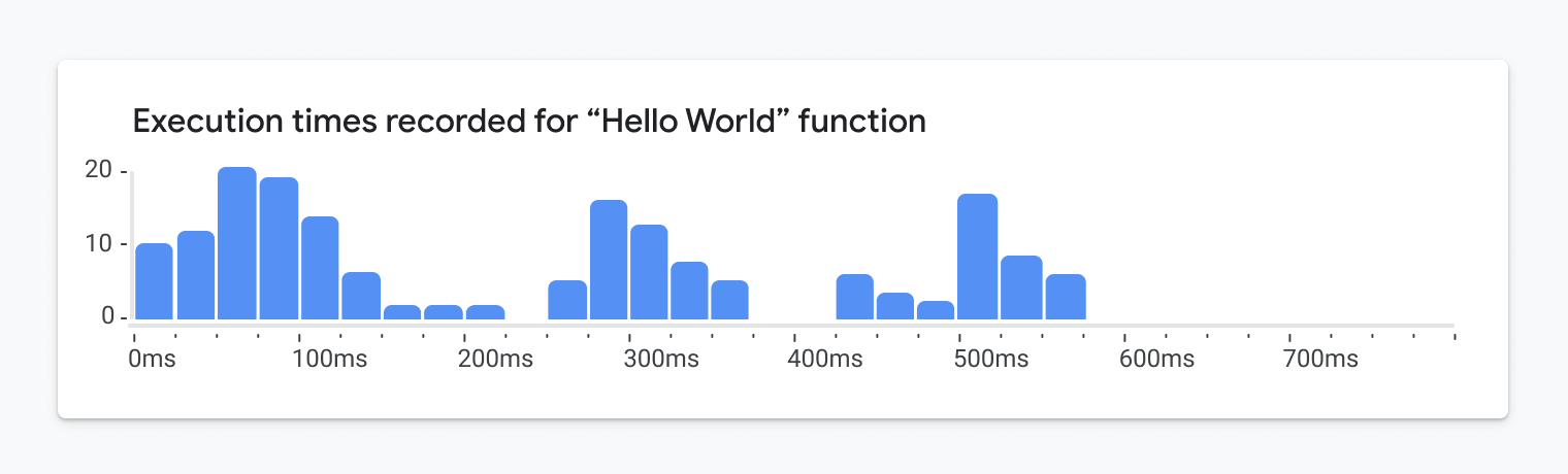
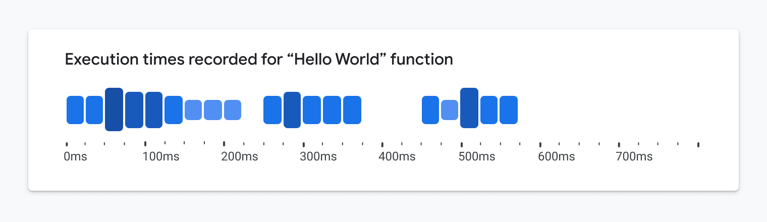
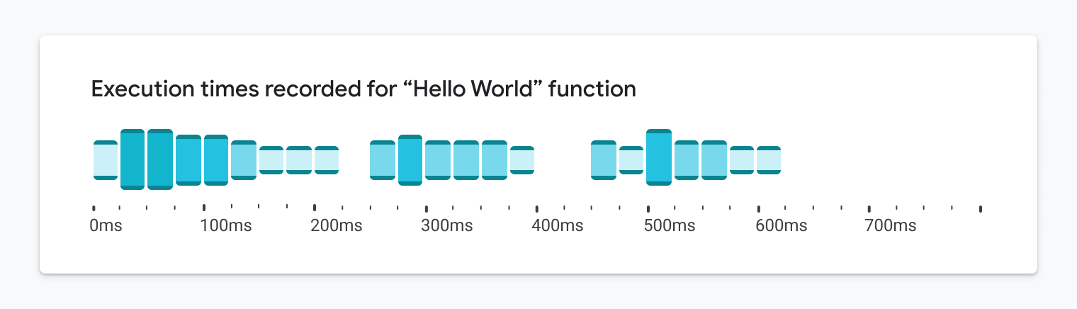
There are several charts that are meant to show the distribution of a variable. The early exploration in the image below shows all recorded execution times for the same function in the codebase:
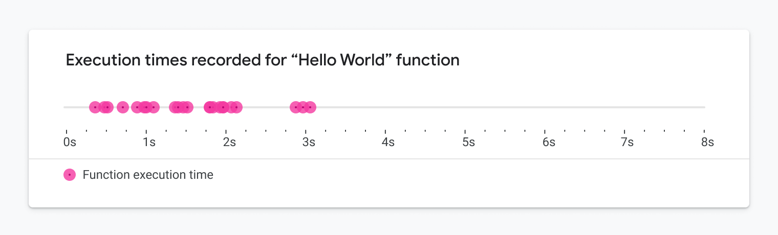
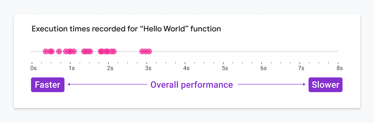
After many runs of the function, we can get a sense of how performant the function is, whether it is typically fast or slow, as illustrated here:
Considering Accessibility Standards
First and foremost, we followed the Web Content Accessibility Guidelines (hereafter referred to as WCAG) in order to ensure that our visualization would meet the necessary accessibility standards. These guidelines are often used to determine whether or not a digital experience can be deemed accessible by auditors. This enabled us to narrow down our options and choose a general direction. Initially, we considered using a histogram (see above) as it’s a more scalable solution than the previous examples shown earlier.
Considering Low-Vision Users
We knew that the visualization would need to provide at-a-glance insights, even for people with low vision viewing the content at a 200% zoom level. Due to this, the visualization should be scalable and occupy as little screen real estate as possible by default. That way, when zoomed in, low-vision users do not have to scroll to read the chart.
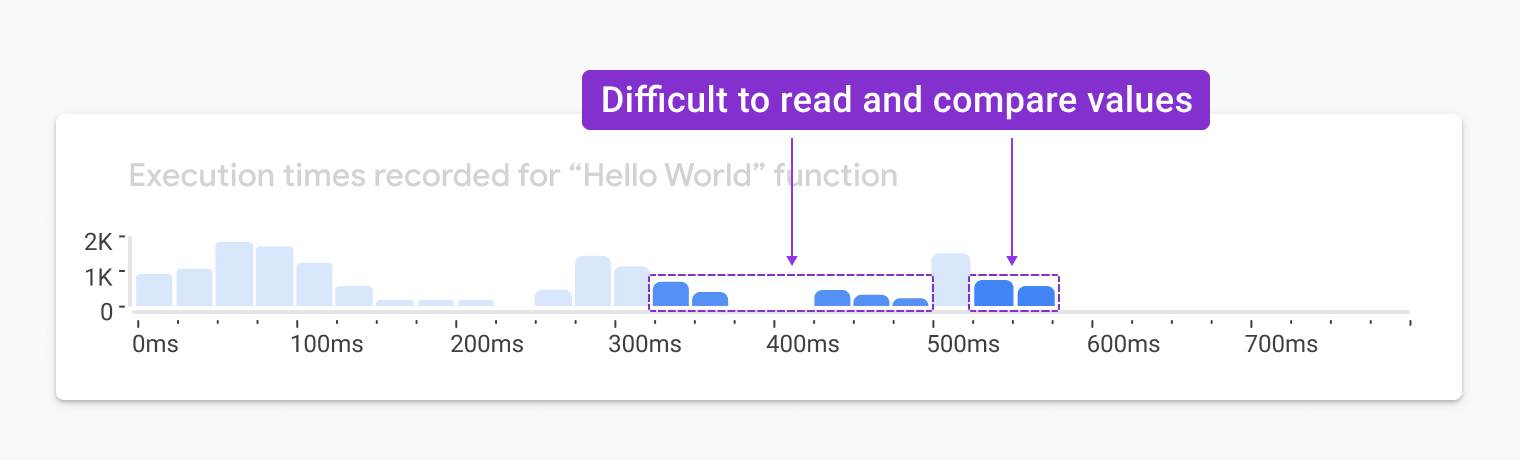
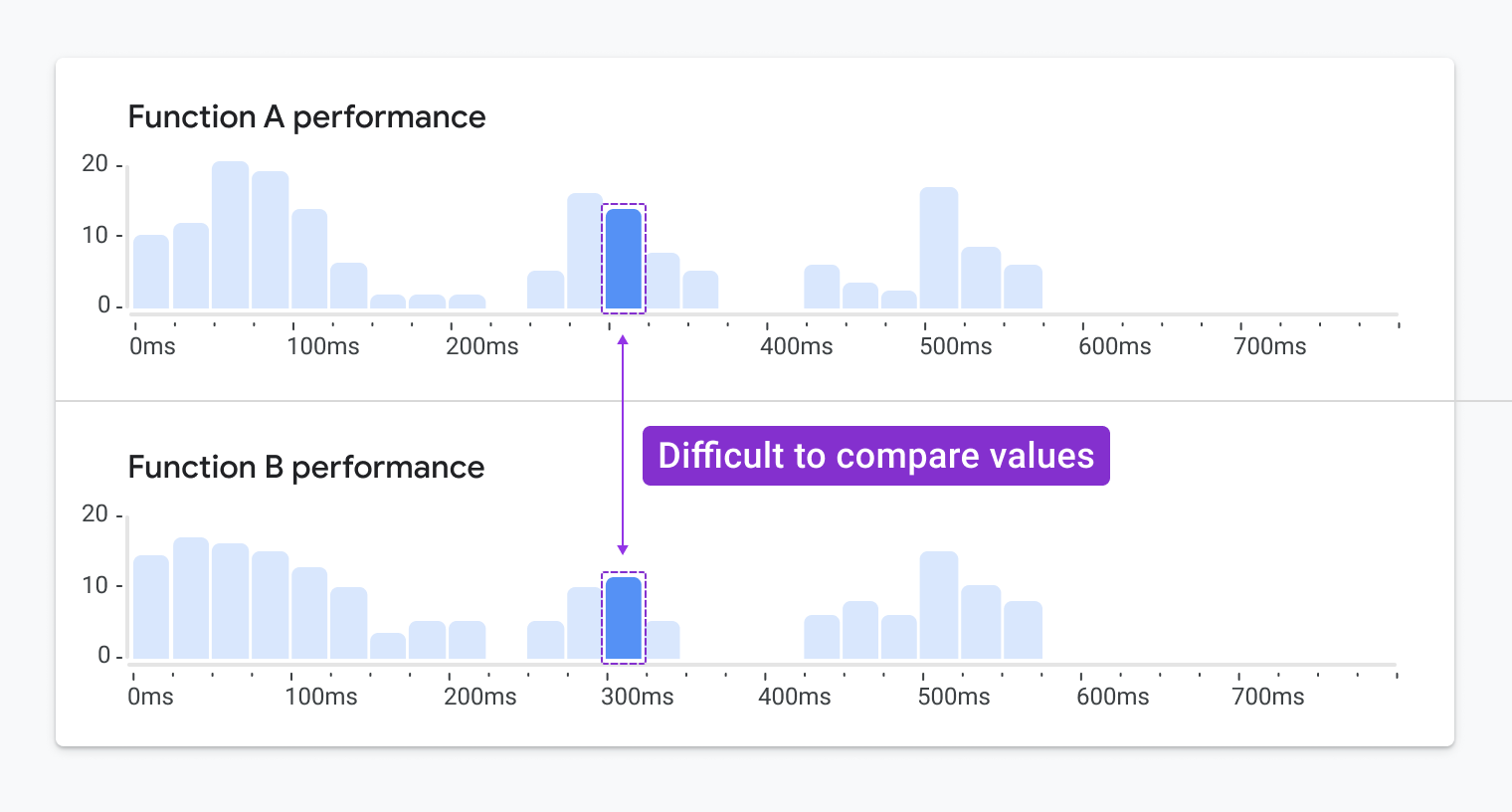
When histograms are reduced in size, it is especially difficult to compare the heights of their bars and map their values back to the compressed Y-axis. In these cases, readability quickly declines. The next image highlights some common readability issues with compressed histograms:
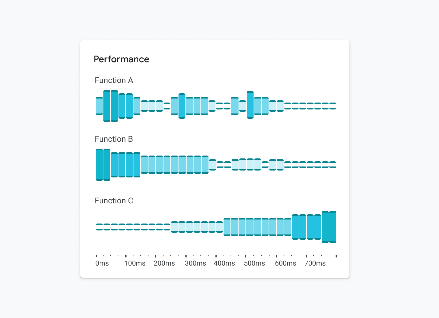
In some cases, we knew we’d want to compare the performance of multiple functions. It isn’t quite easy to compare the heights of bars between two stacked histograms:
Since we would be limited in our ability to reduce the size of the histogram, we also knew scrolling would become an issue. As a result, we quickly eliminated the possibility of using a histogram.
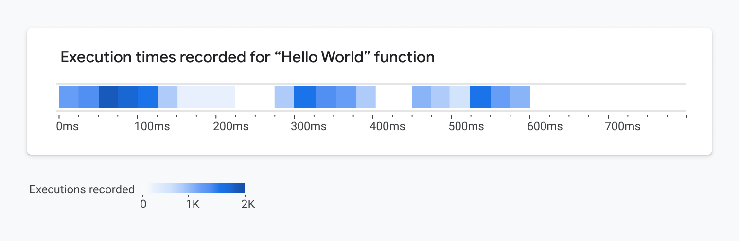
Instead, we considered using a continuous color ramp to represent the execution times recorded for multiple runs of function in the codebase (see image below). We could also stack multiple swimlanes to provide additional insights.
Considering Color Contrast Requirements
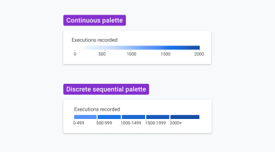
WCAG accessibility guidelines require that graphics achieve a minimum 3:1 contrast ratio with their background. With this requirement, our options for color values are much more limited, especially when displaying a visualization on a white background, which is a core part of Google’s current brand. To accommodate this, instead of applying a continuous color ramp that mapped to a continuous range of values, we decided to use a limited discrete sequential color palette.
The colors can be mapped to a set of grouped value ranges or bins. This technique is known as data binning, and it enabled us to apply a smaller range of colors to the visualization. In doing this, we could ensure we were using colors that meet WCAG’s minimum 3:1 contrast requirement.
The next image shows a comparison of the continuous palette and the binned discrete sequential palette:
To achieve the required 3:1 color contrast ratio, we opened up whitespace between each of the heat map tiles. That way, we didn’t have to worry about the shades of color meeting the contrast ratio with each other.
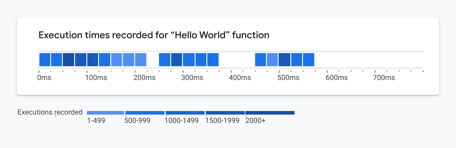
While this update meets the WCAG accessibility requirements, it makes the heatmap more difficult to read. Moreover, the bold nature of this visualization could take focus away from potentially more important screen elements outside of the visualization, such as warnings and alerts.
Considering Colorblind Users
To reduce the dependency on interpreting colors, WCAG requires that something beyond color is used to communicate meaning. This could be a texture, graphical element, icon symbol, or an additional encoding. It’s easy to add any texture, icon or graphical element to meet this requirement. However, it must be done with a lot of care. During several usability studies conducted on accessible chart designs, we found that participants misinterpreted these additions. Oftentimes people felt they represented an additional metric, status, or carried an unintended meaning. In the end, we’d have to choose something that was subtle yet effective.
After careful consideration, we chose an additional encoding. Once we introduced the idea of binning the value ranges, we could think again about using box height to represent the five possible value ranges as depicted in the image below:
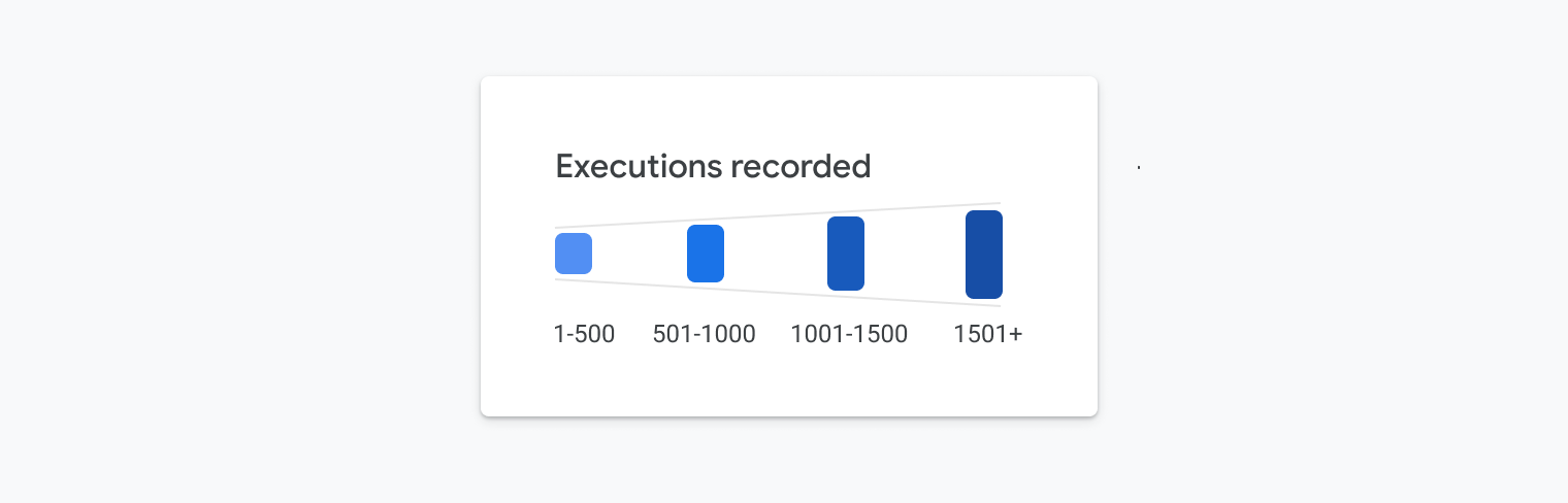
With this change, we had absolute control over the ranges in box heights, and we could ensure it would be easy to compare the heights of all the boxes. The image below illustrates this idea applied to the chart:
Sidestepping The Color Contrast Requirement
Now that we had added a second encoding, we wanted to see how we could improve the design. While WCAG recommends that all colors achieve a 3:1 contrast ratio with the white background, we found some ways to work within the guidelines yet use a broader range of values. Since we’re now using multiple encodings (e.g., color shades and box height) to communicate meaning, we realized our options opened up a bit.
To achieve the required contrast ratio, we added end caps to the top and bottom of each box. These end caps are 3px in thickness and achieve a 4.5:1 contrast ratio. We added subtle rounded corners to give it visual appeal and to ensure it fits within the aesthetic of Google’s Material Design system.
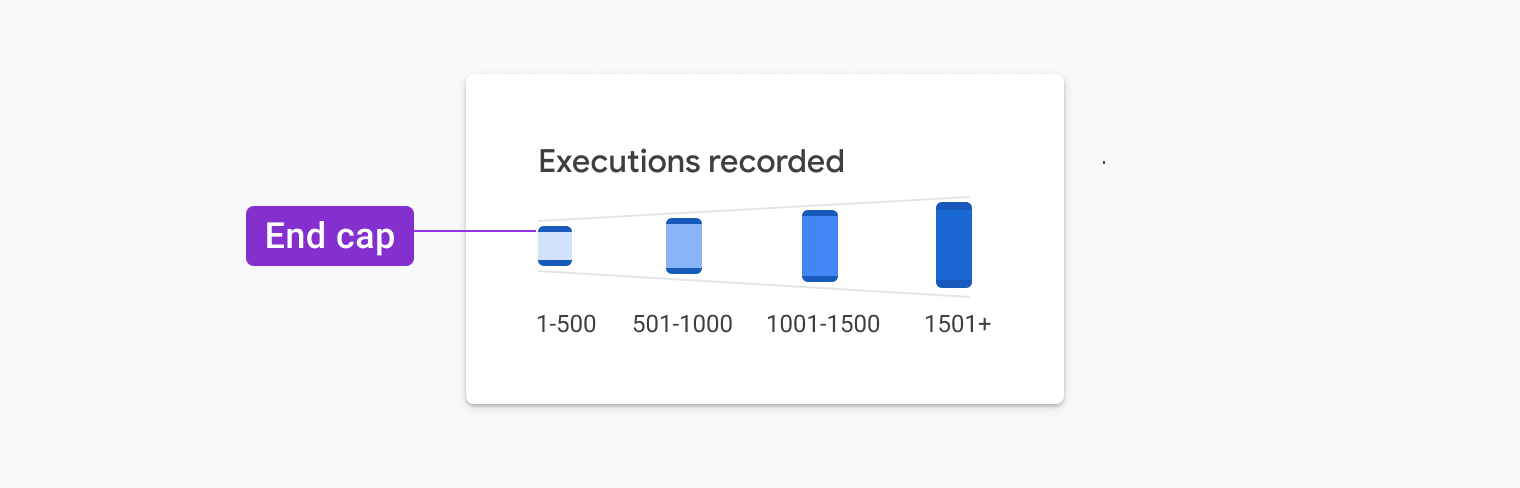
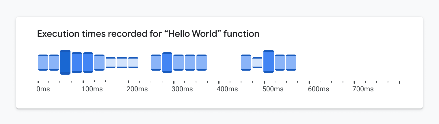
Since the end caps’ position varies, and they achieve the required contrast ratio, we could then apply a broader range of shades to the box fills to strengthen meaning and create a more appealing visual design. We could then use light tones that did not originally achieve the required contrast ratio. We can see an example of this in practice below. The addition of the endcaps was a clever way to ensure low-vision and colorblind users could still read the graph.
A New(ish) Chart Type
The resulting graph is part histogram and part heatmap — we’re calling it a heat lane. It uses binned ranges to represent both time and number of events. It’s a heavy modification to several chart types that seriously flirts with becoming its own new chart type.
So why is this a better visualization for fully sighted people?
As human beings, most of us were born with the natural ability to subconsciously spot trends, patterns, and outliers in the environment. We do this through the images we see, and it happens nearly instantaneously.
Imagine you’re purchasing produce at the grocery store. It’s quite easy to spot the moldy produce that likely wouldn’t be safe to eat. This ability, known as pre-attentive processing, has been integral to our survival as a species for hundreds of thousands of years.

Visualizations are graphics that leverage these core capabilities. In our case, we’ve exploited these capabilities through the design of this particular chart. It’s fairly easy to glean insights and value within milliseconds of glancing at it.
In the case of the heatlane, there’s a visual “blobbing” effect that takes place when glancing at this. It even holds up when squinting at it or when it’s slightly blurred. All of the visual design decisions we made in order to meet accessibility requirements and WCAG standards are a core part of the chart’s design. Because these ideas were not retrofitted to an existing chart, we were able to create an accessible chart without adding extraneous chartjunk or sacrificing visual design and polish.
In addition to aesthetic benefits, our accessibility-first approach led to more useful applications of the chart. In order to start, the heat lane visualization can be stacked repeatedly (see below) so people can understand the correlation of different event types in the stack.
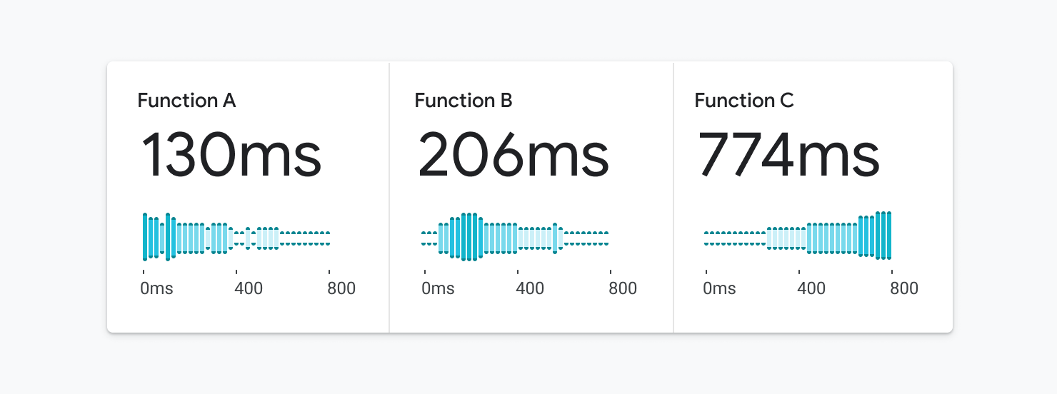
As a bonus, we realized this visualization could be readable as a sparkline as well:

It also works well as a small multiple:
Finally, it can show a few or millions of data points. As we started to apply it in our day-to-day work, we quickly realized that the possibilities were endless. In our opinion, the visual polish really shines through in the last few examples.
Conclusion
Had we not considered the accessibility requirements up front, we might have settled on a generic heatmap or histogram and would not have thought about combining them. We would’ve missed out on creating a more scalable and glanceable visualization that worked for everyone. Similar to how the mobile-first movement improved the way we design digital product experiences, an accessibility-first approach can enable us to create fundamentally better representations of data that can provide more insights and value to everyone.
Doesn’t Accessibility Include More Than Just Visual Design?
This is all just the beginning. While visual design is a core part of accessibility, we’ve been rethinking our overall approach to data visualization, and we’ve been focused on representing data in ways that provide value and insights for everyone, regardless of their ability. For example, we’ve been structuring our charts in ways that are easy to navigate using a keyboard for people with limited motor skills.
As we’re building charts, we ensure that we’re following the specifications for creating Accessible Rich Internet Applications (ARIA) by using the correct roles, landmarks and attributes so that all the chart’s elements can be properly interpreted by the browser’s screen reader. We’re also determining better ways to highlight emerging trends, spikes, dips and outliers in the data using text. In some cases, we’re even using sonification and providing insightful audio summaries that surface insights within the data. Stay tuned for more on this in the future.
Resources
To get started in thinking about data accessibility, check out some of these resources:
- Web Content Accessibility Guidelines
- Accessibility with Material 3
- “Google’s Six Principles for Designing Any Chart”, Manuel Lima
- Data Visualization in Material Design
We’re incredibly proud of our colleagues who contributed to this visualization, including Sierra Seeborn, Jess Klos, Nicholas Cottrell, and Saurabh Kumar. Without everyone’s contributions, we wouldn’t have been able to create, develop and deploy this design as rapidly as we did.
 (cc, yk, il)

