Designing Better Error Messages UX

Email Newsletter
Weekly tips on front-end & UX.
Trusted by 200,000+ folks.


When we design interfaces, we rarely think about error messages first. After all, how much is there to design anyway? We highlight the error, display a message, and nudge users toward the correct input. As it turns out, a strategic and thorough design of these messages can be critical for businesses, especially if they struggle with high abandonment. Error messages can make or break the experience in situations when things go south.
Errors are everywhere, and so are error messages. They are of course common in web forms, but also in complex tables, incompatible filters, search queries and failed interactions. They can be small error notes and large error summaries; short tooltips and lengthy toast messages. So, where do we start? From the beginning.
Pssst! This article is part of our ongoing series on design patterns. It’s also a part of Smart Interface Design Patterns 🍣 and is available in the Live Interface Design Training 🍕 as well.
Not All Error Messages Are Equal
Not all errors are the same. As Page Laubheimer has noted, there are actually two different types of errors. Slips occur when users intend to perform one action but do another (e.g., when filling in a form on autopilot). Mistakes occur when there is a mismatch between the mental model of a user and the system. Our interfaces need to support both types of errors, and slips are usually much easier to resolve than mistakes.
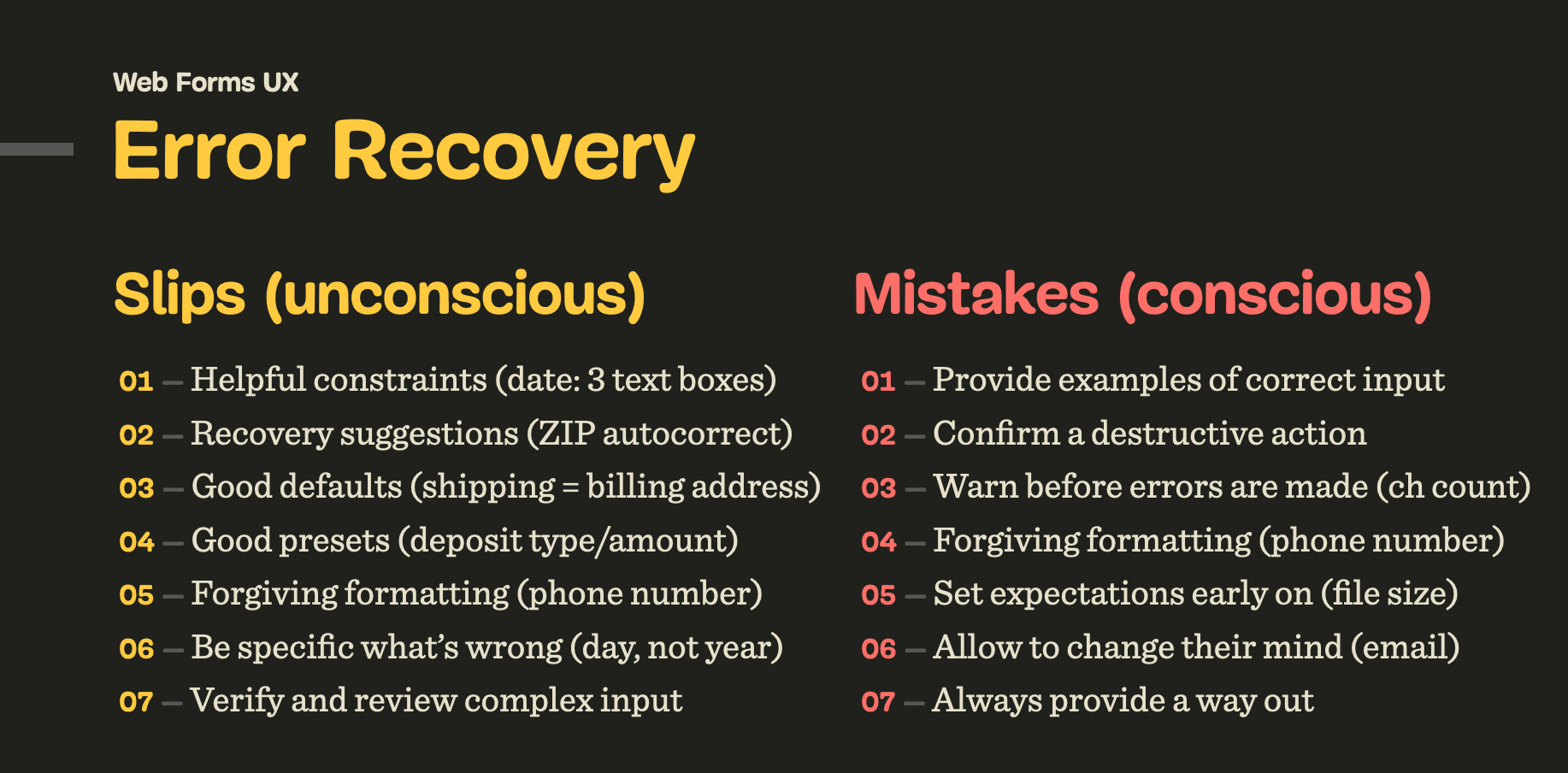
For slips, we can include helpful constraints (e.g. a reasonable width of a text box, prefixes and suffixes), provide recovery suggestions (e.g. autocomplete), choose reasonable defaults, and use forgiving formatting.
To prevent mistakes, we need to confirm destructive actions (when users go back to the previous page), set expectations early on (password requirements or file size), allow users to change their minds (change email or payment method), and in general, always provide a way out.
To measure the success of our error messages, we can define error-focused design KPIs and track them over time. These could include:
- the average number of mistakes in a user journey,
- the error recovery time,
- the completion rates, and – completion times.
We can’t really eliminate mistakes altogether since no human input can be bulletproof, but we can reduce the number of errors by making it more difficult to make mistakes. One simple way of doing so is to improve the discovery errors, by never relying on the color of error messages alone.
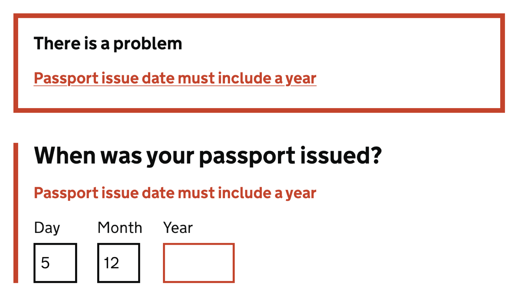
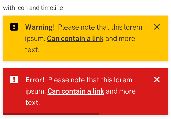
Never Rely On Red Color Alone
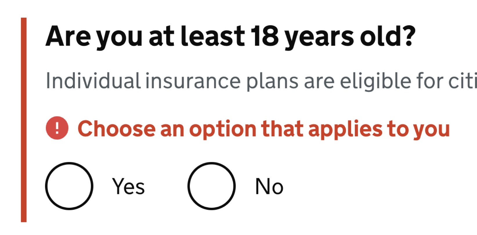
When we think of error messages, we almost subconsciously think of bold red text errors. That’s indeed a very established pattern, but often not enough to indicate to all users that something is wrong.

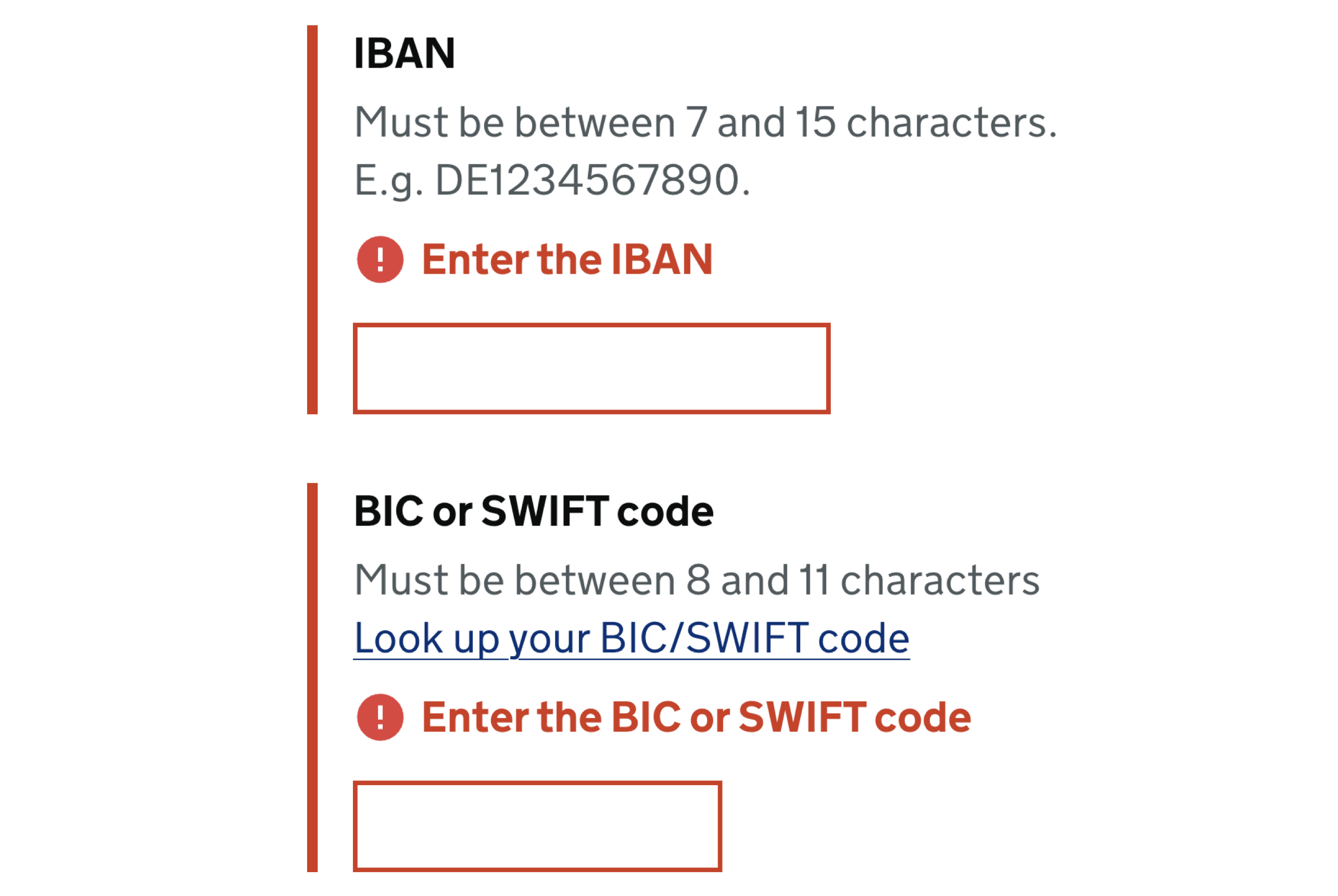
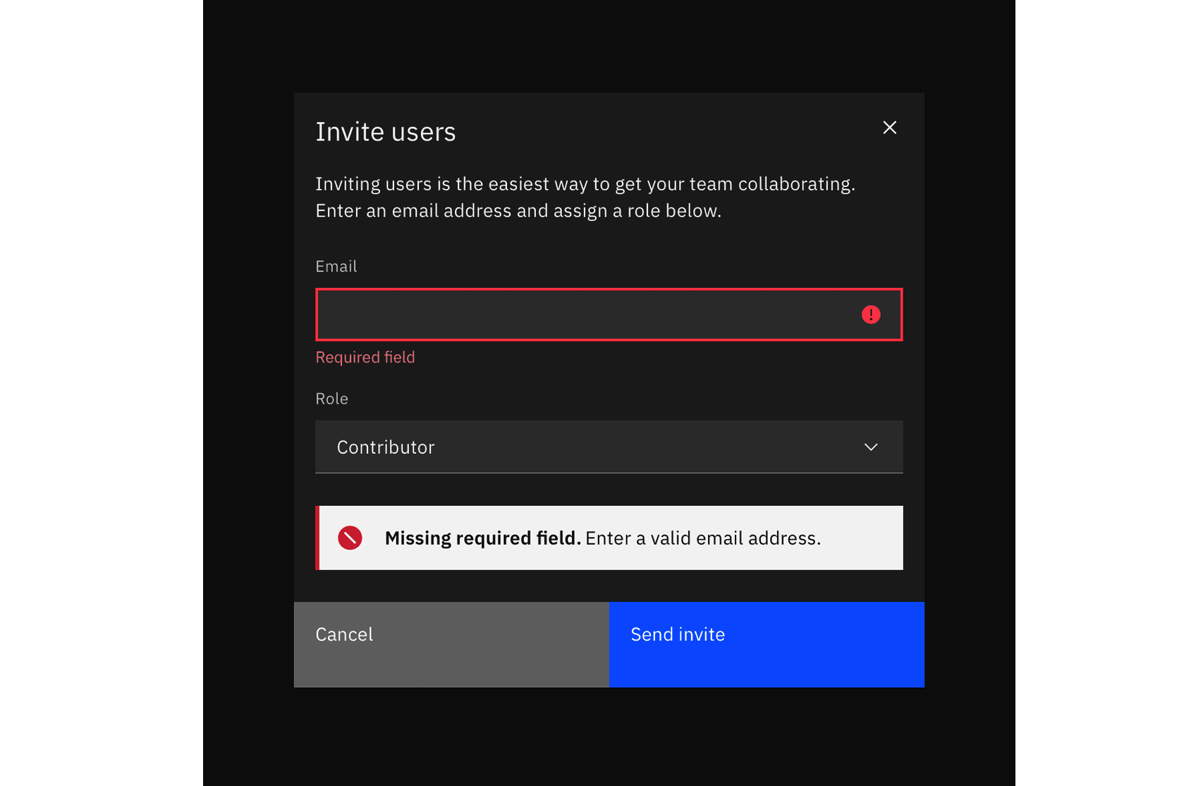
Due to color vision deficiencies, it’s a good idea to always complement error messages with an icon, e.g., a large exclamation mark on a red background — right next to the error message. We can also highlight the entire section, along with the field, label, the hint, the error message and the input field. For example, a thick red vertical line next to the error message is a common pattern for error messages on Gov.uk.
Sometimes the icon is displayed inside of the input field, on the right or on the left edge of the text box. When we display the icon on the right, users who zoom in and out might have difficulties spotting them. That’s why placing the icon on the left edge seems to be just a bit more reliable.
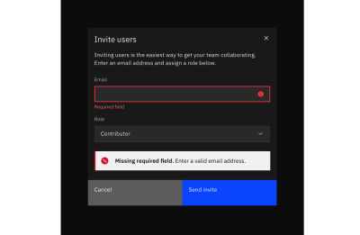
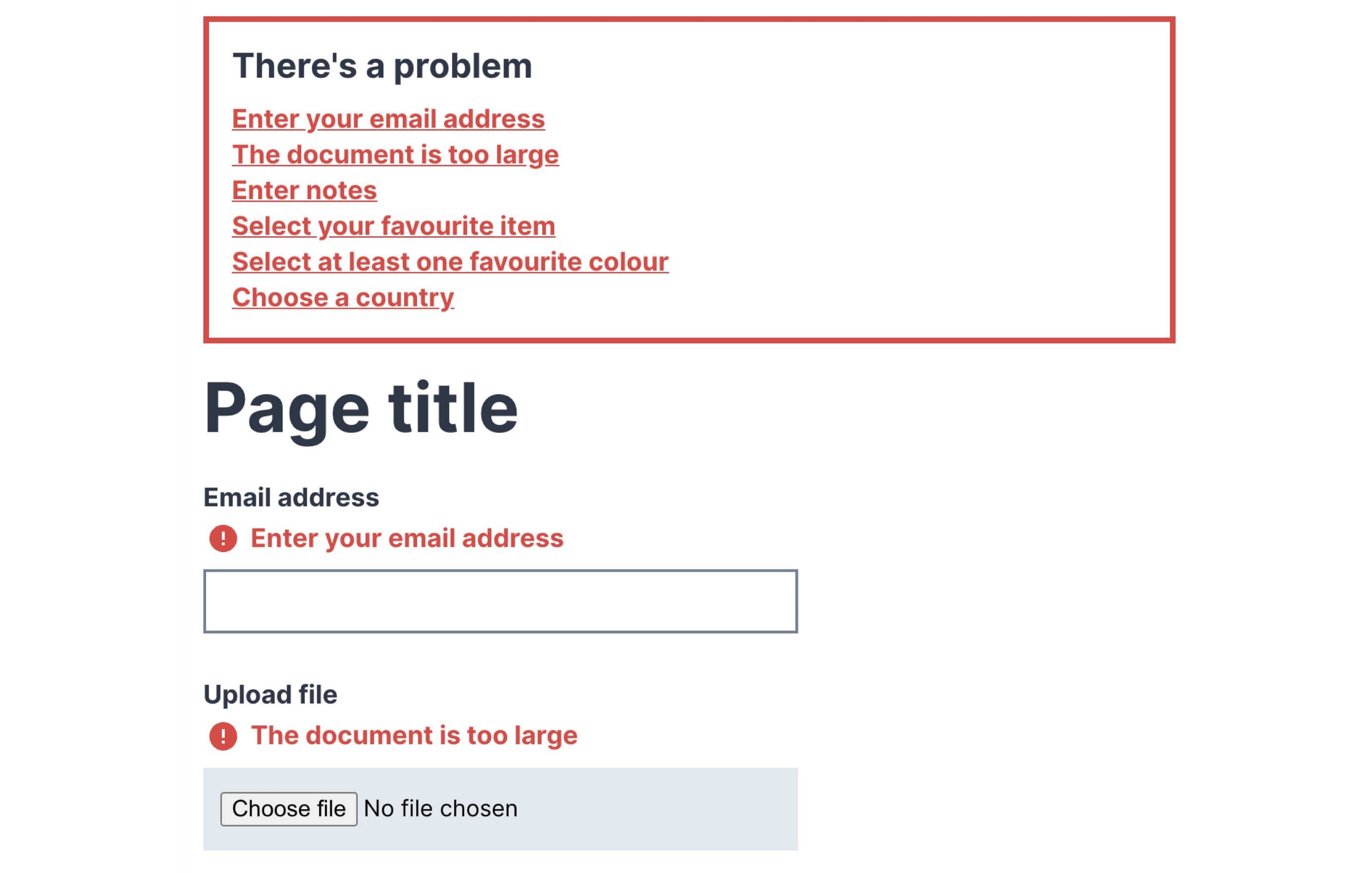
Additionally, it might be a good idea to guide users towards specific issues of the form with an error summary. That summary can contain links to the areas in the form which contain errors, so users can jump there directly.
The summary can appear on the top of the page, or just above the action button, as displayed in the example above.
Most importantly, error summary probably shouldn’t appear under the action button. Too often, especially on mobile, users don’t realize that there is any error message at all, and keep clicking on that poor submit button hoping to get any kind of feedback — be it a status update from the browser, or a change of the URL. The feedback is actually there, under the button, yet in testing, it often shows very poor discovery rates.
If the page is fully refreshed upon validation, the error summary should be at the very top of the page. But if the page is updated without a refresh, it’s reasonable to add the error summary just above the action button where the user has just clicked or tapped — and highlight it with the red color and icon as well.
Avoid Auto-Scrolling and Auto-Jumps
Once a user clicks on the submit button, should we automatically scroll them to the first error? There is no clear answer to that question. Personally, I saw this pattern working very well for some users, but failing miserably for others.
Any sudden movements on the page are likely to cause frustration with at least some users. If anything, users tend to find auto-jumps more annoying than auto-scrolling — as the latter at least communicates the direction of change and hints better at where users have moved to.
Short answer? Start without auto-scrolling and display just an error summary with links. If it’s too slow, or doesn’t work as expected, consider adding auto-scrolling. And by no means move users up and down the page for no obvious reason — that’s a safe way to increase completion times and introduce confusion when it’s probably not needed.
Never Cover User’s Input
When we display error messages, we convey to users that there is a problem; a good error message, however, also guides users to a solution. This, however, requires the ability to consult the error as the error is being fixed. In other words, users should be able to edit the input field while also reviewing the error message(s) provided to them.
So far, so good. However, things become quite complicated once we also have a tooltip in play. Once a tooltip is open, users might lose sight of both the error message and the input. Should they desire to be able to see all three pieces of information at once, they’d be out of luck.
However, we can fix it relatively easily. First of all, we avoid tooltips that open on hover and display the tooltip only once tapped or clicked. That means that a tooltip will never disappear automatically and must be closed manually.
Then, we use the details component and inline accordions as an alternative to tooltips. Hence, we make space for the content of the tooltip to expand between the label and the other content, so nothing will be covered. The error message would be visible at all times as well, next to the input field.

This way, we show all three pieces of information at the same time — and users always have a choice to select what exactly they’d like to see. Is it too much? Maybe. But that’s a great option to keep in mind: at least to always display the input field and the error at the same time without them being covered by the tooltip.
In Forms, Display Error Messages Above Input
Now, this might sound a little bit confusing at first. Usually, error messages will be sitting conveniently under the input field, or perhaps — less frequently — on the right side of the input field. As it turns out, there are a few accessibility issues that come as a cost of these conventions.
- Users of a magnifying software might miss the error message when it’s located on the right.
- On mobile, users might not be able to see the error message under the input because it will be covered by the virtual keyboard.
- When editing input, error messages might be covered by the browser’s autofill or dropdown’s autocomplete suggestions.
Displaying error messages above input fields typically helps us avoid the accessibility issues listed above. The cost of it, though, is layout shifts: with every new error appearing dynamically, the entire form has to shift vertically as we need to make space for the error message to appear. It might be noisy, but sometimes that noise might be very much worth it.
For lengthy error messages, it might sound tempting to display them as a tooltip, yet with it come all the usability issues discussed in the previous section. Using a collapsible accordion instead might be a better idea there.
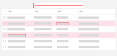
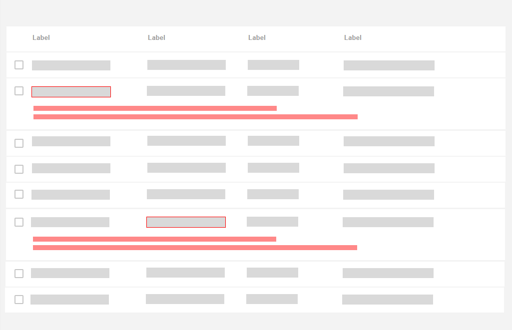
In Tables, Display Error Messages Inline
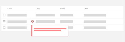
When displaying error messages in tables, it might be a good idea to consider alternative approaches as otherwise we would end up with a lot of layout shifts for each row.
One of the simpler patterns is to display the error message in the same row where the content lives. In that case, the error message is more likely to live under the input field, not above it. Lengthy error messages could be collapsed and expanded with a tap/click on the entire row.
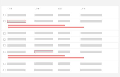
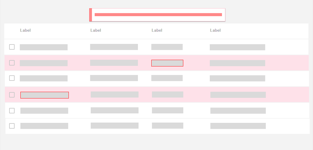
If the same error affects multiple rows, we might want to highlight the rows that contain errors and display an error message at the very top of the page that would explain the error and what needs to be done to fix it.
Don’t Rely On Toast Error Messages
But what about good ol’ toast error messages? Those animated notifications, informing users about change of status of the system with floating messages. They might be uncommon for forms, but they frequently appear in tables and enterprise dashboards.
There are a few common usability issues with toast error messages:
- Users often don’t get a chance to fully read or understand the error message before it has disappeared, and there is no way to restore it or keep it floating.
- Toast messages typically appear on the edges of the screen, and usually, it’s quite far away from the problematic input that has caused the error. There is quite a disconnect between the error message and the input, and it’s rarely possible to read the error message and correct the mistake simultaneously.
- Lengthy toast messages usually block large areas of content that a user might be relying on — and potentially even the input that has caused the error.
- Toast messages need to be announced to screen reader users while also allowing users to bring their focus back and forth between the error message and the erroneous input.
- With toasts, we usually don’t have enough space to provide a detailed help using images or videos, and have to rely on plain text and links leading to external help pages that would usually open in a new tab.
If anything, toasts should be persistent if displaying information that can be acted upon, and users should be able to manually dismiss the notification.
Personally, I’d definitely stay away from designing error messages as toasts, even if they are persistent. The better we can connect an error with its cause visually, the less likely it is to be overlooked. And the better we can explain how to solve that error close to the erroneous input box, the faster users will understand what they need to do.
Allow Users To Override An Error Message
We’ve all been there before: full of hope and passion, you type in your shipping address in an eCommerce checkout, willing to proceed with payment right away. Yet here it comes, an aggressive address validator, telling you that your address is wrong, and you better double check it. You have been living at that address for the last five years, yet for some reason, that’s not good enough for the address validator.
What options do you have? Unless you are willing to deliver the item to another address, this problem will likely cause a 100% abandonment — an extremely high price to pay for a poor address validator. Surely you don’t want to deliver an item to non-existing addresses, yet you don’t want to abandon customers either. Indeed, it might be that only a small portion of customers will be affected by it, but why should we lose these customers either?
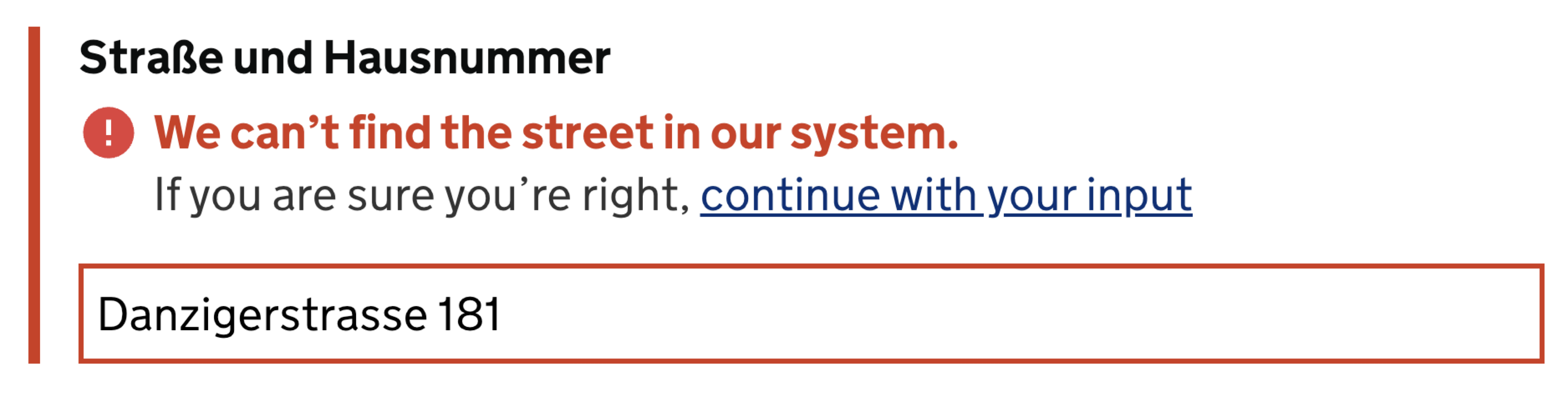
No single validation library is 100% reliable and bulletproof for all the edge cases. Eventually some percentage of your customers will be left out there in the woods, trying to figure out what to do next to proceed. Aggressive validators cost money. Especially when they come in tandem with disabled buttons that literally block users without telling them what exactly needs to be done to fix the issue.
For cases when a validator might be too restrictive, we can allow customers to override validator’s warning. Surely we will get some wrong addresses as a result of that. But as a business, we need to measure just how much money we are losing due to increase in service desk inquiries vs. how much money we gain by allowing people to find a way to proceed even although the interface doesn’t want to play along. More often than not, it’s worth it.
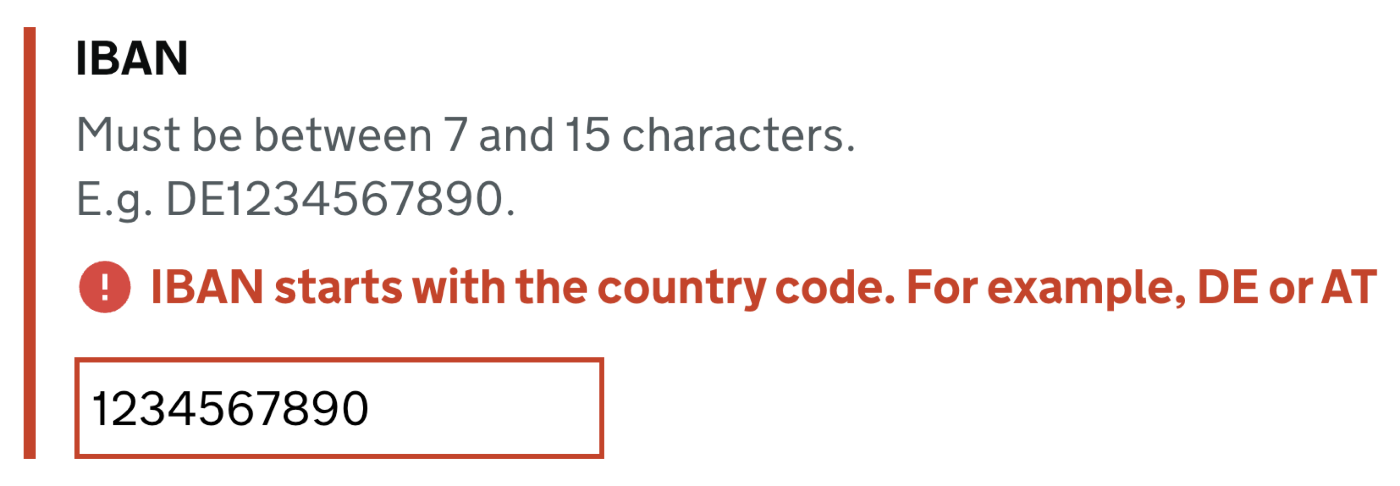
While this pattern works flawlessly for address input and telephone input, it probably won’t work for any input that needs to follow a particular convention — such as the length and checksum of an IBAN number or a credit card number. There, instead of giving customers a carte blanche, we need to meticulously check user’s input and guide them towards what exactly the problem seems to be.
Establish Stop-Words For Your Error Messages
Many error messages in most web applications are remarkably generic. They do indicate errors, but they aren’t very helpful in indicating solutions on how to fix these errors. Most of the time, these messages don’t really refer to the specifics of the user’s input. They provide a very general statement explaining that the input is wrong, with plenty of floral and cryptic words along with it.
In my personal experience, starting a project off by exploring and defining error messaging can be a very valuable exercise. If we can convey friendliness and personality while being concise and helpful in our error messages, we should surely be able to achieve the same in our navigation, body copy and form labels. In many ways, the way we write error messages can help us figure out just the right voice and tone of the entire design.
Depending on your product’s voice and tone, you might want to be very strategic about how your error messages should sound. Here are some of the stop-words that Gov.uk tends to avoid in their interface:
- technical jargon like ‘form post error’, ‘unspecified error’, and ‘error 0x0000000643’;
- words like ‘forbidden’, ‘illegal’, ‘you forgot’, and ‘prohibited’;
- ‘please’ because it implies a choice;
- ‘sorry’ because it does not help fix the problem;
- ‘valid’ and ‘invalid’ because they do not add anything to the message;
- humourous, informal language like ‘oops’.
The choice of words matters. It’s worth emphasizing that spending time and effort on crafting helpful, adaptive error messages is probably one of the best investments a company might make to reduce abandonment and drive conversions.
Provide Examples Of Correct Input
Talking about the choice of words, how do we make it more helpful? And in general, what makes an error message helpful? For example, a clear set of guidelines of what a correct input is. That means adding a hint under the label and provide an example of correct input, so users understand how to re-route and what is expected from them.
Surely, sometimes adding an example might feel unnecessary and just taking up the space in design. I’d challenge you to tackle your conversion issues with well-crafted examples of corrent input. Often it’s the easiest way to improve conversion, as users otherwise just can’t find a way to make something work — even if it’s as simple as an extra empty space.
Display Error Summary On The Top
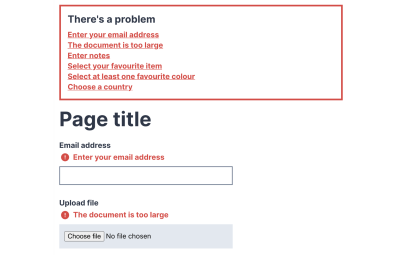
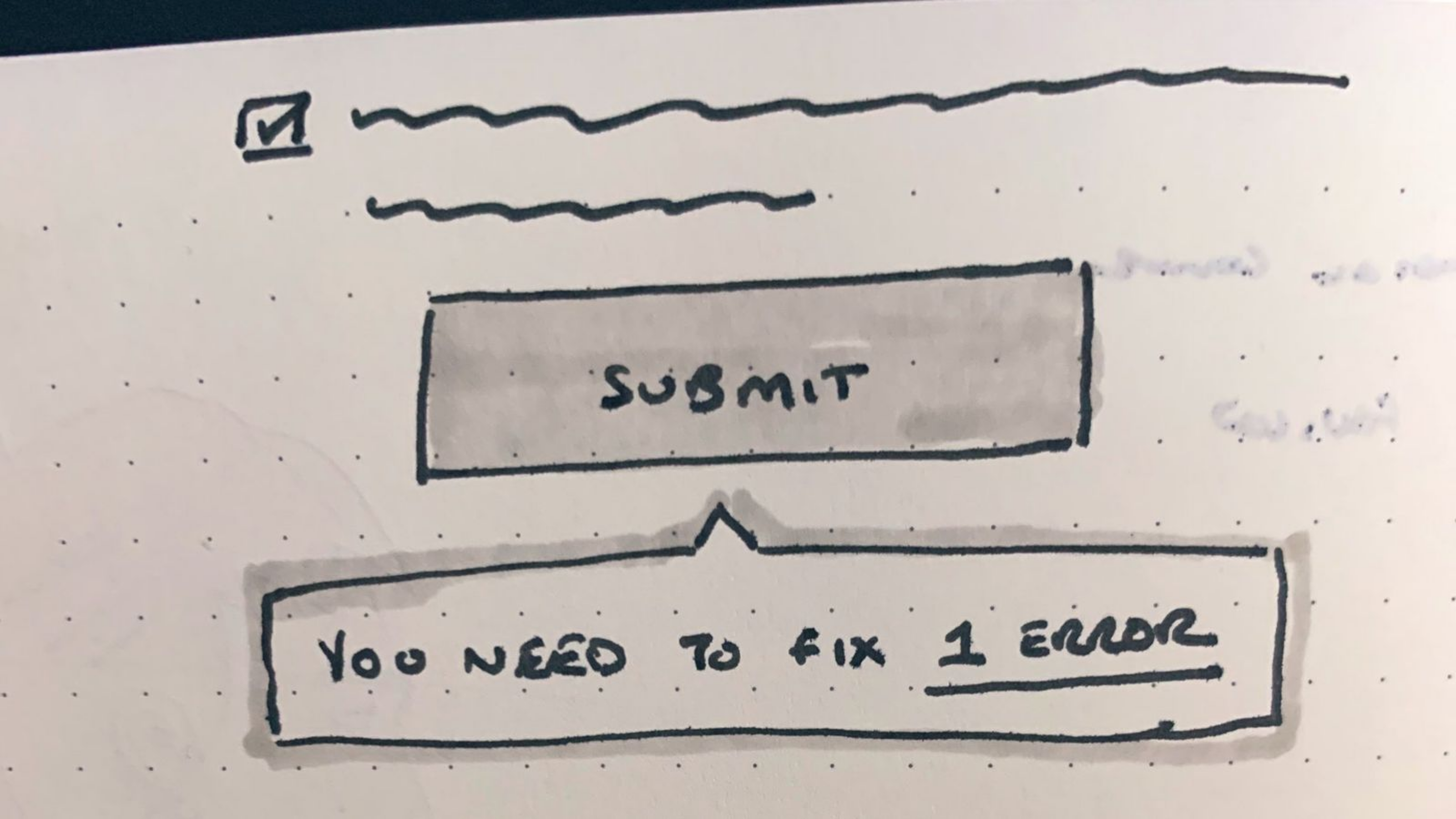
Inline validation deserves a separate conversation. As an alternative approach, of course we could validate the form on submit only. But it doesn’t mean that we have to drive users from one page to a separate new page with all the errors displayed. We could display an error summary just next to the Submit button (as displayed below, sketched by Jordan Moore). It would probably be better to display the error message above the Submit button rather than below it to prevent it from being rendered below the bottom of the viewport and thus not to be visible (thanks Rik!).
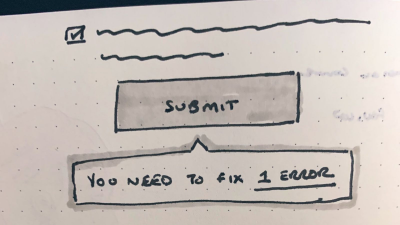
Submit button. Sketched by Jordan Moore. (Large preview)However, if there are a few problems with the form, we can also use an error summary component. With it, we highlight the errors as links so that users can jump to them via the keyboard as well. While doing so, we need to bring focus to the first form field with an error. Preferably with a bit of scroll-margin-top, so screen reader users understand where they currently are.
Additionally, you might want to adjust the favicon and the title of the document if errors do appear, so impatient users who might have already left the form perhaps have a chance to return back and fix the errors, rather than assuming that everything has worked flawlessly.

Wrapping Up
At the first glance, dealing with error messages might not sound like a big deal. However, as we dive into fine details, there are plenty of considerations that might either cause high abandonment or help people resolve issues quickly.
Here’s a quick overview of what we can do to improve the Error Messages UX in our websites and applications:
- Define error-focused design KPIs by measuring the average number of mistakes in a user journey, the error recovery time, the completion rates, and completion times.
- Never rely on the color of the error message alone, and use icons, borders, and section highlights to indicate erroneous input.
- Never cover user’s input nor the error message. Ideally, allow users to consult the error message, the tooltip, and their input at the same time, e.g., by using inline accordions and avoiding tooltips for important details.
- Consider displaying error messages above input to avoid issues with auto-fill, autocomplete, magnifying software, and virtual keyboard.
- Use inline validation for password strength meters, but not for validating every field as users type in. Consider breaking the form into small steps and validate each step only on submit.
- For complex tables, don’t rely on toast error messages and display errors within rows where an error has occurred.
- Be strategic about your error messaging and craft helpful messages that match the voice and tone of your brand, rather than being general and generic.
- Always provide examples of correct input, especially for complex input that are less likely to be auto-filled.
- Allow users to override your validators for address input and telephone input, but not for any input that needs to follow a particular convention.
- When validating on submit, display an error summary on the top of the page, or guide users to an error in a popover. Also, change the favicon and the title of the document to communicate to users who’ve already left that something went wrong.
With these guidelines, we should be better off when boosting our error messages UX. And if you can’t really do much around the way errors appear in your product, explore what you can do to replace generic error messages with helpful ones. This might be a small change with a huge impact that will eventually show up in large business KPIs dashboards.
Meet “Smart Interface Design Patterns”
If you are interested in similar insights around UX, take a look at Smart Interface Design Patterns, our shiny new 10h-video course with 100s of practical examples from real-life projects. Plenty of design patterns, guidelines and a live UX training — with 5 new segments added every year. Just sayin’! Check a free preview.

100 design patterns & real-life
examples.
10h-video course + live UX training. Free preview.
Useful Resources
- Back Button Expectations, Baymard Institute
- Designing With the Web in Mind, Chloe Sanderson
- Designing A Perfect Configurator
- Designing A Perfect Accordion
- Designing A Perfect Infinite Scroll
- Designing A Perfect Feature Comparison
- Designing A Perfect Slider
Related Articles
- “How To Design Error States For Mobile Apps”, Nick Babich
- “Designing Better Tooltips For Mobile User Interfaces”, Eric Olive
 (vf, yk, il)

