Everything Developers Must Know About Figma

Email Newsletter
Weekly tips on front-end & UX.
Trusted by 182,000+ folks.


 Custom Web Forms for Angular, React, & Vue. Your backend.
 Celebrating 10 million developers

We must understand the possibilities and limitations of each other’s tools to work hand in hand, so let me show you the design side of things and all the little Figma treasures you might not yet understand fully.

- We work with components and variants in Figma.
- We work with styles in Figma, but they are not very smart.
- We can set up and test responsive design!
- We have no breakpoints in Figma.
- We can also work with actual data (sort of).
- You might want to point out soft grid vs. hard grid to us.
- Why we sometimes mess up line-height.
- All we have in Figma is PX.
- We can set up pretty sweet prototypes in Figma.
- We will invite you to ‘View Only’ rights, giving you access to everything you need as a developer.
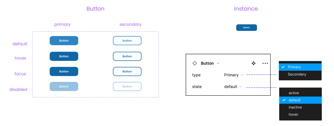
1. We Work With Components And Variants In Figma
Components In Figma
In Figma, we can set up re-usable UI components and create instances. Components can also be nested. Hence we can follow a nice atomic design path.
We Also Have Variants
We can also create component sets containing variants, swapping them easily throughout our design via the properties panel. Therefore, all states of a component can be found in one place for documentation.
Figma variants can be one-dimensional or multi-dimensional, adding several properties.
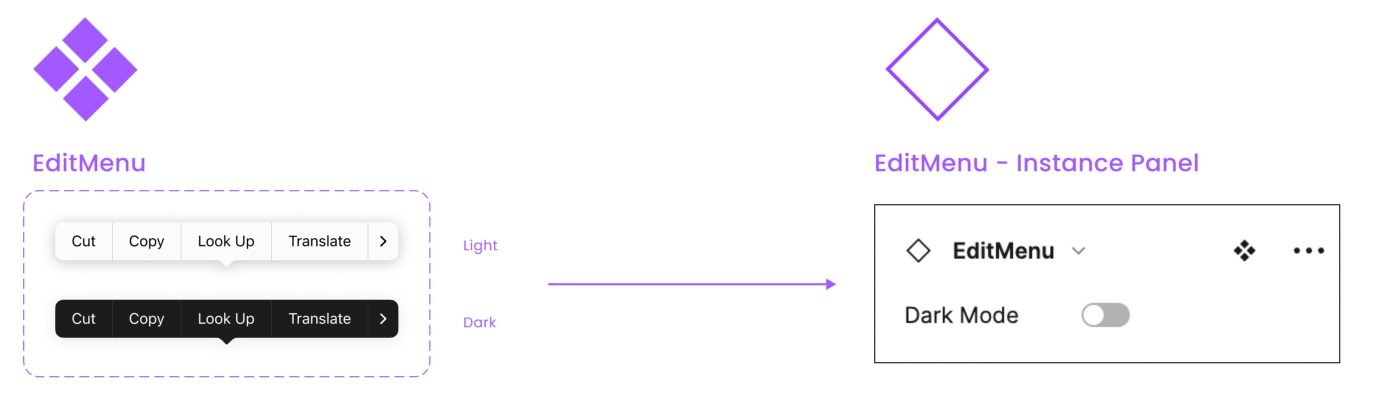
Tip: With true/false or yes/no, you can create a toggle of the entire component. This is a great way to create a light/dark mode.I saw this setup in Joey Banks’s excellent iOS 16 UI Kit for Figma. Best file setup I have ever seen in general!
We Have Props!
Component properties were released in March 2022. So I assume a lot of developers do not know about the possibility of using them in design yet. So far, we have text props, for instance, swap and toggle props. And of course, we can combine them all together.
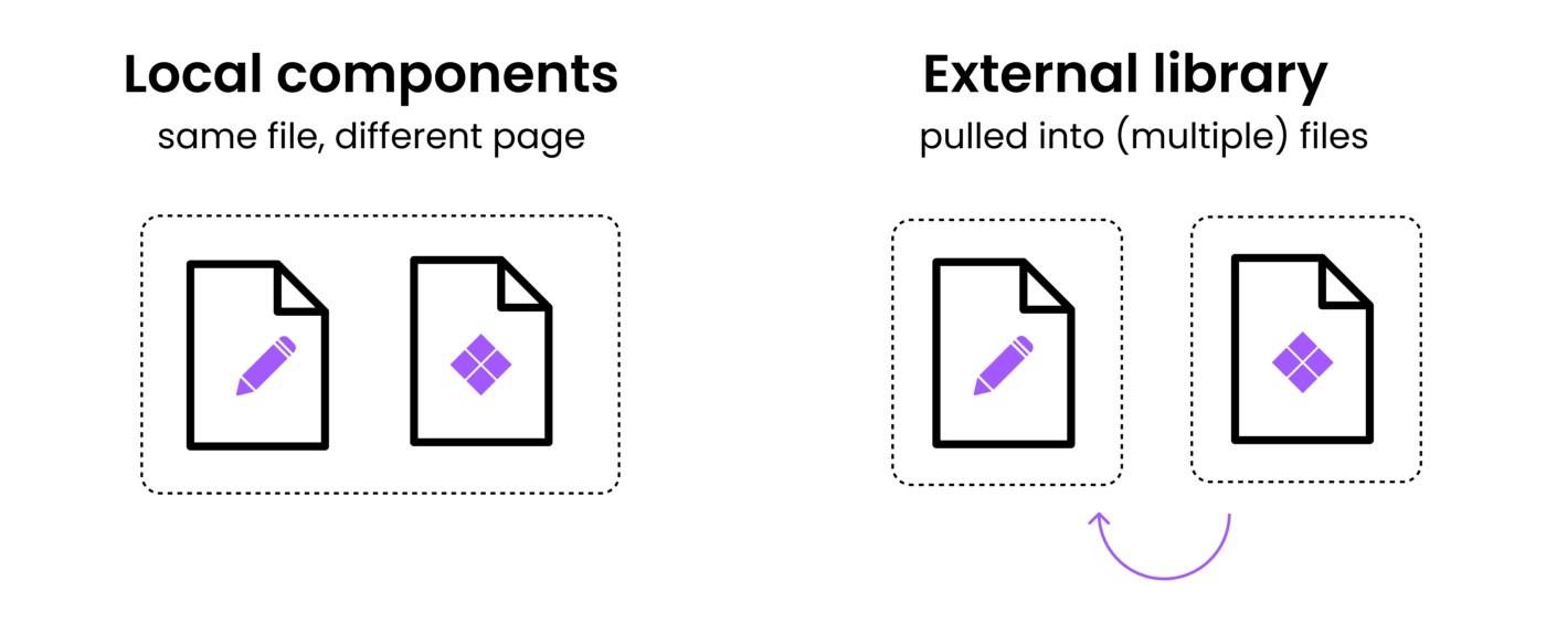
External Or Local Component Libraries
Just as in code, we can store components locally or create external libraries. (Same for styles, by the way). This way, we can pull components into multiple files in Figma yet remain a single source of truth and tidy structure.
Opportunities Between Design And Code
Align UI And Code Components In Naming And Structure
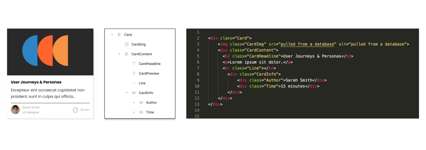
Due to the use of components, variants, and props, we can align our UI components with code components. However, to do so, we need information about the structure, naming, behavior, etc., from development. So sit down with us, have a coffee, and show us the code base you have or dream of building. Many videos and tutorials show how different teams handle this alignment process. I leave you to the rabbit hole.
Quick Link UI And Code Components In Figma
If you want to link components to a code base without much effort and documentation, you can simply add a link and a description to the Figma component documentation (a bit hidden). The link will create a button in the inspect tab linking directly to, e.g., the Github section of the same component in code. The Figma component search also picks up the description, which is handy for larger systems.
Embed A Figma Component In Your Documentation
You can simply copy a link (Cmd + L) of the Figma file (or frame) and live embed it in places like Notion, GitHub, and many more. I did just this in the example below. This is a great way to live embed your design with an existing (probably more code-heavy) documentation. It will, of course, update as you change your Figma file.
Create A Test Environment And Swap Component Libraries
If components and styles have the same name in two different libraries, they can be swapped. This is a really great opportunity to set up test environments in Figma before pushing a new style or component to the master file. More relevant for advanced setups where code and components are already aligned.
Align With Your Actual Components Via Storybook
There are some plugins to align UI components and code components. The most promising one I saw is Storybook Connect. By the way, if you have this fantastic setup, how do you align your code? And Figma makes sure to comment! I would love to hear and add it!

Note: Aligning components is fantastic, but it also takes a lot of effort and, most of all, maintenance, so use it where it makes sense, e.g., a design system. If you just design a one-pager website, you still use components with a clean and scalable design and clear building blocks to be coded, but they do not necessarily need to align with the code. It’s like you would not build an assembly line to streamline the process of making a cake if you would only want to bake a birthday cake for your friend. Yet you still use the same basic ingredients.
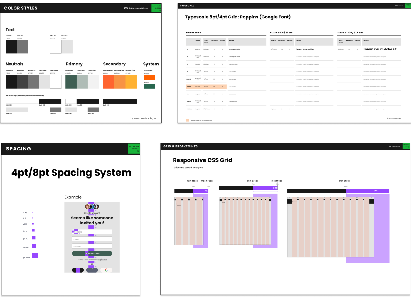
2. We Work With Styles In Figma, But They Are Not Very Smart
Styles In Figma
In Figma, we can create styles for color, text, grids, and things like shadows or blurs and re-apply them across our design. However, that’s pretty much it.
Tip: Click on the grey background area of the canvas, and you get an overview of all (local!) styles.
There is no magic documentation
But any design team usually documents styles and their use either within the same Figma file or in a separate file. Just as with components, we can link to external styles. Oh, and there are no spacing systems styles, so we just need to document this and set the correct distances by hand.
Opportunities Between Design And Code
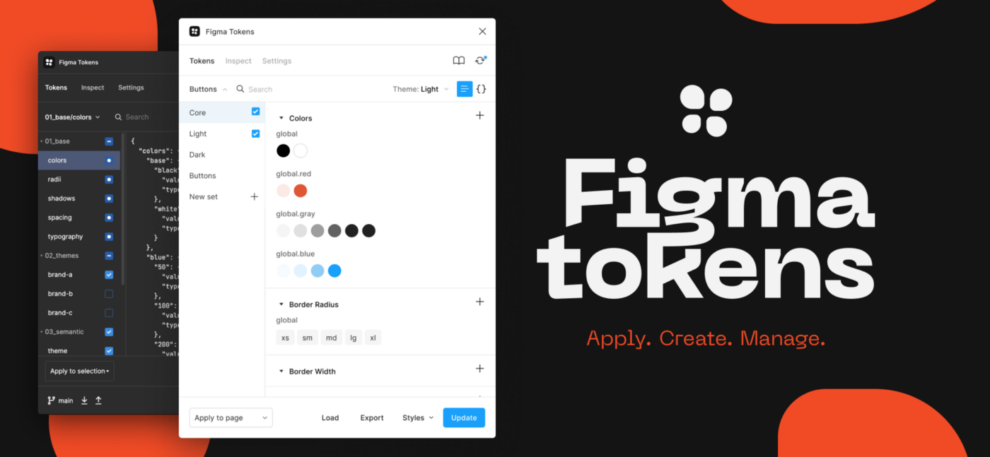
Figma Token Plugin to create or connect with existing tokens
As you can see, Figma styles are a bit isolated and do not interact with one another. So you cannot set a base font size to scale and adapt the scaling rate. You can only set a fixed size. Also, we have no styles for spacing systems (yet). However, with the Figma Tokens plugin, you can create tokens in Figma and work with them. And even more impressive, you can connect and can align with code tokens. Check out the (really well-made) documentation and this fantastic video by the creator Jan Six. So amazing!!!
3. We Can Set Up And Test Responsive Design!
This is a big one! Let’s look at it step by step. The tools we have for responsive design are the following:
Our tools in Figma for responsive design:
We can use the above tools individually, not at all, or combine them. It depends a lot on what we want to build. There is no right or wrong.

Very important to know from a developer’s point of view is that we have no automated breakpoints in Figma (I will talk about how to deal with that in a bit).
Auto Layout
Auto layout is really powerful but takes some practice to work with (and will drive you nuts to start with, but stick with it!!!). It is (loosely) based on flexbox, as you will notice when you glimpse at the Inspect tab.
With the auto layout, we can set:
- Space between items (can be positive for spacing or negative for stacking);
- Padding on all sides individually;
- Alignment;
- Set child element so packed or space between (ideal for navigations);
- Resizing behavior (full container, hug content, or fixed both horizontally and vertically);
- Nest auto layout to create powerful components and even entire pages;
- Add relative positioned elements inside an auto layout frame (new);
- Automatically adapt to new content while keeping all settings in place.
Constraints
Constraints are much more straightforward to work with in Figma. With constraints, you can pin elements to the parent frame when resizing. Note that they will react to a change in parent size but will not adapt to a change in content!
Note: You cannot add auto layout and constraints to the same frame. It is either or (small exception for relative positioned elements within auto-layout). There is no better or worse. It depends on what you want to build.
Grids
We can add grids to frames. When setting up grids, we can adjust columns, gutter, margin, and behavior.
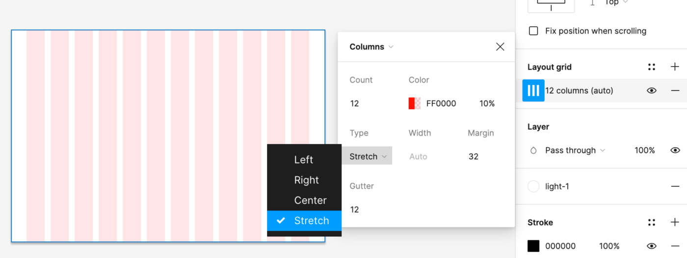
Combine Grids And Constraints
The cool thing is that as soon as a grid is applied to a frame, the constraints will assume the columns as the parent frame. So we can set up really nice and straightforward responsive behavior by combining grids and constraints.
Tip: Figma is all about nesting. You can also apply grids to nested frames, e.g., to create a frame for the sidebar with a fixed with and another nested frame holding the content.
Limitation:
This works fine for a quick test or simple setup. However, as soon as you add more content, you will notice that the margins and padding will not adapt when resizing. This is a Figma issue; in CSS, it would still work just fine.
Combine Grid, Constraints, And Auto Layout Elements
So even though we cannot combine auto layout and constraints within a frame, we can place auto layout elements/instances inside a parent frame and then use constraints around them. In this way, the content reshuffles nicely, keeping all set parameters.
Limitation:
Horizontal spacing will still not adapt. So you will probably have the question in mind: “And if I make it all into an auto layout?” Yes, you can!
Pure Auto Layout Pages
So we could also set up the design in auto layout entirely. There are two ways to use this:
- Imitating a classic grid, then we just set the space between = gutter and get the same result.
- Not work with a Grid System at all, but set up your design later in flexbox, CSS-Grid or anything else, then we just “auto layout away” as we want, you can also mix fixed and fluid.
Limitation:
The auto layout will only distribute elements equally, so you cannot have one element occupying 60% and the other 40%; it will switch to 50⁄50%. You would have to fix one element and have the rest fluid.
4. We Have No Breakpoints In Figma
Ok, great, so we have these sweet features to set up responsive components. However, we have no automation in Figma to set up a breakpoint to test across different screen sizes from mobile to desktop.

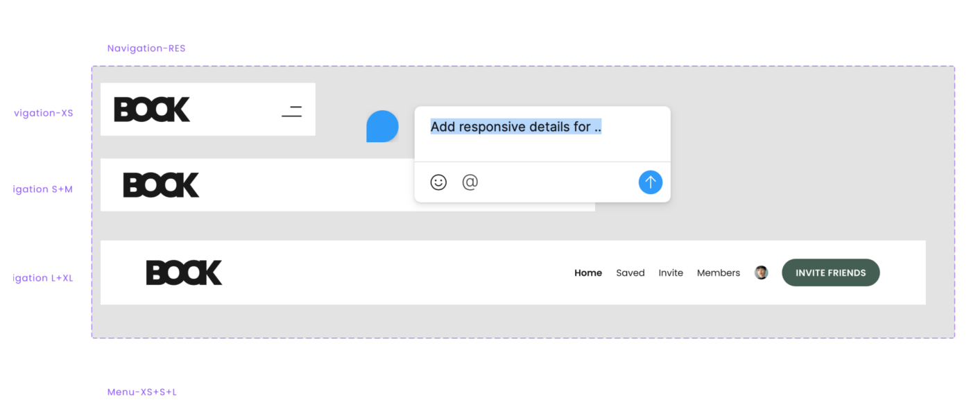
We Can Make Our Own Breakpoints By Hand!
However, we can create our own breakpoints by hand! So with the technical information given, we can set up the visual representation in Figma. I am just using a random example of breakpoints here.
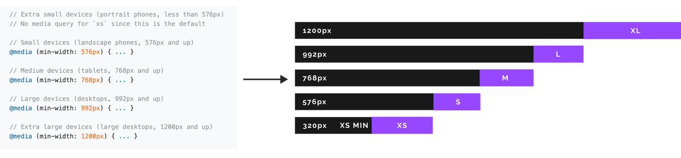
We can then place our auto layout components within those ranges and see where adjustments are necessary. In my example, I switch from a full fluid screen on mobile to an overlay with a fixed size at breakpoint S.
This way, we can really test our components and even entire pages and already have a pretty realistic idea of the look and feel.
If You Want To Work With A Responsive Grid
We can use the same testing setup for responsive grids if needed. With the necessary information, grids can be set up for several screen size ranges and then saved as styles and re-applied. We then just need to add the correct grid when testing the breakpoint range.
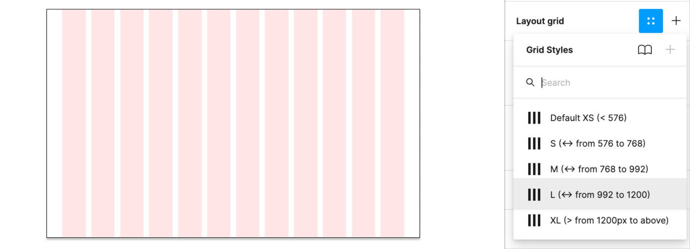
Note: Sometimes, you might use the same grid for several breakpoints, then just note, e.g., Grid: S+M (from 576 to 992). This way, you could always split it in two again in case the margin or anything changes in the future.
Responsive Typography Is Non-Existent
Unfortunately, what kicks in automatically with media queries in CSS needs to be added by hand in Figma. We can set up a responsive Typescale and then need to make sure to change text style (if applicable) when breakpoints are changing. It’s a bit annoying and full of potential errors, I know.
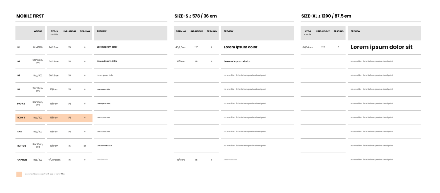
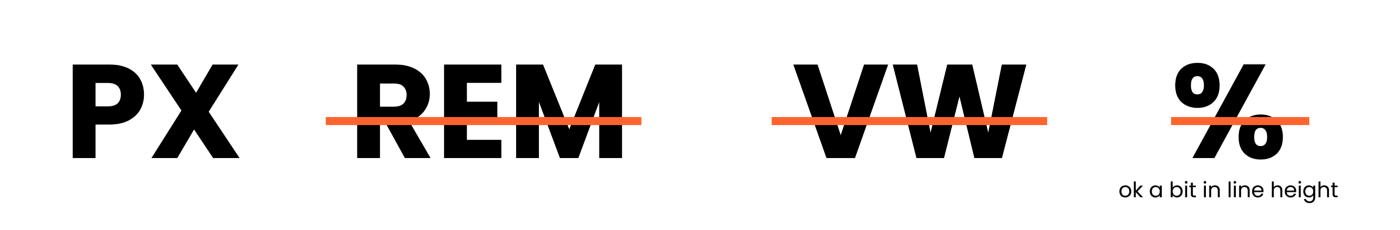
If you want to work with fluid typography (VW units, clamps(), calc(), you name it), this is best tested in the browser as we cannot simulate fluid text behavior with Figma. We can, however, pick a specific min and max screen size to get a rough idea of the situation at a specific width.
Breakpoint Plugin
However, to end on an exciting topic: Once you go through the effort of setting up your components and pages responsively, you can chuck them into the breakpoints plugin and get a really lovely overall idea of the design.
Opportunities Between Design & Code
Save Time, Money And Nerves
Let’s be honest handing in a static design and then seeing the result in the browser never leads to an easy-going relationship between design and development. It is a bottleneck that burns time, money, and nerves on both sides.
Now, this does not mean that we hand off design with a bit of auto layout on top, and that’s it. Seeing the outcome in the browser will surely hold some surprises and room for discussion. However, we have a solid base to start working from and can enter a constructive dialogue between design and development to fine-tune.
Some things will no doubt remain easier to test in CSS than in Figma (e.g., responsive typography), which is just fine. Ultimately, it is about working as a team and valuing each other’s time and effort to create great products.
Align Components With Code
We can also align components further with existing code by mimicking the behavior.
Flexbox In The Inspect Tab. But In The End, It’s Up To Development!
When peeking into the inspect tabs, we can see that auto layout translates to (sort of) flexbox, or as Figma put it, “Auto Layout should be a thoughtful subset of flexbox” hmmm. This is also where it gets a little confusing because it does not mean you HAVE to use flexbox. In Figma, we only have constraints and auto layout, and as you saw, they both have pros and cons to them and do not reflect CSS behavior 100%. So if there is a more innovative or sensible way of setting something up, then, by all means, go for it!
5. We Can Also Work With Actual Data (Sort Of)
Figma cannot connect to a classic database, but we can use actual data with some preparation. You can use the Google Sheets Sync plugin and just add actual content there. By simply naming our layers with #columnname, run the plugin, add the link, and hit sync. And boom, there you go. There is also a Plugin for Airtable and Notion Sync working pretty much in the same way.
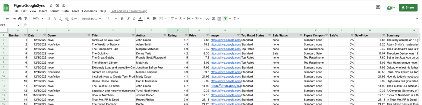
Tip: You can even swap variants dynamically! Isn’t that great?
Opportunities Between Design And Code
Know What You Are Dealing With
It’s great to test actual content and ask for some collaboration from copywriters or content managers on the fly. This way, we do not design with perfect lorem ipsum and stock image components but realistic components in content size and look.
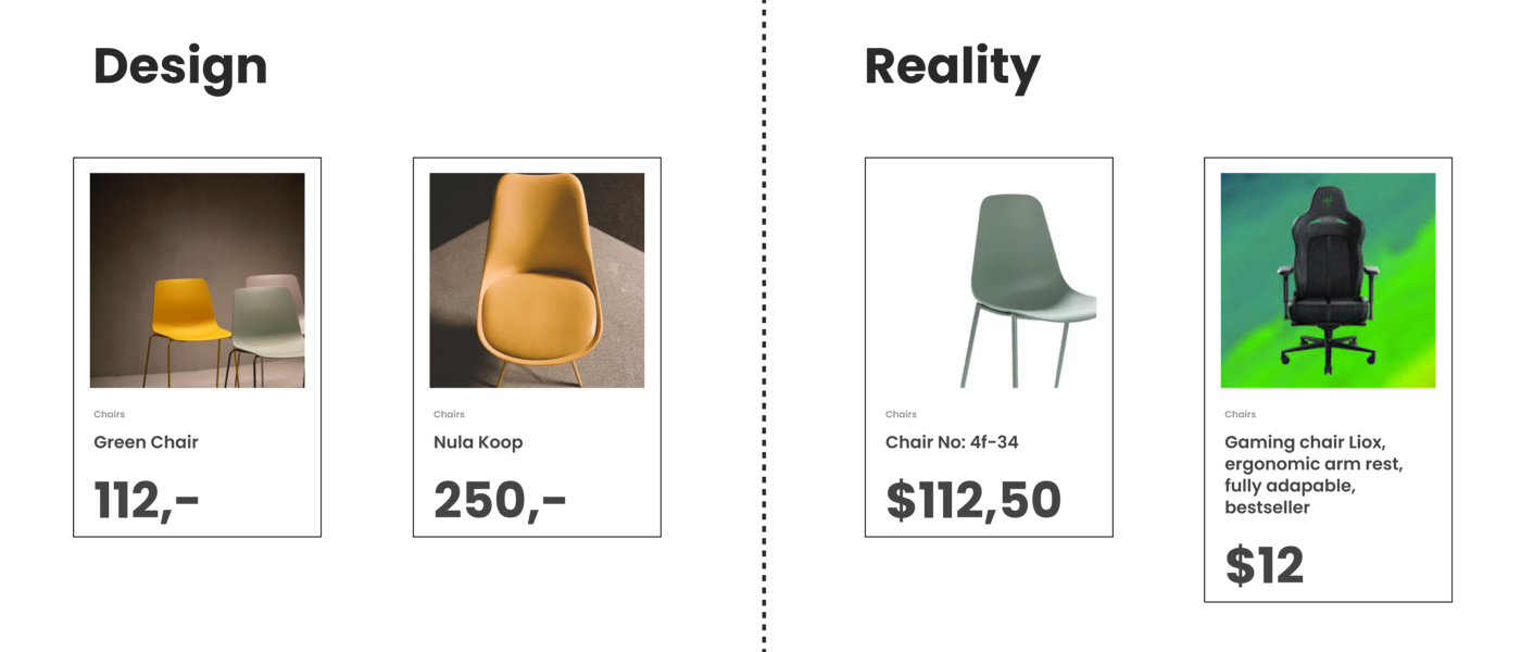
In general, we should test components with different content such as ideal state, little content, heavy content, empty, error, and loading states where applicable. I made a checklist for components you can use before release.
Working with actual data gives us a good idea of potential shortcomings. We can also see if the database needs some grooming or if the image pool needs a bit of love and attention to live up to the brand promise.
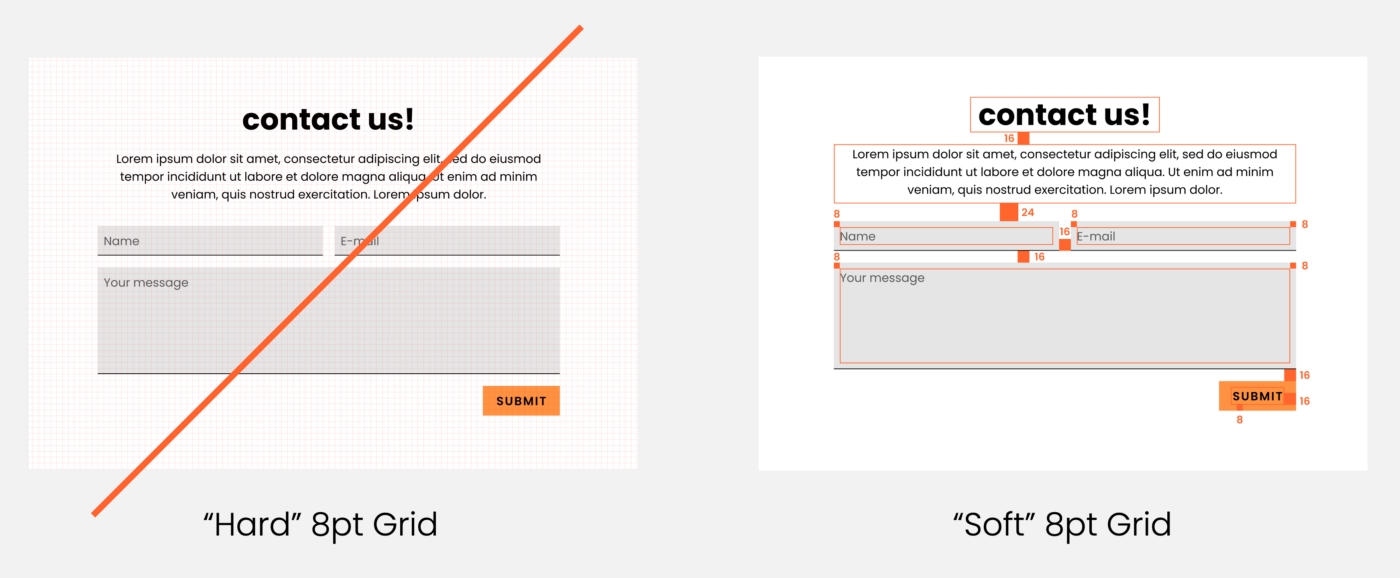
6. You Might Want To Point Out Soft Grid vs. Hard Grid To Us
When we click on Grids, Figma adds this px grid to the background. Order! Structure! As a designer, you jump at this, and as you were told to space with 8pt, you use the grid.
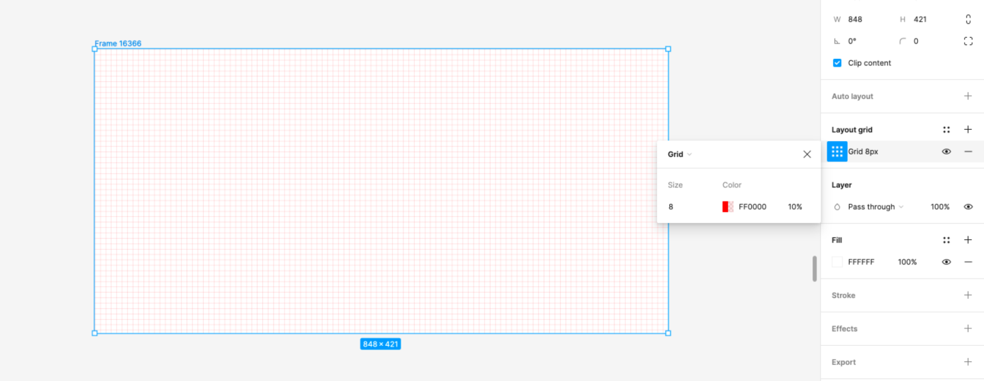
So we have this grid, which is why many designers jump to conclusions using a hard grid to set their spacing (it can be used for other alignment and handy in mobile setup, though). We have no spacing blocks or cubes to create a soft grid, we can set this by hand, though, and nudge in steps of 8, but that is about it.
Tip: In Figma, we can alter the nudge amount. Press Cmd + / and type “nudge” and change to 8. Make sure to keep alt pressing when nudging to see the distances. By pressing shift and up and down arrows, we then nudge in, e.g., 8pt steps.
Opportunities Between Design And Code
How Does Spacing Work For You In CSS?
Feel free to point out (preferably at the beginning of the project) that there is no such magic background grid in CSS and that the spacing system means measuring in spacing blocks from element to element (including the line height!). Or, in other words, explain the difference between the hard grid vs. the soft Grid that we use later in UI Design and CSS.
And yet again: Use the Figma Tokens Plugin.
Here we can just pull the real spacing system with spacing tokens and apply it to our components. We can also set up our own tokens just in Figma right in the plugin.
7. Why We Sometimes Mess Up Line-height
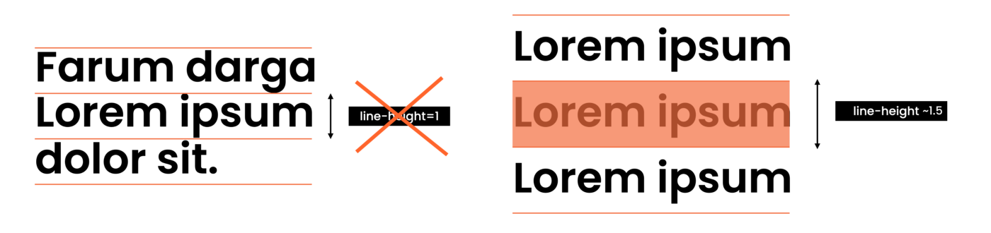
Typography is UI design, quite a complex topic. Here is a detailed class I made. Many UI Designers have a graphic design background, where text is aligned with the baseline. However, in Figma and CSS, we work with line height. This often leads to a lot of confusion amongst new designers, and I get the question “how do I get rid of this access space on top and bottom of my text?” a lot. You don’t. Just work with it!

Note: We cannot set line height in Figma to something like 1.5 notation! By default, it uses px. But we can cheat a little and use %, so 1.5 in CSS would be 150% in Figma. You will still find the px value only in the inspect tab.
Opportunities Between Design And Code
Explain It!
So as a developer, you might find that the line height is randomly set to 1. This is a desperate design attempt to get rid of the “random” space we do not understand (yet). So it makes sense to remind (new) designers that UI Design is dynamic. Screen sizes change, and content length will vary (either because the content is added or translated into a new language). Thus, we can never assume a single line of the text remains a single line of text forever. Also, we do not want to create too many styles. So explain that working with the natural line height is just fine, and you will do the same in CSS.
8. All We Have In Figma Is PX
In Figma, we can only work with px, and we work at 1px=1pt. We do not have rem, em, or any other relative way to define things like font size. So if you see px everywhere in a UI Design, this does not mean we want it hard coded!!!
9. We Can Set Up Pretty Sweet Prototypes In Figma
We can create rather impressive prototypes directly from our design files in Figma. If you hit the play button in the file (top right), you can see them. We can link frames to new pages or overlays and also animate within component sets from variant to variant.
We can also set up individual flows, making them nice and tidy to navigate and test.
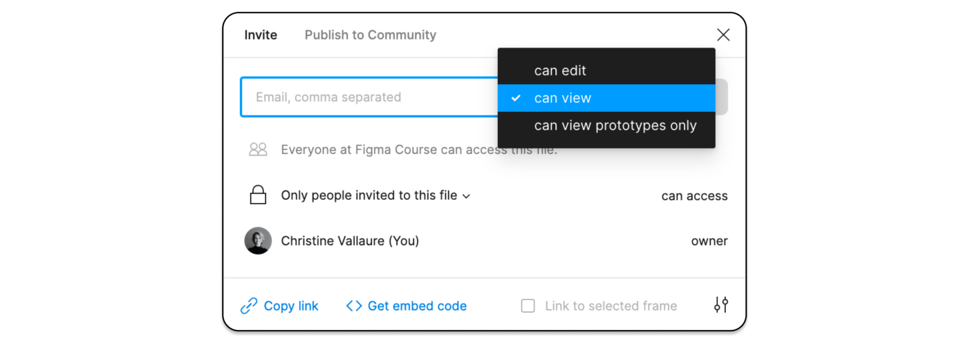
10. We Will Invite You To ‘View Only’ Rights, Giving You Access To Everything You Need As A Developer
As a developer, you will probably receive an invite to “view only” a Figma file, team, or project. You can have a look at a file I set up in view mode here (make to sign up for a free Figma account beforehand).
Opportunities Between Design And Code
As a developer, you will be able to navigate the file and pull out all information you need:
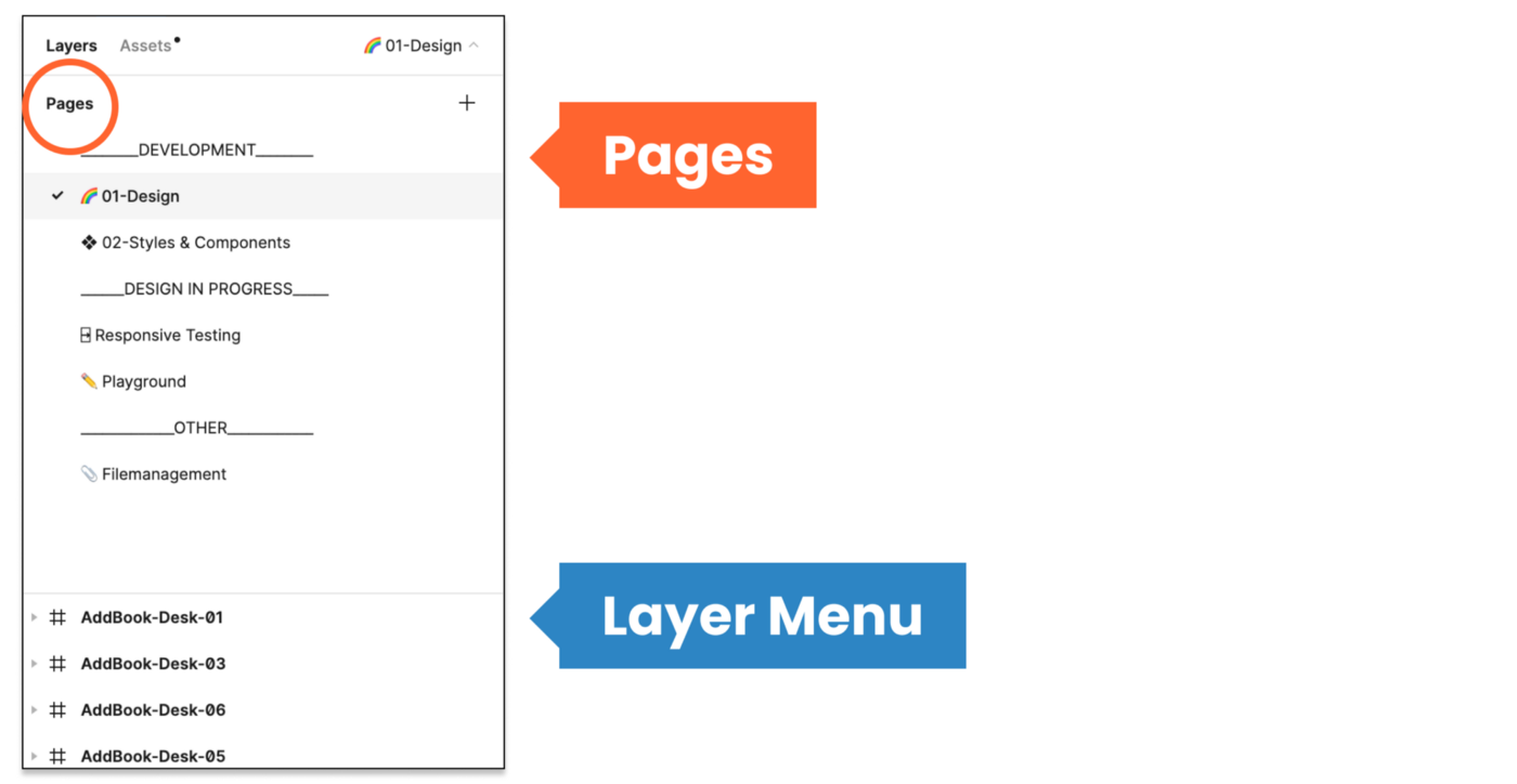
Pages
You can navigate the different frames on the canvas but note how there are different pages above the layers menu on the left. Every team uses pages differently, some for versions and sprints, some to structure the file into the design, components, and testing. In any case, ensure not to overlook the pages as they are the file’s structure.
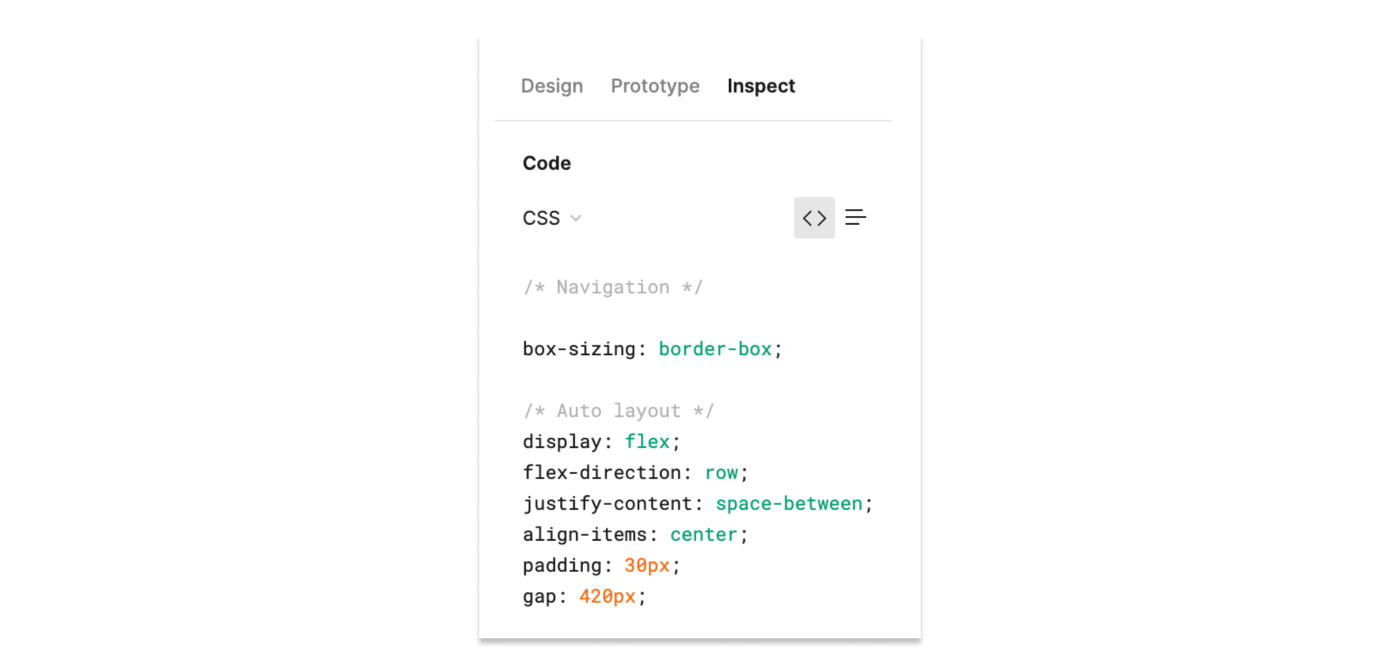
Inspect Mode
When entering a file with view mode, you will see the inspect menu open per default. Click on an element, and you will be shown the distance to the nearest objects and the specs on the right-hand side menu.
You can switch between CSS, iOS, and Android.

When clicking on the main component, you will see the link to the code documentation (if applicable) and any comments in inspect mode.
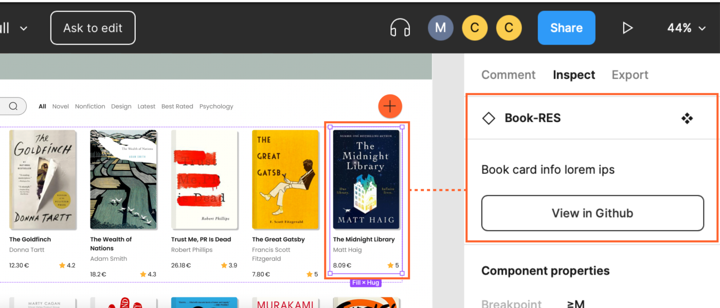
This only shows up if it was added to the design tab’s component documentation. And you obviously only need this if you want to align UI and code components.
By the way, it works with any link. However, some such Github links create a nice custom button.
Styles Overview
Click on the canvas to get an overview of all styles in the file. Note that this only shows local styles; some might be pulled in from an external library. So the best is to check for style documentation (every design team should set this up for you) to make sure you have all information.
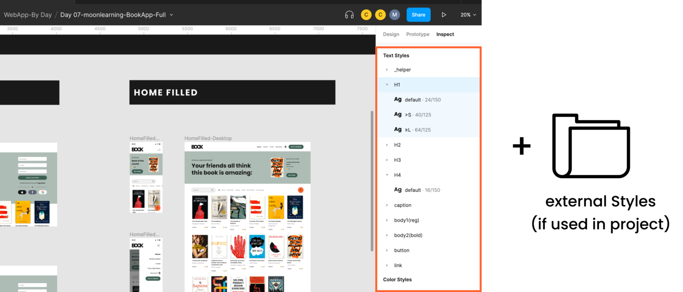
You should, however, still receive a general overview of all styles from your design team, including internal and external styles used now or in the future.

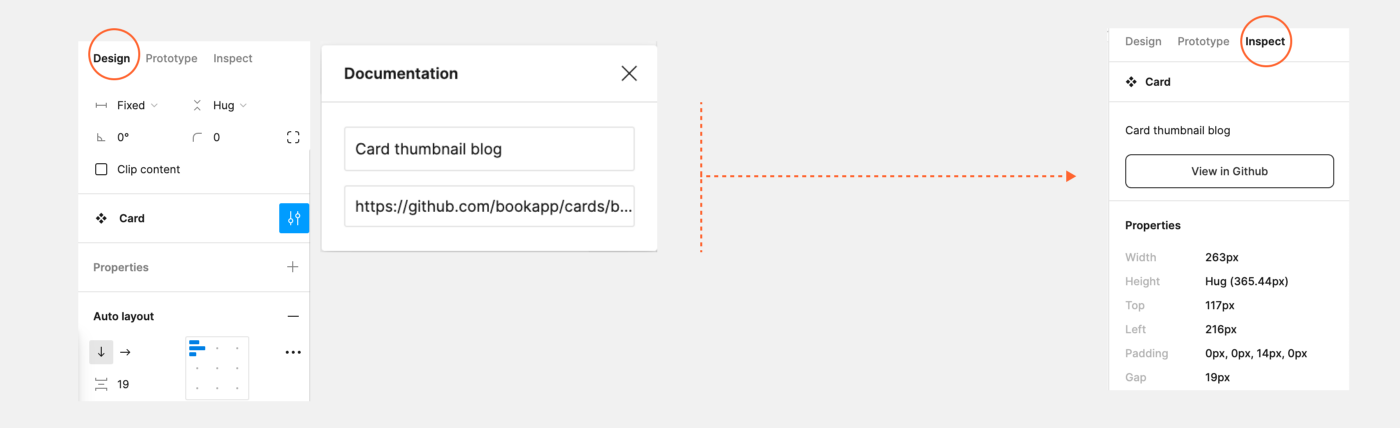
Jump To The Main Component
This is really important yet a bit hidden. Click on any instance on the canvas and then click on the diamond-shaped symbol sign, and you will jump to the main component and documentation. This is where you can get all information and measurements.
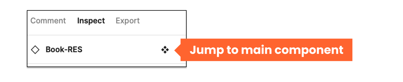
You should then be led to the Figma UI component library. This might be a local page or an external UI component document giving you all the necessary information and specs defined by the UI team. If you do not find such an overview, kindly ask your design team to set this up for you.
There is no magic automation for style and component overview in Figma. This needs to be set up and documented by the design team, and the format may vary.
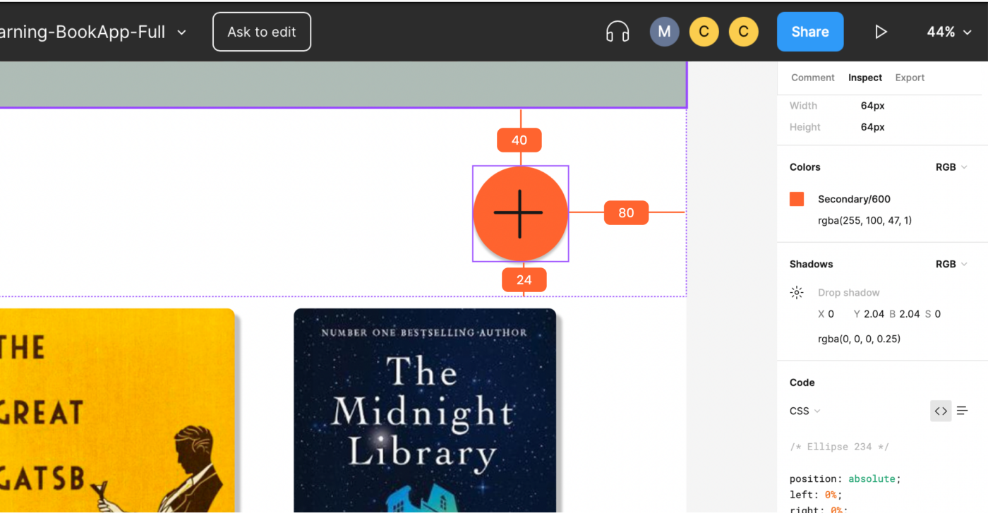
Export Assets Of Any Size And Form
Assets can be exported to any asset in the format (JPG, PNG, SVG) and @size from the “view only” mode, so no bulk export by the design team is needed anymore.
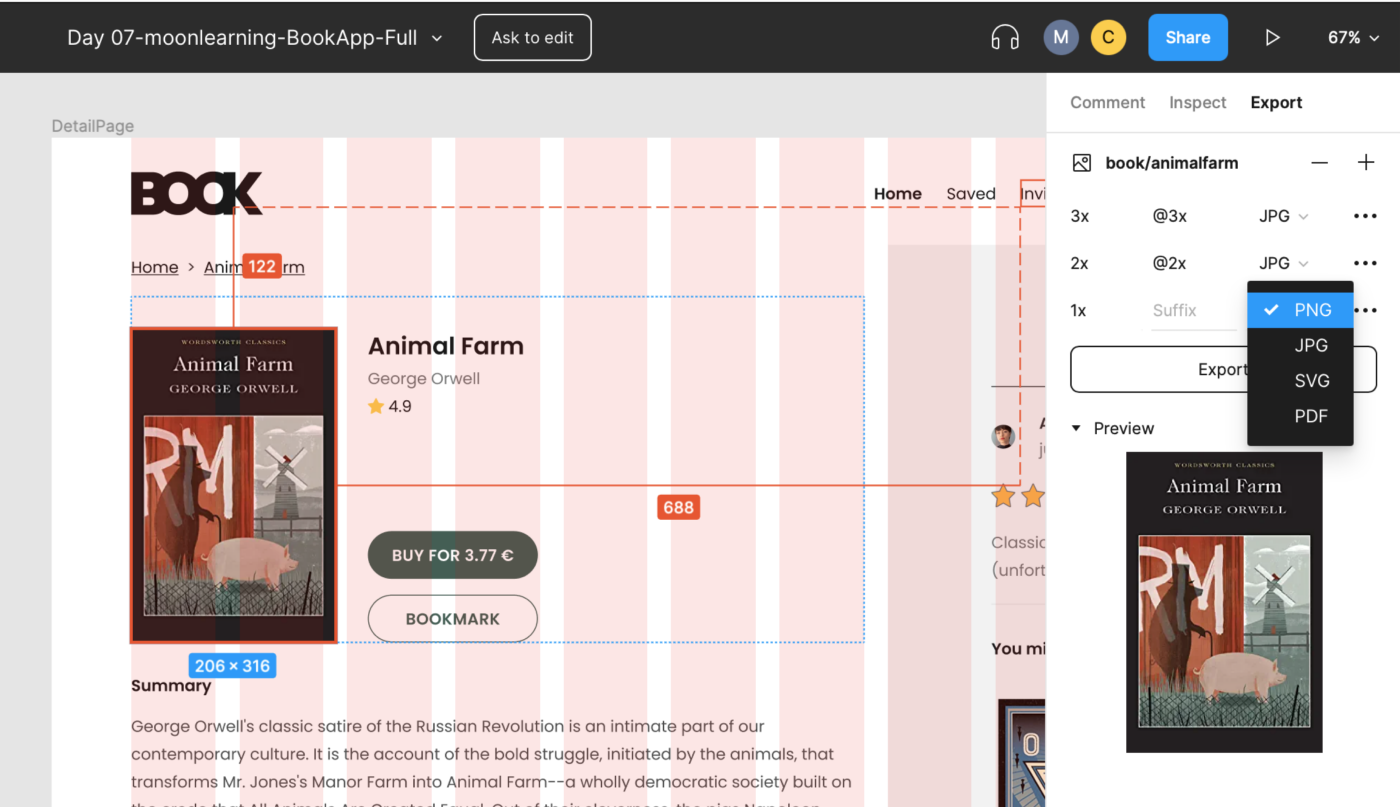
Tip: For a specific height or width, instead of 3x, 2x, just enter the width followed by w (e.g., 300w), and it will export it, keeping the image proportions. It also works for height (h).
Comment
Leave comments and discuss within your team.
Prototype
Hit the play button (top right corner of your design file), and you will jump to the presentation mode seeing your prototype in action. Usually, the designer was nice enough to add some flows and structure the prototype, so you get a good idea of different flows.
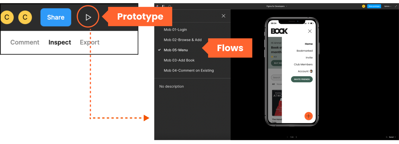
Tip: Individual links can be created from every flow of the prototype menu. I like using this to set up an overview of the design and testing stages. You can also link to any other team planning file here.
Stay In Touch!
If you liked this article, make sure to subscribe and visit me on moonlearning.io, where I teach about UX/UI Design+Figma. This article is also the base of my talk and workshop during the Smashing Conference New York, the 10th to the 13th of October 2022. See you there!
 (mb, vf, yk, il)

