Fluid Sizing Instead Of Multiple Media Queries?

Email Newsletter
Weekly tips on front-end & UX.
Trusted by 200,000+ folks.


clamp function. But: we still need to use media queries for changing colors, borders, shadows and other CSS styles. This article is an enhanced release of the tutorial published earlier.Media queries are a great concept. Building a complex structure in an HTML document and adapting it for various devices is not often possible without them (for the moment at least). Here we will talk about the fact that one of the drawbacks of fluid typography, namely the appearance of a large number of media queries, can be avoided. Or, at least, the number of records in @media rule can be reduced.
The advent of vw and vh relative units, the calc function, and later the min, max, clamp functions in CSS gave us a lot of power. An exhaustive review of Modern Fluid Typography Using CSS Clamp has been recently published by Adrian Bece. I advise everyone to get acquainted with it.
The advantages of the clamp function are obvious. We can define a change, for example, of a font size in a certain range of viewport (screen size) and, at the same time, limit it by maximum and minimum values. In such a simple case, we automatically (thanks to clamp) do not need to use media queries for changing sizes on breakpoints.
So, the following block in the CSS:
.block{
 font-size: 2rem;
}
@media (max-width: 1200px) {
 .block{
   font-size: calc(-1rem + 4vw);
 }
}
@media (max-width: 800px) {
 .block{
   font-size: 1rem;
 }
}
…can be easily replaced using clamp with a single line:
.block{
 font-size: clamp(1rem, -1rem + 4vw, 2rem);
}
But what if we need to set a more complex behavior which is determined by variety of unique behavior on different ranges of the screen width? Look at the following modified code:
.block{
 font-size: calc(-4rem + 8vw);
}
@media (max-width: 1200px) {
 .block{
   font-size: calc(-1rem + 4vw);
 }
}
@media (max-width: 800px) {
 .block{
   font-size: calc(0.5rem + 0.8vw);
 }
}
Can the clamp help us again?
Let’s take a closer look: from simple to complex.
Brief Digression Into Mathematics
As we all know, there is only one way to draw a straight line through two points. There are several ways to write equations to define the straight line. Below, it will be convenient for us to write the equation in the form:
$$(1)\;\;\; y=y_0 + k*x$$
where y0 is a point of intersection of the line with the Y-axis (fig.1), k parameter defines the slope of the straight line to the X-axis and represents the growth/fall rate. Using the following canonical representation of the equation of a straight line:
$$\frac{y - y_1}{y_1 - y_2}=\frac{x - x_1}{x_1 - x_2}$$
It is easy to connect the y0 and k parameters with the coordinates of the two points that belong to this line:
$$(1a)\;\;\; k=\frac{y_2 - y_1}{x_2 - x_1} ,\;\;\; y_0=y_1 - k*x_1$$
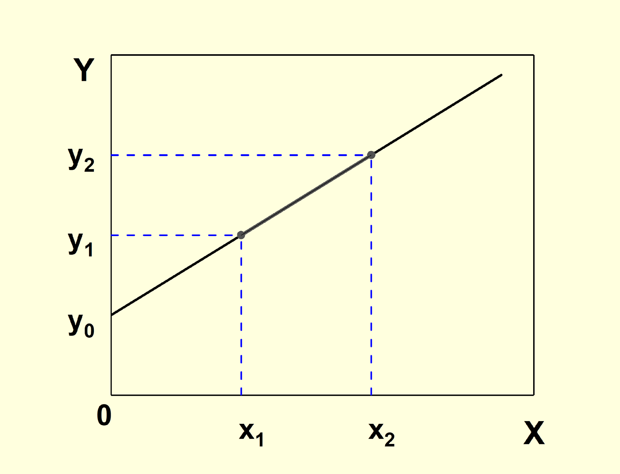
It should be noted that in such problems it is convenient to define the input parameters (point coordinates) in pixels. But at the output the relative unit rem is preferable. We should also remember the fact that viewport width is equal to 100vw (this follows from the definition of vw unit). So, in equation (1) we must replace x variable by just 100vw. Hence, we’ll have:
$$(1b)\;\;\; y=y_0 + k*100vw$$
Now it becomes clear the origin of expressions like 1rem + 2.5vw as one of the arguments of clamp or calc function. The first term (1rem) is the y0 parameter expressed in relative units (rem), and the second one (2.5vw) is the parameter k multiplied by 100vw since x=100vw. The choice of such units — relative unit (rem) for values of output variable and viewport unit (vw) for screen size — has been made due to accessibility and responsiveness, respectively.
So, now we know how to determine the parameters in the equation of the form (1) or (1b) of a straight line drawn through two points. This will be used in the next section.
Main Formula Derivation For General Case
Now we’ll try to obtain an equation for F(x) function that will follow the behavior of property in general case (fig.2). Some information below may be omitted for readers who do not like pure math. You can look at the final equation (3) and the simple example for explanation how to use it.
Let’s look at fig. 2a (below). As you can see from the figure, the behavior of the property is determined (tabulated) by N points with coordinates (xi, yi). Let fi(x) be a function that defines the straight line drawn through (xi, yi) and (xi+1, yi+1) points. We have (N-1) such functions (fig2b). So, how to get a general F(x) function that will be exactly equal to fi(x) function on the corresponding [xi, xi+1] range, notably completely repeat the behavior of property from fig.2?
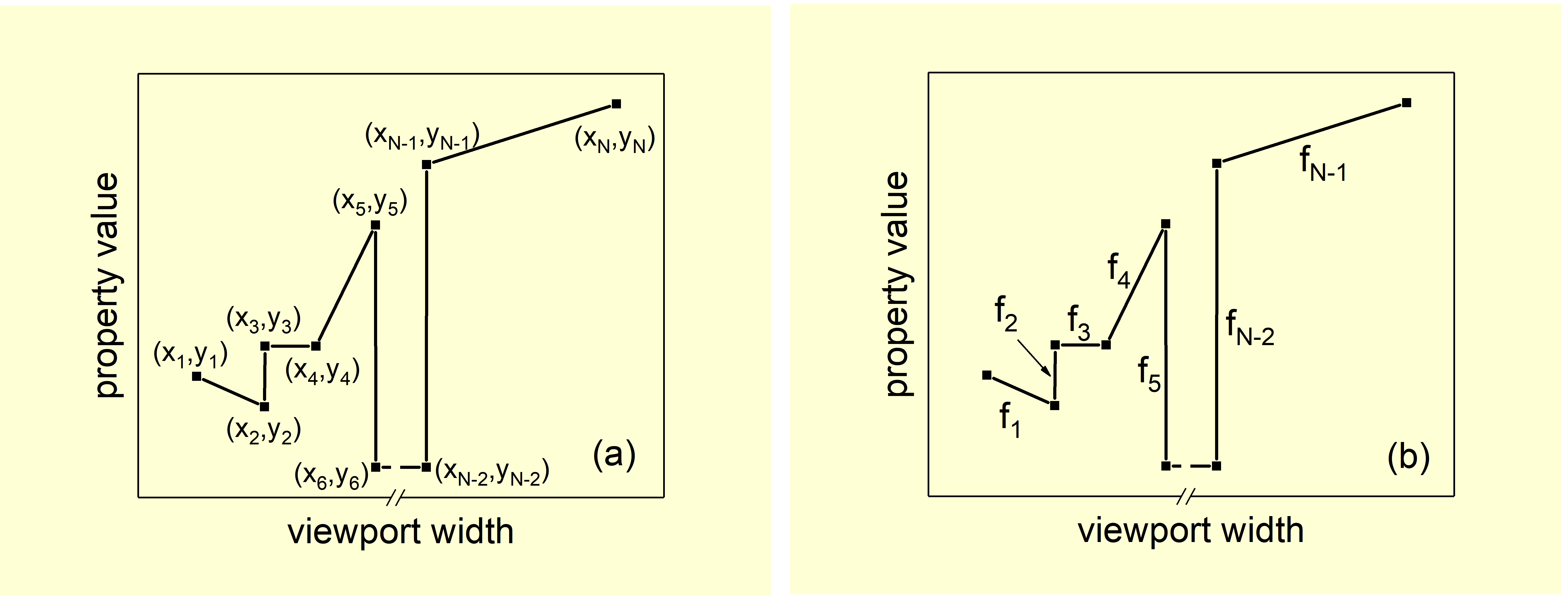
Let’s define the collection of functions gi(x) as:
According to clamp function definition:
Let’s sum the gi(x) functions, and denote the result as G(x) function,
Now we can calculate the values of this function for different ranges of x variable:
or
for
It follows that G(x) function is equal to corresponding fi(x) function for each [xi, xi+1] ranges, after deduction of Const constant term, or…
Equation (3) represents the final result and is the solution to the problem.
Several remarks should be made here:
- If we have the range with yi= yi+1 then fi(x)= yi, and clamp(yi, yi, yi) = yi properly. This fact will give us some simplification in the final expression for
F(x)function. - If we have the range where the yi>yi+1 inequality is satisfied, then we should write the corresponding gi(x) function in the following form:

… because of clamp function definition.
- Let’s consider the ranges where х<х1 and х>хN. From equation (3) it follows that the values of property inside these ranges will be constant and equal to y1 and yN, correspondingly. We can do nothing and leave it like that. But in these intervals, I prefer that the values continue to change according to the same laws as in the [x1, x2] and [xN-1, xN] ranges. Therefore, g1(x) and gN-1(x) functions should be written not by
clampfunction but throughminormaxfunctions depending on the increasing or decreasing of the values in the given ranges. If we take the behavior of the property from fig.2 as an example, then we will have the following two redefinitions:


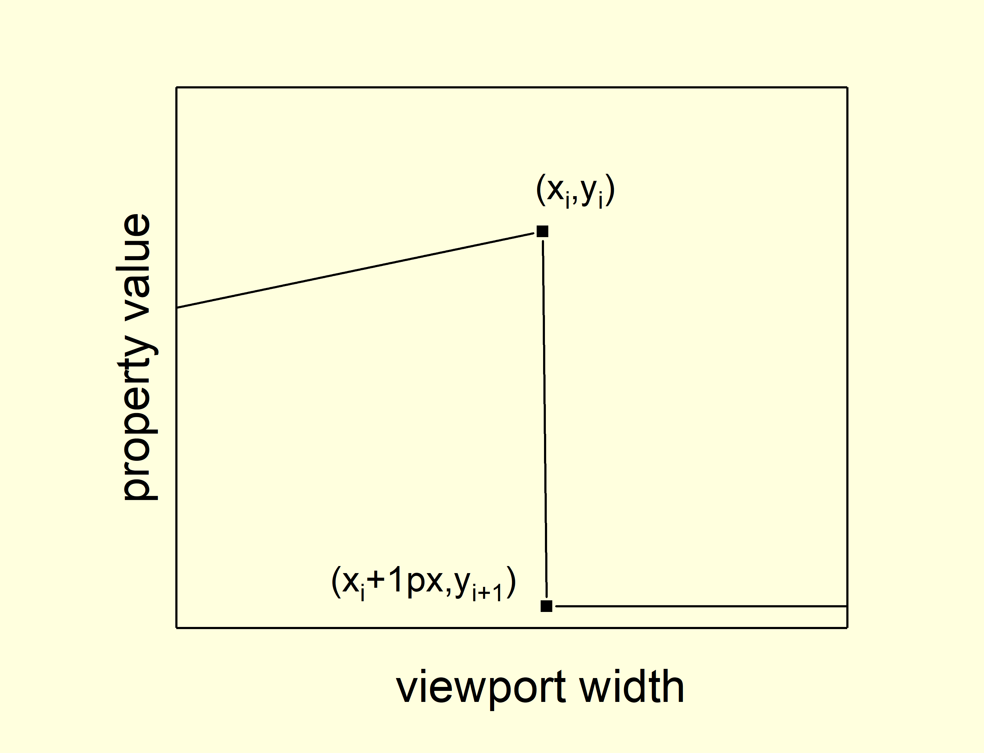
- It is possible to set an abrupt change in the property. In this case, the maximum difference between хi and хi+1 is set to
1px(fig.3) or, which is even more convenient in practice, even less than 1px. - Obviously, the more complex (more ranges) the behavior of the property is, the longer the resulting function will be and vice versa.
- Because of the possible complex structure of the function by equation (3), it must be used as an argument of the CSS
calcfunction in the CSS stylesheet.
Simple Example
Let’s simulate the following simple case. We have a header with a logo and menu items on some page. For mobile devices we need to create a hamburger menu. In this case, the font size of menu items, for example, is equal to 18px at 1920px of screen size and decreases to 12px at the viewport width of 768px. In the range from 320px to 767.98px of viewport width, the font-size is fixed at 20px (fig 4a.). This behavior of font size can be described by equation (3). Let’s start.
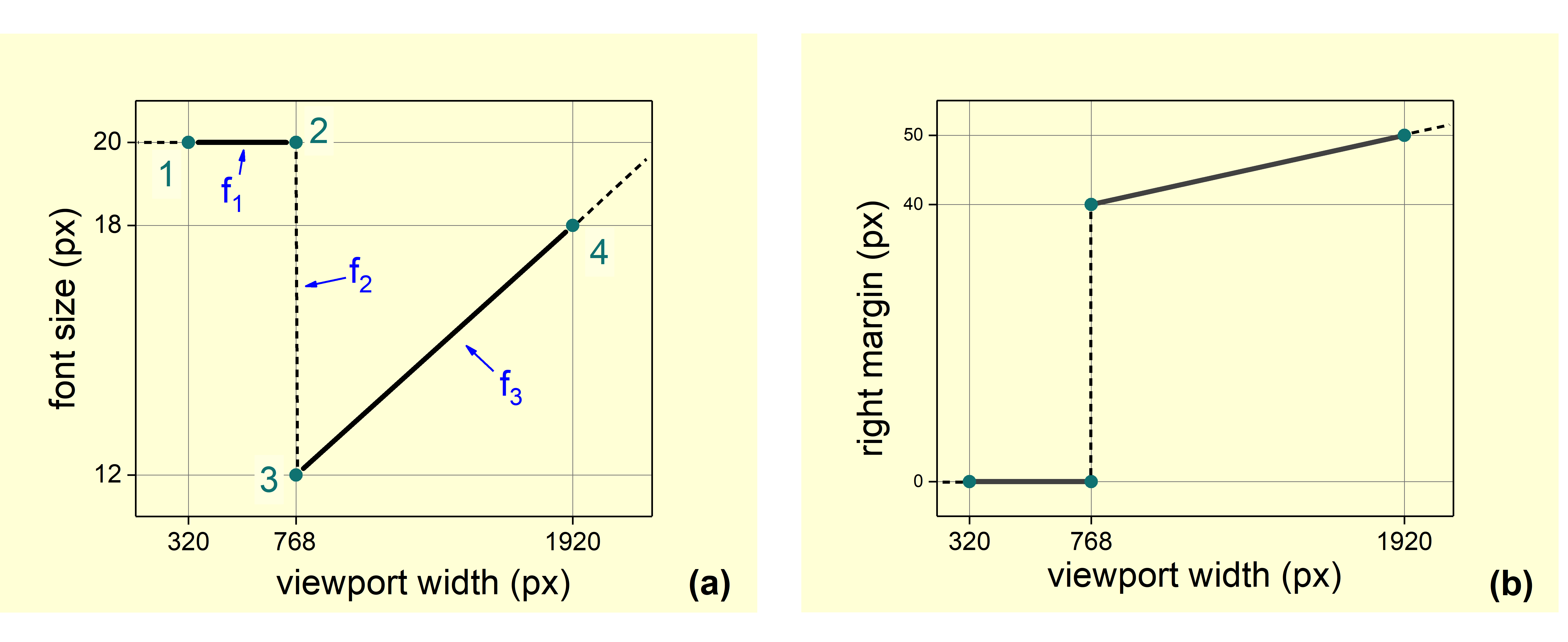
1. We need to calculate the parameters for f1, f2 and f3 lines according to equation (1a) for its representation in the (1b) form. For f1 function we have (using the coordination of 1 and 2 points):

So, using equation (1b):

The same procedure for another two lines gives us:
and
and

2. Now we can construct the gi functions using equation (2):

3. The last term (constant) in equation (3) can be determined:
4. Desired form of equation (3) is…

or, in the final form:

5. Final record in CSS file will be (by remark 6):
.block{
 font-size: calc(clamp(0.75rem, 19200.75rem – 40000vw, 1.25rem) + max(0.75rem, 0.5rem + 0.5208333vw) – 0.75rem);
}
… and is fully equivalent to:
.block{
 font-size: calc(0.5rem + 0.5208333333vw);
}
@media (max-width: 767px) {
 .block {
  font-size: 1.25rem;
 }
}
Evaluations for modeling right margin behavior (see fig. 4b) give the following equation (everyone can verify this):

You can check this example here:
See the Pen [Header [forked]](https://codepen.io/smashingmag/pen/qBxdpqx) by Ruslan.
Another Example
The following dependence of padding:
.block {
 padding: 3rem;
}

@media (max-width: 1199px) {
 .block {
  padding: 2.5rem;
 }
}
@media (max-width: 991px) {
 .block {
  padding: 2rem;
 }
}
@media (max-width: 767px) {
 .block {
  padding: 1.5rem;
 }
}
@media (max-width: 575px) {
 .block {
  padding: 1rem;
 }
}
… can be also easily replaced by:
.block {
 padding: calc(clamp(1rem, -14398.5rem + 40000vw, 1.5rem) + clamp(1.5rem, -19198rem + 40000vw, 2rem) + clamp(2rem, -24797.5rem + 40000vw, 2.5rem) + clamp(2.5rem, -29997rem + 40000vw, 3rem) - 6rem);
}
So, equation (3) gives us the possibility to describe any arbitrary behavior of the property depending on the viewport width. And it should be pointed out, we achieved this by completely eliminating the use of media queries.
Obviously, formula (3) can be used to describe not only the font size, but also every other property whose dimension is a unit of length. This limitation is due to a limitation in CSS itself, namely the lack of support for mathematical operations on values that have dimensions. For example, we cannot calculate something like (2px*6px)/4px in CSS at the date. I hope that such restrictions will disappear in future, and the equation (3) will be applied to properties specified as a percentage or dimensionless.
Also, it should be noted that it makes sense to apply the equation (3) only when the dependence is more complex than in primitive cases shown below:
- Continuous unlimited change, the behavior is determined by two points only,
kparameter offfunction can be positive, negative or even zero (see fig.5a,k>0, for example). Instead of the equation(3) we use a function of the formcalc(f(x)). A font size of some text that monotonically changes with viewport width can be as an example. - Behavior is determined by three points, for
kparameters of f1 and f2 functions the inequality k1>k2 is satisfied (see fig.5b, k1>0 and k2<0, for example). In such case, min(f1,f2) function should be used instead of equation (3). A font size of some text that monotonically changes with viewport width to a certain value and then keeps a constant value can be used as an example. - The same as the second case, but the inequality k1<k2 is satisfied (see fig.5c, k1<0 and k2>0, for example). In such case, max(f1,f2) function should be used instead of equation (3).
See the Pen [Quick CSS example [forked]](https://codepen.io/smashingmag/pen/qBxdpKy) by Ruslan.
Everyone can write their own mixin or function based on the equation (3) or use my implementation as CSS functions that take into account the above remarks and primitive cases.
You can also find a simple example with the flex structure here. In this example, the width of flex elements is calculated using the equation (3). This is an attempt to avoid media queries with such a commonly used transformation — initially the width of each of the four flex items is set to 25% (convert to px units, of course), and then, as the viewport width decreases, it changes to 50%, and then to 100%. It even seems possible to take into account the value of gap, and make it also responsive.
But the example will break as soon as there is a vertical scroll. To avoid example breaking and to compensate for scrollbar, we can replace vw units by % in expressions for width of flex elements. But while CSS restrictions do not allow us to use the equation (3) directly for values given in percentages, it is better to abandon such idea.
Summary
I’d like to mention that the idea was just to proving the possibility of such an approach, and the suitability of its application is your own choice. Of the obvious disadvantage of this approach, I have to highlight that the resulting code becomes less readable. The advantage is that media queries remain solely for describing the logic of changes while adaptive, structural changes and are not clogged with technical lines of changing font sizes, paddings, margins etc.
Editor’s note: It would be fantastic to build up a little tool that would allow developers to define changes and construct these complex queries in no time. Still, the maintainance would become quite a hassle — unless we use a Sass-mixing for it, maybe? We kindly thank Ruslan for taking the time to work on this, and oh my, what a journey it was!
Acknowledgements
Thanks to Evgeniy Andrikanich and his YouTube channel “FreelancerStyle” for creation of free high-quality educational content (HTML, CSS, JS).
Sources
- “Responsible Property By One Line” (in Russian)
- “Modern Fluid Typography Using CSS Clamp,” Adrian Bece
 (vf, yk, il)

