The Accessibility And Usability Journey Of Drupal’s Primary Navigation

Email Newsletter
Weekly tips on front-end & UX.
Trusted by 182,000+ folks.
 Try ProtoPie AI free →
 SurveyJS: White-Label Survey Solution for Your JS App

 Register Free Now
 Celebrating 10 million developers
A website’s primary navigation is critical to its usability and accessibility. However, navigation systems are deceptively complicated. All but the simplest websites have to deal with this.
With version 9.4, Drupal has a brand new default theme called Olivero. Being the default, we knew its navigation system would be used by hundreds of millions (if not billions) of users throughout its lifetime. And of all the things that we are proud of with Drupal’s new theme, the navigation system tops the list. An enormous amount of testing, bug fixes, and care went into it.
Usable, Accessible, Robust, And Beautiful
When we started creating the theme, we knew it needed to be usable, accessible, robust, and beautiful. All of these goals pose significant challenges.
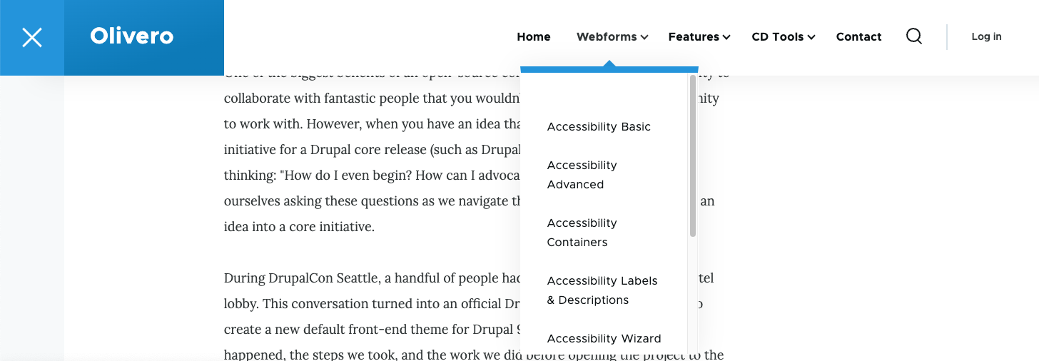
For usability, we wanted to include second-level navigation drop-downs similar to many sites on the internet. These second-level navigation drop-downs need to open on hover, click, and touch.
Accessibility is a Drupal core gate. We knew it must meet or exceed WCAG 2.1 AA standards. More than just meeting the standards, we want our theme to be a delight to navigate for those who need to use assistive technology.
And, because we don’t control the content, the menu system needed to be very robust. We don’t know if the content editors will enter one item or hundreds! We don’t have control over the length of the text. We also support internationalization, which includes supporting right-to-left languages such as Arabic.
On top of this functionality, the menu also needed to be beautiful. Our designers did an amazing job mocking it up, and then we integrated some basic CSS transitions to add a slight fade-in, vertically transformed animation.
Creating The Markup For Our Menu
Olivero’s menu starts with a standard <nav> element. We add an aria-labelledby attribute pointing to the ID of a visually hidden (but accessible to screen readers) h2 element. This communicates the navigation name to people using screen readers so they can differentiate the different navigation elements. It also enables users to find this menu if they navigate by headings.
Menu items rely on a modified link disclosure pattern when using hyperlinks as the top-level navigation item.
Note: Drupal can also use a <button> element as the top level item.
This pattern injects a <button> element after the hyperlink. Within Olivero, we style the button with a “down chevron” icon.
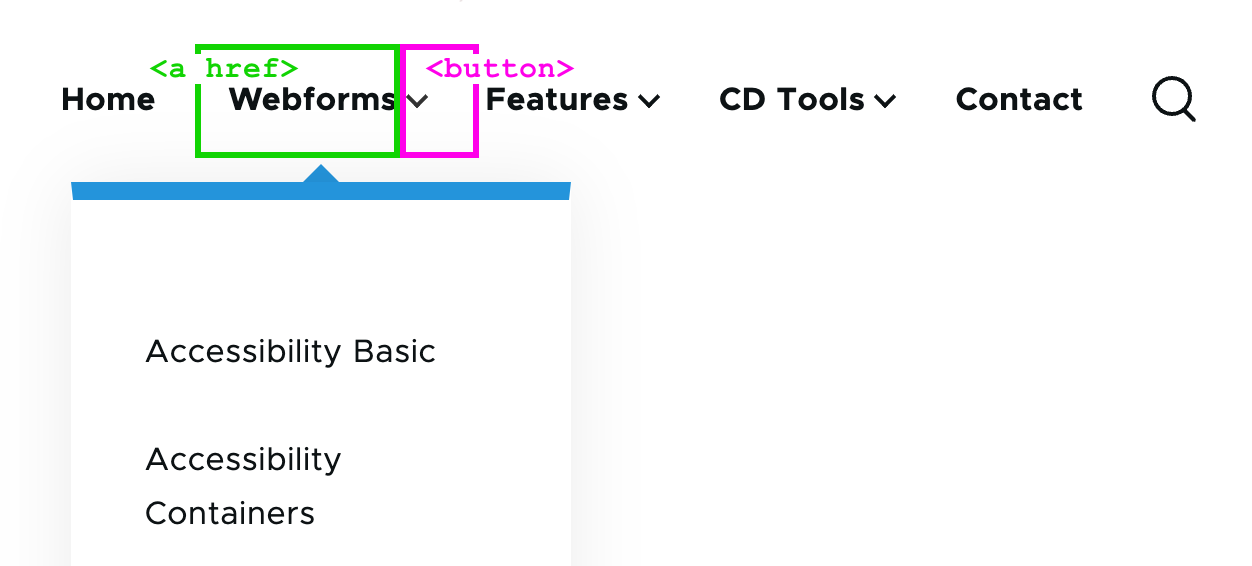
The button has aria-controls (mapped to the ID of the nested <ul>) and aria-expanded attributes that are initialized with JavaScript. If the site is loaded without JavaScript, the buttons become purely presentational.
This button contains visually hidden text with the menu item’s text, followed by “sub-navigation.” This is so people who tab between form controls can understand what submenu the button controls.
<nav aria-labelledby="block-olivero-main-menu-menu">
  <h2 class="visually-hidden" id="block-olivero-main-menu-menu">Main navigation</h2>
  <ul>
    <li>
      <a href="/">Webforms</a>
      <button aria-controls="primary-menu-item-12" aria-expanded="false">
        <span class="visually-hidden">Webforms sub-navigation</span>
      </button>
      <ul id="primary-menu-item-12">
        <!-- Submenu items -->
      </ul>
    </li>
    <!-- More top-level navigation items here. -->
  </ul>
</nav>
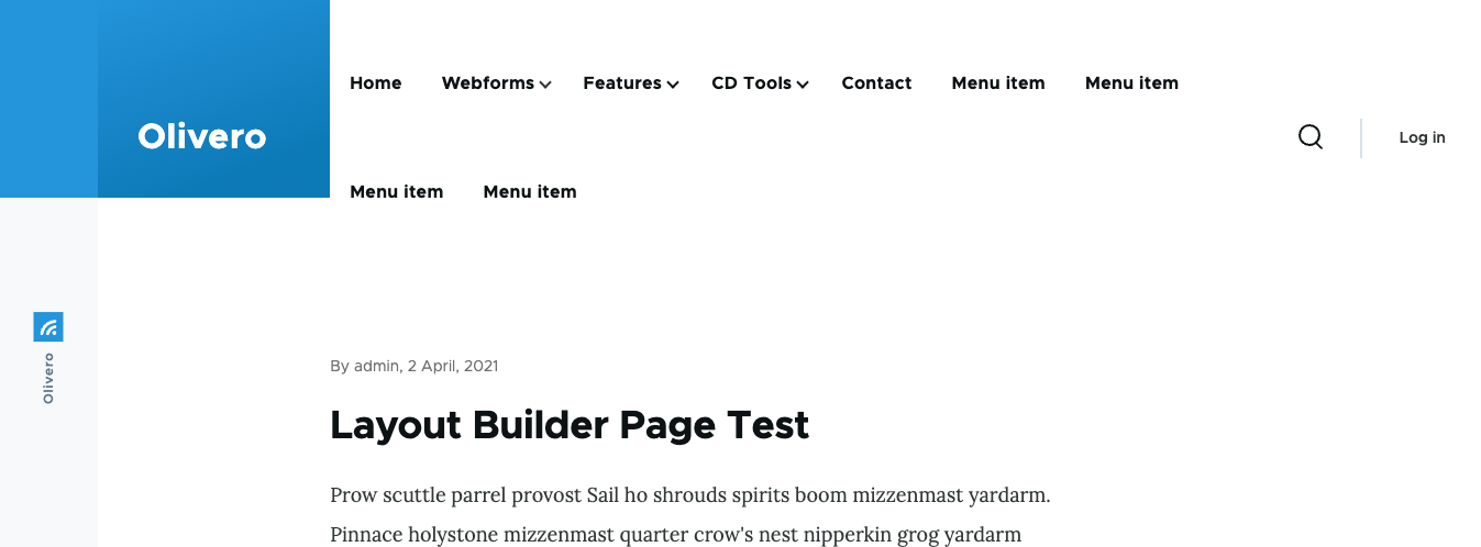
Desktop Menu Features
Opening The Desktop Submenus
The submenus open on hover, click, and tap. However, we need to ensure that these events don’t fire simultaneously (like they can on touch devices) because if the menu instantaneously opens and closes, it’ll seem like nothing has happened! We also need to consider assistive technology like point-scanning tools that may trigger both events in rapid succession.
To accommodate all of this, we listen for a touchstart event and, if present, skip the mouseover event processing. If and when the mouseover event processes, we disable the click event from doing anything for half a second. And finally, when the click event processes, we show the submenu. The logic gets a little complicated, but it’s usable with any assistive technology.
Closing The Desktop Submenus
The submenus need to close when certain conditions are met:
- If the Escape key is pressed, the submenu will close, and the focus will return to the parent item.
- If a
mouseoutevent occurs, the submenu will close unless focus is contained within the submenu. - Similarly, the submenus will close on the
blurevent to ensure that the submenus cannot obscure one another (and potentially violate the WCAG 2.4.7 focus visible success criterion).
Accommodating Large Amounts Of Menu Items
Because the theme can’t control how many menu items the user enters, we have to accommodate an unlimited amount. We built an option to turn on the mobile menu (which can accommodate unlimited items) at all screen widths. But there is still the edge case where there may be enough items at medium widths to trigger the menu to wrap or overflow.
To accommodate this, we switch to the mobile menu when the primary menu runs out of space. To do this, we set a resize observer to trigger a check to see if the text is wrapped. If it is, we enable the mobile menu and remember when to transition back to the desktop version (if the viewport is enlarged).
const navMenu = document.querySelector('.primary-nav');
const navItem = navMenu.querySelector('.primary-nav__menu-item');

function checkIfDesktopNavigationWraps() {
  if (isDesktopNav() && navMenu.height > navItem.clientHeight) {
    enableMobileNav(); // Enable the mobile navigation.
    // Remember when to switch back to desktop navigation.
    const navMediaQuery = window.matchMedia(`(max-width: ${window.innerWidth + 15}px)`);
    navMediaQuery.addEventListener('change', () => {
      // Double check to see if the navigation is wrapping to prevent edge
      // cases where the mobile menu should still be enabled.
      if (navMenu.clientHeight > navItem.clientHeight) {
        disableMobileNav(navMenu, navItem);
      }
    }, { once: true });
  }
}

const resizeObserver = new ResizeObserver(checkIfDesktopNavigationWraps);
resizeObserver.observe(navMenu);
Make Sure Submenus Cannot Overflow The Viewport
Olivero’s menu is fixed to the top of the viewport. Fixed menus can create a problem if the viewport is shorter than the longest submenu — the user will never be able to scroll to access the items at the end. This inability to access items at the end of the menu creates another failure of WCAG 2.4.7 Focus Visible.
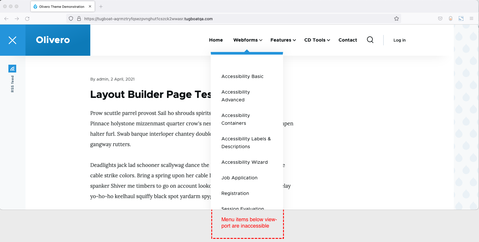
We solve this by calculating the height of the header and setting max-height and overflow: auto on the submenu.
.submenu {
  max-height: calc(100vh - var(--header-height));
  overflow: auto;
}
With these styles in place, the menu will never grow larger than the viewport height, and the browser will make the submenu scrollable only if needed. If the user tabs to the bottom of the submenu, the browser will automatically scroll the content into view.
Non-JavaScript Support
Because Drupal renders its markup on the server, we have the opportunity to support devices where JavaScript is disabled. To make this happen, we enable :hover and :focus-within on the parent menu item.
body:not(.js) .menu-item:is(:hover, :focus-visible) .menu-level-2 {
  visibility: visible;
}
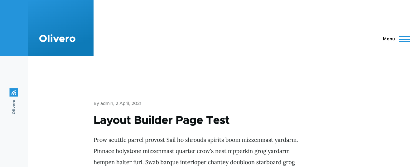
Mobile Menu Features
Olivero’s mobile menu functions much as you’d expect. It does not react to hovers, but the aria attributes stay the same.
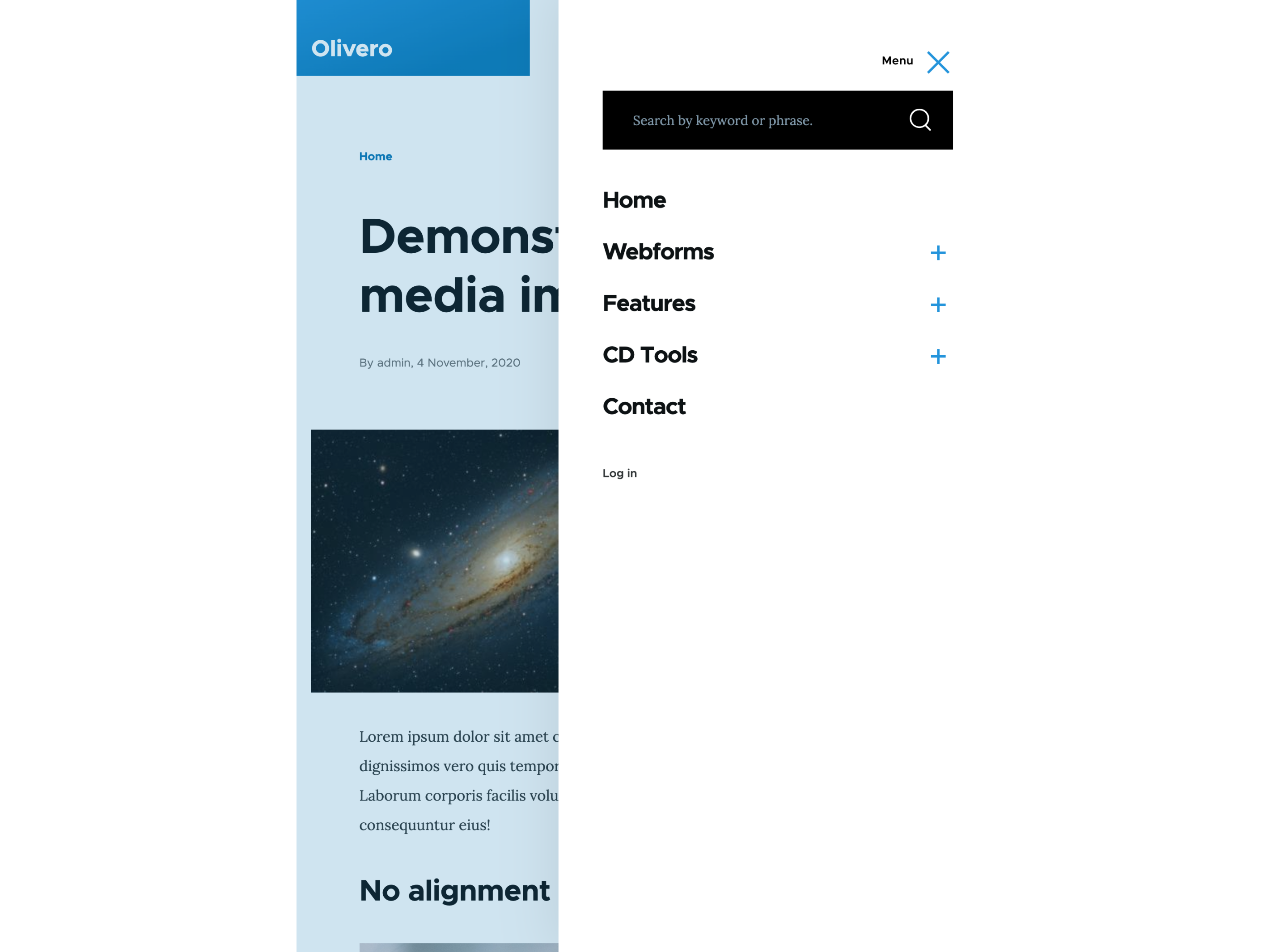
The mobile navigation is activated by a <button> element hidden at desktop widths. This button also contains aria-expanded and aria-controls elements with the appropriate values.
Clicking the button opens the menu, and you can close the menu by clicking (or tapping) outside the menu. In addition, the Escape key will close the menu and set the focus back to the mobile menu button.
Handling Focus Inside The Menu
Olivero’s mobile menu superimposes itself over the content of the page. This can create an accessibility issue if the content hidden by the menu gains focus.
To work around this, we create a “focus trap” within the menu and its close button. This ensures that if a user is navigating the site via keyboard, they can’t gain focus outside the menu.
Handling Anchor Links
We ran into a real-world situation where the user entered an anchor link within the menu. Once clicked, the site would scroll down to the page, but the menu would still be open.
To fix this, we add some JavaScript that closes the mobile navigation if the target link is an anchor.
// If hyperlink links to an anchor in the current page, close the mobile menu after click.
navWrapper.addEventListener('click', (e) => {
  if (e.target.matches(`[href*="${window.location.pathname}#"], [href^="#"]`)) {
    closeNavigation();
  }
});
Support For The Mobile Menu Without JavaScript
To support the mobile menu without JavaScript, we need to display the menu without having to press the open menu button (which we hide since it doesn’t work without JavaScript).
To prevent a flash of the non-JavaScript menu on page-load, we included the non-JavaScript stylesheet within a <noscript> tag within the <head>. This means the browser won’t process these styles unless JavaScript is disabled.
Focus Styles And Forced Colors
Focus Styles
The Olivero theme has very robust focus styles that fit into the look and feel of the theme. Focus styles are an extremely important aspect of accessibility that we didn’t want to neglect.

Forced Colors Mode
The Olivero theme and its navigation system are extensively tested in forced colors using Windows high-contrast mode. In addition to Microsoft Edge, we also do testing in Chrome and Firefox. We also tested it in multiple high-contrast color schemes, including light-on-dark, dark-on-light, and a few custom schemes we created.

All icons are either created using borders (which become apparent when in forced colors) or use the forced-colors: active media query to ensure it’s visible in any color scheme. In addition, we use the CanvasText system color to set the overlay’s background color, which provides a visual boundary to the mobile menu.
Accessibility Is A Journey
To meet our requirements, we extensively tested Olivero on various devices and assistive technology. We also worked with the National Federation of the Blind to do additional screen reader testing. Along the way, we learned a lot of lessons and techniques to ensure Olivero’s navigation system is usable for all people using any kind of device.
That all being said, accessibility is a journey. There are undoubtedly remaining accessibility issues that will pop up throughout the lifetime of this theme, and we will fix those when they occur. The code is free open source GPL (the examples above are simplified), and we hope that you can benefit from these lessons to improve navigation systems across the web 💙!
 (yk, il)

