A Complete Guide To Live Validation UX

Email Newsletter
Weekly tips on front-end & UX.
Trusted by 182,000+ folks.

 SurveyJS: White-Label Survey Solution for Your JS App
 Register Free Now
 Celebrating 10 million developers
Undoubtedly, there are major advantages of live validation. We validate input as users type, and so as people move from one green checkmark to another, we boost their confidence and create a sense of progression. If an input expects a particular type of content, we can flag errors immediately, so users can fix them right away. This is especially useful when choosing a secure password, or an available username.
However, live validation can be problematic. Mostly because we can’t really show an error at just the right time when it occurs. And the reason for that is that we can’t really know for sure when a user has actually finished their input, unless they explicitly tell us that they have.
Clicking on a “Submit” button is a very clear signal that users think they are done, but our implementations usually consider leaving an input field as a strong enough signal to kick off the validation for that input field. Often it will be a correct assumption, but since it’s merely an assumption, eventually it will be wrong for some users — we just don’t know how many people, and how often, will be affected by it.
Surely we don’t want to show “wrong” errors; nor do we want to confuse and frustrate users with flashing error messages as they type. We want to show errors as they happen, and we want to replace them with friendly green checkmarks once they are fixed. How challenging can that be to implement? As it turns out, it is indeed quite challenging.
Pssst! This article is part of our ongoing series on design patterns. It’s also a part of Smart Interface Design Patterns 🍣 and is available in the Live Interface Design Training 🍕 as well.
The Many Faces Of Live Validation
There are surprisingly many flavours of live validation. Over the years, we’ve learned to avoid premature validation — live validation that happens when a user just focuses on an empty input field. In that case, we would display errors way too early, before users even have a chance to type anything. This isn’t helpful, and it is frustrating.
Eventually we moved to real-time validation which happens as users are typing. To do that, for every single field, we define a threshold of entered characters, after which we start validating. This doesn’t really remove frustration entirely, but rather delays it. As users eventually reach the threshold, if the input isn’t complete or properly formatted yet, they start getting confronted with flashes of premature error messages.
Live validation also typically requires quite elaborate and strict formatting rules. For example, at which point should we validate a day and a month for a date input? Would we validate them separately, or validate the date as a whole? Because both day and month inputs are interdependent, getting live validation right there is difficult. From testing, it seems that validating the date at once helps avoid premature errors for good. In practice, each input, and each type of input, requires a conversation about custom validation rules.
The most common type of live validation is late validation: we validate input once a user has left the input field (on blur), and just let them be as they are filling in the data or copy-paste it. This surely helps us avoid flashes of errors. However, we assume a particular order of progression from one field to another. We also prompt users to interrupt their progression and head back to fix an error once it has happened.
So which live validation technique works best? As it turns out in usability testing, users sincerely appreciate both — the live validation and the late validation — if things go perfectly smoothly. Ironically, they also feel utterly frustrated by any kind of live validation once errors start showing up one after another.
The Downsides Of Live Validation
This frustration shows up in different ways, from the task abandonment to the increased frequency of errors. And usually it’s related to a few well-known issues that live validation always entails:
- Live validation always interrupts users.
A user might be just trying to answer a question, but error messages keep flashing in front of them as they type. That’s annoying, disruptive and expensive. - Live validation often kicks in too early or too late.
Errors appear either when the user is typing, or once they have moved to the next input field. Both of these options aren’t ideal: the user is interrupted as they type, or they are focused on the next question, yet we prompt them to fix their previous answer. - Live validation isn’t reliable enough.
Even though an live validator might give the user’s input green light, it can still flash an error message once the input has been re-checked on the server. A correct format of the input doesn’t mean that the input is also accurate.
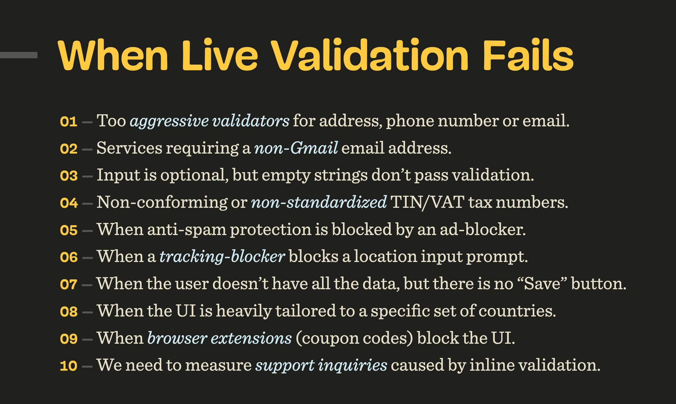
- Validation rules aren’t error-prone to exceptions.
Validation rules rarely account for a much-needed wide range of exceptions and custom rules. They are often based on common assumptions that will eventually fail for some users — we just don’t know for how many. - Live validation demands immediate attention.
When an error appears, most users almost instinctively head to the erroneous input field to fix it right away. But with errors showing up frequently, users keep switching between the keyboard, mouse and the screen, rather than fixing all errors at once. - Often error messages are removed too late.
While the user is editing their input, often error messages remain visible until the user has left the input field again. This leaves users in the dark as they think they’ve fixed the problem already, but the interface doesn’t react accordingly.
Let’s see how we can use some simple techniques to address these issues effectively.
1. Show Errors Immediately If Issues Are Severe
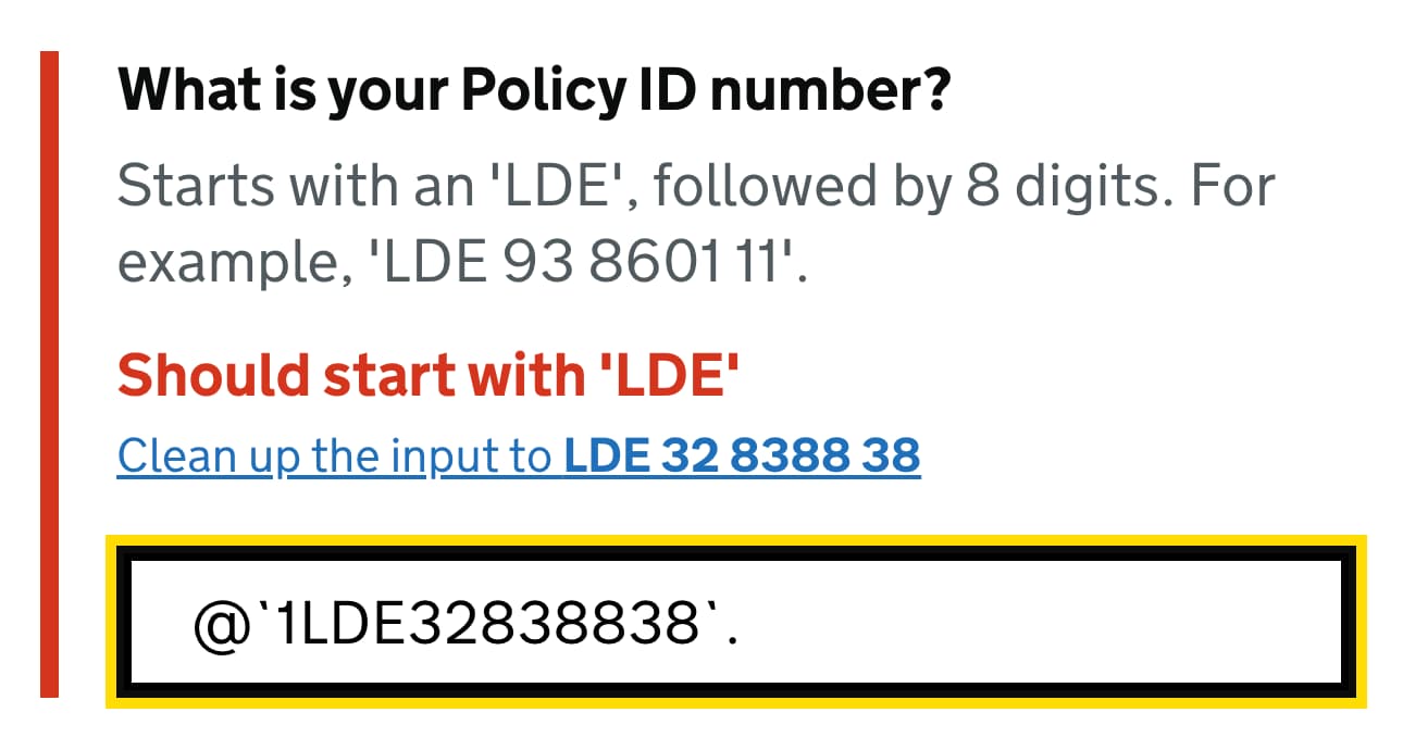
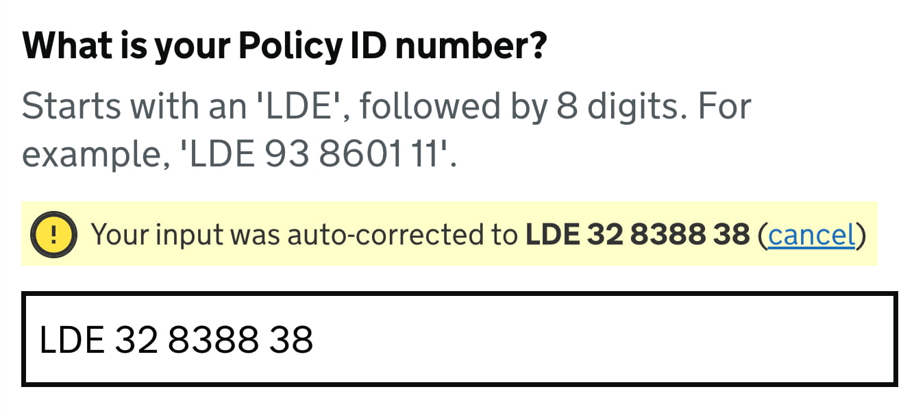
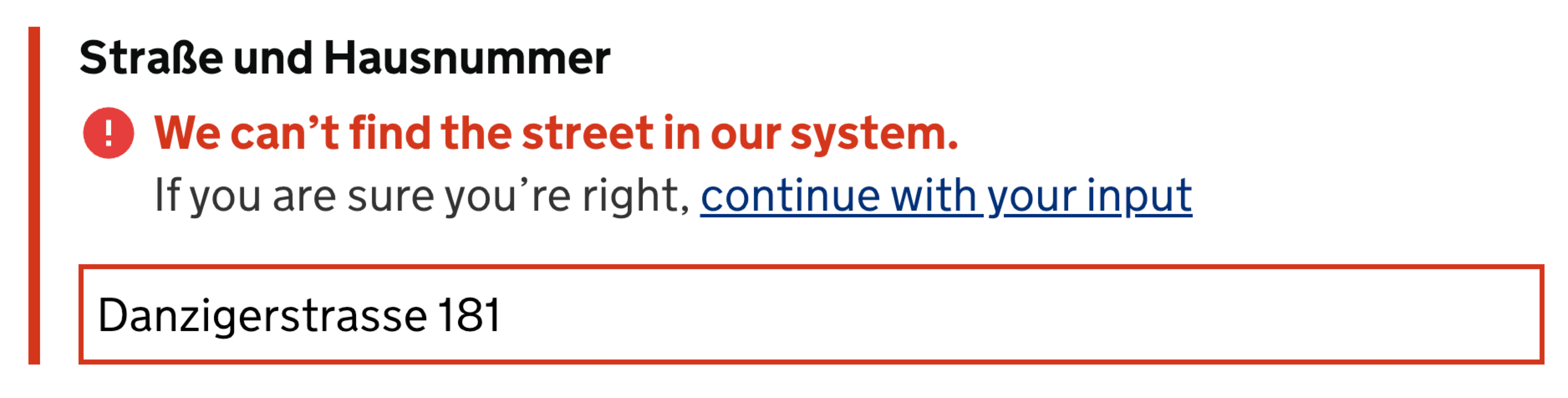
Sometimes it’s critical to show an error immediately as it occurs to prevent unnecessary work and inaccurate input. For example, we probably want to prevent unnecessary typing if we know that the first few characters don’t match an expected format of the input.
Neither do we want to allow for Latin characters in a policy number that may contain only digits. In these cases, we need to communicate to users immediately that their input can’t be right — no matter how many more characters they would type in the input field.
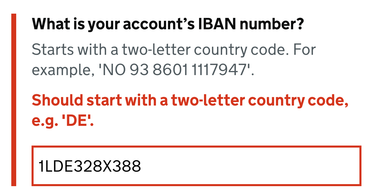
This applies, for example, to ill-formatted VAT-numbers, which always start with a 2-digit-prefix, such as DE or LT. But it also helps with any standardized input such as IBAN number, credit card number, prefixed policy insurance number or lengthy digits-only gift-coupon-codes.
We also want to avoid wrong assumptions or wasted time between pages that potentially don’t even apply to users. The more severe an error is, the more likely it is that users might want to see it sooner, rather than later. However, when we do display errors, we need to ensure users will appreciate the interruption.
2. Late Validation Is Almost Always Better
Especially for complex forms, with plenty of columns, view switchers and filters, premature error messages are often perceived as an annoyance, and a very distracting one. As users are typing, any kind of distraction in such environments is highly unwanted and counter-productive. In fact, distraction often leads to even more errors, but also reduced accuracy of data and increased completion times.
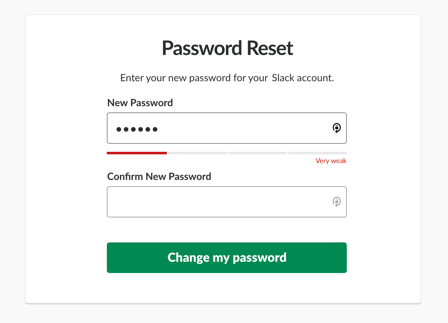
Late validation almost always performs better. It’s just that by validating late, we can be more confident that the user isn’t still in the process of typing the data in the input field. The main exception would be any kind of input, for which users can benefit from real-time feedback, such as password strength meter, or a choice of an available username, or the character count limit. There we need to respond to user’s input immediately, as not doing so would only slow down users desperately trying to find they way around system’s requirements.
In practical terms, that means that for every input in a form, we need to review just what kind of feedback is needed, and design the interaction accordingly. It’s unlikely that one single rule for all inputs will work well: to be effective, we need a more granular approach, with a few validation modes that could be applied separately for each individual input.
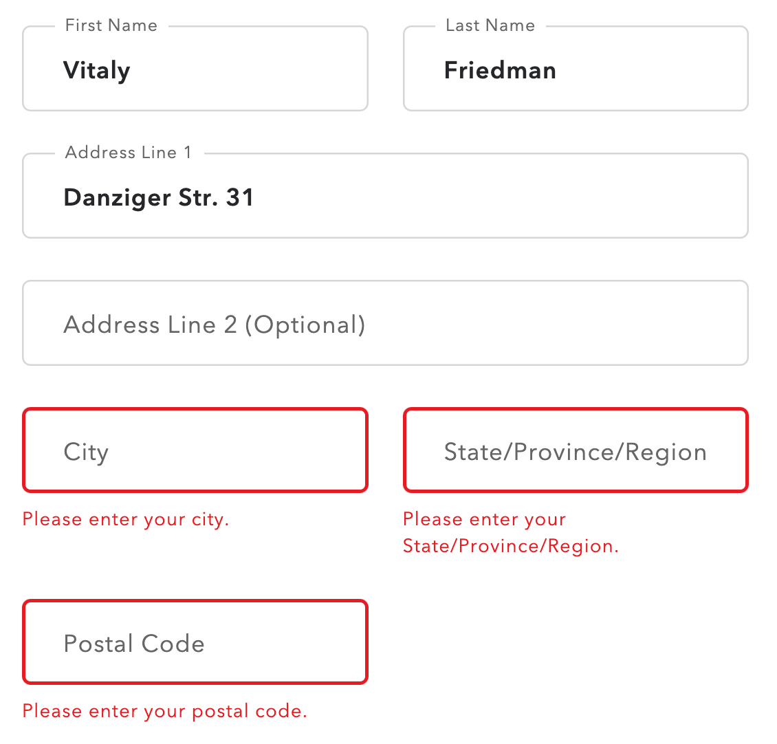
3. Validate Empty Fields Only On Submit
Not all errors are equally severe, of course. Surely sometimes input is just ill-formatted or erroneous, but how do we deal with empty form fields or indeterminate radio buttons that are required? Users might have left them empty accidentally or intentionally, and there isn’t really a sure way for us to predict it. Should we throw an error immediately once the user has left the field empty? The answer isn’t obvious at all.
The user might have indeed overlooked the input field, but that’s not the only option. They might as well just have jumped in a wrong field by mistake, and left it right away. Or they had to jump back to the previous field to correct an error triggered by the validator. Or they skipped the input field because they just wanted to get something else out of the way. Or maybe they just had to clear up their input and then move to another browser’s tab to copy-paste a string of text.
In practice, getting the UX around empty fields right is surprisingly difficult. Yet again, we can’t predict the context in which a user happens to find themselves. And as it turns out, they don’t always have a perfectly linear experience from start to finish — it’s often chaotic and almost unpredictable, with plenty of jumps and spontaneous corrections, especially in complex multi-column forms. And as designers, we shouldn’t assume a particular order for filling out the form, nor should we expect and rely on a particular tabbing behavior.
In my experience, whenever we try to flag the issues with empty fields, too often we will be pointing out mistakes prematurely. A calmer option is to validate empty fields only on submit, as it’s a clear indicator that a user indeed has overlooked a required input as they wish to proceed to the next step.
The earliest time to show an error message is when a user leaves a non-empty input field. Alternatively, depending on the input at hand, we might want to define a minimum threshold of characters, after which we start validating.
4. Reward Early, Punish Late
Another issue that shows up eventually is what should happen if a user chooses to change an input field that’s already been validated? Do we validate immediately as they edit the input, or do we wait until they leave the input field?
As Mihael Konjević wrote in his article on the Reward Early, Punish Late pattern, if a user edits an erroneous field, we should be validating immediately, removing the error message and confirming that the mistake has been fixed as soon as possible (reward early). However, if the input was valid already and it is being edited, it’s probably better to wait until the user moves to the next input field and flag the errors then (punish late).
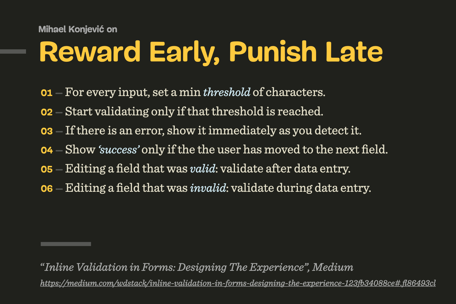
In technical terms, we need to track the state and contents of each input field, and have thresholds for when we start validating, and then have rules for changing input fields that have been validated already, or that contain errors.
As it turns out, the implementation isn’t trivial, and making it work in a complex form will require quite a bit of validation logic. Beware that this logic might also be difficult to maintain if some fields have dependencies or show up only in certain conditions.
5. Prioritize Copy-Paste UX Over Live Validation
For pretty much any form, copy-paste is almost unavoidable. To many users, this seems like a much more accurate way of typing data as they are less likely to make mistakes or typos. While this is less typical for simple forms such as eCommerce checkout or sign up forms, it is a common strategy for complex enterprise forms, especially when users complete repetitive tasks.
However, copy-paste is often inaccurate, too. People tend to copy-paste too few or too many characters, sometimes with delimeteres, and sometimes with “too many” empty spaces or line breaks. Sadly, this often doesn’t work as expected as the input gets truncated, causes a flash of error messages or breaks the form altogether. Not to mention friendly websites that sometimes conveniently attach a string of text (URL or something similar) to the copied string, making copy-pasting more difficult.
In all of these situations, live validation will flag errors, and rightfully so. Of course, in an ideal world, pasting would automatically remove all unnecessary characters. However, as text strings sometimes get appended to copied text automatically, even it wouldn’t really help. So if it’s not possible, an interesting alternative would is to add the “clean-up” feature that would cleanse the input and remove all unnecessary characters from it. Surely we’d also need to confirm with the user if the input is still right.
If instead, after copy-pasting, some parts of the input are automatically removed, or auto-formatted in a wrong way, it can become quite a hassle to correct the input. If we can auto-correct reliably, it’s a good idea to do so; but often getting it right can be quite difficult. Rather than correcting their own mistakes, users now have to correct system’s mistakes, and this rarely results in improved user satisfaction. In such situations, users sometimes would remove the entire input altogether, then take a deep breath and start re-typing from scratch.
Typically, wrong auto-correct happens because the validator expects a very specific format of input. But should it actually? As long as the input is unambiguous, shouldn’t we accept pretty much any kind of input, in a form that users would prefer, rather than the one that the system expects?

A good example of that is a phone number input. In most implementations, one would often integrate fancy drop-downs and country selectors, along with auto-masking and auto-formatting in the phone number input field. Sometimes they work beautifully, but sometimes they fail miserably — mostly because they collide with the copy-paste, literally breaking the input. Not to mention that carefully selecting a country’s international code from a drop-down is much slower than just typing the number directly.

+, 00 or any delimeters. Auto formatting is fine, but it should work well with copy-paste. This is copy-paste-friendly UX. (Image credit: GOV.UK Design System)What’s wrong with the auto-formatting, by the way? Just like live validation is never reliable, so is auto-formatting. The phone number, for example, could start with +49, or 0049 or just the country code 49. It might contain an extension code, and it might be a mobile phone number or a landline number. The question is, how can we auto-format reliably and correctly most of the time? This requires a sophisticated validator, which isn’t easy to build. In practical terms, for a given implementation, we need to test just how often auto-formatting fails and how exactly it fails, and refine the design (and implementation) accordingly.
One more thing that’s worth mentioning: disabling copy-paste is never a good idea. When we disable copy-paste for the purpose of security (e.g. email confirmation), or to prevent mistakes, people often get lost in the copy-paste-loop, wasting time trying to copy-paste multiple times, or in chunks, until they eventually give up. This doesn’t leave them with a thrilling sense of accomplishment, of course. And it does have an impact on the user satisfaction KPI.
In general, we should always allow users to type in data in their preferred way, rather than imposing a particular way that fits us well. The validation rules should support and greenlight any input as long as it’s unambiguous and not invalid (e.g. containing letters for phone input doesn’t make sense). The data cleaning, then, can be done either with late validation or on the server-side in a post-processing step.
6. Allow Users to Override Live Validation
Because live validation is never bulletproof, there will be situations when users will be locked-out, without any option to proceed. That’s not very different from disabled buttons, which often cause nearly 100% abandonment rates. To avoid it, we always need to provide users with a way out in situations when live validation fails. That means adding an option to override validation if the user is confident that they are right.
To support overrides, we can simply add a note next to the input that seems to be erroneous, prompting users to review their input and proceed despite the live validation error, should they want to do so.
We surely will end up with some wrong input in our database, but it might be quite manageable and easy to correct — and also worth it, if we manage to boost conversion as a result of that. Eventually, it’s all about making a case around the value of that design decision.
To get there, we need to measure the impact of overrides for a few weeks. We need to understand just how much more revenue is coming through with the override and just how much inaccurate input and expenses or costs we produce because of it. The decision, then, should be based on these metrics and data, captured by design KPIs. This will give you a comparison to see how costly live validation actually is and make a case about having one, getting a buy-in to adjust it, or making a case for abandoning it.
7. Just-In-Time Validation
It might feel perfectly obvious that live validation is a perfect tool to validate complex input. If a user types in a 16-digits-gift-code, or a lengthy insurance policy number, providing them with confidence about their input is definitely a good idea.
But typing complex data takes time and effort. For lengthy input, users often copy-paste or type chunks of data in multiple steps, often with live validation flashing left and right as they enter and leave input fields. And because the input isn’t simple, they often review their input before proceeding to ensure that they haven’t made any mistakes. This might be one of the cases where live validation is too much of a distraction at the time when users are heavily focused on a task at hand.
So what do we do? Well, again, we could allow users to validate their input only when they are confident that it is complete. That’s the case with the just-in-time validation: we provide users with a “Validate” button that kicks off the validation on request, while the other fields are validated live, immediately.
However, whenever many pieces of content are compounded in a large group and have restrictive rules — like the credit card details, for example — it’s better to live validate them all immediately. This can help users avoid unnecessary input and change the type of input if needed.
8. For Short Forms, Consider Validation on Submit Only
Once we validate just-in-time, we can of course go even further and validate only on submit. The benefit of it is obvious: users are never distracted or annoyed by validation, and have full control over when their input is validated.
However, the pattern doesn’t seem to work well for lengthy pages with dozens and dozens of input fields. There, users often end up typing a lot of unnecessary data before they realize that their initial input isn’t really applicable. But perhaps we could avoid the issue altogether.
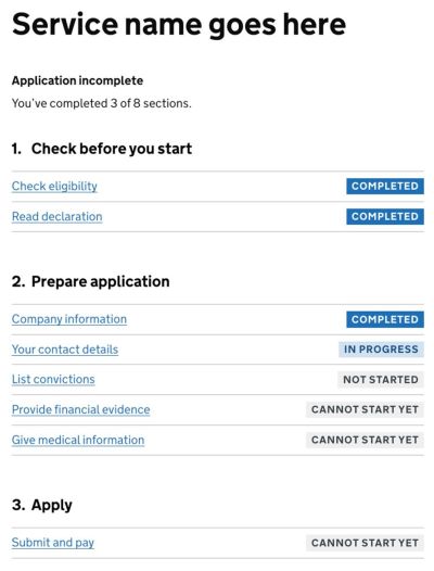
As it turns out, shorter pages usually perform better than one long page. In fact, for sophisticated forms, a better way to deal with complex journeys is to simplify them. We product a sort of a dashboard of tasks that a user has to complete in our complex journey, and dedicate single pages for single tasks. In details, it works like this:
- We split a complex form into small tasks = pages (with the one-thing-per-page pattern);
- For every page, we validate (mostly) on submit, as users are moving from one page to the next;
- We provide users with a task list pattern and support navigation between them, with the option to save input and continue later.
Not only does the approach make form much simpler to manage; because each part of the journey is quite simple and predictable, users are also less likely to make mistakes, but if they do make these mistakes, they can recover from them quickly — without jumping all over the entire form. Definitely an approach worth testing once you end up with a slightly more complex user journey.
When Live Validation Works
We’ve gone all the way from the issues around live validation towards the option to abandon it altogether. However, it’s worth stating that live validation can be very helpful as well. It seems to be most effective when mistakes are common and quite severe.
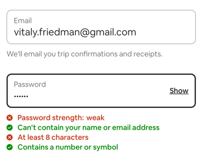
For example, live validation is very useful with a password strength meter. When we describe and live-update password rules as users type, it helps users choose a password that matches all requirements, is secure and won’t trigger any error messages.
Users also appreciate immediate help with any kind of complex input. And, with live validation, users woul never fill out entire sections in the form just to realize that these sections do not apply to them.
All of these advantages make live validation a thrilling and thriving UX technique — especially in situations when most form fields are likely to be completed by browser’s autofill. However, if the live validation is too eager, users quickly get utterly frustrated by it when errors start creeping out.
Wrapping Up
Live validation is useful, but when it fails, its costs can be quite high. With just-in-time validation, reward-early-punish-late-pattern and validating on submit, we avoid unnecessary distractions, complex logic and layout shifts altogether, and communicate errors without annoying users too early or too late.
The downside is, of course, the error recovery speed, which certainly will be slower, yet in the end, the number of errors might be lower as well because we’ve simplified the form massively. It’s just much more difficult to make mistakes if you have just 3–4 input fields in front of you. And that might be just enough to reduce the frequency of errors and increase completion rates.
Meet “Smart Interface Design Patterns”
If you are interested in similar insights around UX, take a look at Smart Interface Design Patterns, our shiny new 10h-video course with 100s of practical examples from real-life projects. Design patterns and guidelines on everything from mega-dropdowns to complex enterprise tables — with 5 new segments added every year. Just sayin’! Check a free preview.

100 design patterns & real-life
examples.
10h-video course + live UX training. Free preview.
Related UX Articles
- Designing Better Error Messages UX
- Rethinking Authenticaiton UX
- Disabled Buttons UX
- Designing A Perfect Infinite Scroll
- Design Patterns and UX on SmashingMag
 (yk, il)

