Design Systems: Useful Examples and Resources

Email Newsletter
Weekly tips on front-end & UX.
Trusted by 182,000+ folks.

 Custom Web Forms for Angular, React, & Vue. Your backend.
 Celebrating 10 million developers


Design systems ensure alignment, reusability, and consistency across a project or brand. And while we have gotten very good at breaking down UIs into reusable components, a lot of design systems aren’t as useful and practical as they could be, or they aren’t even used at all. So how can you make sure that the work you and your team put into a design system really pays off? How can you create a design system that everyone loves to use?
In this post, we’ll take a closer look at interesting design systems that have mastered the challenge and at resources that help you do the same. We’ll explore how to deal with naming conventions, how motion and accessibility fit into a design system, and dive deep into case studies, Figma kits, and more. We hope that some of these pointers will help you create a design system that works well for you and your team.
Table of Contents
Below you’ll find quick jumps to real-world design systems and specific design system topics. Scroll down for a general overview. Or skip the table of contents.
- Audi Design System
- Brand Estonia Design System
- Carbon Design System
- Culture Amp Design System
- Deutsche Bahn Design System
- If Design System
- Nord Design System
- Olympic Brand Design System
- Shopify Design System
- Workbench Design System
- accessibility
- brand expression
- case studies
- custom design attributes
- data visualization
- enterprise design systems
- Figma kits
- live examples
- measuring design systems
- motion
- multi-lingual design
- naming conventions
- ROI calculator
- UX writing
- visual examples
- workbook
Inspiring Real-World Design Systems
Nord: Accessibility And Naming Conventions
Bringing together everything that’s required to manage a healthcare business digitally, Nordhealth creates software that aims to redefine healthcare. As such, their design system Nord is heavily focused on accessibility.

Nord offers plenty of customization options, themes, and a fully-fledged CSS framework, plus dedicated guides to naming conventions and localization, for example. Unfortunately, the Nord Figma Toolkit isn’t open-sourced yet.
Workbench: Comprehensive Live Examples
Gusto serves more than 200,000 businesses worldwide, automating payroll, employee benefits, and HR. To enable their team to develop cohesive and accessible experiences for Gusto’s platform, the Workbench design system encompasses Gusto’s design philosophy, design tokens, creative assets, React components, and utilities — and documentation to tie it all together.
What really stands out in the Workbench system are the comprehensive live examples that explain exactly how components should be used in different contexts. Do’s and don’ts, visual explanations, and implementation details ensure that both designers and developers working with Workbench can use the design system effectively. For even more convenience, there’s also a Gusto Workbench VS Code Extension with common snippets for UI components.
Olympic Brand: Branding And Multi-Lingual Design
The Olympic Games are probably one of the most widely recognized brands in the world. Since the birth of the modern Games more than 125 years ago, hundreds of people have grown and enhanced the Olympic brand. To increase consistency, efficiency and impact across all that they do, the IOC hired a Canadian agency to create a comprehensive design system that conveys the timeless values of the Olympic Games and propels the brand into the future.

The Olympic design system is focused on branding and identity design, but also provides examples of illustrations and graphic elements. It shows how to manage multi-lingual challenges and how to use typography, with plenty of good and not-so-good examples and guidance notes along the way.
Brand Estonia: Custom Design Attributes
Pure and contrasting nature, digital society, and smart, independent-minded people are the core values behind the brand Estonia. The Brand Estonia design system maps the country’s strengths and shows how to express them through writing, designs, presentations, and videos.
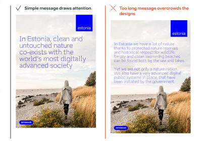
Stories, core messages, facts, and plenty of examples and templates provide a solid foundation for creating texts and designs across the brand — be it on the web, in social media, or print. A special highlight of Estonia’s design system lies on authentic photos and custom design attributes such as wordmarks and boulders to underline the message.
Audi: Visual Examples Of Do’s And Don’ts
Audi UIs range from websites to applications for a particular service. The Audi design system provides a joint set of components, modules, and animations to create a well-balanced, system-wide user experience — from the app to the vehicle.

Along with brand appearance guidelines and UI components, a handy feature of the design system is its comprehensive set of visual examples of how a component should (and shouldn’t) be used in Audi’s interfaces. There is also a Audi UI Kit for Figma and a Sketch UI library that ensure that designers use the most up-to-date components and icons in their products.
Deutsche Bahn: Content Guidelines And UX Writing
Deutsche Bahn, the national railway company of Germany, is one of the most recognized brands in Germany. With the help of their DB Digital Product Platform, the company enables developers, designers, and copywriters to build flexible digital experiences with an emphasis on mobility.

The design system features content guidelines, accessibility considerations, code examples, components, and contextual examples of how to use them. It also provides guidelines around UX writing and helpful visual guides to accessibility and logo. Everything is open source on GitHub and NPM.
Shopify, If, And More: Data Visualization
Data is pretty much useless if we can’t make sense of it. Luckily, data visualization helps us tell the full story. But how to include data visualization in a design system? Here are some examples.

Shopify’s design system Polaris maps out guidelines for how to approach data visualization and defines five core traits for successful data visualizations. Do’s and don’ts for different data visualizations deliver practical examples. Culture Amp features helpful further reading resources for each type of data visualization they define in their design system. The If Design System shines a light on color in data visualizations, and the Carbon Design System comes with demos and ready-to-use code snippets for React, Angular, Vue, and Vanilla.
Design Systems For Figma
Atlassian, Uber, Shopify, Slack — these are just a few of the design systems you’ll find on Design Systems For Figma. Curated by Josh Cusick, the site is a growing repository of freely available Figma kits of design systems — grouped, organized, and searchable.

Not featured in the collection, but worth looking into as well, is the GOV.UK design system Figma kit. It focuses specifically on complex user journeys and web forms. Lots of valuable insights and inspiration are guaranteed.
Design System Resources
Design System Naming Conventions
Let’s face it, naming things can be hard. Particularly in a design system, where you need to find names for your components, styles, and states that can be easily understood by everyone who works with it. But how to best tackle the task? Ardena Gonzalez Flahavin explores not only why we should care about naming in our design systems but also what we should keep in mind when doing so.
Shayna Hodkin also summarized best practices for solid naming conventions for the different categories in a design system — from colors and text styles to layer styles and components.
Another great read on the topic comes from Jules Mahe. To help you find the right balance between clarity, searchability, and consistency, Jules summarized tips for naming your design files, understanding what you need to name in a design system, and structuring it. Three useful resources for futureproofing your design system.
Accessibility In Design Systems
When building a design system, it’s a good idea to include guidelines and documentation for accessibility right from the beginning. By doing so, you reduce the need for repeat accessibility work and give your team more time to focus on new things instead of spending it on recreating and testing accessible color palettes or visible focus states again and again. In her article on accessible design systems, Henny Swan explores what an accessible design system needs to include and how to maintain it.

To shift the understanding of accessibility from one of basic compliance to a truly inclusive, human-centered experience, the team at AdHoc released their Accessibility Beyond Compliance Playbook. It explores several ways to improve accessibility — from the immediate task of building accessible products to creating teams of people that underscore an Accessibility Beyond Compliance mindset.
Another handy resource to help you incorporate accessibility efforts comes from IBM. Their open-source Carbon Design System is based on WCAG AA, Section 508, and European standards to ensure a better user experience for everyone. It gives valuable insights into how users with vision, hearing, cognitive, and physical impairments experience an interface and what designers should think about to ensure their design patterns are operable and understandable.
For more practical tips, be sure to check out the IBM Accessibility Requirements checklist on which Carbon is based. It features detailed tips to make different components and design patterns comply with accessibility standards. A way forward to empowering your diverse user base.
Brand Expression In Design Systems
When it comes to visual elements like icons and illustrations, many companies have difficulties finding the right balance between being on-brand, useful, and scalable. The team behind Design Systems For Figma also faced this challenge and came up with a recipe for creating and scaling a system of visuals. Elena Searcy summarized how this system works.

In her blog post, Elena starts with the smallest visual element, an icon, explaining what her team aims for when choosing and creating icons to make them align with the brand and provide real value for the user. Elena also shares insights into how they handle illustrations, including a scalable way of creating them and considerations regarding anatomy, style, and color. A great example of how a set of established rules can help make visuals more meaningful.
Motion In Design Systems
Motion in design is powerful. It can help to reduce cognitive load, guide users through pages and actions, provide user feedback, improve the discoverability of features, and improve perceived response time. To make full use of motion, the design team at Salesforce created an end-to-end motion language for their products: the Salesforce Kinetics System.

As Pavithra Ramamurthy, Senior Product Designer at Salesforce, explains, the intention behind the Salesforce Kinetics System is to enable the evolution and scaling of kinetic patterns across products, with design system components that are pre-baked with motion right out-of-the-box.
But how do you scale these motion patterns from design system to product? How would teams actually use the artifacts in their daily workflows? Pavithra wrote a case study that takes a closer look to demonstrate the possibilities. Interesting insights guaranteed.
Enterprise Design System 101
Introducing an enterprise design system is a lot of work. But it is work that will pay off. Especially with large teams, multiple platforms, and numerous user interfaces to manage, having a single source of truth helps maintain a consistent user experience. So what do you need to consider when building your own? Adam Fard takes a closer look.

As Adam explains, an enterprise design system is a system of best practices, reusable design elements, processes, usage guidelines, and patterns that help reinforce the brand, improve the UX design process, and optimize the user experience. He compares it to a box of Lego: the building blocks are the collection of code and design components, the building instructions that you’ll usually find inside the box correspond to a collection of guidelines, processes, and best practices that ensure that co-designing and cross-collaboration are seamless. If your enterprise traverses numerous sites or apps, Adam’s writeup is a great opportunity to get familiar with the concept of enterprise design systems.
Measuring A Design System
When you’ve built a design system or are just about to start working on one, metrics might not be the thing you’re concerned about at first sight. However, measuring your design system is more important than you might think. In his article “How to measure your design system?”, Jules Mahe dives deeper into why it’s worth the effort.
Jules explains how to define the KPIs for your design system and how to get quantitative data measurements to learn more about a design system’s efficiency. Qualitative data conducted with the help of surveys and interviews make the narrative more compelling. Of course, Jules also takes a closer look at how to use the data. As he concludes, measuring a design system is challenging and requires time, but it will be a goldmine and one of the essential levers for your design system’s growth and sustainability.
Design System ROI Calculator
Your boss is hesitant that the work you’ll put into a design system will eventually pay off? The Design System ROI Calculator might be just what you need to convince them that the time and money invested in a design system is a good investment.

The ROI calculator helps you understand and project cost savings when implementing a design system. It calculates total employee savings from implementing a design system, as well as time saving and efficiency gain by component or UI element. To estimate total savings, you can select between different scenarios based on team size and product calculation.
Design System Case Studies
Having robust components and patterns that can be reused in different situations is the essential idea behind every design system and often seems like the magical wand everyone has waited for to solve challenges and improve collaboration. Henry Escoto, UX & Design at FOX Corporation, offers a perspective on design systems that is a bit different. He claims that it’s actually the practice which can truly make a difference.

In his case study “Our Design System Journeys”, Henry shares in-depth insights into FOX Tech Design’s design systems Delta and Arches to find answers to the following questions: How will a design system truly help your product design? What does it take to build and execute a design system within an organization? How to inject the practice into existing workflows? And last but not least, what is the pay off of such an investment?
Another interesting case study comes from Jan Klever. Jan is a designer at Quero Educação and also fills the role of the organization’s Design System Ops. He shares from his team’s experience how having a dedicated Design System Ops role can help when it comes to maintenance and following up on the product.
Design System In 90 Days
When you’re starting to work on a design system, you do it with the intent to build something that lasts, a system that teams love to use and that saves them precious time in their daily work. However, many attempts to build a design system end up in great libraries that don’t get used as much as you had hoped. But how do you create a design system that becomes an established part of your organization’s workflow? SuperFriendly published a practical workbook in which they take you and your team from zero to a design system that lasts — in 90 days.

Written for cross-disciplinary teams of design, engineering, and product, the workbook consists of a 130-page PDF and FigJam prompts and Figma templates you’ll use to complete activities. No theory, only clear instructions on what to do and how to do it over a 90-day timeframe. At $349, the workbook isn’t cheap, but considering that it can save you about 6–9 months of figuring out what work to do, the investment is definitely worth considering.
Wrapping Up
Have you come across a design system you found helpful? Or a resource or case study that eased your work and that you’d like to share with others? We’d love to hear about it in the comments below.
 (vf, il)
Useful front-end & UX bits, delivered once a week.
With tools to help you get your work done better. Subscribe and get Vitaly’s Smart Interface Design Checklists PDF via email. 🎁
On front-end & UX. Trusted by 182,000+ folks.


