A Guide To Keyboard Accessibility: HTML And CSS (Part 1)

Email Newsletter
Weekly tips on front-end & UX.
Trusted by 182,000+ folks.
 Custom Web Forms for Angular, React, & Vue. Your backend.
 Celebrating 10 million developers


Keyboard accessibility is an important part of the user experience. There are multiple criteria in Web Content Accessibility Guidelines (WCAG) about this topic. Still, it’s somehow overlooked, affecting the experience of many users, mainly people with motor disabilities — any condition that limits movement or coordination.
Certain conditions like having a broken arm, the loss or damage of a limb, muscular dystrophy, arthritis, and some others can make it impossible for a person to use a mouse to navigate a site. So, making a site navigable via keyboard is a very important part of ensuring the accessibility and usability of our websites.
The importance of making a site accessible for users with motor disabilities becomes even more evident when you learn that they have access to more assistive technology options. Keyboards are not even the main focus of motor disability assistance! There are tools like switches that you use with your hand (or even with your head) to work with any device, which helps a lot for people with more severe motor disabilities. You can see how those technologies work in this demonstration made by Rob Dodson or in this video of Christopher Hills.
In this article, I’ll cover how to use HTML and CSS to create an accessible experience for keyboard users while mentioning what WCAG criteria we should keep into consideration.
HTML
One of the basics of creating a website accessible site for keyboard users is knowing what elements should be navigable via keyboard. For this, a good HTML semantic is crucial because it’ll indicate the kind of elements we want to focus on with keyboard navigation.
The Basics
When a user presses the Tab key, it’ll let them select the next focusable element in the HTML, and when they press the keys Shift + Tab, it’ll take them to the last focusable element. With that said, what elements need to be focusable? Anything that requires user interaction. Between them, you can find the elements button, a, input, summary, textarea, select, and the controls of elements audio, and video (when you add the attribute controls to them). Additionally, certain attributes can make an element keyboard navigable, such as contenteditable or tabindex. In the case of Firefox, any area with a scroll will also be keyboard focusable.
Additionally to that, you can:
- Activate the
button,select,summary, andaelements using the Enter Key. Keep in mind that except for theaelement, you can activate them with the Space Key as well. - Use the arrow keys to navigate between different
inputwith the typeradioif they share the samenameattribute. - Check those inputs using the Space key (keep in mind that when you navigate with the arrow keys
radioinputs, it’ll be checked once the keyboard is focused, but that doesn’t happen withcheckboxinputs). - Use the up and down keys to navigate between the different options of a
selectelement. - Close the
selectelement displayed list and multipleinputpopups. - Use the arrow keys to scroll vertically or horizontally a document.
There are probably more interactions, some of which depend on differences between operating systems and browsers, but that covers mostly what you can do with the keyboard.
Does that mean those elements are automatically keyboard-accessible by default? A good HTML structure is very helpful, and it makes content mostly accessible by default, but you still need to cover some issues.
For example, certain input types like date, datetime-local, week, time, and month have popups that can work differently between browsers. Chrome, for example, allows you to open the date picker popup by pressing the Enter or Space key in a designated button in the input. However, with Firefox, you need to press Enter (or Space) in either the day, month, or year fields to open the popup and modify each field from there.
This lack of consistency can be a bit off-putting, and maybe it’s just a matter of personal preference. Still, I feel that the Firefox experience is not very intuitive, which leads to thinking that, arguably, one of those experiences is more keyboard-accessible than the other. So if you want to create a good, accessible, and consistent keyboard experience between browsers, you’d need more than HTML for that. If you’re going to try it yourself, check this compilation of input types by MDN and navigate them by yourself.
Additionally to the previous point, certain components require elements to be keyboard focusable without being natively selectable. In other cases, we need to manage keyboard focus manually, and our markup needs to help us with that. For both cases, we’ll need to use an HTML attribute that will help us with this task.
tabindex Attribute
This attribute will greatly help us bring keyboard accessibility to more complex component patterns. This attribute receives an integer, and properly using it will help us make a DOM element keyboard focusable. With tabindex, we can find three different cases:
tabindex="0"
It causes the element to be keyboard focusable. You usually don’t want to add keyboard focus to an element unless it is not interactive, but some scenarios will require it.
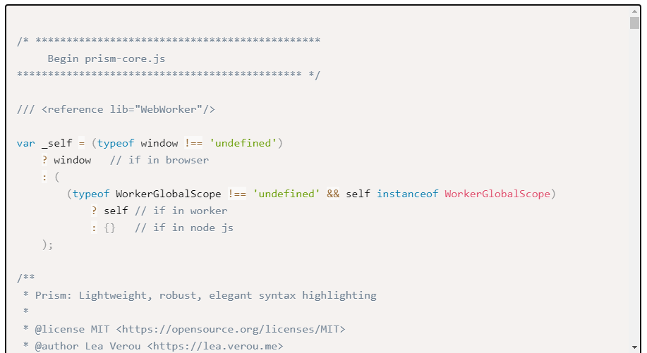
One of them is when you have a component with a scroll beside the body element. Otherwise, keyboard users won’t be able to see the full extent of the content. Some components that could have this trouble are scroll-based carrousels, tables, and code snippets. Just to give an example, any code snippet created with the help of prism.js has the attribute tabindex="0". Open prism.js’ site and navigate it using the Tab key. You’ll be able to focus the snippets and control the vertical and horizontal scroll using the arrow keys.
Some people who start with web accessibility think it is a good idea to add the attribute tabindex="0" to every element because they think it’ll help screen reader users navigate easily through a site. This is a terrible practice because of two reasons:
- Screen reader users have multiple ways to navigate a site. They can jump between headers, landmarks, or form elements, and they don’t need that extra help to create an accessible site as long as the markup is appropriate.
- It can make keyboard navigation difficult because a user will have to press the Tab key many times to arrive at the desired content, and for certain motor disabilities, having too many focusable elements can create a physically painful experience.
So, to summarize: it’s a useful technique for some components, but most of the time, you’ll be alright if you don’t use it, and certainly, you must not use it in every single element of your site.
Negative tabindex
Before we start this section, we need to keep in mind two concepts: a DOM element is at the same time focusable (that means, you can programmatically focus on it with JavaScript) and tabbable (that means, being able to be selected with the Tab Key).
With that in mind, here is where negative tabindex comes into play because it’ll make an element unable to be tabbed (but you can still focus on it with JavaScript). This is important for specific components because, in some cases, we’ll need to make a normally tabbable element unable to be tabbed, or we’ll need an element to be focusable but not tabbable.
One example of that is tabs. A recommended pattern for this component is ensuring that when you press the Tab key when you’re located in the active tab, it goes to the active tabpanel instead of bringing the focus to the next tab. We can achieve that by adding a negative tabindex to all non-active tabs like this:
<ul role="tablist">
  <li role="presentation">
    <button role="tab" href="#panel1" id="tab1" aria-selected="true">Tab one</button>
  </li>
  <li role="presentation">
    <button role="tab" href="#panel2" id="tab2" tabindex="-1">Tab two</button>
  </li>
  <li role="presentation">
    <button role="tab" href="#panel3" id="tab3" tabindex="-1">Tab three</button>
  </li>
  <li role="presentation">
    <button role="tab" href="#panel4" id="tab4" tabindex="-1">Tab four</button>
  </li>
</ul>
We’ll see more examples later about how a negative tabindex will help us to have more control over focus state management in different components, but keep in mind a negative tabindex will be important in those cases.
Finally, you can put any negative integer in the tabindex property, and it’ll work the same. tabindex="-1" and tabindex="-1000" will make no difference, but my mere convention is that we tend to use -1 when we use this attribute.
Positive tabindex
A positive tabindex will make the element keyboard focusable, but the order will be defined according to the used integer. That means that first, the keyboard will navigate all elements with the attribute tabindex="1", then the ones with tabindex="2", and after all elements with a positive tabindex have been navigated, it’ll take into account all interactive elements by default and those with the attribute tabindex="0". This is known as the tabindex-ordered focus navigation scope.
Now, this is a pattern that you shouldn’t use. You’ll be better if you put the required focusable elements in your site in the order you need. Otherwise, you could create a very confusing experience for keyboard users, which would make a failure of the WCAG criterion 2.4.3: Focus order.
“If a Web page can be navigated sequentially and the navigation sequences affect meaning or operation, focusable components receive focus in an order that preserves meaning and operability.”
— Success Criterion 2.4.3: Focus order
It might be useful if you want keyboard users to focus on widgets before they reach the page content, but that’d be a bit confusing for assistive technology users (like screen readers). So again, you’d be better by creating a logical order in the DOM.
inert Attribute
I have to quickly note an incoming attribute that will help us a lot with keyboard accessibility called inert. This attribute will make the content inaccessible by assistive technologies.
Now you might be asking yourself how this can be useful because if something removes keyboard accessibility, but in some cases, that’s a good thing! One component that will benefit from it is modals. Adding this attribute to all elements in the site except this modal will make it easy to create a focus trap. So you’ll ensure the user can’t accidentally navigate to other parts of the site using the Tab key unless they close that modal. Right now, creating a keyboard trap requires quite some thinking with JavaScript (I’ll explain how in the second part of this guide). So, having a way to make it easier with this attribute will be handy.
Sounds pretty cool, right? Well, unfortunately, this attribute is not recommended to be used yet. If you check the caniuse.com entry about this attribute, you’ll notice it’s very recent; Opera doesn’t have support for it yet. The most recent implementation of it was version 105 of Firefox, and at the moment of writing this article, it’s a beta version! So, it’s still very early to do it. There is a polyfill for inert attribute, but right now, it’s a bit performance costly. So, I seriously suggest not using it now for production. But once we have adequate support for this attribute, some component patterns will be easier to create.
CSS
CSS is an essential tool for keyboard accessibility because it allows us to create a level of customization of the experience, which is important for compliance with WCAG 2.2 criteria. Additionally, CSS has multiple selectors with different uses that will help to create a good keyboard experience, but be careful because a bad use of certain properties can be counterproductive. Let’s start diving into the use of this language to create an accessible experience for keyboard users.
Focus Indicator
When you use a mouse, you can see which element you can interact with it thanks to the cursor, and you wouldn’t remove the cursor from your user, right? That’d make them unable to know what element they want to use!
We have a similar concept for keyboard navigation, and it’s called a focus indicator, which by default is an outline that surrounds a keyboard-focusable element when it’s selected by it. Being sure all your keyboard-focusable elements have a focus indicator is essential to making a website keyboard accessible, according to WCAG criteria:
“Any keyboard operable user interface has a mode of operation where the keyboard focus indicator is visible.”
— Success Criterion 2.4.7: Focus Visible
This style is different depending on the browser you’re using. You can see how it looks in the various browsers in those pictures by default and when you use the CSS property color-scheme set to dark just to check out how the default styles would behave in dark mode.

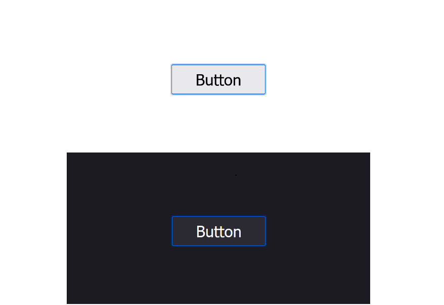

As you can notice, Chromium-based browsers like Chrome or Edge have a black and white outline, which works in light and dark mode. Firefox opted for a blue outline which is noticeable in both modes. And Safari (and Webkit-based browsers because right now, all iOS browsers use Webkit as their browser engine) looks almost the same as Firefox but with an even subtler outline for a dark color scheme.
WCAG Criterion 2.4.11
Now, default focus indicators are visible, but are they enough? The answer is “no”. While it can work in some cases, people with visual impairments will have problems noticing it, so WCAG created the Success Criterion 2.4.11 — Focus appearance to make an accessible focus indicator. Right now, this criterion is part of WCAG 2.2, which is a Candidate Recommendation. So it’s quite unlikely it will change before the final release, but keep in mind that it’s still subject to changes.
When the keyboard focus indicator is visible, one or both of the following is true:
- The focus indicator:
- encloses the visual presentation of the user interface component, and
- has a contrast ratio of at least 3:1 between the same pixels in the focused and unfocused states, and
- has a contrast ratio of at least 3:1 against adjacent colors.
- An area of the focus indicator meets all the following:
- is at least as large as the area of a 1 CSS pixel thick perimeter of the unfocused component, or is at least as large as a 4 CSS pixel thick line along the shortest side of the minimum bounding box of the unfocused component, and
- has a contrast ratio of at least 3:1 between the same pixels in the focused and unfocused states, and
- has a contrast ratio of at least 3:1 against adjacent non-focus-indicator colors, or is no thinner than 2 CSS pixels.
Where a user interface component has active sub-components, if a sub-component receives a focus indicator, these requirements may be applied to the sub-component instead.
— Success Criterion 2.4.11 Focus Appearance
There is something important to consider here, and that’s the area of the focus indicator. This area needs to meet the contrast requirements of this criterion. To illustrate that, I’ll use an example Sara Soueidan made for her article “A guide to designing accessible, WCAG-compliant focus indicators.”
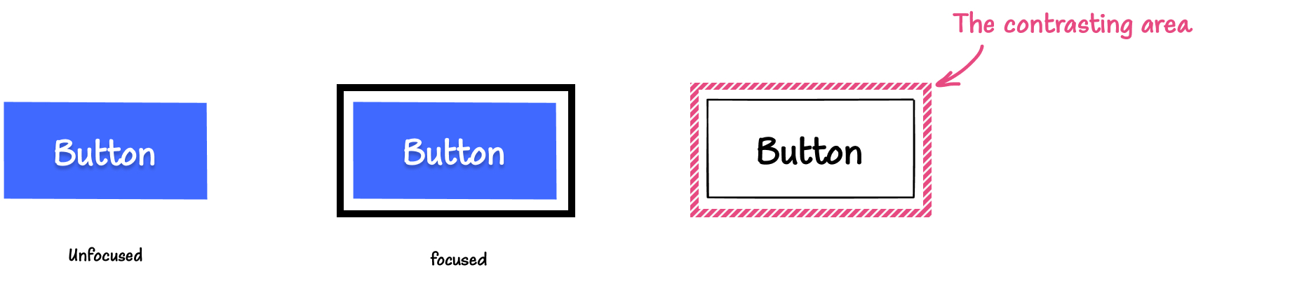
This example uses an outline, but remember that you can use other properties to determine the focus state, like background-color or some creative ways of using box-shadow as long as it’s compliant with the requirements. However, don’t use the property outline: none to eliminate the element’s outline.
That’s important for Windows High Contrast Mode because when it’s active, your website colors will be replaced with ones chosen by the user. So depending on properties like background-color will have no effect there. Instead, use the CSS declaration outline-color: transparent with the appropriate thickness to comply with WCAG criteria. You can see examples of how it works in my article about Windows High Contrast Mode.
The Optimal Outline Size
An easy way to create a compliant focus indicator is using this method Stephanie Eckles suggested in her talk Modern CSS Upgrades To Improve Accessibility. First, we set custom properties in the interactive elements. Remember you can add more elements to the rule depending on the complexity of your project:
/* Add more selectors inside the :is rule if needed */

:is(a, button, input, textarea, summary) {
    --outline-size: max(2px, 0.08em);
    --outline-style: solid;
    --outline-color: currentColor;
}
And then, we use those custom properties to add a global focus rule:
:is(a, button, input, textarea, summary):focus {
    outline:
      var(--outline-size)
      var(--outline-style)
      var(--outline-color);
    outline-offset: var(--outline-offset, var(--outline-size));
}
The use of 0.08em here is to give it a bigger outline size if the font is bigger, helping to scale the element’s contrasting area better with the element’s font size.
Keep in mind that even when WCAG mentions that the focusing area “is at least as large as the area of a 1 CSS pixel thick perimeter of the unfocused component”, it also mentions that it needs to have “a contrast ratio of at least 3:1 against adjacent non-focus-indicator colors, or is no thinner than 2 CSS pixels.” So, a minimum thickness of 2px is necessary to comply with WCAG.
Remember that you might need a thicker line if you use a negative outline-offset because it’ll reduce the perimeter of the outline. Also, using a dashed or dotted outline will reduce the focused area roughly by half, so you’ll need a thicker line to compensate for it.
The outline’s ideal area is related to the perimeter of the element. Sara Soueidan once again did a great job explaining how this formula works in her article about focus indicators. So check it out if you want to understand better the maths behind this matter and how to apply them.
CSS Focus-related Selectors
With CSS, you normally use the pseudo-class :focus to give style to an element when it’s being focused by a keyboard, and it does its job well. But modern CSS has given us two new pseudo-classes, one that helps us with a certain use case and the other that solves an issue that happens when we use the focus pseudo-class. Those pseudo-classes are :focus-within and :focus-visible. Let’s dive into what they do and how they can help us with keyboard accessibility:
:focus-within
This pseudo-class will add a style whenever the element is being focused or any of the element’s children is also being focused. Let’s make a quick example to show how it looks:
<form>
  <label for="name">
    Name:
    <input id="name" type="text">
  </label>
  <label for="email">
    Email:
    <input for="email" type="email">
  </label>
  <button>Submit</button>
</form>
Very quick tangent note: Consider not using label to wrap the input element. While it works in all browsers, it doesn’t work well with Dragon speech recognition software because it won’t be recognized appropriately.
form {
  display: grid;
  gap: 1em;
}

label {
  display: grid;
  gap: 1em;
  padding: 1em;
}

label:focus-within {
  background-color: rebeccapurple;
  color: white
}

This pseudo-class is interesting to enrich the styles of certain components, as previously shown, but in others, it helps a lot to make content accessible for keyboard users. For example, I created a card for my article about media queries hover, pointer, any-hover, and any-pointer. This card shows the content when the user puts the cursor on it, but it also shows the content when you focus the button inside of it using the :focus-within pseudo-class by using the same rules that are triggered on hover. You can check out the code in the mentioned article as well as in this CodePen:
See the Pen [Keyboard accessible animated card [forked]](https://codepen.io/smashingmag/pen/mdLKPWZ) by Cristian Diaz.
focus-visible
On the other hand, we have quite interesting behavior with focus styles due to how the browser decides when to apply this state to an element. If you use the :focus pseudo-class, most browsers will take clicking the element as focusing it, which creates a “false positive” where the element looks like it’s being focused by a keyboard when it’s not the case.
To solve that minor issue, we now have the pseudo-class :focus-visible that creates a focus state only and just only when the element is being focused with a keyboard. Keep in mind that this behavior will apply to elements like button or a and most input elements like the one with the types checkbox, radio, or submit. But it’ll still apply the focus styles when you click them in elements like select, certain input that receive any kind of text like text, number, or the textarea element.
This doesn’t happen nowadays because modern browsers use :focus-visible as their default focus state. But remember, you likely want to change the browser’s default focus indicator to be compliant with WCAG 2.4.11, so you’ll need :focus-visible to avoid this behavior.
If you check the caniuse.com entry about focus-visible pseudo-class, you’ll notice it’s active in all browsers. But in Safari, it has been active since a relatively recent version (15.4, which was released on March 13th, 2022), which means some users probably haven’t updated their browsers yet. That means we should offer any kind of fallback if the browser doesn’t support this pseudo-class. We can do that using the @supports feature query.
Previously, we created a good global style for focus style, now let’s apply the :focus-visible pseudo-class to this rule:
@supports selector(:focus-visible) {
  *:focus {
      outline: none
  }

  *:focus-visible {
      outline:
        var(--outline-size)
        var(--outline-style)
        var(--outline-color);
      outline-offset: var(--outline-offset, var(--outline-size));
  }
}
Quick note: I know I mentioned using the rule outline: none isn’t a good idea, but as we’re replacing it with :focus-visible, this is an “ok” scenario to use it. Just remember to use outline even if it’s not visible. Outline is your friend!
Layout Considerations
Modern CSS power to create layouts is great, but there is a set of practices we should try to use with caution because it can make keyboard navigation experience a problem.
display: contents
This rule is very interesting. It removes the element’s box and makes the element’s children act as if they were direct children of the grandparent’s element without removing the semantics. It makes an element’s child behave as if it were its siblings. This might look a bit confusing, so I’ll explain it with an example. Let’s suppose we have this site’s header’s markup:
<header>
  <a href="#">Go to home</a>
  <nav>
    <ul>
      <li>
        <a href="#">Clothes</a>
      </li>
      <li>
        <a href="#">Accessories</a>
      </li>
      <li>
        <a href="#">Shoes</a>
      </li>
    </ul>
  </nav>
</header>
If we add the rule display: contents to the ul element, we’d be removing the box without removing the semantics, so it’d make the li elements as children of ul’s parent element (in this case, the nav container) like that:
<header>
  <a href="#">Go to home</a>
  <nav>
    <li><a href="#">Clothes</a></li>
    <li>
      <a href="#">Accessories</a>
    </li>
    <li>
      <a href="#">Shoes</a>
    </li>
  </nav>
</header>
And again, that’s without removing the parent element’s semantics. That brings some interesting possibilities for layout creation, as Kevin Powell explains in his video about this property. However, it has a behavior with interactive keyboard elements that should be avoided.
Using it in a keyboard focusable element will make those elements unable to be tabbed. To be fair, it’s very unlikely you find yourself in a situation where you have to use display: contents in a keyboard-focusable element (the only one I could think of if you want to use it to reset the styles of those elements). And this property’s accessibility concerns are for other more common reasons (Safari has a bug that removes the semantics for table and button elements in version 16), but if you somehow find yourself in this situation, avoid it at all costs.
Grid And Flex’s order Property
Grid and flexbox have changed what we can do with layout creation. They’re amazing tools that help us create layouts as complicated as we want, but remember that they can create accessibility issues.
As Manuel Matuzović mentioned in his talk The Dark Side of the Grid, when we change the order of elements visually either by defining an explicit order in a grid with properties like grid-row and grid-column or using the property order on flexbox or grid, it won’t change the order of how the elements appear in the DOM.
This mismatch between DOM and visual order can create a confusing experience for many users, including keyboard users. If we change the visual order too much, it can create a confusing experience for them because the keyboard navigation might not work logically. As I mentioned in the section about positive tabindex, the WCAG criterion 2.4.3 — Focus order, this keyboard navigation needs to preserve an order that “preserves meaning and operability.”
Let’s check that with an example. Let’s take a look at this markup, and let’s order them using a grid:
<ul role="list">
  <li><button>1</button></li>
  <li><button>2</button></li>
  <li><button>3</button></li>
  <li><button>4</button></li>
  <li><button>5</button></li>
  <li><button>6</button></li>
  <li><button>7</button></li>
  <li><button>8</button></li>
  <li><button>9</button></li>
</ul>
button:focus {
  outline: max(2px, 0.08em) solid currentColor;
  outline-offset: -7px;
}

@supports selector(:focus-visible) {
  button:focus {
    outline: none;
  }

  button:focus-visible {
    outline: max(2px, 0.08em) solid currentColor;
    outline-offset: -7px;
  }
}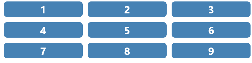
If you use keyboard navigation, you’ll notice the order is pretty straightforward. It reads from left to right and from top to bottom, and the navigation will be the same. Now let’s use grid properties to make some changes:
ul li:where(:nth-child(1), :nth-child(5), :nth-child(7), :nth-child(9)) {
  grid-row: span 2;
  grid-column: span 2
}

ul li:where(:nth-child(1), :nth-child(5)) {
  order: 2;
}

ul li:where(:nth-child(7), :nth-child(8)) {
  order: -1;
}

ul li:nth-child(4) {
  grid-row: 3;
  grid-column: 2 / span 2;
}

ul li:nth-child(3) {
  grid-row: 5 / span 3;
  grid-column: 3;
}
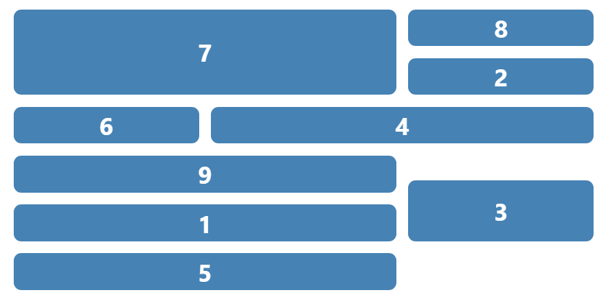
Now it looks completely disarrayed. Sure, the layout looks funny, but when you start navigating it with the Tab key, it’ll have a very random order. There is some degree of predictability now because I used numbers as the button’s label, but what happens if they have different content? It’d be impossible to predict which would be the next button to be focused on with a keyboard.
This is the kind of scenario that needs to be avoided. It doesn’t mean you can’t explicitly order an element within a grid or use the order property. That means you need to be careful with managing your layouts and be sure the visual and DOM order matches as much as possible.
By the way, if you want to try it by yourself, you can see the demo of this code here and experience this chaotic keyboard navigation by yourself:
See the Pen [Focus order demo [forked]](https://codepen.io/smashingmag/pen/GRdGZYJ) by Cristian Diaz.
Some Component Patterns
With what we have seen about HTML and CSS, we can create some simple components to help improve the experience for keyboard users.
Accordions
We can create keyboard-accessible accordions with just HTML thanks to details and summary elements. It has keyboard navigation by default, and screen reader’s support is quite good, be careful with certain interactions between screen readers and browsers, though, as Scott O’Hara points out in his article about details and summary elements, some interactions don’t show important changes when users interact with them. So probably, you could enhance it with JavaScript to support those cases, but this component’s accessibility is pretty great by default, especially for keyboard navigation, which is our main concern in this article!
This is the HTML structure:
<details>
  <summary>
    <h2>Title</h2>
    <span aria-hidden="true"></span>
  </summary>
  <p>
    <!-- Content -->
  </p>
</details>
And this is how it’d look when the components are in their contracted and expanded states:


Now let’s start styling this component! By default, this element uses this triangle to indicate if the details element is opened or closed. We can remove that by adding this rule to the summary element.
summary {
  list-style: none;
}
But we’ll still need a visual indicator to show if it’s opened or closed. My solution is to add a second element as a child of summary. The important part is that this element will have the attribute aria-hidden="true":
<summary>
  <p>
    How much does shipping cost?
  </p>
  <span aria-hidden="true"></span>
</summary>
The reason why I hid this span element is that we’ll be modifying its content with CSS modifying the pseudo-element ::before, and the content we add will be read by a screen reader unless, of course, we hide it from them.
With that said, we can change it because the browser manages the open state of the details element by adding the attribute open to the container. So we can add and change the content using those CSS rules:
summary span[aria-hidden="true"]::before {
  content: "+";
}

details[open] summary span[aria-hidden="true"]::before {
  content: "-";
}
Now, you can add the styling you need to adapt it (remember to use adequate focus states!). You can check this demo I made to see how it works. Test it with a keyboard, and you’ll notice you can interact with it without a problem.
See the Pen [Details and summary demo [forked]](https://codepen.io/smashingmag/pen/jOxKqgG) by Cristian Diaz.
As I mentioned, this approach requires no JavaScript at all, but it’s not the only pattern you can use for markup! If you want to know more about markup for accordion components, you can read this article by Sara Soueidan about this topic.
Skip Links
Sometimes when you navigate a site, you can find big blocks of keyboard-focusable items, like in a menu, for example. And on many occasions, a user just wants to interact with the main content, so offering a way to skip those blocks of interactive elements is important (especially for switch users!). There is even a WCAG criterion for this case.
“A mechanism is available to bypass blocks of content that are repeated on multiple Web pages.”
— Success Criterion 2.4.1: Bypass Blocks
This is where skip links come into play! Skip links are links that usually will only be visible when a user presses Tab, and it’ll let you go to a page’s points of interest. Normally it’s to take you to the main content, as you can notice on YouTube, for example:

But there can be multiple skip links in a site that will lead you to various parts of the site, as Smashing Magazine does. When you use the Tab Key to navigate this website, you’ll notice there are three skip links, all of them taking you to important points of the page:
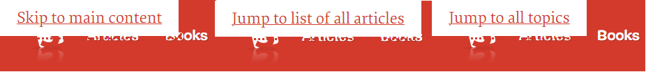
They’re usually located on the site’s header, but it’s not always the case. You can add them where needed, as Manuel Matuzović shows in this tweet. He added an inline skip link to a project because the interactive map has a lot of keyboard-focusable elements.
Working on a feature that allows users to skip areas with many tab stops (inline skip link). 🔥
— Manuel Matuzović (@mmatuzo) April 6, 2022
Video alt: A page with a bunch of links followed by an embedded map. Pressing the Tab key reveals a link that, when activated, moves focus to the next tabbable element after the map. pic.twitter.com/utSPgzs2Kh
Now, as the usefulness of skip links is clear, let’s create one. It’s very simple; we just need to create an a element that takes you to the desired element:
<header>
  <a class="skip-link" href="#main-content">Go to main content</a>
</header>
<main id="main-content"></main>
Next, we need to hide visually the a element. What I do there is use the transform CSS property to remove it from the visual range:
.skip-link {
    display: block;
    transform: translate(-9999px);
}
Then, we move it to the needed position when the element is being focused:
.skip-link:focus {
  transform: translate(0)
}
And that’s it! Creating a skip link is easy and offers a lot of help for keyboard accessibility.
Tooltips
Those little text bubbles that show extra information to an element can be done with pure CSS as well, but a little disclaimer here: it is suggested that you can close a tooltip by pressing the Escape key, which it’s only possible with JavaScript. I’ll explain how to add this feature in the second part of this article, but everything else can be done in a very simple way using HTML and CSS only.
A common problem with tooltips is that a keyboard user cannot see them, so we need to ensure the component that triggers it is a keyboard-focusable element. Our best bet here is using the button element. The semantics is really simple, as Heydon Pickering shows in his book Inclusive Components.
<div class="tooltip-container">
  <button>
  </button>
  <div role="tooltip"></div>
</div>
The container with the class tooltip-container is there just to allow us to manipulate the container’s position with the attribute role="tooltip" later using CSS. Speaking of this element, you would think this role adds enough semantics to make it work, but as a matter of fact, it doesn’t, so we’ll have to rely upon a couple of aria attributes to link it to our button.
This attribute depends of what’s the intention of the tooltip. If you are planning to use it to name an element, you need to use the attribute aria-labelledby:
<div class="tooltip-container">
  <button aria-labelledby="tooltip1">
    <svg aria-hidden="true">
      <!--  SVG Content  -->
    </svg>
  </button>
        <div id="tooltip1" role="tooltip">Shopping cart</div>
</div>
However, if you want to use the tooltip to describe what an element does, you’ll need to link it using the attribute aria-describedby:
<div class="tooltip-container">
  <button aria-label="Shopping cart" aria-describedby="tooltip2">
    <svg aria-hidden="true">
      <!--  SVG Content  -->
    </svg>
  </button>
  <div id="tooltip2" role="tooltip">Check, modify and finish your purchase</div>
</div>
Be careful with this approach; use it only to give auxiliary descriptions, not to give information that is absolutely necessary to understand what this element does. That’s because when a screen reader user generates a list of the form elements (including buttons) in the site, the description won’t be displayed unless the user is focusing on the element, as Adrian Roselli shows in his test on aria-description attribute.
Now, it’s time to talk about what concerns us in this article — keyboard accessibility! For this, we need to hide the tooltip and show it until the user is either focusing the pointer on the element or when it’s being focused with a keyboard. For this, we’ll use the :hover and :focus pseudo-classes in tandem with the adjacent sibling combinator.
Additionally, it’s important you can see the tooltip when you hover over it to comply with WCAG Criterion 1.4.13: Content on Hover or Focus. With those considerations in mind, this is how our code should look:
[role="tooltip"] {
  position: absolute;
  bottom: 0;
  left: 50%;
  display: none;
  transform: translate(-50%, 100%);
}

button:hover + [role="tooltip"], button:focus + [role="tooltip"], [role="tooltip"]:hover {
  display: block;
}
And this is how you create a keyboard-accessible tooltip using HTML and CSS. You can check how both examples of tooltip behave in this demo. Remember, this is not fully ready for production. You need JavaScript to close the tooltip when you press the Esc key. We’ll cover that later in the next part of this article, so keep it in mind.
See the Pen [Tooltip demo - CSS only [forked]](https://codepen.io/smashingmag/pen/Vwxdjbe) by Cristian Diaz.
As Heydon mentions in his book, tooltips have a problem when you use them for devices that don’t have a pointer, like cellphones or tablets, then a different approach for them is required. You can use CSS for that using the media queries hover and pointer, as I explain in my article.
Wrapping Up
Keyboard accessibility is an essential part of accessibility. I hope this article has helped you understand how vital HTML and CSS are to make keyboard navigation a good and accessible user experience. That’s not the end of keyboard accessibility, though! I’ll be covering how we can use JavaScript to manipulate keyboard navigation and how we can use it in more complex component patterns.
 (yk, il)

