Designing Navigation for Mobile: Design Patterns and Best Practices

Email Newsletter
Weekly tips on front-end & UX.
Trusted by 182,000+ folks.
 Celebrating 10 million developers
 Custom Web Forms for Angular, React, & Vue. Your backend.


When it comes to complex navigation on mobile, we often think about hamburger menus, full-page overlays, animated slide-in-menus, and a wide range of nested accordions. Not all of these options perform well, and there are some alternative design patterns that are worth exploring. Let’s dive in!
Pssst! This article is part of our ongoing series on design patterns. It’s also a part of Smart Interface Design Patterns 🍣 and is available in the Live Interface Design Training 🍕 as well.
1. Avoid Too Many Signposts In Your Navigation
One of the most common strategies for navigation on mobile is to use a good ol’ accordion. In fact, accordions work very well for multiple levels of navigation and are usually better than slide-in menus. However, since we open and collapse menus, we also need to indicate it with an icon. This often results in too many signs pulling user’s attention in too many directions.
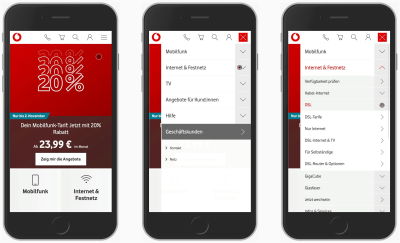
In the example above, Vodafone uses 3 different icons, pointing either to the bottom (accordion collapsed), to the top (accordion open), or to the right. The latter indicates that the selection is a link, driving users to a category page. This is, however, not immediately obvious.
An alternative — and perhaps a slightly more obvious way — is by adding a link underline to links and removing the icons next to them altogether. As a side effect, if we eventually have to mix collapsible menus and links to categories, it’s perhaps a bit more obvious which is which.
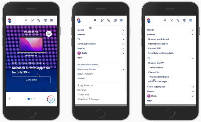
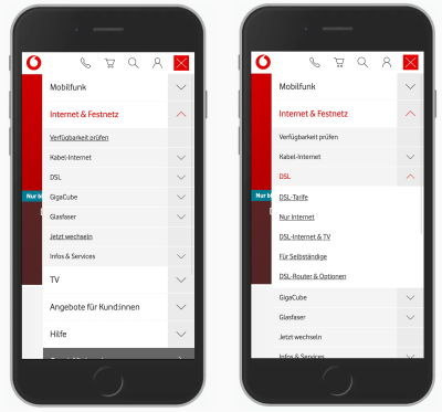
In general, pointing users in too many directions is often unnecessary. It’s quite likely that you’ll be able to achieve better results with just two icons, indicating whether an accordion is open or not. That’s how it’s done on Swisscom (pictured above), for example.
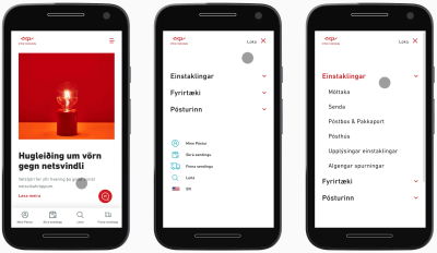
Alternatively, Icelandic Postal Service uses just one single icon, and to indicate expansion of the accordion, changes the color of the heading of the section. This seems to be working fairly well, too.
It’s a good idea to avoid too many icons guiding users in too many directions. If we can get away without them, it’s a good idea to test what happens if we do.
2. Don’t Overload Your Navigation With Multiple Actions
Sometimes navigation menus combine two different functions in one single navigation bar. For example, what if you have categories that you want to link to directly, but then you also want to allow for quick jumps into sub-menu items?
Usually, this means adding two different actions to the same navigation bar. A tap on the title of the category would lead to the category; a tap on the icon would open an accordion or prompt a separate view. And to make this difference a bit more obvious, we often add a vertical separator. Unfortunately, in practice, that doesn’t work too well.
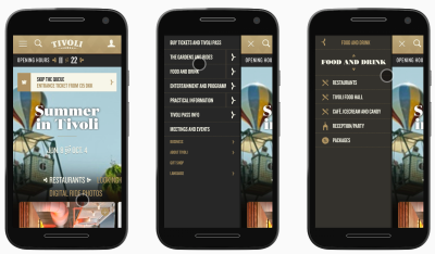
In the example above on Tivoli Gardens Copenhagen, each section title is linked to a standalone category page. A tap on the icon on the right, however, opens a separate sub-navigation. Indeed, a vertical separator does help to distinguish between the two actions, but it still causes plenty of mistakes.
Sometimes users want to just assess the navigation at a glance, and they aren’t yet committing to going to a dedicated page. Yet here they are, being pushed towards a page just when they aren’t ready to go there at all. And once they do, they then have to return back to the previous page and start all over again. Ideally, we’d avoid this problem altogether.
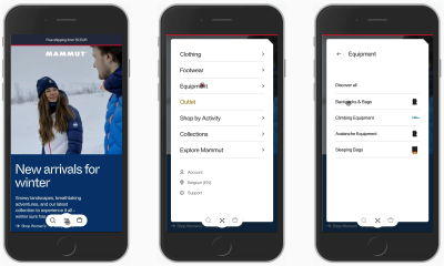
On Mammut, the entire navigation bar drives the user to the second level of navigation. Their users can move to discover all items within the category or jump into a sub-category. Problems solved. Rather than overloading the navigation bar with separators and separate actions, we can help users move forward confidently and comfortably and prevent mistakes altogether. The next action is always just a tap away.
Always consider adding a link to the category page within the expanded accordion or in a separate view, and assign only a singular function to the entire bar — opening that view.
3. Use The Billboard Pattern For Top Tasks
Not every navigation item is equally important. Some items are more frequently used, and they might deserve a little bit more spotlight in your navigation. In fact, if some items are more important than others, we can use the billboard pattern and display them more prominently above the navigation.
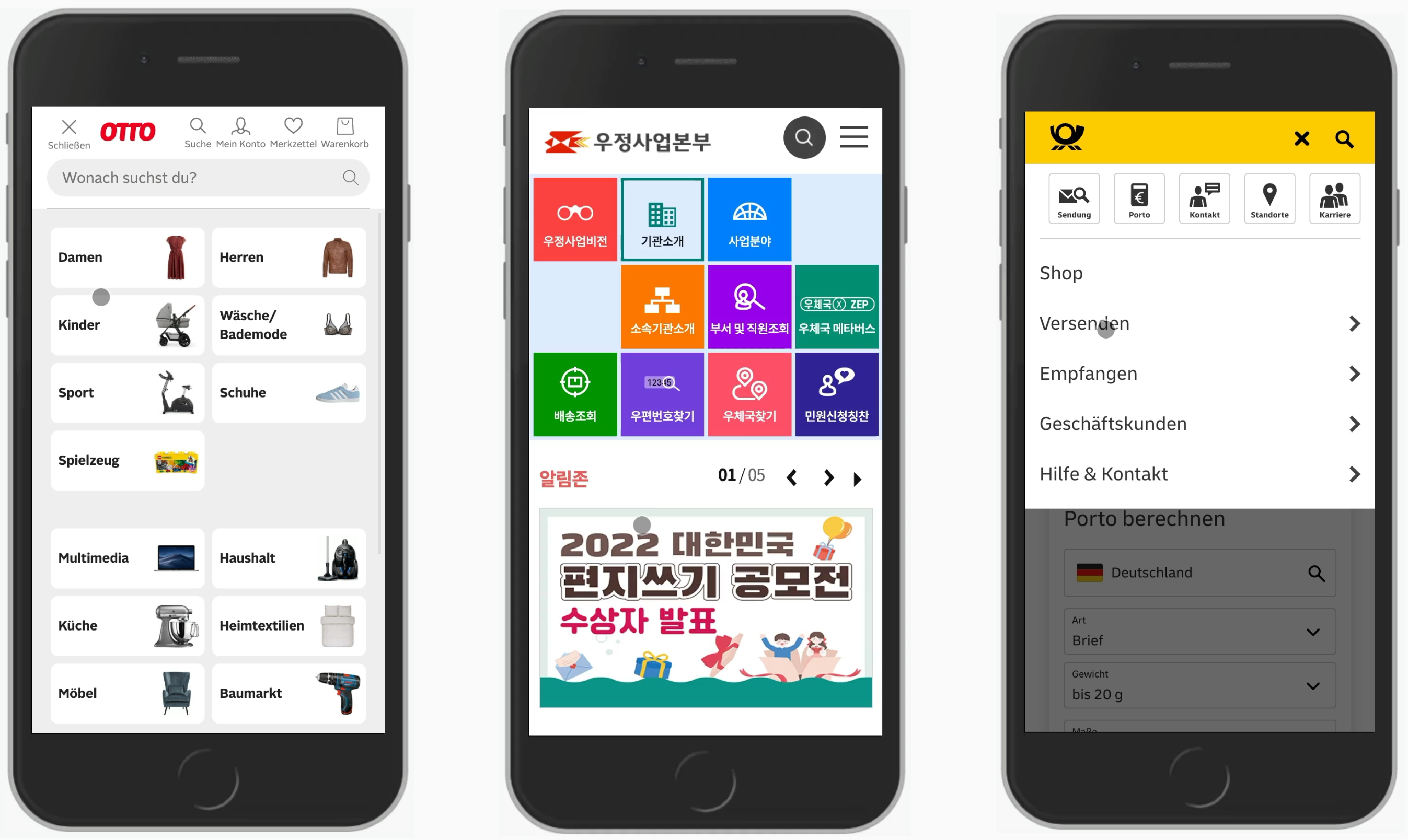
In the examples above — Otto, Korea Post and Deutsche Post — we display the most important topics or features more prominently while the rest of the navigation is available, but gets a slightly less prominent presence.
4. Nested Accordions Work For Expert Users
Just like we might have too many icons, we might end up with too many nested levels of navigation, neatly packaged within nested accordions. For complex sites, it seems like one of the few options to present a huge amount of navigation available on the site. In fact, we could argue that by allowing users to jump from any page to any page on the 4th or even 5th level of navigation, we can massively speed them up in their journeys.
Surprisingly enough, this seems to be right. Expert users typically don’t have massive usability issues with multiple nested accordions. However, infrequent users often struggle to find the information that they need because they don’t understand how the information is organized.
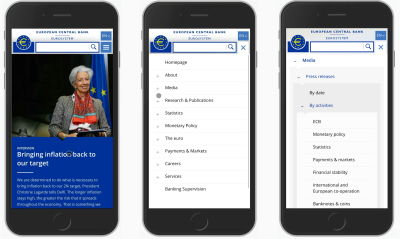
In complex environments, navigation usually mirrors the way the organization is structured internally, and without that prior knowledge finding the right route to the right page is difficult at best. In that case, once a user is looking for something very specific, they seem to use search rather than traversing the navigation tree up and down. This becomes apparent especially when the contrast between levels isn’t obvious, such as on WHO, for example (pictured below).
If we need to include multiple levels of navigation within nested accordions, it’s a good idea to sparkle just a tiny bit of typographic and visual contrast to the menu so that every level of navigation is clearly distinct, and it’s also obvious when links to actual pages start appearing. Compare the quick mock-up below.

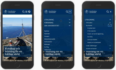
Another way to indicate multiple levels of nesting is by adding different types of icons to make it more obvious where users currently are. This is how it’s done on the Stockholm University website. Personally, I wasn’t able to verify how well this design pattern works, but when combined with better typographic contrast, this might be performing better and is definitely worth testing.
DOT, a public transportation website from Denmark, uses the + icon across multiple levels for their nested accordions. While the chevron is positioned on the left, the + are always positioned on the right. Thus, they display four levels of navigation with nested accordions. Perhaps it’s a bit too much navigation, but it seems to be working fairly well.

On the other hand, it might not be needed at all. Allianz gets away with using a single icon (chevron up and down), but with clearly different designs for every navigation level. The first level is highlighted with white text on a blue background; the second level is designed in bold; and the third level is plain text (which could, of course, be links, too).
Plus, instead of showing all items at the same time, only four most important ones are displayed at first, and the others are available on a separate page. This a great example worth keeping in mind.

Nested accordions can work with enough contrast between each level. However, if you have more than three levels of navigation, making it work with a bit of indentation and various typographic styles will become quite difficult.
5. Slide-In-Menus Don’t Perform Very Well
Admittedly, many navigation menus on mobile aren’t accordions. Because each navigation section might contain dozens and dozens of sub-navigation items, it’s common to see the so-called slide-in menus, with navigation items sliding in horizontally and presenting users with a comprehensive menu of all options available on that level.
With that pattern, quick jumps from one level to another are impossible, as users always have to go back to the previous level to move forward.

Unilever displays only one level of navigation at a time. As users navigate further down the rabbit hole, they are presented with only one level at a time. This does work well to fit all the items and all the levels that an organization might ever need. However, if a user isn’t quite sure where to go, the discovery of content tends to be slower. Also, it’s not necessarily clear where the “Back” button will go to.
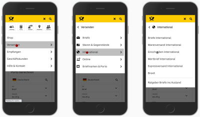
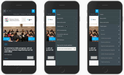
If we do use a slide-in menu, it’s a good idea to replace a generic “Back” button with a more contextual label, explaining to users where exactly they will be returning to. Deutsche Post (pictured above) does just that. Also, notice that the main page of the menu features some of the top tasks on the site, in additionally to the slide-in menu.

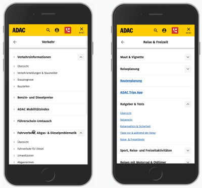
Additionally, The New England Journal of Medicine adds some typographic contrast to each section, so it’s a bit more obvious right away what would open up another section and what is a link driving to a new page. In fact, we can go quite far by just making links more obvious yet again, as displayed in the example of ADAC below.
It’s worth noting that animated slide-ins can be quite disorienting, distracting, and annoying for people who use the navigation a lot. Add to that the slow speed of content discovery, a few too many icons, and a bit too little contrast between the items, and you have a recipe for disaster.
A slide-in menu is an option but rarely the best one. It surely doesn’t perform as well as accordions where jumps between levels are faster and there is rarely a need to go back. However, accordions aren’t the only option we have — especially when we want to help users navigate between levels faster, not slower.
6. The Navigation Stack Works For Quick Jumps
As we move users from one level to another, we also need to provide a way for them to move back. But instead of just displaying a “Back” button, we can stack all the previous sections like a breadcrumb under each other. And so we get a navigation stack.
On Coolblue, a Dutch retailer, as users keep exploring deeper levels of navigation, they can always return all the way to the previous levels that they’ve been coming from. This allows for faster jumps between levels, and is definitely a good idea when driving users from one-page overlay to another.
7. Use Curtain Pattern To Show Multiple Levels of Navigation
It shouldn’t be a big revelation that the speed of navigation is at its maximum when we display navigation options right away. This is why we see large buttons appearing as large clickable cards, filters, and bottom sheets. However, how do we use it in our navigation menus which barely have any place anyway?

We could make better use of the available space. For example, what if split the screen vertically, showing one level of navigation on each? Very much like a curtain that we’d pull to one side of a window. That’s what LCFC (pictured above) does. To move between levels, we don’t need to close any menus or return back at all — instead, we click on large areas, move forward, and explore.
And what if you need slightly more space for your lengthy navigation labels? Well, the labels could wrap onto multiple lines, or we could reduce the width by replacing text labels with icons (as long as they are unambiguous). It might not work for every project, but it seems to work for Playstation (pictured below).
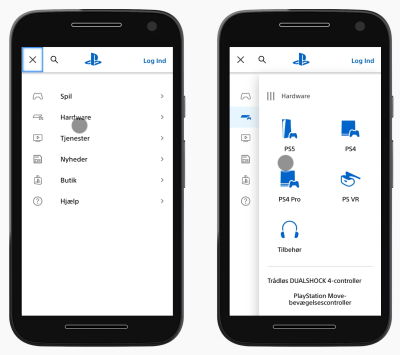
The entire first level of navigation collapses into tabs; yet moving from one level to the other doesn’t require any jumps back. You might be wondering what the three vertical lines represent — ideally, one could drag away the pane, but it doesn’t seem to be working as expected, unfortunately.
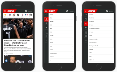
ESPN uses a very similar approach but reduces the amount of space for the first level to the minimum. It could be a little bit larger to prevent mistaps, but the idea is pretty much the same: showing two levels of navigation at the same time.
We could use the same approach in other contexts, such as filtering. We display all filter attributes on the left, and allow users to choose the specific values for these filters in the second vertical pane. That’s what the filtering experience looks like on Myntra, an Indian eCommerce retailer pictured below.

If some filters don’t fit in the right pane, users can scroll to explore more or even search for a specific filter in the selection. Of course, the “Apply” button has to stay floating. It would be lovely to see the total number of results on that button, too.
We could take it even further, though. For example, sometimes users need to select filters that are relevant to them and define their values in the next step. In that case, we group all filters into a few categories (or even sub-categories), and then present all of the categories and filters as sub-categories side-by-side.
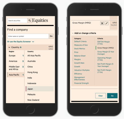
With FT Screener, for example, users can add or change criteria by exploring multiple levels at the same time — both the labels for groups and the filters living within those groups. Once a filter has been chosen, it’s added to the overview on the top. That’s a simple filter constructor for sophisticated filtering on mobile.
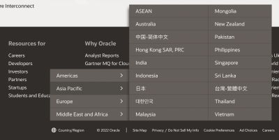
The vertical split could be used to quickly select one important present or make a single choice. That would be the case for a language selector, for example. We could organize all supported countries and languages as cards or accordions, but they could also work as vertical tabs, as it’s done in the footer of Oracle.
This way, we display only options that are relevant to users. They never have to go to irrelevant sections or pages since they get a preview and can navigate away from it quickly, should they wish to do so.
In general, the curtain pattern works well with a quite flat content architecture, but is difficult to manage with three or more levels. It shows its strengths when the speed of navigation matters and when users are likely to jump between sections a lot.
It’s way faster than slide-in-menus but less flexible than accordions. Still, a great lil’ helper to keep in mind to make better use of available space on mobile.
8. You Might Not Need 3+ Levels of Navigation
The curtain pattern works well for two levels of navigation, but you might have many more levels than that. In that case, it might be a good idea to test if it actually has to be this way. What if you show only two or three levels via your menu drawer, but then the rest would be available on standalone pages?
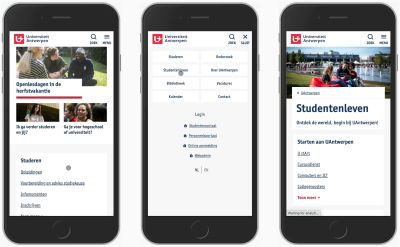
The University of Antwerp gets away with just one level of navigation on mobile. All the sub-section exist on standalone pages as cards. In fact, there are dozens of links on each page, but as long as the navigation is obvious, this might be just what you need.

Gov.uk isn’t a particularly small website, but it features only two main sections with plenty of subsections in its navigation on mobile. However, no third or fourth-level navigation is accessible from the menu drawer. Everything else is accessible via links and cards on separate pages.
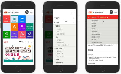
Korea Post follows along with an interesting twist to that idea. On tap in the menu, it shows all items living on the second level, but also automatically shows the options from the third level, too. Additionally, breadcrumbs include drop-downs allowing users to jump quickly between the siblings of each level. You can find out more about that pattern (sideways breadcrumbs) in Designing A Perfect Breadcrumbs UX.
Do you need to display more than two levels of navigation? Perhaps it is indeed necessary, but chances are high that it isn’t. So perhaps it’s worth testing a design that features only two levels. Additionally, we can add another feature to it to make navigation even faster.
9. Query User’s Intent With Navigation Queries
In addition to search and navigation, we could study some of the most frequently visited pages or some of the most popular tasks, and show them directly, as we saw in the Deutsche Post example earlier above.
We could also add navigation queries to ask users about their intent, and allow them to choose a topic relevant to them. Think about it as a mini-search engine for your navigation, designed as a seamless autocomplete experience. This would give users guidance toward the goal and help them navigate more reliably.
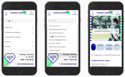
Cosmos Direkt, a German insurance company, features a <select>-menu that allows users to select a particular task that they’d like to perform on the site. This type of navigation exists additionally to search and classic navigation menu, but increases the speed to relevance significantly.
Wrapping Up
Just as a quick summary, here are a few things to keep in mind when dealing with complex multi-level navigation:
- Accordions work well, and for expert users, they work even if they are nested.
- Remove icons that you don’t need. Avoid icons pointing in more than two directions.
- Use the billboard pattern to highlight top tasks that users want to complete on the site.
- For nested navigation levels, make sure that each level is distinct (indentation + type styles).
- Whenever possible, make links obvious by underlining them.
- Slide-in-menus don’t perform very well; they are slow and distracting. Accordions are likely to perform better.
- Keep the navigation stack of the levels that users browsed through to allow for quick jumps.
- Curtain navigation is fast! Consider using it when you have two, or at most three, levels of navigation.
- Perhaps we don’t need to show all levels of navigation and instead can bring users to the relevant page to navigate from there.
Meet “Smart Interface Design Patterns”
If you are interested in similar insights around UX, take a look at Smart Interface Design Patterns, our shiny new 10h-video course with 100s of practical examples from real-life projects. Design patterns and guidelines on everything from mega-dropdowns to complex enterprise tables — with five new segments added every year. Just sayin’! Check a free preview.

100 design patterns & real-life
examples.
10h-video course + live UX training. Free preview.
Related UX Articles
- Designing Perfect Breadcrumbs UX
- Boosting Navigation UX With Navigation Queries
- Designing Better Error Messages UX
- Rethinking Authenticaiton UX
- Disabled Buttons UX
- Designing A Perfect Infinite Scroll
- Design Patterns and UX on SmashingMag
 (vf, il)

