Taking The Stress Out Of Design System Management

Email Newsletter
Weekly tips on front-end & UX.
Trusted by 182,000+ folks.

 Celebrating 10 million developers
 Custom Web Forms for Angular, React, & Vue. Your backend.


As a sole design system maintainer, I try to minimize the time I spend in Slack or meetings and maximize the time I spend in Figma or code (aka, focused and actually working).
For the past four years, I’ve been figuring out how to set up my workflow to achieve that goal. In this article, I want to share what did and didn’t work for me and what you can do to:
- Stress less about design system management.
- Reduce noise.
- Maintain transparency in your process.
- Minimize disruptions for your team and customers.
Let’s dive right in!
Invest Time To Create A Plan
Unless you are joining a company from the outset, you’re probably not starting a design system from scratch. It’s essential to take the time and analyze what’s there instead of jumping right in and treating it like a blank canvas.
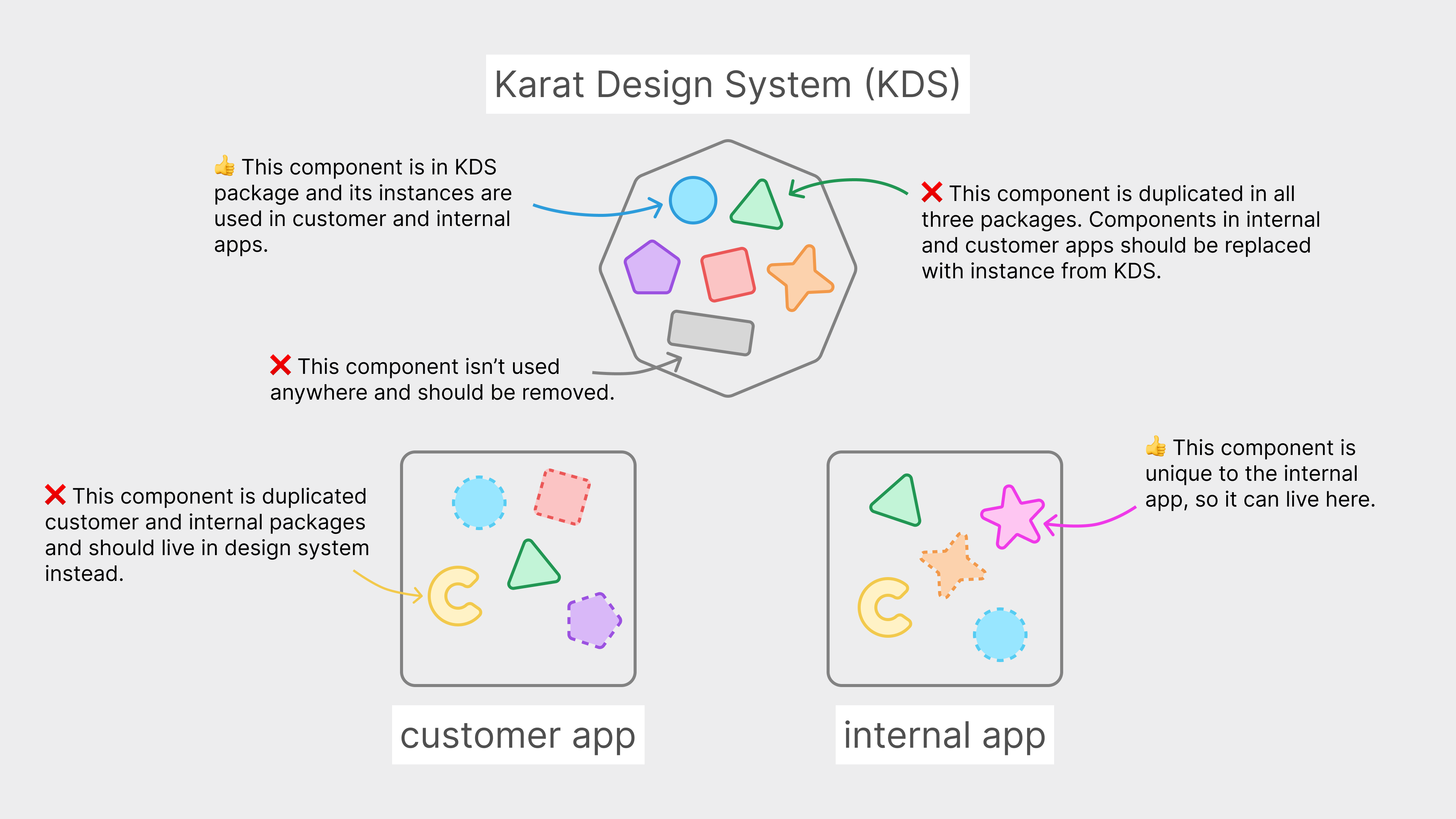
When I joined Karat, we already had two web apps: a customer-facing one and an internal one.

They were both parts of the same repository, which also included a package for our design system (KDS). Some styles and components were coming from the KDS package and were used by both apps. Some were unique to each app and lived in that respective app’s package. Some, however, were duplicated in both apps’ packages (and sometimes the KDS package too).
In addition to the existing codebase, we had designs in Figma with the new look and feel we wanted to pursue:
My manager and fellow designer Mark already did the hard job of defining the core elements and patterns through exploring scenarios and flows (Scenario-Driven Design Systems talk by Yesenia Perez-Cruz takes a deep dive in this topic). My task was to take the new vision, create a sustainable component library for both code and Figma, and integrate it into our app. It was also up to me to figure out how to organize and communicate my work.
I spent the first two weeks auditing our apps, our codebase, and our new designs. Investing that time upfront helped me to figure out a logical (given our context) sequence for implementing and rolling out the design system. Later on, it ensured a smoother transition between our old and new interface.
I wrote my tentative plan in our company’s Notion space (here’s a copy of the plan). There are four pages there:
- Progress: Universal
Tracking progress for foundations (colors, typography, breakpoints, and so on) and common components (buttons, inputs, breadcrumbs, accordions, and so on). - Progress: Customer
Tracking progress for our customer-facing app. - Progress: Internal
Tracking progress for our internal app. - Other projects
Tracking smaller projects and ideas for future enhancements.

Allowing anyone at the company to access the plan made it easier to communicate and define what was being done and in what order. It helped to turn the infamous “When is the design system going to be done?” question into a concrete “When will we be able to do
It’s also important to note that I never treated my plan as fixed. I expected priorities to shift, and they did. The plan was just a rough draft, a single place to track progress at a glance. Looking at it this way made it much less intimidating.
Post Frequent (Yet Short) Updates
The success of any project is half implementation and half communication. It’s harder for people to support your work and advocate for you if they don’t know what you’re doing.
Let’s Get Specific
- Create a dedicated communication channel (we use Slack) that anyone at your company can access. It should be on a platform your company already uses, and the name of the channel should be clear (for example, #design-systems vs. something obscure or abbreviated such as #karatds). The channel also shouldn’t be private — anyone should be able to see it when browsing channels, and they don’t need an invitation to join.

- Use that channel to post frequent updates on the state of your design system. (What got done, what’s getting done, and what’s on the radar.)
- Keep the updates short. One post should include a maximum of 4 bullet points, each just a couple of lines. Your updates should be easy to glance over quickly.

- Don’t make them too frequent, 1-2 updates per week is enough! These updates aim to keep people up to speed, not to overwhelm them.
- Include links. Instead of adding nitty-gritty details that may not be relevant to most of the audience, add a link people can go to and learn more.
- Include pictures. Before/after screenshots, dos/don’ts, and any other visuals are a great way to communicate the impact of the design system.

- Post updates at different times of the day and week to reach different people (especially if everyone works in different time zones).
- Use these updates as an opportunity to say thanks. ❤️ Did a developer help you to implement a component? Did a copywriter work with you to create consistent aria-label tags? Include a small thank you note to acknowledge their work and show your appreciation.
Potential Inhibitors
There are a couple of potential (mostly mental) blockers. Keep them in mind, and don’t let them get in the way!
- “This is a waste of time.” (pt.1)
You may feel like a broken record repeating what you think everyone already knows. However, remember the curse of knowledge: we greatly overestimate things that other people know, especially when it comes to things we know well. - “This is a waste of time.” (pt.2)
You may feel like nobody reads those updates, but they do. Even if you reach 5-10 people per update, it’s still more than if you didn’t write one at all. You may also be reaching 5-10 different people with each update, leading you to slowly sprinkle around the design system awareness. - “This is not the right time.”
You may feel like there’s always something going on and nobody has time to pay attention to what you have to say. Most of the cases, that’s not true. Unless it’s a true emergency, you’re probably good to go ahead and post your update. Otherwise, you’ll be waiting forever. - “This all is self-explanatory.”
The curse of knowledge, once again. It’s self-explanatory to you because you think about design systems eight hours a day. Most other people have no idea what your work entails. A seemingly simple post can lead someone to have an “aha!” moment and recognize the value of what you do. - “I’m too much in a flow to stop everything and do this.”
If your work allows you to have long uninterrupted periods of time to actually get work done, that’s awesome! Stay in your flow, and don’t force yourself to write updates when you would rather be working. However, after you finish one thing and before you start another, take the time to stop, reflect, and write a post. There’s no need to rush immediately to something else. Personally, I prefer writing in the morning when my mind is fresh and I haven’t started (or resumed) working on anything yet. - “I haven’t done anything to post about. This isn’t good enough…”
You probably did more than you think. Start writing things down, and you’ll find that you definitely have 2-3 things to share (you may even need to cut some stuff out to keep the post short). And remember, it’s not just about sharing what got done; it’s also about current progress, upcoming things, or even blockers. You also may never know who has the capability to help you, and you won’t know unless you ask for help. Your work doesn’t have to be perfect to share. - “I’ll wait for people to check in…”
Sometimes the lazy voice in my head tells me that if someone wants to check in, they will. However, this goes right against the goal I brought up at the beginning of this article — spending less time in Slack. If I don’t want to constantly get pinged, it’s my responsibility to keep everyone up to date so that they never have to ask.
Short Updates vs. Release Notes
In addition to these short updates, I also used to keep a Notion page with the release notes (an idea I borrowed from Carbon Design System changelog). That page was difficult to maintain, and no one even checked it. For our small team, short updates in Slack accomplished the same goal.

Takeaway: Just because a big company is doing something doesn’t mean you need to as well. Of course, it’s always worth testing out new ideas, but don’t be afraid to let them go if they don’t fit in.
Don’t Duplicate Documentation
A big part of design systems is to make sure that designers and developers don’t have to create the same components and styles over and over again.
So, why would we ever duplicate the same information in multiple places? This seems paradoxical, but it’s an easy trap to fall into.
Here’s How It Happens
Teams usually have different tools they use to manage their design or development assets. It’s normal. However, it doesn’t mean that everything should be everywhere. Constantly duplicating information leads to these two problems:
- Tons of repetitive work for which you don’t have the time.
- Discrepancies between sources which can result in loss of trust.
Here’s What You Can Do Instead
- Create a one-stop-shop design guide.
- This design guide should have a URL that’s easy to remember (for example, ours is design.trykarat.com).
- Anyone at the company should be able to easily access it. Ours used to be password-protected at first, and while everyone at the company could access it through a password manager, it still introduced a layer of friction. Given the lack of sensitive info, though, we decided to remove the password. (Also, many tools such as Zeroheight allow setting passwords for individual pages, which is a win-win. You can still keep the overall documentation public while protecting private information).
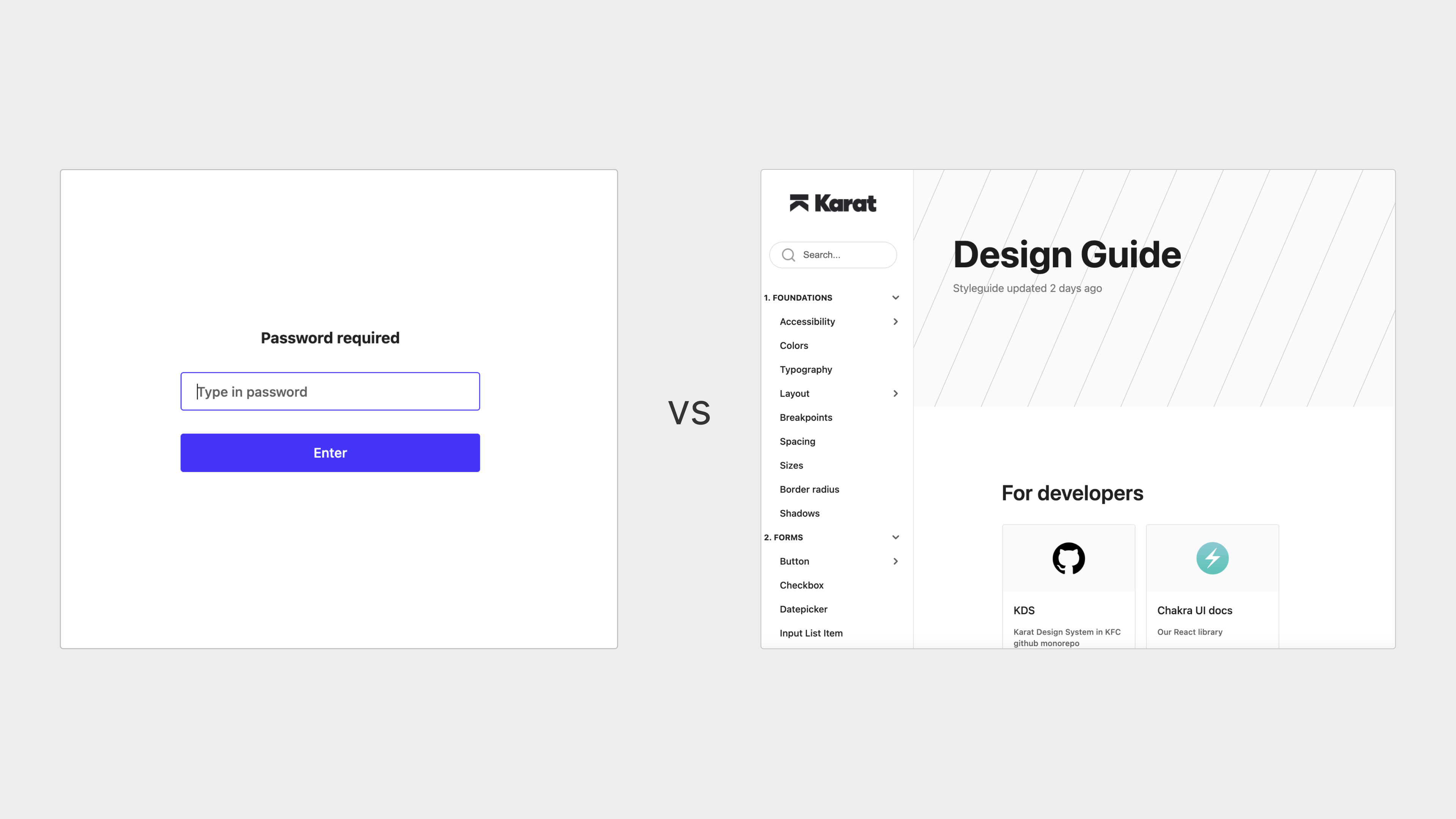
- In that design guide, have a rough overview of all styles and components.
- Instead of diving into specifics (that may not be of value to everyone), add links to the sources your teams use. For designers, you can include a link to the Figma component, and for developers, you can add a link to Storybook.
- You can also use emojis to indicate the state of that component in Figma and code. For example, we use an hourglass for in-progress components and checkmarks for completed ones.
- Of course, you can still include information that everyone should be aware of. That would most likely be general guidelines for component use, which usually aren’t changed frequently (unlike props or variants).

- Overcommunicate your design guide.
- If there’s one thing that everyone should know about design systems, it’s where to find the starting point for everything else.
- Pin it to the top of your Slack channel (or whichever platform you use), and include links to it in your updates, messages, and so on.

I find that the biggest issue for both designers and developers is what’s available and where to find it. Having a simple documentation website helps solve that issue with minimum effort on your part. Once you have a central starting point, you can start building out more specific, relevant documentation in respective designers’ and developers’ tools.
One thing worth duplicating
The high-level organization of components and styles should be the same across different tools. For example, we have divided our styles and components into nine groups:
- Foundations;
- Forms;
- Navigation;
- Cards;
- Data Display;
- Feedback;
- Overlay;
- Brand & Media;
- Composition.

Each group has 2 to 9 components. Although component content inside of each group may vary depending on the tool (for example, we have three different table components in code and only one in Figma), the number of groups, their names, and group order is always the same. Having the same organization makes it easier to jump from tool to tool and find what you need faster.
Unlike specific components, the group names (or their order) are rarely updated. And even if something changes, it’s not difficult to realign all tools.
Reference Your Developers’ Component Library
If your engineers use a component library (for example, Chakra UI, tailwind UI, material UI, and so on), you should reference it. Most libraries are well-documented and have numerous examples you can play with. You don’t even need to know how to code (although getting familiar with the basics always helps).
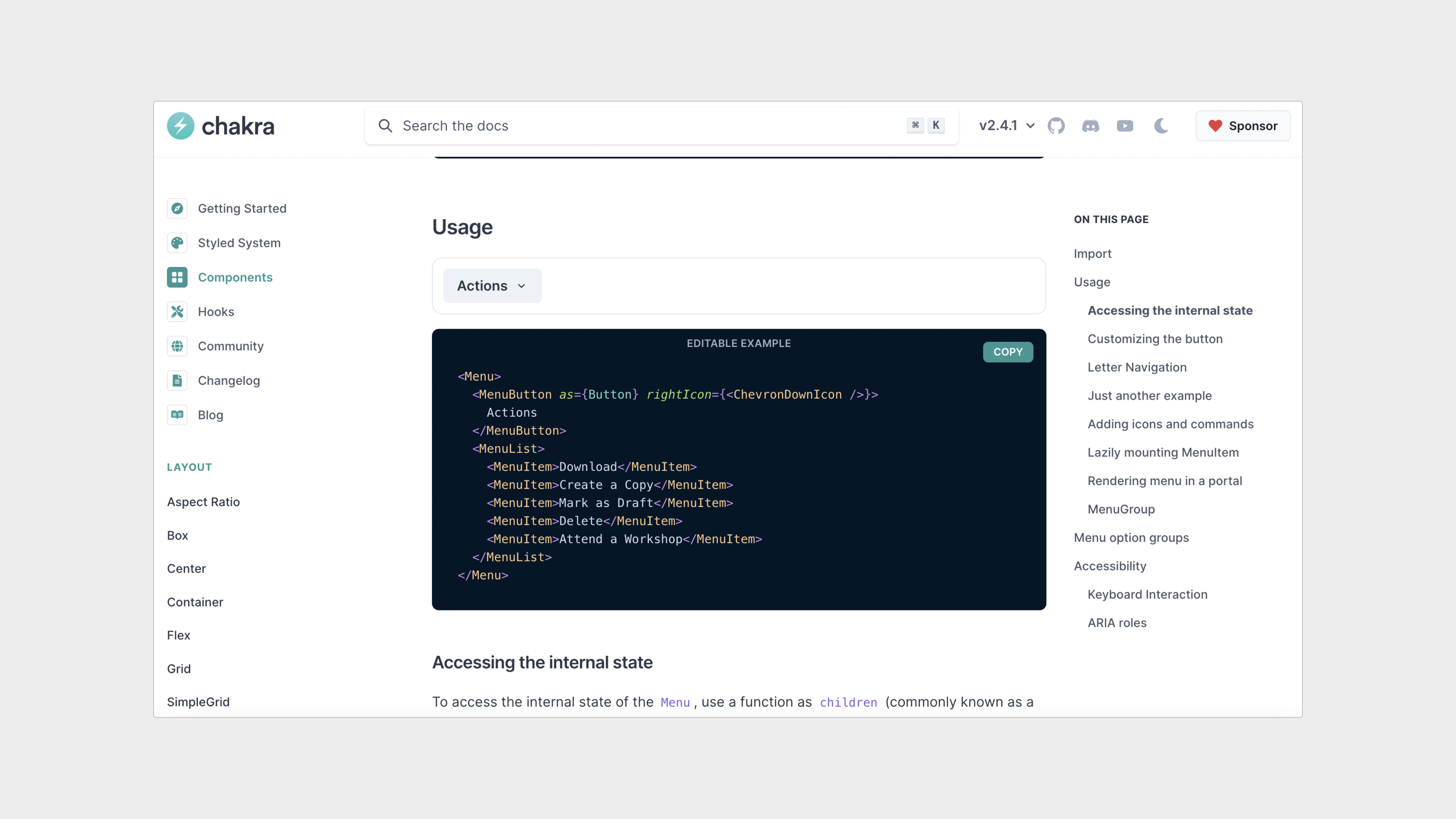
Referencing the library will help you make tons of tiny decisions quickly whenever you have to figure out how a certain component should look and behave. It will also help to settle the naming debates (you can just go with the library’s component names to avoid confusion in the codebase). Lastly, it’ll then take less time for developers to implement the components.
Let’s look at an example.
Shown below are two filter menu components: one created in Figma by a designer and another one from the Chakra UI library:
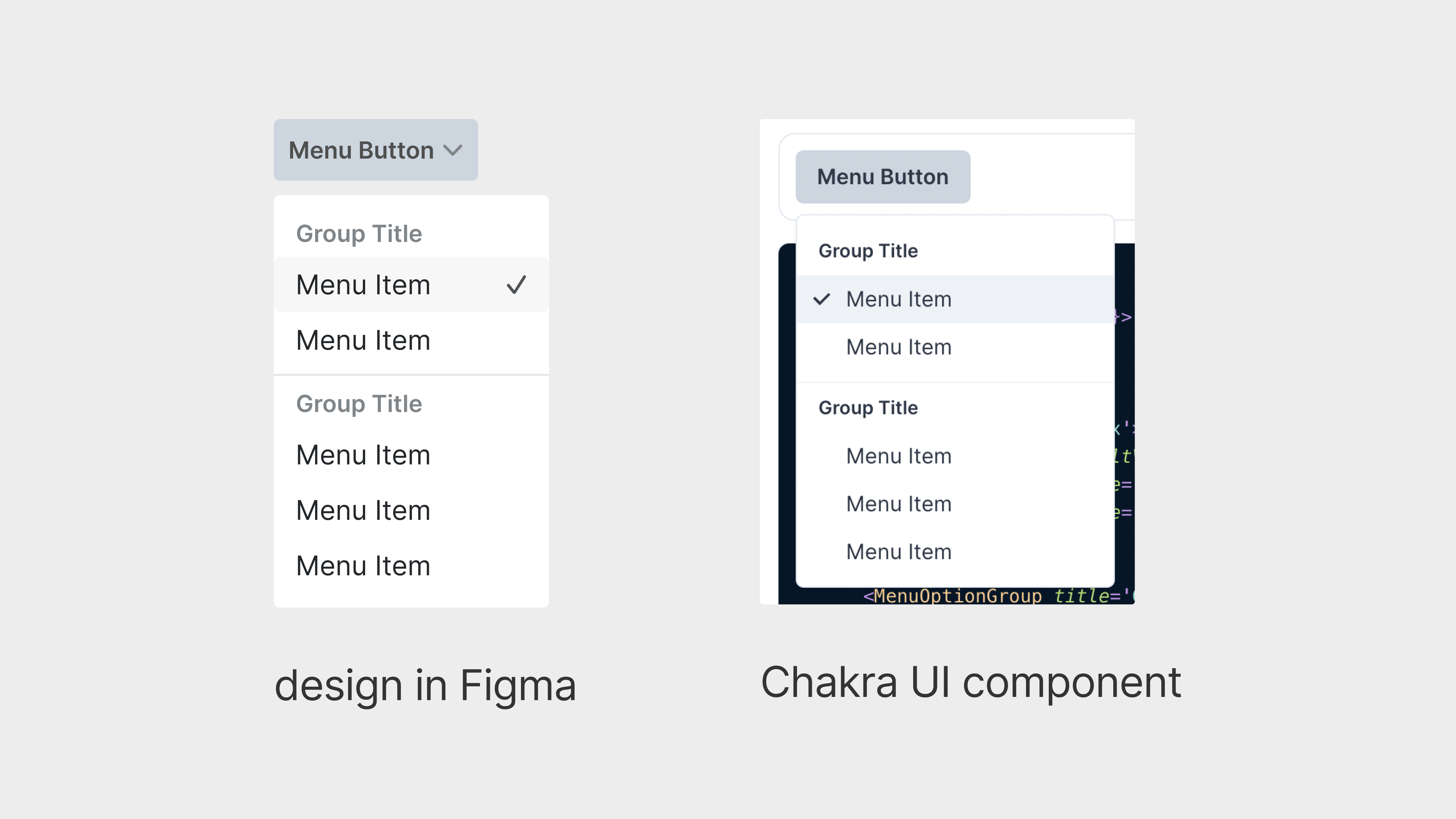
When the designer created this component, they had no strong opinion of where the checkmarks should go. They also didn’t realize that the placement could create problems for engineering.
However, when the developer saw this component, they thought that the checkmark placement was purposeful and that’s how the component should be built. The developer then spent several hours tinkering with the component, only to realize that the change was not as trivial as it seemed. They ended up messaging the designer, who, at that point, switched to working on something else and really didn’t want to revisit the design. Also, other designers have already started using this component, which has pulled more people into the conversation.
Numerous back and forths lasted a couple of days, and eventually, the component was updated. A lot of valuable time was lost over something that didn’t deserve that much attention.
This situation (and many more like that) can easily be avoided if designers reference developers’ documentation from the start. Of course, you shouldn’t choose ease of implementation if it sacrifices user experience.
Keep Your Purpose In Mind
Take the time to think and write down why you love working with design systems. Personally, I do this because it reduces monotonous work for both designers and developers. It frees them to get more creative and spend more time thinking about their problems. And it helps them iterate through possible solutions faster.
While your answer might be different from mine, the overall theme will probably be similar.
So, why is it important to have a clear understanding of your purpose? Because it gives you something to lean on in moments of frustration.
Unfortunately, the nitty-gritty details of design systems work can turn anyone into a control freak. It’s easy to start feeling like your success depends on people using your system all the time just because you invest so much energy into it. What ends up happening is that you create a restrictive environment instead of a freeing, creative one.
I find that reminding myself of my purpose (rereading it or even occasionally rewriting it) helps me approach points of friction more calmly. It helps me figure out when I should step back and go work on something more substantial.
At the same time, it helps me figure out when I should push back. It gives me the confidence to speak out because I know I’m doing it in the interests of my team and not because I’m feeling defensive.
Conclusion
Another reason I love working with design systems is that I enjoy the process of work itself. Either playing in Figma or coding, that’s when I get into that sweet flow state. As the only person on the design systems team, though, I can’t spend all my time in the zone. I still need to organize, share, and communicate my work. Otherwise, no one will know about it, no one will use it, and it will be obsolete.
I can, however, manage the system in a way that lets me spend less time on the administrative stuff and more time doing what I love.
While I hope you find inspiration in the tips outlined here, I also hope that you will feel more comfortable questioning any established or common practices and only use them if they work for you and your team. Perhaps you will also feel more comfortable testing out your own ideas, no matter how unconventional they seem.
 (vf, yk, il)

