A Guide To Getting Data Visualization Right

Email Newsletter
Weekly tips on front-end & UX.
Trusted by 200,000+ folks.


Data visualizations are everywhere; from the news to the nutritional info on cereal boxes, we’re constantly being presented with graphical representations of data. Why? Data visualization is a method of communication. Using the right type can help you quickly convey nuanced information to your audience in a visually appealing way. However, the diversity of styles used in both digital and print formats can be overwhelming. In this article, we will break down the most common visualization types to help guide you through selecting the best choice for your specific needs.
Before getting into the content of the article, let’s briefly address language usage. “Graph” and “chart” are often used interchangeably, but specificity is important. In this article, the term “graph” refers to visual representations of data on a Cartesian plane (they often look like a grid and have an x-, y-, and sometimes z-axis). “Chart” is used as a catchall word for visual representations of data. It’s like the relationship between squares (graphs) and rectangles (charts); all graphs are charts, but not all charts are graphs.
With this understanding, we can dive into the considerations involved in selecting a chart type.
How To Choose The Right Chart Type
There are some questions you should consider when choosing the right data visualization for your purposes, and we’ll dive into each of these in turn:
- What message am I trying to communicate with the data?
- What is the purpose of the data visualization?
- Who is the audience?
- What type and size of data set am I working with?
What Message Am I Trying To Communicate With The Data?
Each data visualization should have a primary message. Having a clear idea of what you want to communicate and focusing on that will increase the overall quality of your data visualization, and it will help you narrow down chart types based on the complexity of the message and/or the amount of information being communicated.
For instance, sometimes, a simple table is enough to communicate a singular idea. However, if the message is more complex and/or meant to empower or motivate the audience to take action, it is worth thinking about more dynamic chart types. The following example of this guidance is based on a dataset created by Stetson Done on Kaggle.
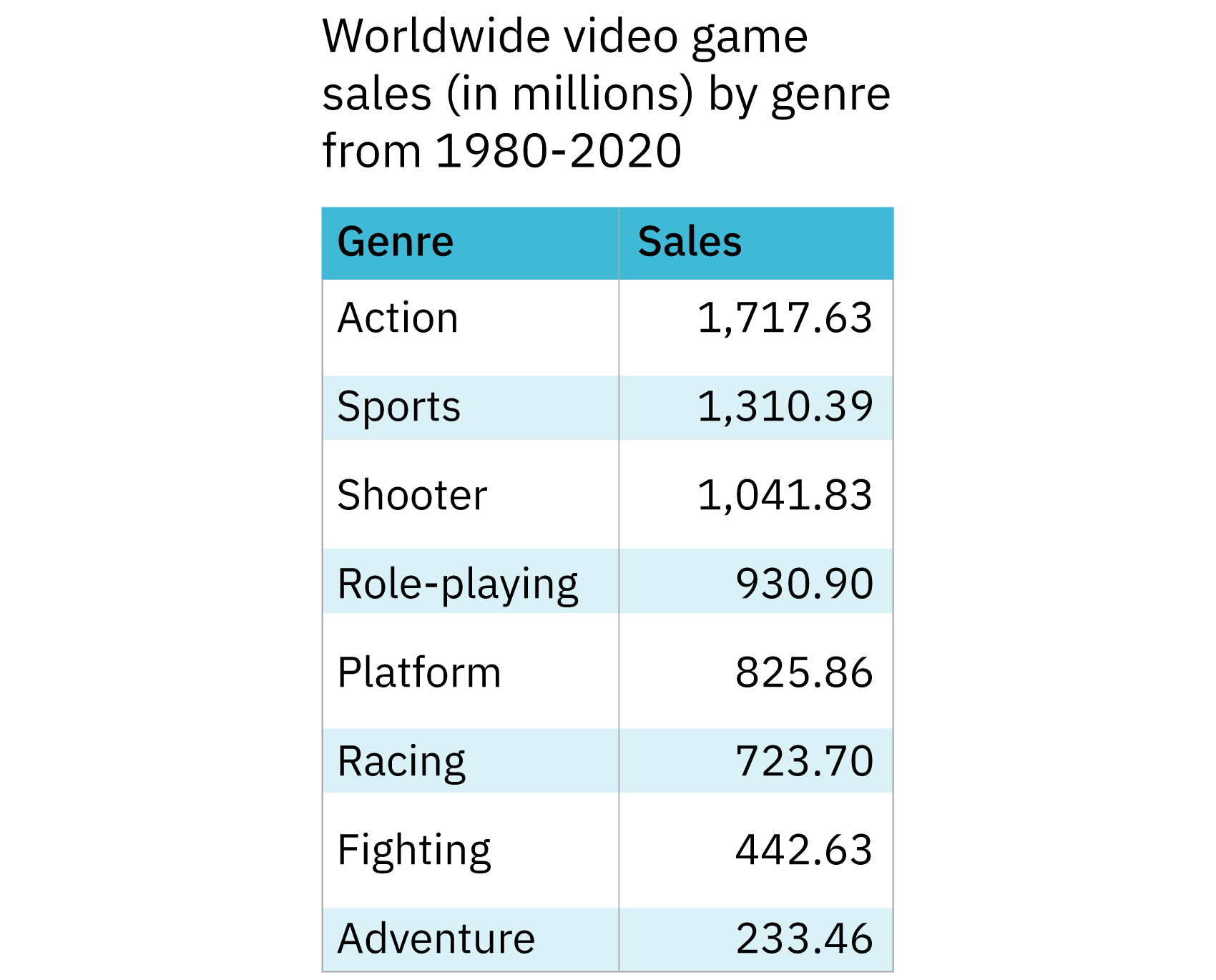
The pared-down dataset is shown as a table. In one column, there’s a categorical variable (genre) and in the other is a quantitative variable (sales). The categories are sorted by sales rather than alphabetically by genre. This makes it easy to glance at the table and get an idea of what the most popular genres are. As an added bonus, the table takes up relatively little space. If the purpose of the data visualization is to communicate simple information about the popularity of various video game genres from 1980-2020, the table in Figure 1 is a good choice. But what if the information is more complex?
The following chart shows a table created with the same dataset but which shows slightly different information. Instead of eight genres, this table shows five, and instead of the total worldwide sales for each genre, it presents sales figures for two regions: the European Union and North America. The message this table is trying to communicate is twofold: the data speaks to the sales of various video game genres in two regions and presents a comparison of the sales across these two regions.
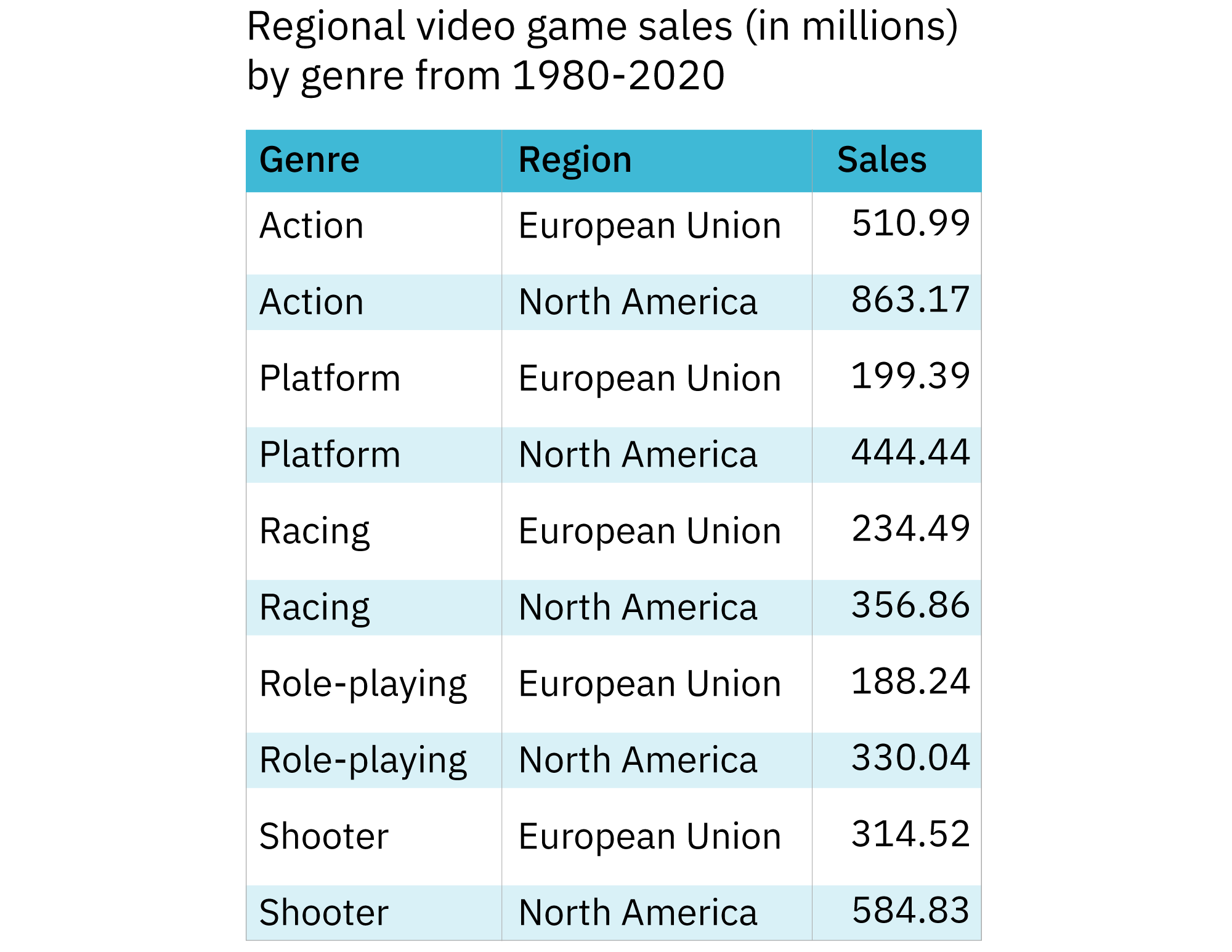
In this format, comparing sales for a genre between the two regions is very straightforward. However, comparing sales across all genres for each region is more complicated. The result is that the latter part of the message isn’t being communicated as effectively.
By changing the type of data visualization we use, we can effectively communicate more information. The following figure displays the same data and the table but in the form of a grouped bar graph.

The bar graph allows the audience to compare each genre across the two regions and to compare sales of all the genres for each region. Because the bar graph communicates more information than the table in Figure 2, it’s a better choice for this data.
Keep in mind that less is more. When selecting a chart type, try to create a data visualization that’s as simple as possible while effectively communicating your intended message(s) to your audience.
What Is The Purpose Of The Data Visualization?
In the field of data visualization, there are four largely accepted categories of data visualization that relate to different purposes:
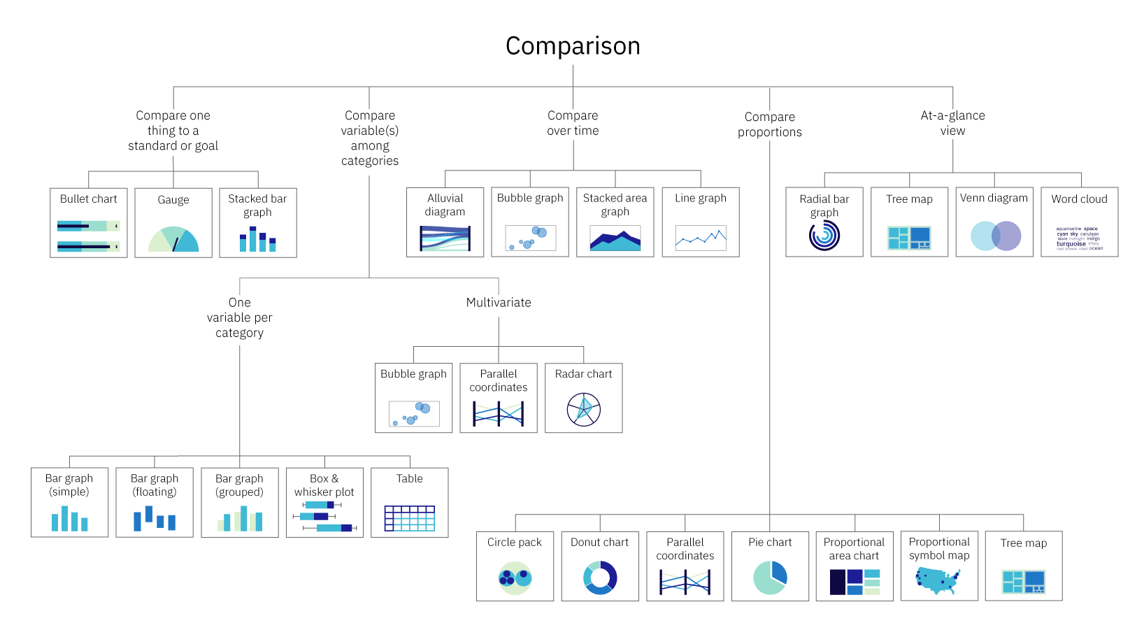
Comparison
How are the elements similar or different? This can be among items and/or over time.
Example: Comparing the sales of two different brands of dog food in a single retail location.
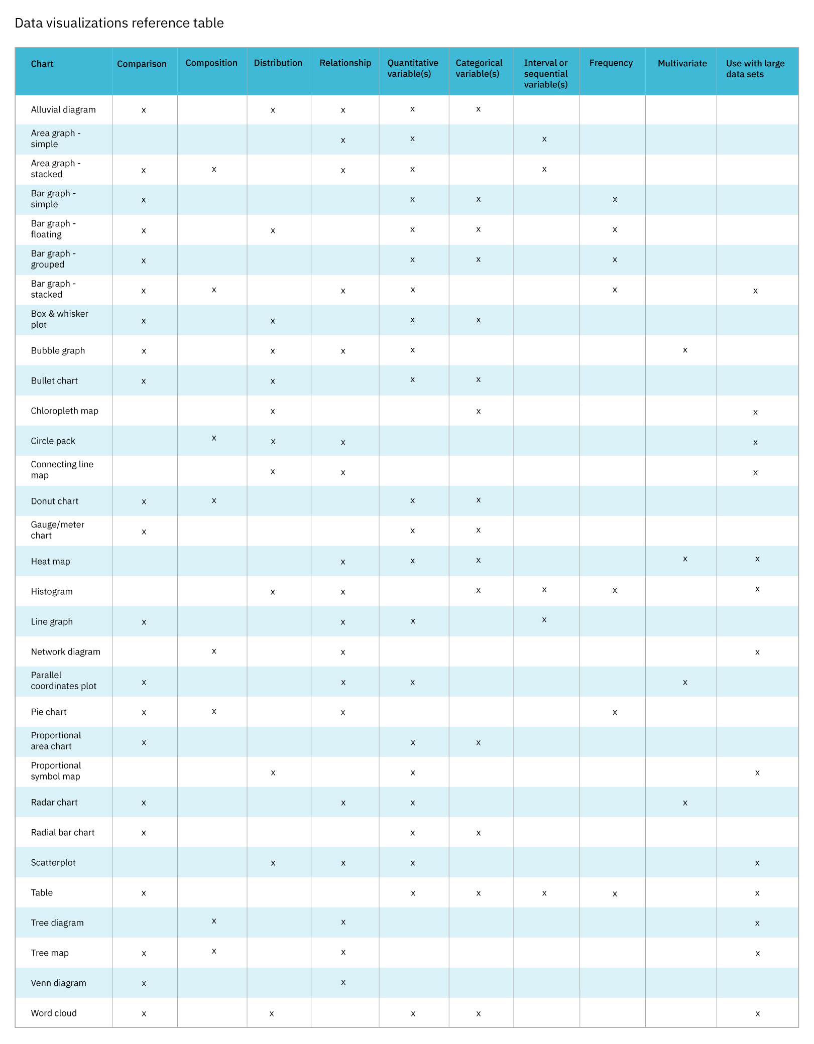
Comparison charts include alluvial diagrams, area graphs (stacked), bar graphs (simple, floating, grouped, and stacked), box and whisker plots, bubble graphs, bullet charts, donut charts, gauge charts, line graphs, parallel coordinates, pie charts, proportional area charts, proportional symbol maps, radar charts, radial bar charts, tree maps, Venn diagrams, and word clouds. To learn more about each of these charts, check out the Chart reference guide, one of two resources provided as a companion to this article.
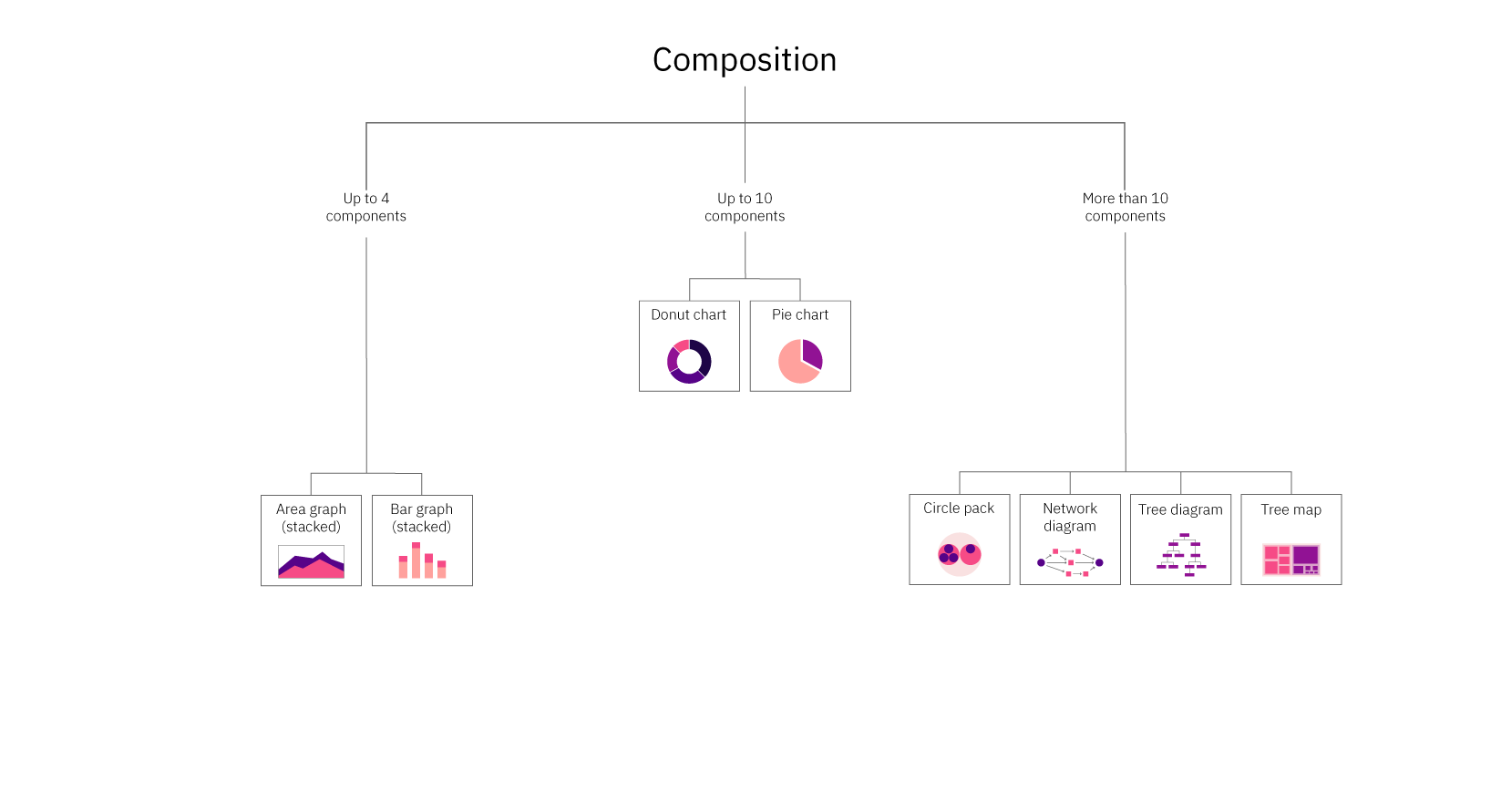
Composition
What parts make up the whole? The composition can be static or change over time.
Example: Showing the breakdown of the diet of Pallas cats.
Composition charts include area graphs (stacked), bar graphs (stacked), circle packs, donut charts, network diagrams, pie charts, tree diagrams, and tree maps. To learn more about each of these charts, check out the Chart reference guide.
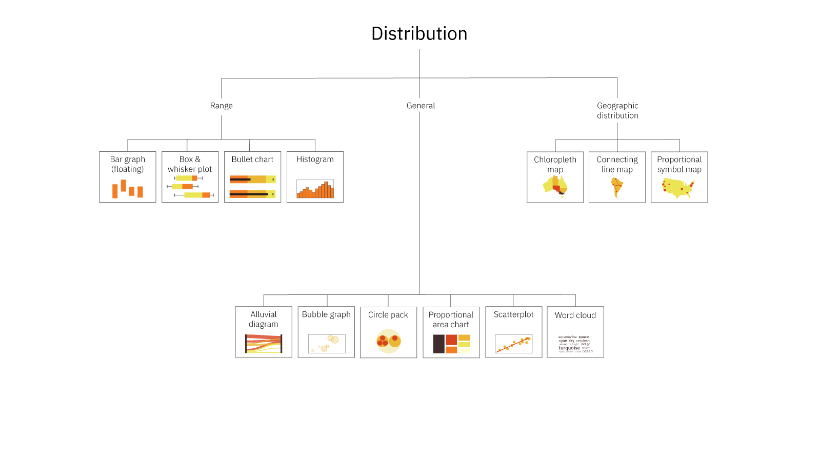
Distribution
Where do the values in a data set fall? Are there outliers?
Example: Communicating the distribution of grades within a middle school class, including the average and outliers.
Distribution charts include alluvial diagrams, bar graphs (floating), box and whisker plots, bubble graphs, bullet charts, circle packs, choropleth maps, connecting line maps, histograms, proportional area charts, proportional symbol maps, scatterplots, and word clouds. To learn more about each of these charts, check out the Chart reference guide.
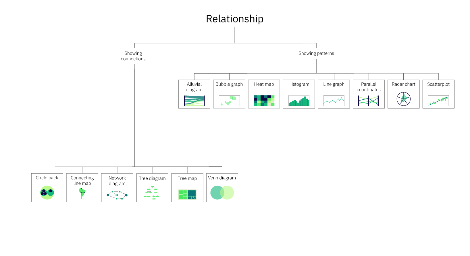
Relationship
How do the elements relate to each other? Is there a correlation?
Example: Showing how colder temperatures are correlated to fewer ice cream sales.
Relationship charts include alluvial diagrams, bubble graphs, circle packs, connecting line maps, heat maps, histograms, line graphs, network diagrams, parallel coordinates, radar charts, scatterplots, tree diagrams, and venn diagrams. To learn more about each of these charts, check out the Chart reference guide.
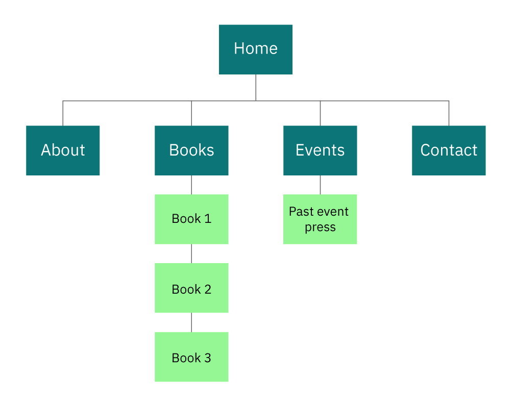
Some chart types fall into multiple categories. For instance, tree diagrams can provide information both on what elements make up a category and on the relationships between those elements. A classic example is a site map. Site maps communicate a list of the pages within a site (composition) and the relationships between the pages.
A donut chart is another good example. Figure 5 shows the results of a second-grade class being asked what their favorite animal is.
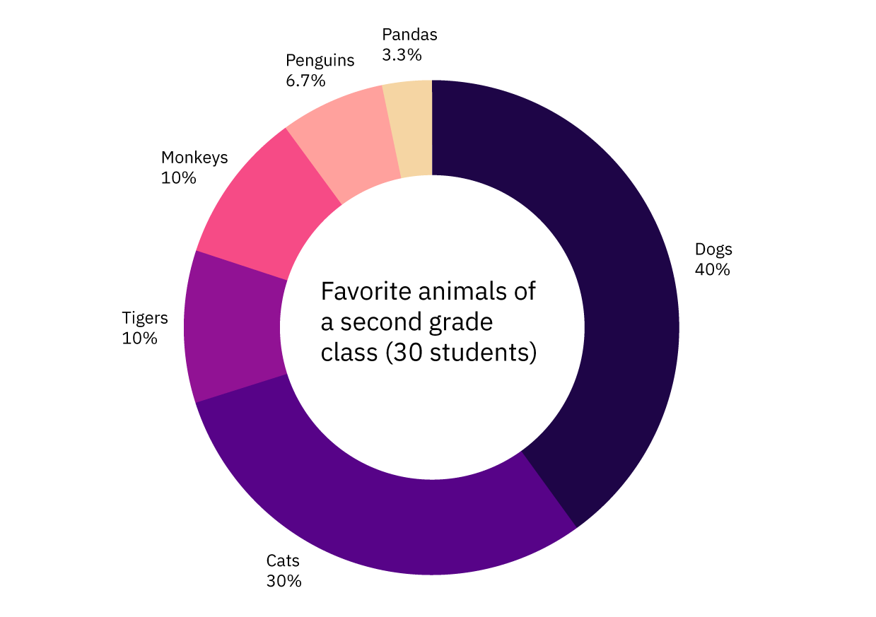
Not only does Figure 5 give you a complete listing of the favorite animals selected by the class, but it also allows you to compare the popularity of those animals. Thus, it achieves both comparison and composition.
Multi-purpose charts don’t have to be used for multiple purposes, but when you do want a single chart that can do more than one thing, these types of charts can be a good choice. You can learn more about which chart types are multi-purpose, including what types of variables they use in the Data visualizations table, one of two resources provided as a companion to this article (reference Figure 12).
Knowing what the purpose of the data visualization is will help narrow the options down significantly. If you find that you have multiple purposes and/or messages that can’t be communicated in a single multi-purpose chart, consider using multiple charts, especially if your audience is less familiar with data visualizations and may have trouble reading a more complex chart type. For more information on different chart types, including their purpose, when to use each, and an example, refer to the Chart reference guide.
That brings us to the next consideration in choosing a chart type — audience.
Who Is The Audience?
Knowing your audience is key to effective communication. For our purposes, knowledge about your audience will be immensely helpful in both selecting the type of data visualization you’ll use as well as deciding various aspects of the design.
When considering your audience, it’s important to think about things like:
- How familiar they are with the subject matter of your data.
- How much context they already have versus what you should supply.
- Their familiarity with various methods of data visualization.
This information should help inform your selection of chart type. For instance, some data visualization types are quite complex and should only be used with high-level experts in the field and/or individuals who are very familiar with data visualizations. For more information on which chart should only be used with this type of audience, refer to the “When to use” sections of the reference guide. The following is an example of one set of data communicated with two different chart types.
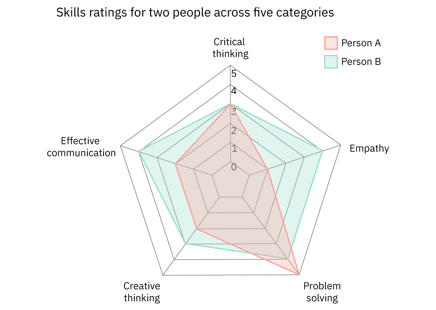
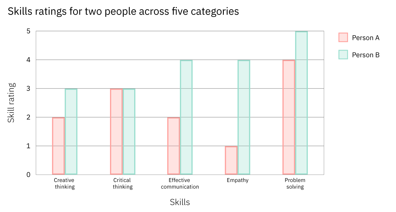
Both charts communicate the same skill ratings for two individuals across five categories. Figure 6 uses a radar chart. While these can be a good tool to communicate comparative data, many audiences aren’t familiar with this chart type or with the circular format in which they present the data. As such, Figure 6 may be more difficult for many people to read than Figure 7.
Figure 7, on the other hand, uses a grouped bar graph to display the same data. Since grouped bar graphs are familiar to most people regardless of their familiarity with data visualization, it’s more likely to be easier to understand by a larger audience.
If you’re wondering, “Why not always opt for the simpler chart type,” you’re not alone. Simplicity is key, but it should be looked at from the perspective of the bigger picture. Some chart types, while more complicated for a general lay audience to understand, communicate information more successfully for audiences that are familiar with them. This is evident in Figures 6 and 7. While radar charts are likely more difficult for a random person to read, in this case, the radar chart, for someone who can easily read it, does a better job of allowing for a comparison across the two people.
Considering your audience will be important after you’ve selected your chart type as well. For a general audience — not composed of experts — you should use simple, straightforward language and avoid using jargon or technical terminology. Additionally, for general audiences without a lot of background knowledge on the topic of your data, you may want to include more contextual information before introducing the data visualization or provide context and additional information within the visualization.
A stacked area graph is a good example of this. Stacked area graphs are like simple area graphs. The difference is that they show two or more data series stacked on one another. Each data series after the first one starts where the one before it ends. In other words, if point A for data series 1 stops at $18 million, then point A for data series 2 will begin at $18 million.
For this reason, they can be a bit confusing if you’re not familiar with them, and if they aren’t labeled, reading them can require some math. However, the benefit of using them is that they show the values for each series as well as the totals (for each point, the top of the stack is the total). Figures 8 and 9 demonstrate this.
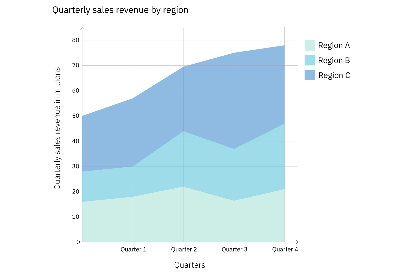
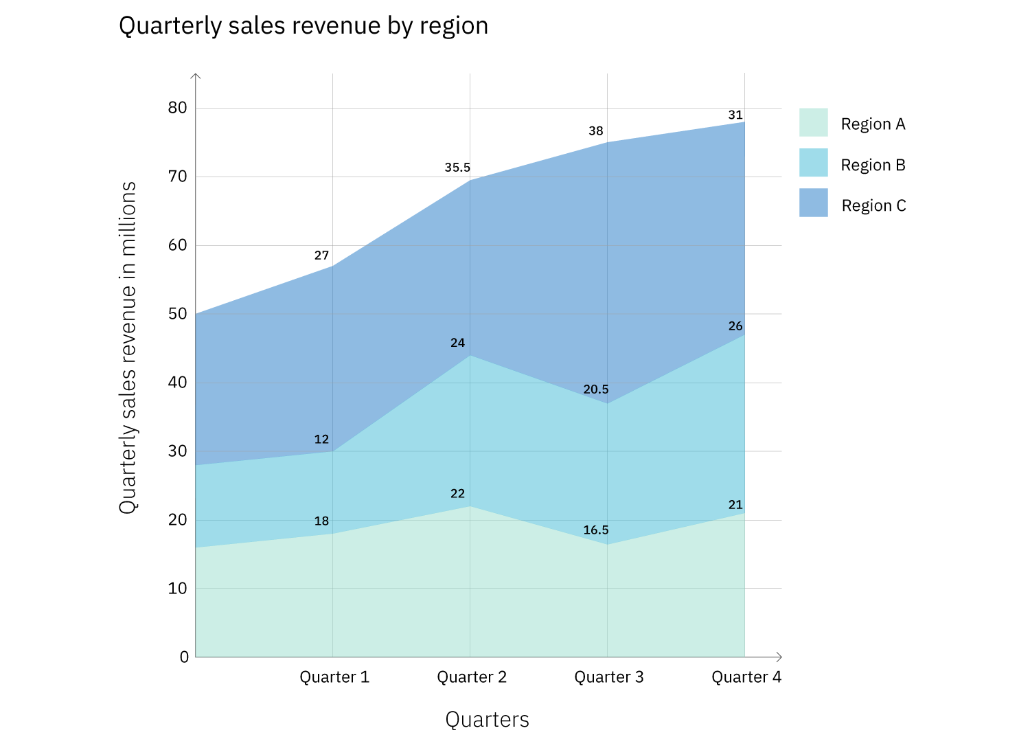
Both Figures 8 and 9 show a stacked area graph with the same data. However, Figure 9 provides additional information by labeling the values for each region for each quarter. This not only eliminates the need for the audience to calculate the figures, but it also helps to illuminate a characteristic of stacked area graphs. Because of the way they’re laid out, it can be difficult to compare the values for the different data series (in this case, regions) at a single point, for instance, Quarter 1. Adding the values to the graph helps with that. However, it’s not always a good idea to label every element in a graph. Doing so with large data sets often results in a graph that’s overcrowded and harder to read (see Figure 10).
By this point, the types of charts still under consideration should have narrowed significantly based on your message, purpose, and audience. Based on your remaining options, it’s now largely a matter of matching up the details of your data set, including the type and number of variables for the remaining options.
What Type And Size Of Data Am I Working With?
There are different types of data and variables:
- Quantitative: numerical (like population size or temperature).
- Continuous: numerical data can take any value between two numbers (ex: weight or temperature).
- Discrete: numerical data that, unlike continuous data, has a limited number of possible values and includes finite, numeric, countable, non-negative integers (ex: the number of people who have been to space).
- Ordinal: non-numerical data that has a natural order (ex: days of the week or spiciness levels on a menu (mild, spicy, very spicy)).
- Categorical (aka nominal): categories that don’t have an inherent order or numerical values (ex: oak, ash, and elm trees; pink, purple, and blue).
Knowing what type of data you plan to use in your data visualization will help you eliminate some chart types. For instance, if your data consists of a categorical and a quantitative variable, you can’t use a histogram because they show frequency and quantitative variables split into intervals.
Similarly, the size of your data set can help you to eliminate some chart types. Certain data visualization types like bar graphs and pie charts only lend themselves to being used with a small set of data. The reason is that charts should communicate a message in a way that’s easy to understand. A bar graph with eighteen bars or a pie chart with twenty slices is not going to be easy to read. However, there are chart types that can be used with large data sets. Figures 10 and 11 demonstrate this.
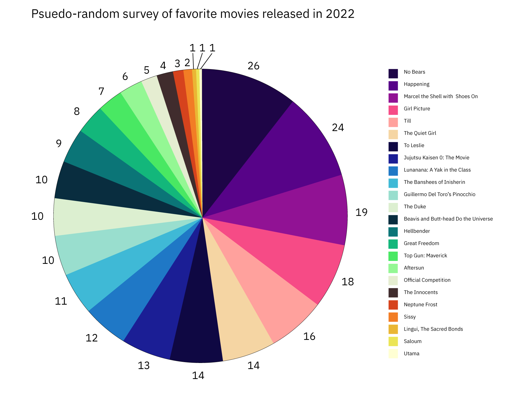

Both charts are based on the same data, but when presented as a pie chart, the information takes longer to process than when presented in a table. Because the pie chart has so many slices, it’s not possible to label each one with the movie title, so we have to use a key. This means that the audience will have to keep scanning from right to left over and over again to look from the key to the pie chart. The table, on the other hand, has the number of votes presented beside the movie title, making it easy to understand not only the popularity of the movies but the exact number of votes each one received.
For more information on which charts work with large data sets and other information about over 30 of the most popular chart types, refer to Figure 12.

Conclusion
We’ve covered the most important considerations when choosing a chart type, as well as what to look out for. To learn more about data visualizations, refer to the resources linked at the bottom of the article.
Hopefully, you now feel empowered with the knowledge you need to create a stellar data visualization! If you want to try out some of the tips in the article and don’t have a data set to work with, you can browse sites like Kaggle, World Bank Open Data, and Google Public Data Explorer. As a final reminder, keep it simple and focus on your message — you’ve got this!
Resources
General Info
Narratives And Data Visualization
- “Designing experiences through data stories”, Marion Hekeler
- “Data Storytelling: How to Effectively Tell a Story with Data”, Catherine Cote
How To Choose A Chart
- The Extreme Presentation Method
- “Data Visualization 101: How to Choose a Chart Type”, Sara A. Metwalli
- From Data to Viz
- “How to Choose the Right Data Visualization”, Mike Yi, Mel Restori
Design Tips For Data Visualizations
- “Data Visualization Tips For More Effective And Engaging Design”, Tableau
- “Which fonts to use for your charts and tables”, Lisa Charlotte Muth
Data Visualization Inspiration
Ethics And Data
- “The Ethics of Data Visualization”, Peter Haferl
- “Bad Data Visualizations: 5 Examples of Misleading Data”, Tim Stobierski
- “Ethical Data Viz”, Jo Hardin
- Inculcating ethics in data visualization dashboards, Abhinay Gupta Somisetty (Thesis)


