CSS And Accessibility: Inclusion Through User Choice

Email Newsletter
Weekly tips on front-end & UX.
Trusted by 182,000+ folks.
 Celebrating 10 million developers
 Custom Web Forms for Angular, React, & Vue. Your backend.


We make a series of choices every day. Get up early to work out or hit the snooze button? Double foam mocha latte or decaf green tea? Tabs or spaces? Our choices, even the seemingly insignificant ones, shape our identities and influence our perspectives on the world. In today’s modern landscape, we have come to expect a broad range of choices, regardless of the products or services we seek. However, this has not always been the case.
For example, there was a time when the world had only one font family. The first known typeface, a variant of Blackletter, graced Johannes Gutenberg’s pioneering printing press in 1440. The first set of publicly-available GUI colors shipped with the 10th version of the X Window System consisted of 69 primary shades and 138 entries to account for various color variations (e.g., “dark red”). In September 1995, a Netscape programmer, Brendan Eich, introduced “Mocha,” a scripting language that would later be renamed LiveScript and eventually JavaScript.
Fast forward to the present day, and we now have access to over 650,000 web fonts, a hexadecimal system capable of representing 16,777,216 colors, and over 100 public-facing JavaScript frameworks and libraries to choose from. While this is great news for professionals designing and building user interfaces, what choices are we giving actual users? Shouldn’t they have a say in their experience?
CSS Media Features
While designers and developers may have some insights into user needs, it is very challenging to understand the actual user preferences of 7.8 billion people at any given time. Supporting the needs of individuals with disabilities and assistive technology adds a layer of complexity to an already complex situation. Nonetheless, designers and developers are responsible for addressing these user needs as best we can by providing accessible choices. One promising solution is user-focused CSS media features that allow us to customize the user experience and cater to individual preferences.
Media Features For Color
Let’s first focus on CSS media features for color. Color plays a vital role in design, impacting how we perceive brands. Studies suggest that color alone can influence up to 90% of snap judgments about products. Considering the large number of people worldwide with visual deficiencies such as color blindness and low vision, developers and designers have a significant opportunity to improve accessibility with this element alone.
prefers-color-scheme
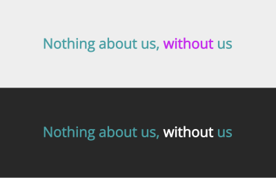
The prefers-color-scheme CSS media feature helps identify whether users prefer light or dark color themes. Users can indicate their preferences through settings in the operating system or user agent.
There are two values for this CSS media feature: light and dark. Typically, the default theme presented to users is the light version, even if the user expresses no preference. However, the opposite can also be true, and websites or apps default to a dark theme and switch to a light theme using the media (prefers-color-scheme: light) media feature and corresponding code.
Users opting for a dark mode signifies their preference for a dark-themed page. Using media (prefers-color-scheme: dark), various theme elements, such as text, links, and buttons, are adjusted to ensure they stand out against darker background colors.
In the past, there was also a no-preference value to indicate when users had no theme preference. However, user agents now treat light themes as the default, rendering the no-preference value obsolete.
@media (prefers-color-scheme: dark) {
  body {
    background-color: #282828;
  }

  .without [data-word="without"] .char:before,
  .without [data-word="without"] .char:after {
    color: #fff;
  }
}
The prefers-color-scheme is one of the most widely used CSS media features today and it has a very large percentage of browser support at 94%. It is so popular that additional values may be introduced in the future to express more specific preferences or color schemes, such as sepia or grayscale.
Switching from the default light mode to dark mode is relatively straightforward. Consult the user setting guides for Mac and Windows operating systems to learn more (select the relevant hardware and operating system version), then navigate to a browser that supports this CSS media feature.
Pro-tip: A more sophisticated solution to demo user preference settings is using Chrome’s Rendering tab coupled with CSS media features emulator to easily switch from light to dark modes to emulate prefers-color-scheme as users experience it. This solution is convenient for live demos where you need to show the user preference changes quickly or emulate media features not fully supported by your OS or browser.

prefers-color-scheme at the time of writing. (Large preview)forced-colors
The forced-colors CSS media feature enables the detection of the forced colors mode enforced by the user agent. This mode imposes a limited color palette the user chooses onto the page. This newer media feature provides an alternative approach to handle colors for non-Window devices, and we expect it will replace Windows High Contrast Mode in the future.
There are two values for the forced-colors media feature: none and active. The media (forced-colors: none) value indicates that the forced colors mode is inactive and uses the default color scheme, while the media (forced-colors: active) value means that the forced colors mode is active and the user agent enforces the user-selected limited color palette.
It’s worth noting that enabling forced-colors mode does not necessarily imply a preference for higher contrast. The color adjustments align with the user’s choice, which may not strictly fit into the low or high-contrast categories.
Note: There are some properties affected by the forced-color mode that you need to be aware of when designing and testing your forced-colors theme. Check out Eric Bailey’s article “Windows High Contrast Mode, Forced Colors Mode And CSS Custom Properties” for more information about this media feature and its integration with CSS custom properties.
@media (forced-colors: active) {
  body {
    background-color: #fcba03;
  }

  .without [data-word="without"] .char:before,
  .without [data-word="without"] .char:after {
    color: #ac1663;
  }

  .without {
    color: #004a72;
  }
}

The forced-colors CSS media feature is currently supported by 31% of the most popular browsers, including desktop versions of Chrome, Edge, and Firefox. Although the browser support for this feature is increasing, not all operating systems currently offer a setting to activate the forced colors mode. The Windows operating system is the only exception, as it provides the necessary functionality for users to create customized themes that override the default ones by utilizing the Windows High Contrast mode.
If you are using a non-Windows machine, you can emulate the behavior of this media feature by following the steps mentioned earlier in the prefers-color-scheme section using Chrome’s Rendering tab and emulator, but with a focus on emulating forced-colors instead.

@prefers-forced-colors at the time of writing. (Large preview)inverted-colors
The inverted-colors CSS media feature determines whether to show the content in its standard colors or if it reverses the colors.
Two modes are available for the inverted-colors media feature: none and inverted. The media (inverted-colors: none) value indicates that the forced colors mode is not activated and uses the default color scheme. Using the media (inverted-colors: inverted) value indicates that all pixels within the displayed area have been inverted and renders the inverted color theme when a user chooses this option.
When writing code for the inverted-colors CSS media feature, one option is to write your code using the inverted value of what you want a user to see to ensure correct rendering after applying the user’s setting.
For example, you want your element’s background to be #e87b2d, which is a tangerine orange. In the theme code, you would write the opposite color, #1784d2, powder blue. Incorporating this inverse color into the code renders the intended tangerine orange instead of its inverse when users enable the inverted-colors setting.
@media (inverted-colors: inverted) {
  body {
    background-color: #99cc66;
  }

  .without [data-word="without"] .char:before,
  .without [data-word="without"] .char:after {
    color: #ee1166;
  }

  .without {
    color: #111111;
  }
}

Current browser support for inverted-colors is 20% for Safari desktop and iOS browsers. While Chrome’s Rendering tab and emulator do not work for this particular media feature, you can emulate inverted-colors using Firefox (version 114 or newer).
- Open a new tab in Firefox and type or paste
about:configin the address bar, and press Enter/Return. Click the button acknowledging that you will be careful. - In the search box, enter
layout.css.inverted-colorsand wait for the list to be filtered. - Use the toggle button to switch the preference from
falsetotrue. - Enable the inverted colors setting in your operating system and navigate to a webpage or code example with the
inverted-colorstheme to observe the inverted effect.
The setting for the inverted-colors media feature is available on Mac and Windows operating systems.

inverted-colors at the time of writing. (Large preview)Media Features For Contrast
Next, let’s talk about CSS media features related to contrast. Contrast plays a crucial role in conveying visual information to users, working hand in hand with color. When proper levels of color contrast are not implemented, it becomes difficult to distinguish essential elements such as text, icons, and important graphics. As a result, the design can become inaccessible not only to the 46 million people worldwide with low vision but also to older adults, individuals using monochrome displays, or those in specific situations like low lighting in a room.
prefers-contrast
The prefers-contrast CSS media feature detects the user’s preference for higher or lower contrast on a page. The feature uses the information to make appropriate adjustments, such as modifying the contrast ratio between colors nearby or altering the visual prominence of elements, such as adjusting their borders, to better suit the user’s contrast requirements.
There are four values for this CSS media feature: no-preference, less, more, and custom. The media (prefers-contrast: no-preference) value indicates that the user has no preference (or did not choose one since it is the default setting), and the media (prefers-contrast: less) value indicates a user’s preference for less contrast. Conversely, the media (prefers-contrast: more) value indicates a user’s preference for stronger contrast.
The media (prefers-contrast: custom) value is a bit more complex as it allows users to use a custom set of colors — which could be specific to contrast — or choose a palette. For example, a user could select a theme composed entirely of shades of blue, primary colors, or even a rainbow theme — anything they choose.
Note: When a user selects the custom contrast setting, it will align with the color palette defined by users of forced-colors: active value, so be sure to account for that in the code.
@media (prefers-contrast: more) {
  .title2 {
    color: var(--clr-6);
  }

  .aurora2__item:nth-of-type(1),
  .aurora2__item:nth-of-type(2),
  .aurora2__item:nth-of-type(3),
  .aurora2__item:nth-of-type(4) {
    background-color: var(--clr-6);
  }
}

@media (prefers-contrast: less) {
  .title {
    color: var(--clr-5);
  }

  .aurora__item:nth-of-type(1),
  .aurora__item:nth-of-type(2),
  .aurora__item:nth-of-type(3),
  .aurora__item:nth-of-type(4) {
    background-color: var(--clr-5);
  }
}

@media (prefers-contrast: custom) {
  .aurora2__item:nth-of-type(1) {
    background-color: var(--clr-1);
  }
  .aurora2__item:nth-of-type(2) {
    background-color: var(--clr-2);
  }
  .aurora2__item:nth-of-type(3) {
    background-color: var(--clr-3);
  }
  .aurora2__item:nth-of-type(4) {
    background-color: var(--clr-4);
  }
}

Currently, 91% of the most widely used browsers offer support for the prefers-contrast media feature. However, the majority of this support is focused on enhancing contrast rather than reducing it or allowing for personalized contrast themes.
To effectively demo and test all the different contrast options for this CSS media feature, use the Chrome Rendering tab and emulator as described earlier, but with a specific emphasis on emulating the prefers-contrast media feature this time.
@prefers-contrast at the time of writing. (Large preview)prefers-reduced-transparency
The prefers-reduced-transparency CSS media feature determines if the user has requested the system to use fewer transparent or translucent layer effects.
It takes one of two possible values: no-preference and reduce. The media (prefers-reduced-transparency: no-preference) value indicates that the user has not specified any preference for the system (this is also the default setting). On the other hand, the media (prefers-reduced-transparency: reduce) value indicates that the user has informed the system about their preference for an interface that minimizes the application of transparent or translucent layer effects.
@media (prefers-reduced-transparency: reduce) {
  .title,
  .title2 {
    opacity: 0.7;
  }
}

The current browser support for @prefers-reduced-transparency stands at 0%. This CSS media feature is highly experimental and should not be utilized in production code at the time I’m writing this article.
However, if you wish to emulate the prefers-reduced-transparency media feature behavior, you can follow these steps using Firefox (version 113 or newer).
- Open a new tab in Firefox and type or paste
about:configin the address bar, and press Enter/Return. Click the button acknowledging that you will be careful. - In the search box, type or paste
layout.css.prefers-reduced-transparencyand wait for the list to be filtered. - Use the toggle button to switch the preference from the default state of false to true.
- Adjust your operating system’s transparency settings and navigate to a webpage or code example with the
prefers-reduced-transparencytheme to observe the effect of reduced transparency.

@prefers-reduced-transparency at the time of writing. (Large preview)Media Features For Motion
Lastly, let’s turn our focus to motion. Whether it involves videos, GIFs, or SVGs, movement can enrich our online experiences. However, this media type can also adversely affect many individuals. People with vestibular disabilities, seizure disorders, and migraine disorders can benefit from accessible media. CSS media features for motion allow us to incorporate both dynamic movement and static states for elements, enabling us to have the best of both worlds.
prefers-reduced-motion
Using the prefers-reduced-motion CSS media feature helps determine whether the user has requested the system to minimize the usage of non-essential motion.
This CSS media feature accepts one of two values: no-preference and reduce. The media (prefers-reduced-motion: no-preference) value indicates that the user has not specified any preference for the system (this is also the default setting). Conversely, the media (prefers-reduced-motion: reduce) value indicates that the user has informed the system about their preference for an interface that eliminates or substitutes motion-based animations that may cause discomfort or serve as distractions for them.
@media (prefers-reduced-motion: reduce) {
  .bg-rainbow {
    animation: none;
  }

  .perfection {
    .word {
      .char {
        animation: slide-down 5s cubic-bezier(0.75, 0, 0.25, 1) both;
        animation-delay: calc(#{$delay} + (0.5s * var(--word-index)));
      }
    }

    [data-word="perfection"] {
      animation: slide-over 4.5s cubic-bezier(0.5, 0, 0.25, 1) both;
      animation-delay: $delay;

      .char {
        animation: none;
        visibility: hidden;
      }

      .char:before,
      .char:after {
        animation: split-in 4.5s cubic-bezier(0.75, 0, 0.25, 1) both alternate;
        animation-delay: calc(
          3s + -0.2s * (var(--char-total) - var(--char-index))
        );
      }
    }
  }
}
You can compare the difference in the following videos and by viewing a live demo.
The prefers-reduced-motion CSS media feature boasts the broadest browser support among all other CSS media features, with an impressive 94% support across the latest versions of the most popular desktop and mobile browsers. Most operating systems offer a reduced motion setting that you can use for demo purposes. Alternatively, you can emulate prefers-reduced-motion using Chrome’s Rendering tab and emulator.
Unlike other media features, the main questions regarding the prefers-reduced-motion media feature revolve less around browser and operating system support and more around determining the degree and manner of motion reduction. For instance, should the motion be slowed down, prevented from infinite loops, or entirely stopped? There are many aspects to consider when defining the reduced motion states of your moving elements. When in doubt, think: less is more.

prefers-reduced-motion at the time of writing. (Large preview)prefers-reduced-data
Last but certainly not least, let’s examine the prefers-reduced-data CSS media feature. This media feature determines whether the user prefers to receive alternate content that consumes less data when rendering the page.
This CSS media feature has two possible values: no-preference and reduce. The media (prefers-reduced-motion: no-preference) value indicates that the user has not specified any preference for the system (which is also the default setting). On the other hand, the media (prefers-reduced-data: reduce) value indicates that the user has expressed a preference for lightweight alternate content.
Unlike other CSS media features, a user’s preference for the prefers-reduced-data media feature could vary. It may be a system-wide setting exposed by the operating system or settings controlled by the user agent. In the case of the user agent, they may determine this value based on the same user or system preference used for setting the Save-Data HTTP request header.
Note that the Save-Data network client request header is still considered experimental technology, but it has achieved a remarkable 72% browser support across various browsers, except Safari and Firefox on desktop and mobile.
@media (prefers-reduced-data: reduce) {
  .bg-rainbow {
    animation: none;
  }

  .perfection {
    .word {
      .char {
        animation: none;
      }
    }

    [data-word="perfection"] {
      animation: none;

      .char {
        animation: none;
        visibility: hidden;
      }

      .char:before,
      .char:after {
        animation: none;
      }
    }
  }
}

@media (prefers-reduced-data: reduce. (Demo) (Large preview)Similar to prefers-reduced-transparency, the prefers-reduced-data CSS media feature is highly experimental and should not be utilized in production code at this time as the current browser support for it stands at 0%.
However, if you wish to emulate the prefers-reduced-data behavior, you can follow these steps using Chrome (version 85 or newer).
- Open a new tab in Chrome and type or paste
chrome://flagsin the address bar and press Enter/Return. - In the search box, type or paste
experimental-web-platform-featuresand wait for the list to be filtered. - Use the dropdown option to switch the preference from the default state of disabled to enabled.
- Use the Chrome Rendering tab and choose the appropriate CSS media feature to emulate.
Note that you can also enable the prefers-reduced-data feature in Edge, Opera, and Chrome Android (all behind the same experimental-web-platform-features flag), but it is less clear how you would emulate the media feature without the rendering tab and emulator found in the desktop version of Chrome.

prefers-reduced-data at the time of writing. (Large preview)Amplifying Inclusion Through User Choice
In the tech world, accessibility often receives criticism, particularly with aesthetics and advanced features. However, this negative perception can be changed. It is possible to incorporate stunning design and innovative functionality while prioritizing accessibility by leveraging CSS user-focused media features that address color, contrast, and motion.
Today, by incorporating all available options for each CSS media feature currently supported by browsers (with support exceeding 90%), you can provide users with 16 combinations of options. However, when the browsers and operating systems implement and support more experimental media features, the impact on user customization expands significantly to a staggering 256 combinations of options. A large number of possible options truly amplifies the potential impact designers and developers can have on user experiences.
As professionals within the technology industry, our goal should be to ensure that digital products are accessible to all individuals. By offering users the ability to personalize their experience, we can include an array of remarkable features in a responsible manner. Our job is to provide options and let people choose their own adventure.
Further Reading On SmashingMag
- “Creating A High-Contrast Design System With CSS Custom Properties,” Brecht De Ruyte
- “A Step-By-Step Guide To Building Accessible Carousels,” Sonja Weckenmann
- “Designing Age-Inclusive Products: Guidelines And Best Practices,” Michal Halperin Ben Zvi
- “A Guide To Keyboard Accessibility: HTML And CSS (Part 1),” Cristian Díaz
 (yk, il)

