Design Patterns For AI Interfaces

Email Newsletter
Weekly tips on front-end & UX.
Trusted by 182,000+ folks.
So you need to design a new AI feature for your product. How would you start? How do you design flows and interactions? And how do you ensure that that new feature doesn’t get abandoned by users after a few runs?
In this article, I’d love to share a very simple but systematic approach to how I think about designing AI experiences. Hopefully, it will help you get a bit more clarity about how to get started.
This article is part of our ongoing series on UX. You can find more details on design patterns and UX strategy in Smart Interface Design Patterns 🍣 — with live UX training coming up soon. Jump to table of contents.
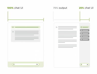
The Receding Role of AI Chat
One of the key recent shifts is a slow move away from traditional “chat-alike” AI interfaces. As Luke Wroblewski wrote, when agents can use multiple tools, call other agents and run in the background, users orchestrate AI work more — there’s a lot less chatting back and forth.
In fact, chatbots are rarely a great experience paradigm — mostly because the burden of articulating intent efficiently lies on the user. But in practice, it’s remarkably difficult to do well and very time-consuming.
Chat doesn’t go away, of course, but it’s being complemented with task-oriented UIs — temperature controls, knobs, sliders, buttons, semantic spreadsheets, infinite canvases — with AI providing predefined options, presets, and templates.
There, AI emphasizes the work, the plan, the tasks — the outcome, instead of the chat input. The results are experiences that truly amplify value for users by sprinkling a bit of AI in places where it delivers real value to real users.
To design better AI experiences, we need to study 5 key areas that we need to shape.
Input UX: Expressing Intent
Conversational AI is a very slow way of helping users express and articulate their intent. Usability tests show that users often get lost in editing, reviewing, typing, and re-typing. It’s painfully slow, often taking 30-60 seconds for input.
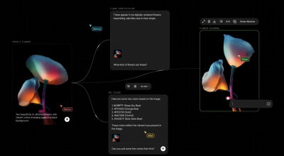
As it turns out, people have a hard time expressing their intent well. In fact, instead of writing prompts manually, it’s a good idea to ask AI to write a prompt to feed itself.
With Flora AI, users can still write prompts, but they visualize their intent with nodes by connecting various sources visually. Instead of elaborately explaining to AI how we need the pipeline to work, we attach nodes and commands on a canvas.
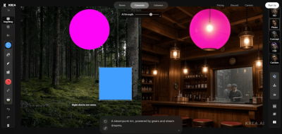
With input for AI, being precise is slow and challenging. Instead, we can abstract away the object we want to manipulate, and give AI precise input by moving that abstracted object on a canvas. That’s what Krea.ai does.
In summary, we can minimize the burden of typing prompts manually — with AI-generated pre-prompts, prompt extensions, query builders, and also voice input.
Output UX: Displaying Outcomes
AI output doesn’t have to be merely plain text or a list of bullet points. It must be helpful to drive people to insights, faster. For example, we could visualize output by creating additional explanations based on the user’s goal and motivations.

For example, Amelia Wattenberger visualized AI output for her text editor PenPal by adding style lenses to explore the content from. The output could be visualized in sentence lengths and scales Sad — Happy, Concrete — Abstract, and so on.
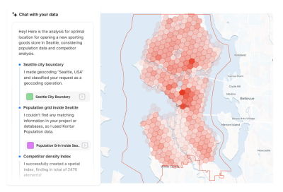
The outcome could also be visualized on a map, which, of course, is expected for an AI GIS analyst. Also, users can access individual data layers, turn them on and off, and hence explore the data on the map.
We can also use forced ranking and prioritizations to suggest best options and avoid choice paralysis — even if a user asks for top 10 recommendations. We can think about ways to present results as a data table, or a dashboard, or a visualization on a map, or as a structured JSON file, for example.
Refinement UX: Tweaking Output
Users often need to cherry-pick some bits from the AI output and bring them together in a new place — and often they need to expand on one section, synthesize bits from another section, or just refine the outcome to meet their needs.
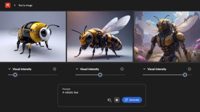
Refinement is usually the most painful part of the experience, with many fine details being left to users to explain elaborately. But we can use good old-fashioned UI controls like knobs, sliders, buttons, and so on to improve that experience, similar to how Adobe Firefly does it (image above).

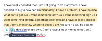
We can also use presets, bookmarks, and allow users to highlight specific parts of the outcome that they’d like to change — with contextual prompts acting on highlighted parts of the output, rather than global prompts.
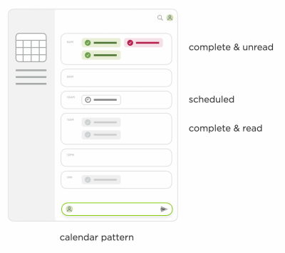
AI Actions: Tasks To Complete
With AI agents, we can now also allow users to initiate tasks that AI can perform on their behalf, such as scheduling events, planning, and deep research. We could also ask to sort results or filter them in a specific way.
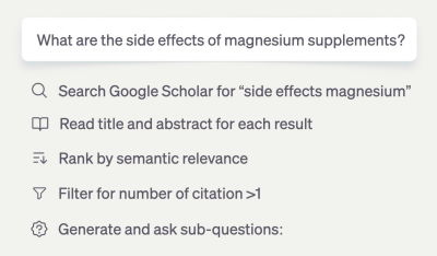
But we can also add features to help users use AI output better — e.g., by visualizing it, making it shareable, allowing transformations between formats, or also posting to Slack, Jira, and so on.
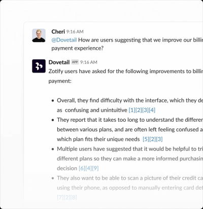
AI Integration: Where Work Happens
Many AI interactions are locked within a specific product, but good AI experiences happen where the actual work happens. It would be quite unusual to expect a dedicated section for Autocomplete, for example, but we do so for AI features.

The actual boost in productivity comes when users rely on AI as a co-pilot or little helper in the tools they use daily for work. It’s seamless integrations into Slack, Teams, Jira, GitHub, and so on — the tools that people use anyway. Dia Browser and Dovetail are great examples of it in action.
Wrapping Up
Along these five areas, we can explore ways to minimize the cost of interaction with a textbox, and allow users to interact with the points of interest directly, by tapping, clicking, selecting, highlighting, and bookmarking.
Many products are obsessed with being AI-first. But you might be way better off by being AI-second instead. The difference is that we focus on user needs and sprinkle a bit of AI across customer journeys where it actually adds value.
And AI products don’t have to be AI-only. There is a lot of value in mapping into the mental models that people have adopted over the years, and enhance them with AI, similar to how we do it with browsers’ autofill, rather than leaving users in front of a frightening and omnipresent text box.
Useful Resources
- Where Should AI Sit In Your UI?, by Sharang Sharma
- Shape of AI: Design Patterns, by Emily Campbell
- AI UX Patterns, by Luke Bennis
- Design Patterns For Trust With AI, via Sarah Gold
- AI Guidebook Design Patterns, by Google
- Usable Chat Interfaces to AI Models, by Luke Wroblewski
- The Receding Role of AI Chat, by Luke Wroblewski
- Agent Management Interface Patterns, by Luke Wroblewski
- Designing for AI Engineers, by Eve Weinberg
Meet “Smart Interface Design Patterns”
You can find more details on design patterns and UX in Smart Interface Design Patterns, our 15h-video course with 100s of practical examples from real-life projects — with a live UX training later this year. Everything from mega-dropdowns to complex enterprise tables — with 5 new segments added every year. Jump to a free preview. Use code BIRDIE to save 15% off.

Video + UX Training
$ 495.00 $ 699.00 Get Video + UX Training25 video lessons (15h) + Live UX Training.
100 days money-back-guarantee.
Video only
40 video lessons (15h). Updated yearly.
Also available as a UX Bundle with 2 video courses.