Designing For TV: Principles, Patterns And Practical Guidance (Part 2)

Email Newsletter
Weekly tips on front-end & UX.
Trusted by 182,000+ folks.
 Register Free Now
 SurveyJS: White-Label Survey Solution for Your JS App

 Celebrating 10 million developers

Having covered the developmental history and legacy of TV in Part 1, let’s now delve into more practical matters. As a quick reminder, the “10-foot experience” and its reliance on the six core buttons of any remote form the basis of our efforts, and as you’ll see, most principles outlined simply reinforce the unshakeable foundations.
In this article, we’ll sift through the systems, account for layout constraints, and distill the guidelines to understand the essence of TV interfaces. Once we’ve collected all the main ingredients, we’ll see what we can do to elevate these inherently simplistic experiences.
Let’s dig in, and let’s get practical!
The Systems
When it comes to hardware, TVs and set-top boxes are usually a few generations behind phones and computers. Their components are made to run lightweight systems optimised for viewing, energy efficiency, and longevity. Yet even within these constraints, different platforms offer varying performance profiles, conventions, and price points.
Some notable platforms/systems of today are:
- Roku, the most affordable and popular, but severely bottlenecked by weak hardware.
- WebOS, most common on LG devices, relies on web standards and runs well on modest hardware.
- Android TV, considered very flexible and customisable, but relatively demanding hardware-wise.
- Amazon Fire, based on Android but with a separate ecosystem. It offers great smooth performance, but is slightly more limited than stock Android.
- tvOS, by Apple, offering a high-end experience followed by a high-end price with extremely low customizability.
Despite their differences, all of the platforms above share something in common, and by now you’ve probably guessed that it has to do with the remote. Let’s take a closer look:
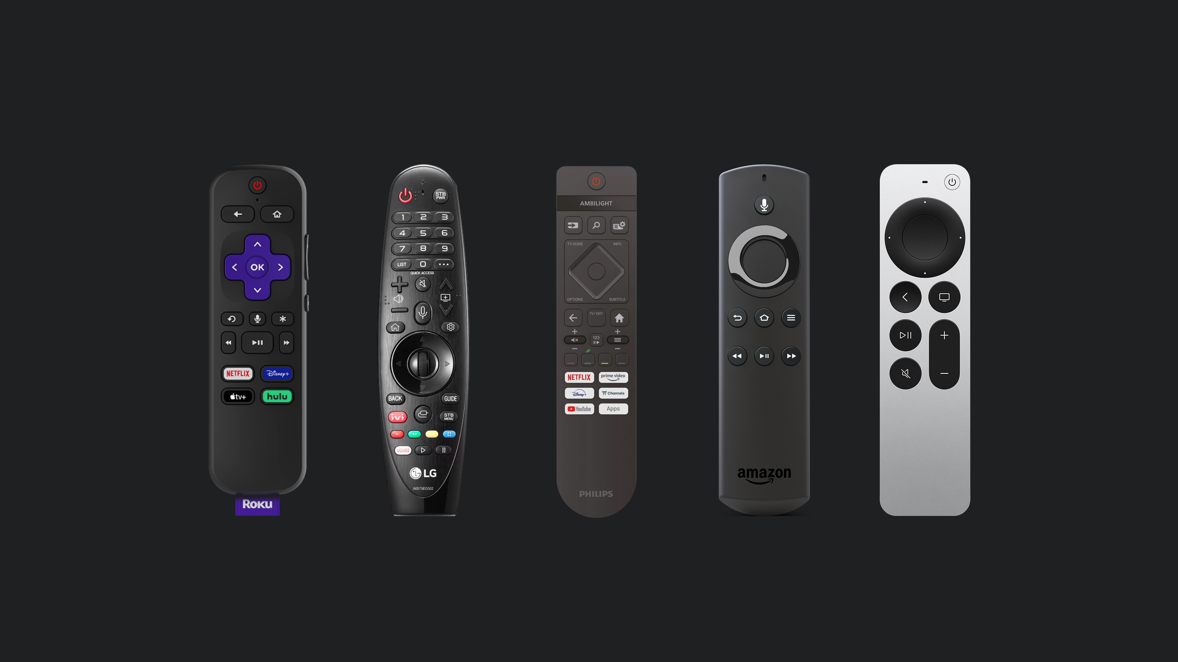
If these remotes were stripped down to just the D-pad, OK, and BACK buttons, they would still be capable of successfully navigating any TV interface. It is this shared control scheme that allows for the agnostic approach of this article with broadly applicable guidelines, regardless of the manufacturer.
Having already discussed the TV remote in detail in Part 1, let’s turn to the second part of the equation: the TV screen, its layout, and the fundamental building blocks of TV-bound experiences.
TV Design Fundamentals
The Screen
With almost one hundred years of legacy, TV has accumulated quite some baggage. One recurring topic in modern articles on TV design is the concept of “overscan” — a legacy concept from the era of cathode ray tube (CRT) screens. Back then, the lack of standards in production meant that television sets would often crop the projected image at its edges. To address this inconsistency, broadcasters created guidelines to keep important content from being cut off.

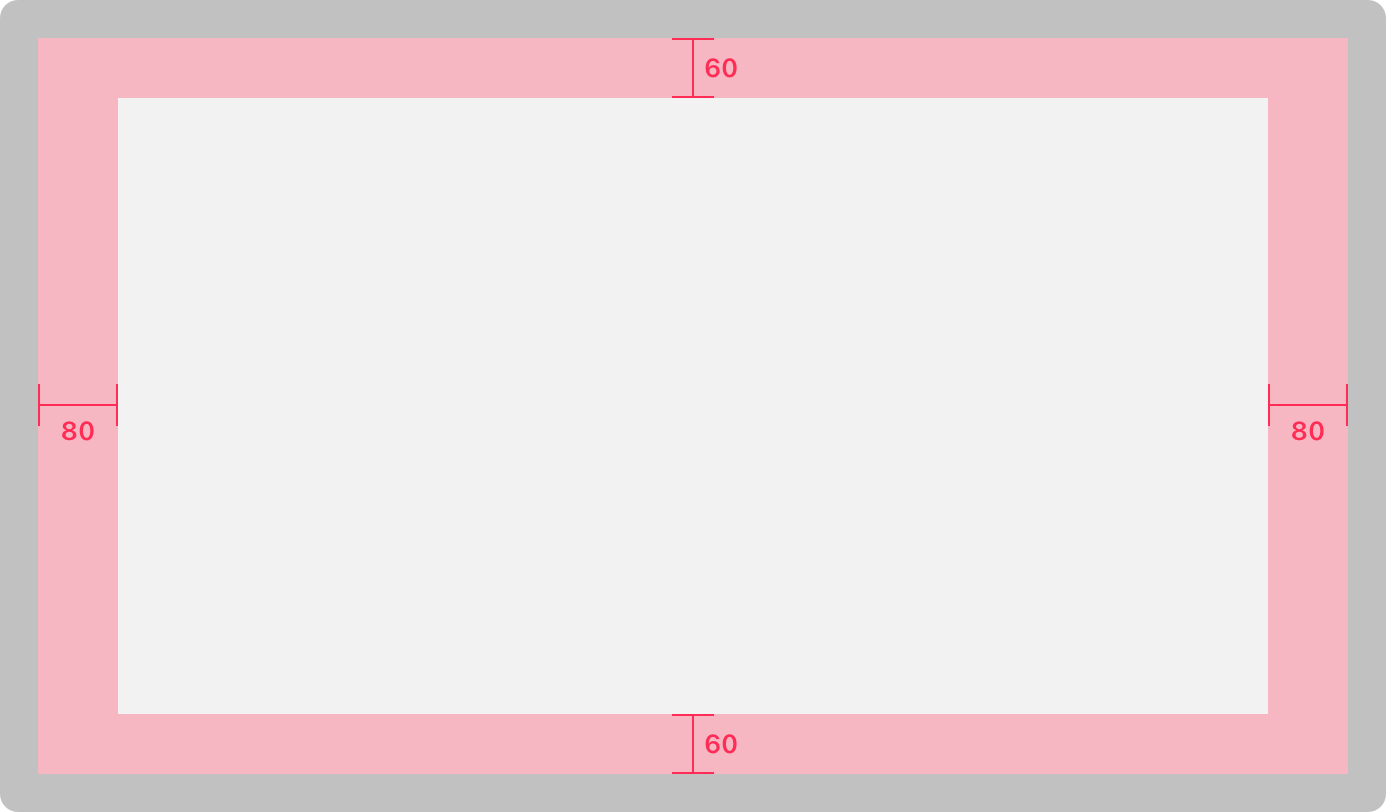
While overscan gets mentioned occasionally, we should call it what it really is — a thing of the past. Modern panels display content with greater precision, making thinking in terms of title and action safe areas rather archaic. Today, we can simply consider the margins and get the same results.

Google calls for a 5% margin layout and Apple advises a 60-point margin top and bottom, and 80 points on the sides in their Layout guidelines. The standard is not exactly clear, but the takeaway is simple: leave some breathing room between screen edge and content, like you would in any thoughtful layout.
Having left some baggage behind, we can start considering what to put within and outside the defined bounds.
The Layout
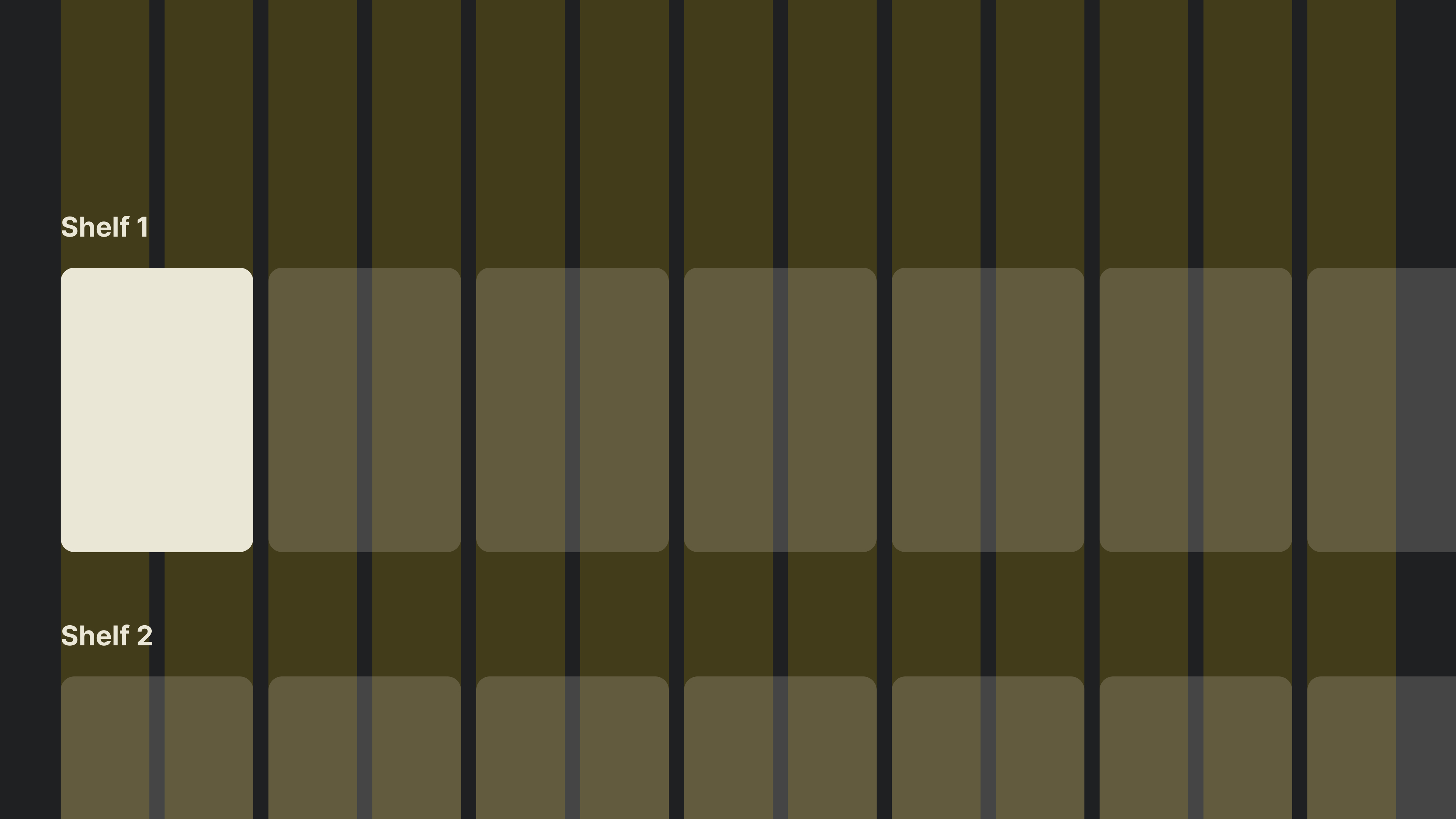
Considering the device is made for content consumption, streaming apps such as Netflix naturally come to mind. Broadly speaking, all these interfaces share a common layout structure where a vast collection of content is laid out in a simple grid.
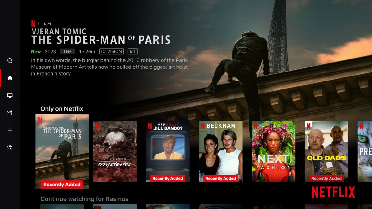
These horizontally scrolling groups (sometimes referred to as “shelves”) resemble rows of a bookcase. Typically, they’ll contain dozens of items that don’t fit into the initial “fold”, so we’ll make sure the last visible item “peeks” from the edge, subtly indicating to the viewer there’s more content available if they continue scrolling.
If we were to define a standard 12-column layout grid, with a 2-column-wide item, we’d end up with something like this:
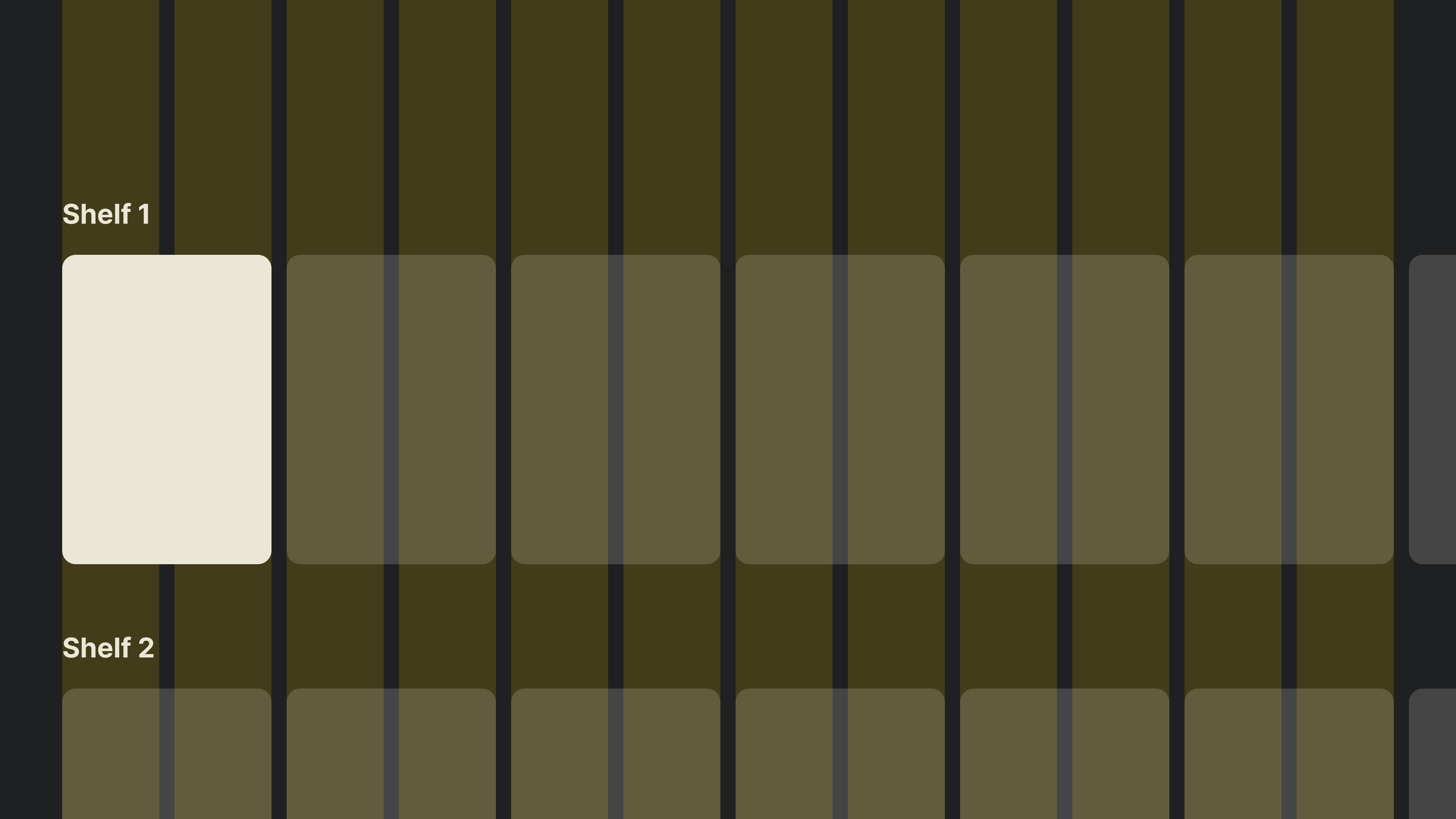
As you can see, the last item falls outside the “safe” zone.
Tip: A useful trick I discovered when designing TV interfaces was to utilise an odd number of columns. This allows the last item to fall within the defined margins and be more prominent while having little effect on the entire layout. We’ve concluded that overscan is not a prominent issue these days, yet an additional column in the layout helps completely circumvent it. Food for thought!
Typography
TV design requires us to practice restraint, and this becomes very apparent when working with type. All good typography practices apply to TV design too, but I’d like to point out two specific takeaways.
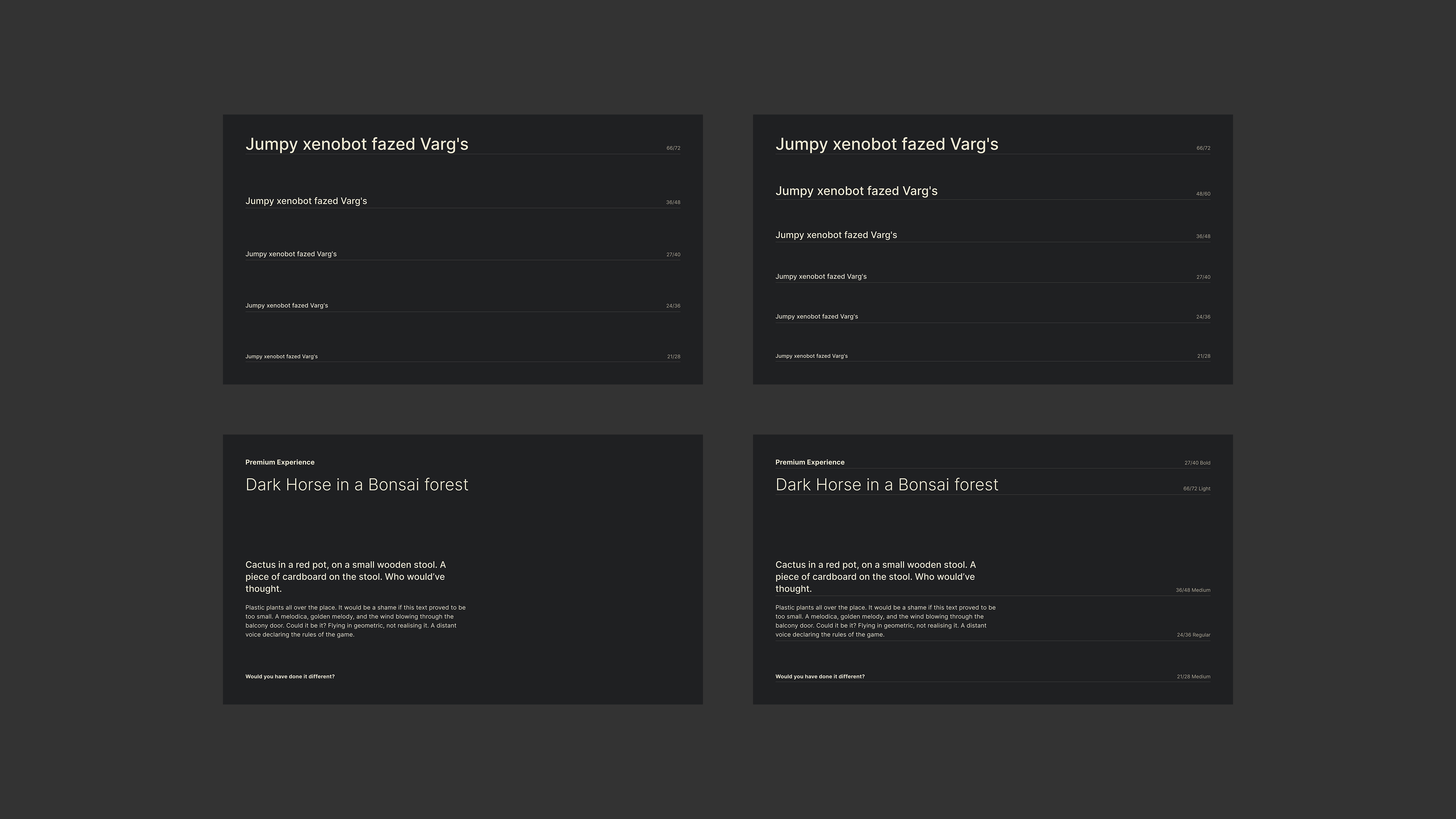
First, accounting for the distance, everything (including type) needs to scale up. Where 16–18px might suffice for web baseline text, 24px should be your starting point on TV, with the rest of the scale increasing proportionally.
“Typography can become especially tricky in 10-ft experiences. When in doubt, go larger.”
— Molly Lafferty (Marvel Blog)
With that in mind, the second piece of advice would be to start with a small 5–6 size scale and adjust if necessary. The simplicity of a TV experience can, and should, be reflected in the typography itself, and while small, such a scale will do all the “heavy lifting” if set correctly.
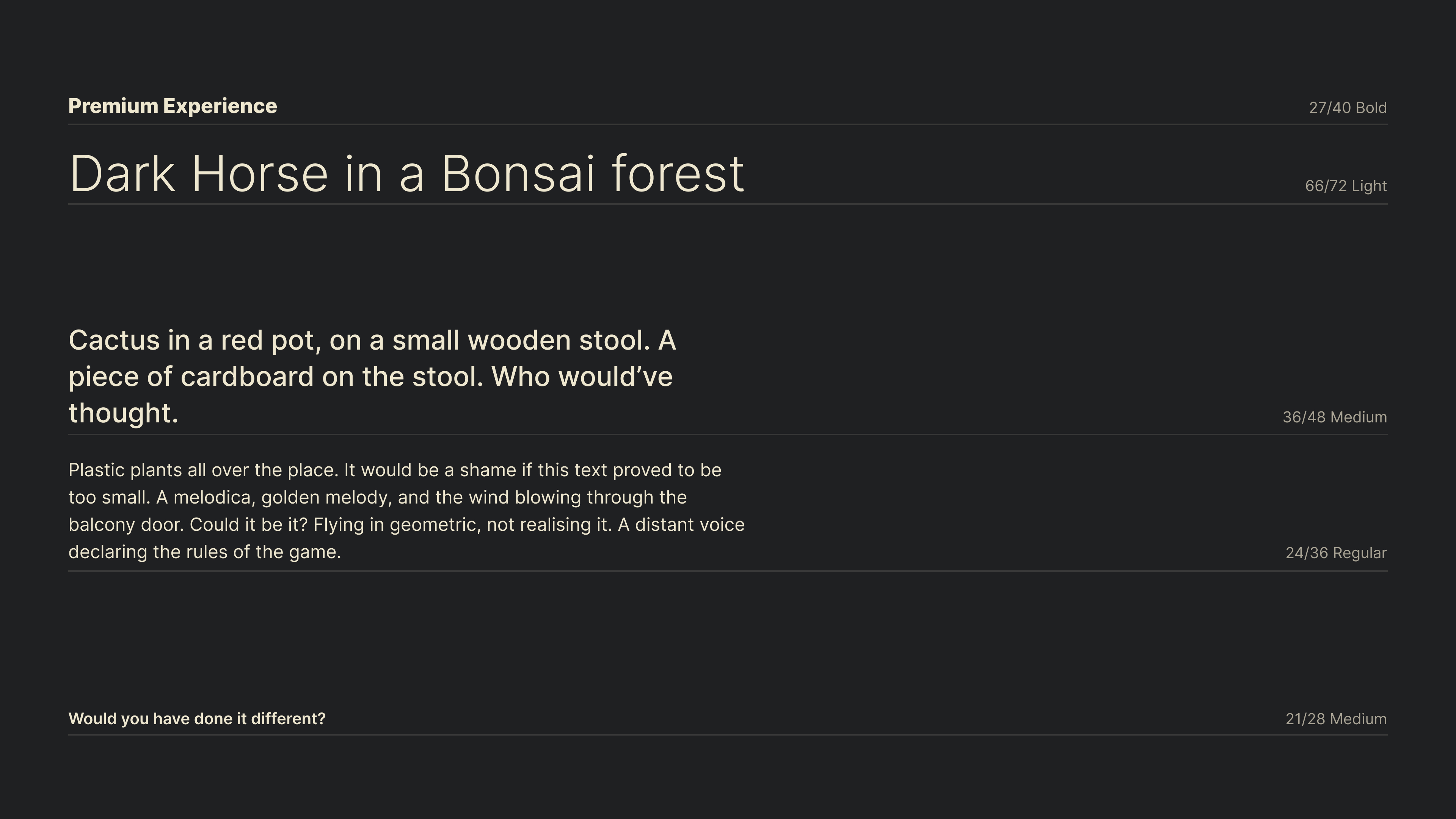
What you see in the example above is a scale I reduced from Google and Apple guidelines, with a few size adjustments. Simple as it is, this scale served me well for years, and I have no doubt it could do the same for you.
Freebie
If you’d like to use my basic reduced type scale Figma design file for kicking off your own TV project, feel free to do so!
Color
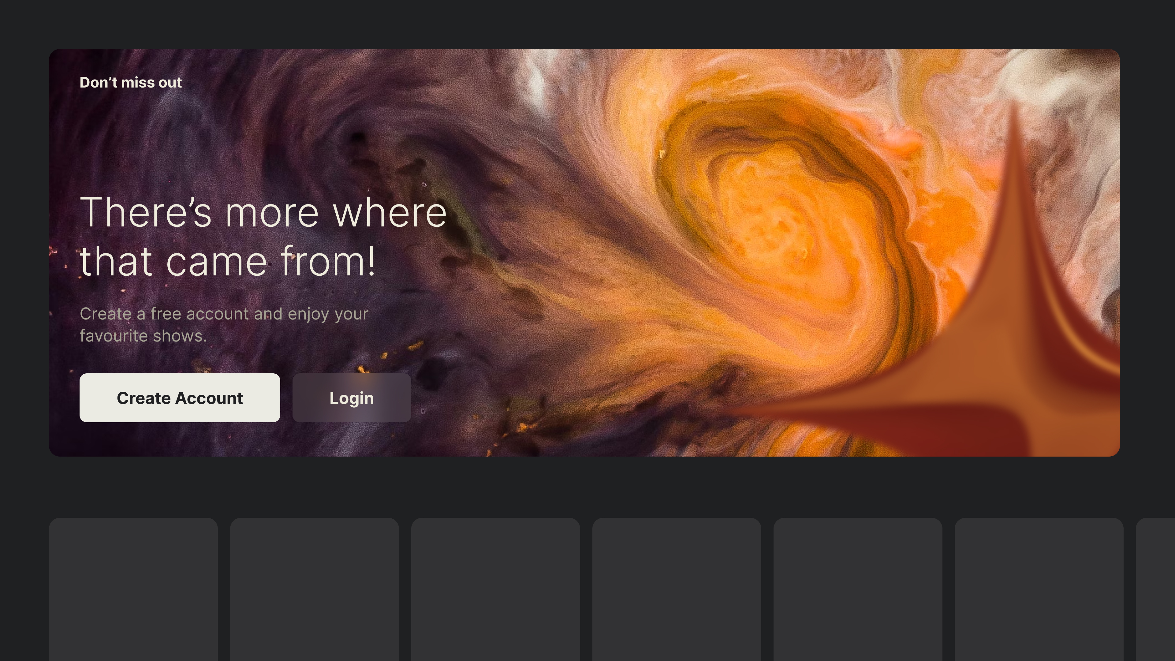
Imagine watching TV at night with the device being the only source of light in the room. You open up the app drawer and select a new streaming app; it loads into a pretty splash screen, and — bam! — a bright interface opens up, which, amplified by the dark surroundings, blinds you for a fraction of a second. That right there is our main consideration when using color on TV.
Built for cinematic experiences and often used in dimly lit environments, TVs lend themselves perfectly to darker and more subdued interfaces. Bright colours, especially pure white (#ffffff), will translate to maximum luminance and may be straining on the eyes. As a general principle, you should rely on a more muted color palette. Slightly tinting brighter elements with your brand color, or undertones of yellow to imitate natural light, will produce less visually unsettling results.
Finally, without a pointer or touch capabilities, it’s crucial to clearly highlight interactive elements. While using bright colors as backdrops may be overwhelming, using them sparingly to highlight element states in a highly contrasting way will work perfectly.
This highlighting of UI elements is what TV leans on heavily — and it is what we’ll discuss next.
Focus
In Part 1, we have covered how interacting through a remote implies a certain detachment from the interface, mandating reliance on a focus state to carry the burden of TV interaction. This is done by visually accenting elements to anchor the user’s eyes and map any subsequent movement within the interface.
If you have ever written HTML/CSS, you might recall the use of the :focus CSS pseudo-class. While it’s primarily an accessibility feature on the web, it’s the core of interaction on TV, with more flexibility added in the form of two additional directions thanks to a dedicated D-pad.
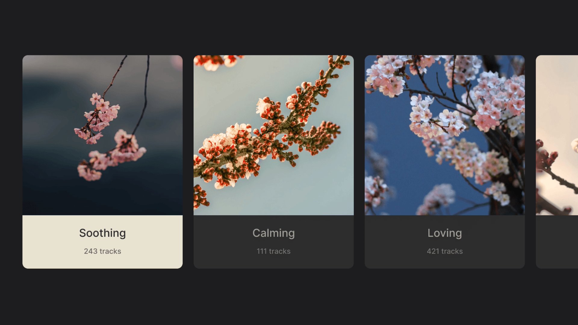
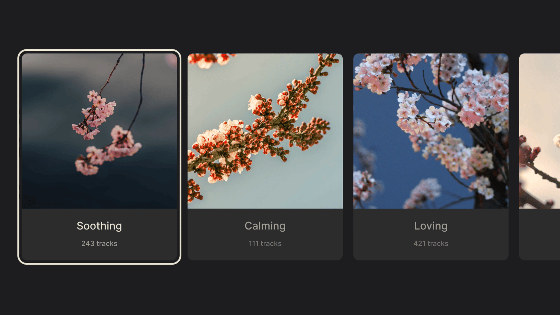
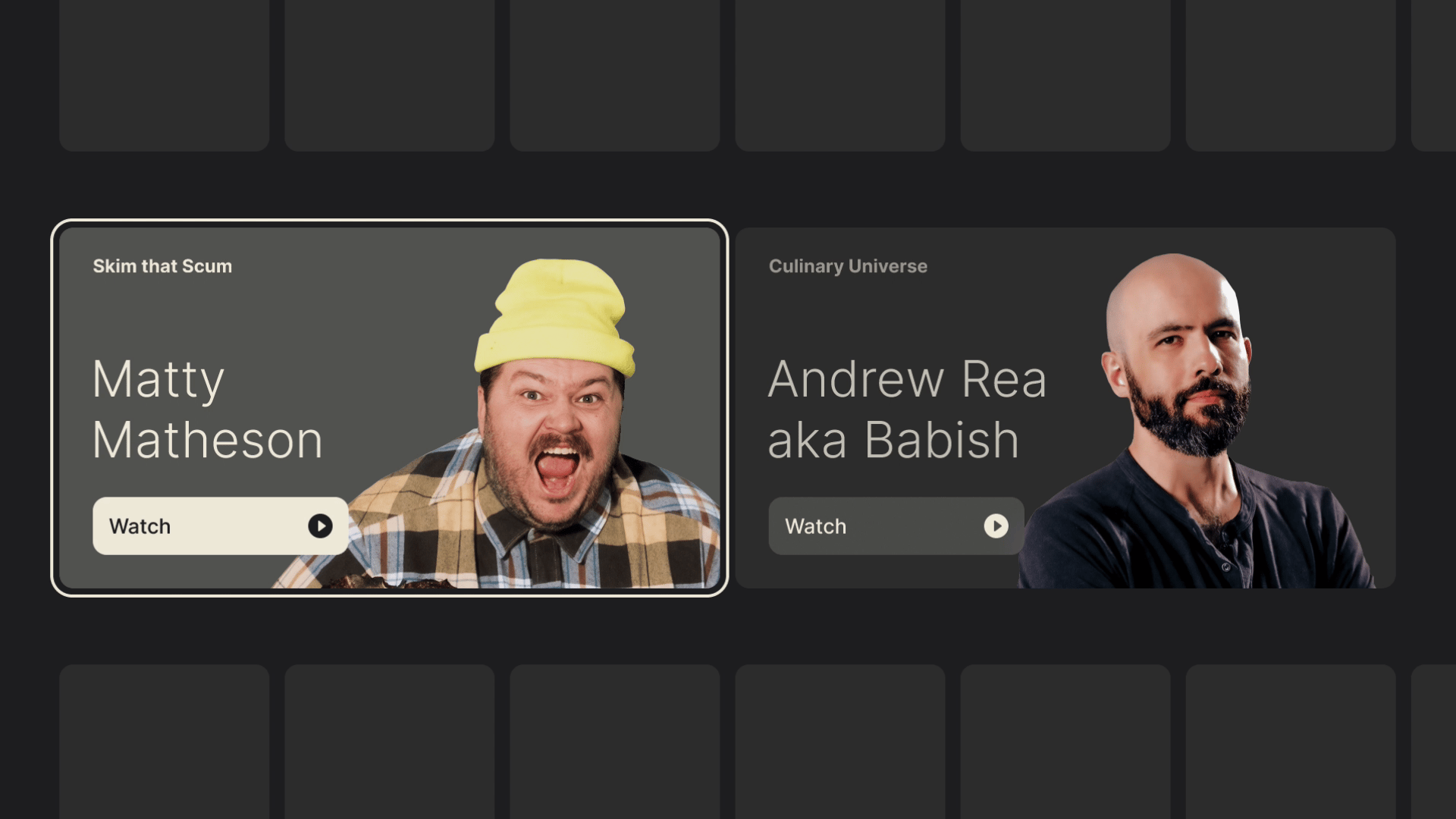
Focus Styles
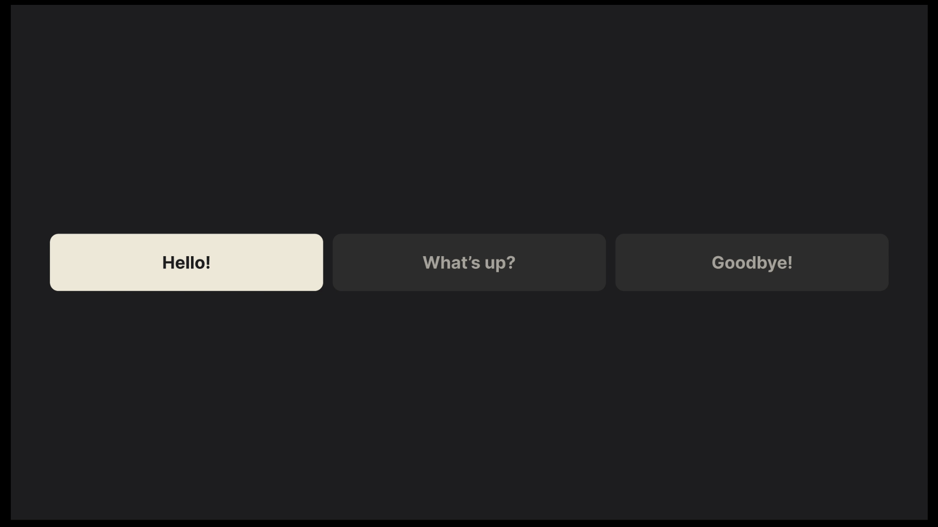
There are a few standard ways to style a focus state. Firstly, there’s scaling — enlarging the focused element, which creates the illusion of depth by moving it closer to the viewer.
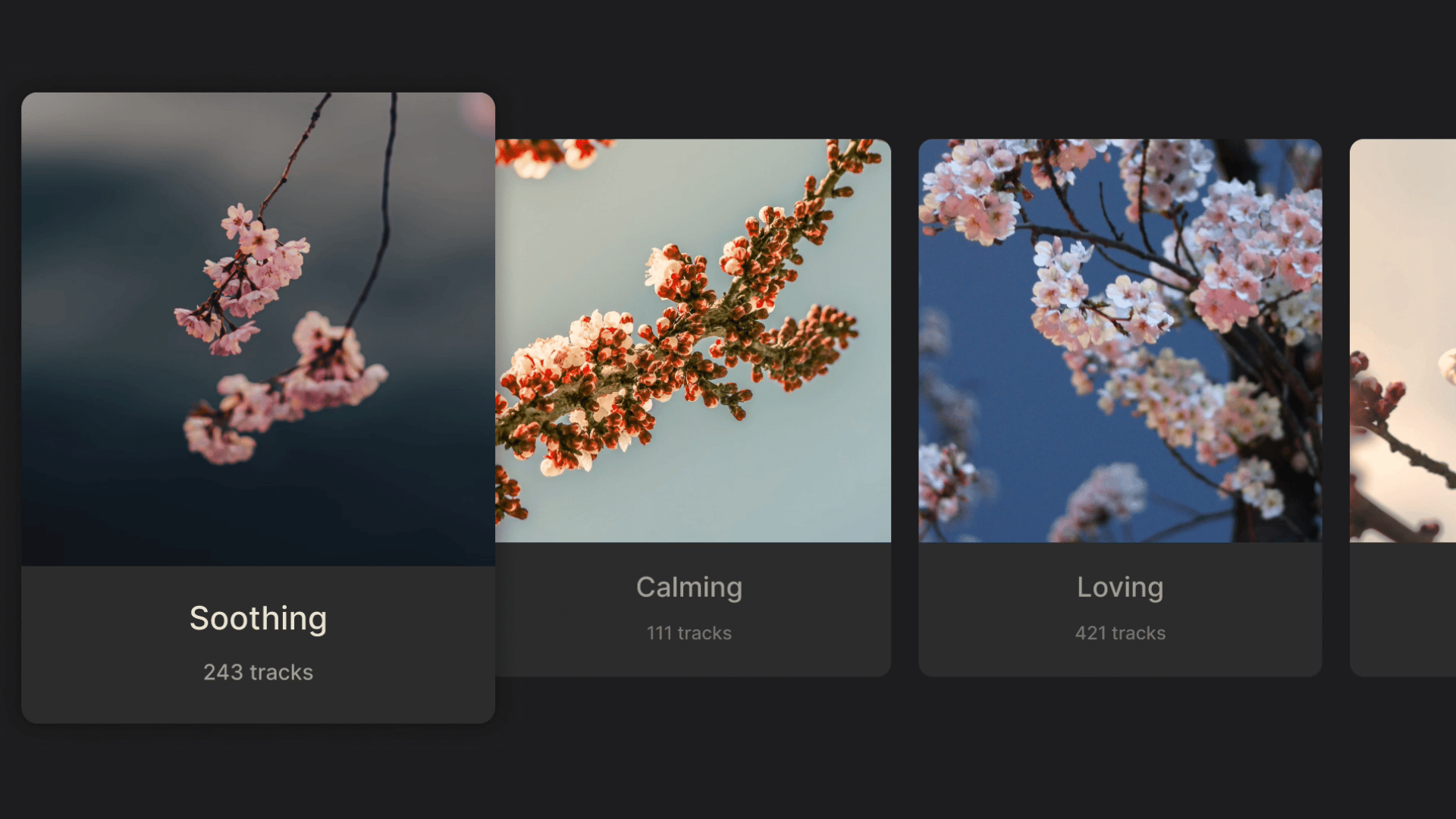
Another common approach is to invert background and text colors.
Finally, a border may be added around the highlighted element.
These styles, used independently or in various combinations, appear in all TV interfaces. While execution may be constrained by the specific system, the purpose remains the same: clear and intuitive feedback, even from across the room.
Having set the foundations of interaction, layout, and movement, we can start building on top of them. The next chapter will cover the most common elements of a TV interface, their variations, and a few tips and tricks for button-bound navigation.
Common TV UI Components
Nowadays, the core user journey on television revolves around browsing (or searching through) a content library, selecting an item, and opening a dedicated screen to watch or listen.
This translates into a few fundamental screens:
- Library (or Home) for content browsing,
- Search for specific queries, and
- A player screen focused on content playback.
These screens are built with a handful of components optimized for the 10-foot experience, and while they are often found on other platforms too, it’s worth examining how they differ on TV.
Menus
Appearing as a horizontal bar along the top edge of the screen, or as a vertical sidebar, the menu helps move between the different screens of an app. While its orientation mostly depends on the specific system, it does seem TV favors the side menu a bit more.
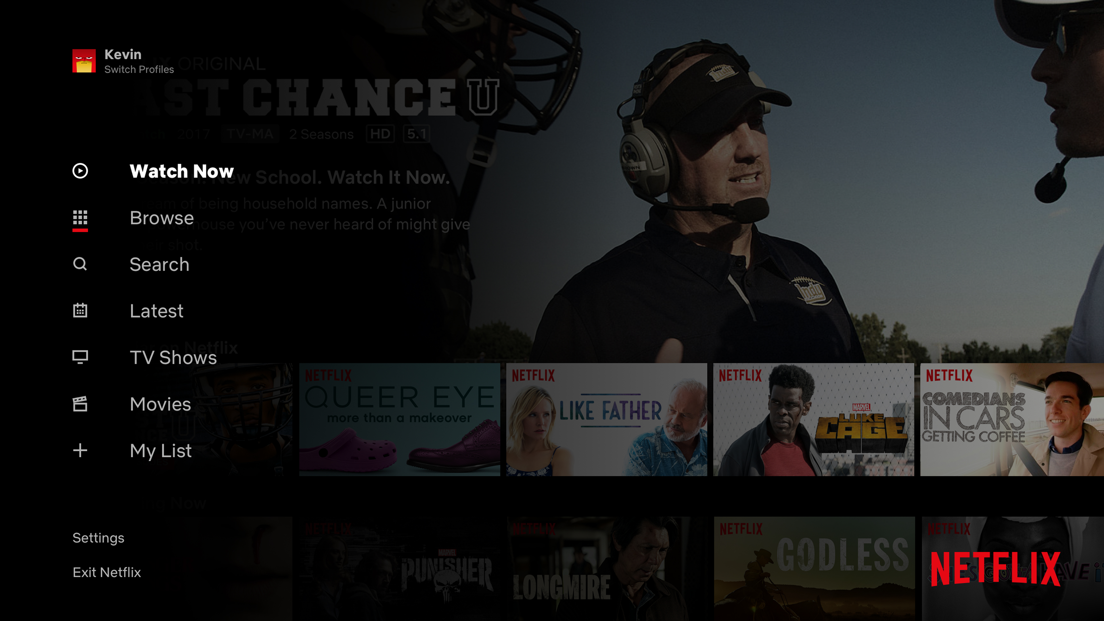
Both menu types share a common issue: the farther the user navigates away from the menu (vertically, toward the bottom for top-bars; and horizontally, toward the right for sidebars), the more button presses are required to get back to it. Fortunately, usually a Back button shortcut is added to allow for immediate menu focus, which greatly improves usability.
That said, the problem will arise a lot sooner for top menus, which, paired with the issue of having to hide or fade the element, makes a persistent sidebar a more common pick in TV user interfaces, and allows for a more consistent experience.
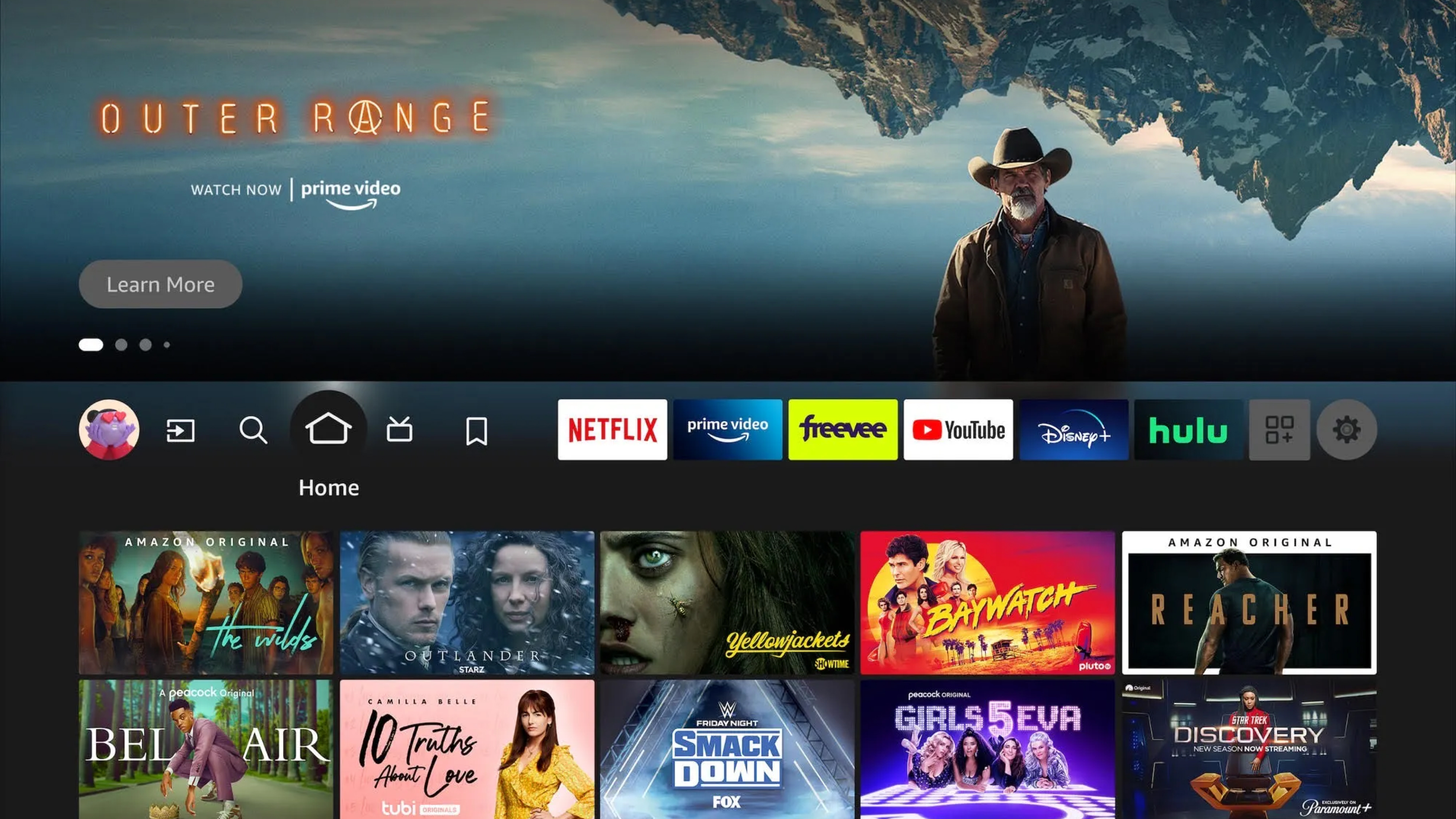
Shelves, Posters, And Cards
We’ve already mentioned shelves when covering layouts; now let’s shed some more light on this topic. The “shelves” (horizontally scrolling groups) form the basis of TV content browsing and are commonly populated with posters in three different aspect ratios: 2:3, 16:9, and 1:1.
2:3 posters are common in apps specializing in movies and shows. Their vertical orientation references traditional movie posters, harkening back to the cinematic experiences TVs are built for. Moreover, their narrow shape allows more items to be immediately visible in a row, and they rarely require any added text, with titles baked into the poster image.
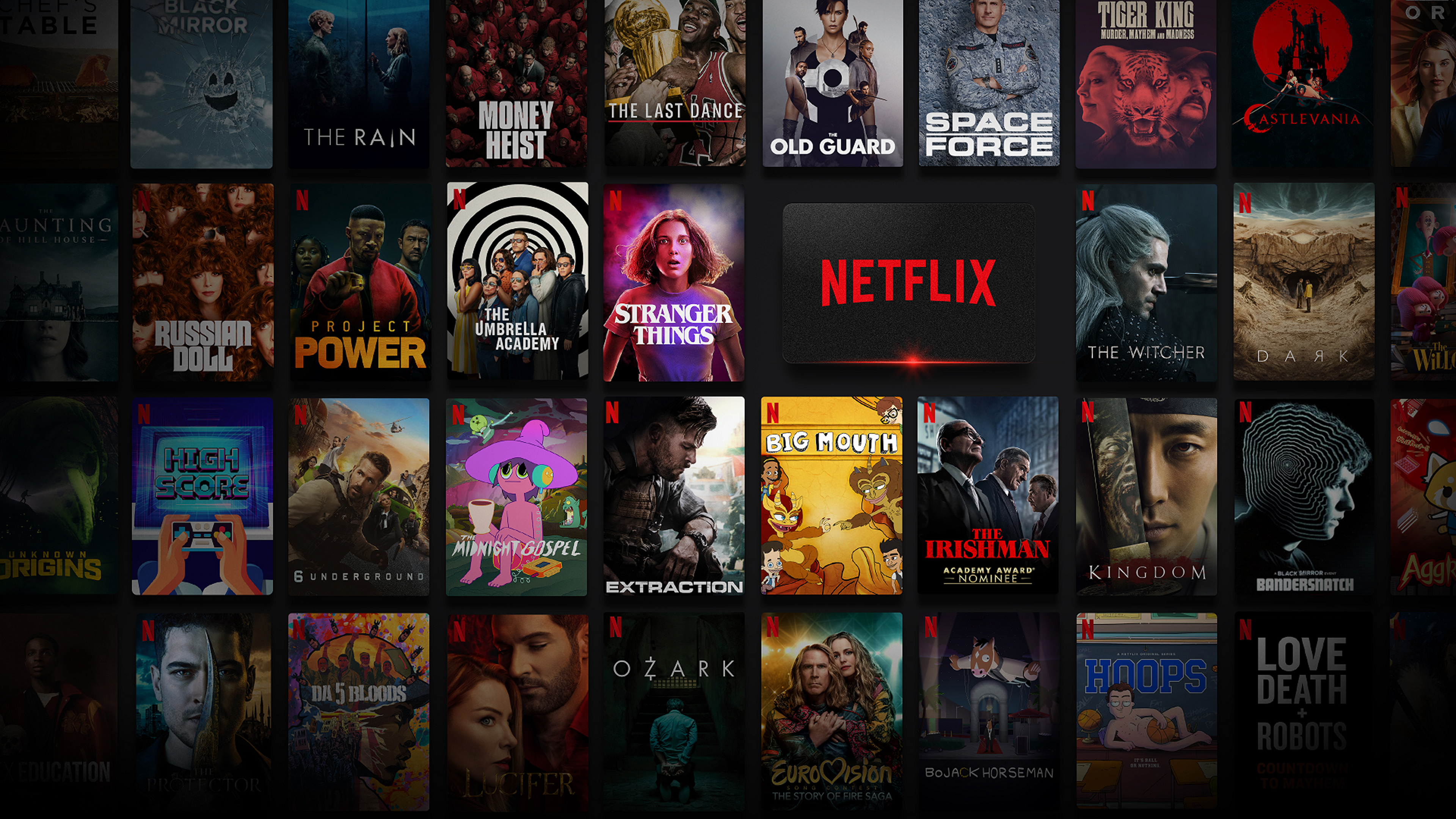
16:9 posters abide by the same principles but with a horizontal orientation. They are often paired with text labels, which effectively turn them into cards, commonly seen on platforms like YouTube. In the absence of dedicated poster art, they show stills or playback from the videos, matching the aspect ratio of the media itself.
1:1 posters are often found in music apps like Spotify, their shape reminiscent of album art and vinyl sleeves. These squares often get used in other instances, like representing channel links or profile tiles, giving more visual variety to the interface.
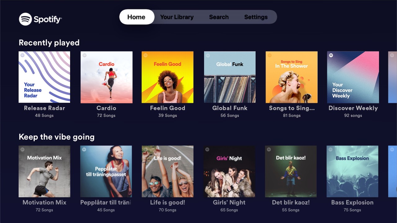
All of the above can co-exist within a single app, allowing for richer interfaces and breaking up otherwise uniform content libraries.
And speaking of breaking up content, let’s see what we can do with spotlights!
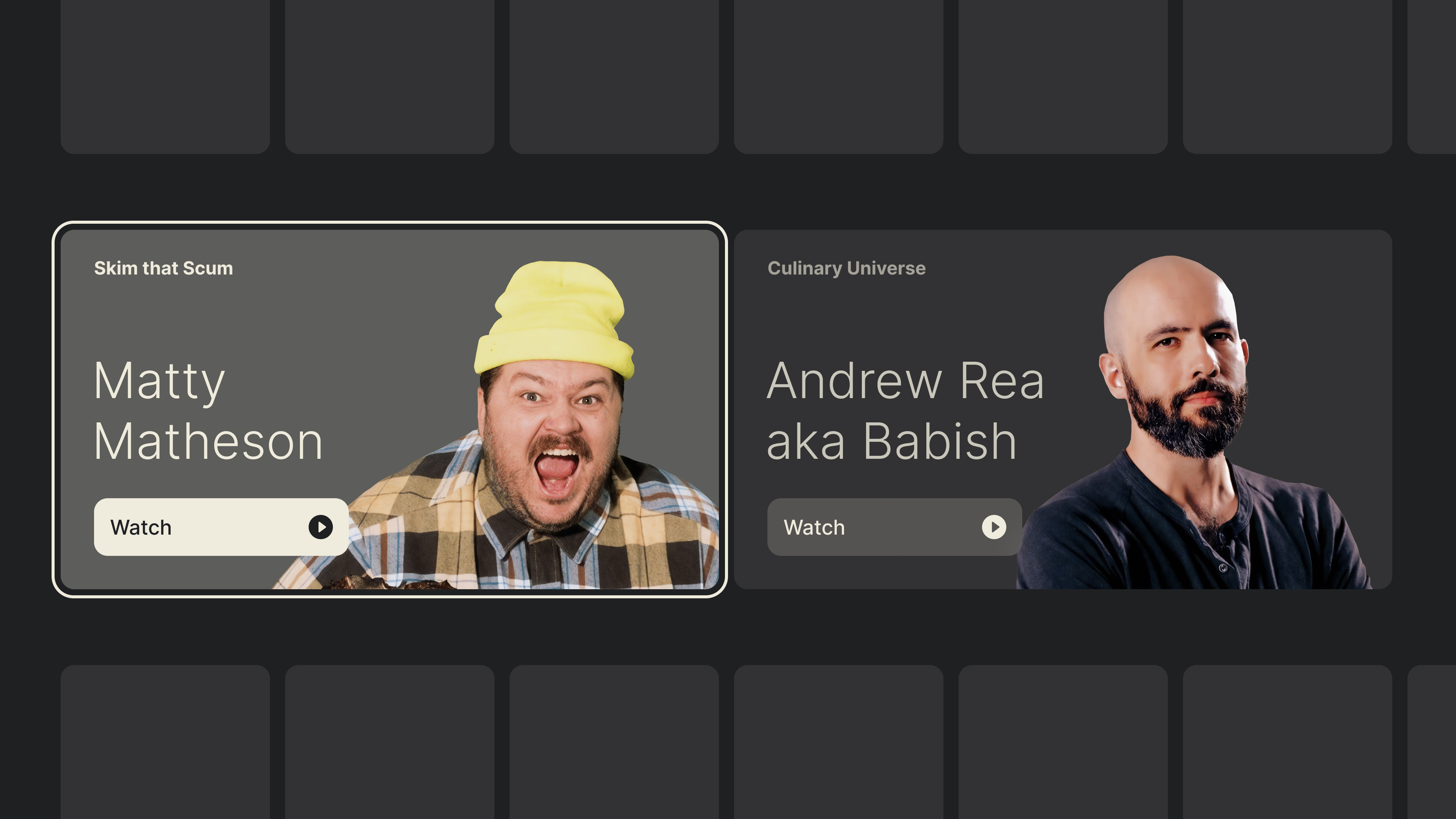
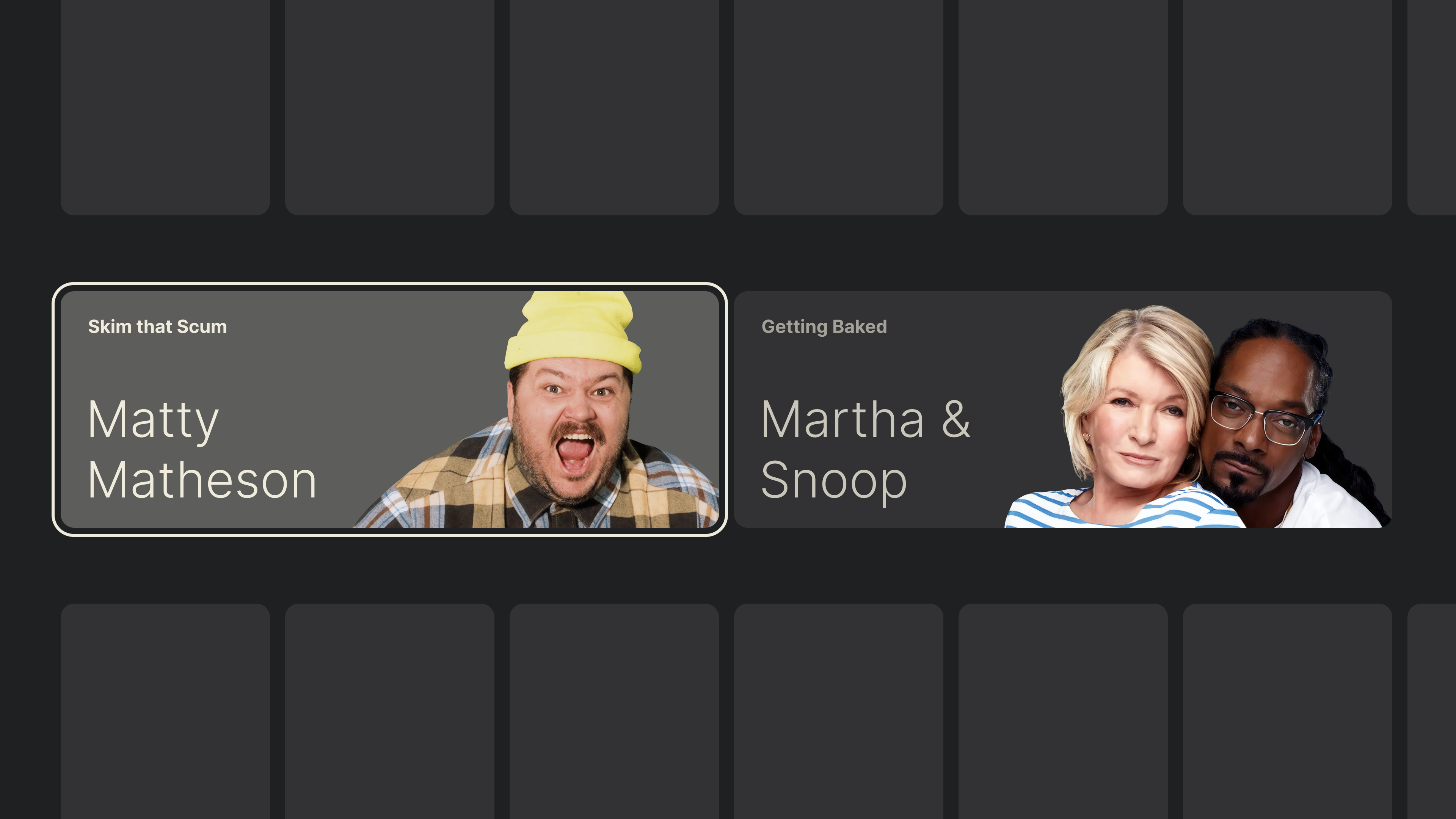
Spotlights
Typically taking up the entire width of the screen, these eye-catching components will highlight a new feature or a promoted piece of media. In a sea of uniform shelves, they can be placed strategically to introduce aesthetic diversity and disrupt the monotony.
A spotlight can be a focusable element by itself, or it could expose several actions thanks to its generous space. In my ventures into TV design, I relied on a few different spotlight sizes, which allowed me to place multiples into a single row, all with the purpose of highlighting different aspects of the app, without breaking the form to which viewers were used.
Posters, cards, and spotlights shape the bulk of the visual experience and content presentation, but viewers still need a way to find specific titles. Let’s see how search and input are handled on TV.
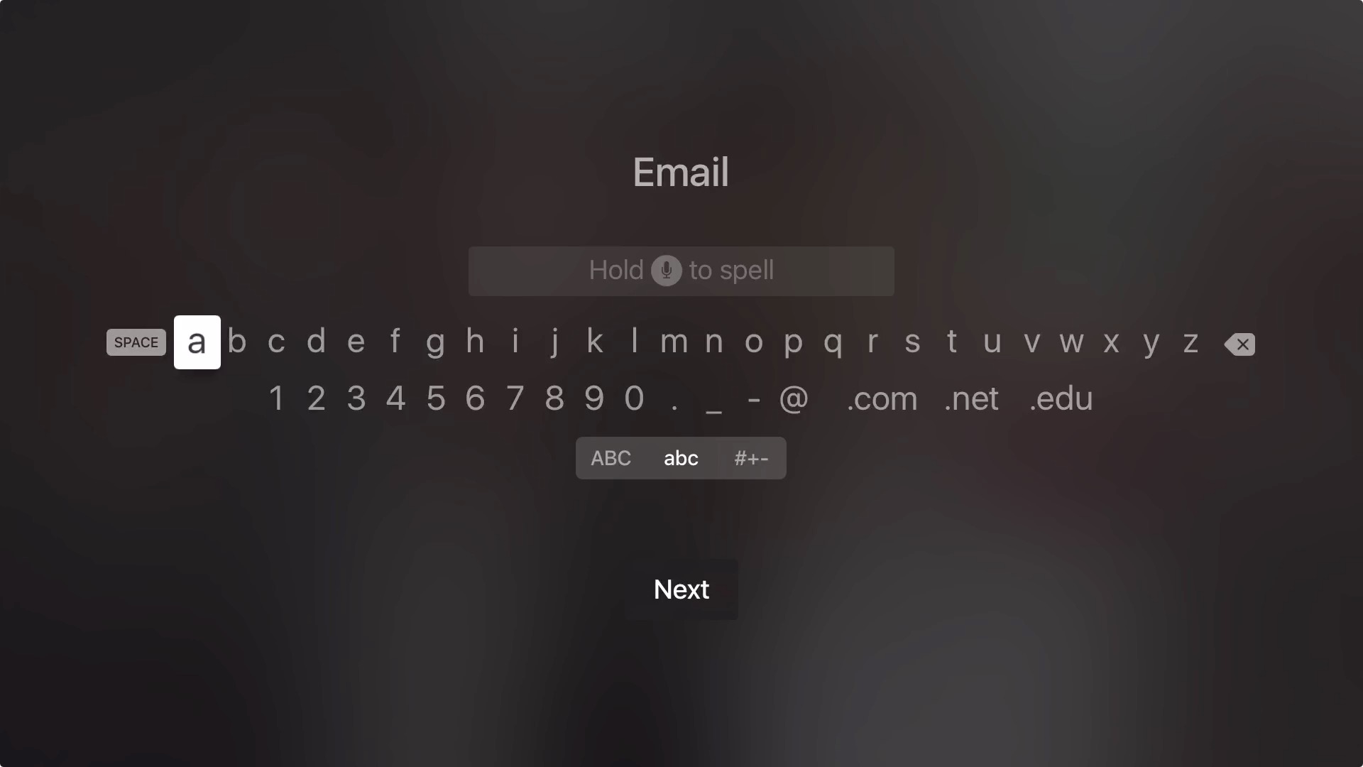
Search And Entering Text
Manually browsing through content libraries can yield results, but having the ability to search will speed things up — though not without some hiccups.
TVs allow for text input in the form of on-screen keyboards, similar to the ones found in modern smartphones. However, inputting text with a remote control is quite inefficient given the restrictiveness of its control scheme. For example, typing “hey there” on a mobile keyboard requires 9 keystrokes, but about 38 on a TV (!) due to the movement between characters and their selection.
Typing with a D-pad may be an arduous task, but at the same time, having the ability to search is unquestionably useful.
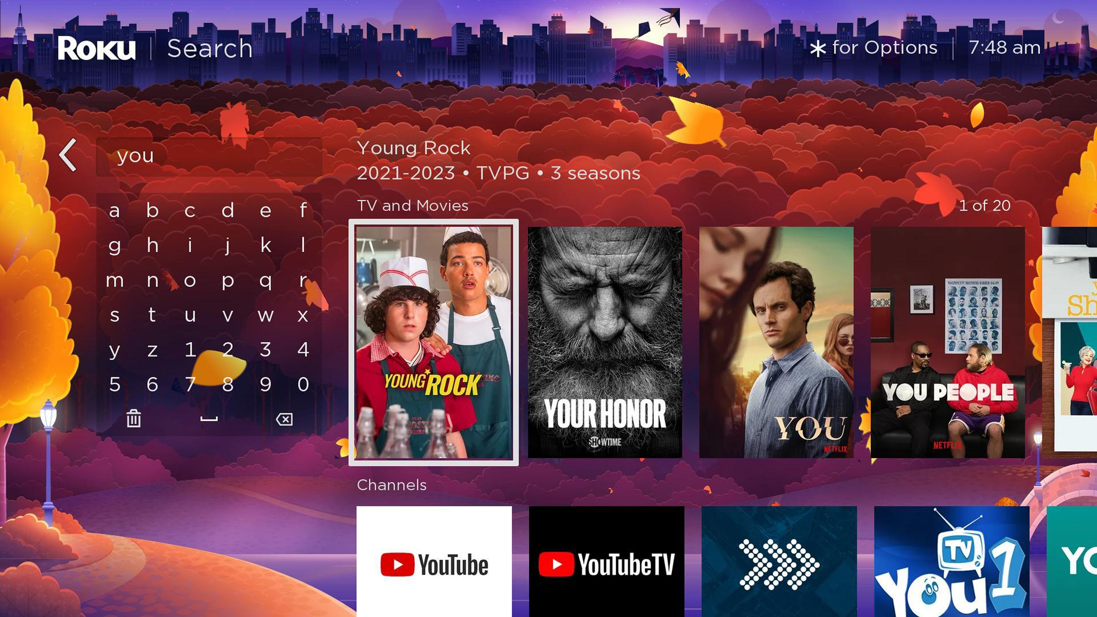
Luckily for us, keyboards are accounted for in all systems and usually come in two varieties. We’ve got the grid layouts used by most platforms and a horizontal layout in support of the touch-enabled and gesture-based controls on tvOS. Swiping between characters is significantly faster, but this is yet another pattern that can only be enhanced, not replaced.
“
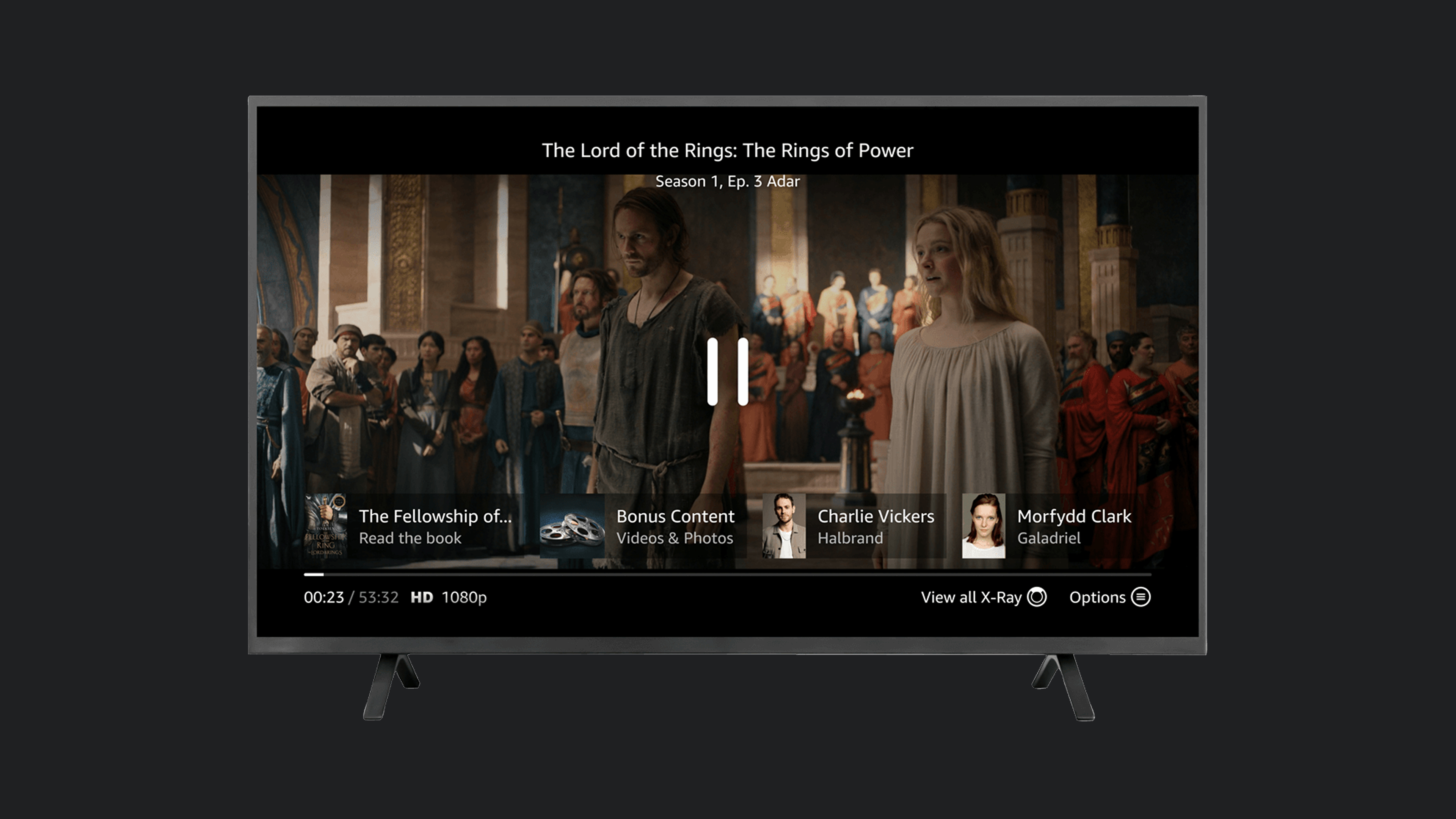
Players And Progress Bars
While all the different sections of a TV app serve a purpose, the Player takes center stage. It’s where all the roads eventually lead to, and where viewers will spend the most time. It’s also one of the rare instances where focus gets lost, allowing for the interface to get out of the way of enjoying a piece of content.
Arguably, players are the most complex features of TV apps, compacting all the different functionalities into a single screen. Take YouTube, for example, its player doesn’t just handle expected playback controls but also supports content browsing, searching, reading comments, reacting, and navigating to channels, all within a single screen.
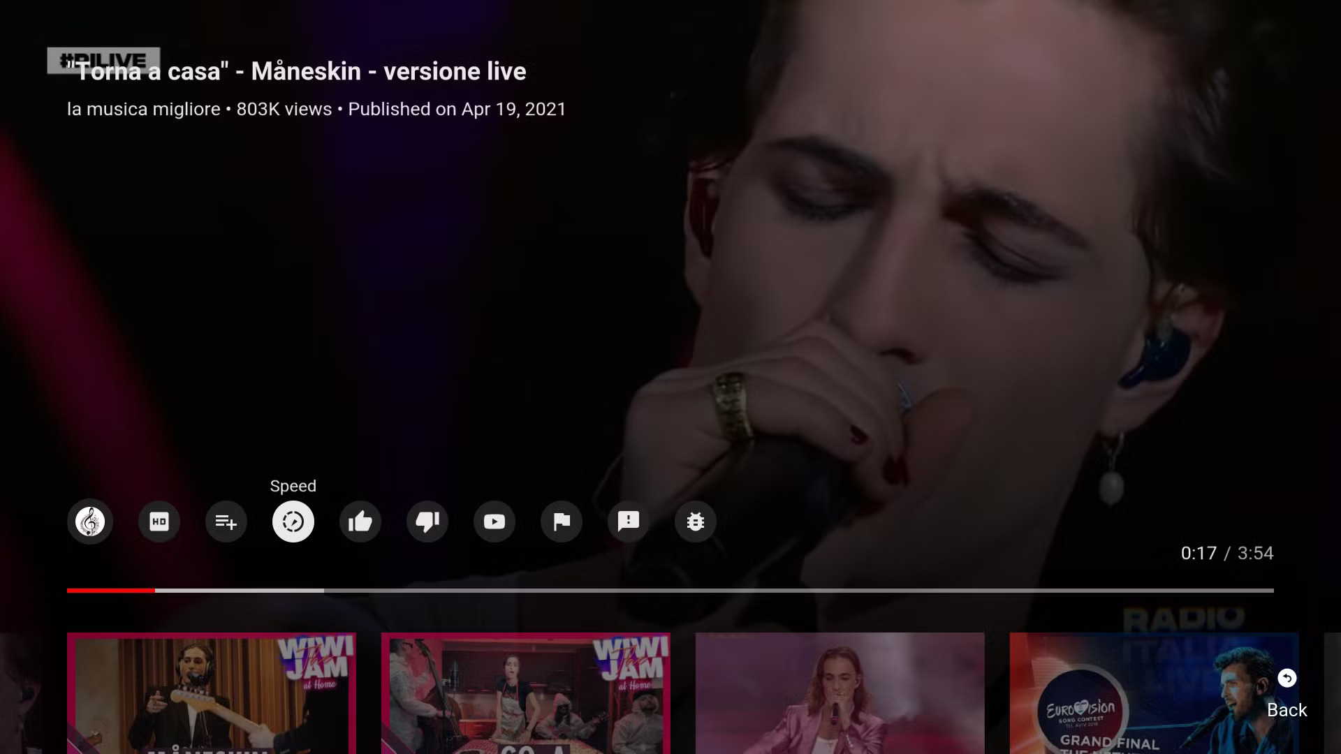
Compared to YouTube, Netflix offers a very lightweight experience guided by the nature of the app.
Still, every player has a basic set of controls, the foundation of which is the progress bar.

The progress bar UI element serves as a visual indicator for content duration. During interaction, focus doesn’t get placed on the bar itself, but on a movable knob known as the “scrubber.” It is by moving the scrubber left and right, or stopping it in its tracks, that we can control playback.
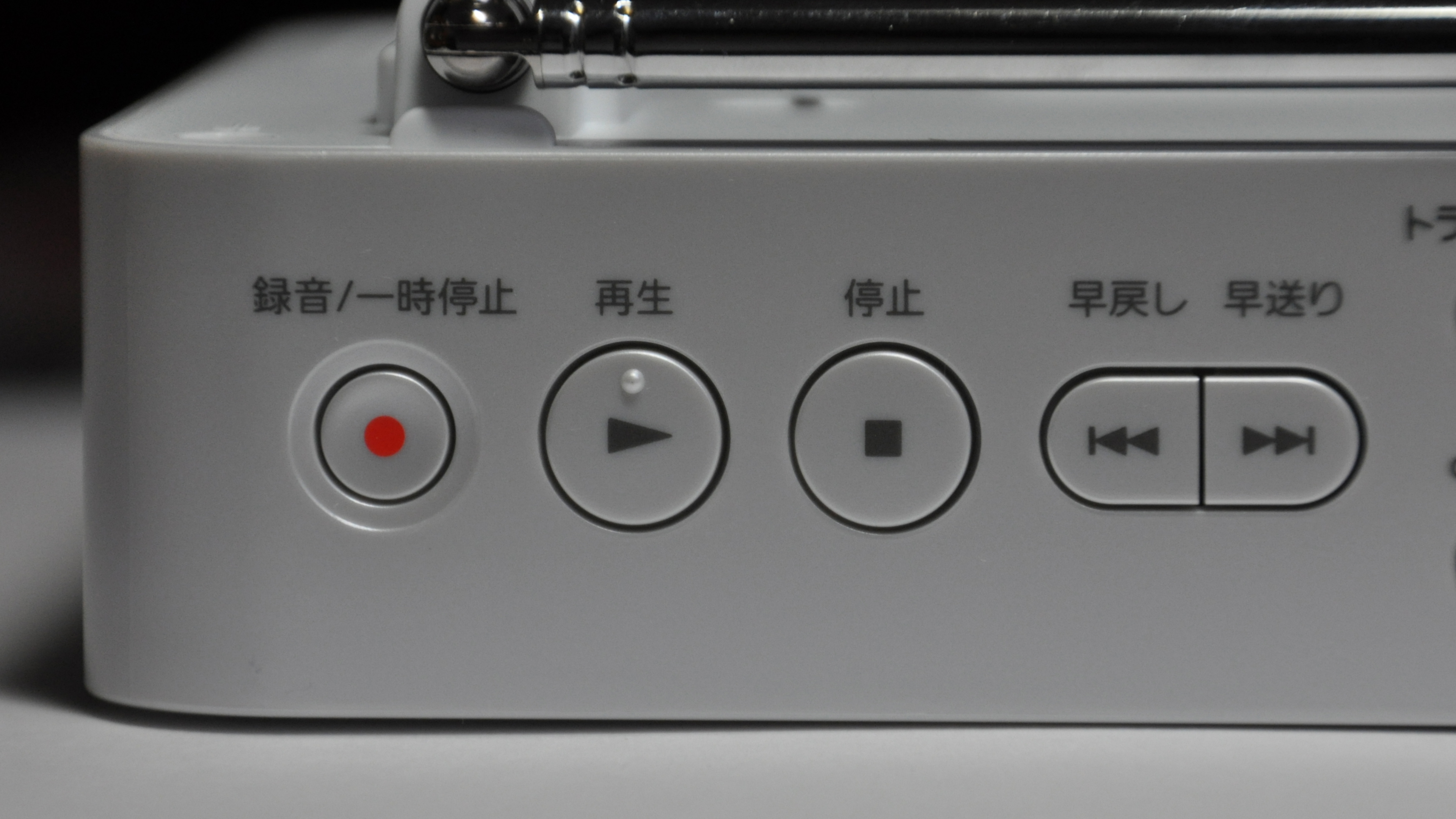
Another indirect method of invoking the progress bar is with the good old Play and Pause buttons. Rooted in the mechanical era of tape players, the universally understood triangle and two vertical bars are as integral to the TV legacy as the D-pad. No matter how minimalist and sleek the modern player interface may be, these symbols remain a staple of the viewing experience.
The presence of a scrubber may also indicate the type of content. Video on demand allows for the full set of playback controls, while live streams (unless DVR is involved) will do away with the scrubber since viewers won’t be able to rewind or fast-forward.
Earlier iterations of progress bars often came bundled with a set of playback control buttons, but as viewers got used to the tools available, these controls often got consolidated into the progress bar and scrubber themselves.
Bringing It All Together
With the building blocks out of the box, we’ve got everything necessary for a basic but functional TV app. Just as the six core buttons make remote navigation possible, the components and principles outlined above help guide purposeful TV design. The more context you bring, the more you’ll be able to expand and combine these basic principles, creating an experience unique to your needs.
Before we wrap things up, I’d like to share a few tips and tricks I discovered along the way — tips and tricks which I wish I had known from the start. Regardless of how simple or complex your idea may be, these may serve you as useful tools to help add depth, polish, and finesse to any TV experience.
Thinking Beyond The Basics
Like any platform, TV has a set of constraints that we abide by when designing. But sometimes these norms are applied without question, making the already limited capabilities feel even more restraining. Below are a handful of less obvious ideas that can help you design more thoughtfully and flexibly for the big screen.
Long Press
Most modern remotes support press-and-hold gestures as a subtle way to enhance the functionality, especially on remotes with fewer buttons available.
For example, holding directional buttons when browsing content speeds up scrolling, while holding Left/Right during playback speeds up timeline seeking. In many apps, a single press of the OK button opens a video, but holding it for longer opens a contextual menu with additional actions.
While not immediately apparent, press-and-hold is often used in many instances of TV experiences, essentially doubling the capabilities of a single button. Depending on context, you can map certain buttons to have an additional action and give more depth to the interface without making it convoluted.
And speaking of mapping, let’s see how we can utilize it to our benefit.
Remapping Keys And The Importance Of Context
While not as flexible as long-press, button functions can be contextually remapped. For example, Amazon’s Prime Video maps the Up button to open its X-Ray feature during playback. Typically, all directional buttons open video controls, so repurposing one for a custom feature cleverly adds interactivity with little tradeoff.
“
Another great example is YouTube’s scrubber interaction. Once the scrubber is moved, every other UI element fades. This cleans up the viewer’s working area, so to speak, narrowing the interface to a single task. In this state — and only in this state — pressing Up one more time moves away from scrubbing and into browsing by chapter.
This is such an elegant example of expanding restraint, and adding more only when necessary. I hope it inspires similar interactions in your TV app designs.
Efficient Movement On TV
At its best, every action on TV “costs” at least one click. There’s no such thing as aimless cursor movement — if you want to move, you must press a button. We’ve seen how cumbersome it can be inside a keyboard, but there’s also something we can learn about efficient movement in these restrained circumstances.
Going back to the Homescreen, we can note that vertical and horizontal movement serve two distinct roles. Vertical movement switches between groups, while horizontal movement switches items within these groups. No matter how far you’ve gone inside a group, a single vertical click will move you into another.
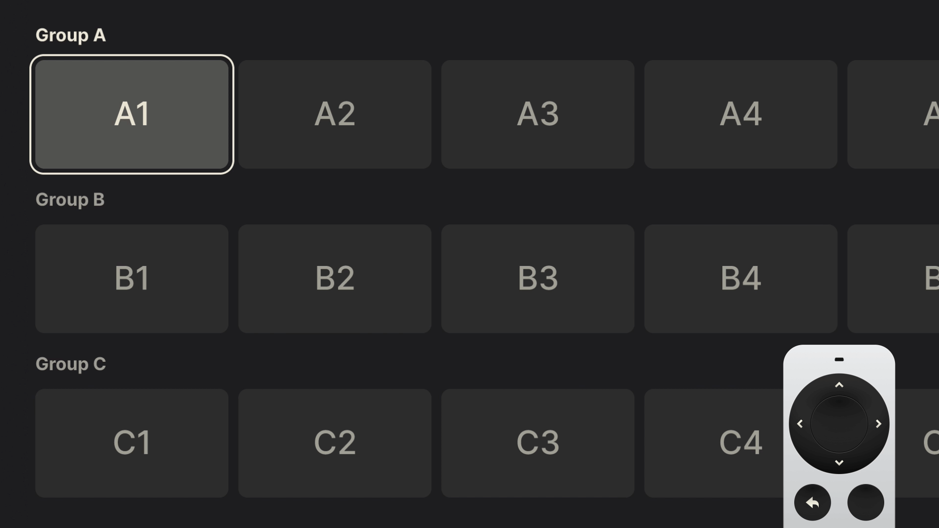
This subtle difference — two axes with separate roles — is the most efficient way of moving in a TV interface. Reversing the pattern: horizontal to switch groups, and vertical to drill down, will work like a charm as long as you keep the role of each axis well defined.
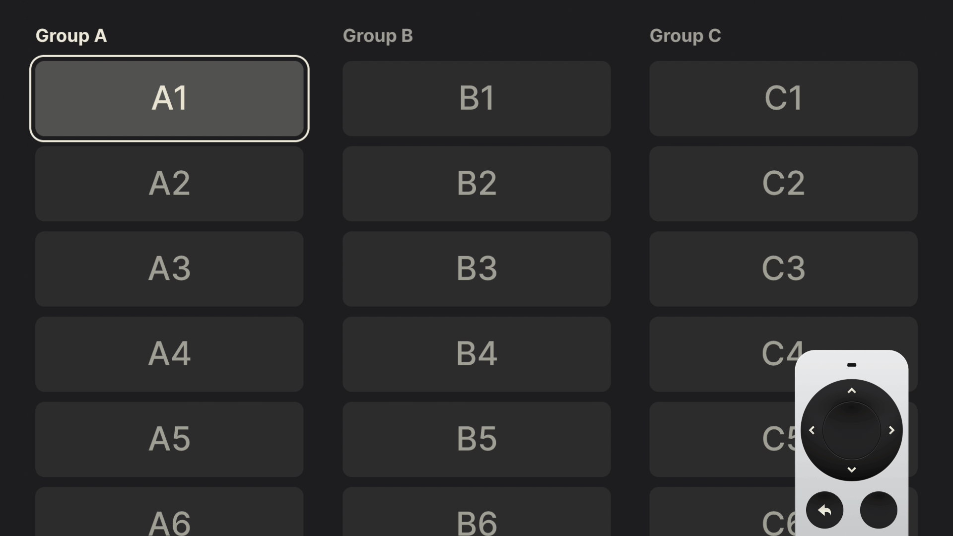
Quietly brilliant and easy to overlook, this pattern powers almost every step of the TV experience. Remember it, and use it well.
Thinking Beyond JPGs
After covering in detail many of the technicalities, let’s finish with some visual polish.
Most TV interfaces are driven by tightly packed rows of cover and poster art. While often beautifully designed, this type of content and layouts leave little room for visual flair. For years, the flat JPG, with its small file size, has been a go-to format, though contemporary alternatives like WebP are slowly taking its place.
Meanwhile, we can rely on the tried and tested PNG to give a bit more shine to our TV interfaces. The simple fact that it supports transparency can help the often-rigid UIs feel more sophisticated. Used strategically and paired with simple focus effects such as background color changes, PNGs can bring subtle moments of delight to the interface.
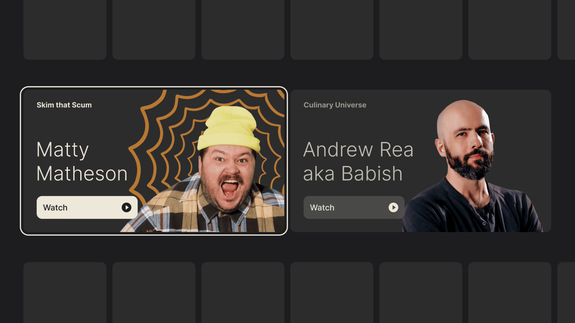
Moreover, if transformations like scaling and rotating are supported, you can really make those rectangular shapes come alive with layering multiple assets.
As you probably understand by now, these little touches of finesse don’t go out of bounds of possibility. They simply find more room to breathe within it. But with such limited capabilities, it’s best to learn all the different tricks that can help make your TV experiences stand out.
Closing Thoughts
Rooted in legacy, with a limited control scheme and a rather “shallow” interface, TV design reminds us to do the best with what we have at our disposal. The restraints I outlined are not meant to induce claustrophobia and make you feel limited in your design choices, but rather to serve you as guides. It is by accepting that fact that we can find freedom and new avenues to explore.
This two-part series of articles, just like my experience designing for TV, was not about reinventing the wheel with radical ideas. It was about understanding its nuances and contributing to what’s already there with my personal touch.
If you find yourself working in this design field, I hope my guide will serve as a warm welcome and will help you do your finest work. And if you have any questions, do leave a comment, and I will do my best to reply and help.
Good luck!
Further Reading
- “Design for TV,” by Android Developers
Great TV design is all about putting content front and center. It’s about creating an interface that’s easier to use and navigate, even from a distance. It’s about making it easier to find the content you love, and to enjoy it in the best possible quality. - “TV Guidelines: A quick kick-off on designing for Television Experiences,” by Andrea Pacheco
Just like designing a mobile app, designing a TV application can be a fun and complex thing to do, due to the numerous guidelines and best practices to follow. Below, I have listed the main best practices to keep in mind when designing an app for a 10-foot screen. - “Designing for Television – TV Ui design,” by Molly Lafferty
We’re no longer limited to a remote and cable box to control our TVs; we’re using Smart TVs, or streaming from set-top boxes like Roku and Apple TV, or using video game consoles like Xbox and PlayStation. And each of these devices allows a user interface that’s much more powerful than your old-fashioned on-screen guide. - “Rethinking User Interface Design for the TV Platform,” by Pascal Potvin
Designing for television has become part of the continuum of devices that require a rethink of how we approach user interfaces and user experiences. - “Typography for TV,” by Android Developers
As television screens are typically viewed from a distance, interfaces that use larger typography are more legible and comfortable for users. TV Design’s default type scale includes contrasting and flexible type styles to support a wide range of use cases. - “Typography,” by Apple Developer docs
Your typographic choices can help you display legible text, convey an information hierarchy, communicate important content, and express your brand or style. - “Color on TV,” by Android Developers
Color on TV design can inspire, set the mood, and even drive users to make decisions. It’s a powerful and tangible element that users notice first. As a rich way to connect with a wide audience, it’s no wonder color is an important step in crafting a high-quality TV interface. - “Designing for Television — TV UI Design,” by Molly Lafferty (Marvel Blog)
Today, we’re no longer limited to a remote and cable box to control our TVs; we’re using Smart TVs, or streaming from set-top boxes like Roku and Apple TV, or using video game consoles like Xbox and PlayStation. And each of these devices allows a user interface that’s much more powerful than your old-fashioned on-screen guide.
 (mb, yk)


.jpg)