Ambient Animations In Web Design: Practical Applications (Part 2)

Email Newsletter
Weekly tips on front-end & UX.
Trusted by 182,000+ folks.
 Try ProtoPie AI free →
 Celebrating 10 million developers


 SurveyJS: White-Label Survey Solution for Your JS App
First, a recap:
Ambient animations are the kind of passive movements you might not notice at first. However, they bring a design to life in subtle ways. Elements might subtly transition between colours, move slowly, or gradually shift position. Elements can appear and disappear, change size, or they could rotate slowly, adding depth to a brand’s personality.
In Part 1, I illustrated the concept of ambient animations by recreating the cover of a Quick Draw McGraw comic book as a CSS/SVG animation. But I know not everyone needs to animate cartoon characters, so in Part 2, I’ll share how ambient animation works in three very different projects: Reuven Herman, Mike Worth, and EPD. Each demonstrates how motion can enhance brand identity, personality, and storytelling without dominating a page.
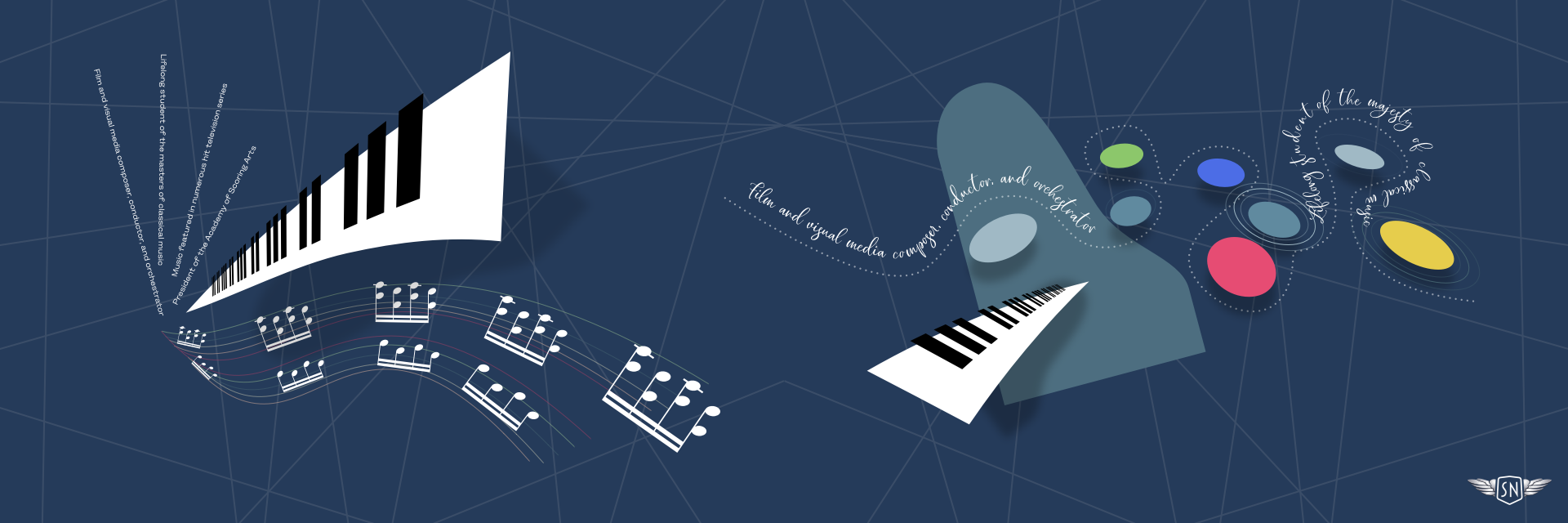
Reuven Herman
Los Angeles-based composer Reuven Herman didn’t just want a website to showcase his work. He wanted it to convey his personality and the experience clients have when working with him. Working with musicians is always creatively stimulating: they’re critical, engaged, and full of ideas.
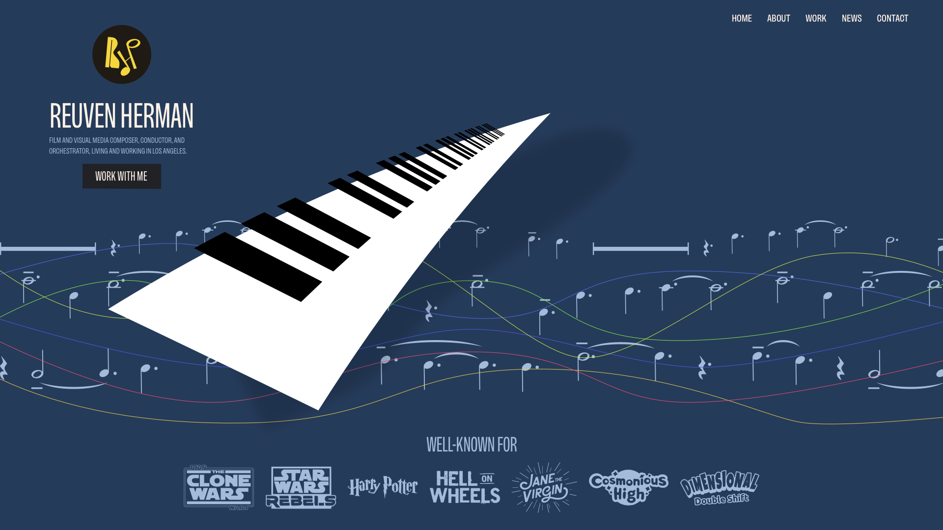
Reuven’s classical and jazz background reminded me of the work of album cover designer Alex Steinweiss.
I was inspired by the depth and texture that Alex brought to his designs for over 2,500 unique covers, and I wanted to incorporate his techniques into my illustrations for Reuven.
To bring Reuven’s illustrations to life, I followed a few core ambient animation principles:
- Keep animations slow and smooth.
- Loop seamlessly and avoid abrupt changes.
- Use layering to build complexity.
- Avoid distractions.
- Consider accessibility and performance.
You can view this ambient animation in my lab. For Reuven’s site:
- Sheet music stave lines morph between wavy and straight states.
- Notes drift at different speeds to create parallax-like depth.
- Piano keys appear to float.
My first step is always to optimise my SVGs for animation by exporting and optimising one set of elements at a time — always in the order they’ll appear in the final file and building the master SVG gradually. Working forwards from the background, I exported the sheet music stave lines, first in their wavy state.
…followed by their straight state:
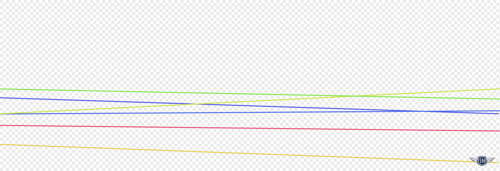
The first step in my animation is to morph the stave lines between states. They’re made up of six paths with multi-coloured strokes. I started with the wavy lines:
<!-- Wavy state -->
<g fill="none" stroke-width="2" stroke-linecap="round">
<path id="p1" stroke="#D2AB99" d="[…]"/>
<path id="p2" stroke="#BDBEA9" d="[…]"/>
<path id="p3" stroke="#E0C852" d="[…]"/>
<path id="p4" stroke="#8DB38B" d="[…]"/>
<path id="p5" stroke="#43616F" d="[…]"/>
<path id="p6" stroke="#A13D63" d="[…]"/>
</g>
Although CSS now enables animation between path points, the number of points in each state needs to match. GSAP doesn’t have that limitation and can animate between states that have different numbers of points, making it ideal for this type of animation. I defined the new set of straight paths:
<!-- Straight state -->
const Waves = {
  p1: "[…]",
  p2: "[…]",
  p3: "[…]",
  p4: "[…]",
  p5: "[…]",
  p6: "[…]"
};
Then, I created a GSAP timeline that repeats backwards and forwards over six seconds:
const waveTimeline = gsap.timeline({
  repeat: -1,
  yoyo: true,
  defaults: { duration: 6, ease: "sine.inOut" }
});

Object.entries(Waves).forEach(([id, d]) => {
  waveTimeline.to(`#${id}`, { morphSVG: d }, 0);
});
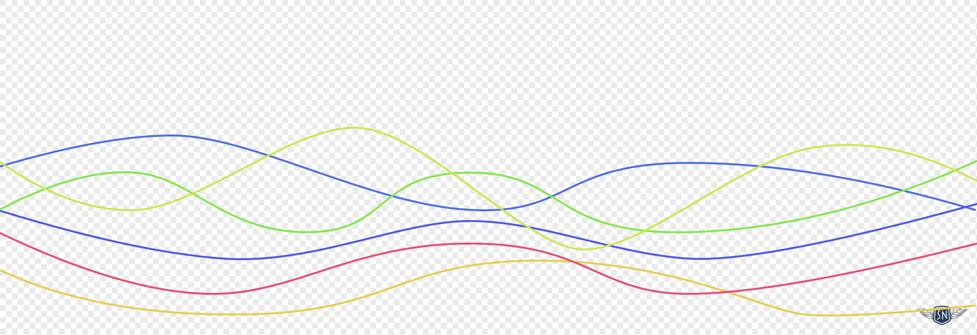
Another ambient animation principle is to use layering to build complexity. Think of it like building a sound mix. You want variation in rhythm, tone, and timing. In my animation, three rows of musical notes move at different speeds:
<path id="notes-row-1"/>
<path id="notes-row-2"/>
<path id="notes-row-3"/>
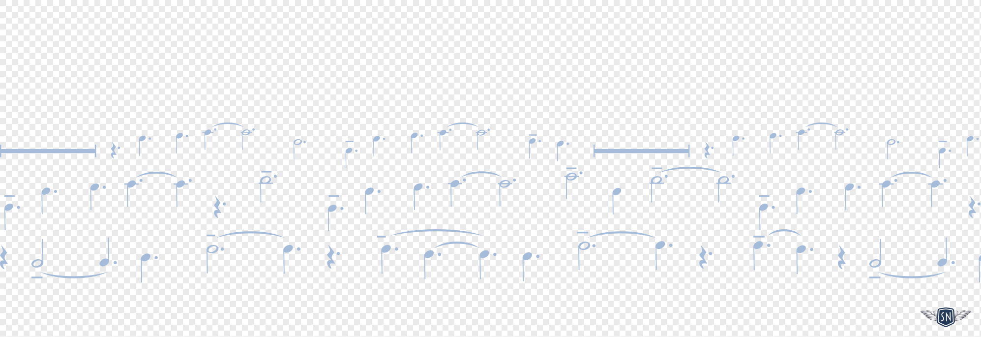
The duration of each row’s animation is also defined using GSAP, from 100 to 400 seconds to give the overall animation a parallax-style effect:
const noteRows = [
  { id: "#notes-row-1", duration: 300, y: 100 }, // slowest
  { id: "#notes-row-2", duration: 200, y: 250 }, // medium
  { id: "#notes-row-3", duration: 100, y: 400 }  // fastest
];

[…]
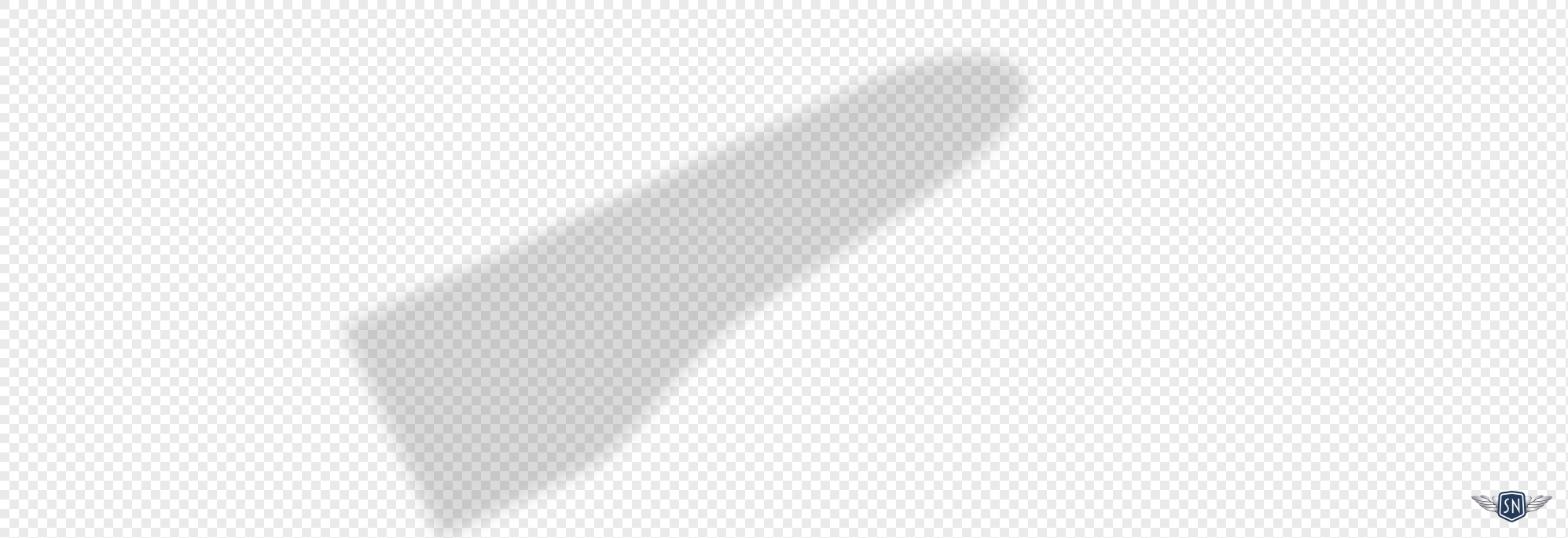
The next layer contains a shadow cast by the piano keys, which slowly rotates around its centre:
gsap.to("shadow", {
  y: -10,
  rotation: -2,
  transformOrigin: "50% 50%",
  duration: 3,
  ease: "sine.inOut",
  yoyo: true,
  repeat: -1
});
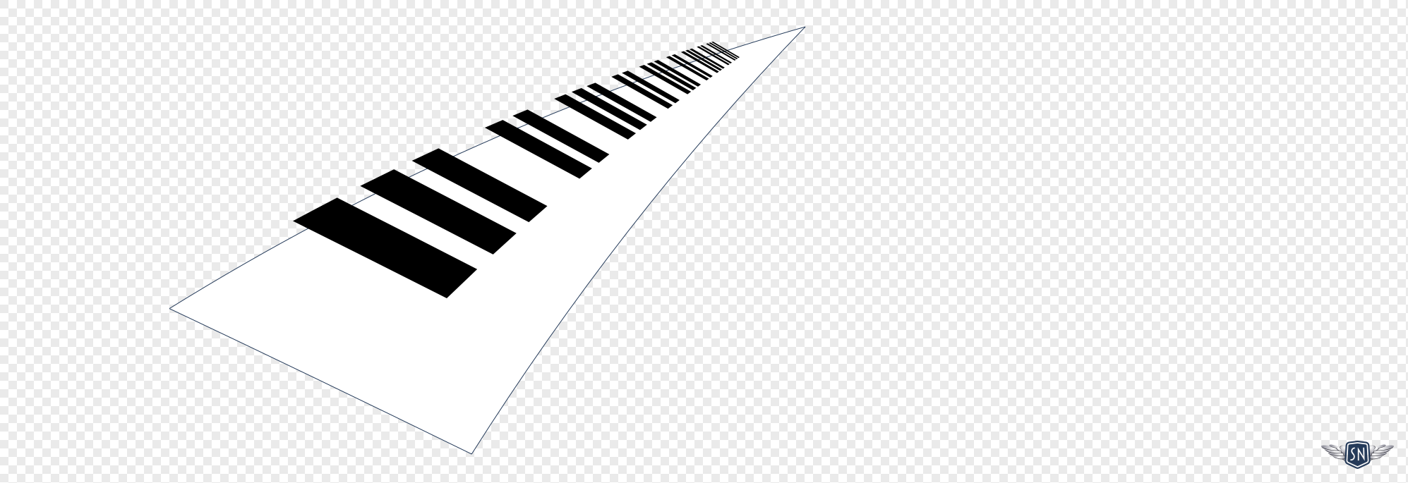
And finally, the piano keys themselves, which rotate at the same time but in the opposite direction to the shadow:
gsap.to("#g3-keys", {
  y: 10,
  rotation: 2,
  transformOrigin: "50% 50%",
  duration: 3,
  ease: "sine.inOut",
  yoyo: true,
  repeat: -1
});
The complete animation can be viewed in my lab. By layering motion thoughtfully, the site feels alive without ever dominating the content, which is a perfect match for Reuven’s energy.
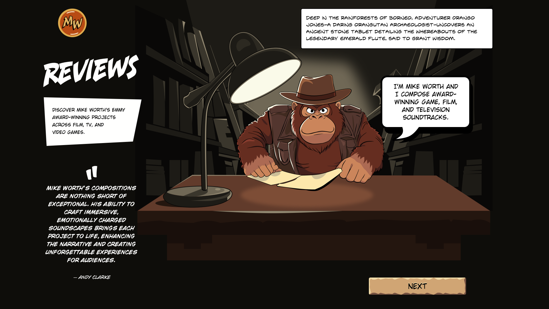
Mike Worth
As I mentioned earlier, not everyone needs to animate cartoon characters, but I do occasionally. Mike Worth is an Emmy award-winning film, video game, and TV composer who asked me to design his website. For the project, I created and illustrated the character of orangutan adventurer Orango Jones.
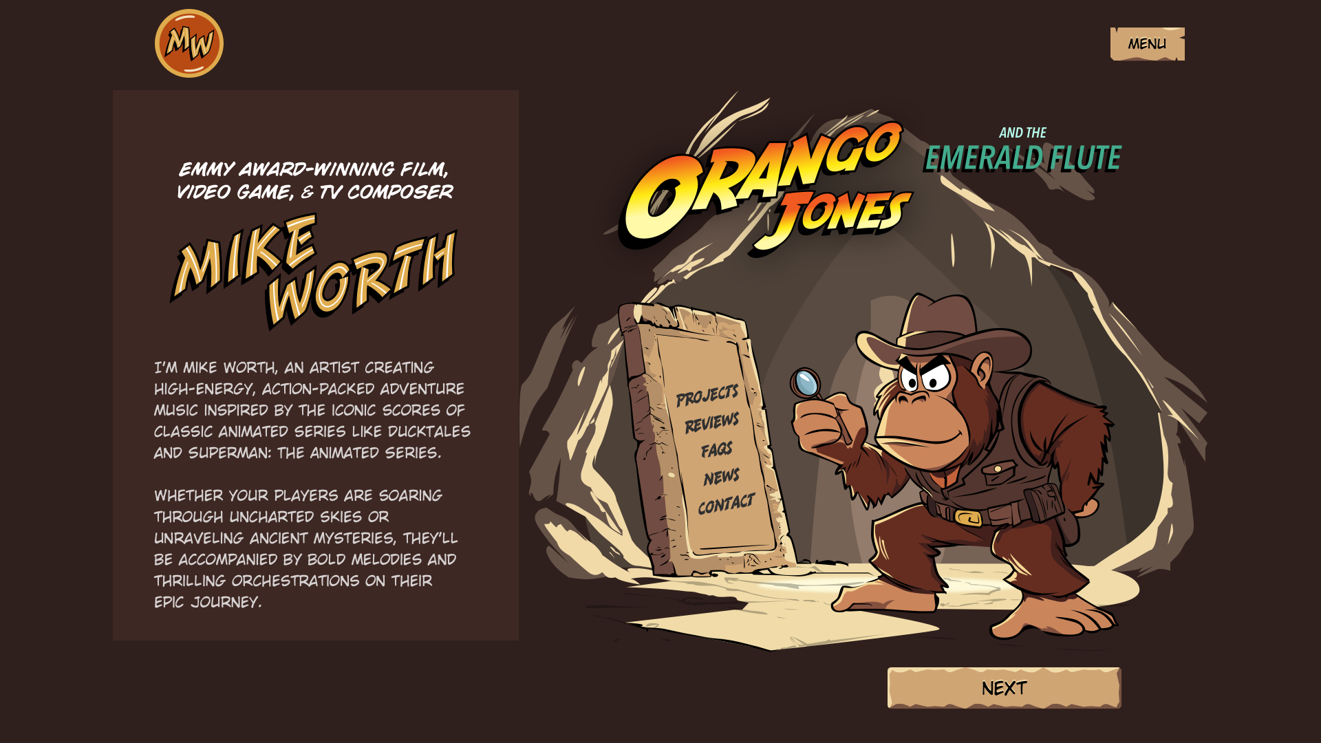
Orango proved to be the perfect subject for ambient animations and features on every page of Mike’s website. He takes the reader on an adventure, and along the way, they get to experience Mike’s music.
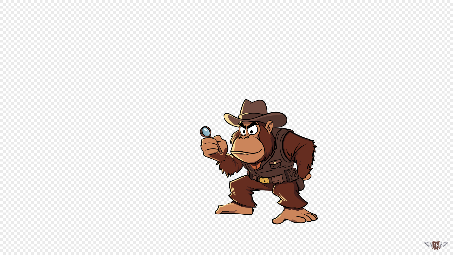
For Mike’s “About” page, I wanted to combine ambient animations with interactions. Orango is in a cave where he has found a stone tablet with faint markings that serve as a navigation aid to elsewhere on Mike’s website. The illustration contains a hidden feature, an easter egg, as when someone presses Orango’s magnifying glass, moving shafts of light stream into the cave and onto the tablet.
My SVG is deliberately structured, and from back to front, it includes the cave, light shaft, Orango, and navigation:
<svg data-lights="lights-off">
  <g id="cave">[…]</g>
  <path id="light-shaft" d="[…]"></path>
  <g id="orango">[…]</g>
  <g id="nav">[…]</g>
</svg>
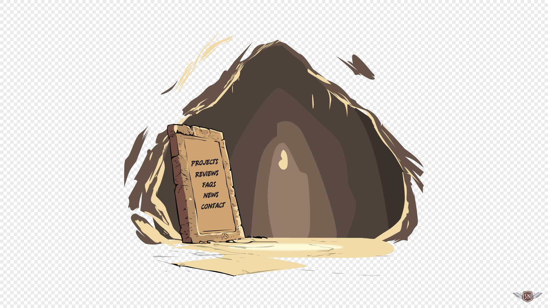
I also added an anchor around a hidden circle, which I positioned over Orango’s magnifying glass, as a large tap target to toggle the light shafts on and off by changing the data-lights value on the SVG:
<a href="javascript:void(0);" id="light-switch" title="Lights on/off">
  <circle cx="700" cy="1000" r="100" opacity="0" />
</a>
Then, I added two descendant selectors to my CSS, which adjust the opacity of the light shafts depending on the data-lights value:
[data-lights="lights-off"] .light-shaft {
  opacity: .05;
  transition: opacity .25s linear;
}

[data-lights="lights-on"] .light-shaft {
  opacity: .25;
  transition: opacity .25s linear;
}
A slow and subtle rotation adds natural movement to the light shafts:
@keyframes shaft-rotate {
  0% { rotate: 2deg; }
  50% { rotate: -2deg; }
  100% { rotate: 2deg; }
}
Which is only visible when the light toggle is active:
[data-lights="lights-on"] .light-shaft {
  animation: shaft-rotate 20s infinite;
  transform-origin: 100% 0;
}

When developing any ambient animation, considering performance is crucial, as even though CSS animations are lightweight, features like blur filters and drop shadows can still strain lower-powered devices. It’s also critical to consider accessibility, so respect someone’s prefers-reduced-motion preferences:
@media screen and (prefers-reduced-motion: reduce) {
  html {
    scroll-behavior: auto;
    animation-duration: 1ms !important;
    animation-iteration-count: 1 !important;
    transition-duration: 1ms !important;
  }
}
When an animation feature is purely decorative, consider adding aria-hidden="true" to keep it from cluttering up the accessibility tree:
<a href="javascript:void(0);" id="light-switch" aria-hidden="true">
  […]
</a>
With Mike’s Orango Jones, ambient animation shifts from subtle atmosphere to playful storytelling. Light shafts and soft interactions weave narrative into the design without stealing focus, proving that animation can support both brand identity and user experience. See this animation in my lab.
EPD
Moving away from composers, EPD is a property investment company. They commissioned me to design creative concepts for a new website. A quick search for property investment companies will usually leave you feeling underwhelmed by their interchangeable website designs. They include full-width banners with faded stock photos of generic city skylines or ethnically diverse people shaking hands.
For EPD, I wanted to develop a distinctive visual style that the company could own, so I proposed graphic, stylised skylines that reflect both EPD’s brand and its global portfolio. I made them using various-sized circles that recall the company’s logo mark.
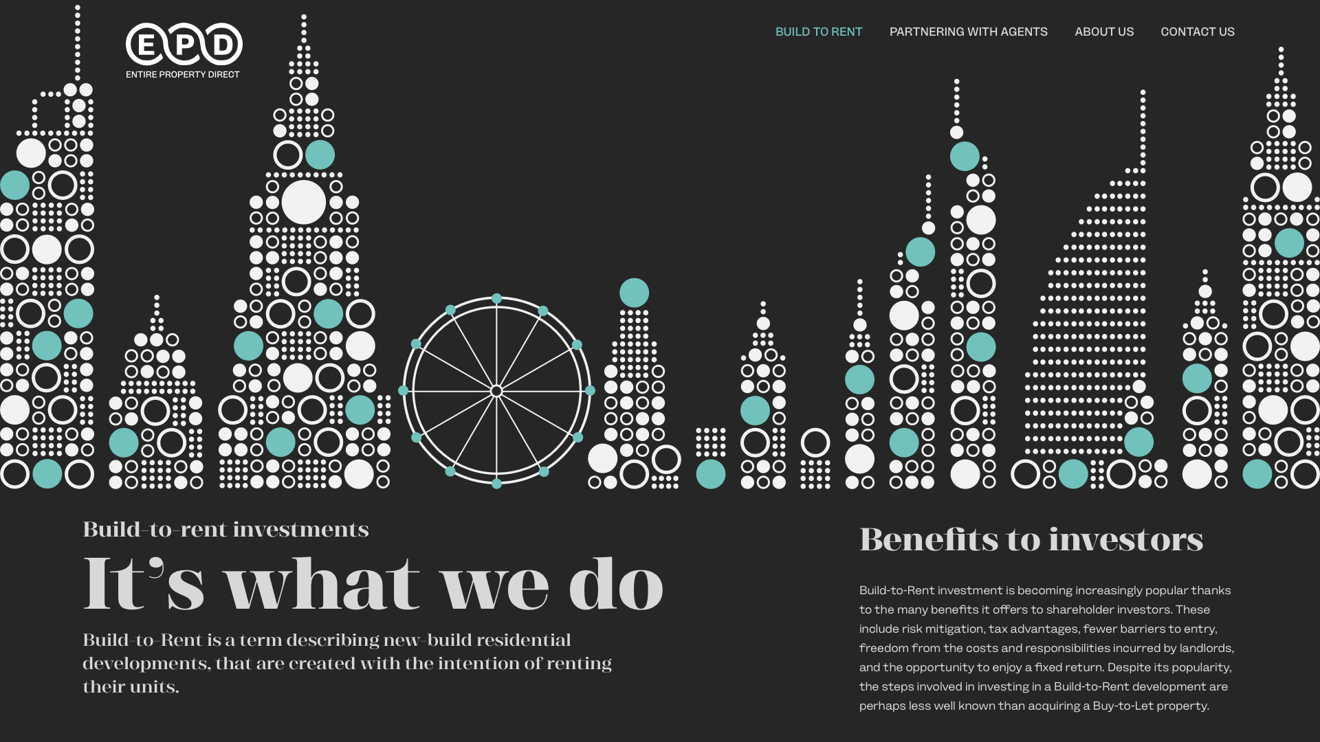
The point of an ambient animation is that it doesn’t dominate. It’s a background element and not a call to action. If someone’s eyes are drawn to it, it’s probably too much, so I dial back the animation until it feels like something you’d only catch if you’re really looking. I created three skyline designs, including Dubai, London, and Manchester.
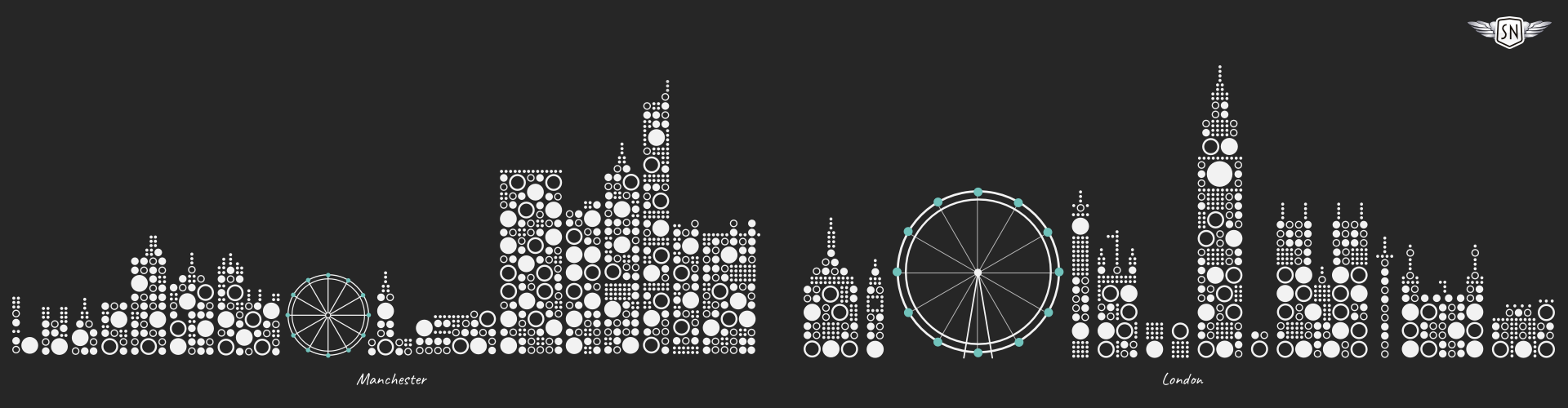
In each of these ambient animations, the wheels rotate and the large circles change colour at random intervals.
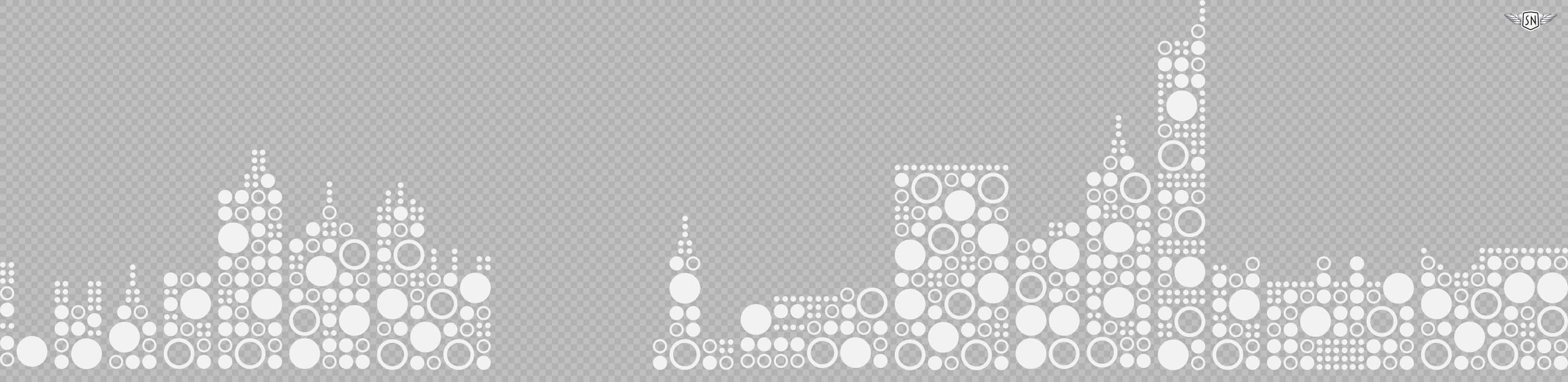
To begin optimising this illustration for animation, I exported the base paths containing every element except the wheel:
<g id="banner-base>
  <path d="[…]"/>
  <path d="[…]"/>
  <path d="[…]"/>
  […]
</g>
Next, I exported a layer containing the circle elements I want to change colour.
<g id="banner-dots">
  <circle class="data-theme-fill" […]/>
  <circle class="data-theme-fill" […]/>
  <circle class="data-theme-fill" […]/>
  […]
</g>
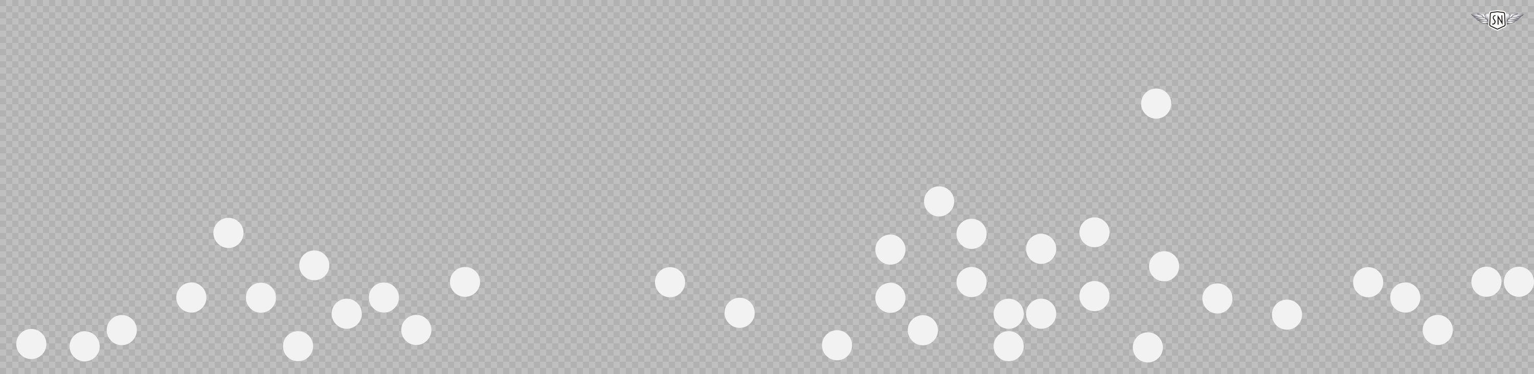
Once again, I used GSAP to select groups of circles that flicker like lights across the skyline:
function animateRandomDots() {
  const circles = gsap.utils.toArray("#banner-dots circle")
  const numberToAnimate = gsap.utils.random(3, 6, 1)
  const selected = gsap.utils.shuffle(circles).slice(0, numberToAnimate)
}
Then, at two-second intervals, the fill colour of those circles changes from the teal accent to the same off-white colour as the rest of my illustration:
gsap.to(selected, {
  fill: "color(display-p3 .439 .761 .733)",
  duration: 0.3,
  stagger: 0.05,
  onComplete: () => {
    gsap.to(selected, {
      fill: "color(display-p3 .949 .949 .949)",
      duration: 0.5,
      delay: 2
    })
  }
})

gsap.delayedCall(gsap.utils.random(1, 3), animateRandomDots) }
animateRandomDots()
The result is a skyline that gently flickers, as if the city itself is alive. Finally, I rotated the wheel. Here, there was no need to use GSAP as this is possible using CSS rotate alone:
<g id="banner-wheel">
  <path stroke="#F2F2F2" stroke-linecap="round" stroke-width="4" d="[…]"/>
  <path fill="#D8F76E" d="[…]"/>
</g>

#banner-wheel {
  transform-box: fill-box;
  transform-origin: 50% 50%;
  animation: rotateWheel 30s linear infinite;
}

@keyframes rotateWheel {
  to { transform: rotate(360deg); }
}
CSS animations are lightweight and ideal for simple, repetitive effects, like fades and rotations. They’re easy to implement and don’t require libraries. GSAP, on the other hand, offers far more control as it can handle path morphing and sequence timelines. The choice of which to use depends on whether I need the precision of GSAP or the simplicity of CSS.
By keeping the wheel turning and the circles glowing, the skyline animations stay in the background yet give the design a distinctive feel. They avoid stock photo clichés while reinforcing EPD’s brand identity and are proof that, even in a conservative sector like property investment, ambient animation can add atmosphere without detracting from the message.
Wrapping up
From Reuven’s musical textures to Mike’s narrative-driven Orango Jones and EPD’s glowing skylines, these projects show how ambient animation adapts to context. Sometimes it’s purely atmospheric, like drifting notes or rotating wheels; other times, it blends seamlessly with interaction, rewarding curiosity without getting in the way.
Whether it echoes a composer’s improvisation, serves as a playful narrative device, or adds subtle distinction to a conservative industry, the same principles hold true:
“
 (gg, yk)

