Beyond The Black Box: Practical XAI For UX Practitioners

Email Newsletter
Weekly tips on front-end & UX.
Trusted by 182,000+ folks.

 Celebrating 10 million developers
 Register Free Now
 SurveyJS: White-Label Survey Solution for Your JS App
In my last piece, we established a foundational truth: for users to adopt and rely on AI, they must trust it. We talked about trust being a multifaceted construct, built on perceptions of an AI’s Ability, Benevolence, Integrity, and Predictability. But what happens when an AI, in its silent, algorithmic wisdom, makes a decision that leaves a user confused, frustrated, or even hurt? A mortgage application is denied, a favorite song is suddenly absent from a playlist, and a qualified resume is rejected before a human ever sees it. In these moments, ability and predictability are shattered, and benevolence feels a world away.
Our conversation now must evolve from the why of trust to the how of transparency. The field of Explainable AI (XAI), which focuses on developing methods to make AI outputs understandable to humans, has emerged to address this, but it’s often framed as a purely technical challenge for data scientists. I argue it’s a critical design challenge for products relying on AI. It’s our job as UX professionals to bridge the gap between algorithmic decision-making and human understanding.
This article provides practical, actionable guidance on how to research and design for explainability. We’ll move beyond the buzzwords and into the mockups, translating complex XAI concepts into concrete design patterns you can start using today.
De-mystifying XAI: Core Concepts For UX Practitioners
XAI is about answering the user’s question: “Why?” Why was I shown this ad? Why is this movie recommended to me? Why was my request denied? Think of it as the AI showing its work on a math problem. Without it, you just have an answer, and you’re forced to take it on faith. In showing the steps, you build comprehension and trust. You also allow for your work to be double-checked and verified by the very humans it impacts.
Feature Importance And Counterfactuals
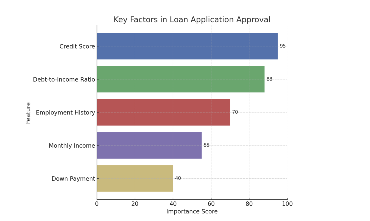
There are a number of techniques we can use to clarify or explain what is happening with AI. While methods range from providing the entire logic of a decision tree to generating natural language summaries of an output, two of the most practical and impactful types of information UX practitioners can introduce into an experience are feature importance (Figure 1) and counterfactuals. These are often the most straightforward for users to understand and the most actionable for designers to implement.
Feature Importance
This explainability method answers, “What were the most important factors the AI considered?” It’s about identifying the top 2-3 variables that had the biggest impact on the outcome. It’s the headline, not the whole story.
Example: Imagine an AI that predicts whether a customer will churn (cancel their service). Feature importance might reveal that “number of support calls in the last month” and “recent price increases” were the two most important factors in determining if a customer was likely to churn.
Counterfactuals
This powerful method answers, “What would I need to change to get a different outcome?” This is crucial because it gives users a sense of agency. It transforms a frustrating “no” into an actionable “not yet.”
Example: Imagine a loan application system that uses AI. A user is denied a loan. Instead of just seeing “Application Denied,” a counterfactual explanation would also share, “If your credit score were 50 points higher, or if your debt-to-income ratio were 10% lower, your loan would have been approved.” This gives Sarah clear, actionable steps she can take to potentially get a loan in the future.
Using Model Data To Enhance The Explanation
Although technical specifics are often handled by data scientists, it’s helpful for UX practitioners to know that tools like LIME (Local Interpretable Model-agnostic Explanations) which explains individual predictions by approximating the model locally, and SHAP (SHapley Additive exPlanations) which uses a game theory approach to explain the output of any machine learning model are commonly used to extract these “why” insights from complex models. These libraries essentially help break down an AI’s decision to show which inputs were most influential for a given outcome.
When done properly, the data underlying an AI tool’s decision can be used to tell a powerful story. Let’s walk through feature importance and counterfactuals and show how the data science behind the decision can be utilized to enhance the user’s experience.
Now let’s cover feature importance with the assistance of Local Explanations (e.g., LIME) data: This approach answers, “Why did the AI make this specific recommendation for me, right now?” Instead of a general explanation of how the model works, it provides a focused reason for a single, specific instance. It’s personal and contextual.
Example: Imagine an AI-powered music recommendation system like Spotify. A local explanation would answer, “Why did the system recommend this specific song by Adele to you right now?” The explanation might be: “Because you recently listened to several other emotional ballads and songs by female vocalists.”
Finally, let’s cover the inclusion of Value-based Explanations (e.g. Shapley Additive Explanations (SHAP) data to an explanation of a decision: This is a more nuanced version of feature importance that answers, “How did each factor push the decision one way or the other?” It helps visualize what mattered, and whether its influence was positive or negative.
Example: Imagine a bank uses an AI model to decide whether to approve a loan application.
Feature Importance: The model output might show that the applicant’s credit score, income, and debt-to-income ratio were the most important factors in its decision. This answers what mattered.
Feature Importance with Value-Based Explanations (SHAP): SHAP values would take feature importance further based on elements of the model.
- For an approved loan, SHAP might show that a high credit score significantly pushed the decision towards approval (positive influence), while a slightly higher-than-average debt-to-income ratio pulled it slightly away (negative influence), but not enough to deny the loan.
- For a denied loan, SHAP could reveal that a low income and a high number of recent credit inquiries strongly pushed the decision towards denial, even if the credit score was decent.
This helps the loan officer explain to the applicant beyond what was considered, to how each factor contributed to the final “yes” or “no” decision.
It’s crucial to recognize that the ability to provide good explanations often starts much earlier in the development cycle. Data scientists and engineers play a pivotal role by intentionally structuring models and data pipelines in ways that inherently support explainability, rather than trying to bolt it on as an afterthought.
Research and design teams can foster this by initiating early conversations with data scientists and engineers about user needs for understanding, contributing to the development of explainability metrics, and collaboratively prototyping explanations to ensure they are both accurate and user-friendly.
XAI And Ethical AI: Unpacking Bias And Responsibility
Beyond building trust, XAI plays a critical role in addressing the profound ethical implications of AI*, particularly concerning algorithmic bias. Explainability techniques, such as analyzing SHAP values, can reveal if a model’s decisions are disproportionately influenced by sensitive attributes like race, gender, or socioeconomic status, even if these factors were not explicitly used as direct inputs.
For instance, if a loan approval model consistently assigns negative SHAP values to applicants from a certain demographic, it signals a potential bias that needs investigation, empowering teams to surface and mitigate such unfair outcomes.
The power of XAI also comes with the potential for “explainability washing.” Just as “greenwashing” misleads consumers about environmental practices, explainability washing can occur when explanations are designed to obscure, rather than illuminate, problematic algorithmic behavior or inherent biases. This could manifest as overly simplistic explanations that omit critical influencing factors, or explanations that strategically frame results to appear more neutral or fair than they truly are. It underscores the ethical responsibility of UX practitioners to design explanations that are genuinely transparent and verifiable.
UX professionals, in collaboration with data scientists and ethicists, hold a crucial responsibility in communicating the why of a decision, and also the limitations and potential biases of the underlying AI model. This involves setting realistic user expectations about AI accuracy, identifying where the model might be less reliable, and providing clear channels for recourse or feedback when users perceive unfair or incorrect outcomes. Proactively addressing these ethical dimensions will allow us to build AI systems that are truly just and trustworthy.
From Methods To Mockups: Practical XAI Design Patterns
Knowing the concepts is one thing; designing them is another. Here’s how we can translate these XAI methods into intuitive design patterns.
Pattern 1: The “Because” Statement (for Feature Importance)
This is the simplest and often most effective pattern. It’s a direct, plain-language statement that surfaces the primary reason for an AI’s action.
- Heuristic: Be direct and concise. Lead with the single most impactful reason. Avoid jargon at all costs.
Example: Imagine a music streaming service. Instead of just presenting a “Discover Weekly” playlist, you add a small line of microcopy.
Song Recommendation: “Velvet Morning”
Because you listen to “The Fuzz” and other psychedelic rock.
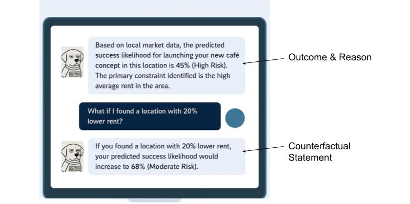
Pattern 2: The “What-If” Interactive (for Counterfactuals)
Counterfactuals are inherently about empowerment. The best way to represent them is by giving users interactive tools to explore possibilities themselves. This is perfect for financial, health, or other goal-oriented applications.
- Heuristic: Make explanations interactive and empowering. Let users see the cause and effect of their choices.
Example: A loan application interface. After a denial, instead of a dead end, the user gets a tool to determine how various scenarios (what-ifs) might play out (See Figure 1).

Pattern 3: The Highlight Reel (For Local Explanations)
When an AI performs an action on a user’s content (like summarizing a document or identifying faces in photos), the explanation should be visually linked to the source.
- Heuristic: Use visual cues like highlighting, outlines, or annotations to connect the explanation directly to the interface element it’s explaining.
Example: An AI tool that summarizes long articles.
AI-Generated Summary Point:
Initial research showed a market gap for sustainable products.
Source in Document:
“...Our Q2 analysis of market trends conclusively demonstrated that no major competitor was effectively serving the eco-conscious consumer, revealing a significant market gap for sustainable products...”
Pattern 4: The Push-and-Pull Visual (for Value-based Explanations)
For more complex decisions, users might need to understand the interplay of factors. Simple data visualizations can make this clear without being overwhelming.
- Heuristic: Use simple, color-coded data visualizations (like bar charts) to show the factors that positively and negatively influenced a decision.
Example: An AI screening a candidate’s profile for a job.
Why this candidate is a 75% match:
Factors pushing the score up:
- 5+ Years UX Research Experience
- Proficient in Python
Factors pushing the score down:
- No experience with B2B SaaS
Learning and using these design patterns in the UX of your AI product will help increase the explainability. You can also use additional techniques that I’m not covering in-depth here. This includes the following:
- Natural language explanations: Translating an AI’s technical output into simple, conversational human language that non-experts can easily understand.
- Contextual explanations: Providing a rationale for an AI’s output at the specific moment and location, it is most relevant to the user’s task.
- Relevant visualizations: Using charts, graphs, or heatmaps to visually represent an AI’s decision-making process, making complex data intuitive and easier for users to grasp.
A Note For the Front End: Translating these explainability outputs into seamless user experiences also presents its own set of technical considerations. Front-end developers often grapple with API design to efficiently retrieve explanation data, and performance implications (like the real-time generation of explanations for every user interaction) need careful planning to avoid latency.
Some Real-world Examples
UPS Capital’s DeliveryDefense
UPS uses AI to assign a “delivery confidence score” to addresses to predict the likelihood of a package being stolen. Their DeliveryDefense software analyzes historical data on location, loss frequency, and other factors. If an address has a low score, the system can proactively reroute the package to a secure UPS Access Point, providing an explanation for the decision (e.g., “Package rerouted to a secure location due to a history of theft”). This system demonstrates how XAI can be used for risk mitigation and building customer trust through transparency.
Autonomous Vehicles
These vehicles of the future will need to effectively use XAI to help their vehicles make safe, explainable decisions. When a self-driving car brakes suddenly, the system can provide a real-time explanation for its action, for example, by identifying a pedestrian stepping into the road. This is not only crucial for passenger comfort and trust but is a regulatory requirement to prove the safety and accountability of the AI system.
IBM Watson Health (and its challenges)
While often cited as a general example of AI in healthcare, it’s also a valuable case study for the importance of XAI. The failure of its Watson for Oncology project highlights what can go wrong when explanations are not clear, or when the underlying data is biased or not localized. The system’s recommendations were sometimes inconsistent with local clinical practices because they were based on U.S.-centric guidelines. This serves as a cautionary tale on the need for robust, context-aware explainability.
The UX Researcher’s Role: Pinpointing And Validating Explanations
Our design solutions are only effective if they address the right user questions at the right time. An explanation that answers a question the user doesn’t have is just noise. This is where UX research becomes the critical connective tissue in an XAI strategy, ensuring that we explain the what and how that actually matters to our users. The researcher’s role is twofold: first, to inform the strategy by identifying where explanations are needed, and second, to validate the designs that deliver those explanations.
Informing the XAI Strategy (What to Explain)
Before we can design a single explanation, we must understand the user’s mental model of the AI system. What do they believe it’s doing? Where are the gaps between their understanding and the system’s reality? This is the foundational work of a UX researcher.
Mental Model Interviews: Unpacking User Perceptions Of AI Systems
Through deep, semi-structured interviews, UX practitioners can gain invaluable insights into how users perceive and understand AI systems. These sessions are designed to encourage users to literally draw or describe their internal “mental model” of how they believe the AI works. This often involves asking open-ended questions that prompt users to explain the system’s logic, its inputs, and its outputs, as well as the relationships between these elements.
These interviews are powerful because they frequently reveal profound misconceptions and assumptions that users hold about AI. For example, a user interacting with a recommendation engine might confidently assert that the system is based purely on their past viewing history. They might not realize that the algorithm also incorporates a multitude of other factors, such as the time of day they are browsing, the current trending items across the platform, or even the viewing habits of similar users.
Uncovering this gap between a user’s mental model and the actual underlying AI logic is critically important. It tells us precisely what specific information we need to communicate to users to help them build a more accurate and robust mental model of the system. This, in turn, is a fundamental step in fostering trust. When users understand, even at a high level, how an AI arrives at its conclusions or recommendations, they are more likely to trust its outputs and rely on its functionality.
AI Journey Mapping: A Deep Dive Into User Trust And Explainability
By meticulously mapping the user’s journey with an AI-powered feature, we gain invaluable insights into the precise moments where confusion, frustration, or even profound distrust emerge. This uncovers critical junctures where the user’s mental model of how the AI operates clashes with its actual behavior.
Consider a music streaming service: Does the user’s trust plummet when a playlist recommendation feels “random,” lacking any discernible connection to their past listening habits or stated preferences? This perceived randomness is a direct challenge to the user’s expectation of intelligent curation and a breach of the implicit promise that the AI understands their taste. Similarly, in a photo management application, do users experience significant frustration when an AI photo-tagging feature consistently misidentifies a cherished family member? This error is more than a technical glitch; it strikes at the heart of accuracy, personalization, and even emotional connection.
These pain points are vivid signals indicating precisely where a well-placed, clear, and concise explanation is necessary. Such explanations serve as crucial repair mechanisms, mending a breach of trust that, if left unaddressed, can lead to user abandonment.
The power of AI journey mapping lies in its ability to move us beyond simply explaining the final output of an AI system. While understanding what the AI produced is important, it’s often insufficient. Instead, this process compels us to focus on explaining the process at critical moments. This means addressing:
- Why a particular output was generated: Was it due to specific input data? A particular model architecture?
- What factors influenced the AI’s decision: Were certain features weighted more heavily?
- How the AI arrived at its conclusion: Can we offer a simplified, analogous explanation of its internal workings?
- What assumptions the AI made: Were there implicit understandings of the user’s intent or data that need to be surfaced?
- What the limitations of the AI are: Clearly communicating what the AI cannot do, or where its accuracy might waver, builds realistic expectations.
AI journey mapping transforms the abstract concept of XAI into a practical, actionable framework for UX practitioners. It enables us to move beyond theoretical discussions of explainability and instead pinpoint the exact moments where user trust is at stake, providing the necessary insights to build AI experiences that are powerful, transparent, understandable, and trustworthy.
Ultimately, research is how we uncover the unknowns. Your team might be debating how to explain why a loan was denied, but research might reveal that users are far more concerned with understanding how their data was used in the first place. Without research, we are simply guessing what our users are wondering.
Collaborating On The Design (How to Explain Your AI)
Once research has identified what to explain, the collaborative loop with design begins. Designers can prototype the patterns we discussed earlier—the “Because” statement, the interactive sliders—and researchers can put those designs in front of users to see if they hold up.
Targeted Usability & Comprehension Testing: We can design research studies that specifically test the XAI components. We don’t just ask, “*Is this easy to use?*” We ask, “*After seeing this, can you tell me in your own words why the system recommended this product?*” or “*Show me what you would do to see if you could get a different result.*” The goal here is to measure comprehension and actionability, alongside usability.
Measuring Trust Itself: We can use simple surveys and rating scales before and after an explanation is shown. For instance, we can ask a user on a 5-point scale, “*How much do you trust this recommendation?*” before they see the “Because” statement, and then ask them again afterward. This provides quantitative data on whether our explanations are actually moving the needle on trust.
This process creates a powerful, iterative loop. Research findings inform the initial design. That design is then tested, and the new findings are fed back to the design team for refinement. Maybe the “Because” statement was too jargony, or the “What-If” slider was more confusing than empowering. Through this collaborative validation, we ensure that the final explanations are technically accurate, genuinely understandable, useful, and trust-building for the people using the product.
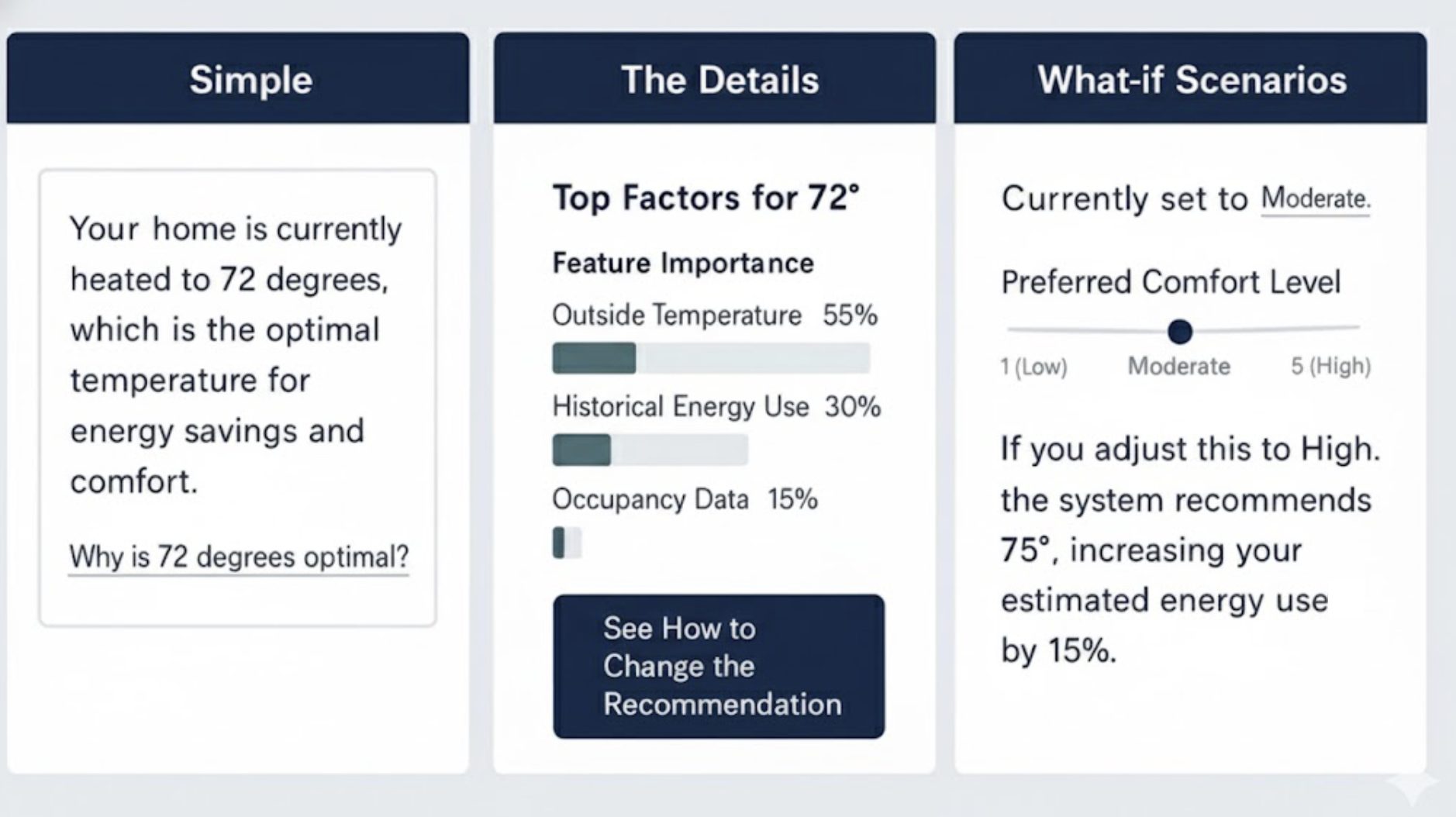
The Goldilocks Zone Of Explanation
A critical word of caution: it is possible to over-explain. As in the fairy tale, where Goldilocks sought the porridge that was ‘just right’, the goal of a good explanation is to provide the right amount of detail—not too much and not too little. Bombarding a user with every variable in a model will lead to cognitive overload and can actually decrease trust. The goal is not to make the user a data scientist.
One solution is progressive disclosure.
- Start with the simple. Lead with a concise “Because” statement. For most users, this will be enough.
- Offer a path to detail. Provide a clear, low-friction link like “Learn More” or “See how this was determined.”
- Reveal the complexity. Behind that link, you can offer the interactive sliders, the visualizations, or a more detailed list of contributing factors.
This layered approach respects user attention and expertise, providing just the right amount of information for their needs. Let’s imagine you’re using a smart home device that recommends optimal heating based on various factors.
Start with the simple: “*Your home is currently heated to 72 degrees, which is the optimal temperature for energy savings and comfort.*”
Offer a path to detail: Below that, a small link or button: “Why is 72 degrees optimal?“
Reveal the complexity: Clicking that link could open a new screen showing:
- Interactive sliders for outside temperature, humidity, and your preferred comfort level, demonstrating how these adjust the recommended temperature.
- A visualization of energy consumption at different temperatures.
- A list of contributing factors like “Time of day,” “Current outside temperature,” “Historical energy usage,” and “Occupancy sensors.”
It’s effective to combine multiple XAI methods and this Goldilocks Zone of Explanation pattern, which advocates for progressive disclosure, implicitly encourages this. You might start with a simple “Because” statement (Pattern 1) for immediate comprehension, and then offer a “Learn More” link that reveals a “What-If” Interactive (Pattern 2) or a “Push-and-Pull Visual” (Pattern 4) for deeper exploration.
For instance, a loan application system could initially state the primary reason for denial (feature importance), then allow the user to interact with a “What-If” tool to see how changes to their income or debt would alter the outcome (counterfactuals), and finally, provide a detailed “Push-and-Pull” chart (value-based explanation) to illustrate the positive and negative contributions of all factors. This layered approach allows users to access the level of detail they need, when they need it, preventing cognitive overload while still providing comprehensive transparency.
Determining which XAI tools and methods to use is primarily a function of thorough UX research. Mental model interviews and AI journey mapping are crucial for pinpointing user needs and pain points related to AI understanding and trust. Mental model interviews help uncover user misconceptions about how the AI works, indicating areas where fundamental explanations (like feature importance or local explanations) are needed. AI journey mapping, on the other hand, identifies critical moments of confusion or distrust in the user’s interaction with the AI, signaling where more granular or interactive explanations (like counterfactuals or value-based explanations) would be most beneficial to rebuild trust and provide agency.
Ultimately, the best way to choose a technique is to let user research guide your decisions, ensuring that the explanations you design directly address actual user questions and concerns, rather than simply offering technical details for their own sake.
XAI for Deep Reasoning Agents
Some of the newest AI systems, known as deep reasoning agents, produce an explicit “chain of thought” for every complex task. They do not merely cite sources; they show the logical, step-by-step path they took to arrive at a conclusion. While this transparency provides valuable context, a play-by-play that spans several paragraphs can feel overwhelming to a user simply trying to complete a task.
The principles of XAI, especially the Goldilocks Zone of Explanation, apply directly here. We can curate the journey, using progressive disclosure to show only the final conclusion and the most salient step in the thought process first. Users can then opt in to see the full, detailed, multi-step reasoning when they need to double-check the logic or find a specific fact. This approach respects user attention while preserving the agent’s full transparency.
Next Steps: Empowering Your XAI Journey
Explainability is a fundamental pillar for building trustworthy and effective AI products. For the advanced practitioner looking to drive this change within their organization, the journey extends beyond design patterns into advocacy and continuous learning.
To deepen your understanding and practical application, consider exploring resources like the AI Explainability 360 (AIX360) toolkit from IBM Research or Google’s What-If Tool, which offer interactive ways to explore model behavior and explanations. Engaging with communities like the Responsible AI Forum or specific research groups focused on human-centered AI can provide invaluable insights and collaboration opportunities.
Finally, be an advocate for XAI within your own organization. Frame explainability as a strategic investment. Consider a brief pitch to your leadership or cross-functional teams:
“By investing in XAI, we’ll go beyond building trust; we’ll accelerate user adoption, reduce support costs by empowering users with understanding, and mitigate significant ethical and regulatory risks by exposing potential biases. This is good design and smart business.”
Your voice, grounded in practical understanding, is crucial in bringing AI out of the black box and into a collaborative partnership with users.


